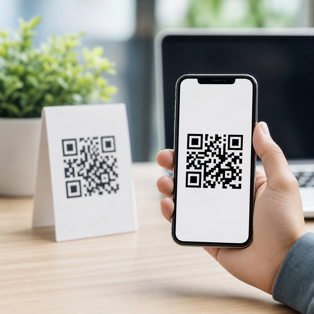
Choosing the right QR code format for logos and branding determines whether your code prints sharply, scans reliably, and fits your brand system across packaging, signage, menus, mailers, and mobile screens. In practice, this decision is not just about file extensions. It involves vector versus raster output, color control, transparency, print scaling, error correction, and how a branded QR code will be reused by designers, developers, and printers. I have seen excellent campaign concepts fail because a team downloaded a tiny PNG with a logo overlay, then stretched it onto a trade show banner where the edges blurred and scan rates collapsed. I have also seen simple vector exports perform flawlessly across business cards, storefront vinyl, and app onboarding screens. For teams creating mobile QR codes, understanding QR code formats and file types is the foundation for consistent branding. This hub explains which formats are best for logos, when to use SVG, PNG, PDF, EPS, and JPG, and how to choose based on real production requirements rather than guesswork.
A QR code format is the file type used to save and distribute the code, such as SVG, PNG, PDF, EPS, or JPG. Logos and branding matter because most businesses no longer use plain black-and-white codes in isolation; they place QR codes inside broader visual systems with brand colors, icon overlays, campaign-specific calls to action, and multi-channel assets. The key requirement is balancing appearance with readability. A beautifully branded code that does not scan is a failed asset. A technically perfect code that clashes with packaging or looks low quality weakens user trust. This article serves as the central guide to QR Code Formats & File Types, connecting the practical needs of marketing, design, and production. If you are deciding what to hand to a printer, what to upload into Canva or Figma, or what format to keep as your master file, the answer starts with one principle: use a vector master whenever possible, then export the right delivery format for each channel.
Why vector formats are usually best for branded QR codes
For logos and branding, vector QR code formats are usually the best choice because they scale without losing sharpness. The main vector formats used for QR codes are SVG, EPS, and PDF. Unlike raster files, vectors describe shapes mathematically, so the square modules in the QR code remain crisp at any size. This is critical when a single branded code appears on a small product label, a countertop display, and a large window cling. In my experience, SVG is the most versatile format for modern brand workflows because it works well in web design tools, presentation tools, and many print workflows, while also allowing clean scaling and small file sizes. EPS remains useful in legacy print environments, especially when a commercial printer or packaging vendor requests it. PDF is excellent when a QR code must be locked into a print-ready layout or shared with teams that need dependable viewing across devices.
Vector files also make logo integration cleaner. If a QR code includes a center logo mark, a border frame, or custom brand shapes around the finder patterns, vectors preserve edge definition better than raster exports. That matters because scan engines detect contrast transitions along module boundaries. Soft edges introduced by scaling a raster image can reduce decoding tolerance, especially in low light or on lower-end smartphone cameras. Vector output does not eliminate scan risk on its own; the code still needs sufficient quiet zone, high contrast, and tested logo sizing. But as a file foundation, vector is the safest long-term choice. If your team maintains a design system, keep one approved master QR code in SVG or PDF, document the minimum size and clear space, and generate channel-specific derivatives from that master instead of recreating the code repeatedly.
When PNG is the right choice and when it is not
PNG is the best raster format for many branded QR code uses, especially digital placements where transparency, predictable rendering, and easy sharing matter more than infinite scalability. A high-resolution PNG works well in social graphics, slide decks, email headers, landing pages, app screens, and documents created by non-design teams. PNG supports lossless compression, which preserves the hard edges that QR scanners need. It also supports transparent backgrounds, making it easier to place a branded code over colored layouts without a white box. For many marketing teams, PNG becomes the default working file because it opens everywhere and behaves consistently.
However, PNG is not the best master file for logos and branding if the code will be resized often or printed at unknown dimensions. A 512-pixel PNG might look acceptable on a phone mockup but fail on a poster. Even a large PNG can create workflow problems when someone crops, compresses, or re-exports it from a design platform. I have audited campaigns where the original QR code was fine, but a scheduler downloaded a preview image from a DAM system, reducing effective resolution so much that the printed mailer became unreliable. Use PNG for delivery, not archival control. Export it at the exact or higher-than-needed pixel dimensions, preserve a strong contrast ratio, and test the final placed asset on both iPhone and Android devices before production.
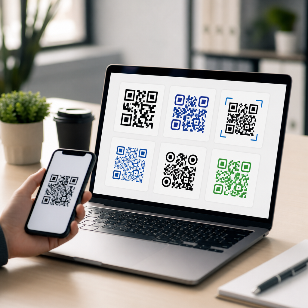
SVG, EPS, PDF, PNG, and JPG compared for logos and branding
The best QR code file type depends on where the branded asset will live. SVG is usually the top choice for flexibility. EPS is still valuable for professional print vendors. PDF is dependable for locked print output and cross-device sharing. PNG is ideal for screen use and simple internal distribution. JPG is generally the weakest option for QR codes because its lossy compression can blur edges and introduce artifacts around modules, especially after repeated saves. If a platform forces JPG, use the highest quality setting and verify scans carefully, but for logos and branding, JPG should be a fallback rather than a standard.
| Format | Best use | Main advantage | Main limitation |
|---|---|---|---|
| SVG | Brand systems, web, scalable design assets | Infinite scaling and editable vector paths | Some legacy print workflows need conversion |
| EPS | Commercial printing and packaging vendors | Accepted in traditional print production | Less convenient for everyday digital use |
| Print-ready sharing and locked layouts | Reliable viewing and output consistency | Less editable than SVG in many workflows | |
| PNG | Digital marketing, presentations, documents | Lossless raster with transparency support | Not ideal for frequent scaling or large print |
| JPG | Limited cases where only JPEG uploads are allowed | Universally supported | Compression artifacts can hurt scan reliability |
How logos affect QR code performance
Adding a logo changes the technical demands on the QR code. Every QR code has built-in redundancy through error correction levels: L, M, Q, and H. Higher error correction allows more damage or obstruction to the code, which is why branded QR codes with center logos often use level H. But higher redundancy also increases code density for the same data, which can make small prints harder to scan. The right approach is not simply “set error correction to high.” It is to pair a short destination, often through a dynamic URL, with an appropriate correction level and then keep the logo small enough that finder patterns, alignment patterns, and timing patterns remain visually distinct. Most successful branded codes place the logo inside a reserved center area and maintain generous contrast between dark modules and the background.
Color choices matter just as much as file type. Dark foreground on a light background remains the standard because most camera-based decoders are optimized for that contrast pattern. Brand teams often want light gray modules on pastel backgrounds or reverse white codes on dark packaging. These can work, but they need testing under realistic conditions such as matte stock, glossy lamination, low indoor light, and curved surfaces. I advise teams to treat black-on-white as the performance benchmark, then compare branded variants against it. If scan distance drops dramatically, the branding treatment is too aggressive. File format cannot rescue weak contrast or an oversized logo.
Choosing the right format by channel and production workflow
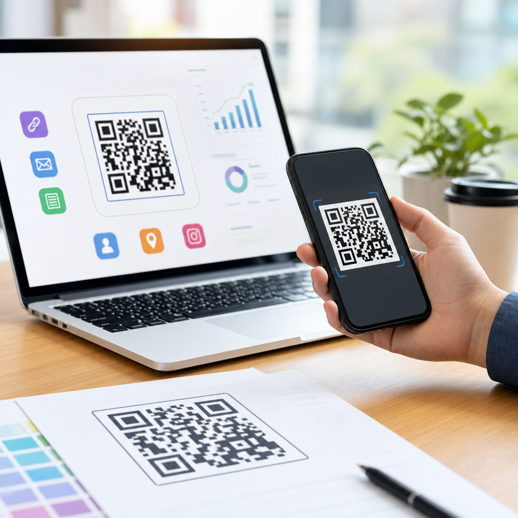
The practical answer to which QR code format is best for logos and branding is channel-specific. For print campaigns, start with SVG or EPS as the master, then place that vector into Adobe Illustrator, InDesign, or a packaging template supplied by your vendor. For general office use, distribute a PDF and a high-resolution PNG so non-design stakeholders do not accidentally edit the asset. For websites and responsive landing pages, SVG is often best because it remains sharp on high-density displays and scales cleanly inside modern front-end layouts. For social scheduling tools, marketplace listings, or presentation software that handles vectors inconsistently, export a PNG at the exact needed dimensions with enough margin around the code.
This hub also fits within broader Creating Mobile QR Codes workflows, where the final destination is usually a smartphone screen. That means testing should prioritize mobile camera behavior, thumb distance, and environment. A QR code on a restaurant table tent has different needs than one inside a mobile onboarding email. In the first case, physical durability and print contrast dominate. In the second, digital rendering and screenshot clarity matter more. Teams that document approved file types by use case avoid expensive rework. A simple internal standard works well: master in SVG, print vendor copy in PDF or EPS, everyday digital copy in PNG, never use JPG unless a platform leaves no alternative.
Best practices for managing a QR code file library
A branded QR code should be governed like any other brand asset. Store the master file, define naming conventions, record the destination URL, error correction level, creation date, campaign owner, and approved color variants. If the code is dynamic, note the redirect platform, such as Bitly, QR Code Generator, Beaconstac, or Flowcode, and control who can change the destination. Keep a proof sheet showing minimum print size, required quiet zone, and examples of approved and rejected uses. This is especially important for sub-pillar topics like QR Code Formats & File Types, because format mistakes often happen after the code leaves the original creator and gets reused by sales, franchisees, event teams, or agencies.
Version control prevents hidden failures. If a logo is updated, do not let old raster copies continue circulating in cloud folders. Replace them with current exports derived from the same master. Before launch, test scans across multiple devices, at multiple distances, and from both native camera apps and common social apps that open embedded browsers. Reliable branded QR codes are not accidental. They come from choosing the right format, preserving technical integrity, and aligning design decisions with the realities of print and mobile scanning. If you want the safest default, keep a vector master, export PNG for routine digital use, avoid JPG when possible, and validate every branded variation before it reaches customers. Audit your current QR assets now and standardize the file types your team uses.
Frequently Asked Questions
Which QR code file format is best for logos and branding overall?
For most branding and design workflows, a vector format is the best choice because it stays sharp at any size and gives your team more control over color, layout, and print production. SVG is usually the most practical option for day-to-day use because it scales cleanly, works well in modern design tools, and is easy to hand off across digital and print teams. If a QR code will appear on packaging, retail signage, brochures, menus, trade show graphics, or any asset that may be resized repeatedly, vector output prevents the softness and pixelation that often happen with raster files like PNG or JPG.
That said, “best” depends on where the code will live. If the QR code is going into a professional print layout, formats such as SVG, EPS, or PDF are often preferred because they preserve crisp edges and support production-ready output. If the code is only being used on websites, apps, slide decks, or email graphics, a PNG can still work well when exported at the correct size and resolution. The key point is that branding teams usually need flexibility. A master vector file lets designers adapt the code for dark backgrounds, light backgrounds, label constraints, and campaign variations without recreating it from scratch.
From a brand management perspective, vector formats also make it easier to keep the QR code consistent with the rest of the visual system. You can align the code with exact brand colors, spacing rules, and logo lockups while maintaining scan reliability. In other words, if you need one answer for the safest long-term branding choice, start with SVG as the master asset, then export PNG versions as needed for specific digital placements.
Should I use SVG, PNG, EPS, or PDF for a branded QR code?
Each of these formats has a good use case, but they serve different production needs. SVG is often the most versatile format for branded QR codes because it is lightweight, scalable, and editable in many design environments. It is especially useful when the code needs to appear across websites, responsive layouts, social graphics, packaging mockups, and marketing collateral. Designers like SVG because it can be resized without losing edge quality, which is critical for QR modules to remain crisp and scannable.
PNG is best when you need a straightforward raster image for digital use. It supports transparency, which is helpful if the code needs to sit over a colored background or within a design composition. However, PNG has fixed dimensions, so if the original file is exported too small and later enlarged, the QR code can become blurry and harder to scan. For that reason, PNG is usually a delivery format, not the best archival master for a brand system.
EPS and PDF are strong options for print production, especially when working with commercial printers, packaging vendors, or large-format sign producers. EPS has long been used in professional print workflows, though some modern teams prefer PDF because it is easier to preview and share while still retaining vector information. If your printer specifies one of these formats, it is usually because they want predictable output in a controlled production environment. In many cases, the smartest workflow is to generate a vector master in SVG and then save or export PDF or EPS versions for print vendors as needed.
JPG is generally the weakest choice for branded QR codes because it introduces compression artifacts and does not support transparency. Those artifacts can soften the clean edges a QR code depends on. When scan performance matters, and it always should, JPG is rarely the preferred format. So in practical terms: use SVG as the default master, PNG for digital placements, and PDF or EPS for professional print handoff when required.
Why does vector versus raster matter so much for QR codes with logos?
It matters because QR codes rely on precise geometry. The small square modules, finder patterns, and spacing around the code all need to remain visually clean for cameras to interpret them correctly. Vector files describe those shapes mathematically, so they stay crisp whether the code is printed on a business card or enlarged for a storefront window. Raster files, by contrast, are made of pixels. Once you scale them beyond their original size, those edges can become soft or jagged, which increases the risk of scanning problems.
This becomes even more important when a logo is added. A logo typically occupies part of the center area, which means the remaining visible structure of the QR code has less margin for visual distortion. If the code is already being pushed creatively with brand colors, rounded modules, custom frames, or a central icon, you do not want file quality to become another source of failure. A vector format preserves the clean contrast and alignment needed to support error correction and real-world scanning conditions.
Vector files also make revisions easier. Branding teams frequently need multiple versions of the same code for dark mode, light mode, co-branded campaigns, multilingual packaging, or region-specific promotions. With a vector source, those changes can be made without degrading the asset. Designers can update stroke, fill, background treatment, and surrounding layout while preserving the code’s structural integrity. In short, vector matters because it supports both design freedom and technical reliability, which is exactly the balance branded QR codes need.
How do color, transparency, and logo placement affect the best QR code format?
These factors directly influence both appearance and scan performance, and they often determine which format is easiest to work with. Color matters because branded QR codes must still maintain strong contrast between the foreground pattern and the background. A code that matches your brand palette perfectly but lacks contrast may look polished and still fail in real use. Vector formats are especially helpful here because they allow exact color specification and easy testing across multiple backgrounds, substrates, and campaign layouts.
Transparency is another major consideration. If the QR code needs to sit over photography, packaging textures, colored panels, or layered design elements, formats that support transparent backgrounds are much more flexible. SVG and PNG are commonly used for this reason. Transparent-background assets make it easier to integrate the code cleanly into brand compositions without adding a white box around it, although designers still need to protect the quiet zone and preserve enough visual separation for scanning.
Logo placement adds another layer of complexity. When a logo is embedded in the center of a QR code, you are intentionally covering part of the data pattern. That can work well when the code is generated with sufficient error correction, but it leaves less room for poor formatting decisions. The file needs to stay sharp, the logo cannot overwhelm the code, and the surrounding modules must remain clear and high contrast. Vector formats help because they allow precise control over the size and placement of the logo relative to the QR structure. That precision is much harder to maintain if teams are stretching low-resolution raster files across multiple outputs.
For branded applications, the safest approach is usually to create a high-quality vector version with carefully tested brand colors and logo placement, then export purpose-built raster variants only when necessary. That workflow keeps the visual identity intact while reducing the risk that a beautiful design becomes a non-scannable asset in the final environment.
What is the safest workflow for creating a branded QR code that prints sharply and scans reliably everywhere?
The safest workflow starts with generating the QR code as a vector master file, usually SVG, using the final destination URL or dynamic QR destination you plan to deploy. From there, apply branding carefully rather than aggressively. Add your logo only after confirming that the base code scans consistently, and use a suitable error correction level so the code can tolerate a modest center overlay. Maintain a proper quiet zone around the entire code, avoid low-contrast color combinations, and test the branded version on multiple phones before approving it.
Next, create output-specific files rather than forcing one file to serve every purpose. Use the vector master for packaging, signage, print ads, direct mail, menus, and any layout that may be resized. Export high-resolution PNG files for web pages, presentations, online listings, and app interfaces. If your printer or production partner requests PDF or EPS, provide those from the same approved vector source so every channel stays consistent. This reduces version drift, where different teams accidentally use outdated or low-quality copies.
It is also smart to build a simple brand usage standard around the QR code. Document approved colors, minimum size, logo treatment, background rules, and file formats for internal teams and vendors. Many QR failures happen not because the original code was bad, but because someone reused it incorrectly on a small label, placed it over a busy image, exported it as a compressed JPG, or removed the quiet zone to save space. A clear asset package and usage guide prevent those common breakdowns.
Finally, test the code in realistic conditions. Scan it on iPhone and Android devices, under bright and dim lighting, from short and moderate distances, and on the actual printed material if possible. A code that works on a desktop mockup may fail on textured packaging or glare-heavy signage. The strongest branding decision is not just choosing a visually attractive format. It is choosing a workflow that preserves clarity, consistency, and scan reliability from design concept to final use in the field.