
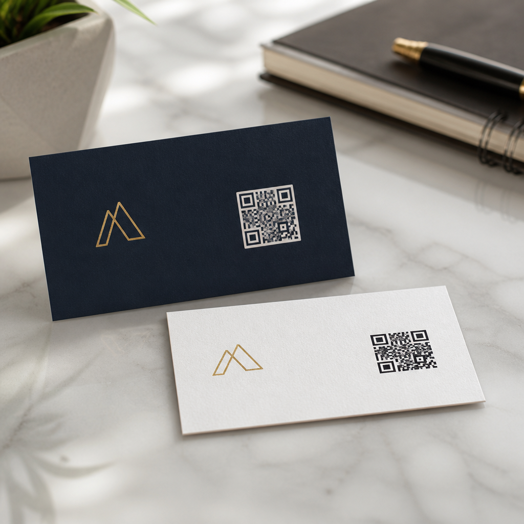
Where to place QR codes on business cards is not a cosmetic decision; it directly affects scan rate, readability, branding, and how quickly a contact moves from paper to phone. A QR code is a two-dimensional barcode that opens a digital destination such as a landing page, vCard, booking form, portfolio, or payment link when scanned by a smartphone camera. On business cards, placement means the exact physical location, surrounding white space, relative size, and relationship to text, logos, and print finishes. I have tested card layouts for sales teams, consultants, and event exhibitors, and the pattern is consistent: the best placement feels obvious to the eye, remains easy for a camera to read, and supports the card’s primary goal without overwhelming identity details. This matters because a business card has only a few square inches to communicate trust, role, and next action. Good QR code placement strategies increase successful first scans, reduce awkward rescans, and preserve a professional design that people keep instead of discard.
Best placement zones on the front and back of a business card
The best place for a QR code on a business card is usually the back, centered or anchored in one corner with generous white space. In practice, the back gives the code room to breathe and avoids crowding your name, title, company, and contact details on the front. If the front must contain the code, the safest positions are bottom right or bottom left, away from critical text and logos. Cameras need contrast and a quiet zone around the symbol, so placing the code flush against borders, over patterns, or near fine print lowers reliability. A centered back placement works well for networking cards that use the code as the main call to action, such as “Save my contact” or “Book a demo.” A corner placement works better when the back also includes a short message, social handle, or service list. The front can work for retail, restaurants, and real estate, where instant action matters, but the hierarchy must remain clear: identity first, action second, decorative elements last.
How size, quiet zone, and print quality affect scan success
A QR code that is badly printed or undersized will fail no matter where you place it. For standard business cards, a practical minimum is about 0.8 x 0.8 inches, while 1.0 x 1.0 inches is safer when the audience may scan in low light or while moving. The code also needs a quiet zone, the blank margin around all four sides, typically at least four modules wide. Without that space, smartphone cameras struggle to detect the code’s boundaries. I recommend exporting vector artwork such as SVG or EPS for print, not a screenshot copied from a web app. Print at high contrast, ideally black on white or another dark-on-light combination, and avoid glossy lamination that creates glare under venue lighting. Error correction helps recover from small print imperfections, but it is not a license to crowd the design. If you add a logo inside the code, increase the physical size and test on both iPhone and Android cameras before sending the card to press.
Placement strategy by card goal and audience
Effective QR code placement strategies start with the card’s job. A consultant’s card usually needs balanced credibility and action, so the back-center position is strong for linking to a portfolio or scheduling page. A salesperson at a trade show often needs rapid, repeated scans; a larger code on the back with the instruction “Scan to save my contact” reduces friction. Realtors and insurance agents frequently use the front lower corner because recipients want immediate access to listings or quote forms while still seeing the agent’s face and phone number. Creative professionals can place the code on the back beside a single visual sample, but they should resist background textures that reduce contrast. Restaurants, salons, and local service businesses may use a code for reviews, menus, or booking, and in those cases the code should sit where a customer naturally looks after reading the business name. Audience context matters too. Older audiences benefit from larger codes and explicit scan instructions. Tech-savvy audiences tolerate more minimal layouts but still need clean spacing and predictable placement.
Recommended placements by use case
The fastest way to choose a position is to match the placement with the action you want next. The table below summarizes the positions I use most often and why they work in real printing and scanning conditions.
| Use case | Best placement | Why it works |
|---|---|---|
| Digital contact card | Back center | Makes the code the main action and leaves the front clean for identity details. |
| Portfolio or personal brand | Back bottom right | Supports a short tagline or sample image without overpowering the layout. |
| Event networking | Back large, slightly above center | Improves quick scans in crowded spaces and under inconsistent lighting. |
| Retail or restaurant offer | Front bottom corner | Places the action near the first reading path after the business name. |
| Appointment booking | Back center with CTA text above | Pairs a clear instruction with a high-visibility, easy-to-frame code. |
How to balance branding, readability, and conversion
Good business card design is a hierarchy problem. The QR code should support your brand, not compete with it. That means placing it where the eye finds it after the essentials: name, company, role, and one primary contact method. On premium cards, I often reduce visual clutter by shortening URLs, trimming secondary social icons, and giving the code a dedicated zone. This improves both aesthetics and conversion. A strong CTA printed near the code can raise scans significantly because it removes uncertainty. “Scan to save my contact” performs better than “Scan me” because it names the benefit. Brand colors can be used, but maintain high contrast and avoid light-on-light combinations. Rounded module styles and custom frames are acceptable if they remain standards-compliant and tested. Avoid placing the code over photos, gradients, foil, embossing, or heavily textured stock. These finishes may look expensive, yet they create real camera recognition problems. The most successful cards I have deployed favor functional clarity over novelty, especially when the code is expected to generate leads, bookings, or profile views.
Common placement mistakes and how to avoid them
The most common mistake is treating the QR code like a decorative badge instead of a scannable interface. Tiny corner codes, low-contrast colors, and placement too close to other graphic elements are frequent causes of failure. Another mistake is putting the code on the front without enough space, forcing the logo, phone number, email, and address into unreadable sizes. A third is linking the code to a generic homepage when the context calls for a direct action page. Placement and destination must match. If the card is used at conferences, linking to a prefilled contact card or short lead form usually beats sending people to a navigation-heavy site. I also see teams ignore print production realities. Dark stocks, spot UV, metallic inks, and edge-to-edge designs can make a code look sharp in mockups but unreliable in hand. Finally, many people skip testing. Print a small batch, scan under daylight and indoor lighting, and try multiple devices and camera apps. If one person needs two attempts, revise the placement before ordering hundreds or thousands.
Testing, tracking, and linking placement to performance
The smartest QR code placement strategies are validated with data, not preference. Use a dynamic QR code platform so you can change the destination without reprinting cards and measure scans over time. Tools from providers such as Bitly, Beaconstac, Uniqode, and QR Code Generator Pro can track total scans, time, device type, and sometimes approximate location. For business cards, that data helps answer practical questions: does a back-centered code outperform a front-corner code, and does a vCard destination outperform a homepage? In one campaign I managed for a B2B software team, switching from a small front code linking to the company homepage to a larger back code linking to a direct contact card increased scans and follow-up completions because the action was simpler. Use UTM parameters when the destination is a web page so analytics platforms can separate business-card traffic from email or social traffic. If multiple teams use different layouts, assign unique codes by rep or region. Over time, placement becomes a measurable design decision tied to lead quality, not just visual taste.
Choosing where to place QR codes on business cards comes down to one principle: make scanning effortless while protecting the card’s core identity. For most brands, that means using the back of the card, giving the code ample size and quiet space, and pairing it with a direct benefit-led call to action. Front placement can work, but only when the layout remains clear and the code supports an immediate customer action. Reliable QR code placement strategies also account for print contrast, glare, stock, and the actual destination behind the code. The highest-performing cards are rarely the flashiest; they are the easiest to understand and the easiest to scan. Start with a back-centered or back-corner layout, test it on real phones, track results with dynamic codes, and refine based on scan behavior. If you want better business cards, treat the QR code as a user experience element, not an afterthought, and design every millimeter around that reality today.
Frequently Asked Questions
Where is the best place to put a QR code on a business card?
The best place to put a QR code on a business card is usually on the back of the card or in a clearly defined area on the front where it does not compete with essential contact details. Placement matters because a QR code needs to be immediately visible, easy to scan, and visually separated from other design elements. In most cases, the back of the card gives the code enough room to breathe, which helps preserve readability and keeps the front focused on your name, title, company, phone number, and other key information.
If the QR code must go on the front, corners often work well, especially the bottom right or bottom left, as long as the code is not crowded by logos, borders, icons, or dense text. The real goal is not simply choosing a corner, but creating a clear scan zone around the code. That means giving it adequate white space and making sure it does not sit too close to the card edge, where trimming can affect print accuracy. Good placement also supports user behavior. When someone picks up your card, they should instantly understand what to do next and be able to scan the code without rotating the card awkwardly or covering it with their fingers. In short, the best placement is the spot that balances scanability, print reliability, and the overall hierarchy of your card design.
How much space should surround a QR code on a business card?
A QR code should always have a clear margin of empty space around it, often called the quiet zone. This space is essential because smartphone cameras and scanning apps rely on contrast and separation to identify the full shape of the code. If text, logos, lines, patterns, or background graphics are placed too close, scanning becomes slower and less reliable. On a business card, where every millimeter counts, this is one of the most important layout decisions you can make.
As a practical rule, avoid placing any visual element directly against the code. Give it visible breathing room on all four sides so the code reads as a standalone object rather than part of a crowded design block. This becomes even more important if the card uses textured stock, glossy finishes, dark backgrounds, or decorative patterns, all of which can make scanning less forgiving. The surrounding space also improves visual clarity for the person holding the card. It subtly signals, “this is interactive,” which increases the chance that the recipient notices the code and uses it. If you are deciding between making the code slightly smaller with more white space or slightly larger with tighter spacing, the cleaner buffer around the code is usually the better choice for real-world usability.
How big should a QR code be on a business card to stay easy to scan?
A QR code on a business card should be large enough to scan quickly without dominating the design. In most cases, a code around 0.8 to 1 inch square is a reliable range, though the ideal size depends on how much data the code contains, the print quality, the color contrast, and the expected scanning conditions. A simple URL can often remain readable at a smaller size, while a more complex code linking to a vCard or encoded with more information may need to be larger.
The key is to think beyond dimensions alone. A technically printable QR code is not always a practically scannable one. Business cards are small, often viewed in mixed lighting, and handled quickly in networking settings. That means your code should scan from a comfortable phone distance without requiring repeated attempts. If you make it too small, the tiny modules inside the code can blur together during printing or become hard for phone cameras to resolve. If you make it too large, it can overpower the card and reduce room for the branding and text people still need to read. The smartest approach is to test printed samples before ordering a full run. Scan the card on different phones, in bright and dim environments, and from normal hand-held angles. A code that works well in real conditions is more valuable than one that only looks balanced on a screen mockup.
Should a QR code go on the front or back of a business card?
In most cases, the back of a business card is the stronger choice because it gives the QR code more space, minimizes visual clutter, and keeps the front clean and professional. This approach works especially well when the front of the card already carries your brand identity and direct contact information. Putting the code on the back also creates a natural interaction flow: the front introduces who you are, and the back provides the digital next step, whether that is saving your contact, viewing your portfolio, booking a consultation, or opening a landing page.
That said, the front can still be the right location if scanning the code is the card’s primary objective. For example, if the card is meant to drive immediate action at an event, link to a payment page, or function almost like a mini call-to-action card, front placement may increase visibility and use. The decision should come down to hierarchy and intent. Ask what the recipient needs to notice first. If your card is meant to reinforce your identity and credibility, put the QR code on the back. If instant scanning is the main conversion goal, a front placement can make sense, provided the code does not interfere with legibility or branding. Either way, the code should feel integrated into the design rather than added as an afterthought.
What design mistakes make QR codes on business cards harder to scan?
The most common mistakes are making the QR code too small, placing it too close to other elements, using low-contrast colors, distorting its shape, and printing it on finishes or backgrounds that reduce clarity. A QR code is functional first. If it is stretched, heavily stylized, partially covered, or blended into a busy design, scan performance drops quickly. Designers sometimes try to treat the code like a decorative graphic, but on a business card its job is to move someone from print to phone with as little friction as possible.
Other frequent issues include placing the code too close to the trim edge, which risks it being cut off or visually cramped, and linking it to a vague or irrelevant destination. Even a perfectly printed code underperforms if the person scanning it does not know what they will get. Adding a short call to action such as “Scan to save my contact,” “View portfolio,” or “Book a call” can significantly improve response. It is also important to test for surface glare, especially on glossy cards, since reflected light can interfere with phone cameras. Finally, never assume digital proofs tell the whole story. The final printed card, paper stock, ink density, and finish all affect scan results. The safest strategy is a clean layout, strong contrast, enough white space, a clear destination, and real-world testing before mass printing.





