
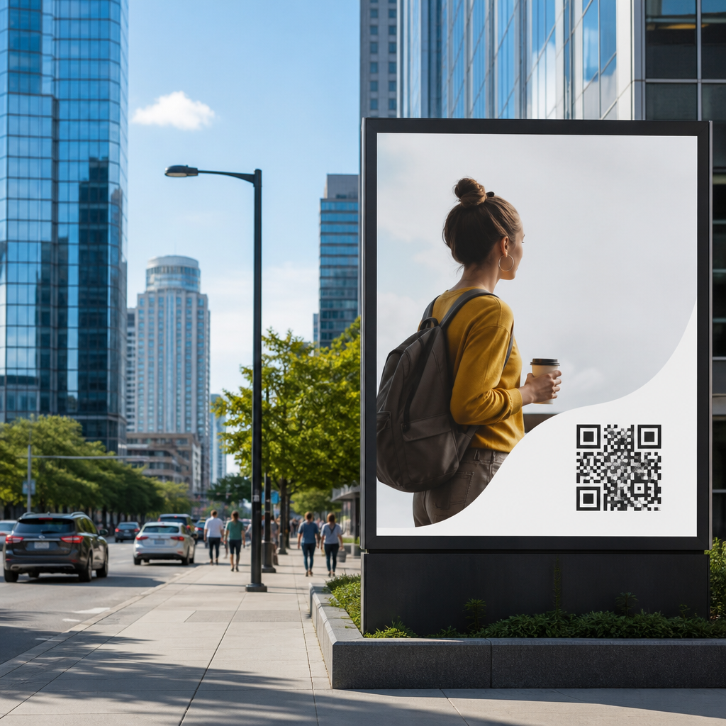
QR code placement for billboards and outdoor ads determines whether a passing audience can scan instantly or ignore a code that looks good in a mockup but fails in the real world. In outdoor advertising, placement is not a cosmetic decision; it is a usability, visibility, and conversion decision shaped by distance, speed, lighting, screen size, and the physical behavior of people in cars, on sidewalks, and in transit areas. A QR code is a two-dimensional barcode read by a smartphone camera, while placement strategy refers to where that code appears within a layout, how large it is relative to the ad, and the environmental conditions around it. I have tested QR creatives on roadside boards, transit shelters, stadium signage, and retail facades, and the same lesson keeps repeating: a technically valid code can still underperform if it is too high, too small, poorly contrasted, or paired with an unclear call to action. Strong placement matters because outdoor media usually gives viewers only seconds of attention, and those seconds must support quick recognition, safe scanning, and confidence about what happens next.
Good placement strategy sits at the intersection of design, human factors, and measurement. Designers often focus first on branding, but smartphone cameras need clean contrast, adequate quiet zone, and enough on-screen code area to decode quickly. Media buyers care about impressions, yet a billboard may generate little mobile engagement if the code cannot be reached from a safe stopping point. Marketers want attribution, which means the code must route to a fast mobile landing page with campaign parameters and a destination that matches the ad promise. In practice, the best-performing outdoor QR codes are not merely visible; they are intentionally positioned for audience context. A commuter waiting at a bus stop behaves differently from a driver passing a highway spectacular, and a shopper outside a mall behaves differently from a fan entering an arena. Understanding those contexts is the foundation of every placement decision.
Start with viewing distance, speed, and dwell time
The first rule of QR code placement strategies is simple: match the code to the distance and speed of the audience. A pedestrian at a storefront might stand three to ten feet away and has enough dwell time to align a camera, read supporting text, and complete a scan. A driver moving at city speed may have only a brief glance and should not be expected to scan at all unless the ad is visible from a safe stopping area, such as a parking lot entrance, red-light corridor, or rideshare queue. For highway billboards, many campaigns should avoid QR codes entirely because the environment does not support safe interaction. Where codes are used, they perform best on lower-speed roads, transit zones, event perimeters, and places where people naturally pause.
Distance also drives size. A common field guideline is to make the code at least one-tenth of the scanning distance, measured in the same unit, though real performance depends on camera quality, error correction level, and environmental noise. If a transit shelter panel is read from six feet away, the code should be roughly seven inches or more. If a wallscape is meant to be scanned from fifteen feet, a code around eighteen inches is a more realistic starting point. I treat these as minimums, then test upward. Larger usually wins outdoors because glare, motion, and imperfect camera focus reduce effective readability. The practical goal is not theoretical scannability but first-attempt scanning on average consumer devices, including older phones with less capable autofocus.
Choose placement zones that support natural phone use
Where the code sits inside the ad matters as much as its size. For outdoor ads, the best placement zones are usually in the lower middle or lower right portion of the creative, where viewers can spot the code quickly without losing the main message. Placing a code in the extreme top corner of a tall billboard forces an awkward camera angle and shrinks the effective code area on the phone screen. On bus shelters and kiosks, lower-half placement works well because it aligns with comfortable arm and eye position for most adults standing on a sidewalk. On storefront windows, I have seen the highest scan completion when the code is placed between chest and eye level, not near the floor and not above the door frame.
Natural phone use also means respecting the physical path of the audience. A code should face the direction from which people approach, not the direction a designer prefers in a static comp. At event venues, codes placed just after security checkpoints often outperform codes at the gate itself because people can finally stop and use their phones. In parking garages, elevator lobbies and payment kiosks are stronger scan zones than entry ramps. In retail districts, curbside sandwich boards and window decals near queue lines often generate better results than large facade signs mounted too high to frame easily in a camera.
| Outdoor format | Best placement approach | Why it works |
|---|---|---|
| Transit shelter | Lower half, center-right, eye-level viewing | High dwell time and easy standing scan angle |
| Storefront window | Chest-to-eye level near entrance or queue | Captures intent close to point of action |
| Street-level billboard | Lower center with large clear CTA | Improves detectability from sidewalk or stopped traffic |
| Event signage | Post-entry concourse or concession zones | Audiences pause and have phones in hand |
| Highway billboard | Avoid or redirect to short URL instead | Low dwell time and safety concerns limit scanning |
Protect scanability with contrast, quiet zone, and material choices
Placement fails when production details are ignored. A QR code needs strong luminance contrast between dark modules and a light background, and it needs an unobstructed quiet zone around the code, typically four modules wide at minimum. Outdoor ads regularly break these rules by placing codes over photography, gradients, reflective vinyl, or patterned brand colors. When I audit underperforming campaigns, the most common issue is not the code generator but the surrounding design. A clean white box behind the code often improves scan rate more than any stylistic customization. Branded codes can work, but only when contrast remains high and the finder patterns stay intact.
Material and lighting are equally important. Glossy substrates can create hot spots that wash out modules in direct sun. Mesh banners can distort edges. Backlit units may shift contrast at night. Digital out-of-home screens introduce refresh and moiré issues when photographed from certain angles. The fix is straightforward: use matte finishes where possible, preserve a clear buffer around the code, and proof the final production file at actual size. Test in morning, midday, and evening conditions with multiple phones on both iOS and Android. A code that scans in the studio can still fail outdoors when a viewer is wearing sunglasses, standing in shadow, or dealing with screen glare on their own device.
Pair placement with a clear call to action and destination match
People scan when the value exchange is obvious. The code should sit near a short call to action that answers three questions immediately: why scan, what will I get, and how long will it take. “Scan for menu” works at a restaurant window because the intent is direct. “Scan to see available units” fits apartment signage. “Scan for same-day coupon” works near retail entrances. Vague prompts such as “Learn more” usually underperform because outdoor viewers do not want homework. The surrounding copy should be readable at the same distance as the code, and the landing experience must match the promise exactly. If the ad offers a discount, the landing page should surface that discount without extra navigation.
This is where placement connects to conversion quality. A perfectly placed code can still waste spend if it opens a slow desktop page, a generic homepage, or a form too long for mobile users standing outside. Use a mobile-first destination, tagged with UTM parameters and, when relevant, linked to location-aware content. Dynamic QR codes are the default choice because they let teams update destinations, monitor scans by time and geography, and support A/B testing across placements. Tools such as Bitly, QR Code Generator Pro, Beaconstac, and analytics platforms like Google Analytics 4 make it possible to compare scan volume against foot traffic, weather, or daypart and then refine placement with evidence instead of guesswork.
Measure performance by environment, not just total scans
Outdoor QR code placement should be managed like a live performance channel. Total scans are useful, but they are not enough. Segment results by format, height, orientation, time of day, traffic pattern, and proximity to stopping points. In one retail campaign I worked on, a window decal near the checkout line produced fewer impressions than a facade banner but delivered a much higher scan-through and purchase rate because people had both intent and dwell time. In another campaign, moving the code from the upper-left corner of a transit poster to the lower-right increased scans meaningfully without changing the offer, simply because the new position matched how people approached the shelter.
Good measurement also means understanding failure modes. If impressions are high and scans are low, check size, contrast, and CTA clarity first. If scans are healthy but conversions are poor, audit the landing page speed, message match, and mobile form friction. If one location outperforms another, compare sunlight exposure, sidewalk width, traffic speed, and whether users can stop safely. The central benefit of a strong hub-level QR code placement strategy is consistency: every outdoor execution follows the same usability principles while adapting to context. Build that discipline into your design reviews, production proofs, and post-campaign analysis. Then test every placement in the field, on real phones, before launch. Better placement turns outdoor attention into measurable mobile action.
Frequently Asked Questions
What is the most important factor in QR code placement for billboards and outdoor ads?
The most important factor is real-world scannability, not how the QR code looks in a design file. Outdoor audiences are often moving, distracted, or viewing the ad from a distance, so placement must support fast recognition and easy phone alignment. A QR code on a billboard or transit ad should be positioned where people can naturally notice it, understand what it is for, and scan it without awkward body movement or visual searching. That means considering viewing distance, travel speed, likely angle of approach, surrounding copy, glare, shadows, and how much time a person has before the ad disappears from view.
In practice, placement should support the user journey in seconds: see the ad, identify the QR code, understand the value of scanning, and act. If the code is too high, too small, too close to the edge, crowded by other design elements, or placed where vehicles or pedestrians cannot safely respond, conversion drops quickly. The strongest placements usually put the code in a visually clean area with strong contrast, enough white space, and proximity to a short call to action that explains why scanning is worthwhile. For outdoor advertising, the best placement decision is the one that matches human behavior in that specific environment, not a generic rule copied from print or packaging.
How large should a QR code be on a billboard or outdoor advertisement?
QR code size should be based on expected scanning distance and audience movement, not just available space in the layout. A code that is technically visible may still be unscannable if a viewer is too far away or only has a few seconds to respond. On outdoor ads, larger is usually safer because smartphone cameras need enough detail to detect the code quickly, especially under imperfect conditions like motion, reflections, weather, or low light. As a general principle, the farther away the audience is, the larger the code must be, and the less dense the encoded data should be.
For pedestrian-facing placements such as bus shelters, storefront windows, kiosks, and platform posters, a moderately sized code can work well if people can get physically close and pause. For roadside billboards viewed from moving vehicles, a QR code often performs poorly unless the placement is designed for moments when traffic slows or stops, such as near intersections, parking areas, pickup zones, or long red lights. Even then, the code should be large, visually isolated, and paired with a simple landing experience. If the code contains too much data, its pattern becomes denser and harder to scan at distance, so using a short URL or dynamic QR code is often better. The right approach is to test the code on actual phones from actual viewing distances before launch rather than relying on mockup assumptions.
Where should a QR code be positioned within the billboard or ad layout?
The QR code should be placed where the eye can find it quickly after the main message is understood. In most outdoor layouts, that means avoiding corners that feel visually detached, areas with heavy background texture, and positions that are too close to trim, folds, frames, or structural obstructions. The code should feel integrated into the hierarchy of the ad, but not buried inside it. A good rule is that the audience should first notice the headline or main visual, then immediately see a clear invitation to scan. If the code is visually competing with logos, product shots, taglines, and legal text, it often gets ignored.
Lower-to-mid sections of pedestrian ads often work well because they are easier to align with a phone camera at natural hand height. For larger outdoor formats, the best position depends on where viewers approach from and how long they remain in the viewing zone. The code should not be placed so low that it can be blocked by parked cars, street furniture, crowds, or dirt, and it should not be placed so high that scanning requires uncomfortable angling. Leave generous quiet space around the code so cameras can isolate it, and keep nearby text short and readable. Strong placements also account for environmental realities such as pole shadows, reflections from glass, and the fact that certain parts of a billboard may be less visible depending on lane direction or sidewalk flow.
Do lighting and weather conditions affect QR code performance outdoors?
Yes, significantly. Outdoor QR code placement is heavily influenced by lighting, weather, and time of day. A code that scans perfectly in a studio proof can fail outdoors because of direct sun glare, low evening light, rain, shadows from trees or buildings, or reflective substrates that wash out contrast. Smartphone cameras rely on clear visual separation between dark and light modules in the QR code, so any condition that reduces contrast or introduces distortion can hurt scan reliability. This is why material choice, finish, orientation, and placement angle matter just as much as the code design itself.
For example, glossy surfaces can create harsh reflections that obscure the pattern, especially on bus shelters, windows, and metal-backed signage. Backlit environments can also cause exposure problems if the code is placed over bright panels or inconsistent illumination. Weather adds another layer: dirt, condensation, fading, and physical wear can gradually reduce readability. The best way to reduce these risks is to use high-contrast printing, matte or low-glare finishes when possible, and placements that avoid the most reflection-prone areas. It is also smart to test the code at multiple times of day using different phone models and camera apps. A QR code used outdoors should be treated as a functional interface element, not just a graphic asset, so environmental durability and visual stability should be part of the placement strategy from the start.
What are the biggest mistakes to avoid when placing QR codes on billboards and outdoor ads?
One of the biggest mistakes is placing a QR code where people cannot realistically scan it safely or comfortably. A code on a high-speed roadside billboard may look modern, but if drivers only see it for a few seconds and cannot safely take out a phone, it is not an effective call to action. Another common error is making the code too small, too dense, or too visually busy. Designers sometimes reduce the code to preserve aesthetic balance, add branding that interferes with readability, or place it over a patterned background that confuses camera detection. These choices often damage performance even if the code remains technically valid.
Other frequent mistakes include failing to explain why someone should scan, neglecting contrast and white space, positioning the code near edges or obstacles, and skipping live testing in the actual installation environment. It is also a mistake to send users to a slow, non-mobile-friendly, or irrelevant landing page, because placement only succeeds if the full scan experience converts. The best outdoor QR implementations keep the code simple, visible, and well-supported by context. They are placed where the audience has both the opportunity and the motivation to act, and they are validated under real conditions before the campaign goes live. In outdoor advertising, small placement errors can have outsized effects on scan rate, so careful planning and field testing are essential.





