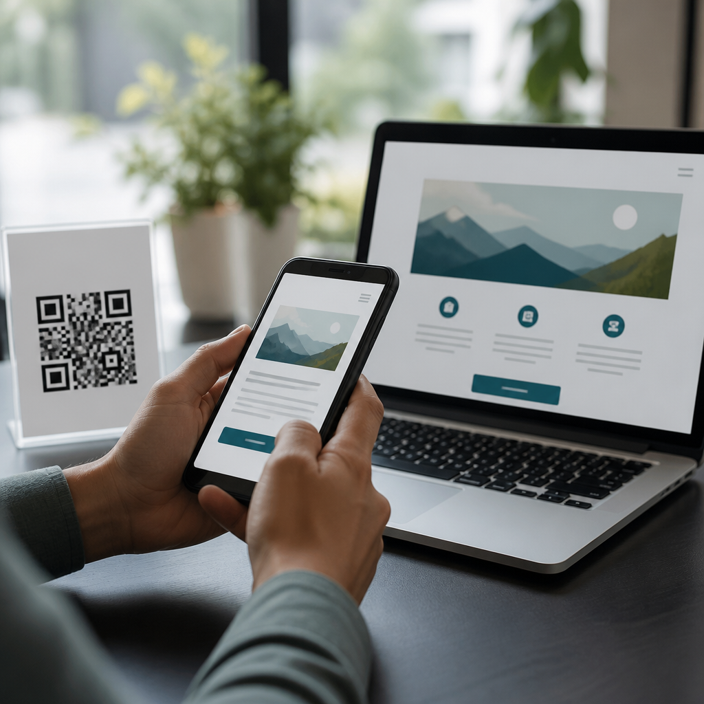
Accessible QR code design starts with contrast, because a code that cannot be seen, focused, or reliably scanned excludes users before any content or transaction begins. In practical terms, contrast ratio describes the luminance difference between two colors, usually expressed as a number such as 4.5:1 or 7:1. For QR codes, the key relationship is between the dark modules and the lighter background, but accessibility considerations extend further: surrounding context, print quality, glare, color blindness, low vision, and the camera limitations of older phones all affect success. I have tested QR campaigns on packaging, posters, menus, event signage, and warehouse labels, and the same lesson repeats every time: when contrast is weak, scan rates drop sharply even if the code technically meets size requirements.
The best contrast ratios for accessible QR codes are usually higher than minimum text standards because scanning is not the same as reading. A smartphone camera must separate hundreds of small square modules, detect finder patterns, correct perspective, and decode data despite shadows, curved surfaces, and motion blur. That is why high-contrast combinations such as black on white, dark navy on white, or deep green on cream consistently outperform fashionable but low-contrast palettes like pastel on pastel or metallic ink on colored stock. Accessibility matters here because QR codes are often gateways to essential information: menus, payments, tickets, instructions, health forms, and wayfinding. If the code is hard to perceive or scan, the experience becomes slower, frustrating, and in some cases impossible.
This article explains the best contrast ratios for accessible QR codes and covers the broader accessibility considerations that belong in every mobile QR code design workflow. It addresses what ratio to target, which color combinations work in print and on screens, how to test codes under real conditions, and what design choices create avoidable barriers. As a hub page, it also frames the related issues that connect contrast to size, placement, error correction, alternate access, and inclusive visual design. The goal is simple: make every QR code easy to notice, easy to scan, and easy to trust across devices, lighting conditions, and user abilities.
Recommended contrast ratios and why they matter
If you need a direct recommendation, aim for at least 7:1 contrast between the darkest QR modules and the lightest background, and treat that as a baseline rather than an aspirational maximum. A 4.5:1 ratio may be acceptable for some interface text, but QR codes demand more because cameras are less forgiving than human readers. In field testing, I have seen 5:1 combinations scan well indoors on flagship phones but fail outdoors, on textured labels, or on lower-end Android devices with weaker autofocus. A 7:1 target creates a practical safety margin, and ratios above 10:1 are ideal for small codes, glossy print, and fast-moving scan environments such as retail counters or transit gates.
Why is the threshold higher? QR decoding depends on clean edge detection. Each module must stand apart from its neighbors and from the background, while finder patterns in three corners must remain unmistakable. Low contrast softens these edges, especially when ambient light is uneven or the camera applies noise reduction. The result is delayed focus, repeated rescans, or total failure. High contrast also improves discoverability for people with low vision, supports users in bright sunlight, and reduces dependence on screen brightness or camera quality. In short, stronger contrast improves both accessibility and conversion.
Standards help frame the issue, even though no single accessibility rule sets one universal QR ratio. WCAG 2.2 provides contrast guidance for text and user interface components, and ISO/IEC 18004 defines QR code structure and decoding fundamentals. Taken together, they support a conservative approach: preserve a very light background, use very dark modules, and avoid decorative treatments that weaken the code’s machine readability. When clients ask whether black on white is still the best answer, the honest response is yes. It remains the most robust, most accessible, and easiest-to-test option available.
Best color combinations for accessible QR codes
The safest accessible QR code uses near-black modules on a white background. Charcoal on white also performs well, as do dark navy, dark forest green, and deep maroon on white or very pale neutral backgrounds. The common principle is simple: dark foreground, light background, and enough luminance separation to stay readable in poor conditions. Light modules on a dark background can work for some scanners, but they are inherently riskier because many camera and software pipelines still expect a standard dark-on-light structure. In production, I recommend reversing colors only after broad device testing.
Color choice is not only about hue; it is about relative luminance. Two colors can look dramatically different yet still produce weak contrast. For example, saturated red on black may feel bold in branding mockups but often scans poorly because both colors are relatively dark. Similarly, medium blue on dark gray can fail under dim restaurant lighting even when it looks stylish on a calibrated monitor. Designers should evaluate combinations with contrast tools such as WebAIM Contrast Checker, Stark, or Adobe Color, then confirm scan performance with real devices. A contrast checker gives an essential starting point, but scan testing is the deciding step.
| Color combination | Typical accessibility outcome | Use case guidance |
|---|---|---|
| Black on white | Excellent contrast and scan reliability | Best default for print, signage, packaging, and screens |
| Dark navy on white | Very strong when ratio exceeds 7:1 | Good brand-friendly alternative to black |
| Dark green on cream | Strong if cream is very light and matte | Suitable for menus, labels, and sustainable packaging |
| Medium gray on white | Borderline for small codes | Use only at larger sizes with testing |
| Pastel on pastel | Poor contrast and frequent scan failure | Avoid in all essential journeys |
| Metallic ink on colored stock | Unpredictable due to glare and reflection | Avoid unless extensively tested in final materials |
Avoid gradients, shadows, transparency, and busy photographic backgrounds. These effects reduce local contrast inside the symbol, which is far more damaging than many teams expect. The quiet zone, the clear margin around the code, must also remain highly distinct from nearby graphics. If surrounding content crowds that area, scanners struggle to isolate the symbol. This is one reason accessible QR design belongs in a broader mobile QR code design and UX system, not as an afterthought at the end of a campaign.
Accessibility considerations beyond contrast
Contrast is foundational, but accessible QR codes require several supporting decisions. Size matters because users with low vision, hand tremor, or older devices benefit from larger targets. For print, 2 x 2 centimeters is often cited as a minimum for close-range use, but larger is better when viewing distance increases. A practical rule I use is roughly one inch of code width for every ten inches of scanning distance, then add margin if the environment is dim or crowded. Error correction matters too. Higher levels such as Q or H can protect branding overlays or minor damage, but they do not compensate for poor contrast. They are backups, not substitutes.
Placement affects accessibility in ways teams often miss. Codes mounted too high, too low, behind reflective acrylic, on curved bottles, or near seams become difficult for wheelchair users, people with limited reach, and anyone trying to scan quickly. For public-facing materials, position the code within a comfortable line of sight, provide adequate white space, and make sure the linked destination is mobile optimized. An accessible QR code that opens a cluttered, nonresponsive page still creates friction. This hub topic therefore connects directly to landing page usability, tap target sizing, readable typography, and form simplification.
Equally important is alternate access. Never force the QR code to be the only path to essential information. Include a short URL, NFC where appropriate, plain-language instructions, and visible context about what happens after scanning. For example, “Scan to view allergen menu” is better than placing an unlabeled code on a table tent. In healthcare, transportation, education, and government contexts, this redundancy is not optional; it is a trust and compliance issue. Users need to know what the code does, and they need another route if scanning fails.
How to test accessible QR codes in real conditions
The most reliable testing process combines contrast analysis, device diversity, and environmental checks. Start by measuring the chosen colors with a trusted checker and confirm that the module-to-background ratio reaches at least 7:1. Next, print or render the code at final size and test it on multiple devices: recent iPhone and Pixel models, at least one mid-range Android phone, and if the audience skews older, an older device with a weaker camera. Test native camera apps first, then common third-party scanners if relevant to your use case. Scan under direct sunlight, indoor warm light, and low light. Tilt the surface, add realistic motion, and test from expected distances.
I also recommend failure testing, which reveals issues perfect-condition reviews miss. Try scanning with screen brightness reduced, through fingerprints on the phone camera, and from awkward angles. Check whether glossy lamination creates hotspots, whether colored paper shifts the effective contrast, and whether brand edits changed the quiet zone. On digital displays, test dark mode surroundings, low brightness, and kiosk screens with older panels. Document the shortest successful scan time and the percentage of first-attempt scans. Those metrics are far more useful than a subjective “seems fine.”
Finally, validate the destination experience. The accessible QR code is only the entry point. Confirm that the landing page loads quickly on mobile data, supports zoom, uses clear heading structure, and offers readable contrast itself. If the code initiates payment, ticket retrieval, or account access, check keyboard support and screen reader announcements on the destination flow. Accessibility is end to end, and the handoff from physical code to digital content is where many organizations lose users.
Common mistakes and a practical design policy
The most common mistake is treating the QR code as a decorative brand asset instead of a functional access tool. That leads to low-contrast palettes, inverted color schemes without testing, oversized center logos, clipped quiet zones, and placement over patterns or photographs. Another recurring error is approving codes on a designer’s monitor only, then discovering that the printed version on uncoated stock, kraft paper, or reflective packaging behaves differently. Teams also underestimate how much older phone cameras and poor connectivity shape real-world performance. Accessibility fails in edge cases first, but edge cases are often normal user conditions.
A workable policy is straightforward: require dark modules on a very light background, target 7:1 contrast or higher, preserve the quiet zone, keep branding minimal, test final materials on multiple devices, and always provide a visible alternate path such as a short URL. Add environmental review for glare, curvature, mounting height, and expected scanning distance. When these rules are built into your mobile QR code design and UX governance, accessible outcomes become repeatable rather than dependent on individual judgment.
The best contrast ratios for accessible QR codes are not a matter of style preference; they are a usability requirement that affects scan speed, task completion, and equal access. Aim for 7:1 or higher, default to dark-on-light combinations, and verify performance in the exact conditions where people will use the code. Then support contrast with proper size, placement, quiet zone protection, mobile-friendly destinations, and alternate access options. If you manage QR codes across products, campaigns, or public spaces, turn these principles into a standard checklist and apply it before every launch.
Frequently Asked Questions
What contrast ratio is best for accessible QR codes?
The best contrast ratio for accessible QR codes is usually as high as you can reasonably achieve, with dark modules on a very light background. While general accessibility guidance often references minimum text contrast ratios such as 4.5:1 or 7:1, QR codes typically benefit from stronger separation than the bare minimum because they must be detected and decoded by cameras under inconsistent real-world conditions. In practice, a black-on-white QR code remains the most dependable choice because it creates a very clear luminance difference that helps both human users and scanning software identify the code quickly. If you are choosing custom brand colors, aim for a contrast level that approaches the clarity of black on white rather than merely meeting a minimum threshold. The reason is simple: QR codes are not just viewed, they are machine-read, and successful scanning depends on reliable edge detection, shape recognition, and clean distinction between the modules and the background.
It is also important to think beyond the code itself. A technically strong contrast ratio can still fail if the QR code is placed on a busy layout, printed with low ink density, viewed in glare, or reduced to a size that makes the modules hard to distinguish. For accessible design, the most effective standard is not just “passes contrast” but “scans quickly under normal and imperfect conditions.” That means testing the code in daylight, low light, on older phone cameras, and at likely scanning distances. If your design must prioritize accessibility, usability, and scan reliability, a very high-contrast QR code with a plain, light background is the safest and most inclusive option.
Is 4.5:1 contrast enough for a QR code, or should it be higher?
A 4.5:1 contrast ratio may be acceptable in some situations, but for QR codes it should generally be treated as a floor rather than a target. Text contrast standards are helpful for understanding visibility, but QR codes introduce additional technical demands. A code must remain readable not only to people with varied visual abilities, but also to smartphone cameras interpreting the pattern through motion blur, low resolution, reflections, shadows, and automatic exposure adjustments. Because of those variables, a QR code that looks acceptable on a screen may become unreliable when printed, displayed behind glossy material, or viewed from an angle. That is why higher contrast is usually recommended.
Whenever possible, aim well above 4.5:1, especially for public signage, packaging, menus, medical materials, transportation notices, and anything intended for broad audiences in uncontrolled environments. A stronger contrast ratio gives you more resilience when other conditions are less than ideal. For example, if a code is slightly smudged, affected by sun glare, or printed on textured stock, higher contrast can make the difference between an instant scan and total failure. In short, 4.5:1 may work in ideal conditions, but the best accessible QR code design plans for less-than-ideal conditions. That is why a higher ratio is the smarter and more inclusive standard.
Do accessible QR codes always need to be black and white?
No, accessible QR codes do not always need to be black and white, but black on white is still the most reliable and universally recommended combination. Accessibility depends on strong luminance contrast, not on a specific pair of colors. That means some dark-on-light combinations can work well, such as deep navy on white, dark green on a pale background, or charcoal on a very light neutral. The key is that the dark modules must remain clearly darker than the background in actual luminance, not just in hue. Two colors can look different to the eye yet still produce weak contrast when scanned by a camera, especially if they are similar in brightness.
Problems often arise when brands try to invert that relationship or use decorative palettes. Light modules on a dark background can sometimes scan, but they are generally less dependable and may confuse lower-quality cameras or scanning apps. Metallic inks, gradients, translucent overlays, patterned backgrounds, and low-contrast brand colors also reduce reliability. If you want a branded QR code that remains accessible, the safest approach is to preserve the classic dark-foreground, light-background structure and customize around the edges rather than compromising the core scanning pattern. In other words, color flexibility is possible, but accessibility improves when design decisions protect the code’s visual clarity first and branding second.
How do glare, print quality, and surrounding design affect QR code contrast?
Glare, print quality, and surrounding design can significantly weaken an otherwise good contrast ratio. A QR code is never experienced in a vacuum. For example, a code printed with excellent contrast on glossy paper may become difficult to scan under bright lights because reflections wash out the dark modules or obscure the boundaries between shapes. Similarly, a code with strong digital contrast may lose clarity when printed with low-quality ink, poor toner coverage, color shifts, or bleeding edges that distort the module pattern. In each case, the mathematical contrast ratio may look fine in theory, but the practical scan experience becomes worse.
The surrounding design matters just as much. Busy backgrounds, nearby patterns, competing blocks of color, tight cropping, and insufficient quiet zone space can all make the code harder for cameras to isolate. Accessible QR code design requires both internal contrast and external separation. The code should sit on a clean, uncluttered area with enough margin around it so that scanning software can identify the code boundary without interference. This is especially important for users who need more time to align a phone camera or who rely on assistive strategies when interacting with visual materials. A high-contrast QR code works best when supported by matte or non-reflective production choices, crisp printing, adequate size, and a calm visual environment around it.
How can I test whether my QR code contrast is truly accessible?
The best way to test QR code contrast is to combine visual review, contrast evaluation, and real-world scanning trials. Start by checking whether the code uses a dark foreground and a light background with a strong luminance difference. Then evaluate the code in the exact context where it will appear: on screens, printed labels, posters, packaging, menus, or signs. Do not rely on a design mockup alone. A code may appear sharp in a design file but perform poorly once resized, printed, laminated, or placed in bright light. Testing should include multiple phone models, different camera qualities, and more than one scanning app if possible.
It is also wise to test under realistic conditions rather than perfect ones. Try scanning from the expected user distance, at slight angles, in bright daylight, indoor lighting, and low-light environments. Check how quickly the code is recognized and whether users need to reposition their phones repeatedly. If the code includes brand colors, compare it directly against a black-on-white version to see whether scan reliability drops. Finally, review accessibility more broadly: make sure the code is large enough, placed at a usable height, paired with clear instructions or a plain-language call to action, and supported by an alternative access method such as a short URL. True accessibility is not only about meeting a numeric contrast threshold; it is about ensuring that the code can be found, perceived, and scanned consistently by the widest possible range of users.