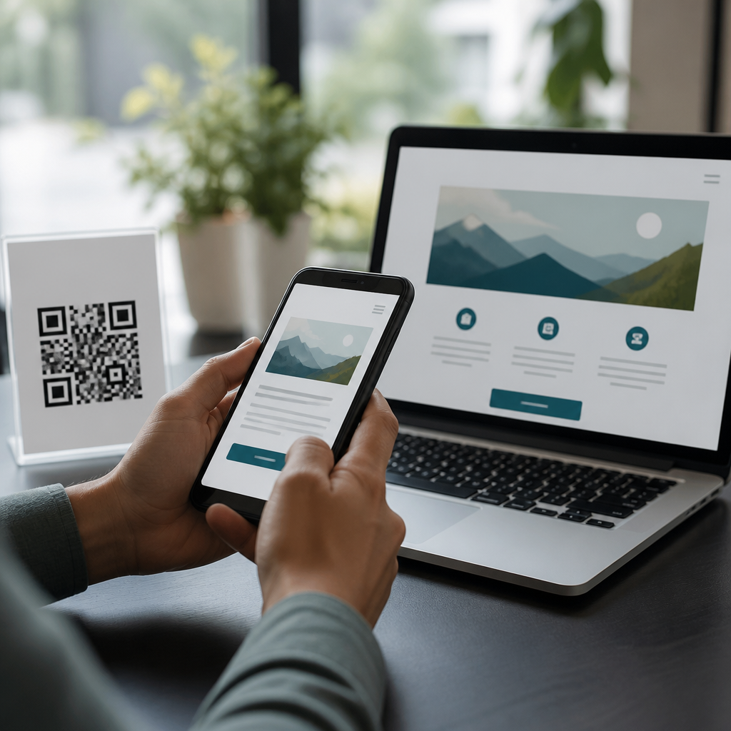
Accessible QR code design is the practice of making scannable codes usable by the widest possible range of people, including users with low vision, color-vision deficiency, motor limitations, cognitive disabilities, and situational constraints such as glare, poor lighting, cracked screens, or shaky movement. In my work reviewing print campaigns, retail signage, event badges, packaging, and restaurant menus, accessibility problems show up far more often than outright technical QR code failures. The code may scan in a studio test, yet fail in a dim hallway, on a reflective poster, or for a customer who cannot distinguish low-contrast colors. Designing accessible QR codes means treating scannability, placement, instructions, and destination experience as one system rather than as a black-and-white square dropped into a layout at the last minute.
That system matters because QR codes are now routine entry points to payments, product details, tickets, forms, support, and wayfinding. If the code is hard to find, hard to scan, or sends users to a page that breaks screen readers, the experience excludes people and undermines conversions. Accessibility also overlaps with brand performance: a code that scans quickly from multiple angles and devices reduces abandonment for everyone. Key terms are straightforward. Contrast is the lightness difference between code modules and background. Quiet zone is the clear margin around the code required for reliable detection. Error correction is the built-in redundancy that helps a damaged or partially obscured code still scan. Mobile landing page accessibility covers readable text, keyboard support, alt text, captions, and predictable navigation after the scan. Getting these fundamentals right turns a QR code from a visual ornament into a dependable access point.
Start with scannability, contrast, and physical presentation
The first rule of accessible QR code design is that the code must scan consistently in real conditions, not just in design software. Use high contrast, ideally dark modules on a light matte background. Black on white remains the benchmark because camera algorithms detect it easily across older Android phones, low-end webcams, and cracked or smudged lenses. Avoid pastel-on-pastel combinations, metallic inks, gradients crossing the finder patterns, and glossy laminates that create hotspots under overhead lights. Color can be used carefully, but contrast should remain strong enough that the pattern structure is obvious at a glance and to the camera sensor. For printed pieces, test under warm indoor light, daylight, and shadow. For screens, test at reduced brightness and with dark mode surroundings, because edge definition can change dramatically.
Size and distance also determine access. A practical baseline I use is a scanning distance ratio near 10:1, meaning a one-inch code should be comfortably scanned from roughly ten inches away. Large-format posters need much bigger codes because users may be standing several feet back, and wheelchair users may approach from different angles than standing adults. Preserve the quiet zone on all sides; trimming it to fit a layout is one of the fastest ways to create scan failures. If a logo is placed in the center, increase error correction carefully and verify readability across iPhone and Android devices. Never warp the code heavily to match packaging contours or decorative shapes unless extensive testing proves reliability. Accessibility begins with forgiving geometry and stable detection, because every added point of friction increases exclusion.
Place QR codes where people can find and reach them
Placement is an accessibility decision, not only a design decision. On walls, doors, kiosks, shelves, and transit signage, the code should be visible without awkward body positioning and reachable by users of different heights. Codes placed too high force arm extension and unstable aiming; codes placed too low may be hard for people with back or neck limitations. As a practical range for public environments, placing the center around 48 to 60 inches from the floor often works well, though context matters. On tables, avoid putting the code under glass, near spills, or where shadows from condiments and cups fall across it. On product packaging, keep it off seams, folds, perforations, curved necks, and highly reflective shrink wrap. These are common production choices that look fine in mockups but undermine use in stores.
Users also need to recognize that a QR code is present and worth scanning. Give it a visible label and enough surrounding whitespace so it does not blend into a cluttered poster. In audits, I repeatedly find codes surrounded by competing icons, dense text, or decorative patterns that delay discovery. If the code launches a menu, payment page, warranty registration, audio description, or support chat, say so directly next to the code. This helps users decide whether scanning is useful and safe. It also supports people with cognitive disabilities by reducing ambiguity. A simple line such as “Scan to read the menu with larger text and screen-reader support” tells users exactly what benefit they will receive. Good placement combines physical reach, visual findability, and clear purpose.
Provide instructions, alternatives, and predictable next steps
An accessible QR code should never be the only path to essential information. Always offer a short URL, NFC option where relevant, printed phone number, or clearly stated fallback instruction. This is critical in healthcare, government, transportation, and hospitality, where access barriers can have real consequences. Some users do not know how to scan a code, use older devices, keep camera permissions disabled, or have limited data connectivity. Others may rely on assistive technology that makes camera alignment difficult. In those cases, a backup path preserves access and trust. I advise teams to treat the fallback as part of the primary experience rather than as a reluctant footnote. If the code links to a boarding pass, users should also be able to enter a simple URL manually or request the information at a staffed desk.
Instructions should be concise and task-based. “Open your camera and point it at the code” is usually enough, but add a second line when the audience may need more context, such as at museums or public service locations. Explain what happens after scanning, whether the page opens a browser, downloads a PDF, starts a payment flow, or plays audio. This reduces hesitation caused by security concerns and prevents accidental data use surprises. The destination must then honor accessibility too: semantic headings, descriptive link text, large tap targets, proper form labels, transcript or caption support, and compatibility with VoiceOver and TalkBack. If the QR code is easy to scan but the landing page traps keyboard focus or uses tiny text, the overall experience is still inaccessible.
Test across devices, environments, and user needs
Accessibility quality comes from testing, not assumptions. A strong QR code review checks print fidelity, lighting, device variation, and destination usability. At minimum, test on recent iPhone and Android models, an older budget Android phone, and both native camera apps and a third-party scanner. Verify scans in bright sun, low indoor light, and from expected approach distances. Print prototypes at final size, because codes that scan on a high-resolution office print may behave differently on textured packaging or coated posters from a commercial press. If brand colors are nonstandard, confirm contrast using grayscale previews and device camera tests rather than relying only on what looks distinct on a calibrated monitor.
| Checkpoint | What to verify | Why it matters |
|---|---|---|
| Contrast | Dark code, light nonreflective background | Improves detection for cameras and low-vision users |
| Quiet zone | Clear margin on all four sides | Prevents recognition failures in cluttered layouts |
| Placement | Reachable height, visible location, no glare | Supports diverse mobility and viewing angles |
| Instructions | Label, purpose, and fallback URL or phone | Reduces confusion and preserves access |
| Landing page | Screen-reader support, readable text, large targets | Completes the accessible journey after scan |
Include users with disabilities in testing whenever possible. Even a small moderated session reveals issues that standard QA misses, such as difficulty locating the code on a busy sign, uncertainty about whether scanning is safe, or frustration with auto-playing media after the scan. For formal guidance, align mobile destinations with WCAG 2.2 success criteria and use tools such as WAVE, axe DevTools, Lighthouse, and platform accessibility inspectors. Measure task completion, scan time, and abandonment, not just whether the code technically resolves. The best accessible QR code programs document these findings in reusable standards for marketing, packaging, and product teams so each new campaign does not repeat the same avoidable mistakes.
Build accessibility into brand systems and governance
Accessible QR codes scale when organizations stop treating them as one-off graphics and instead define them in design systems. Create standards for minimum size, approved color combinations, quiet-zone preservation, logo treatment, placement ranges, instructional copy, and fallback requirements. Add production notes for printers and packaging vendors covering substrate choice, varnish restrictions, and proofing expectations. In digital templates, lock the code area so eager designers cannot crop margins or place text too close. In campaign briefs, specify the destination type and accessibility acceptance criteria before creative work starts. This prevents late-stage compromises, which are expensive and usually visible to users.
The hub value of accessibility considerations is that it connects every other QR code UX topic: contrast rules influence branding, placement affects wayfinding, landing-page structure affects conversion, and analytics reveal whether access barriers remain. Teams that govern these pieces together usually see better scan success and fewer support requests. The practical takeaway is simple: design the code, the context, and the content as one accessible journey. Audit your current QR codes, fix the most common failures first, and establish a repeatable standard for every future campaign.
Frequently Asked Questions
What makes a QR code accessible, beyond simply being scannable?
An accessible QR code does more than technically scan under ideal conditions. It is designed so that the widest possible range of people can notice it, understand what it is for, position a device to scan it, and successfully use the destination content afterward. In practice, that means considering visual clarity, placement, surrounding instructions, contrast, size, and the real-world environments where the code appears. A QR code may pass a technical scan test on a designer’s phone and still fail for users dealing with glare, poor lighting, shaky movement, cracked screens, low vision, or cognitive overload.
Accessibility starts with visibility and comprehension. People should be able to quickly identify that the symbol is a QR code, know what will happen when they scan it, and understand whether scanning is optional or required. Clear labels such as “Scan to view the menu,” “Scan for event schedule,” or “Scan to pay securely” remove guesswork and reduce hesitation. This is especially important for users with cognitive disabilities, older adults, and anyone encountering the code in a busy or distracting setting.
It also includes physical usability. If the code is placed too high, too low, behind reflective glass, on a curved surface, or in a spot where people must hold a phone awkwardly, many users will struggle even if the printed code itself is perfectly generated. Likewise, if the destination page is not mobile-friendly, readable by screen readers, or easy to navigate, the overall experience is not truly accessible. Accessible QR code design is therefore a full user journey issue, not just a symbol creation issue.
What are the most common design mistakes that make QR codes hard to use?
The most common problems are surprisingly basic: low contrast, code sizes that are too small, poor placement, and a lack of instructional text. Designers sometimes reverse colors in a visually interesting way, place codes over busy backgrounds, or use brand colors that reduce contrast too much. While some modern phones can scan imperfect codes, low contrast dramatically increases friction for users with low vision, color-vision deficiency, older device cameras, or challenging lighting conditions.
Another frequent mistake is printing codes too small for the expected scanning distance. A code on a poster, storefront window, trade show banner, or overhead sign must be much larger than a code on packaging or a business card. If people have to inch forward, zoom awkwardly, or repeatedly reposition their phone, the design has failed in practical terms. Small quiet zones, meaning the blank margin around the code, are also a recurring issue. Without adequate spacing, phone cameras may struggle to distinguish the code from nearby graphics or text.
Placement errors matter just as much as graphic errors. Codes placed on glossy surfaces, folded corners, cylindrical packaging, moving displays, drive-through signs, or dimly lit areas create accessibility barriers. Event badges often place QR codes in locations that swing, crease, or get covered by lanyards. Restaurant menus may print them too close to edges or in low light, forcing awkward scanning angles. In retail, codes are often positioned where users must stand in a walkway or reach around other people.
Finally, many QR codes fail because they provide no context. Users should know what they will get, whether internet access is needed, and whether an alternative is available. A simple line of text can reduce uncertainty and improve completion rates. For example, “Scan to view today’s menu. Printed menus available on request” is far more inclusive than presenting an unexplained code by itself. Accessibility improves when the code is treated as one access method among several, not the only path.
How can I design a QR code that works well for people with low vision or color-vision deficiency?
The strongest starting point is high contrast: typically a dark code on a light, matte background. Black on white remains the most reliable choice because it is easy for cameras to read and easy for users to distinguish in varied lighting. If brand requirements call for color, use combinations with strong luminance contrast rather than relying on hue differences alone. This is important for users with color-vision deficiency, who may not distinguish between certain color pairings even if they appear stylish in a brand mockup.
Size is the next major factor. Larger codes are easier to locate, frame, and scan, especially for users with low vision or hand instability. The correct size depends on viewing distance, but the practical rule is simple: if the code might be scanned from more than arm’s length away, increase the print size significantly and test in realistic conditions. Keep the quiet zone clear on all sides, and avoid decorative elements that blur the edges or interfere with the finder patterns.
Surface and lighting matter as well. Matte finishes usually outperform glossy ones because they reduce glare. This is especially important in storefront windows, laminated menus, product packaging, and outdoor signage where reflections can wash out parts of the code. If the code will be used in uneven light, nighttime environments, or bright daylight, test it under those exact conditions. What works in a well-lit office often fails in the field.
Supportive text also improves access for low-vision users. Add a visible label, a short description of the destination, and if possible a plain web address or short alternative link nearby. This gives users another path if scanning is difficult and helps them decide whether interacting is worth the effort. Accessibility is strengthened when the QR code is clear visually, understandable contextually, and backed up by a non-scan option.
Where should accessible QR codes be placed on signs, packaging, menus, and event materials?
Placement should support a natural scanning posture, a clear line of sight, and enough space for people to pause without blocking others or feeling rushed. On printed signs and posters, place the code at a height that most standing users can comfortably frame with a phone, usually avoiding very low or very high locations. On counters, tables, and restaurant menus, avoid placing the code near folds, seams, stains, glare-heavy lamination, or edges where it may be clipped or obscured.
For packaging, keep the code on the flattest practical surface. Curved bottles, crinkled wrappers, and corners of boxes are common accessibility failures because they distort the code or make it hard to hold steady in view. For event badges, avoid spots likely to bend, swing, or be covered by jackets, hair, lanyards, or badge holders. If attendees are expected to scan one another’s badges, test whether the code can be read quickly while the person is moving, talking, or standing in poor light.
Environmental conditions should guide placement decisions. In retail and public spaces, make sure people have room to stop and scan without standing in traffic flow or reaching across obstructions. Outdoor signs should account for sun angle, weather, and reflective materials. Window-mounted codes may look clean in a design proof but can become difficult or impossible to scan once glare and background reflections appear. If scanning must happen from a vehicle, a queue, or a distance, the code needs much more generous sizing and much simpler placement.
It is also wise to place QR codes near relevant content rather than isolating them as a decorative add-on. A code that appears immediately beside the product details, menu section, schedule information, or call to action is easier to understand and more likely to be used. Include a text alternative nearby whenever possible, such as a short URL, printed instructions, or staff assistance. Good placement is not just about camera performance; it is about reducing physical strain, confusion, and situational barriers.
How should I test QR codes for accessibility before publishing or printing them?
Testing should go well beyond checking whether the code scans once on the designer’s own phone. Start by testing across multiple devices, camera apps, and operating systems because scanning behavior can vary. Then test in the actual formats and environments where the code will appear: printed proofs, mounted signage, glossy packaging, dim restaurants, bright storefronts, outdoor sunlight, moving event lines, and whatever other real conditions apply. Many accessibility issues only become obvious when the code leaves the screen and enters the physical world.
Evaluate the entire experience, not just the scan. Can users find the code easily? Do they understand what it does before scanning? Can they hold their phone at a comfortable angle? Is there enough room to step back? Does the destination page load quickly on mobile? Is it readable, zoom-friendly, keyboard-friendly, and compatible with assistive technology? A QR code that leads to a cluttered, inaccessible landing page still creates a barrier, even if the scan itself is perfect.
It helps to test with edge cases in mind: glare, shadows, older phones, cracked screens, weak internet, one-handed use, and low-light conditions. If possible, include people with different access needs in testing or at minimum simulate common barriers. Review whether your code remains readable when slightly smudged, viewed at an angle, or partially obstructed by normal wear. This is especially important for long-running signage, menus, badges, and packaging that will be handled repeatedly.
Finally, confirm that an alternative path is available. A short URL, printed instructions, NFC option, customer support prompt, or accessible printed content can prevent exclusion when scanning fails. The best accessible QR code programs assume that not every user will want or be able to scan every time. Testing is successful when