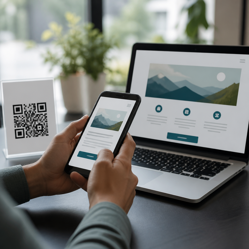
QR codes fail when people cannot scan them quickly, and accessibility is usually the hidden reason. In mobile QR code design and UX, accessibility considerations mean designing codes, placement, instructions, and surrounding experiences so people with different devices, vision levels, motor abilities, lighting conditions, and digital skills can all complete the same task without friction. I have tested restaurant menus, event check-ins, retail packaging, transit posters, and patient intake forms, and the same pattern appears every time: teams focus on brand styling before they confirm scan reliability. That is backwards. An accessible QR code is not a decorative square; it is a functional entry point to content, payment, identity verification, navigation, or support. If the entry point breaks for older phones, low contrast vision, glare, shaky hands, poor signal, or confusing landing pages, the entire user journey breaks. This matters because QR codes increasingly mediate essential services, from boarding passes to medicine instructions. Making QR codes easy to scan for everyone improves completion rates, reduces support requests, protects trust, and creates a better experience for both occasional users and people who rely on assistive technology or constrained devices every day.
Start with scan reliability, not decoration
The first rule of QR code accessibility is simple: prioritize machine readability before visual customization. A QR code works because a camera detects contrast, alignment patterns, timing patterns, and error correction data. When designers add gradients, low-contrast brand colors, transparent backgrounds, cropped quiet zones, or logo overlays that are too large, scanning speed drops immediately. In my audits, the most common failure is inadequate contrast between foreground and background. Dark modules on a light background remain the safest default. Black on white is best, but dark navy on white also performs well. Light gray on pastel beige does not. ISO/IEC 18004 defines the technical structure of QR codes, and the practical takeaway for teams is straightforward: preserve the code geometry and maintain a clear quiet zone around the symbol, usually at least four modules wide on all sides. Without that empty border, many camera apps struggle to isolate the code from the surrounding design.
Size also determines accessibility. As a field rule, the scanning distance should be roughly ten times the code width. A 2 centimeter code is reasonable at about 20 centimeters, while a poster viewed from 2 meters needs a code around 20 centimeters wide. Tiny codes on product labels may pass print review and still fail in store lighting with midrange Android cameras. If a code must live on small packaging, use a short URL backup nearby and test under glossy reflections. Error correction matters too. Levels L, M, Q, and H trade capacity for resilience. Higher correction can help when a code is partially obscured, but it does not justify aggressive logo placement. Use dynamic QR code management tools carefully; they help with analytics and destination updates, but they do not rescue poor physical design.
Design for people with low vision, color vision differences, and glare
Accessibility considerations begin with real human viewing conditions, not perfect mockups on calibrated displays. Many users scan under overhead lighting, through cracked screens, with camera autofocus delays, or in bright outdoor sun. People with low vision benefit from larger codes, stronger contrast, uncluttered placement, and visible instructions that explain what will happen after scanning. Avoid relying on color alone to distinguish the code area. A code printed in brand red on black may look stylish to a design team and appear nearly invisible to users in dim light. Matte print finishes often outperform glossy stock because they reduce glare, especially on menus, brochures, and window signage. For digital displays, avoid animated backgrounds behind a QR code and never place a code over video. Motion and glare interfere with both perception and camera lock.
Text around the code is part of accessibility too. Label the destination in plain language, such as “Scan to view the accessible menu” or “Scan to download medicine instructions in English and Spanish.” This helps users decide whether the interaction is safe and relevant. If the code launches a payment flow, sign-in page, app download, or PDF, state that explicitly. Clear labeling supports people with cognitive disabilities and also reduces phishing anxiety for everyone. In public settings, pair the code with a readable fallback URL in large type. Short, memorable links remain essential because some users cannot scan at all due to device limitations, camera damage, enterprise restrictions, or temporary disability. Good QR UX never assumes scanning is the only path.
Account for motor access, reach, and physical placement
Many QR code failures are environmental, not technical. Placement determines whether users can physically align a camera long enough to capture the symbol. Mounting a code too high, too low, behind glass, around corners, on a moving surface, or where people must stop in a crowded path creates immediate barriers. For wheelchair users, children, and many standing adults, a code placed roughly between 90 and 120 centimeters from the ground is often easier to approach than one mounted above eye level. In healthcare and transit, I have seen check-in codes placed on angled stands work far better than flat countertop stickers because users can frame them without bending awkwardly or casting shadows. If a code appears on a kiosk, leave enough clearance for someone using one hand, a mobility aid, or limited fine motor control.
Surrounding context matters as much as the code itself. If users must hold bags, tickets, or ID while scanning, reduce the need for precision. Larger codes, stable mounting, and obvious framing space help. On tables, avoid placing the code near reflective cutlery or patterned surfaces that confuse autofocus. In stores, put shelf-edge codes where customers can step aside safely rather than blocking the aisle. For event check-in, display duplicate codes at multiple heights and provide staff assistance without making help the default route. Accessibility is not a separate version of the experience; it is the baseline design of the main experience.
Support older phones, weak connections, and diverse user journeys
People do not scan with identical devices. Camera quality, operating system behavior, and default QR detection vary widely across iPhone and Android models. Some older phones need stronger lighting, larger targets, and more time to focus. Others detect the code instantly but struggle once the destination page loads. That is why accessible QR code design extends beyond the symbol to the landing experience. After scanning, users should reach a fast, mobile-optimized page with large tap targets, clear headings, and minimal layout shift. If the page opens a heavy PDF, many users on limited data or older browsers will abandon. In these cases, an HTML page that summarizes the content and offers optional downloads performs better than a document-only destination.
Use descriptive URLs, avoid unnecessary redirects, and compress assets. A code that opens three tracking hops before loading a video is not accessible, especially in areas with weak mobile coverage. If sign-in is required, say so before the scan. If the content is location-specific, explain that too. For multilingual audiences, route users to a language selection page with visible options rather than forcing browser detection that may guess wrong. For forms, support autofill, screen readers, and error recovery. The code may scan perfectly, but if the form fields lack labels or the submit button is hidden below a sticky banner, the task still fails.
| Accessibility factor | Common mistake | Better practice |
|---|---|---|
| Contrast | Brand colors with weak separation | Dark modules on a light, solid background |
| Quiet zone | Text or graphics touching code edges | Keep a clear border at least four modules wide |
| Physical size | Small code viewed from far away | Match code width to expected scanning distance |
| Placement | Mounted too high or behind glare | Place within comfortable reach and stable sightlines |
| Fallback access | No alternative if scanning fails | Add a short URL and clear destination label |
| Landing page | Slow PDF or app gate | Use a fast mobile page with accessible navigation |
Test with real users, real devices, and real environments
The fastest way to improve accessibility considerations is structured testing. I recommend testing every production QR code in at least three environments: bright light, low light, and moderate glare. Test on recent iPhones, midrange Android phones, and at least one older device still common in your audience. Scan from the intended distance, angle, and height. Confirm first-scan success rate, time to destination, and completion of the task after landing. If the code is printed, test the final substrate, not a desktop print. If it appears on a digital sign, test the actual screen brightness and refresh behavior. Small differences in contrast, laminate, or mount angle can change outcomes dramatically.
User testing should include people with low vision, users who enlarge text, people who use screen readers, and people with limited dexterity. Observe where hesitation occurs. Often the issue is not the code but the missing instruction, ambiguous CTA, or inaccessible destination. Track support tickets and analytics for scan abandonment, bounce rate, and device mix. Those signals reveal whether the code is discoverable, scannable, and useful. For a sub-pillar hub under mobile QR code design and UX, the core principle is consistency: accessible code design, accessible placement, accessible instructions, and accessible landing pages must all work together. Audit existing deployments, update weak codes, add fallbacks, and build testing into every release. When teams treat QR accessibility as a practical quality standard rather than a final polish step, scan success rises, trust improves, and more people can reach the information they need. Review your current QR touchpoints this week and fix the one that creates the most friction first.
Frequently Asked Questions
What makes a QR code easy to scan for everyone, not just most people?
A QR code is easy to scan when the entire experience works for people with different phones, camera quality, vision levels, hand stability, lighting conditions, and comfort with mobile technology. That means success is not only about generating a technically valid code. It also depends on size, contrast, placement, spacing, instructions, and what happens after the scan. In practice, the most reliable QR codes are large enough to be recognized quickly, printed or displayed with strong contrast, surrounded by enough empty space, and positioned where users can hold a phone comfortably without glare, obstruction, or awkward angles.
Accessibility is often the hidden factor behind scan failures. A code may work perfectly in ideal lab conditions but still fail in a restaurant with dim lighting, on transit signage in direct sun, at an event check-in with people rushing, or on packaging curved around a bottle. Through testing in menus, retail displays, posters, patient forms, and check-in stations, one pattern shows up repeatedly: when a QR code is designed only for average conditions, a meaningful percentage of real people are excluded. Someone with low vision may struggle with a small code. Someone with tremors may need more time and a steady framing area. Someone using an older device may need a larger target and simpler landing page. Making the code easy to scan for everyone means reducing friction at every step, not just assuming the camera will do the rest.
How large should a QR code be, and where should it be placed for the best scanning results?
Size and placement are two of the biggest predictors of scan success. A common practical rule is that the farther away the user will stand, the larger the code needs to be. Small codes may work on handouts or table tents viewed up close, but posters, window signs, product packaging, and public signage usually need significantly larger codes to scan reliably across a wide range of devices. If people need to scan while standing, walking, or holding bags, the code should be more forgiving than the minimum possible size. When in doubt, increase the size rather than trying to save visual space.
Placement matters just as much. Put the code where people can physically approach it, pause, and point a phone without twisting their wrist or blocking others. Avoid placing codes too high, too low, behind reflective surfaces, around tight corners, on moving displays, or on curved packaging where the pattern can distort. Keep it away from visual clutter and give it clear surrounding space so the camera can detect it quickly. For accessibility, think about wheelchair users, people of shorter height, and anyone who cannot easily hold a device above shoulder level or near the floor. In testing, codes perform better when they are placed in a natural viewing zone, well lit, and easy to frame within the phone screen. A technically perfect code in a poor location will still produce a poor user experience.
Do color, contrast, and design styling affect whether people can scan a QR code?
Yes, very strongly. Decorative QR code styling can look appealing, but readability should always come first. The safest approach is dark code modules on a light background with strong contrast. That gives cameras the clearest possible signal and helps users with low vision identify the code quickly. Problems appear when brands reverse colors, reduce contrast, place codes over busy images, use gradients, add shadows, or apply artistic shapes that interfere with the code pattern. Some modern generators allow customization, but every visual modification increases the need for real-world testing across multiple devices and environments.
Accessibility and scan reliability usually improve when the design is simple and high contrast. Avoid glossy finishes that create glare, especially on menus, posters in windows, and medical forms under bright overhead lights. Avoid tiny logos in the center unless error correction has been planned carefully and scanning has been validated. Also preserve the quiet zone, the blank space around the code, because cameras rely on that separation to detect the code boundaries. In real use, the most successful codes are usually not the most stylized ones. They are the ones people can instantly see, distinguish from the background, and capture without fighting reflections, visual noise, or weak contrast.
Should I include instructions or a backup option near a QR code?
Absolutely. One of the easiest ways to improve accessibility is to avoid assuming every person knows what to do next. A short instruction such as “Open your camera and point it at the code” can remove uncertainty for less confident users. If the result is important, such as a patient intake form, event registration, transit update, or restaurant menu, add a plain-language description of what will happen after scanning. For example, “Scan to view the menu” or “Scan to check in for your appointment.” This helps users decide whether they are in the right place and builds trust before they act.
A backup option is just as important. Not everyone can or wants to scan a QR code, and some environments make scanning difficult no matter how well the code is designed. Include a short URL, NFC alternative, printed instructions, staffed support, or another path to the same task. This matters for accessibility, but it also improves completion rates overall. In field testing, fallback options consistently reduce abandonment because they help people with cracked cameras, older devices, low battery, poor connectivity, limited digital skills, or temporary situational barriers like glare or crowding. The goal is equal task completion, not forcing every user through the same method. A QR code should be a convenient path, not the only path.
What happens after the scan, and how does that affect QR code accessibility?
The post-scan experience is a major part of QR code usability, and it is often overlooked. A code may scan instantly, but if it opens a slow, cluttered, non-mobile-friendly page, the user still experiences failure. The landing page should load quickly, fit small screens, use readable text, have strong contrast, and present the next action clearly. Forms should be short and touch-friendly. Menus should not require pinching and zooming. Check-in flows should not depend on tiny buttons or complex account creation steps. If people scan in bright sun, with one hand, while standing, or while under time pressure, the destination has to be just as accessible as the code itself.
This is especially important in real-world settings like healthcare, transit, events, and retail. A patient trying to complete intake on a phone may need larger fields and clear labels. A commuter scanning a poster may need instant information without multiple redirects. A restaurant guest may need a menu that works with screen readers and does not trap them in a PDF designed for desktop. The best way to improve results is to test the full journey end to end: spotting the code, aiming the camera, understanding the prompt, loading the destination, and finishing the intended task. When teams evaluate accessibility across that entire sequence, QR codes stop being fragile little squares and become dependable tools that work for a much wider range of people.