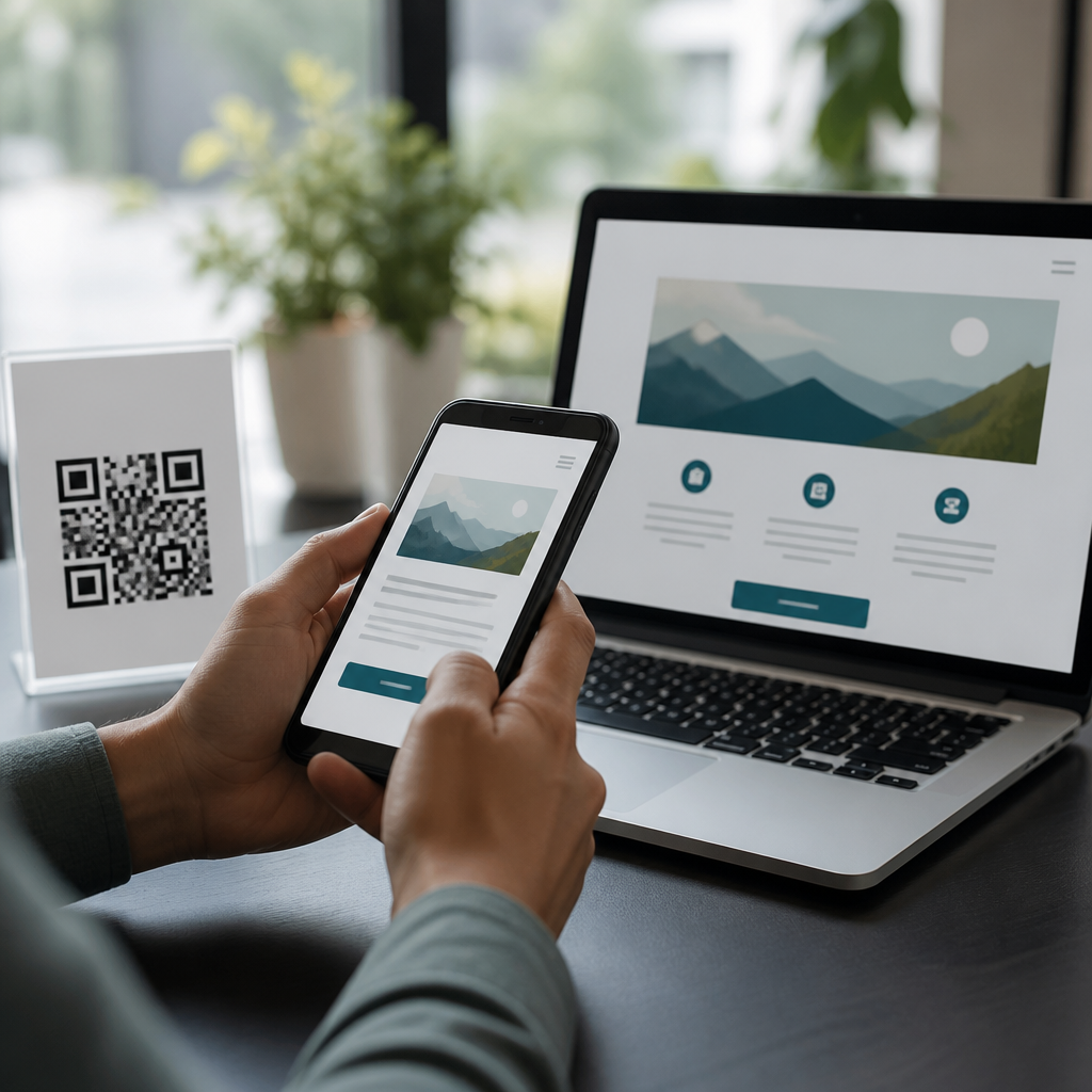
QR codes for visually impaired users require more than a scannable square; they demand an accessibility strategy that supports discovery, orientation, scanning, and comprehension across the full user journey. In mobile QR code design and UX, accessibility considerations include visual contrast, physical placement, tactile cues, voice support, error correction, fallback content, and testing with people who have low vision, blindness, color vision deficiency, or age related sight loss. I have worked on QR deployments in retail, transit, healthcare, and museums, and the same lesson repeats: a code that works perfectly in a design mockup often fails in the field because users cannot find it, frame it, or trust what happens after scan. This matters because QR codes increasingly act as doorways to payments, menus, medication details, wayfinding, and authentication. If that doorway excludes users with impaired vision, the experience becomes frustrating at best and discriminatory at worst. An accessible QR implementation improves usability for everyone, reduces support burden, and aligns with recognized standards such as WCAG, ADA informed design practices, and inclusive wayfinding principles used in public environments.
What accessibility means for QR code experiences
Accessibility for QR code experiences starts before the camera opens. A person with low vision may need to locate the code on packaging, signage, or a kiosk, understand its purpose, and hold a phone at the right distance under imperfect lighting. A blind user may not be able to independently find the code at all unless the environment provides tactile markers, consistent placement, or staff assistance. That means accessibility is not only about whether a smartphone can decode the pattern. It includes discoverability, operability, understandable outcomes, and equivalent access to the same information through another channel.
In practice, the most accessible QR systems combine multiple cues. A short printed instruction such as “Scan for audio guide” clarifies purpose. High luminance contrast between the code and its background helps low vision users and smartphone cameras. Quiet zones around the symbol prevent recognition failures. A nearby NFC tag, embossed border, raised locator dot, or braille label can help users identify the interaction point. If the code opens a web page, that landing page must work with VoiceOver, TalkBack, screen magnification, and zoom up to at least 200 percent without loss of content or function. The accessible experience is the whole chain, not just the graphic.
Designing the physical QR code for discoverability and scan success
The physical design of a QR code has direct accessibility impact. Start with size. A common field rule is a scanning distance to code size ratio of about 10:1, so a code intended to be scanned from one meter away should be roughly 10 centimeters wide. In public settings, larger is usually safer because users with low vision may have reduced acuity and shakier framing. Contrast should be strong, ideally dark modules on a light matte background. Avoid glossy finishes, metallic inks, patterned substrates, and placing codes behind reflective acrylic, all of which I have seen cut scan rates dramatically under overhead light.
Placement is equally important. Codes should sit at a reachable and predictable height, with clear space around them and without visual clutter. On walls and kiosks, center placement roughly between 120 and 140 centimeters from the floor often works well for standing adults, while seated access may require lower placement. Never put essential codes around corners, on curved surfaces, or near moving visual distractions. For packaging, reserve a flat panel and keep the quiet zone intact. ISO/IEC 18004 defines technical structure for QR symbols, but good accessibility practice extends beyond conformance by accounting for glare, motion, crowding, and hand tremor in real environments.
Mobile UX patterns that help visually impaired users complete the scan
Camera based scanning is often the hardest step for users with impaired vision, so the mobile interface should reduce precision demands. Native camera apps on iPhone and Android already detect many QR codes automatically, but product teams can make the process easier by providing direct scan buttons, large touch targets, spoken instructions, vibration feedback, and persistent flashlight access. When building scanning into an app, avoid requiring users to align the code exactly inside a tiny frame. Modern libraries such as ZXing, ML Kit, and Apple Vision can detect codes across a wider field, which supports users who cannot center the target perfectly.
Instruction copy should answer immediate questions clearly: what to scan, how far to hold the phone, and what happens next. If the code links to critical content, offer a manual entry alternative such as a short URL or numeric code. In healthcare pilots I have supported, medication packs with both QR and human readable URLs reduced task failure for older adults who struggled with focus and framing. Audio guidance can further improve completion. A simple sequence like “move closer,” “tilt left,” or “code detected” mirrors accessible document scanner apps and gives low vision users a workable path without sighted assistance.
Content alternatives and post-scan accessibility requirements
A QR code is only a gateway, so accessible destination content is mandatory. If the landing page contains a restaurant menu, product instructions, bus timetable, or event ticket, that content must be structured semantically with headings, labels, alt text where needed, and logical focus order. Text embedded in images should be avoided because screen readers cannot reliably interpret it and magnification makes it blurry. PDFs are especially risky; unless they are tagged properly, they create barriers for blind users. In most cases, a responsive HTML page is the safest default because it supports reflow, browser zoom, reader modes, and assistive technology better than image based assets.
Equivalent access also means redundancy. If a museum exhibit uses a QR code to trigger an audio description, the exhibit label should still include a short summary and a staffed alternative. If a payment flow starts from a code, the same payment method should be available through an accessible app path or staffed checkout. Time sensitive flows need special care. Session timeouts, auto redirecting splash pages, and CAPTCHAs can all block users relying on screen readers or magnifiers. Every post scan journey should be tested against core mobile accessibility checks from WCAG 2.2, including focus visibility, target size, error identification, and orientation support.
Common accessibility failures and how to prevent them
Most QR accessibility problems are predictable. Teams often prioritize branding over function by recoloring codes, embedding logos too aggressively, or placing them on busy imagery. Others assume smartphone technology alone solves access, ignoring the fact that a blind user cannot independently find an unlabeled code on a wall. Another frequent mistake is treating the QR code as the only path to essential information. That creates a hard dependency on device ownership, camera confidence, connectivity, and visual targeting. Prevention requires basic governance: define minimum contrast, minimum physical size, approved materials, placement rules, and mandatory alternate access methods.
| Failure | User impact | Better practice |
|---|---|---|
| Low contrast or glossy print | Code is hard to see and camera struggles to decode | Use matte stock and strong dark on light contrast |
| Code hidden in clutter | User cannot locate or frame the symbol | Provide clear space, predictable placement, and purpose text |
| QR only access | Blind or low vision users may have no equivalent route | Offer short URL, NFC, staff help, or printed alternatives |
| Inaccessible landing page | Scan succeeds but task still fails | Use semantic HTML, large targets, and screen reader testing |
Testing prevents these failures from reaching production. I recommend evaluating both symbol performance and task completion. Print samples should be checked in bright sun, dim interiors, and under reflective light. Users should test from realistic distances, with common devices, and with accessibility features enabled. Include participants who use screen readers, magnification, high contrast settings, and progressive lenses. Quantitative measures such as successful first scan rate, time to complete, and abandonment reason give teams evidence for design decisions. Accessibility improves when it is measured, not assumed.
Building an accessible QR code standard for organizations
Organizations that deploy QR codes repeatedly need a documented standard rather than one off fixes. A practical standard covers symbol generation, error correction level, minimum print size, contrast thresholds, placement ranges, plain language instructions, alternate access channels, and destination page requirements. It should also define ownership: marketing may create artwork, but UX, accessibility, compliance, and operations need review authority because the code affects real world task completion. Retailers, campuses, and healthcare systems benefit from templates that keep placement and labeling consistent, making codes easier to find across locations.
Governance should connect design to maintenance. Dynamic QR platforms can be useful because destinations change without reprinting, but they introduce risks if redirect chains break or analytics scripts slow the page. Link monitoring, accessibility regression testing, and content audits matter just as much as the original print design. Staff training is also part of accessibility. Frontline employees should know what each code does, where alternatives exist, and how to assist without taking over the user’s device. When teams treat QR codes as service touchpoints instead of decorative add ons, accessibility becomes operational and durable.
QR codes for visually impaired users work best when teams design for the entire experience: finding the code, scanning it with confidence, and receiving content in an accessible format. The core principles are straightforward. Use strong contrast, adequate size, matte materials, and predictable placement. Add purpose text and, where appropriate, tactile or alternate technologies such as NFC. Never make a QR code the sole route to essential information. Ensure the landing page supports screen readers, zoom, keyboard navigation, and clear error recovery. Finally, test with real users in real environments, because accessibility failures usually appear in context, not in mockups. This accessibility hub under mobile QR code design and UX should guide every related implementation decision, from packaging to kiosks to public signage. If you manage QR campaigns or product experiences, audit one live code this week from the perspective of a low vision user and fix the first barrier you find.
Frequently Asked Questions
What makes a QR code accessible for visually impaired users?
An accessible QR code is not defined by the code itself alone, but by the entire experience around it. For visually impaired users, accessibility starts with discovery: people need to be able to find the code in the first place. That means placing it where users can reasonably expect it, avoiding cluttered surroundings, and using clear visual contrast between the code, its background, and nearby instructional text. Size also matters. A code that is technically scannable may still be difficult to locate or frame if it is too small, printed on reflective material, or positioned awkwardly.
Accessibility also depends on orientation and guidance. Users with low vision may need strong contrast, larger layouts, and plain language instructions nearby, while blind users may benefit from tactile markers, braille labels, raised frames, or consistent placement conventions that make the code easier to identify without relying entirely on sight. Once the code is scanned, the destination content must also be accessible. If a QR code leads to a page, audio clip, menu, form, or instructional asset that is not compatible with screen readers, does not support zoom, or uses poor heading structure, then the overall QR experience still fails.
In practice, accessible QR code design includes high contrast printing, sufficient quiet space around the code, forgiving scan performance through error correction, simple surrounding layouts, accessible linked content, and alternative ways to get the same information. The most effective approach treats the QR code as one touchpoint in a broader accessibility strategy rather than a standalone visual object.
Where should QR codes be placed so they are easier for people with low vision or blindness to find and use?
Placement has a major effect on usability. QR codes should be positioned at a predictable height and location so users do not have to search randomly across a surface. If a code is placed too high, too low, behind glass glare, around a corner, on a curved object, or among heavy visual clutter, it becomes much harder to detect and scan. For users with low vision, the code should be in a well-lit area with minimal reflections and enough surrounding contrast to stand out from nearby graphics or text.
For blind users, physical context is especially important. A code can be easier to locate if it is paired with tactile cues such as a raised border, textured sticker, embossed marker, braille label, or a consistent placement system used throughout a building, product line, or printed document. For example, if every code on a venue map appears in the lower right corner with a tactile identifier beside it, users can learn that pattern and navigate more independently. Verbal signage or nearby staff support can also help in public environments, but the goal should be to reduce dependence on assistance whenever possible.
Good placement also means considering what the user is expected to do while scanning. There should be enough physical room to hold a phone steady, move closer or farther away, and hear voice feedback from assistive technology without obstruction. Codes should not be placed where wheelchair access is limited or where a user must block a path to scan. In short, accessible placement is predictable, reachable, visible, and supported by orientation cues that help users understand where the code is and how to interact with it safely.
How can businesses and designers make QR codes easier to scan for users with limited vision?
Improving scanability starts with solid technical design. The QR code should have strong contrast, typically dark modules on a light matte background, and enough clear space around all sides so camera software can detect it quickly. Decorative interference should be kept to a minimum. Logos, gradients, patterned backgrounds, and inverted color schemes may look attractive, but they often reduce scanning reliability, especially for users who need more time or rely on phone positioning assistance. Printing the code at an adequate size and using higher error correction can also improve performance when the code is slightly damaged, angled, or partially obscured.
The environment around the code matters just as much as the file itself. Glossy surfaces, low lighting, extreme sunlight, and curved packaging can make scanning harder for everyone, but especially for people with low vision, tremor, or age related sight loss. Designers should test codes in real conditions, not just on a screen or proof sheet. A code that scans instantly at a desk may become frustrating on a restaurant table, medicine box, poster behind glass, or product shelf under fluorescent lighting.
Instructions can also significantly improve usability. Short, plain language prompts such as “Scan for audio instructions” or “Use your phone camera for accessible menu” tell users what they will get and whether it is worth the effort. If the mobile experience includes voice prompts, auto-detection, or large interface elements, the scan journey becomes much more inclusive. The best results come from combining technically robust QR code production with practical UX choices that reduce guesswork and physical strain during scanning.
Why are fallback options important when using QR codes for accessibility?
Fallback options are essential because no QR code system works perfectly for every user, every device, or every environment. Even a well-designed code can become inaccessible if lighting is poor, the print is damaged, the user’s camera is weak, the phone has no data connection, or the person simply cannot locate the code independently. If the QR code is the only way to access critical information, the design creates unnecessary exclusion. That is why accessible QR deployments should always include another path to the same content.
Useful fallback options may include a short URL in large print, an NFC tap option, a phone number, braille or large print instructions, nearby human assistance, or printed summaries of the key information. For digital destinations, the linked content should also support multiple formats such as readable text, screen reader compatibility, captions, transcripts, and audio. If a QR code points to a PDF that is not tagged properly or a video without narration, the fallback has not really solved the accessibility issue. The alternative must be equivalent in substance, not just present in theory.
Fallbacks also build resilience into the user journey. They help older adults who may be less comfortable with scanning, users with color vision deficiency who struggle with poor contrast designs, and blind users who may need orientation support before they can even bring a camera to the right location. From an inclusion and compliance perspective, fallback content is not a nice extra. It is a practical safeguard that acknowledges real-world variability and ensures information remains reachable even when QR scanning is inconvenient or impossible.
How should QR codes be tested to ensure they work well for visually impaired users?
Testing should go beyond checking whether a phone can technically scan the code. A truly useful testing process evaluates the full journey: Can users find the code? Can they identify what it is for? Can they orient their device without frustration? Does the code scan reliably in realistic conditions? Is the destination content understandable and accessible once it opens? These questions are especially important in mobile QR code design and UX, where small barriers at any stage can break the experience.
The most valuable testing includes people with a range of visual needs, including low vision, blindness, color vision deficiency, and age related sight loss. Their feedback often reveals issues that sighted teams overlook, such as poor placement consistency, weak contrast, confusing nearby text, missing tactile guidance, inaccessible linked forms, or mobile pages that do not behave well with screen readers and zoom settings. Testing should cover different devices, camera qualities, lighting conditions, distances, and connectivity scenarios so the QR experience is assessed in the same contexts where people will actually use it.
Teams should also test the linked experience against accessibility best practices. That means checking semantic headings, readable text sizing, keyboard navigation, alt text where relevant, captioning and transcripts for media, and compatibility with voice support and assistive technologies. Iterative testing is important. A code may pass one round of internal review and still fail in the field. The strongest approach is to test early, revise based on user input, and retest until the full interaction feels clear, reliable, and respectful of how visually impaired users move through the real world.