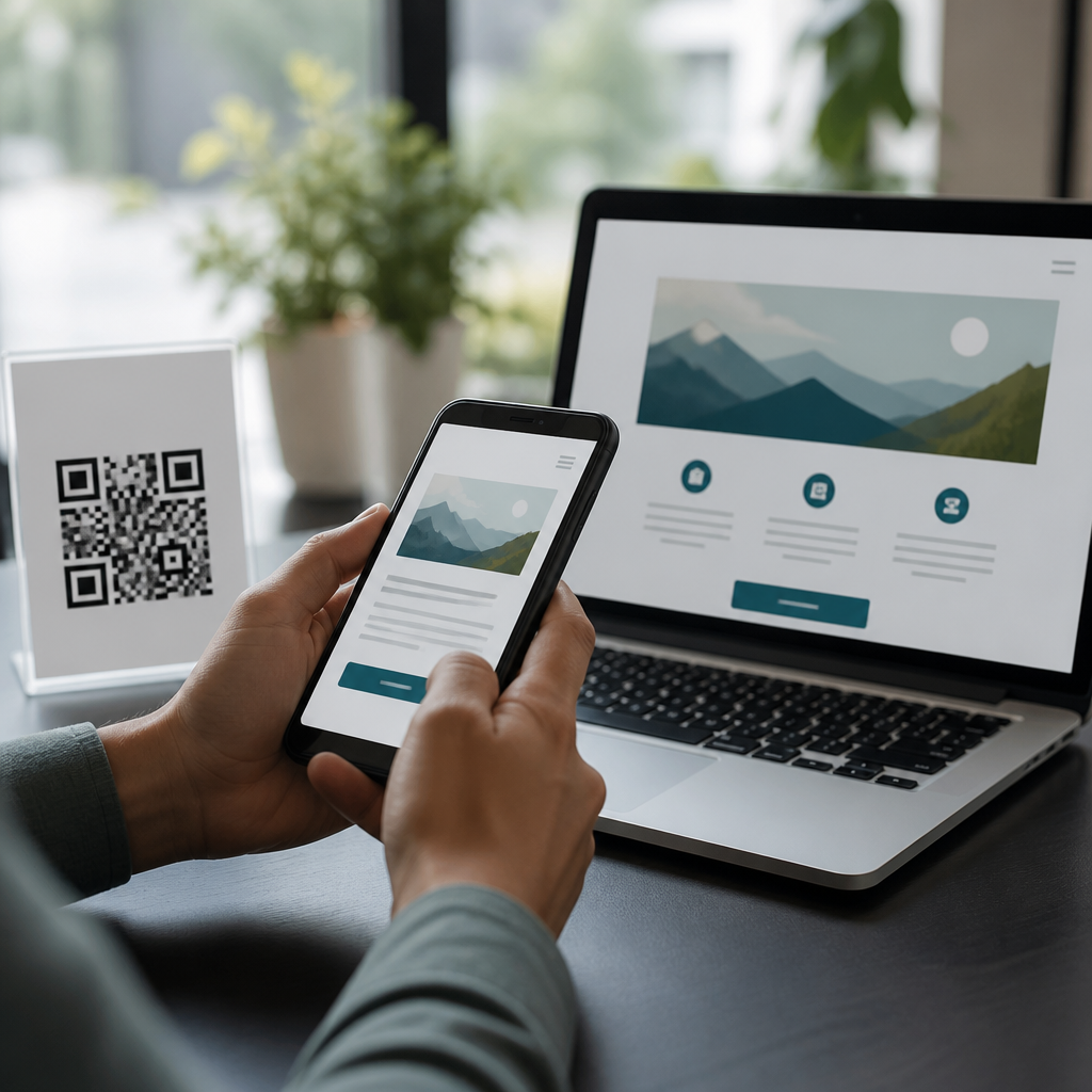
ADA compliance and QR code design intersect wherever a printed square becomes a gateway to digital content, because access fails if either the code or the destination excludes part of the audience. In practice, accessibility considerations for QR codes cover far more than scan reliability. They include physical placement, contrast, lighting, labeling, instructions, link behavior, mobile interaction, screen reader support, captioning, keyboard access, and alternate paths when scanning is difficult or impossible. ADA compliance refers to obligations under the Americans with Disabilities Act, while many design teams also rely on the Web Content Accessibility Guidelines, especially WCAG 2.1 and 2.2, as the most practical technical benchmark for digital experiences. This matters because QR codes now appear on menus, posters, product packaging, wayfinding signs, medical forms, event check-in stations, invoices, museum labels, and transit notices. I have seen campaigns fail not because the code was broken, but because glare, tiny print, poor instructions, or an inaccessible landing page blocked users at the moment of intent. Designing accessible QR code experiences protects revenue, reduces legal risk, and makes routine interactions easier for everyone.
What ADA-compliant QR code design actually includes
An ADA-compliant QR code experience has two layers: the scannable object in the physical environment and the digital destination that opens after the scan. Many teams focus only on error correction level or module size, yet legal and usability exposure usually sits in the full journey. If a visitor cannot locate the code, distinguish it from the background, hold a phone at the needed angle, understand what will happen after scanning, or complete the next step without vision, hearing, or precise motor control, the experience is not truly accessible.
Start with physical usability. A QR code should be large enough for the expected scanning distance, printed sharply, and placed where a seated user can approach it without awkward reaching. As a rule of thumb used by printers and sign fabricators, minimum size scales with distance, and quiet zone preservation matters as much as the code itself. Contrast should be strong, ideally dark modules on a light matte background. Reverse, decorative, or low-contrast treatments often pass brand review and then fail in the field. I advise clients to test under real lighting, including sunlight and indoor reflections on acrylic or glass.
Next comes comprehension. Every code needs adjacent plain-language labeling that says what the user gets, such as “Scan to read the menu” or “Scan for audio tour with captions.” Good labels also set expectations around file type, login, payment, download, or time limit. For accessibility considerations, this label is essential because not every user can infer purpose from context. A short fallback URL should appear nearby when possible. On regulated notices, healthcare paperwork, or payment requests, I recommend a second access route such as NFC, a printed phone number, or a staffed assistance option.
Physical accessibility: placement, contrast, lighting, and reach
Physical accessibility determines whether someone can begin the interaction. For wall signs, table tents, kiosks, and packaging displays, placement should account for wheelchair users, people with limited reach, and users who cannot steady a device overhead. In retail audits, I routinely find QR codes mounted too low on shelves, too high on lobby signs, or on curved surfaces that distort modules. Flat placement is best. If the code sits behind glass, glare testing is mandatory. Matte lamination almost always outperforms gloss for public signage.
Color choices require discipline. The safest pattern remains near-black on white with generous quiet zones. Brand colors can work, but only if luminance contrast remains high and the finder patterns are unmistakable. Busy photographic backgrounds, gradients, and translucent overlays reduce detection speed, especially on older phones or in low light. Users with low vision benefit from larger print, stronger edge definition, and nearby text that is not buried in small caption copy.
| Design factor | Accessible practice | Common failure |
|---|---|---|
| Code size | Scale to viewing distance; test with multiple phones | Tiny code on poster or product label |
| Contrast | Dark code on light, matte background | Low-contrast brand colors or glossy finish |
| Placement | Reachable from seated and standing positions | Mounted too high, too low, or behind obstacles |
| Instructions | Clear label with expected outcome | No context or vague “scan me” text |
| Fallback | Short URL, phone, or staff assistance | QR-only access to essential content |
Wayfinding and environmental context also matter. At museums, campuses, and transit locations, users may be moving, crowded, or outdoors. Accessible QR code design therefore benefits from redundancy: a tactile sign nearby, a visible URL, and content that does not require immediate precise tapping after load. If the code supports emergency instructions or legally required information, never make scanning the sole method of access. Equal access means equivalent access, not just a technologically novel one.
Digital destination accessibility after the scan
The landing page is where most accessibility failures occur. A scan that opens a page with missing headings, unlabeled buttons, autoplay video, poor color contrast, or a keyboard trap undermines the entire effort. ADA compliance for QR code design therefore depends heavily on mobile web accessibility. Use semantic headings, descriptive link text, visible focus states, sufficient target sizes, and forms with explicit labels and error guidance. Screen reader users need pages that announce structure clearly in VoiceOver and TalkBack, not just visually polished layouts.
Performance is part of accessibility. Large interstitials, app-install gates, cookie banners that trap focus, and slow-loading JavaScript can make a simple scan unusable for people with cognitive disabilities or limited bandwidth. I recommend sending QR traffic to lightweight mobile pages, not desktop microsites shrunk to fit a phone. If the code opens a PDF, verify that the PDF is tagged, readable by screen readers, and practical on small screens. In many cases, HTML is the better default because text can reflow, zoom works better, and assistive technology support is stronger.
Media requires its own checks. Video destinations need captions, and audio tours need transcripts. If the QR code links to payment, registration, or ticketing, every critical action should be operable without gesture complexity. Authentication flows should avoid inaccessible CAPTCHA; alternatives like email magic links, passkeys, or vendor solutions with accessible challenges are often safer. For multilingual audiences, language selection should be obvious and coded correctly so screen readers switch pronunciation as intended.
Instructions, labels, and alternative access paths
Clear instructions are one of the most overlooked accessibility considerations in QR code design. “Scan me” is not enough. Users need to know the benefit, any requirements, and any possible cost. Better labels include “Scan to view allergen information,” “Scan to pay invoice securely,” or “Scan to open accessible event guide in your browser.” This phrasing reduces uncertainty and helps users decide whether the interaction is worth the effort.
Alternative access is equally important. Some users do not use smartphone cameras easily; others work in environments where phones are restricted, batteries are low, or signal is weak. On restaurant menus, I advise keeping at least one accessible non-QR option available, whether a printed large-type menu or a staff-assisted digital device. On packaging, include a short vanity URL. On posters, a text keyword and SMS number can help. These options are not redundant overhead; they are practical safeguards that widen successful access.
Security messaging belongs here as well. Users have learned to be cautious about anonymous codes. A recognizable branded domain, a brief destination description, and HTTPS reassure people who may otherwise avoid scanning. For phishing-sensitive contexts like payments, healthcare, and education, pair the QR code with explicit verification text so users know the legitimate domain before opening it. Trust is an accessibility issue because confusion and fear create barriers as real as poor contrast.
Testing methods, standards, and governance
Accessible QR code design should be tested as a workflow, not approved from artwork alone. My standard process includes print proofs at final size, multi-device scan testing, glare checks, seated and standing reach checks, and destination audits against WCAG success criteria most relevant to mobile use. Tools such as WAVE, axe DevTools, Lighthouse, VoiceOver on iOS, TalkBack on Android, and color contrast analyzers catch many problems early, but they do not replace human testing.
User testing is where hidden barriers surface. Ask participants with low vision, screen reader users, users with limited dexterity, and older adults to complete realistic tasks: scan the code, understand the label, load the page, and finish the intended action. Measure time to completion, mis-scan rates, abandonment points, and requests for help. In one venue rollout I supported, the code itself scanned well, but users repeatedly missed the tiny “audio transcript” link on the landing page. A simple heading change and larger button resolved the issue immediately.
Governance keeps improvements from disappearing in the next campaign. Establish a checklist for designers, printers, web teams, and compliance reviewers. Document minimum code size, contrast rules, approved label patterns, destination requirements, and fallback policies. If your organization maintains mobile QR code design guidelines, this accessibility hub should link to pages on QR code sizing, landing page UX, accessible forms, color contrast, mobile typography, and testing procedures. The strongest programs treat accessibility as a repeatable standard, not a late legal review.
ADA compliance and QR code design succeed when teams treat the code, the environment, and the landing page as one continuous user experience. The core accessibility considerations are straightforward: make the code easy to find and scan, explain exactly what it does, provide another way in, and ensure the destination works with assistive technology on a mobile device. Done well, accessible QR code design improves completion rates for every user, not only people with disabilities. It reduces friction at the moment of intent, supports trust, and prevents expensive retrofits after launch.
As the hub for accessibility considerations within mobile QR code design and UX, this topic should guide every related decision, from print production and placement to page templates and testing protocols. If you manage menus, signage, packaging, events, healthcare forms, or payment flows, audit your current QR experiences end to end. Fix the obvious barriers first: poor contrast, missing labels, no fallback path, and inaccessible landing pages. Then formalize your standards so future campaigns start accessible instead of being repaired later. Better QR design is not just compliant; it is measurably more usable, inclusive, and effective.
Frequently Asked Questions
What does ADA compliance mean in the context of QR code design?
ADA compliance in QR code design means making sure the entire user journey is accessible, not just that the code can be scanned. A QR code is only the starting point. If someone can physically see the code but cannot reach it, understand what it does, scan it under real-world conditions, or use the linked content with assistive technology, the experience is not truly accessible. In practical terms, ADA-minded QR code design includes the printed code itself, its placement, the surrounding instructions, environmental factors such as glare and lighting, and the usability of the mobile landing page or document it opens.
For example, an accessible QR code should be placed where people with different mobility needs can reasonably approach it. It should include a clear text label explaining what the code leads to, such as a menu, form, event schedule, payment page, or product details. The page behind the code should work with screen readers, support keyboard navigation, use readable text and sufficient color contrast, and avoid barriers such as unlabeled buttons, inaccessible PDFs, autoplay media, or time-limited interactions. ADA compliance also means offering an alternative path, such as a short URL, printed instructions, or staff assistance, so access does not depend entirely on scanning a square with a smartphone camera.
How can I make a printed QR code itself more accessible and easier for everyone to use?
Start with scan reliability, because a code that is hard to scan becomes an accessibility issue very quickly. Use adequate size based on viewing distance, preserve the code’s quiet zone, maintain strong contrast between the foreground and background, and avoid decorative treatments that reduce readability. In most cases, a dark code on a light matte background performs best. Glossy finishes, reflective surfaces, poor lighting, and highly patterned backgrounds can all interfere with scanning, especially for users with low vision, hand tremors, or older devices.
Accessibility also depends heavily on context. Include a nearby text label that states what the QR code does before someone scans it. Phrases like “Scan to view accessible menu,” “Scan to hear audio guide,” or “Scan for application form” help users decide whether the action is relevant and safe. Brief instructions are helpful when the audience may not be highly familiar with QR scanning. If scanning requires standing in a doorway, holding a phone at an awkward angle, or moving into bright sun or dim light, the placement should be reconsidered. Mount codes at a reachable and viewable height, leave enough space for users with wheelchairs or mobility devices, and avoid locations where people feel rushed or blocked by foot traffic. Good QR accessibility is often less about graphic style and more about practical usability in the real environment.
Why is the destination page just as important as the QR code for accessibility?
Because the QR code is merely a link, the real accessibility experience happens on the destination page. A perfectly printed code can still lead to an inaccessible mobile site, a badly structured PDF, a video without captions, or a form that cannot be completed using a screen reader or keyboard. That means organizations should evaluate the landing experience with the same seriousness they give to the printed piece. If the linked resource is essential for service, navigation, instructions, transactions, or public information, then accessibility at the destination is critical.
An accessible landing page should have semantic headings, descriptive link text, properly labeled form fields, and logical focus order. It should work well on mobile devices without requiring pinch-zoom to read text or precise gestures to activate controls. Images should have meaningful alternative text when needed, videos should include captions and ideally transcripts, and downloadable files should be accessible as well. It is also wise to avoid sending users into unexpected app installs, forced downloads, or rotating carousels that create cognitive friction. In short, ADA-conscious QR code design treats the printed symbol and the digital content as one connected experience. If the final page excludes users, the QR code does too.
Should accessible QR codes always include an alternative to scanning?
Yes, in most situations that is the safest and most inclusive approach. Scanning a QR code can be difficult or impossible for many reasons: low vision, limited dexterity, broken camera hardware, poor connectivity, device restrictions, unfamiliarity with scanning, glare, distance, or a simple preference not to use a phone in that moment. Relying exclusively on a QR code creates a single point of failure. An alternative path helps ensure that access to information or services does not depend on one technology or one physical action.
Common alternatives include a short, easy-to-type URL printed directly below the code, an NFC option where appropriate, a phone number, printed summary information, or a clear statement that staff can provide assistance. The best alternative depends on the context. In a restaurant, a printed menu or available accessible digital menu may be necessary. In a museum, visitors may need both a QR code and a staffed or printed option for exhibit details. In healthcare, education, government, and employment settings, alternatives are especially important because the information may be essential rather than optional. From both a usability and risk-management standpoint, backup access methods are one of the strongest practices in ADA-aware QR implementation.
What are the most common ADA-related mistakes businesses make with QR codes?
One of the most common mistakes is assuming that adding a QR code automatically modernizes access. In reality, many deployments create new barriers. Businesses often place codes too high, too low, behind glass, in dim corners, on curved surfaces, or in crowded areas where scanning is awkward. They also frequently use low-contrast branding treatments, shrink the code too much, or remove the quiet zone to fit a layout. Another frequent issue is failing to say what the code does, leaving users uncertain whether it leads to a menu, payment portal, video, download, or unrelated promotion.
The larger mistakes usually happen after the scan. A code may open a non-mobile-friendly page, an inaccessible PDF, a video without captions, or a form with unlabeled fields. Some landing pages trap users with pop-ups, cookie banners that are hard to dismiss, or buttons that do not work well with screen readers. Others redirect through multiple links, causing confusion or delay. Businesses also overlook the importance of redundancy, providing no short URL, no printed alternative, and no staff support. The best way to avoid these mistakes is to test the full experience in realistic conditions: different phones, varying light, one-handed use, zoomed text, screen readers, keyboard-only navigation where applicable, and low-bandwidth scenarios. Accessibility for QR codes is not a checkbox on the print layout; it is end-to-end experience design.