
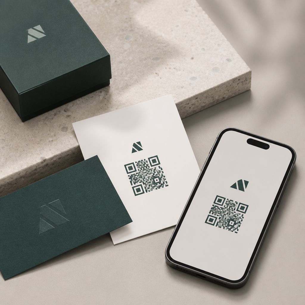
QR codes have moved from purely functional black-and-white squares to recognizable brand assets that shape how people experience a company across packaging, retail, events, and digital touchpoints. In a visual identity system, a QR code is no longer just a shortcut to a URL; it becomes a designed interaction point that carries the same signals as a logo, color palette, typography, and photography style. When organizations treat branding with QR codes as part of brand governance instead of an afterthought, scans increase, trust improves, and campaigns become easier to manage across channels.
A visual identity system is the set of repeatable design rules that makes a brand instantly identifiable. It usually includes marks, colors, type, spacing, iconography, motion, and layout principles. A branded QR code belongs in that system because it appears in places where the audience makes quick decisions: on shelf labels, menus, direct mail, product packaging, posters, trade show booths, invoices, and app onboarding screens. I have seen teams invest heavily in premium packaging design, then drop in an unstyled QR code generated minutes before print approval. The result is visual friction. The code may still scan, but it interrupts the experience and can even look suspicious to users trained to watch for scams.
Branding with QR codes matters because scan behavior is shaped by three factors: visibility, trust, and clarity of value. Visibility comes from contrast, placement, and size. Trust comes from consistent use of brand elements and from destination transparency. Clarity of value comes from the surrounding message explaining what the user gets after scanning. Strong QR code design balances all three. It respects technical constraints such as quiet zone, error correction, and minimum module size while integrating visual identity cues that make the code feel intentional rather than generic.
Why QR codes belong in brand systems
A QR code should be documented in the same standards manual that governs logos and social icons because it functions as a branded gateway. The code often connects physical media to digital environments where conversion happens, whether that means redeeming an offer, viewing product instructions, joining a loyalty program, or opening a payment screen. If the bridge between those environments feels inconsistent, users hesitate. In usability testing, people routinely ask two questions before scanning: “Will this take me somewhere safe?” and “Is it worth my time?” Brand-consistent QR execution helps answer both instantly.
For that reason, a mature identity system defines approved code shapes, color combinations, label styles, CTA language, placement rules, and destination types. It also specifies when not to customize. Highly stylized codes can weaken readability, particularly on low-quality substrates such as corrugated boxes or glossy curved bottles. The practical goal is recognition without compromising scan performance. Dynamic QR platforms such as Bitly, Flowcode, Beaconstac, and QR Code Generator Pro support editable destinations, analytics, and campaign naming, which makes them useful for enterprise governance. Static codes still have a place for permanent destinations, but they offer less control once distributed.
Core design principles for branded QR codes
The best branded QR codes follow established scanning standards first and aesthetic goals second. Start with contrast. Dark modules on a light background remain the most reliable configuration, especially under mixed lighting or lower-end smartphone cameras. Avoid reversing the code unless testing confirms consistent readability. Maintain a quiet zone of at least four modules around the code, because nearby graphics can interfere with recognition. Size depends on context, but a common baseline is a scan distance ratio of roughly 10:1, meaning a code viewed from 10 feet should be about 1 foot wide. For print, many teams use a minimum of 0.8 to 1 inch square for comfortable consumer scanning.
Error correction is the main technical lever that enables branding. QR codes support levels L, M, Q, and H, allowing approximately 7 percent, 15 percent, 25 percent, and 30 percent data recovery. If you plan to insert a centered logo or apply styling to eyes and modules, level H is usually the safest starting point, though it increases code density. Density matters because more encoded data creates smaller modules that become harder to read in print. That is why shortened URLs and dynamic redirect layers are so valuable: they reduce complexity while preserving flexibility.
Shape customization should be subtle. Rounded modules, softened corners, or eye-frame treatments can align a code with brand aesthetics, but decorative distortion has limits. Gradients, metallic inks, embossing, and varnishes may photograph beautifully and still fail under practical conditions. I recommend testing with both iOS and Android devices, native camera apps, and at least one older phone model. Teams often forget environmental variables such as glare on laminated menus, motion in transit ads, and wrinkling on flexible packaging. A code that scans in the studio can fail on a real shelf.
How to align QR codes with logos, color, and typography
Branded QR codes work best when they borrow cues from the wider system rather than trying to become miniature logos. Use logo placement sparingly, typically centered and sized within the tolerance allowed by high error correction. If the logo has intricate detail, simplify it for the code variant. Color should reflect the approved palette, but legibility rules override brand purity. A dark navy on white often performs well; pale brand pastels usually do not. Typography matters around the code more than inside it. The label, CTA, and fallback URL should match the brand type system and tone of voice, because those elements tell users what action to take.
In packaging design, for example, a cosmetics brand may use a clean serif headline, muted neutrals, and fine-line iconography. Its QR code can echo that language with a restrained navy code, a subtle circular eye treatment, and a concise label such as “See application steps.” A youth-oriented beverage brand may use a bolder approach with a bright accent frame and a CTA tied to rewards or music content. In both cases, the QR code remains part of a modular identity system, not a one-off graphic made by a vendor without brand oversight.
| Brand element | Recommended QR application | Common mistake |
|---|---|---|
| Logo | Small centered mark with high error correction | Oversized logo blocking finder patterns |
| Color palette | High-contrast brand colors on light backgrounds | Low-contrast pastel combinations |
| Typography | Clear CTA and fallback URL in approved fonts | No instruction beside the code |
| Layout system | Consistent spacing and placement rules | Crowding the quiet zone with graphics |
| Tone of voice | Benefit-led scan prompts | Generic “Scan me” language everywhere |
Use cases across packaging, retail, events, and service design
Packaging is one of the strongest use cases because it combines product context with post-purchase utility. A food brand can link to sourcing details, allergy information, or recipes. An electronics company can connect buyers to setup videos and warranty registration. In retail environments, shelf talkers and endcaps can use QR codes to deliver comparison guides, inventory checks, or customer reviews without overloading signage. Event teams use them for ticketing, session schedules, lead capture, and post-event content distribution. In service design, utilities, healthcare providers, and financial institutions can place codes on statements, appointment reminders, and kiosks to shift users into authenticated mobile flows more efficiently.
The most effective programs map each QR touchpoint to a specific customer intent. On-pack educational codes serve different needs than promotional codes in a storefront window. Internal teams should define the audience, the moment, the destination, and the success metric before designing the asset. A restaurant menu code is judged by speed and readability. A museum exhibit code is judged by engagement time and content depth. A B2B trade show badge scan may optimize for CRM enrichment and lead qualification. The visual treatment can remain consistent while the surrounding message changes by context.
Governance, analytics, and performance measurement
Branding with QR codes becomes scalable when governance and analytics are built in from the start. Every code should have an owner, naming convention, destination rule, and retirement plan. Dynamic codes are especially useful because they allow teams to update landing pages without reprinting materials. They also support scan analytics by date, device, and location, depending on the platform and privacy settings. Those data points help identify whether poor performance is caused by weak placement, unclear CTA, low traffic, or destination mismatch.
Measurement should go beyond raw scans. Track scan-through rate relative to impressions, landing page load speed, bounce rate, form completion, add-to-cart rate, or assisted revenue. Use UTM parameters and analytics platforms such as GA4 alongside your QR management tool so campaign data ties back to broader reporting. In my experience, the highest lift usually comes from message refinement, not from dramatic visual restyling. Changing “Scan here” to “Watch the 30-second setup” often improves performance because the value exchange becomes explicit.
Common mistakes and what a strong hub strategy includes
The most common branding mistakes are overdesign, underlabeling, and poor destination planning. Overdesign happens when teams chase novelty with gradients, tiny modules, or logo-heavy treatments that break scanning. Underlabeling happens when a code appears without context, forcing users to guess what happens next. Poor destination planning happens when the scan opens a generic homepage instead of a mobile-optimized page tied to the exact promise on the printed material. Security also matters. Use recognizable domains, HTTPS, and destinations that clearly reflect the brand. If users cannot verify where the code leads, they may avoid it entirely.
As a hub page within Mobile QR Code Design and UX, this topic should connect readers to deeper guidance on QR code CTA writing, packaging placement, scan testing, accessibility, analytics setup, dynamic versus static codes, landing page optimization, and anti-fraud practices. The central idea is simple: QR codes are not decorative add-ons. They are branded interfaces that deserve the same design discipline as any other customer touchpoint. Audit your current codes, document standards, test them in real conditions, and turn every scan into a coherent brand experience.
Frequently Asked Questions
What does it mean to treat QR codes as part of a visual identity system?
Treating QR codes as part of a visual identity system means designing and managing them the same way a company manages logos, typography, colors, iconography, and other brand assets. Instead of viewing a QR code as a purely technical tool that sends someone to a link, the organization recognizes it as a visible brand touchpoint that shapes perception before, during, and after a scan. The code appears on packaging, storefront signage, event materials, menus, direct mail, product inserts, presentations, and digital screens, so it often becomes one of the most repeated interaction elements in the customer journey.
In practice, this approach requires consistency. A branded QR code should reflect the organization’s visual language through approved color use, surrounding layout, logo placement, caption style, spacing rules, and call-to-action messaging. It should also follow governance standards so teams across departments do not create inconsistent versions that weaken recognition or create usability problems. When QR codes are integrated into the identity system, they stop feeling like generic add-ons and start functioning as intentional, recognizable brand assets that support trust, cohesion, and a more polished customer experience.
Why are branded QR codes important for brand recognition and customer experience?
Branded QR codes matter because they influence both how a company is remembered and how easily people engage with it. A generic black-and-white code may work functionally, but it does little to reinforce the brand or reassure users that the destination is legitimate. A thoughtfully designed QR code, presented within a consistent visual system, signals professionalism, familiarity, and intent. That is especially valuable in environments where people make quick judgments, such as retail shelves, event booths, restaurant tables, product packaging, and out-of-home advertising.
From a customer experience perspective, branding helps create continuity. If the code’s styling aligns with the rest of the brand, users are more likely to understand that the scan is part of a deliberate journey rather than a random link. This can improve confidence and increase scan rates. It also helps set expectations about the content behind the code, whether that is product information, an interactive campaign, warranty registration, app download, menu, loyalty sign-up, or exclusive content. Over time, repeated use of branded QR codes can make the interaction itself feel familiar and owned by the company, which supports recognition and strengthens the relationship between visual identity and digital engagement.
How can a company customize QR codes without hurting scan performance?
The key is balancing brand expression with technical reliability. QR codes can be customized in many ways, including color changes, embedded logos, adjusted corner markers, custom frames, branded calls to action, and surrounding graphic treatments. However, every design decision must preserve readability across real-world conditions such as glare, curved packaging, low light, small print sizes, motion, and older smartphone cameras. A code that looks attractive but fails in practical use damages both the customer experience and the brand.
Best practice is to maintain strong contrast between the foreground and background, protect the quiet zone around the code, avoid excessive visual clutter, and test every version at intended sizes and placements. If a logo is placed in the center, it should not obscure too much data area, and the code should be built with appropriate error correction to compensate. Designers should also avoid highly reflective materials, distorted proportions, or color combinations that reduce legibility. Most importantly, organizations should create brand standards for QR code usage, including approved templates, minimum sizes, acceptable color ranges, and testing requirements. That way, teams can customize within controlled parameters and preserve dependable scanning performance across channels.
Where should QR codes appear within a brand ecosystem?
QR codes can appear almost anywhere the brand wants to connect a physical or visual moment to a digital action, but they are most effective when their placement is intentional and tied to user context. Common applications include product packaging, labels, point-of-sale displays, window decals, event signage, printed brochures, business cards, restaurant menus, onboarding materials, posters, direct mail, trade show booths, receipts, manuals, and in-store educational displays. They also work well in hybrid experiences, such as presentation screens, livestream backdrops, interactive exhibits, and printed assets that support mobile conversion.
The most strategic placements are those where users already have a reason to seek more information or take the next step. On packaging, a QR code can unlock tutorials, sourcing details, authenticity verification, care instructions, or loyalty enrollment. In retail, it can connect shoppers to reviews, product comparisons, or inventory options. At events, it can streamline registration, downloads, schedules, lead capture, and social engagement. In each case, the code should be framed clearly with a specific value-driven prompt so users know why they should scan. When placed thoughtfully across the brand ecosystem, QR codes create a connected network of interaction points that make the identity system more dynamic and measurable.
What governance and design standards should organizations create for branded QR codes?
Organizations should establish QR code standards as part of broader brand governance, not as a last-minute production detail. At a minimum, the standards should define approved visual styles, logo usage rules, color specifications, acceptable code shapes or patterns, quiet zone requirements, minimum and maximum sizes, placement guidelines, and accessibility considerations. They should also include copy standards for the call to action, recommendations for destination page design, and instructions for testing codes in different environments such as print, packaging, signage, and screens.
Governance should also cover ownership and workflow. Teams need to know who can generate codes, whether static or dynamic QR codes should be used, how destinations are managed over time, and how campaign tracking is implemented. Version control is important so outdated links, duplicate designs, or unofficial templates do not spread across the organization. Many brands benefit from maintaining a centralized library of approved QR assets and usage examples. The most mature programs go further by measuring performance, reviewing scan analytics, and refining standards based on real-world behavior. This turns the QR code from a tactical utility into a governed brand component that supports consistency, usability, trust, and long-term brand equity.





