
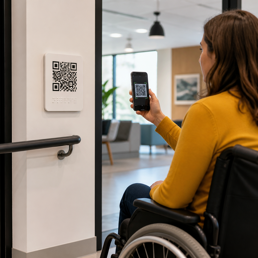
QR codes sit at the intersection of physical environments, mobile interaction, and inclusive design, which makes accessibility a core requirement rather than an optional enhancement. In the context of universal design principles, a QR code is not simply a machine-readable square; it is a touchpoint that must work for people with different visual, motor, cognitive, language, and situational needs. Universal design refers to creating products and environments usable by the widest range of people possible without requiring adaptation. For teams responsible for posters, packaging, menus, wayfinding, tickets, product labels, or service counters, this matters because a QR code often becomes the front door to information, payment, support, or verification.
I have seen organizations treat QR implementation as a purely technical task: generate a code, place it on a surface, and assume the job is complete. In practice, failed scans, low contrast, tiny placement, confusing instructions, inaccessible landing pages, and poor connectivity turn a simple interaction into an exclusion point. Accessibility considerations for QR codes therefore extend beyond the symbol itself into surrounding copy, physical context, device behavior, and destination content. A well-designed code can improve autonomy for blind and low-vision users, reduce cognitive load for older adults, support non-native speakers through mobile translation, and help every user succeed in bright sunlight, noisy spaces, crowded venues, or one-handed use. This hub explains the principles, implementation details, and testing methods that make QR code experiences measurably more usable.
Start with universal design, not just scannability
The first principle is simple: a QR code experience begins before the camera opens. Universal design asks whether people can perceive, understand, and act on the invitation to scan. That means the code needs a clear purpose statement, such as “Scan to view accessible menu with large text and allergen filters,” instead of a vague “Scan here.” Specific labels reduce uncertainty and support people with cognitive disabilities, first-time users, and anyone deciding whether the interaction is worth the effort. In my projects, response rates increase when the surrounding text answers three questions immediately: what this is, what happens next, and whether there is an alternative.
Alternatives are essential because not every user can or wants to scan. A short URL, NFC tap point, printed phone number, or staffed assistance option prevents the code from becoming a single point of failure. This is especially important in healthcare, transportation, public services, and hospitality, where the information may be time-sensitive or legally significant. The best implementations treat the QR code as one channel in an omnichannel access model. If the poster is unreachable for a wheelchair user, the glare blocks a scan, or the camera app is unfamiliar, the person still needs a path to the same information. Equality of outcome matters more than elegance of design.
Make the printed code physically accessible
Physical accessibility determines whether scanning is possible at all. ISO/IEC 18004 governs QR code symbology, but practical usability depends on placement, size, contrast, and environmental conditions. A reliable baseline is to match code size to scanning distance at roughly a 10:1 ratio: a 2 centimeter code for 20 centimeters, a 10 centimeter code for about 1 meter. For public signs, I recommend going larger than the mathematical minimum because users may have shaky hands, older cameras, cracked lenses, or limited ability to step closer. Quiet zones also matter. The required blank margin around the symbol should be at least four modules, and in busy layouts I often increase it to improve first-pass detection.
Contrast should be high, typically dark modules on a light matte background. Decorative inversions, gradients, metallic inks, and glossy laminates may look refined yet sharply reduce scan reliability, especially under glare or low light. Placement height should accommodate seated and standing users, with clear sightlines that do not require awkward neck extension or blocking pedestrian flow. If a code is mounted on a countertop, a wheelchair user should be able to approach and hold a device steady. If it appears on a transit shelter, it should not force users into unsafe curb positions. Accessibility considerations also include durability: creased stickers, curved bottles, and weather-faded labels can break detection and leave people without access.
Support comprehension with plain language and clear cues
Many QR failures are comprehension failures. Users need confidence that the code is legitimate, useful, and simple to use. Plain-language instructions outperform clever marketing copy. “Open your camera and point it at the code” is better than “Unlock exclusive digital experiences.” Where appropriate, add a concise benefit statement and expected destination, such as “Opens timetable” or “Starts secure payment page.” This helps users assess safety and relevance, a critical issue in an era of phishing concerns known as quishing, where malicious QR codes lead to fraudulent sites. Trust cues such as official branding, recognizable domains, and contextual explanation lower risk without creating visual clutter.
For cognitive accessibility, reduce competing messages near the code and avoid packing multiple unrelated QR codes into one small area. If several codes are necessary, label each one distinctly and place them in a structured reading order. This is where a hub approach within mobile QR code design and UX becomes valuable: one page can establish standards for instruction copy, icon use, multilingual support, and fallback channels that linked detail pages expand upon. The surrounding experience should also respect literacy differences. Pair text with straightforward icons, avoid jargon, and ensure any mandatory steps, like downloading an app or granting camera permissions, are disclosed before scanning, not after frustration begins.
Ensure the landing page is fully accessible
A scannable code that leads to an inaccessible page is still an inaccessible experience. The destination must work with screen readers, keyboard navigation, zoom up to 200 percent and beyond, responsive layouts, and sufficient color contrast, consistent with WCAG 2.2 guidance. In audits I often find the printed code performs well, while the mobile page fails because buttons are too small, headings are missing, session timers expire, or PDF menus are image-based and unreadable to assistive technology. Since most scans happen on phones, touch target size is particularly important; cramped links and sticky banners create avoidable barriers for users with motor impairments.
Content format matters too. If the QR code opens a restaurant menu, users should get semantic text, prices, and allergen data, not a photo of a printed page. If it opens a transit map, provide text alternatives and route lookup. If it triggers audio, captions and transcripts should be available. If the page requests authentication or payment, error recovery must be clear and forgiving. Accessibility considerations should include performance optimization because slower networks and older devices magnify friction. Compress images, minimize scripts, and avoid interstitials that hijack focus. The destination should load quickly, announce itself clearly, and let users complete the task without pinch-zooming or guesswork.
Design for diverse contexts, devices, and risk scenarios
Universal design recognizes situational limitations alongside permanent disabilities. A parent holding a child, a traveler in bright sun, a delivery driver wearing gloves, or an older adult with a budget Android phone may all struggle with the same QR code. Testing therefore has to cover real conditions, not ideal studio setups. I recommend evaluating camera recognition speed on iOS and Android, native camera apps and common scanning apps, weak cellular environments, low battery mode, dark mode, and browser text enlargement. Teams should also test whether the code remains usable after social sharing, photocopying, scaling in print production, or placement on textured materials.
| Accessibility factor | Common failure | Better practice |
|---|---|---|
| Print size | Code too small for viewing distance | Use distance-based sizing with generous margin |
| Contrast | Stylized colors and glossy finish | Dark on light, matte surface, strong contrast |
| Instructions | “Scan me” with no context | State purpose, outcome, and fallback option |
| Placement | Mounted too high or in glare | Reachable height with clear sightline |
| Destination | Image-only PDF or tiny buttons | Responsive page with semantic content |
| Security | Unknown link creates distrust | Use branded domain and clear legitimacy cues |
Security and privacy are part of accessibility because fear and confusion block use. People need to know whether scanning triggers a download, opens a browser, starts a payment flow, or requests personal data. In regulated sectors, consent and data handling should be explicit. Dynamic QR codes can improve maintenance by allowing destination changes, but governance is essential so redirects remain trustworthy and current. Broken redirects, expired campaigns, and analytics wrappers that create long load chains disproportionately affect users who already face interaction barriers. Good QR governance includes content ownership, review dates, accessibility checks, and a documented fallback process when technology fails.
Build a hub strategy for accessibility considerations
As a sub-pillar hub within mobile QR code design and UX, this topic should connect standards, examples, and implementation guidance across the full lifecycle. The most useful structure starts with foundational principles, then links outward to deeper articles on print specifications, inclusive copywriting, accessible mobile forms, multilingual QR experiences, testing protocols, analytics interpretation, and secure deployment. That internal architecture helps teams move from isolated fixes to a repeatable system. For example, a museum may need one article on exhibit label placement, another on audio guide landing pages, and another on visitor testing with blind users, all anchored by this central accessibility overview.
Governance turns principles into consistent practice. Create a checklist used by designers, marketers, developers, print vendors, and operations staff before anything goes live. Include minimum size, contrast thresholds, approved instruction patterns, alternative access methods, destination page requirements, and maintenance ownership. Pair that checklist with periodic field testing and analytics review. Scan completion rate alone is not enough; look at bounce rate, task completion, assistive technology compatibility, and support requests. When organizations treat QR codes as part of service design rather than graphic decoration, they reduce exclusion, improve trust, and get better business outcomes from the same assets.
QR codes and universal design principles belong together because scanning is never just a technical event; it is a human interaction shaped by environment, language, mobility, perception, trust, and device constraints. The practical lesson is straightforward: make the code visible, reachable, understandable, and backed by an equivalent alternative. Then make the destination fast, semantic, responsive, and compatible with assistive technology. When those pieces work together, QR codes expand access instead of narrowing it.
For teams building a stronger mobile QR code design and UX program, accessibility considerations should become the default review lens for every campaign, sign, label, and transactional flow. Start with one audit of your highest-traffic QR touchpoints, document the barriers, and fix the biggest friction points first: size, contrast, instructions, fallback options, and landing page usability. That simple discipline produces better experiences for disabled users and smoother outcomes for everyone else. Use this hub as your baseline, then apply its standards across every QR code you publish.
Frequently Asked Questions
Why are QR codes considered an accessibility issue, not just a convenience feature?
QR codes are often treated as simple shortcuts to digital content, but in real-world use they function as access points to information, services, instructions, payments, tickets, menus, wayfinding tools, and customer support. That means if a QR code is poorly placed, too small, low contrast, dependent on glare-prone surfaces, or linked to inaccessible content, it can block access just as effectively as an unreadable sign or an inaccessible doorway. From a universal design perspective, the code itself and the experience it unlocks must both be usable by the widest possible range of people, including people with visual, motor, cognitive, language, and temporary or situational limitations.
This is what makes accessibility a core requirement rather than an optional enhancement. A person may be unable to scan a code because it is mounted too high, placed behind reflective glass, printed in weak contrast, or surrounded by visual clutter. Someone else may scan it successfully but encounter a website that does not work with screen readers, has tiny text, uses confusing navigation, or requires precise gestures. Universal design asks a broader question: can different people complete the same task with dignity, independence, and reasonable effort? When QR codes are part of essential communication, inclusive design must cover discoverability, scanability, comprehension, and the usability of the destination content.
How can a QR code be designed and placed so more people can actually use it?
Effective QR code accessibility starts with the physical presentation. The code should be large enough to scan easily at the expected distance, printed with strong contrast, and placed on a non-reflective surface whenever possible. Avoid decorative styling that interferes with recognition, such as overly customized shapes, low-contrast color combinations, or busy backgrounds. The area around the code should include enough empty space so cameras can detect it reliably, and the placement should account for common environmental barriers like poor lighting, glare, curved surfaces, or obstructed viewing angles.
Placement matters just as much as print quality. A code should be positioned where people can approach it comfortably without awkward reach, bending, or crowding. If the code appears in a public environment, consider wheelchair reach ranges, line of sight, traffic flow, and whether users have enough time and space to pause and scan. It also helps to include a short plain-language label explaining what the code does, such as “Scan to view accessible menu” or “Scan for audio instructions.” That context supports users with cognitive or language needs and reduces uncertainty for people who may hesitate to scan unlabeled codes. Whenever possible, provide an alternative access method nearby, such as a short URL, NFC option, printed summary, or staff assistance, so the QR code does not become the only route to important information.
What universal design principles apply most directly to QR code experiences?
Several universal design principles are especially relevant. Equitable use means the QR code experience should serve people with diverse abilities without creating separate or lower-quality paths. If a code leads to a menu, form, or instruction set, that destination should be accessible to screen reader users, keyboard users, people who need zoom, and people who benefit from clear language. Flexibility in use means offering multiple ways to access the same content, such as a readable URL, printed information, or alternative formats like audio and multilingual versions. Simple and intuitive use is critical because many people encounter QR codes in busy, distracting, or unfamiliar environments.
Perceptible information is another major principle: users need clear labels, readable instructions, understandable feedback, and content that works across sensory differences. Tolerance for error matters too, especially if the QR code initiates time-sensitive actions, payments, check-ins, or forms. Users should be able to confirm choices, go back, or recover from mistakes. Low physical effort applies to the act of scanning and interacting with the linked content; people should not have to hold a phone at awkward angles, perform repeated retries, or navigate tiny touch targets. Finally, size and space for approach and use are directly relevant in physical installations, where height, angle, reach, and surrounding environment determine whether the QR code is practically usable. Taken together, these principles shift thinking away from “Can a phone read the code?” toward “Can real people access the full experience comfortably and successfully?”
What should the content behind a QR code include to support inclusive design?
The destination content should be treated as part of the QR code system, not as a separate concern. Once scanned, the user should land on a mobile-friendly page that loads quickly, uses semantic structure, supports screen readers, and allows text resizing without loss of function. Headings should be logical, buttons should be clearly labeled, color contrast should be strong, and forms should include helpful instructions and error messages. If the page contains video, captions should be provided; if it contains important audio content, transcripts or equivalent text should be available. If images communicate meaning, they should include useful alternative text or adjacent explanation.
Inclusive destination design also means paying attention to comprehension. Use plain language, short sections, and predictable navigation, especially when the QR code is used in healthcare, transportation, education, hospitality, or government settings. If the audience is diverse, multilingual support can make a major difference. Avoid forcing users into app downloads, account creation, or complex multi-step flows unless absolutely necessary. If authentication or payment is required, the process should be compatible with assistive technology and allow enough time to complete tasks. In short, a QR code cannot be called accessible if it leads to content that is confusing, fragile, or inaccessible on mobile devices. The scan is only the first step; the real measure of success is whether the user can understand and complete the intended task.
Are there situations where QR codes should not be the only option?
Yes, especially when the information is essential, urgent, regulated, or needed by a broad public audience. QR codes should not be the sole method for accessing critical instructions, safety details, pricing, medical information, transportation updates, legal notices, or customer service pathways. Even a well-designed code assumes a working smartphone, camera access, sufficient battery, internet connectivity, and a degree of digital familiarity. Universal design recognizes that many users may not have all of those conditions at the moment they need the information. They may also be dealing with glare, noise, time pressure, language barriers, stress, or device limitations.
Providing alternatives is both practical and inclusive. Depending on the context, that might mean pairing the QR code with printed text, a memorable short link, a phone number, in-person assistance, tactile signage, or downloadable materials in accessible formats. In restaurants, for example, a QR menu should be accompanied by printed menus in readable formats. In exhibits or wayfinding systems, a QR-triggered audio experience can be complemented by visible summaries and accessible staff support. In healthcare or service environments, instructions accessed by QR should also be available directly in plain text. The goal is not to eliminate QR codes, but to avoid creating a single point of failure. The most universally designed solution is one that preserves user choice while ensuring that no one is excluded from core information or participation.





