
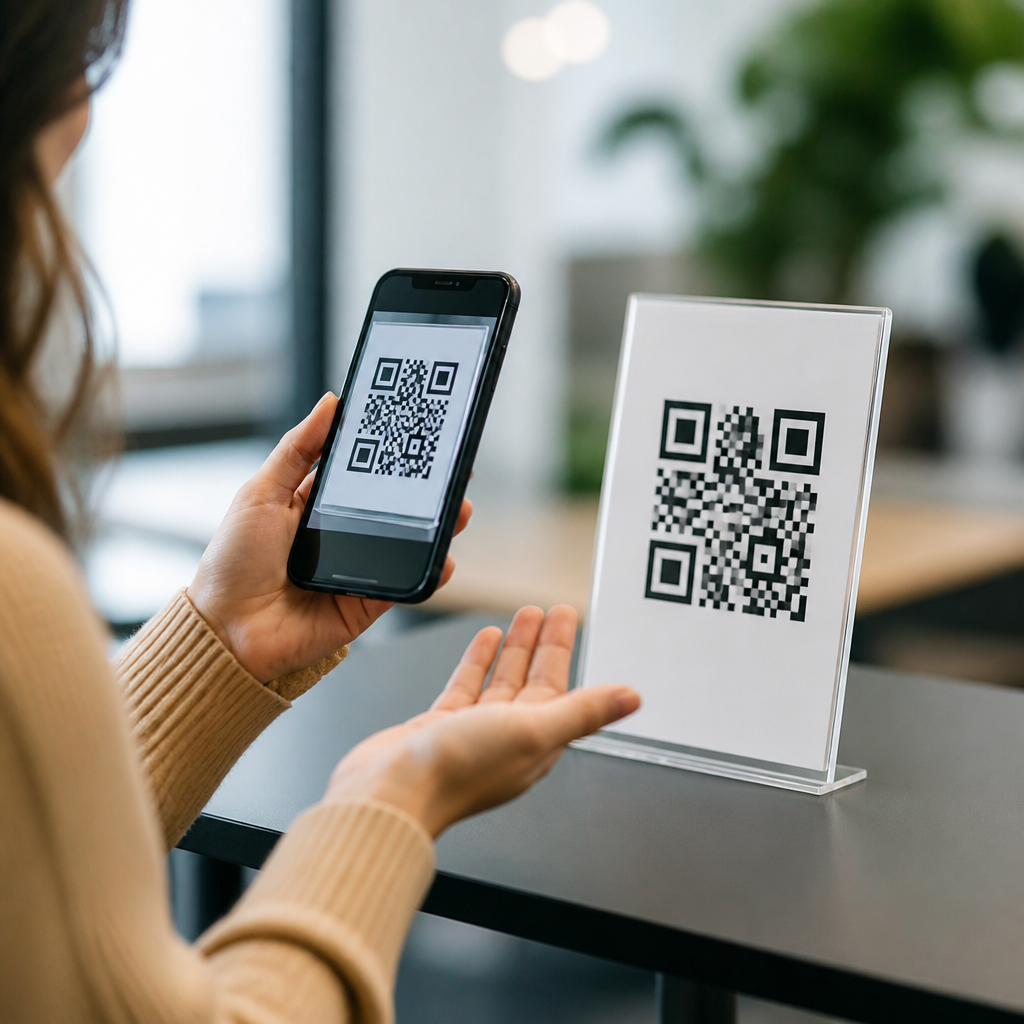
QR codes are now a routine part of payments, menus, product packaging, event check-in, public signage, and healthcare workflows, but many implementations still fail basic accessibility expectations. In practice, accessibility considerations for QR codes means designing the code, its placement, the surrounding instructions, and the destination experience so people with visual, motor, cognitive, hearing, or language-related barriers can successfully use it. I have audited QR deployments in retail stores, museums, campuses, and clinics, and the same pattern repeats: teams focus on whether the code scans on a test phone, not whether every user can discover it, reach it, understand it, and complete the task after scanning.
That gap matters because QR code accessibility affects conversion, customer service volume, legal risk, and public trust. A code that is technically scannable but physically unreachable, poorly labeled, low contrast, or linked to an inaccessible mobile page excludes users just as effectively as a broken link. Standards such as WCAG 2.2, ADA expectations in the United States, and EN 301 549 in Europe do not mention QR codes as a separate universe; they apply to the full user journey. This hub explains the most common accessibility issues with QR codes, why they happen, and what good mobile QR code design and UX looks like in real settings.
Missing Context and Instructions
The most common accessibility issue is not the symbol itself but the absence of clear context around it. A standalone QR code with no nearby explanation assumes users already know what it does, whether it is safe, and what they should expect after scanning. For many users, especially people with cognitive disabilities, low digital confidence, or limited language proficiency, that ambiguity creates friction before the camera even opens. The fix is simple: add a short, plain-language call to action such as “Scan to view today’s menu,” “Scan to pay your bill securely,” or “Scan for audio exhibit guide.”
Instructions should also include an alternative path. I recommend pairing every QR code with a short URL, an NFC option where appropriate, or a staffed alternative for essential services. If a patient cannot scan a clinic check-in code because of tremor, glare, or an older device, they still need an equitable way to complete the task. Good instruction design also sets expectations about app requirements, login steps, file downloads, data use, or time sensitivity. When users know what scanning will do, trust improves and abandonment falls.
Poor Physical Placement and Reach
Placement failures are widespread and easy to miss during desk reviews. Codes are often mounted too high on walls, too low near the floor, behind reflective acrylic, on curved bottles, or in crowded areas where people cannot stop safely to scan. Accessibility considerations begin with reach ranges, line of sight, and approach space. A wheelchair user may not be able to get close enough to frame the code. A person using a walker may struggle if the code is placed where they must twist or hold a phone one-handed. In transit settings, a code near a stairwell can create both safety and access problems.
In field testing, I use real distances, multiple device sizes, and varied lighting conditions. A poster code that scans at three feet in a conference room may fail outdoors because users cannot step closer without entering traffic or because backlighting washes out the image. Best practice is to place codes at a comfortable viewing height, provide clear floor space, avoid glossy covers, and ensure users can approach directly. If the code supports a required transaction, offer it in more than one location so people are not forced into a single inaccessible position.
Low Contrast, Small Size, and Print Quality Problems
QR codes are image-based triggers, so visual clarity is critical. Common design mistakes include tiny codes on packaging, brand colors with weak contrast, decorative logos that disrupt finder patterns, and low-resolution exports that blur module edges. Although error correction can tolerate some damage, accessibility is not improved by pushing technical tolerance to its limits. Users with low vision, older phone cameras, cracked screens, or hand shake need generous margins for success. A good rule from print production is to size the code according to scanning distance and test on mainstream devices, not just flagship phones.
Contrast issues deserve special attention. Dark code on a light background remains the most reliable choice. Reversed white-on-black codes can work, but they are less forgiving across devices and lighting conditions. Gradients, patterned backgrounds, and transparent overlays increase failure rates. Quiet zone violations are another frequent problem; without enough empty space around the code, camera software struggles to isolate it. In restaurant table tents, I regularly see folds, shadows, and glossy lamination reduce readability. Printing one strong, boring code is better than printing a stylish code that excludes users.
Destination Experience Is Not Mobile Accessible
A scan is only the start of the interaction. Many organizations improve the code and forget that the landing page, PDF, form, or app deep link must also be accessible on mobile. If a menu opens as an untagged PDF, a screen reader user may encounter an unreadable image. If a payment page has tiny tap targets, missing labels, or session timeouts, users with motor impairments may fail after a successful scan. Accessibility considerations therefore extend from symbol design into responsive layout, semantic structure, focus order, form validation, and compatibility with VoiceOver, TalkBack, and browser zoom.
In audits, I treat the QR code as an entry point to a mobile task flow. That means testing screen reader announcements, landscape and portrait orientation, dynamic type, keyboard navigation for switch users, and plain-language error recovery. If a museum exhibit code launches audio, the player needs labeled controls and captions for any spoken introduction. If a parking code launches payment, the checkout must expose amount, vehicle fields, and confirmation clearly. The most accessible QR deployment is one where the user can complete the entire task independently without visual guessing or repeated retries.
Insufficient Alternatives for Non-Scanners
Not everyone can or wants to scan a QR code. Some users have older devices, restricted corporate phones, camera permission blocks, low battery, poor data coverage, or accessibility settings that make camera workflows difficult. Others may have security concerns because malicious QR codes are a real phishing vector. A compliant and user-centered approach always provides an equivalent alternative, especially when the code gates a core service like ordering, registration, payment, medication instructions, or transport updates. “QR only” is rarely defensible when a simple backup can remove exclusion.
| Use case | Common QR-only mistake | Accessible alternative |
|---|---|---|
| Restaurant menu | Menu available only through scan | Printed menu plus short URL |
| Event check-in | Entrance requires mobile scan | Staffed desk and manual lookup |
| Public exhibit | Audio guide only via QR app | NFC, keypad device, or loaner handset |
| Medical forms | Pre-visit paperwork only by code | Accessible web link and paper option |
Alternatives should be equally useful, not nominal placeholders. A tiny printed URL with mixed case and punctuation is not a realistic fallback for users with low vision or dyslexia. Staff also need training so alternatives are offered without friction or stigma. I have seen front-line teams say, “Just have someone else scan it for you,” which undermines independence and privacy. Better systems make alternatives visible from the start and support the same outcome with minimal extra effort.
Accessibility Gaps in Signage, Language, and Wayfinding
Another common issue is treating the QR code as self-explanatory within a larger physical environment that is not accessible. On signs, users need readable typography, strong color contrast, glare control, and enough surrounding space to identify the code’s purpose. Wayfinding matters too. In a hospital, a code for appointment check-in placed among donation posters and cafeteria notices creates cognitive overload. In a gallery, multiple unlabeled codes on one wall force users to guess which one starts the audio tour and which one opens a ticket form.
Language accessibility intersects here. Clear headings, translated instructions where needed, and recognizable icons reduce confusion. If the code launches video, note whether captions, transcripts, or sign-language interpretation are available. If it opens maps or emergency information, use direct wording and avoid marketing copy. The design goal is immediate comprehension: what this code does, who it is for, and what happens next. Well-structured signage supports everyone, including tourists, older adults, and users managing stress or time pressure in unfamiliar places.
Testing, Governance, and Maintenance Failures
Most QR accessibility problems persist because organizations do not test systematically or assign ownership after launch. Effective governance means creating a repeatable checklist that covers print specs, placement, instruction text, fallback options, destination accessibility, analytics, and content maintenance. Dynamic QR platforms such as Bitly, QR Code Generator, or Beaconstac can help with link management and scan reporting, but they do not guarantee accessible outcomes. Someone still has to validate the real-world experience across devices, lighting, mobility constraints, and assistive technologies.
Maintenance is especially important for a hub topic like accessibility considerations. Links break, PDFs get replaced with inaccessible versions, pages add cookie banners that trap focus, and seasonal signage introduces new barriers. I advise teams to schedule periodic scans, maintain content inventories, and include accessibility review in every campaign launch. The strongest QR programs document standards, train designers and operations staff, and treat accessibility as an operational requirement rather than a final compliance check. Start by auditing your current codes, fixing the highest-friction journeys, and building accessible defaults into every new deployment.
Frequently Asked Questions
What are the most common accessibility issues with QR codes?
The most common accessibility problems usually start long before someone tries to scan the code. A QR code may be printed too small, placed too high or too low, wrapped around curved packaging, obscured by glare, or positioned in a location that is hard to approach from a wheelchair or while using a mobility aid. Low color contrast, decorative styling, and poor lighting can also make codes harder for cameras to detect. In retail, hospitality, healthcare, and public signage, these physical issues are often the first point of failure.
Just as important, many QR codes are presented without usable instructions or alternatives. A sign may say “Scan here” but fail to explain what the code is for, whether a person needs to download an app, what happens after scanning, or what someone should do if they cannot scan it at all. This creates barriers for people with low vision, limited dexterity, cognitive disabilities, language-related barriers, or people who simply are not familiar with QR workflows. A code that only works if the user already understands the process is not an accessible implementation.
The destination experience is another major problem area. Even when a person can successfully scan the code, the landing page may be inaccessible because it is not screen-reader friendly, not keyboard operable, not translated appropriately, or not usable on mobile devices. Common failures include unlabeled buttons, poorly structured forms, auto-playing media without captions, time-limited check-in flows, and documents delivered only as inaccessible PDFs. In practice, an accessible QR code experience depends on the entire chain working well: the code itself, the placement, the instructions, the physical environment, and the digital content that opens after scanning.
How should QR codes be designed and placed to improve accessibility?
Accessible placement begins with reach, visibility, and stability. A QR code should be located where people can approach it comfortably and hold a device steady while scanning. That means avoiding awkward mounting heights, floor-level placement, ceiling-level signage, or positions behind glass where reflections interfere with camera focus. Codes should not be placed on moving surfaces, heavily curved containers, or areas with visual clutter that makes them hard to distinguish from surrounding graphics. In stores, restaurants, clinics, and transit environments, placement should also account for crowding, queue lines, and whether a person using a wheelchair can get close enough to scan without assistance.
Design choices matter too. QR codes should be large enough to scan from the expected distance, printed clearly, and given sufficient contrast against the background. Overly stylized codes may look attractive in a campaign mockup but often reduce reliability in real-world conditions. Quiet space around the code is essential so cameras can detect the boundaries cleanly. If the code appears on packaging, posters, payment terminals, kiosks, or event materials, it should not be distorted, partially wrapped around edges, or printed on glossy surfaces that create glare under indoor lighting. A technically valid code is not necessarily a usable one if physical presentation makes scanning difficult.
Good placement also includes context. Users should immediately know what the QR code does, whether it opens a menu, starts payment, checks in for an appointment, links to product information, or launches support materials. Clear labels and concise instructions reduce confusion and help people decide whether to proceed. Where possible, the code should be accompanied by a short URL, printed phone number, NFC option, or staff-assisted alternative so the task can still be completed without scanning. That combination of physical usability and alternative access is what separates an accessible deployment from one that only works for ideal users in ideal conditions.
Why is providing an alternative to scanning a QR code so important?
A QR code should never be the only path to essential information or services. Some people cannot scan reliably because of low vision, limited hand control, tremors, device limitations, poor connectivity, unfamiliarity with smartphone scanning, or language and cognitive barriers that make the process unclear. Others may not have a compatible phone available at the moment, may use assistive technology that makes switching between camera and browser tasks difficult, or may be in an environment where scanning is impractical, such as a crowded entrance, a dimly lit restaurant, or a medical setting where speed matters. If scanning is the sole method, the organization is effectively excluding part of its audience.
Alternatives should be equivalent, not second-class. A short, memorable URL is one of the simplest and most effective backups because it allows users to type the address manually, share it, or access it later. In some settings, a printed phone number, text keyword, staffed assistance, accessible kiosk, or paper copy may also be appropriate. For payments, menus, check-in, health forms, and product instructions, the alternative should provide the same core content and functionality without adding unnecessary friction. Telling someone to “ask for help” is not always enough, especially when privacy, independence, or timing are important.
From an accessibility and usability standpoint, alternatives also improve resilience for everyone. A code may be damaged, network access may be weak, a camera may fail to focus, or the linked page may load slowly. Multi-path access reduces abandonment and support burden while making the experience more inclusive. In audits, one of the clearest signs of a mature QR strategy is not the visual design of the code itself but whether the organization anticipated failure points and built accessible fallback options that still let users complete the task independently.
What should the instructions around a QR code include to make the experience more accessible?
Accessible instructions should answer four basic questions immediately: what this code is for, how to use it, what happens next, and what to do if scanning does not work. For example, “Scan to view the accessible menu,” “Open your phone camera and point it at the code,” “You will be taken to our online check-in form,” and “If you cannot scan, visit example.com/menu or ask staff for a printed copy.” That level of clarity reduces guesswork and helps users decide whether they are willing and able to continue. It is especially useful for people with cognitive disabilities, users who are less familiar with QR interactions, and anyone encountering the code in a noisy, rushed, or stressful environment.
Instructions should be written in plain language and presented with strong legibility. Tiny text, jargon, and vague labels like “Tap in” or “Go digital” create confusion. If the action is important, such as making a payment, completing consent forms, joining event registration, or accessing medical information, the user should know exactly what they are opening. Where relevant, it helps to note any requirements, such as internet access, a mobile browser, or a specific app. In multilingual environments, instructions should be available in the primary languages of the audience, and visual cues should support understanding without relying on complex wording alone.
Good instructions also reinforce trust and safety. People are increasingly cautious about scanning unknown codes, and rightly so. A brief explanation of the destination, organization name, or visible short link can reassure users that the code is legitimate. If the code opens video, audio, a form, or a time-sensitive process, users should know that in advance. This is not just a security best practice; it is an accessibility benefit because predictability helps all users, particularly those who rely on assistive technology or who need extra time to process and complete digital tasks.
How can businesses test whether a QR code experience is actually accessible?
The most effective way to test accessibility is to evaluate the full end-to-end journey in real conditions. Start with the physical deployment: can people notice the code, approach it, understand its purpose, and scan it comfortably from the actual location where it is installed? Test with different phone sizes, camera quality levels, lighting conditions, glare, mounting heights, and distances. If the code appears in retail aisles, on tables, at payment counters, on packaging, or in healthcare waiting areas, test it there rather than relying on a perfect desktop printout in an office. Real-world conditions often reveal barriers that design teams miss.
Next, assess the instruction layer and the fallback options. Ask whether a first-time user can understand the task without staff intervention. Confirm that the alternative path, such as a short URL or printed option, is easy to find and genuinely usable. If staff assistance is part of the backup plan, verify that employees know when and how to offer it. For high-stakes workflows like payments, appointment check-in, consent, or medication information, inaccessible fallbacks can create serious operational and legal risk. Accessibility testing should therefore include not only design review but also process review.
Finally, audit the destination content on mobile with assistive technology and basic usability checks. Test with screen readers, keyboard navigation where applicable, zoom and reflow, color contrast review, form error handling, heading structure, link clarity, captioning, language support, and timeout behavior. Make sure critical actions can be completed without unnecessary gestures or precise tapping. If the QR code links to a PDF, confirm that the PDF itself is accessible; if it links to video, confirm captions and controls. The strongest results come from involving people with disabilities in testing, because lived experience consistently surfaces issues that checklist-only reviews miss. An accessible QR code is not just one that scans; it is one that supports successful completion for the widest possible range of users.





