
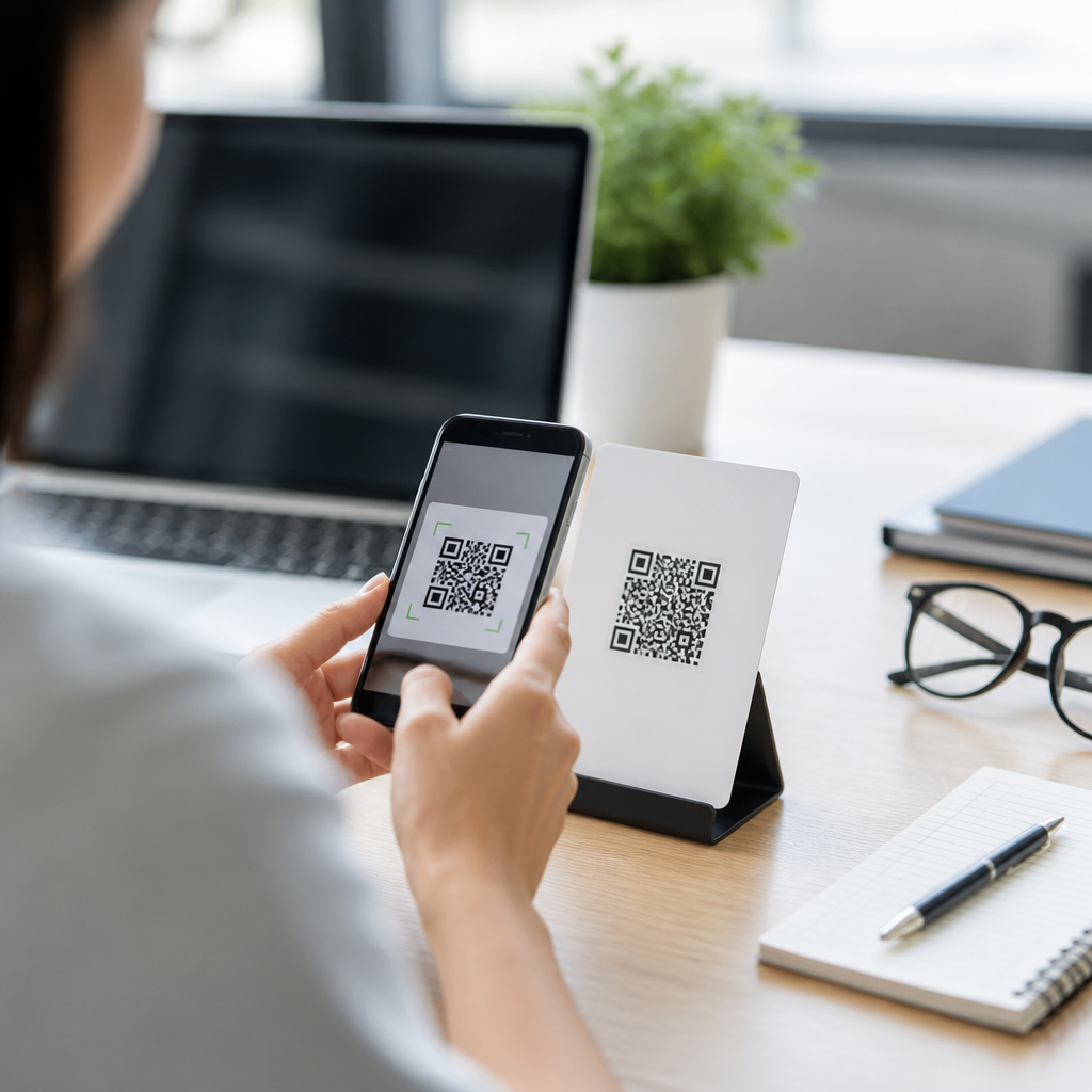
QR code accessibility testing methods determine whether people with different visual, motor, cognitive, and situational limitations can reliably notice, understand, scan, and complete the task behind a code. In mobile QR code design and UX work, accessibility considerations go far beyond print contrast or scan speed. They include discoverability, instruction clarity, camera handling, lighting tolerance, target placement, fallback paths, screen reader compatibility after the scan, and the plain-language quality of the destination page. I have tested QR campaigns on packaging, posters, menus, kiosks, museum labels, and event signage, and the same lesson appears every time: a technically valid code can still fail real users. That matters because QR interactions often sit at critical moments such as payment, account login, ticket retrieval, medicine information, and service access. If the code cannot be used by someone with low vision, tremor, limited reach, glare sensitivity, or weak connectivity, the design has introduced an avoidable barrier. A strong testing approach therefore evaluates the complete user journey, from first noticing the code to finishing the intended action on a mobile device.
Accessibility considerations also matter because QR usage happens in unpredictable environments. A code may be placed on a glossy poster under bright sunlight, on a moving train, behind a restaurant counter, or on product packaging held in one hand. Many users scan while carrying bags, using older phones, zooming text, or relying on assistive technology. Standards such as WCAG 2.2 help frame digital accessibility, but QR codes require physical-environment testing too. For that reason, the best accessibility testing methods combine artifact review, environmental checks, assistive technology testing, and task-based usability sessions. When this work is done well, scan completion rates improve, abandonment drops, and support requests fall because the interaction becomes resilient for a wider range of people.
Start with an accessibility test plan that covers the full QR journey
The most effective QR code accessibility testing methods begin with a clear test plan. Define the user goal, the context, the scanning device, and the completion criteria. A good plan does not stop at “camera recognizes code.” It asks whether the user can find the code, understand why they should scan it, physically position the phone, receive confirmation, reach accessible content, and recover if something goes wrong. In practice, I document the journey as five stages: discover, interpret, scan, transition, complete. That structure exposes failures early. For example, a code on medication packaging may scan perfectly, yet fail at the interpret stage because instructions use low-contrast six-point text or omit a plain-language explanation of what the scan provides.
Define participant profiles before testing. Include people with low vision, color vision deficiency, limited dexterity, tremor, one-handed use patterns, cognitive processing differences, older adults, and users on slower devices or weak networks. Include both native camera app scanning and third-party scanners when the audience is broad. Record environmental conditions such as lux level, glare, mounting height, distance from the user, and whether the object is curved. These variables strongly affect outcomes. A code printed on a cylindrical bottle, for instance, can distort finder patterns enough to reduce scan reliability, especially for users who cannot easily rotate the package.
Evaluate physical presentation: size, contrast, quiet zone, placement, and lighting
Physical presentation is the first major accessibility checkpoint because many failures happen before software is involved. Test the x-dimension and overall code size against expected scanning distance. A practical field rule is roughly one inch of code width for every ten inches of scanning distance, then validate with real devices. Maintain a proper quiet zone of at least four modules around the code so camera algorithms can isolate it. Check contrast between dark modules and light background, but do not rely on contrast ratio alone. Decorative gradients, patterned surfaces, foil finishes, and transparent overlays can reduce detectability even when a design looks attractive on a desktop proof.
Placement determines whether people can align the camera without strain. Avoid mounting codes too high, too low, behind reflective glass, or near corners where phone positioning becomes awkward. For public installations, verify seated and standing reach ranges and sightlines. On packaging, test whether fingers naturally cover the code during handling. Lighting tests should include bright daylight, fluorescent interiors, and dim evening conditions. I regularly see glossy lamination create hotspots that block scanning for users with limited wrist mobility because they cannot tilt the phone enough to avoid glare. Accessibility here is not abstract; it is the physical ease with which different bodies can perform the action.
| Test factor | What to verify | Common failure | Practical fix |
|---|---|---|---|
| Code size | Scans at expected distance on older and newer phones | Too small on posters or labels | Increase printed size and retest by distance |
| Quiet zone | Clear margin around all sides | Text or borders crowd the code | Restore four-module minimum margin |
| Contrast | Dark modules remain distinct under glare and low light | Gradient or low-contrast branding | Use high-contrast dark-on-light treatment |
| Placement | Reachable and visible for seated and standing users | Mounted too high or behind glass | Reposition within accessible sightline and reach |
| Surface | No distortion from curves, folds, or reflections | Cylindrical packaging or glossy laminate | Flatten area, enlarge code, reduce shine |
Test comprehension: instructions, context, and fallback options
People should never have to guess what scanning a QR code will do. Accessibility testing must examine surrounding copy, iconography, and expectations. In moderated sessions, ask users what they think will happen before they scan. If answers vary widely, the design lacks context. Effective labels are concrete: “Scan to hear audio instructions,” “Scan to pay your bill,” or “Scan for allergen information.” Vague prompts such as “Scan me” force cognitive effort and can undermine trust. This is especially important for users who are cautious about phishing, hidden fees, or unexpected downloads.
Every accessible QR implementation also needs a fallback path. Provide a short URL, NFC alternative where appropriate, printed phone number, or clear manual access route. Test whether the fallback is actually usable, not just technically present. I have reviewed posters where the short URL existed but used mixed-case characters and tiny typography that low-vision users could not read. For critical services, the fallback should deliver equivalent information, not a reduced experience. This is one of the most reliable accessibility improvements because it supports users whose devices, camera permissions, or environments make scanning impractical.
Run assistive technology and mobile interaction tests after the scan
Scanning the code is only half the job. The destination must also work with assistive technology and mobile accessibility settings. Test the landing page with VoiceOver on iOS and TalkBack on Android. Check page titles, heading structure, form labels, focus order, button names, and status messages. Verify that text reflows at 320 CSS pixels, zoom works up to 200 percent, and orientation changes do not break key functions. If the scan opens an app clip, payment sheet, PDF, or video player, include those states in testing because handoff points are common failure zones.
Also test with enlarged text, bold text, reduced motion, dark mode, and browser zoom. A QR code that links to a menu PDF may be useless if the file is image-only and unreadable by screen readers. A code for event check-in may appear successful until a modal traps keyboard focus for switch control users. The right method is end-to-end testing of the actual task. For transactions, track whether participants can complete the flow independently, how many corrections they need, and where they hesitate. Accessibility is measured by successful completion with reasonable effort, not by the absence of obvious defects alone.
Use realistic usability sessions and operational metrics to find failures early
Lab review and checklist audits are necessary, but realistic usability testing reveals problems that specifications miss. Create scenarios that reflect real conditions: scanning from a bus shelter at noon, from a restaurant table with low light, or from a moving queue where time pressure matters. Ask participants to use their own phones when possible. Device diversity changes autofocus behavior, default camera prompts, and browser rendering. Capture completion rate, time to first successful detection, time to task completion, number of reposition attempts, and fallback usage. These metrics show whether a design is merely functional or genuinely accessible.
Operational data should continue after launch. Use analytics to compare scan starts, landing page loads, completion rates, and drop-off points by device class. Support logs often reveal accessibility issues before formal audits do. If many users abandon on a permissions prompt or call support after scanning printed bills, investigate that moment directly. A/B testing can validate fixes such as larger codes, clearer labels, or better fallback placement. The strongest teams treat QR accessibility as an ongoing quality practice tied to design, print production, content strategy, and mobile engineering, not as a one-time compliance exercise.
QR code accessibility testing methods work best when they examine the whole interaction rather than the symbol in isolation. The essential checks are straightforward: confirm the code is physically scannable in real conditions, verify users understand its purpose, provide an equivalent fallback, and test the destination with assistive technology and mobile settings. When teams measure discoverability, scan effort, completion success, and recovery from errors, they uncover barriers that basic camera tests miss. For a subtopic as important as accessibility considerations within mobile QR code design and UX, this hub page sets the baseline: design for variation, test in context, and validate every step of the journey. Use these methods on your next QR deployment, document the failures honestly, and fix the experience before it reaches the public.
Frequently Asked Questions
1. What is QR code accessibility testing, and why is it important?
QR code accessibility testing is the process of evaluating whether a QR code experience works for the widest possible range of people, including users with visual, motor, cognitive, and situational limitations. A successful test does not stop at asking whether a phone camera can technically read the code. It also examines whether people can notice the code, understand what it is for, position their device comfortably, scan it in realistic conditions, and complete the task that follows without confusion or unnecessary barriers.
This matters because real-world QR use happens in imperfect environments. People may be scanning from a wheelchair, in low light, with one hand, through glare, while wearing progressive lenses, or while managing limited attention. A code that works in ideal office conditions can still fail badly in a store aisle, on public transit, on a poster mounted too high, or on packaging with poor instructions. Accessibility testing helps identify these failures before launch.
It is also important to remember that the accessible experience extends beyond the moment of scanning. If the QR code leads to a page that is not screen reader compatible, uses unclear language, relies on tiny tap targets, or forces users into a complex flow without alternatives, then the QR experience is not truly accessible. Good testing therefore covers the full journey: discoverability, scanability, comprehension, and task completion.
2. What should be included in a complete QR code accessibility testing process?
A complete QR code accessibility testing process should cover the entire user journey from first glance to final outcome. At the beginning, test whether people can easily identify the QR code and understand its purpose. A code placed on a busy sign or package may be visually present but not meaningfully discoverable. The surrounding instructions should explain what happens after scanning, what value the user gets, and whether a fallback option is available for those who cannot or do not want to scan.
Next, evaluate physical and visual scanning conditions. This includes code size, contrast, quiet zone spacing, angle, placement height, distance, glare, motion, and lighting tolerance. Test with different phone models, camera qualities, and operating systems because performance varies widely. Also assess whether people with limited dexterity can hold and align their devices long enough to capture the code comfortably. If the code is on a curved surface, glossy material, rotating display, or moving object, those factors should be tested as well.
After the scan, review the destination experience with the same rigor. The landing page, app flow, or file download should be usable with screen readers, voice control, keyboard navigation where relevant, zoom, and reduced-motion settings. The content should use plain language, predictable structure, and clear calls to action. If the QR code opens a form, payment step, menu, ticket, or instructional content, measure whether users can complete that task successfully without extra assistance.
Finally, include fallback paths and failure handling in the test plan. An accessible QR implementation usually provides an alternative short URL, printed instructions, human assistance path, or nearby NFC/manual option. Testing should verify that when scanning fails, users are not left stranded. In practice, the strongest test plans combine heuristic review, device-based technical checks, and moderated usability sessions with participants who represent a range of abilities and contexts.
3. How do you test QR codes for users with visual, motor, and cognitive accessibility needs?
Testing for visual accessibility starts with whether the code can be located and recognized easily. Review contrast between the code and its background, but do not stop there. Also assess code size, spacing, placement, and surrounding clutter. A QR code may have acceptable contrast ratios and still be difficult to spot if it competes with dense graphics or is placed too low, too high, or in reflective materials. Include users with low vision, people who rely on zoom, and people who use screen readers after the scan. Make sure any follow-on content has proper headings, labels, alternative text, and readable text size.
For motor accessibility, focus on handling and positioning. Some users cannot easily hold a phone steady, extend their arms, or align a camera precisely with a small target. Test whether the code can be scanned from practical distances and angles without requiring a highly controlled posture. Placement matters a great deal here. Codes on floor decals, overhead signage, or narrow packaging can introduce unnecessary physical strain. Observe whether users need multiple attempts, awkward wrist positions, or support from another person in order to scan successfully.
Cognitive accessibility involves clarity, predictability, and reduced mental effort. Test whether users understand what the QR code does before they scan it. Vague prompts such as “Scan here” are less effective than plain-language instructions like “Scan to view the accessible menu” or “Scan to pay your bill securely.” The destination should also be simple and direct. Avoid unnecessary redirects, overloaded pages, jargon-heavy content, or multi-step flows with unclear progress. People should not have to guess what comes next or whether they are in the right place.
The most effective method is observational usability testing with representative participants, supported by task-based metrics such as time to locate the code, number of scan attempts, success rate, confidence level, and completion rate after scan. These observations often reveal issues that technical checks alone miss, especially when accessibility barriers come from context, wording, posture, or environmental stress rather than code generation quality.
4. What real-world conditions should be simulated when testing QR code accessibility?
Real-world testing should reflect the fact that QR codes are frequently scanned outside controlled environments. Start by testing different lighting situations, including bright daylight, dim indoor lighting, shadows, glare from glossy surfaces, and mixed lighting that can confuse autofocus. A code that scans perfectly on a flat matte print under office lights may become frustrating on a shiny poster near a window or on product packaging under retail lighting.
Distance and placement should also be varied. Test codes mounted at standing eye level, seated height, shelf height, door height, and elevated signage. Include scenarios where the user is close to the code, several feet away, moving past it, or trying to scan from a constrained position such as a queue line, vehicle seat, or wheelchair. If the code appears in public spaces, evaluate line-of-sight obstruction, crowding, and whether users have enough time and room to stop and scan safely.
Device diversity is another major factor. Use multiple phones with different camera capabilities, screen sizes, focus speeds, and operating systems. Some older or lower-cost devices struggle with small codes, low contrast, or poor lighting. Test with browser-based scanning, native camera scanning, and any in-app scanner if relevant. If the destination opens a webpage, make sure it behaves well under poor connectivity, zoom settings, screen reader use, and orientation changes.
Situational limitations should be part of the plan too. Many accessibility issues emerge when people are carrying bags, using one hand, experiencing time pressure, dealing with noise, or dividing attention. These situations can affect everyone, not only people with permanent disabilities. By simulating realistic contexts, teams uncover practical barriers that strongly influence whether the QR experience succeeds in everyday use.
5. What are the most common accessibility problems found in QR code testing, and how can they be fixed?
One of the most common problems is poor discoverability. The QR code may be technically functional but visually buried, unlabeled, or placed where users do not expect it. This is often fixed by improving surrounding layout, adding a clear call to action, using plain-language instructions, and making the value of scanning explicit. Users should understand why they should scan and what they will get before they commit to the action.
Another frequent issue is difficult scanning caused by small code size, insufficient quiet zone, low contrast, decorative styling, glare, curved surfaces, or poor placement. Fixes include increasing the code size, preserving proper spacing around it, using high-contrast non-decorative designs, avoiding reflective finishes, and placing the code where users can approach and align a device comfortably. Testing should confirm that these fixes work across common phone types and lighting conditions, not just on one ideal test device.
A third major problem appears after the scan. Teams sometimes optimize the code itself but send users to inaccessible landing pages, confusing app flows, or files that do not work with assistive technology. The remedy is to treat the destination as part of the QR experience. Use semantic structure, readable typography, descriptive buttons, accessible forms, plain language, and compatibility with screen readers and zoom. If a task is critical, provide a fallback method such as a short URL, printed phone number, or in-person alternative.
Finally, many organizations overlook error recovery. When the scan fails, users often receive no support beyond trying again. Better practice is to offer visible backup options and concise troubleshooting guidance nearby, such as “If you cannot scan, visit this short link” or “Ask staff for assistance.” The best fixes are usually simple, but they only become obvious when teams test with real users in real conditions and evaluate the entire path from noticing the code to completing the intended task.





