
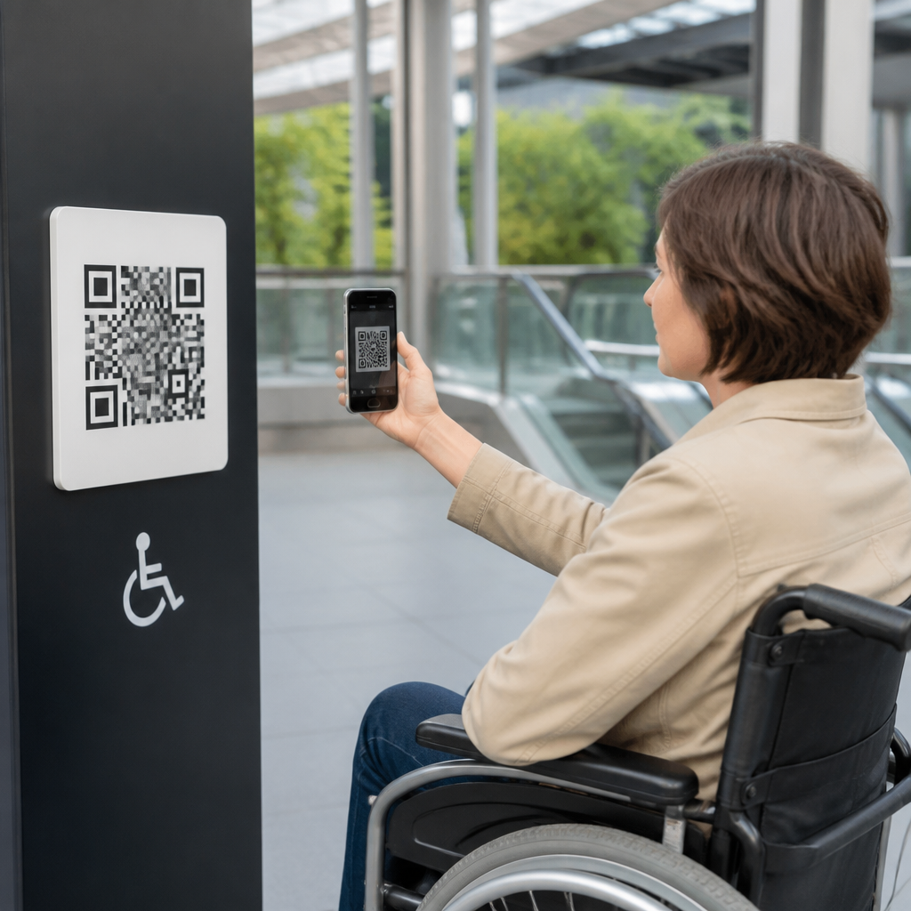
Designing QR codes for public spaces accessibility means creating scannable codes, surrounding instructions, and linked mobile experiences that people with different physical, sensory, cognitive, and language needs can use confidently in real environments. In practice, that covers the code itself, the mounting location, lighting, contrast, tactile context, fallback information, and the destination content after the scan. I have worked on QR deployments in museums, transit corridors, clinics, and campuses, and the same lesson repeats: a perfectly branded code fails if a wheelchair user cannot reach it, if glare blocks the camera, or if the landing page is unreadable by a screen reader.
Accessibility matters because public spaces are unpredictable. People scan while moving, carrying bags, managing children, navigating noise, or using assistive technology. Standards such as the ADA Standards for Accessible Design, WCAG 2.2, and plain-language guidance all influence whether a QR experience is usable. Accessibility also affects operational outcomes. When codes are easier to find, understand, and scan, completion rates rise, staff interruptions fall, and essential information reaches more people. For a sub-pillar hub in mobile QR code design and UX, accessibility is not a niche concern. It is the baseline for effective wayfinding, contactless services, menus, ticketing, interpretation, safety messaging, and civic communication.
Good accessible QR design starts with a simple principle: treat the code as one touchpoint in a service journey, not as a decorative graphic. Users need three things: discoverability, scan reliability, and an accessible destination. If any one breaks, the entire interaction breaks. Public-space deployments demand extra rigor because unlike packaging or direct mail, the environment cannot be controlled. Sunlight changes, queues form, walls get scuffed, and visitors arrive with hundreds of device combinations. The sections below explain how to design the full system so more people can use it successfully.
Place QR Codes Where People Can Reach, See, and Understand Them
Placement is the first accessibility decision, and it is where many public QR projects go wrong. A code installed too high, behind glass, on a curved pillar, or in a dim corner excludes users before scanning even begins. In my audits, the safest approach has been to place the code within a comfortable viewing and reaching zone for both standing users and wheelchair users, with a clear forward approach and enough space to pause without blocking circulation. Mounting height varies by context, but the principle is constant: avoid forcing users to stretch, crouch, twist, or scan from an awkward angle.
Readable context matters just as much as physical access. A QR code should never appear without a short label that answers the user’s first question: what happens if I scan this? “Scan for audio guide,” “Scan for live arrivals,” or “Scan for large-print map” reduces uncertainty and improves trust. In multilingual environments, pair concise instructions with the most common local languages and recognizable icons. If the code supports a critical service, add a non-QR path nearby, such as a short URL, NFC tap point, staffed desk reference, or printed phone number. Accessibility in public spaces always includes redundancy.
Environmental conditions can either support or sabotage scanning. Glossy signs under spotlights create reflections that camera autofocus struggles to resolve. Exterior placements can suffer from harsh sun, rain streaks, and vandalism. I generally recommend matte finishes, stable lighting, and a quiet visual zone around the code. Do not embed QR codes inside cluttered posters or over busy photographic backgrounds. Clear space helps users locate the code quickly and helps cameras isolate it. If the sign sits in a queueing area, position it where users can step aside, scan, and read without pressure from people behind them.
Build the Code for Reliable Scanning Under Real-World Conditions
Accessible QR codes must scan fast on average phones, older devices, and cracked screens, not just in studio mockups. That begins with size, contrast, and error correction. As a rule, larger is safer in public spaces because users scan from varying distances and camera quality differs widely. Black on white remains the most dependable combination. Branded colors can work, but low contrast reduces reliability, especially in dim light or for users with older cameras. Keep the quiet zone intact around the code, and do not distort the square modules with excessive styling. Rounded modules, logos, and decorative frames may be acceptable, but each adds scanning risk.
Error correction should match the environment. Higher correction can preserve scan performance if part of the code is scratched or partially obstructed, but too much styling combined with high correction can still create failures. Dynamic QR codes are often the better operational choice because the destination can be updated without reprinting signage. That matters for accessibility: if a landing page breaks, language options change, or an emergency notice must be added, a dynamic destination lets teams respond immediately. Static codes are suitable only when the content is stable and governance is strong.
| Design factor | Recommended practice | Accessibility benefit |
|---|---|---|
| Color contrast | Dark code on light matte background | Improves recognition in glare, dim light, and older cameras |
| Code size | Scale for expected viewing distance and approach angle | Reduces need for precise positioning or close reach |
| Quiet zone | Maintain clear margin around all sides | Helps cameras isolate the code quickly |
| Destination type | Use dynamic links with governance controls | Allows rapid fixes to broken or inaccessible content |
| Material finish | Choose nonreflective substrates | Prevents glare that blocks scanning |
Testing should reflect reality, not only design intent. I test scans at different times of day, from seated and standing positions, on iPhone and Android devices, using native camera apps and lower-end hardware. Include users with screen readers, magnification, tremor, and limited dexterity. Measure time to locate, time to scan, and task completion after the scan. If users repeatedly tilt their phones, back away, or ask what the code does, the problem is usually not user behavior. It is a design signal.
Design the Surrounding Signage for Sensory and Cognitive Accessibility
A QR code in public space is part of signage, so signage rules apply. Use plain language, predictable layout, and strong visual hierarchy. The top line should state the purpose. The next line should give a direct action, such as “Open on your phone for step-free route details.” If there are privacy implications, say so plainly. People are increasingly cautious about unknown codes, and a brief trust cue helps: naming the organization, using the official domain in print, and explaining the benefit lowers hesitation.
For blind and low-vision users, the code itself is not enough. Add tactile or high-contrast cues that help locate the sign, and make sure nearby text meets readable size and contrast expectations. Braille may be appropriate for permanent installations, especially when the code unlocks audio content or orientation support, but braille must supplement rather than replace visible instructions. For Deaf or hard-of-hearing users, linked content should include accurate captions and transcripts where audio or video is involved. For users with cognitive disabilities, reduce branching and ambiguity. One code should do one clear thing whenever possible.
Public spaces also serve visitors with limited literacy or limited proficiency in the dominant language. Icons can help, but they must be paired with words because icons alone are often interpreted inconsistently. Use familiar symbols for audio, map, help, restroom, or information. Avoid dense instructional blocks. In transit and healthcare environments, I have seen concise, task-based wording outperform elaborate explanatory text because users are already under time pressure. Accessibility often looks like restraint: fewer decisions, shorter sentences, clearer outcomes.
Make the Post-Scan Mobile Experience Fully Accessible
The landing page determines whether the QR code truly delivers access. If the mobile experience violates basic accessibility principles, the physical sign has only shifted the barrier from wall to screen. Start with semantic structure, keyboard compatibility, descriptive headings, sufficient color contrast, and responsive layouts that do not break at high zoom. Screen readers must announce controls clearly. Forms should have explicit labels and input assistance. Timeouts, motion, and autoplay media should be minimized or controllable. If the page contains maps, provide text alternatives such as step-by-step directions.
Performance is part of accessibility. Heavy pages, oversized scripts, and auto-loading video can effectively exclude users on slow connections, older devices, or limited data plans. In public settings, cellular coverage may be weak indoors or underground, so prioritize fast loading and small file sizes. If the QR code is essential for safety, ticketing, or navigation, cache-friendly pages and graceful degradation are not optional. A simple HTML page with clear actions often outperforms a polished but bloated microsite.
Content format should match user needs. Offer text, audio, captions, transcripts, and downloadable alternatives when appropriate. Museums can provide audio description and easy-read summaries. Parks can provide text-based trail guidance plus audio alerts about steep grades. Civic buildings can link to language selection, large-print PDFs, and live assistance options. The best mobile QR code design and UX work treats accessibility considerations as content strategy as much as interface design. Users do not just need access to a page; they need access to the meaning on the page.
Governance, Maintenance, and Measurement Keep Accessibility Intact
Accessible QR systems fail over time when no one owns them. Signage gets relocated, URLs change, content teams publish inaccessible PDFs, and analytics focus only on scan volume instead of completed outcomes. Establish ownership across facilities, design, content, and IT. Maintain an inventory of every public QR code, its physical location, destination URL, purpose, installation date, and review cycle. Broken-link monitoring and routine physical inspections should be standard. For critical services, include incident response procedures so inaccessible content can be fixed quickly.
Measure the right things. Scan count alone says little about accessibility. Track successful page loads, task completion, bounce rate by device type, caption usage, language selection, and support contacts triggered by the sign. Pair analytics with observational testing and periodic accessibility audits against WCAG 2.2 criteria. If users scan but abandon at the first form field, the issue may be labeling, not interest. If one location underperforms, inspect sightlines, glare, or mounting height before changing the code artwork. Accessibility considerations are ongoing operational decisions, not one-time design tasks.
Designing QR codes for public spaces accessibility requires a full-system mindset: accessible placement, reliable scan performance, understandable signage, inclusive mobile content, and disciplined maintenance. The strongest deployments assume variation in bodies, devices, environments, and attention. They explain the benefit clearly, provide alternatives, and remove unnecessary friction at every step. That is why accessible QR design improves more than compliance. It increases reach, trust, and successful task completion for everyone, including rushed commuters, older adults, tourists, and first-time visitors.
As the hub for accessibility considerations within mobile QR code design and UX, this topic should guide every related implementation decision, from code styling and material choice to landing-page architecture and analytics. If you are planning a new rollout, start by auditing one real location with diverse users and real devices. Fix placement and post-scan barriers first, then refine branding. Public QR codes succeed when access comes before aesthetics, and the results are measurable.
Frequently Asked Questions
What makes a QR code accessible in a public space, beyond just being easy to scan?
An accessible QR code in a public setting is not only technically scannable, but also discoverable, understandable, reachable, and useful for people with different abilities and in different real-world conditions. That means the design process has to include the code itself, the surrounding signage, the installation height and angle, the lighting conditions, and the mobile experience that opens after the scan. A code can be printed perfectly and still fail if it is mounted too high for a wheelchair user, placed in glare-heavy lighting, or presented without clear instructions for first-time users.
In practice, accessible QR design starts with strong visual contrast, sufficient code size for the expected scanning distance, and quiet space around the code so phone cameras can detect it quickly. It also includes plain-language instructions nearby, such as what the code does, why someone would scan it, and what kind of content to expect. In public spaces like museums, clinics, and transit corridors, that predictability matters because users often need to make quick decisions while moving, waiting, or managing other demands.
Accessibility also means providing context for people who may not be able to use the code at all. For example, include a short URL, text instructions, or a clearly labeled alternative way to access the same information. If the QR code links to audio, maps, forms, or service information, the destination must also work with screen readers, support zoom, use readable typography, and avoid unnecessary barriers like forced app downloads or inaccessible menus. The most effective approach is to treat the QR code as one step in an accessible information system, not as a standalone graphic.
Where should QR codes be placed in public spaces so they are usable for the widest range of people?
Placement is one of the most important accessibility decisions because even a well-designed code becomes ineffective if people cannot comfortably approach it, see it, or hold a phone steady enough to scan it. In general, QR codes should be mounted at a height and angle that works for both standing users and people using wheelchairs or other mobility devices. They should be located where someone can pause safely without blocking circulation or feeling rushed by pedestrian traffic.
Good placement also accounts for line of sight, reach range, and environmental obstacles. Avoid installing codes behind reflective glass, too close to corners, in cramped alcoves, or in places where someone has to twist awkwardly to scan. In transit stations and healthcare environments especially, users may be carrying bags, pushing strollers, assisting others, or managing fatigue. The scan point should feel stable and forgiving, with enough room for a person to position a device and read any nearby instructions.
Lighting and surrounding conditions matter just as much as height. Direct sunlight, harsh spotlights, low illumination, and shadow-heavy surfaces can all reduce scan success. Designers should test the code at different times of day and from realistic user positions. It is also smart to place QR codes near the information they relate to, rather than making users search for relevance. For example, a code for exhibit audio should be adjacent to the exhibit, and a code for wayfinding help should appear at decision points, not after them. When possible, include tactile or high-contrast visual cues nearby so users can locate the code area more confidently.
How should instructions and surrounding signage be written to support people with sensory, cognitive, and language needs?
The best instructions around a QR code are short, explicit, and reassuring. Many people know how to scan a QR code, but many do not, and public accessibility design should never assume prior knowledge. A helpful sign should explain what the code is for, what action to take, and what will happen next. For example, language such as “Scan for audio guide,” “Scan for translated clinic check-in instructions,” or “Scan to hear this stop announcement” is much more useful than a generic “Scan me.”
Clear wording supports cognitive accessibility because it reduces ambiguity and decision-making effort. Use plain language, familiar verbs, and a predictable structure. If scanning leads to a video, form, map, emergency information page, or downloadable file, say so directly. If headphones are recommended for audio content, mention that. If the content may use mobile data, that can also be worth noting in some environments. This kind of expectation-setting helps users feel in control and reduces frustration.
For sensory and language accessibility, pair concise text with strong visual contrast and readable typography. Avoid crowded layouts, decorative fonts, and tiny labels. If the setting serves multilingual communities, provide translated instructions or a clear path to language selection after the scan. Icons can help, but they should support the text rather than replace it, because icons alone are often interpreted inconsistently. In high-stress settings such as clinics or transport hubs, instructions should be especially calm and direct. The goal is to make the QR code interaction understandable at a glance, even for someone who is distracted, unfamiliar with the environment, or using assistive technology.
What should the mobile content behind the QR code include to meet accessibility expectations?
The destination experience is where many QR accessibility efforts succeed or fail. If the landing page, form, audio player, map, or document is not accessible, then the public-facing code has only shifted the barrier from the wall to the screen. The linked content should be mobile-friendly, fast-loading, and built to work with screen readers, voice control, zoom, and keyboard-style navigation where relevant. Users should not have to pinch and struggle through a desktop layout just to read basic information.
Accessible destination content should use semantic headings, meaningful link text, readable font sizes, sufficient color contrast, and clear focus order. Images should have useful alt text when they convey important information. Audio and video should include captions or transcripts where appropriate. Forms should have properly labeled fields, clear error messages, and a simple completion flow. If the page includes maps or visual directions, offer text-based alternatives. If it includes time-sensitive service information, make sure that information is visible without forcing users through pop-ups, rotating banners, or inaccessible widgets.
It is also important to minimize friction. Avoid requiring a special app unless absolutely necessary, and avoid unnecessary login steps for public information. A good QR destination opens directly to the intended resource and makes the next step obvious. For public spaces accessibility, redundancy is a strength: provide text, audio, and visual options when possible. In environments like museums, clinics, and transit corridors, people may be dealing with noise, low vision, limited dexterity, anxiety, or limited language proficiency. The linked experience should respect those realities by being simple, stable, and flexible enough to support different ways of accessing the same information.
Should accessible QR codes include alternatives for people who cannot scan them, and what are the best fallback options?
Yes, absolutely. Accessibility in public spaces should never depend on a single method of access, and QR codes are no exception. Some people may not have a smartphone, may not know how to scan a code, may have limited hand control, may be dealing with low battery or poor connectivity, or may use assistive tools that make scanning inconvenient. Others may simply be in a hurry or in a position where holding a phone up is impractical. A QR code should therefore be one access path among several, not the only path.
The most common and effective fallback is a short, readable URL printed near the code. This gives users a direct manual option if scanning fails. In some situations, a phone number, SMS keyword, NFC tap option, printed summary, or nearby staffed help point may also be appropriate. The right fallback depends on the setting. In a clinic, a printed phone extension or multilingual desk support may matter most. In a museum, a printed exhibit number with audio access instructions may be more useful. In a transit corridor, concise text directions or a clearly posted service hotline can be critical.
Fallback information should be intentionally designed, not added as an afterthought. It needs to be easy to spot, easy to understand, and genuinely equivalent in usefulness. If the QR code leads to important access content such as wayfinding, health instructions, or safety updates, the alternative should provide that same essential information in another format. This is where real-world testing is valuable: observe what happens when the scan does not work immediately, and ask whether the backup path is clear enough for someone under time pressure. The strongest accessible QR deployments are the ones that assume variation in devices, abilities, and conditions from the start, then provide practical options that keep people informed and independent.





