
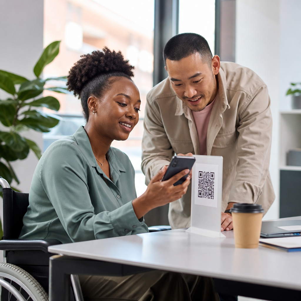
Inclusive QR code experiences start with a simple truth: a scannable square is only useful when every intended user can notice it, understand it, and complete the next step without avoidable friction. In mobile QR code design and UX, accessibility considerations cover the full journey, from visual discovery and camera scanning to landing page interaction, form completion, and confirmation. I have seen teams celebrate high scan rates while missing the fact that older users could not hold focus long enough, screen reader users landed on unlabeled buttons, and people with low vision were blocked by tiny quiet zones or weak contrast. An inclusive QR code experience reduces those failures by designing for diverse abilities, devices, environments, and connectivity conditions. It matters because QR codes now support menus, payments, tickets, onboarding, healthcare instructions, and public services. When the path breaks, users blame the brand, not the code. This hub explains the core principles, the technical standards that shape practical decisions, and the methods that consistently improve accessibility considerations across print, packaging, signage, and mobile flows.
Make the code itself perceivable and scannable
The first accessibility consideration is whether people can find and scan the QR code at all. Perceivability depends on size, contrast, placement, lighting, and surrounding context. In practice, I use a minimum print size based on scanning distance: roughly one inch for close range, then add about one tenth of an inch for every additional foot of distance. A poster viewed from six feet away needs a much larger code than a product label held in hand. Contrast should be strong, ideally dark modules on a light background, because inverted or decorative codes still fail in many real environments. Keep a clean quiet zone around the code, usually four modules wide, so camera software can separate the symbol from nearby graphics. Avoid glossy lamination when possible, since glare reduces scan reliability for users with tremor, low vision, or older phone cameras. Placement also matters. Codes mounted too high, too low, or on curved surfaces increase scanning difficulty. Always pair the code with a short text instruction and a visible fallback URL, because some users cannot scan even a technically correct symbol.
Design for motor, cognitive, and situational limitations
Accessibility considerations for QR codes are not only about disability categories; they also include temporary and situational limitations. A parent carrying a child, a commuter in bright sun, or a shopper with one hand occupied faces the same friction as many users with permanent impairments. Reduce that friction by limiting required precision. Put the QR code where a phone can be aligned without awkward wrist angles. Leave physical space in front of signage so wheelchair users and people using walkers can approach directly. If scanning triggers a timed task, such as coupon redemption or event check-in, provide generous timeouts and clear recovery steps. Cognitive load should be low. The instruction beside the code should answer three questions in plain language: what this is, what happens next, and whether an app is required. “Scan to view accessible menu in your browser” is better than “Tap into our digital dining experience.” Where security concerns exist, explain them simply, such as “Opens example.com.” Users who know the destination are more likely to trust the interaction and less likely to abandon it.
Build accessible destinations after the scan
A QR code can be perfectly scannable and still create an inaccessible experience if the landing page fails. The destination must work with screen readers, keyboard navigation, zoom, reduced motion preferences, and mobile assistive technologies such as VoiceOver and TalkBack. Follow established standards from the Web Content Accessibility Guidelines, especially around text alternatives, color contrast, focus order, form labels, and error identification. In my audits, the most common post-scan failure is a mobile page built as a visual campaign without semantic structure. A user scans a code on packaging, lands on a page with an autoplay video, and cannot find the ingredient details because headings, buttons, and landmarks are missing. A second common failure is relying on PDF documents that are not tagged for accessibility. If the code links to instructions, tickets, or menus, an accessible HTML page is usually the safest default. Keep page weight low for slow connections, and avoid forcing account creation for simple tasks. Inclusion improves completion rates because fewer users get stuck after the scan.
Provide clear alternatives and redundant paths
No matter how well designed the code is, some people will not be able to use it. Strong accessibility considerations always include alternatives that deliver the same outcome. The fallback URL should be short, readable, and easy to type. For phone-based services, add a phone number or SMS option when appropriate. In public spaces, near field communication, printed instructions, or staffed assistance can provide equivalent access. Redundancy is especially important in healthcare, transportation, government, and education, where the content may be essential rather than promotional. During a hospital wayfinding project I reviewed, the team initially used QR codes as the primary route to maps and appointment prep. We pushed for printed room directories, shortened URLs, and multilingual desk support because visitors included people with low digital confidence, limited data plans, and inaccessible older devices. The result was not just more equitable; it reduced congestion at reception. Equivalent access should not feel like a penalty path. The alternative needs to be as current, as complete, and as easy to use as the QR route.
Test across devices, environments, and assistive technology
Reliable inclusion comes from testing, not assumptions. QR code accessibility considerations should be validated at three levels: symbol performance, interaction flow, and destination accessibility. Symbol testing means trying multiple phone models, camera apps, and lighting conditions. Interaction testing means observing whether users can discover the code, interpret instructions, and recover from errors. Destination testing means checking browsers, orientation changes, text scaling, screen readers, external keyboards, and low bandwidth. I recommend combining lab checks with real-world walkthroughs because office lighting rarely exposes the problems you see on a bus shelter or laminated menu stand.
| Test area | What to verify | Useful tools or methods |
|---|---|---|
| Code visibility | Size, contrast, quiet zone, glare, placement, reachable viewing angle | Print proofs, field photos, distance testing |
| Scanning reliability | Fast detection on iPhone and Android, no app dependency, damaged print tolerance | Native camera apps, multiple generations of devices |
| Landing page access | Semantic headings, label clarity, zoom to 200 percent, readable focus states | VoiceOver, TalkBack, Axe, WAVE, Lighthouse |
| Task completion | Forms, payments, downloads, confirmations, timeout recovery | Moderated usability sessions, analytics funnels |
Use analytics carefully. Scan rate alone is incomplete. Compare scans to successful completions, form error rates, bounce rate, and support contacts. If a location shows healthy scans but weak completions, the accessibility issue may be on the destination rather than the code. If completions vary sharply by device type, test specific operating systems and browser combinations.
Address language, trust, and content structure
Accessibility considerations also include comprehension. Users need content in plain language, meaningful headings, and predictable structure. If the QR code appears in multilingual contexts, indicate available languages before the scan or immediately after arrival. Do not bury translation controls in a menu icon that screen reader users must hunt for. Trust signals matter as well because QR codes can feel opaque. Show the destination domain in print, use branded short links responsibly, and avoid unnecessary redirects that make users wonder whether they landed somewhere unsafe. For critical content, include publication dates, contact details, and version information. This is especially important when the QR code points to safety instructions, medication guidance, or policy updates. Structured content helps everyone. A restaurant menu page should separate starters, mains, allergens, and prices with clear headings, not present one endless scroll of stylized cards. A product setup page should lead with the primary task, list tools needed, then offer troubleshooting. When the information architecture is clean, assistive technology users move faster and sighted users make fewer mistakes.
Plan governance for long-term accessibility
The most overlooked accessibility considerations are operational. QR codes often outlive the campaign or staff team that launched them. If ownership is unclear, links break, landing pages drift, and accessible alternatives disappear. Governance should define who approves print specifications, who maintains destination content, how redirects are updated, and when audits occur. Dynamic QR codes can help because the destination can be changed without reprinting, but they also introduce risk if redirects are managed carelessly. Maintain an inventory with code location, purpose, target URL, fallback path, language variants, and review date. Treat major QR deployments like any other customer-facing product touchpoint, with change control and regression testing. Staff training matters too. Designers should know minimum size and contrast rules. Content teams should understand heading hierarchy and link labeling. Field teams should know not to place stickers over quiet zones or move signs into inaccessible positions. Accessibility holds when the process supports it, not when one specialist catches problems at the end.
Inclusive QR code experiences succeed when every layer works together: the code is easy to notice and scan, the instruction is clear, the destination is accessible, and an alternative path exists when scanning fails. Accessibility considerations are therefore not a final checklist item; they are a design and governance discipline across print, mobile, content, and support operations. Teams that apply these practices reduce abandonment, improve trust, and serve more people in more contexts. As this hub for accessibility considerations within mobile QR code design and UX, the main lesson is straightforward: design for variability from the start, then verify with real users and real environments. Review your current QR touchpoints, document failure points, and prioritize the fixes that remove the biggest barriers first.
Frequently Asked Questions
What makes a QR code experience truly inclusive?
A truly inclusive QR code experience works for people with different visual, motor, cognitive, and situational needs from the moment they first encounter the code to the moment they finish the task. That means inclusion is not limited to whether a phone camera can technically scan the code. The placement of the QR code, the surrounding instructions, the contrast, the lighting conditions, the size of the code, the distance from the user, and the clarity of the next step all matter. If someone can see the code but cannot understand why they should scan it, or if they can scan it but the landing page is hard to read, the experience is not inclusive.
In practice, inclusive design means reducing friction at every stage. Users should be able to notice the QR code easily, know what it does before scanning, and access a landing page that is readable, keyboard-friendly, mobile-friendly, and compatible with assistive technologies. Forms should have clear labels, large tap targets, plain language, and error messages that explain how to recover. Confirmation pages should tell users exactly what happened next. Inclusive QR experiences also account for real-world conditions, such as shaky hands, poor connectivity, screen glare, low digital confidence, and older devices. The best standard is simple: if your intended audience can reliably discover, scan, understand, and complete the destination task without unnecessary difficulty, your QR experience is moving in the right direction.
How can I make a QR code easier for more people to find and scan?
Start with physical and visual usability. A QR code should be large enough for the expected scanning distance, printed clearly, and placed where users do not need to bend awkwardly, reach too high, or stand in unsafe or crowded positions. Strong contrast between the code and its background is essential, and decorative styling should never reduce scan reliability. Avoid placing codes on reflective surfaces, curved packaging, moving displays, or areas with poor lighting. Quiet zones around the code should remain clear so cameras can detect it more consistently. In many environments, a clean black-and-white or dark-on-light presentation still performs best.
Equally important are the instructions around the code. Many users still benefit from a simple prompt such as “Scan to view the menu,” “Scan to check in,” or “Scan to pay securely.” This reduces uncertainty and helps users decide whether the interaction is relevant. If a step is time-sensitive or requires preparation, say so upfront. You should also provide a visible alternative, such as a short URL, NFC option, printed instructions, or staffed assistance, because some users may not be able to scan the code at all. Testing matters here: check scan performance across different phones, camera qualities, lighting conditions, and hand steadiness levels. What scans quickly for a designer using a new device may be frustrating for an older user trying to hold focus long enough to complete the action.
What should happen after the scan to keep the experience accessible?
The landing experience should be fast, simple, and designed for mobile use first. After a scan, users should arrive on a page that loads quickly on both strong and weak connections, uses readable text sizes, supports zoom, and avoids layout shifts that make interaction harder. Headings should be clear, content should be structured logically, and buttons should be large enough to tap accurately. If the purpose of the QR code was advertised before the scan, the first screen should immediately confirm that the user is in the right place. This builds trust and reduces cognitive load.
Accessibility on the destination page should follow established best practices. Use semantic HTML, sufficient color contrast, descriptive link text, and form labels that are properly associated with fields. Avoid relying on color alone to communicate status or errors. If there is a form, keep it short, explain why each piece of information is needed, and support autofill where possible. Error messages should be specific and easy to fix, not vague warnings that leave users guessing. Screen reader compatibility, keyboard navigation, and orientation flexibility are all important, especially because some users may use assistive technologies or alternative input methods on mobile devices. Inclusive QR design succeeds when the scan is only the beginning of a well-considered accessible journey, not the only part the team optimized.
How do I design QR code experiences that work better for older adults and users with low digital confidence?
Designing for older adults and less confident mobile users often improves the experience for everyone. Begin by removing assumptions. Do not assume users know where to point their camera, how long to hold it steady, or what will happen after scanning. Clear printed instructions help, especially when they explain the value of the scan in plain language. Use large type near the code, strong contrast, and uncluttered layouts so the QR code and its purpose are immediately understandable. Avoid tiny codes, glossy materials, and placement that requires precise positioning. If scanning takes more than a moment under normal conditions, many users will assume they are doing it wrong.
Once users arrive on the destination page, simplify the path forward. Keep the number of choices limited, write in plain language, and use familiar interface patterns. Ask only for essential information, and do not overload the page with promotions, pop-ups, or multiple competing calls to action. For important tasks such as registration, payment, or check-in, provide reassurance about security and privacy in concise terms. Confirmation screens should be obvious and specific, so users know they have completed the process correctly. Most importantly, always offer a backup path, such as a short web address, phone number, in-person help, or printed option. Inclusive QR strategy acknowledges that some users can complete the task independently with a little support, while others may need an alternative that avoids scanning entirely.
How should I test and measure whether a QR code experience is inclusive?
Inclusive testing goes beyond asking whether the code scans on a few popular phones. You need to evaluate the entire interaction across diverse users, devices, environments, and abilities. Test the code in realistic conditions: different lighting, various print sizes, multiple distances, shaky hands, older camera hardware, slower mobile networks, and busy public spaces. Observe whether people can discover the code easily, understand its purpose before scanning, and complete the intended action without confusion. Include users with accessibility needs when possible, and review both the physical QR presentation and the digital destination for issues related to readability, navigation, forms, and confirmation.
Measurement should also go deeper than scan rate alone. High scans do not prove success if users abandon the page, fail to submit the form, or need assistance to finish. Track metrics such as landing page load time, completion rate, field error rate, time to task completion, bounce rate, and drop-off points within the flow. Compare performance across device types and contexts, and look for signs that some groups face more friction than others. Qualitative feedback is just as valuable as analytics: ask users what felt confusing, tiring, or unclear. A strong inclusive QR program treats accessibility findings as product insights, not edge cases. The goal is not just to get more scans, but to ensure more people can successfully complete the experience with confidence and dignity.





