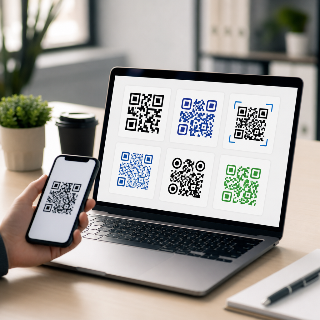
QR code size guidelines for print and digital determine whether a code scans instantly or fails at the exact moment a customer wants information. In practical terms, size means the physical dimensions of the symbol, the module size of each tiny square, and the surrounding quiet zone that scanners use to detect boundaries. In years of producing QR assets for packaging, posters, menus, direct mail, landing pages, and event signage, I have seen beautifully branded codes underperform simply because they were too small, too dense, or placed in poor lighting conditions. Good design starts with function: a QR code is successful only when an average phone camera can recognize it quickly from a realistic distance and angle.
This matters because scan friction directly affects campaign results. A code on a business card has seconds to work. A code on a store window must survive glare, weather, and varying phone models. A code inside an email or app needs to display crisply on high-density screens without forcing awkward zooming. The right size is not one universal number; it depends on scan distance, data density, error correction level, contrast, substrate, and the context in which people encounter it. If you are creating mobile QR codes, this hub on designing effective QR codes gives the core standards you should apply before diving into related topics such as QR code placement, color choices, testing protocols, or dynamic code analytics.
The baseline rule used across print production is simple: the minimum scanning distance should be about ten times the width of the code. A 2-centimeter code is meant for roughly 20 centimeters of scanning distance. That rule is useful, but it is not enough on its own. Real-world performance improves when you also keep a quiet zone of at least four modules on every side, maintain strong contrast between dark modules and a light background, and avoid loading too much data into the symbol. A short dynamic URL typically produces a less complex code than a long static URL, allowing larger modules and more reliable scans at smaller physical sizes. Those fundamentals apply whether the code appears on a flyer, kiosk, product label, presentation slide, or smartphone screen.
Core QR code size rules every designer should use
The first guideline is to think in modules, not just inches or pixels. Every QR code is a grid of modules, and scanner reliability depends on each module being large enough to resolve clean edges. A tiny code can still scan if it contains little data and prints sharply; a larger code can fail if a logo covers too much of the pattern or if the quiet zone is trimmed away. I usually start with the destination and data strategy first. When I switch a static destination URL to a dynamic short link, I often reduce symbol complexity dramatically, which creates more forgiving module sizes without enlarging the overall code.
For print, 0.8 x 0.8 inches is a common practical minimum for short URLs viewed at close range, but I rarely recommend going below 1 x 1 inch for customer-facing materials. On packaging, 0.5 inch sometimes works in controlled conditions, yet printing tolerances, curved surfaces, varnishes, and consumer phone quality introduce enough risk that larger is safer. For posters, window clings, and signs viewed from several feet away, 1.5 to 3 inches is usually more realistic. For billboards or transit placements, the code may need to be several inches or even feet wide, depending on how close people can physically get. The correct answer always combines distance, data complexity, and material constraints.
Error correction also changes size requirements. QR codes support four standard levels: L, M, Q, and H. Higher levels allow more damage or obstruction to be corrected, but they also increase symbol density because more redundancy is encoded. That means a highly branded QR code with a logo in the center and H-level correction often needs a larger overall size than a plain black-and-white code using M-level correction. The tradeoff is worth understanding. More correction can help when codes may be scratched, folded, or partially covered, but raising error correction is not a substitute for proper sizing, contrast, and testing.
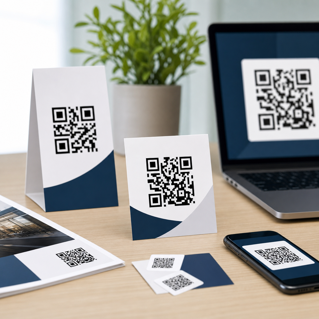
Recommended sizes for common print formats
Print environments vary more than many teams expect, so size recommendations should be tied to use cases rather than abstract standards. The table below summarizes dimensions I use as starting points before live testing on target devices. These are conservative recommendations intended to improve first-scan success rates, not absolute minimums under perfect conditions.
| Format | Typical Viewing Distance | Recommended QR Size | Notes |
|---|---|---|---|
| Business card | 6 to 12 inches | 1.0 x 1.0 inch | Use dynamic URL; avoid crowding near edges or trim lines |
| Flyer or brochure | 8 to 24 inches | 1.0 to 1.25 inches | Maintain high contrast and at least 4-module quiet zone |
| Product packaging | 6 to 18 inches | 0.8 to 1.25 inches | Increase size on curved, textured, or glossy surfaces |
| Poster | 1 to 4 feet | 1.5 to 3 inches | Account for glare, lighting, and walking speed |
| Storefront sign | 2 to 6 feet | 2 to 4 inches | Test through glass and in daylight reflections |
| Trade show banner | 3 to 8 feet | 3 to 5 inches | Make destination obvious with a clear call to action |
These sizes assume a short destination and clean production. If your print provider uses low-resolution output, dot gain on uncoated stock, or heavy lamination, increase size. The same applies when adding a logo, custom eyes, or nonstandard colors. In prepress, I always inspect the code in vector format when possible, confirm the quiet zone survives layout export, and check proofs at actual size. A code that looks sharp on a designer’s monitor can soften enough in print to hurt scan speed. That difference is especially noticeable on labels, corrugated packaging, and small-format promotional items.
Screen size guidelines for websites, apps, and presentations
Digital QR code sizing is less about inches and more about displayed pixel dimensions, screen density, and viewing context. On a web page meant to be scanned from a laptop by a phone, 160 to 256 pixels square is usually a workable minimum for simple codes, while 256 to 320 pixels gives more comfort. In apps or mobile wallets, the code may be shown to a scanner rather than scanned by the same device, so display brightness, anti-aliasing, and edge clarity matter. For conference slides or webinar screenshares, tiny embedded codes are a frequent mistake. If attendees are expected to scan from the audience or from another monitor, the code must be large enough relative to the full canvas, often occupying a meaningful portion of the slide.
Responsive design introduces another issue: CSS can shrink a QR image below its usable threshold on smaller breakpoints. I recommend setting a minimum rendered size and using SVG whenever possible for websites because it scales cleanly without raster blur. PNG still works well if exported at sufficient resolution, but avoid screenshotting codes from generators and dropping them into layouts. That often creates soft edges, mismatched color profiles, and hidden compression artifacts. On OLED screens, dark mode interfaces can also reduce contrast if the code is placed over tinted backgrounds. Keep the code itself high contrast even if the surrounding design is stylized.
One practical warning: avoid asking users to scan a QR code on the same device they are already using unless there is a clear handoff flow. If the user is reading an email on a phone, a QR code in that email is inconvenient because the same phone cannot easily scan itself. In those cases, include a tappable link and reserve the QR for desktop viewers. That is part of designing effective QR codes: not just making the symbol scan, but matching the delivery method to human behavior.
Design factors that change the minimum workable size
Several design decisions can force a larger QR code even when the target distance stays the same. The biggest factor is encoded data volume. A vCard, Wi-Fi credential set, or long URL generates a denser matrix than a short dynamic link, so modules become smaller at the same overall size. Dense codes are harder to scan under motion blur, poor light, or lower-end cameras. Whenever campaign flexibility allows, encode a short redirect URL and manage the destination server-side. That improves scan reliability and lets you update the target later without reprinting assets.
Contrast comes next. Standard guidance from major platform documentation and generator tools aligns on dark modules over a light background, with the highest reliability coming from near-black on white. Reversed codes, gradients, metallic inks, and patterned backgrounds can work, but they reduce tolerance. I have seen gold foil codes that passed studio tests and failed on store shelves because overhead lighting destroyed edge definition. If brand colors are nonnegotiable, increase the code size, keep the background plain, and test under the exact lighting where people will scan.
Material and placement also matter. Curved bottles, flexible pouches, textured paper, window glass, and fabric banners all introduce distortion or reflection. So do creases, seams, and transparent overlays. Never place a QR code across a fold, perforation, zipper seal, or rounded corner. Keep it away from busy visual elements so the quiet zone remains visually clean. If a code is meant to be scanned while a person is walking or standing in a queue, enlarge it beyond theoretical minimums because real users do not hold cameras perfectly still.
Testing methods that prevent scan failures
The most reliable QR code size guideline is validated testing, not guesswork. My standard process is straightforward: generate the final code, export it in production format, print or display it at actual size, then test on multiple devices and camera apps. At a minimum, use recent iPhone and Android models, plus one older midrange phone with a weaker camera. Test under bright light, dim light, and common glare conditions. Move through realistic scan distances rather than only trying from the perfect spot. Measure not only whether it scans, but how long it takes to lock.
For print campaigns, I also test after finishing effects are applied. Matte lamination may behave differently from gloss; curved packaging differs from a flat proof; a storefront decal behind glass can pick up reflections that never appear indoors. Analytics from dynamic QR platforms such as Bitly, QR Code Generator PRO, Beaconstac, or Scanova can reveal location and device patterns after launch, but analytics cannot rescue a code that is physically hard to scan. Build testing into approval workflows and treat scan speed as a quality benchmark, not an afterthought.
Strong QR code design is a systems decision, not a decoration choice. Use the ten-to-one distance rule as a starting framework, but size up when data is dense, branding is heavy, materials are reflective, or the audience will scan in motion. For print, 1 inch square is a dependable floor for close-range consumer use, while posters and signs usually need substantially more space. For digital, protect minimum rendered pixel size, preserve contrast, and use SVG or high-resolution assets. Most important, shorten the payload with dynamic URLs and test in real conditions before release.
If you are building a complete creating mobile QR codes workflow, use this hub as the foundation for every related design decision: placement, color, branding, file format, and analytics all depend on getting size right first. A well-sized code removes friction, improves scan rates, and protects campaign ROI across print and digital touchpoints. Review your current QR assets, compare them against these guidelines, and run live scan tests this week.
Frequently Asked Questions
What is the minimum QR code size for print materials?
There is no single universal minimum that works for every print use case, but a reliable starting point is to size the QR code based on expected scanning distance. A widely used rule is that the scanning distance should be about 10 times the width of the code. In simple terms, if someone will scan from 10 inches away, the code should be about 1 inch wide. For close-range applications such as product packaging, business cards, menus, labels, or direct mail, many well-produced QR codes perform well at around 0.8 to 1 inch square, provided the print quality is sharp, the contrast is high, and the quiet zone is preserved. As the intended scanning distance increases, the code should scale up accordingly. Posters, window signs, and event graphics typically need much larger sizes because people scan them from several feet away rather than at arm’s length.
It is also important to understand that physical size alone does not determine scan performance. The module size, meaning the size of each individual square in the QR code, matters just as much. If the code contains a long URL or dense encoded data, the number of modules increases, and each module becomes smaller unless the overall code size is enlarged. That is why a 1-inch code can work perfectly in one campaign and fail in another. The more complex the code, the more space it needs. For print, a practical best practice is to test the final exported file at actual production size on the real material before approving it. What looks acceptable on a screen can become too dense after printing on textured paper, corrugated packaging, glossy labels, or low-resolution signage.
How large should a QR code be for posters, signs, and other long-distance scanning situations?
For posters, storefront displays, trade show graphics, transit ads, and event signage, the QR code should be sized according to realistic viewer distance, not just available design space. The common 10-to-1 guideline is especially useful here: if the audience will scan from 5 feet away, the code should be roughly 6 inches wide; if the scan point is closer to 10 feet, the code may need to be around 12 inches wide or more. These are not rigid formulas, but they are dependable planning benchmarks. In public environments, people rarely stand perfectly still with ideal lighting and camera alignment, so giving the code extra size usually improves performance.
Distance is only part of the equation. Environmental conditions can make long-range scans harder, including glare from glass, harsh sunlight, dim venue lighting, motion, angled viewing positions, and lower-quality phone cameras. In those cases, increasing the code size beyond the minimum is a smart choice. You should also keep the design simple, use strong contrast, and avoid placing the QR code in cluttered layouts where surrounding text, patterns, or images compete with edge detection. For signs and displays, the quiet zone becomes especially important because scanners rely on that empty margin to separate the code from the rest of the artwork. If you are designing for public traffic, one of the safest approaches is to prototype at final size, install it in a comparable setting, and test with multiple phone models from the actual expected distance.
Why do module size and quiet zone matter as much as the overall QR code dimensions?
When people talk about QR code size, they often focus only on the outer dimensions, but scan reliability depends heavily on the internal structure of the code. Module size refers to the dimensions of each tiny square that makes up the symbol. If those modules become too small, cameras struggle to distinguish one square from another, especially in poor lighting, on curved surfaces, or when the print is slightly soft. A larger overall QR code does not automatically solve the problem if the file itself is overly dense due to long data strings, excessive error correction, or unnecessary complexity. In practical production terms, you want each module to remain large and crisp enough to reproduce cleanly in the final medium.
The quiet zone is the blank space around the QR code, and it is essential for scanner recognition. Standard guidance is to maintain a quiet zone at least four modules wide on all sides. If this margin is cropped, crowded by text, boxed into decorative shapes, or placed over a busy background, many phones will struggle to detect where the code begins and ends. This is one of the most common reasons beautifully branded QR codes underperform in print and digital layouts. Designers often shrink the quiet zone to make a composition look tighter, but that small visual compromise can produce a major functional failure. The safest approach is to treat the quiet zone as part of the code itself, not as optional whitespace. If you preserve clear margins and maintain healthy module size, you dramatically improve scan consistency across devices and environments.
Do QR code size guidelines differ between print and digital screens?
Yes, they do, because digital display introduces variables that print does not. On screens, the QR code must still be large enough to scan comfortably, but pixel rendering, screen brightness, compression, scaling behavior, and responsive layouts all affect readability. A code that looks sharp on a desktop monitor can become too small or too dense on a mobile screen, especially if it appears inside a banner, pop-up, email, or social graphic. For digital use, the goal is not just absolute size but usable on-screen presence. The code should occupy enough space that its modules remain distinct after scaling and platform compression. It should also have strong contrast against the background and sufficient clear space around it.
Context matters a lot in digital environments. If a QR code is displayed on a presentation slide viewed from the back of a room, it needs to follow the same distance-based thinking used for physical signage. If it appears on a landing page, users may be viewing it on a laptop from close range, but they also might need to scan it with a separate device. In mobile contexts, showing a QR code to someone already using their phone can be impractical unless they are expected to scan it with another device. For digital ads, event screens, or kiosks, motion and transition timing also matter; people need enough time to notice, frame, and scan the code. A best practice is to export the code as a crisp vector or high-resolution asset where possible, avoid screenshots or low-quality raster files, and test the code on the actual screens and platforms where it will appear.
What are the most common QR code sizing mistakes that cause scanning failures?
The most common mistake is making the code too small for the intended scanning distance. This happens constantly in packaging, posters, and promotional layouts where visual balance is prioritized over usability. A second major issue is creating a code that is physically large enough but too dense internally because it encodes a long URL, multiple parameters, or unnecessary data. In that case, the modules become tiny and harder to reproduce or detect. Another frequent problem is reducing or eliminating the quiet zone to fit the code into tight designs. Even a technically correct QR code can fail if scanners cannot isolate it from nearby colors, text, borders, or images.
Other mistakes include using low contrast color combinations, placing the code on reflective or textured surfaces, exporting at low resolution, stretching the code disproportionately, or adding logos and decorative elements too aggressively. Print production can introduce additional risk through dot gain, ink spread, poor registration, or substrate texture, all of which can blur module edges. On digital screens, platform compression and responsive resizing can reduce clarity without the designer noticing. The most reliable way to avoid these failures is to treat QR code sizing as a performance decision rather than a decorative one. Keep the encoded data short when possible, preserve the quiet zone, ensure each module remains adequately sized, match the overall dimensions to real scanning distance, and always test in the final environment. A QR code succeeds when it scans instantly with minimal effort, and that usually comes from disciplined sizing choices made early in the design process.