
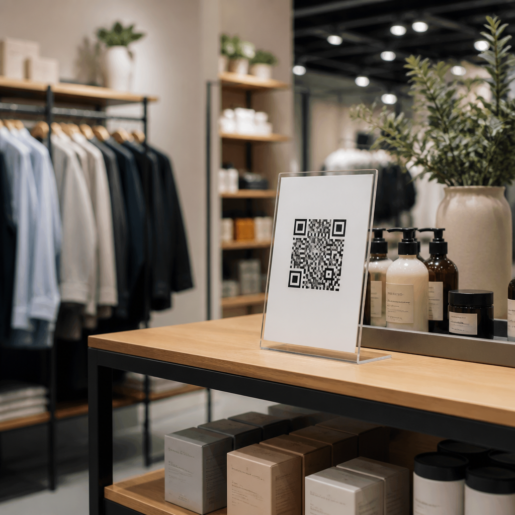
QR code placement for retail displays determines whether a shopper notices the code, understands its purpose, and scans it without friction. In stores, a QR code is not just a graphic; it is a bridge between physical merchandising and mobile action. Placement strategies define where that bridge appears, how quickly it is recognized, and whether the shopper feels enough value to take out a phone. I have tested QR programs on shelf talkers, endcaps, fitting-room signage, window clings, and point-of-sale displays, and the difference between strong placement and weak placement is measurable in scan rate, dwell time, and conversion.
A retail display is any customer-facing physical presentation used to influence attention and purchase behavior, including shelves, dump bins, countertop units, mannequins, posters, and temporary promotional fixtures. QR code placement means positioning the code at the right height, angle, distance, and visual context so it can be scanned comfortably under real store conditions. That includes practical factors such as line of sight, glare from lighting, shopper traffic flow, competing signage, and the size of the mobile camera preview on common smartphones. Good placement is not decoration. It is a usability decision tied to shopper intent.
This topic matters because shoppers move quickly, often with one hand occupied, under inconsistent lighting, and with limited patience. If the code is too low, too high, too small, curved around packaging, or separated from the call to action, performance drops. If it is placed where interest naturally peaks, such as next to price, benefits, reviews, tutorials, or inventory information, scans rise because the value exchange is immediate. Retailers also rely on QR codes for product education, loyalty enrollment, app downloads, coupon redemption, contactless payment, and post-purchase support. Each use case changes the ideal placement strategy.
Core Principles of QR Code Placement Strategies
The best QR code placement strategies start with one rule: place the code where the customer makes the related decision. If the scan reveals nutritional information, put it near the product facts area on a shelf blade or wobble sign. If the scan launches a virtual try-on or size guide, place it at the fitting room entrance and on apparel displays where comparison happens. If the code unlocks a coupon, position it before the shopper reaches checkout, not after the product is already in the basket. Relevance beats visibility alone.
Physical ergonomics matter just as much as marketing relevance. In most retail environments, the easiest scan zone sits roughly between chest and eye level for standing adults, with the code facing forward on a flat surface. Angled displays can still work, but extreme tilt, reflective lamination, and curved acrylic holders introduce scan errors. I have seen strong creative fail because spotlights created glare over a glossy sign. Matte print finishes, consistent contrast, and a quiet area around the code improve detection for iPhone and Android camera apps as well as embedded scanners in retailer apps.
Distance must match code size. A useful rule in stores is that larger viewing distance requires proportionally larger codes, especially when shoppers are expected to scan without stepping closer. Small shelf labels can support scans from short range, while aisle signs, endcaps, and windows need larger symbols with stronger contrast. Placement also has to account for congestion. A perfect code hidden behind a queue, cart corral, or swinging door is functionally invisible. The winning strategy combines line of sight, easy reach, and immediate informational payoff.
Where QR Codes Work Best Across Retail Display Types
Different fixtures create different placement opportunities. On shelf displays, QR codes perform best near the product block and price communication, where shoppers already pause to compare. Shelf talkers and blade signs can carry educational scans for ingredients, compatibility, how-to videos, or reviews. On endcaps, placement should sit in the shopper’s primary sightline as they approach the display head-on. Endcaps often support seasonal or promotional storytelling, so QR codes there work well for bundles, recipes, demos, or limited-time offers connected to the featured assortment.
Countertop and point-of-sale displays are effective when the scan complements waiting time. Loyalty sign-up, digital receipts, financing applications, and app download prompts fit naturally here because customers are stationary. Window displays are different. They must be scannable from outside, often through changing daylight and reflection. That means larger code sizes, fewer competing messages, and placement that does not force pedestrians to stop in an awkward traffic path. Apparel stores can place QR codes on mannequins, size charts, or feature cards, but the code should remain on a flat tag or sign rather than on fabric folds that break readability.
Temporary displays require extra discipline because assembly errors are common. Pop-up signage, floor stands, and corrugated displays can warp, bow, or be installed at inconsistent heights across locations. For chain retail, placement guidelines should specify exact position from floor level, minimum printed dimensions, approved materials, and the call-to-action text nearest the code. That consistency improves execution and makes performance data comparable from store to store.
| Display type | Best placement zone | Typical QR purpose | Main risk |
|---|---|---|---|
| Shelf talker | Next to price or key benefit | Specs, reviews, coupons | Too small for scan distance |
| Endcap | Front-facing center panel | Bundles, recipes, demos | Visual clutter from promo copy |
| Counter display | Cardholder or payment area | Loyalty, app, receipts | Blocked by staff or terminals |
| Window sign | Lower-middle exterior sightline | Store info, offers, catalog | Glare and pedestrian flow |
| Fitting room sign | Mirror-side or door panel | Size guide, styling help | Poor lighting or privacy concerns |
Optimizing Placement for Shopper Behavior and Mobile UX
Shoppers do not scan because a code exists; they scan because placement aligns with motivation. In grocery, the trigger is often reassurance: ingredients, allergens, sourcing, or recipes. In beauty, it may be shade matching, tutorials, or before-and-after proof. In electronics, shoppers want compatibility, feature comparison, warranty details, or live inventory. Placement should follow that decision path. Put reassurance content where hesitation happens. Put inspiration content where discovery happens. Put service content where commitment happens. This is the practical foundation of mobile QR code design and UX in stores.
Instructions must sit immediately beside the code. “Scan for reviews,” “Scan for assembly video,” or “Scan for today’s offer” tells the shopper why the action is worthwhile. Generic language such as “Learn more” underperforms because it hides the payoff. The landing destination also affects placement choices. If the experience takes more than a few seconds to load or demands form entry, use placements where customers have time, such as fitting rooms, waiting zones, or service counters. Fast actions, including product pages or coupon reveals, belong in high-traffic merchandising areas.
Accessibility matters. Codes placed too low exclude people with limited mobility and become difficult for anyone using a larger phone. Codes placed above average eye level force awkward wrist angles and unstable framing. Multilingual stores should pair QR calls to action with clear iconography and concise translated support. Retailers should also test placement under actual store Wi-Fi and cellular conditions. A scan that works in a conference room can fail on a lower level with weak signal, making a good placement strategy look bad when the real problem is connectivity.
Testing, Measurement, and Governance Across Stores
Retailers should treat QR code placement as a testable variable, not a one-time design choice. The cleanest method is to vary one factor at a time: height, adjacent copy, sign format, or exact fixture position. Dynamic QR platforms such as Bitly, Flowcode, QR Code Generator Pro, and Adobe Express workflows can support campaign-specific destinations and analytics, while Google Analytics with UTM parameters helps connect scans to downstream behavior. Scan volume alone is not enough. The real indicators are qualified visits, engagement time, add-to-cart actions, coupon redemption, and store-level sales lift where measurable.
Operational governance prevents slow decay. Stores routinely move signs, replace damaged fixtures, and improvise around local conditions. A QR code strategy needs a field-ready placement standard with photo examples, approved dimensions, contrast rules, mounting guidance, and maintenance checks. Teams should inspect for fading, peeling corners, cracked holders, and seasonal lighting changes that introduce glare. For regulated categories such as alcohol, supplements, or financial promotions, legal review must confirm that required disclosures remain clear and proximate to the code-driven claim.
Finally, hub-level planning connects this topic to the wider mobile experience. Placement strategy works only when code design, landing page speed, analytics, and content relevance are aligned. A well-placed code cannot rescue a confusing destination, and a strong mobile page cannot compensate for a code hidden at ankle height. When retailers build standards across display type, shopper intent, accessibility, and measurement, QR codes become a dependable merchandising tool rather than a novelty. Audit your current displays, document where scans happen, and refine placement based on real shopper behavior.
Frequently Asked Questions
Where should a QR code be placed on a retail display for the highest scan rate?
The best placement is usually where the shopper naturally pauses and already has visual attention. In most retail environments, that means around chest to eye level, on a surface that faces the primary walking path, and close to the product or message the code supports. A QR code on a shelf talker, endcap sign, fitting-room placard, window cling, or point-of-purchase display performs best when it feels integrated into the shopper journey rather than added as an afterthought. If customers need to bend down, reach around merchandise, or step into traffic to scan, response rates tend to drop quickly.
In practical terms, strong placement often comes down to visibility, approach angle, and decision timing. A code should appear at the moment a customer is asking a relevant question: “Is this available in another size?” “How does this work?” “Is there a promotion?” “Can I see reviews?” For example, on an endcap, the code should sit near the main product claim or callout, not buried in the lower corner. On shelf signage, it should be near the price or product benefit area where the eye already lands. In fitting rooms, it should be positioned where people wait or evaluate items, not where it gets hidden behind a door swing or clothing hook.
Distance also matters. The shopper should be able to scan comfortably from a normal standing position without crowding the display. If a code is too small, too low, or placed behind glossy plastic, the scan experience becomes frustrating. The highest-performing placements usually combine clear line of sight, enough white space around the code, and a concise prompt that explains why scanning is worth it. Placement is not just about being seen; it is about being seen at the right moment, in the right orientation, with the right incentive to act.
What height and size work best for QR codes on shelf talkers, endcaps, and other in-store signage?
There is no universal measurement that works for every store format, but the rule is simple: the code must be easy to notice, easy to frame with a phone camera, and easy to scan from the shopper’s expected distance. For most retail displays, placing the code roughly between waist and eye level gives the most reliable results because it aligns with how customers browse without forcing awkward body movement. Shelf talkers may need lower placement by necessity, but even then, the code should remain as accessible as possible and not be blocked by products, rails, baskets, or promotional tags.
Size should match scanning distance. A code viewed from a few inches away can be smaller, while one intended to be scanned from a couple of feet away needs more print area. On small shelf signage, the code still needs enough space to render clearly and preserve a clean quiet zone around the edges. On larger endcaps, freestanding signs, or window graphics, increasing the size improves recognition and reduces scan hesitation. It is common for brands to make the code technically scannable but visually too insignificant to command action. If the shopper has to “hunt” for the code, placement and sizing are already working against performance.
Testing in the actual store is essential because lighting, glare, store traffic, and fixture geometry all affect usability. A code that looks fine on a design proof may fail on a reflective sign holder or a curved display surface. The most effective retail teams print samples, place them in real conditions, and test scanability from multiple angles and phone models. A well-sized code at the wrong height under poor lighting will underperform, just as a perfectly placed code that is too small will. Height and size should be treated as part of one system: how quickly the customer notices the code, understands its value, and scans without friction.
How do you make a shopper understand why they should scan a QR code on a retail display?
A QR code should never appear without context. Shoppers are far more likely to scan when the value is immediate, obvious, and relevant to the product in front of them. That means placement must be paired with a direct call to action such as “See product reviews,” “Unlock today’s offer,” “Check available sizes,” “Watch how it works,” or “Browse colors not on shelf.” The message should answer the shopper’s silent question: “What do I get if I take out my phone right now?” Without that answer, even excellent placement can produce weak results.
The wording around the code matters as much as the location. A generic “Scan me” is rarely as effective as a specific benefit statement. On a shelf talker, the code might be next to a product comparison claim. On a window cling, it might invite passersby to browse featured collections before entering. In a fitting room, it might connect shoppers to alternate sizes, styling ideas, or loyalty rewards. In each case, the placement should support the task the customer is already trying to complete. When the code solves a real shopping need, scanning feels useful rather than promotional.
Design cues also help. Good retail displays frame the QR code with enough breathing room, directional hierarchy, and a short supporting line that reduces hesitation. If the display is visually crowded, the code disappears into the noise. If the purpose is unclear, trust drops. The strongest implementations treat the code as a service tool, not just a digital decoration. When customers can instantly see what action the code unlocks and why that action improves the shopping experience, scan rates typically rise. In-store QR success is driven by clarity of benefit just as much as physical placement.
What common QR code placement mistakes reduce engagement in retail environments?
The most common mistake is placing the code where it is technically present but functionally inconvenient. Codes get buried near the bottom of displays, tucked into corners, hidden by product inventory, placed on curved or glossy surfaces, or installed where customers cannot stop comfortably to scan. In busy stores, even small obstacles matter. If a shopper has to reposition their body, wait for foot traffic to clear, or deal with glare from overhead lights, many will simply move on. Friction is the enemy of retail QR performance.
Another frequent issue is poor alignment between placement and shopper intent. A code may be visible, but if it appears in a place where the shopper is not ready for that type of interaction, it underperforms. For instance, a code asking someone to “learn more” may not work well in a fast-moving aisle if the customer is in grab-and-go mode. The same code may perform better in a fitting room, on an endcap for a featured product, or at a point-of-purchase display where the shopper is already considering a decision. Good placement depends on timing as much as location.
Retailers also lose engagement when they separate the code from the message it supports. If the promotion is at the top of the sign and the code is far below, the visual connection weakens. If there is no explanation, shoppers may distrust the destination or assume the effort is not worthwhile. Small code size, low contrast, cluttered backgrounds, insufficient white space, and placement behind reflective acrylic all contribute to poor usability. The best way to avoid these mistakes is to walk the floor like a customer, test with multiple devices, and observe whether people can notice, understand, and scan the code in one smooth sequence.
How should QR code placement differ between window clings, fitting rooms, endcaps, and point-of-purchase displays?
Each retail zone has a different shopper mindset, so placement should adapt to context instead of following a single template. Window clings serve customers before they enter, which means the QR code should be visible from outside, readable through reflections, and paired with a fast, high-value message such as store hours, featured promotions, new arrivals, or buy-online options. Because the shopper is often standing or walking on a sidewalk or in a mall corridor, the code needs to be positioned where it can be scanned without awkward angles and without being blocked by door frames, handles, or competing decals.
Fitting rooms are a different environment entirely. Shoppers are in evaluation mode, often asking whether a piece fits, whether another size is available, or how to style an item. QR codes in this area work best when placed near eye level on an interior sign or mirror-adjacent surface, where they can connect users to size lookup, style recommendations, reviews, or associate assistance. The customer is stationary, so there is a real opportunity for deeper engagement, but only if the code is easy to notice and not hidden among store policy text or general signage.
Endcaps and point-of-purchase displays tend to capture attention closer to a buying decision, so the code should sit near the key selling claim, price feature, or promotional message. On endcaps, placement should support discovery and education. At point-of-purchase, placement should support action, such as joining a loyalty program, claiming an offer, or accessing care instructions and product details. In every case, the best placement reflects the shopper’s purpose in that zone. Window clings attract, fitting rooms assist, endcaps persuade, and checkout-area displays convert. Retail QR strategy improves dramatically when placement is matched to those distinct behavioral moments.





