
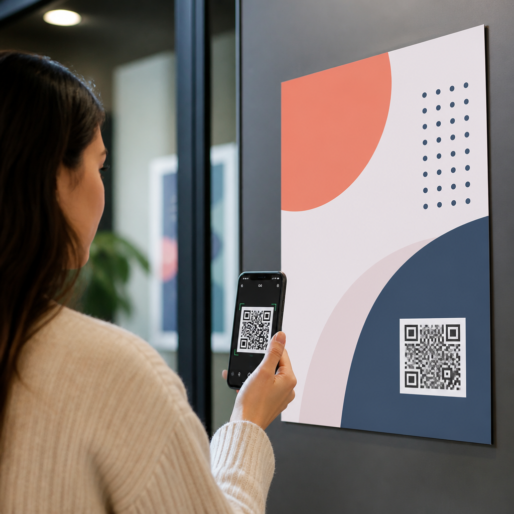
How to position QR codes on posters and flyers is not a minor layout choice; it directly affects scan rate, user trust, and campaign attribution. In print design, placement means the exact physical location of the code on the page, its surrounding white space, its relation to headlines and calls to action, and its visibility at the distance where people first notice the piece. I have tested QR placements on retail posters, event flyers, trade show signs, restaurant table tents, and transit ads, and the pattern is consistent: the same code can perform very differently depending on where it sits. A technically valid QR code is not automatically a usable one.
That matters because posters and flyers are consumed in motion. People glance while walking past a window, waiting in line, or sorting through handouts. They are deciding in seconds whether to scan. If the code is too low, hidden in visual clutter, or detached from a clear benefit, many people never attempt the action. If it is too high to frame comfortably, too close to a fold, or competing with dense copy, the scan feels awkward and conversion drops. Good QR code placement strategies reduce friction by matching the physical behavior of the viewer to the intent of the design.
The goal of this hub article is to explain where QR codes should go, why some positions outperform others, and how to adapt placement for size, environment, and campaign objective. You will see practical rules, common mistakes, and decision factors designers use in production. The core principle is simple: place the QR code where the eye naturally travels, where the phone can capture it easily, and where the value of scanning is instantly clear. When those three conditions align, posters and flyers stop treating the code as decoration and start using it as a conversion tool.
Start with the scanning context, not the layout grid
The best QR code placement strategy begins before software opens. Ask where the poster or flyer will be seen, from what distance, at what angle, and under what time pressure. A flyer handed out at a conference is usually read at arm’s length in good light. A poster in a storefront window may be viewed from six to ten feet away through reflections. A transit shelter ad may be noticed while people are moving. Those conditions determine practical placement more than aesthetic preference does.
For arm’s-length materials, I usually position the QR code in the lower right or lower center area, paired with a short action line such as “Scan for menu,” “Scan to register,” or “Scan for directions.” These zones work because readers often move through a page from headline to image to offer, then toward the lower portion for action. For wall posters, middle-right and lower-middle placements often scan more easily than top corners because users can raise a phone naturally without stretching or stepping backward. A code placed above average eye level may still be visible, but visibility is not the same as usability.
Context also affects whether one code should dominate or support. On a poster whose sole purpose is ticket sales, the QR code can be a primary action and placed prominently near the central message. On a flyer with several details, the code should support a specific task, such as downloading a schedule or claiming a coupon, and sit close to that task language. In both cases, the code should not float without explanation. People scan when they understand what happens next.
Use visual hierarchy to guide the eye toward the code
QR codes perform best when they are integrated into the page’s hierarchy. Hierarchy is the ordered path a viewer’s eye follows through headline, supporting message, image, proof, and action. If the code interrupts that path, it feels random. If it concludes that path, it feels like the obvious next step. On posters and flyers, the strongest placements sit after the persuasive content, not before it.
That means a QR code should usually appear near the call to action, not isolated in a decorative corner. If the headline promises “Get the full product catalog,” the code belongs directly beneath or beside that promise. If an event flyer says “Reserve your seat,” the code should sit within the same visual block as the reservation message. Proximity is critical because users mentally connect objects that are close together. Designers sometimes place the code at the bottom and the explanation several inches away; that separation weakens comprehension.
White space is equally important. Every QR code needs a quiet zone, the empty margin around the symbol required for reliable scanning under ISO/IEC 18004 specifications. In practice, I protect more white space than the minimum because posters are often viewed in imperfect lighting and at slight angles. A crowded border, photo edge, or text box too close to the modules can reduce readability. Strong hierarchy is not only about making the code noticeable; it is about making it clean enough to decode quickly.
Choose placement based on format, distance, and user intent
Different print formats reward different QR code positions. The table below summarizes the placement patterns that repeatedly perform well in real campaigns.
| Format | Best placement zone | Why it works | Typical use case |
|---|---|---|---|
| A5 or letter flyer | Lower right or lower center | Fits natural reading flow and leaves room for CTA copy | Menus, signup sheets, coupons |
| Portrait poster | Center-right to lower-middle | Easier phone framing than top corners | Events, retail promotions |
| Landscape poster | Right third near CTA | Balances image-heavy layouts and supports left-to-right scanning | Trade shows, product launches |
| Window poster | Below eye level, away from glare hotspots | Reduces reflections and awkward reach angles | Storefront offers, hours, ordering |
Distance changes size and placement together. A common rule used in signage is roughly one inch of QR code width for every ten feet of scanning distance, though testing should confirm it because camera quality and lighting vary. Placement should then support that size. A large code in the extreme bottom corner can still be awkward if pedestrians must crouch or if the poster sits behind a display object. Likewise, a perfectly centered code may fail if it is too small to acquire from the likely viewing distance.
User intent matters too. People scanning for immediate utility, such as a menu, Wi-Fi instructions, or payment link, tolerate a more prominent code because the task is obvious. People scanning for exploratory content, such as a brand story or campaign video, need stronger persuasion. In those cases, placing the code next to social proof, a benefit statement, or a time-sensitive offer improves action. Placement is not only physical; it is psychological positioning within the decision moment.
Avoid common placement mistakes that reduce scan rate
The most frequent mistake is placing the QR code where designers have leftover space instead of where users can comfortably act. Dead corners, narrow margins, and areas close to trim lines look neat on screen but become unreliable in print production and awkward in real life. A flyer may be cropped slightly by a printer, pinned under a clip, or curled in someone’s hand. A code needs breathing room from edges, folds, perforations, and fixtures.
Another mistake is placing the code over busy imagery or colored backgrounds with insufficient contrast. Dark modules on a light background remain the safest choice. Brand customization can work, but once logos, gradients, or reversed colors reduce contrast, scan performance can degrade, especially on older phones. I have also seen posters place codes behind glossy lamination hotspots or on glass where reflections wash out key finder patterns. Placement should account for material finish as much as page composition.
A third error is ignoring the call to action. “Scan me” is weaker than “Scan to see today’s pricing” because users want certainty. The placement should give that certainty immediately beside the code. Finally, avoid placing multiple QR codes on one small flyer unless each serves a distinct purpose and is clearly labeled. Too many options create hesitation, and users often abandon the scan entirely.
Test placement with analytics, prototypes, and field checks
Effective QR code placement strategies are validated, not guessed. Use dynamic QR codes from platforms such as Bitly, QR Code Generator Pro, Beaconstac, or Flowcode so you can change destinations and measure scans by date, device, and campaign. If two flyer versions are possible, test one with a lower-right code and another with a centered CTA block. Even simple A/B distribution across matched locations can reveal meaningful differences.
Print prototypes at full scale and test them with several phones, including older Android devices and iPhones with average camera performance. Check scans in daylight, indoor lighting, and from the real approach angle. I also recommend a five-second visibility test: place the poster where it will actually live, walk by, and ask whether the next step is obvious without reading every word. If the code does not feel like the natural action in that brief window, revise the placement or accompanying message.
After launch, compare scan data with placement conditions. A retail poster near an entrance may get many impressions but few scans because people are in motion; moving the same creative to a queue area can lift engagement. An event flyer might scan better when the code is brought closer to the registration deadline copy. Treat placement as part of conversion optimization, not a final decoration step. Review scan-through rate, landing page completion, and offline context together, then refine the next print run.
Strong QR code placement on posters and flyers comes down to usability. Put the code where people can see it quickly, frame it comfortably, and understand the benefit instantly. Align it with the page’s hierarchy, protect white space, account for glare and distance, and keep it close to a specific call to action. The highest-performing placements are rarely accidental; they are chosen for the real conditions of scanning.
As the hub for QR code placement strategies, this topic connects to related decisions about code size, contrast, CTA wording, print materials, and destination page design. Those elements work together, but placement is the bridge between noticing and acting. If your scans are lower than expected, audit the physical position before changing the offer or blaming the technology. Small layout shifts often produce measurable gains.
Use these guidelines on your next poster or flyer, then test in the field and track the results. Better placement makes every scan easier, and easier scans create better campaign performance.
Frequently Asked Questions
Where should a QR code be placed on a poster or flyer for the highest scan rate?
The best placement is usually where the viewer naturally looks after understanding the main message and seeing the call to action. In most poster and flyer layouts, that means placing the QR code in the lower half of the design, often near the bottom center or bottom right, with a short instruction nearby such as “Scan to book,” “Scan for menu,” or “Scan for event details.” This works because people typically read the headline first, then the supporting benefit, then look for the next step. If the code appears too early in the visual hierarchy, people may not yet know why they should scan it. If it appears too late or in a crowded corner, it may be ignored.
That said, the “best” position depends on viewing distance and context. On a retail poster in a window, the code should be visible from the point where foot traffic first notices the piece, not hidden in a low-contrast footer. On an event flyer handed out in person, the code can sit closer to the response section because the viewer is already holding the piece. On trade show signs and transit ads, placement needs to account for fast glances and awkward viewing angles, so the QR code should be easy to spot without forcing the user to hunt for it. In practice, high-performing placement balances visibility, intent, and usability: the code should feel like the natural next action, not a decorative afterthought.
How much white space should surround a QR code on printed materials?
A QR code needs generous clear space around it to scan reliably. This clear area, often called the quiet zone, should be free from text, images, borders, patterns, and background clutter. At minimum, the quiet zone should be at least four modules wide on all sides, but in real print design it is smart to give the code even more breathing room, especially on posters and flyers where lighting, print quality, and camera angles are unpredictable. The cleaner the surrounding area, the easier it is for a phone camera to distinguish the code from the rest of the design.
From a layout standpoint, white space also improves user trust and visual emphasis. A QR code crammed into a busy section of the page looks less intentional and may feel harder to scan. By contrast, a code with visible padding reads as a deliberate interactive element. This matters on restaurant table tents, retail signage, and promotional flyers where every second counts. If your code sits on a colored background, make sure the contrast remains strong and the quiet zone is still clearly preserved. Designers sometimes try to save space by shrinking the margin around the code or placing it inside graphic frames, but that often lowers scan success. Clean isolation almost always performs better than clever styling.
Should the QR code be near the headline, the call to action, or the contact information?
In most cases, the QR code should be placed closest to the call to action, because that is where user intent is strongest. The headline attracts attention, the body copy explains value, and the call to action tells the viewer what to do next. The QR code is the mechanism that makes that action immediate. If the code is separated from the CTA, users have to connect those elements mentally, which adds friction. A simple line of copy next to the code, such as “Scan to claim your discount” or “Scan to register now,” makes the purpose instantly clear and improves conversion.
Placing the code near contact information can work if the goal is practical access, such as opening a map, saving a phone number, or visiting a booking page. But even then, it should still be framed as a next step rather than a floating utility icon. Near the headline is less common unless the entire design is built around scanning as the primary interaction. For example, on a minimalist event poster, the code may sit directly under the headline if the main objective is immediate registration. The key principle is alignment with user flow. Wherever the code is placed, it should appear exactly where the viewer expects to take action after reading the message, not where there happened to be leftover space in the layout.
How large should a QR code be on a poster or flyer, and how does placement affect size?
Size and placement are tightly connected because the farther away someone is when they first notice the piece, the larger and more prominent the QR code needs to be. A small code may scan perfectly at arm’s length on a handout, but fail completely on a poster viewed from several feet away. As a practical guideline, flyers typically allow for smaller QR codes because they are handled close-up, while posters, trade show signs, storefront displays, and transit ads require larger codes that remain visible and scannable at distance. Placement matters because a code positioned in a less noticeable area usually has to work harder to get attention, whereas a code placed in a clear, visually important zone can perform better at the same size.
The most reliable approach is to test the printed piece in its real environment. Print a full-scale proof, place it where it will actually be used, and try scanning from realistic distances and angles with multiple phones. Check whether glare, folds, glass reflections, or crowded surroundings interfere with visibility. Also remember that the code should not just be technically scannable; it should be comfortably scannable. People should be able to identify it quickly, understand what it does, and use it without stepping into an awkward position. If a code only works when someone is directly in front of it with perfect lighting, the design is too fragile for real-world performance.
What are the most common QR code placement mistakes on posters and flyers?
The biggest mistake is treating the QR code like a minor footer element instead of a conversion tool. When the code is tucked into a corner, placed too close to the trim, hidden near cluttered logos, or surrounded by distracting graphics, scan rates usually suffer. Another common error is positioning the code where people can see it but cannot comfortably access it, such as too low on a window poster, too high on a trade show wall, or at an angle that creates glare. On flyers, folds, creases, or overlapping design elements can also interfere with scanning. In each case, the issue is not just technical readability but friction in the user experience.
Other frequent problems include weak contrast, missing instructions, and poor alignment with campaign intent. A QR code without a clear reason to scan often gets ignored, even if placement is technically correct. If users do not know whether the code leads to a menu, coupon, form, video, or product page, hesitation increases. Another mistake is using the same placement strategy across every format without adjusting for context. What works on a restaurant table tent may fail on a transit shelter ad because viewing conditions are completely different. The most effective designs account for distance, dwell time, lighting, audience movement, and what the person is expected to do next. Strong placement is not random; it is intentional, tested, and matched to the specific behavior the print piece is trying to generate.





