
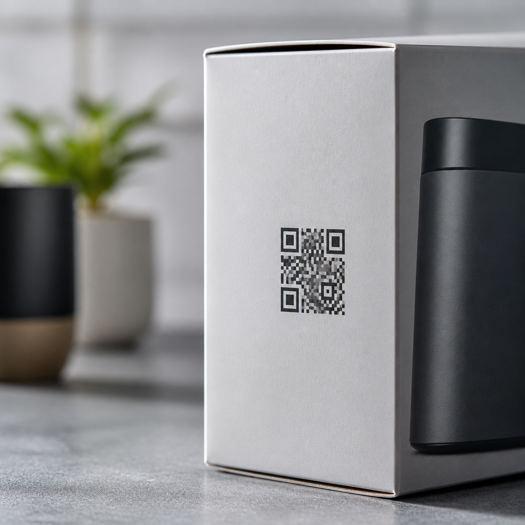
QR code placement on product packaging determines whether a customer scans instantly, ignores the code entirely, or struggles through a failed mobile experience. In packaging work, I have seen beautifully designed QR campaigns underperform simply because the code sat on a curved bottle seam, beside reflective foil, or too close to a cut line. Placement is not decoration. It is a functional decision that affects scan rate, shopper trust, manufacturing reliability, and post-purchase engagement.
A QR code is a two-dimensional matrix barcode that stores a URL, product record, app deep link, coupon, authentication page, or support resource. Placement strategies are the practical rules for deciding where that code appears on a carton, label, pouch, can, bottle, or flexible pack. Good placement accounts for line of sight, package geometry, print contrast, quiet zone, consumer context, and the camera behavior of modern smartphones. Poor placement creates scan friction even when the code itself is technically valid.
This matters because packaging is often the first offline-to-mobile touchpoint in the customer journey. A code can deliver setup instructions, ingredient sourcing details, loyalty enrollment, refill ordering, traceability, warranty registration, or anti-counterfeit verification in seconds. GS1 Digital Link, for example, is accelerating the shift toward packaging that connects physical products to structured digital content. As brands prepare for richer connected packaging, QR code placement strategies become operational, not optional.
Choose a flat, visible, and scannable surface first
The best location for a QR code is usually the flattest area customers naturally see and can hold steady in front of a phone. On cartons, that often means the back panel or side panel above regulatory text, not the bottom panel. On bottles, it may be a wrap label segment away from the seam. On stand-up pouches, it is typically the upper-middle region where creasing is minimal. If the substrate bends, wrinkles, or distorts after filling, scanning performance drops because module shapes no longer reproduce cleanly.
Visibility matters as much as print quality. If the shopper has to rotate the package awkwardly, peel back a flap, or scan near a shelf edge, response rates decline. I generally recommend placing consumer-facing QR codes where a person can discover them during normal handling: near usage instructions, under a short call to action, or beside product story content. Hidden placement can be useful for internal logistics, but customer engagement codes should never feel buried.
Avoid corners, folds, perforations, and closure areas. These zones are vulnerable to trimming variance, adhesive bleed, scuffing, and deformation during transport. The quiet zone, the clear margin around the code, must remain intact on the final package, not just on the artwork file. If a dieline, zipper, cap overlap, or tamper band intrudes on that margin, the code may still print yet fail in real-world scans.
Match placement to packaging format and shopper moment
Effective QR code placement strategies vary by structure because consumers interact differently with each package type. A cereal box is read upright at home and on shelf. A beverage can is gripped in one hand and often viewed under cooler lighting. A cosmetic carton may be examined closely for ingredients, while a frozen food pouch may be handled quickly through condensation. The right placement follows those behaviors instead of forcing one universal template.
| Packaging format | Recommended placement | Main risk to avoid |
|---|---|---|
| Folding carton | Back or side panel, mid-height, away from folds | Placement across panel transitions |
| Rigid bottle | Front-adjacent label area on the smoothest arc | Seams, strong curvature, condensation glare |
| Flexible pouch | Upper center or upper back, clear of gussets and zippers | Wrinkles after filling and shelf compression |
| Can | Body label zone, not near top rim or vertical join | Reflections and cramped print area |
| Blister card | Flat printed card section beside instructions | Plastic glare over the code |
The shopper moment also changes the best position. A code meant for pre-purchase education should be visible on shelf-facing panels. A code meant for setup or warranty may work better on the back, where the buyer lingers after opening. Reorder and refill codes should sit where the customer sees them during product depletion, such as near dosage directions or inside the secondary pack. Placement should follow intent.
Protect scan performance with size, contrast, and print discipline
Placement only works when paired with technical scanning standards. A QR code needs sufficient physical size for the expected scanning distance. As a practical rule, many packaging teams use a scan-distance ratio around 10:1, meaning a 25 mm code is comfortable at roughly 250 mm. Dense codes carrying long URLs need larger dimensions than short, redirected links. This is one reason dynamic URLs are usually better: they reduce symbol complexity and preserve placement flexibility.
High contrast is essential. Dark modules on a light matte background remain the most reliable option. Reversed codes, metallic inks, transparent labels, and busy patterns can work, but they raise risk and require testing under actual retail lighting. I have seen excellent lab scans fail on shelf because a glossy laminate produced specular highlights that washed out key finder patterns. If a code must sit on branded artwork, isolate it inside a solid patch rather than letting imagery touch the quiet zone.
Print production variables deserve early attention. Flexography gain, digital press sharpness, screen ruling, varnish registration, and substrate absorbency all affect edge clarity. Vector artwork should remain untouched until final output, and prepress teams should verify minimum module size against the selected process. ISO/IEC 18004 defines QR code specifications, while ISO/IEC 15415 and 15416 inform print quality evaluation practices. Brands that test only on office proofs miss the manufacturing reality that determines scan success.
Use placement to support calls to action, compliance, and trust
A QR code without context underperforms. The strongest packaging placements pair the code with a concise reason to scan: “See setup video,” “Check authenticity,” “View nutrition details,” or “Join rewards.” That message should sit immediately adjacent to the code, not on another panel. In testing, direct benefit statements consistently outperform generic prompts because they reduce uncertainty. Placement, copy, and user motivation work as one system.
Trust signals also matter. On products involving health, supplements, alcohol, baby care, or electronics, people want confidence before tapping a link. Placing the code near recognizable brand identifiers, support information, or certification language can increase perceived legitimacy. For anti-counterfeit use cases, codes should be hard to tamper with yet easy for buyers to find. Some brands place an authentication code where opening the pack reveals evidence of interference, balancing security with usability.
Regulatory and accessibility constraints can influence location. Packaging already carries mandatory content such as ingredients, warnings, net quantity, lot codes, and recycling marks. The QR code should complement, not crowd out, these elements. In the European Union and United States, marketers also need to ensure the linked experience respects privacy, claims substantiation, and any category-specific disclosure obligations. A code that opens a coupon, collects data, or changes market-specific content must be governed as carefully as the printed pack itself.
Test placement in real environments before scaling
The most reliable way to choose QR code placement on product packaging is structured testing. Start with prototype locations on production-intent materials, then evaluate scans across iPhone and Android devices, multiple camera apps, and common lighting conditions such as supermarket fluorescents, kitchen LEDs, daylight, and low light. Test while the package is upright, hand-held, chilled, slightly crushed, and on shelf. Scan success should be measured alongside time to first successful scan and subjective ease.
Analytics close the loop. Dynamic QR platforms can reveal scan volume, device type, time, geography, and destination engagement. If one SKU has strong impressions but weak scans, placement is often a culprit before creative or offer quality. In one beverage rollout I worked on, moving the code from the lower wrap seam to a smoother shoulder label area increased successful scans by more than a third without changing the landing page. Small physical adjustments can produce outsized digital gains.
This hub page should guide every packaging team back to one principle: a QR code earns results only when people can notice it, trust it, and scan it effortlessly. Prioritize flat, visible surfaces; adapt placement to package structure and shopper timing; protect performance with correct size, contrast, and print controls; and support every code with a clear reason to scan. Before finalizing artwork, test the code on real packs in real conditions. Treat placement as part of product experience design, and your connected packaging will work harder from shelf to smartphone.
Frequently Asked Questions
Where should a QR code be placed on product packaging for the best scan performance?
The best QR code placement is wherever the customer can see it clearly, access it easily, and scan it without fighting the shape or finish of the package. In practical terms, that usually means placing the code on a flat, unobstructed panel that remains visible at the moment of decision, whether that is on shelf, during unboxing, or after purchase. Front panels can work well when the QR code supports purchase intent, such as linking to product education, reviews, or promotions. Side or back panels are often better when the goal is post-purchase engagement, instructions, warranty registration, recipes, tutorials, or brand storytelling. The key is matching placement to when and why the user is expected to scan.
A strong placement also protects the technical readability of the code. Avoid curved edges, corners, folds, closures, tamper seals, perforations, and any area that may wrinkle, distort, or get hidden once the package is filled, sealed, or stacked. If a shopper has to rotate the item awkwardly, flatten a pouch, or peel back a flap just to try a scan, performance will drop. Good placement feels intuitive. The code should appear where users naturally pause and where their phone camera can capture it in one quick attempt.
It is also important to consider real retail conditions, not just digital mockups. A QR code that looks fine on a design file may become hard to notice when surrounded by dense copy, promotional bursts, nutrition panels, or competing visual elements. The most effective placements give the code breathing room, clear contrast, and a nearby call to action that explains the value of scanning. In other words, the best location is not simply “where it fits.” It is the place that balances visibility, usability, and production reliability.
What packaging surfaces and materials should be avoided when placing a QR code?
QR codes should not be placed on surfaces that interfere with how smartphone cameras detect contrast, alignment, and shape. Reflective foil, metallic inks, glossy laminates, holographic finishes, and highly textured substrates are common problem areas because they can create glare, distort the code pattern, or reduce edge definition. A code may technically be printed correctly, yet still fail in everyday scanning conditions because overhead lighting, store fixtures, or sunlight wash out the image. This is one of the most common reasons attractive packaging underperforms in the real world.
Curved and unstable surfaces are another major concern. Cylindrical bottles, tapered jars, flexible pouches, shrink sleeves, and gusseted bags can bend or stretch the code enough to reduce readability, especially if the symbol wraps around a seam or moves near the edge of the package. On paperboard cartons, avoid cut lines, score lines, folds, glued areas, and openings where the code may be interrupted or partially hidden. On labels, make sure the code does not sit too close to the edge where trimming variation could clip the quiet zone or the code itself.
If a difficult material or shape cannot be avoided, the solution is not guesswork. Increase code size, simplify surrounding artwork, improve contrast, and test printed samples on actual production materials under realistic lighting. In many cases, moving the QR code to a flatter secondary panel or changing the finish behind the code to a matte white patch dramatically improves performance. The goal is to design for successful scanning after manufacturing, shipping, shelf handling, and consumer use, not just at the concept stage.
How much clear space should surround a QR code on packaging?
A QR code needs clear space around it, often called the quiet zone, so scanning apps can distinguish the symbol from the surrounding design. Without enough separation, the camera may struggle to identify the code boundaries, particularly on busy packaging with patterns, text, icons, or color blocks pressed tightly against it. As a best practice, maintain a quiet zone of at least four modules on all sides of the code, and whenever possible give it even more room on packaging because printing variation, curvature, and visual clutter can make marginal spacing risky.
Beyond the technical minimum, generous breathing room improves both function and perception. A code crowded into a corner or wedged between legal copy and decorative graphics often looks like an afterthought, which reduces trust and lowers scan intent. By contrast, a properly isolated QR code appears purposeful and easier to use. This matters because scanning is both a technical action and a behavioral one. People are more likely to scan when the code looks intentional, accessible, and connected to a clear benefit.
It is also wise to protect the quiet zone from production tolerances. On packaging, dielines, trimming, label application drift, and print registration shifts can all eat into the safe area. That means designers should leave extra margin from cut lines, folds, seams, and neighboring artwork, not just meet the theoretical minimum. If the code is important to the customer journey, treat its surrounding space as functional infrastructure rather than optional white space. That small buffer often makes the difference between a frictionless scan and a failed one.
Should a QR code go on the front, back, or side of the package?
The answer depends on the campaign objective and the moment you want the customer to engage. A front-of-pack QR code works best when scanning supports immediate purchase decisions. Examples include ingredient sourcing, product demos, social proof, sustainability claims, limited-time offers, or comparison tools that help shoppers choose on shelf. Front placement gives the code maximum visibility, but it must be integrated carefully so it does not compete with branding, mandatory information, or the primary product message.
Back or side placement is often the smarter choice for deeper, post-purchase interactions. If the destination includes setup instructions, care guidance, recipes, loyalty enrollment, warranty activation, tutorials, or extended storytelling, the shopper does not necessarily need to scan before buying. In these cases, a secondary panel can provide enough room for the code, stronger contrast, more quiet space, and a fuller call to action. It also reduces the risk of cluttering the main selling surface while still making the QR code easy to find.
The most effective decision comes from mapping placement to customer behavior. Ask when the scan should happen, what the user is trying to accomplish, and how the package is handled in that moment. A code intended for in-store discovery should be visible while the product is standing normally on shelf. A code intended for use at home should remain visible after unboxing or opening. There is no universal rule that front is best or back is best. The right panel is the one that supports the user journey, preserves scanability, and survives the realities of production and retail display.
How can brands test QR code placement before finalizing packaging?
The most reliable approach is to test physical prototypes, not just on-screen artwork. Print the QR code on the actual substrate or the closest possible production material, at the intended size, finish, and placement. Then scan it using multiple phone models, camera apps, and lighting conditions. Test it indoors, under bright retail-style lighting, near windows, and at angles that mimic how people actually hold the package. A placement that scans perfectly in a studio may perform poorly in a store aisle or kitchen environment.
Testing should also include manufacturing and handling realities. Review proofs against dielines, folds, seams, varnishes, embossing, labels, and shrink application. Confirm that the quiet zone remains intact after trimming and that the code is not distorted once the package is assembled and filled. For flexible or curved packaging, test the code both before and after the product is packed, because shape changes can alter scan performance. If the package may get wet, scuffed, or refrigerated, include those conditions as well. The point is to validate the code in the same state the customer will encounter it.
Finally, evaluate the placement from a user-experience perspective, not only a pass-fail scan perspective. Ask whether the code is noticeable, whether the call to action is clear, and whether the destination matches the promise on the package. Measure how quickly first-time users can find and scan it without assistance. If people hesitate, rotate the package repeatedly, or ask what the code does, placement likely needs improvement. The strongest QR packaging programs combine technical testing, production review, and human usability feedback before the design is locked for print.





