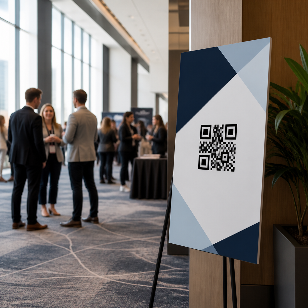
QR code placement for event signage determines whether attendees scan instantly or walk past without noticing. In live environments, design quality matters, but physical placement matters more because distance, lighting, motion, and crowd flow decide whether a code is even seen, let alone scanned. A QR code is a two-dimensional matrix barcode that opens a URL, app, file, form, map, menu, or payment screen when read by a smartphone camera. Event signage includes entrance boards, wayfinding signs, sponsor displays, registration counters, stage screens, tabletop cards, booth backdrops, window clings, and temporary vinyl installations. Placement strategy means choosing the right height, angle, size, surface, surrounding copy, and context so scanning feels natural and reliable.
I have worked on QR deployments for trade shows, conferences, festivals, retail activations, and museum programming, and the same pattern appears every time: teams obsess over branded code styling, then lose scans because the code is mounted too high, too low, too far away, or in a congested decision point. Good placement improves scan rate, reduces staff questions, shortens lines, and creates cleaner attribution data for marketing and operations. It also affects accessibility. A code that only works for tall attendees with the newest phones is poorly deployed even if it looks polished. This hub article covers the core principles behind QR code placement strategies so event teams can build signage systems that perform across venues, audiences, and use cases.
Start with user intent and the exact scan moment
The best QR code placement begins with one question: what should the attendee do at this exact location? Placement is not only a graphic decision; it is a behavioral decision. At registration, the goal may be pulling up a ticket or completing check-in. At a breakout room, the goal may be downloading slides. Near a sponsor booth, it may be claiming a giveaway. These are different moments, so the same placement rule should not be repeated blindly across all signs.
In practice, I map signs to attendee intent before I approve artwork. Entrance signage works best when the code is visible before the queue compresses, giving people time to open their camera app. Session signage should sit where people pause naturally, such as outside room doors, not inside a moving corridor where they must stop abruptly. Networking signage can support lower-intent actions, such as joining a community or saving contact details, but the code still needs a clear instruction like “Scan to join today’s attendee list.” When the scan moment matches the user’s immediate need, placement decisions become easier and scan rates rise.
Use distance, size, and height as a single system
A QR code must be physically large enough for the expected scanning distance. A practical field rule is roughly one inch of code width for every ten inches of viewing distance, then test on multiple phones. If attendees will scan from five feet away, a code near six inches square is usually safer than a three-inch code, especially under uneven lighting. On overhead banners, people may be ten to fifteen feet away, which pushes the required code size beyond what many designers initially allow. If the code must be scanned from farther away, create a dedicated nearby sign rather than relying on a distant banner.
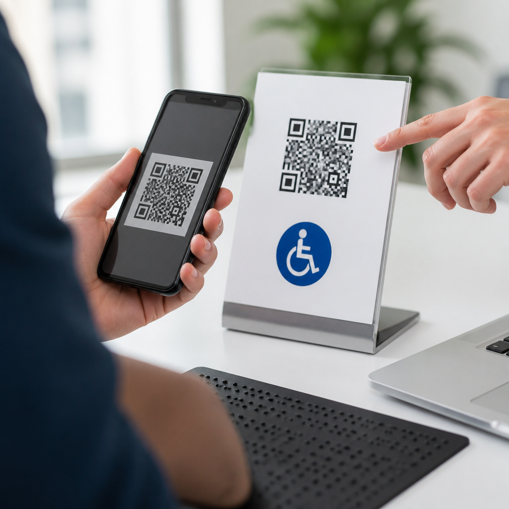
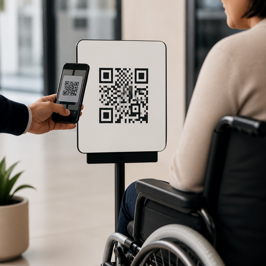
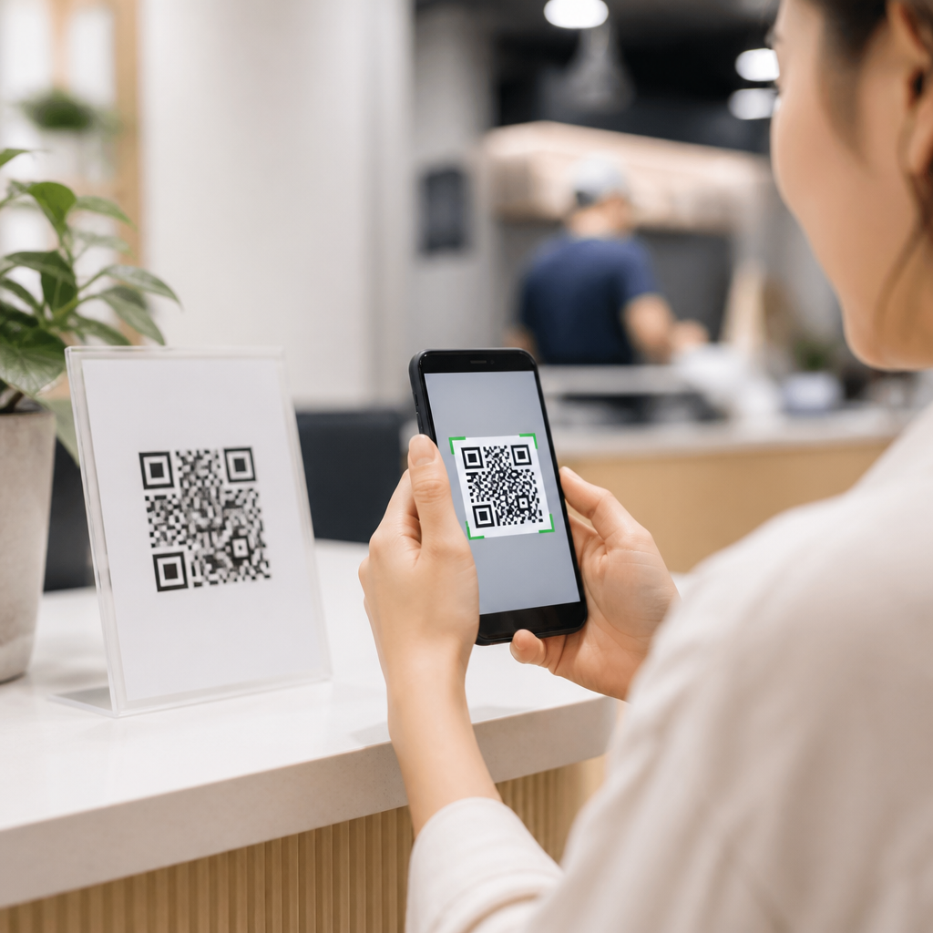
Height matters just as much as size. For most standing adults, the center of the code should often fall around 48 to 60 inches from the floor, similar to comfortable touch and reading zones used in retail and exhibit design. On counters, place tabletop signs upright rather than flat, because phones scan angled vertical surfaces faster than horizontal cards under glare. For accessible use, avoid forcing wheelchair users or shorter attendees to reach above shoulder height or bend deeply. When children are part of the audience, such as family festivals or school events, duplicate important codes at a lower height instead of asking one placement to serve every user equally well.
Position signs where people naturally slow down
The highest-performing QR codes are usually placed at “friction-light pause points,” not in the middle of fast traffic. These include registration lines, elevator lobbies, outside session rooms, food pickup zones, coat check areas, and booth edges where visitors pause before entering. People need two to five seconds to notice the sign, understand the value proposition, raise their phone, and achieve a lock. If the environment demands constant movement, many will postpone the scan and never return.
I have seen this clearly at convention centers. A sponsor once placed a lead-capture QR code on a back wall inside a narrow booth. Foot traffic passed quickly, and only a small number scanned. We moved the same code to a freestanding sign at the booth threshold with a concise offer and recovered performance the same day. The lesson was not creative brilliance; it was placement aligned with body movement. Event signage should work with traffic flow, not compete against it.
| Event location | Best placement approach | Common mistake |
|---|---|---|
| Registration area | Place codes before the final queue turn, at eye level, with task-focused copy | Mounting codes only at the desk where people have no time to prepare |
| Session entrance | Use door-adjacent signs where attendees pause to confirm room details | Putting codes inside the room after attendees are seated and distracted |
| Sponsor booth | Position at booth edge, counter front, and demo station with one clear CTA | Hiding one small code on the back wall among dense graphics |
| Food and beverage zone | Place near menu decision points and pickup waiting areas | Using glossy tabletop cards under direct lighting glare |
Control lighting, glare, and surface materials
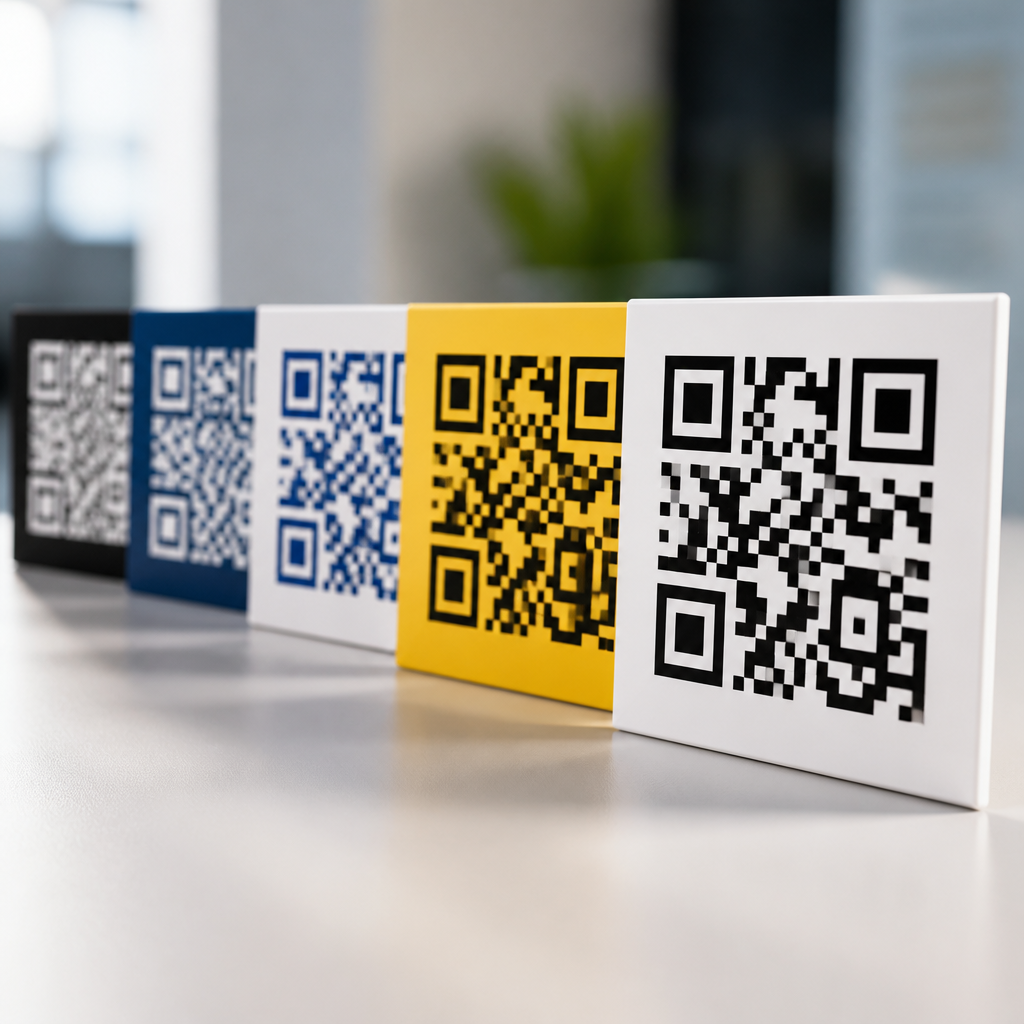
Even a correctly sized code fails if reflections or low contrast interfere with camera recognition. Matte substrates usually outperform glossy acrylic, laminated posters, and polished metal because they reduce glare from venue lighting. If a sign must sit near windows or spotlights, tilt it slightly or relocate it so the code is not washed out at peak daylight or under stage spill. Standard black on white remains the most dependable option. Branded color variations can work, but low-contrast combinations often reduce recognition speed on older phones and in dim rooms.
Surface stability also affects scanning. Fabric backdrops can wrinkle, stretching finder patterns and making codes harder to read from an angle. Curved placements on columns, bottles, or cylindrical stands often distort modules enough to hurt performance. For temporary event signage, foam board, rigid PVC, Sintra, ACM panels, and quality card stock tend to produce cleaner results than thin paper taped to uneven walls. The practical rule is simple: if the code surface bends, shines, or shadows unpredictably, scanning reliability drops.
Match the call to action to the placement context
Placement and messaging are inseparable. A QR code without nearby explanatory text asks attendees to guess why they should scan, and most will not. The instruction should answer three questions immediately: what happens after the scan, why it is useful now, and how long it takes. “Scan for agenda” is better than “Learn more.” “Scan to check in” is better than “Get started.” At events, people are time-constrained, so specificity wins.
Context changes the wording. On directional signage, “Scan for venue map” works because it solves an immediate problem. On a stage slide, “Scan to download today’s slides” aligns with the speaker moment. On sponsor signage, “Scan to enter the drawing” can convert well, but only if the code sits where someone can pause without blocking traffic. I also recommend reinforcing the scan action with a short fallback URL for attendees whose phones restrict camera scanning or who want to revisit the content later. That small addition improves usability and preserves response from edge cases.
Design for testing, analytics, and operational reality
Strong QR code placement strategies are tested on site, not approved only from digital mockups. I always run pre-event checks using multiple devices, including older Android phones, across realistic distances and lighting conditions. A code that scans flawlessly in the studio can fail when mounted beside a glass door at 4 p.m. or when a queue forms directly in front of it. Event teams should perform a walk-through during setup and again when the venue is fully lit and active.
Use dynamic QR codes so the destination can be updated without reprinting signage and so scan data can be segmented by location. A registration code, breakout room code, and sponsor code should each have unique tracking even if they route into the same platform. Tools such as Bitly, QR Code Generator, Beaconstac, and analytics parameters in Google Analytics help attribute performance to placement decisions. This matters because optimization often reveals operational truths: a code near escalators may underperform not because the offer is weak, but because people cannot safely stop. When teams connect scan data with traffic observations, placement improves quickly.
This hub should guide related planning across mobile landing page speed, code styling, quiet zone protection, error correction levels, campaign tagging, and accessibility reviews. Placement is the hub because it connects all of those disciplines. A beautiful code with a slow page still underperforms, but a fast page attached to a poorly placed sign underperforms too. Treat QR signage as a system that spans physical environment, mobile UX, analytics, and attendee behavior. That systems view is what separates ornamental QR usage from signage that measurably supports event goals.
Conclusion: place for behavior, not decoration
QR code placement for event signage works when it respects how people move, pause, see, and decide. The essentials are consistent: place codes at natural stopping points, size them for real scanning distance, mount them at comfortable heights, protect contrast, avoid glare, and pair each code with a direct call to action. Then validate those choices in the actual venue using several phones and track results by location. These steps sound basic, but they solve most scan failures before the event opens.
For event teams building a stronger mobile experience, placement is the highest-leverage improvement because it affects every attendee interaction at once. A better sign location can lift scans without redesigning the campaign, changing the offer, or retraining staff. Use this article as the hub for your QR code placement strategies, then audit every sign in your event plan against these principles. If a code is hard to notice, hard to reach, or hard to scan, move it before attendees arrive.
Frequently Asked Questions
Where should a QR code be placed on event signage for the highest scan rate?
The best placement is wherever attendees can notice the code, stop comfortably, and scan without blocking traffic or feeling rushed. In most event settings, that means putting the QR code at natural decision points such as entrances, registration desks, outside session rooms, exhibitor booths, food areas, and major wayfinding intersections. A code may be beautifully designed, but if it is mounted too high, hidden in glare, placed in a fast-moving corridor, or buried in visual clutter, scan performance drops quickly. People need enough time to recognize the code, understand why they should scan it, and physically position their phone camera to capture it.
Eye-level or slightly below eye-level placement usually works best for standing adults, especially on signs meant to be scanned up close. For larger boards viewed from several feet away, the code should be large enough and placed in a clear, unobstructed section of the sign rather than near edges, folds, seams, or mounting hardware. It is also smart to place the code near the core message or call to action, not as an afterthought in a corner. If the purpose is registration, agenda access, maps, lead capture, or payment, attendees should immediately understand what the scan will do. The highest-performing event QR codes typically combine strong visibility, simple instructions, and a location that matches attendee behavior in the moment.
How high should a QR code be placed on event signs?
Height matters because attendees need to scan quickly without awkward body positioning. For signs intended for close-range scanning, a practical target is around chest to eye level for the average attendee. This generally allows someone to approach, raise their phone naturally, and scan without bending down or reaching overhead. Codes placed too low may be blocked by bags, stanchions, furniture, or crowds. Codes placed too high often force users to tilt their phones at steep angles, which can create focus issues, glare, and frustration.
The ideal height also depends on the environment and sign type. A tabletop sign should angle the code toward the viewer rather than laying flat under overhead lighting. A freestanding lobby sign can support slightly larger codes at a comfortable standing height. A wall-mounted code near a check-in station should be reachable and visible even when a small line forms in front of it. If children, international groups, or mixed mobility audiences are expected, it helps to avoid a single rigid height standard and instead use multiple sign formats throughout the venue. In practice, the goal is simple: make scanning feel effortless for as many people as possible, and test placement in the real space before the event begins.
What environmental factors most affect QR code visibility on event signage?
The biggest environmental factors are distance, lighting, motion, and crowd flow. Distance affects whether attendees can even recognize the QR code and understand that it is intended to be scanned. If the sign is visible only from far away, the code must be larger and supported by a short call to action. Lighting is equally important because dim spaces reduce contrast, while harsh overhead lights, direct sunlight, glossy lamination, and digital display reflections can make scanning unreliable. Even a technically correct code may fail if the camera sees glare instead of the pattern.
Motion and crowd behavior also play a major role. In fast-moving areas such as entry corridors or transitions between keynote sessions, many people do not have time to stop and scan unless there is a clearly designated pause point. In busy exhibit halls, a code placed where people naturally gather performs better than one positioned where they are navigating congestion. Signage should be evaluated from the attendee’s real approach path, not just from directly in front of the sign during setup. Obstructions like open doors, queue ropes, furniture, plants, and other attendees can all reduce visibility. The most effective event teams account for these conditions in advance and place QR codes where people can see them early, understand the benefit instantly, and scan without friction.
Should every event sign include a QR code?
No. A QR code should be used where it adds clear value, not simply because space is available. When every sign includes a code, attendees often stop noticing them, and the result is lower engagement across the board. A QR code works best when it solves a specific need in that exact location, such as opening the event schedule at the entrance, showing a venue map near a directional sign, launching session materials outside a room, capturing leads at a booth, or linking to mobile ordering in a food area. Relevance drives scans far more than quantity does.
Selective placement also improves clarity and design quality. Event signs already compete with branding, directional information, sponsor logos, safety messaging, and logistical details. Adding a QR code to every sign can create clutter and weaken the primary message. Instead, use codes strategically at moments when attendees are most likely to want more information or take action. It is also important to pair each code with a direct instruction such as “Scan for agenda,” “Scan for booth giveaway entry,” or “Scan for venue map.” That context removes ambiguity and gives people a reason to engage. In short, the right number of QR codes is not the maximum possible number. It is the number that supports attendee intent without overwhelming the visual environment.
How can event organizers test whether QR code placement is effective before and during the event?
The best approach is to test placement in the real venue under real conditions. Before the event opens, organizers should stand at the actual approach points for each sign and ask a few practical questions: Can the code be seen quickly? Is the purpose obvious from a distance? Can a person stop here safely without disrupting traffic? Is the lighting consistent throughout the day? Does glare appear from certain angles? Can the code still be scanned when several people are nearby? This kind of on-site review reveals problems that are easy to miss in design files or empty-room setup conditions.
During the event, scan data can help confirm whether placement is working. If a code on a high-traffic sign receives very few scans, the issue may be placement, weak messaging, insufficient size, or poor visibility rather than lack of attendee interest. Organizers can improve results by moving signs slightly, adding a stronger call to action, reducing surrounding clutter, or relocating the code to a slower traffic zone nearby. Staff feedback is also valuable because front-line teams often see where attendees hesitate, ask questions, or fail to notice signage altogether. The most successful event QR strategies are not set once and forgotten. They are observed, tested, and refined so that placement supports how people actually move through the space.