
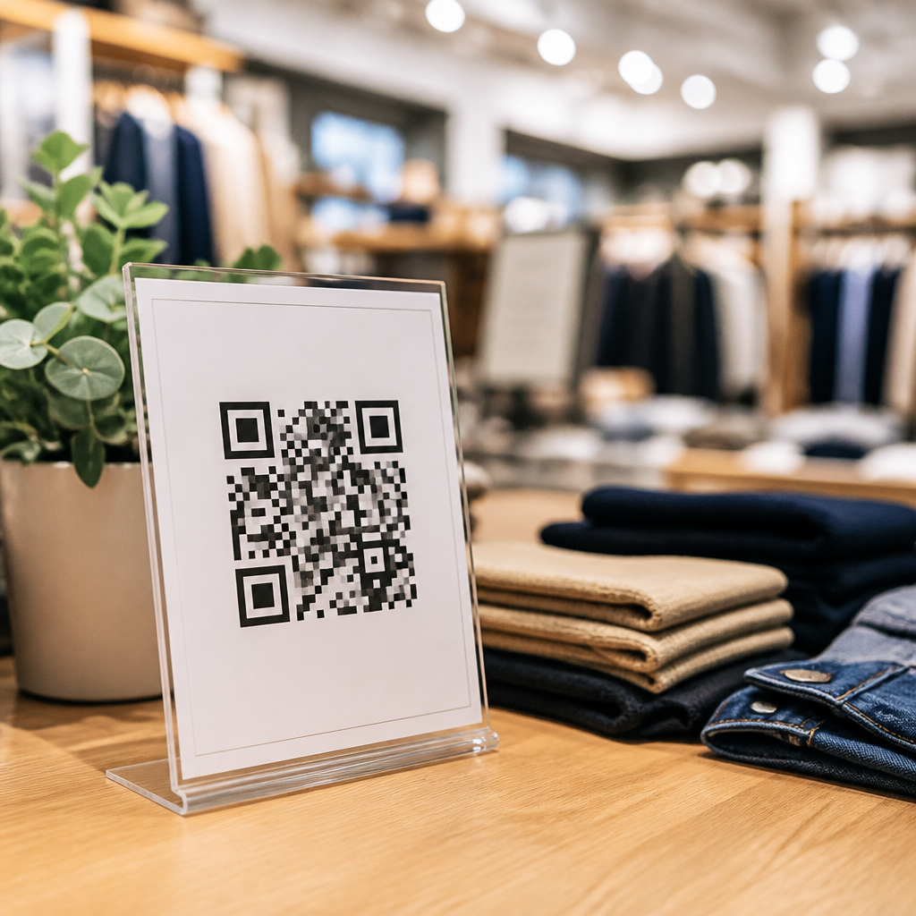
QR code CTAs for retail promotions turn a passive square on packaging, signage, or receipts into a measurable action prompt that moves shoppers from browsing to buying. In retail, a CTA, or call to action, is the short instruction paired with a QR code that tells people exactly what they will get by scanning, such as “Unlock 15% off,” “See sizes in stock,” or “Join rewards now.” I have worked with store teams that improved scan rates simply by rewriting vague prompts like “Scan me” into benefit-led language tied to a clear next step. That change matters because the code itself does not persuade anyone; the value proposition beside it does. Effective QR code CTA optimization blends copywriting, placement, design, landing-page continuity, and measurement so the customer journey feels obvious and low friction from shelf edge to smartphone checkout.
Retailers care about this because QR codes bridge physical traffic and digital behavior in a way most print assets cannot. A well-executed retail QR code campaign can drive coupon redemption, product education, app installs, loyalty enrollment, and post-purchase reviews while creating first-party data opportunities. The stakes are higher than they look. If the CTA is ambiguous, the destination is slow, or the offer feels generic, scans collapse and store teams conclude that QR codes do not work. In practice, they often fail because the CTA does not answer three shopper questions immediately: Why should I scan, what happens next, and is it worth my time? This article explains how to optimize QR code CTAs for retail promotions so every scan invitation is specific, credible, and aligned with the shopper’s moment of intent.
What makes a retail QR code CTA effective
An effective retail QR code CTA has four traits: clarity, relevance, immediacy, and continuity. Clarity means the instruction is direct and concrete. “Scan to compare colors” outperforms “Learn more” because it names the outcome. Relevance means the CTA matches the shopper’s context. On an endcap featuring sunscreen, “Check SPF guide for your skin type” fits better than a generic loyalty pitch. Immediacy means the reward feels accessible now, not after a long form or forced app download. Continuity means the landing experience matches the exact promise made near the code. If a window sign says “Scan for today’s in-store deal,” the page must open quickly to today’s deal, not a homepage carousel.
Specificity consistently lifts response. In A/B tests I have run, benefit-led wording beat neutral phrasing because customers evaluate scanning as a time trade. “Get a recipe and shopping list” gives a shopper a reason; “Scan here” gives only an instruction. The best CTAs also reduce perceived risk. Adding short qualifiers such as “No app needed,” “Takes 10 seconds,” or “Instant coupon” can remove hesitation, especially among older shoppers and in high-traffic aisles where attention is fragmented. Retail environments are noisy, so compact language matters. Aim for one primary action, one promised benefit, and one confidence signal.
Match the CTA to the retail moment and channel
QR code CTA optimization starts with location. The same code should not carry the same prompt everywhere because shopper intent changes by touchpoint. At the storefront, the goal may be footfall conversion: “Scan to see today’s doorbusters before you enter.” On shelf talkers, the goal may be product confidence: “Scan for ingredients, allergen details, and reviews.” On receipts, the objective often shifts to retention: “Scan to earn points on this purchase.” At the fitting room, a fashion retailer can reduce walkaways with “Scan to request another size” or “See this jacket styled three ways.”
Campaign timing matters too. Seasonal retail promotions should make the value feel event-specific. During back-to-school, “Scan for teacher-approved supply bundles” speaks to a planning mindset. During Black Friday, urgency can be explicit: “Scan for the next flash deal—updates every hour.” Omnichannel retailers should also align CTA language with supporting media. If paid social ads promise an exclusive coupon, the in-store QR code should echo that language so shoppers recognize the offer instantly. Consistency across poster, email, app push, and shelf signage improves trust because it signals the scan will deliver the expected result rather than a dead end or bait-and-switch.
Write CTA copy that earns the scan
The strongest QR code CTAs in retail use plain language, a visible benefit, and a verb that signals action. Good formulas include verb plus benefit, verb plus outcome, or verb plus savings. Examples include “Unlock 20% off today,” “Compare flavors before you choose,” “See how this sofa fits your room,” and “Join rewards for free shipping.” Weak CTAs usually fail for one of three reasons: they are generic, they hide the payoff, or they ask for too much commitment. “Discover more” is too vague. “Download our app to begin” creates friction when a mobile web page would suffice. “Scan for details” may work only when the adjacent packaging already conveys strong intent.
Use urgency carefully. Time-bound promotions can increase response when the deadline is real and visible, as in “Scan before 6 PM for same-day pickup discount.” False urgency damages credibility. The same applies to exclusivity. “Members-only early access” works if the landing page actually verifies membership and presents inventory benefits. Numbers often help because they imply a concrete reward: “Save $10,” “See 12 color options,” or “Watch a 30-second setup video.” In my experience, the most reliable copy improvement is replacing abstract words with the exact thing the shopper receives after the scan. If the destination is a coupon, say coupon. If it is stock availability, say stock availability.
Design and placement rules that improve scan rate
Even perfect copy will underperform if the code is hard to notice or hard to scan. Retail QR code design begins with adequate size, contrast, and quiet space around the code. As a practical floor, I recommend at least 2 x 2 centimeters for close-range packaging and much larger for aisle signage or windows, with a dark code on a light background. Glossy surfaces, wrinkled labels, and curved packaging can degrade readability, so test under actual store lighting. Keep the CTA adjacent to the code, not separated by product claims, legal text, or multiple competing offers.
Placement should support natural phone use. Codes on lower shelves are harder to scan because shoppers crouch and fight glare. Endcaps at chest height usually perform better. Window graphics should account for reflections and allow enough distance for a camera to focus. If several products use codes in the same area, differentiate the CTA by use case rather than repeating one generic prompt. The visual hierarchy should be obvious: headline benefit first, QR code second, backup explanation third.
| Retail touchpoint | Best CTA angle | Design note |
|---|---|---|
| Storefront window | Today’s offer or store hours | Use large code and anti-glare placement |
| Shelf tag | Reviews, specs, ingredients, stock | Keep copy under ten words |
| Endcap display | Bundle savings or product demo | Place at chest height |
| Receipt | Loyalty signup or review request | Short URL backup helps later scanning |
| Packaging insert | Setup guide or reorder offer | Ensure landing page loads without app |
Build landing pages that fulfill the CTA promise
A QR code CTA succeeds only when the destination completes the promise with minimal friction. For retail promotions, that usually means a mobile-first landing page with a single primary action, compressed images, and a headline that mirrors the CTA verbatim. If the sign says “Unlock 15% off today,” the page should open to a coupon or auto-applied discount, not ask the user to hunt through navigation. This message match is one of the fastest ways to improve conversion after the scan.
Technical details matter. Dynamic QR codes are preferable for most retail campaigns because they let teams update destinations without reprinting assets and provide scan analytics by time, device, and location. UTM parameters should be standardized so analytics platforms such as Google Analytics 4 can attribute scans to exact placements. If the promotion requires form capture, ask only for the minimum needed. Email plus consent may be enough; requiring account creation can cut completion sharply. Retailers should also consider Apple Wallet or Google Wallet coupon saves, map links, and one-tap SMS enrollment when speed matters. Accessibility is part of optimization too. Use readable font sizes, strong color contrast, and concise instructions so the post-scan experience works for more shoppers, more often.
Measure performance and keep improving
The core metrics for QR code CTA optimization are scan rate, landing-page conversion rate, coupon redemption rate, revenue per scan, and assisted outcomes such as store visit uplift or product page engagement. Scan rate tells you whether the code, CTA, and placement are doing their job in the physical environment. Conversion rate shows whether the destination fulfills the promise. Redemption and revenue clarify whether the promotion creates business value rather than vanity traffic. I also watch bounce rate, page load time, and completion time because they reveal friction that store teams cannot see from the aisle.
Testing should be disciplined. Change one major variable at a time: CTA wording, incentive level, placement height, or destination type. A grocery chain might test “Get tonight’s recipe” against “Save on all ingredients” on the same meal display. A beauty retailer might compare “Try the shade finder” with “See customer swatches.” The result often depends on shopper mindset: utility may beat discount when the product is complex, while price may win in commodity categories. Review scan data by store format, not only in aggregate, because airport stores, suburban big boxes, and urban convenience formats behave differently. The strongest retail teams treat QR code CTAs as ongoing conversion assets, not one-time artwork.
QR code CTAs for retail promotions work when they make the shopper’s next step feel useful, immediate, and effortless. The biggest gains usually come from fundamentals: a specific benefit, context-aware placement, a scannable design, and a landing page that exactly matches the promise. Retailers do not need clever wording as much as they need precision. “Unlock today’s coupon,” “Check sizes in stock,” and “See ingredients and reviews” outperform generic prompts because they answer the customer’s first question before the phone comes out.
As the hub for CTA optimization for QR codes, this topic connects copy, design, analytics, and in-store operations. Get those pieces aligned, and QR codes become reliable drivers of promotion response, loyalty growth, and better shopper experiences. Audit your current codes, rewrite the CTA around one clear benefit, and test the destination this week. Small wording and placement changes can produce measurable retail results fast.
Frequently Asked Questions
What is a QR code CTA in retail promotions, and why does it matter?
A QR code CTA, or call to action, is the short line of copy placed next to a QR code that tells shoppers exactly why they should scan and what they will get in return. In a retail setting, that might be a discount, product information, stock availability, loyalty enrollment, a limited-time offer, or access to a curated shopping experience. The QR code itself is only the tool. The CTA is what gives it purpose. Without clear direction, many shoppers see a code as a passive graphic and ignore it. With a strong CTA, that same code becomes an actionable prompt that moves people from awareness to engagement and, ideally, to purchase.
This matters because retail environments are crowded with messages competing for attention. Shoppers make fast decisions, often in seconds, so clarity is critical. A vague prompt like “Scan me” does not communicate value. A specific benefit-driven CTA such as “Unlock 15% off today” or “See available sizes now” gives shoppers a reason to act immediately. Strong QR code CTAs reduce friction, increase scan rates, and make promotions more measurable because each scan can be tracked against a specific placement, campaign, or store objective. In practical terms, a better CTA can improve offer redemptions, drive foot-to-digital engagement, support upsells, and help retailers understand what messaging actually influences buying behavior.
What makes a QR code CTA effective for retail shoppers?
An effective QR code CTA is clear, specific, relevant, and immediate. It tells the shopper what action to take and what benefit to expect. The best retail CTAs usually answer a simple question: “Why should I scan this right now?” If the answer is obvious and valuable, the CTA is doing its job. Phrases like “Get today’s deal,” “Browse colors in stock,” “Claim your gift with purchase,” or “Join rewards for instant savings” work well because they connect the scan to a concrete shopper benefit.
Strong CTAs also match the retail context. On shelf signage, shoppers may want quick product details, reviews, or comparisons. On packaging, they may be more interested in how-to content, replenishment options, or warranty registration. At checkout, a CTA may perform best when tied to loyalty programs, bounce-back offers, or digital receipts. Effective wording should align with where the shopper is in the purchase journey. It should also be short enough to read quickly, but strong enough to motivate action. Good QR code CTAs often use action verbs, mention a real incentive, and create a sense of relevance or urgency without sounding pushy. The key is making the value exchange unmistakable.
Where should retailers place QR code CTAs for the best results?
The best placement depends on the goal of the promotion, but high-performing QR code CTAs are usually placed where shoppers can act with minimal effort and maximum context. Common placements include product packaging, shelf talkers, endcap displays, window signage, fitting room graphics, countertop displays, receipts, shopping bags, and in-store posters. Each location serves a different purpose. For example, a shelf-level QR code CTA can help shoppers compare features or check sizes in stock, while a window display CTA can encourage after-hours browsing or capture interest from foot traffic before someone enters the store.
Placement works best when it matches shopper intent. If the CTA is about a product benefit, put it near the product. If it is about rewards or future savings, checkout and receipts are often ideal. Visibility matters too. The code should be easy to spot, easy to scan, and not surrounded by visual clutter. The CTA should sit close enough to the code that there is no ambiguity about what the shopper is being asked to do. Retailers should also consider practical scanning conditions such as lighting, height, distance, and traffic flow. A well-written CTA can still underperform if the code is awkwardly placed or difficult to access. In-store testing is essential because even small placement changes can affect scan behavior significantly.
How can retailers measure the success of QR code CTAs in promotions?
Retailers can measure QR code CTA performance by tracking both engagement and business outcomes. At the most basic level, scan volume shows how many people responded to the prompt. But the more useful question is what happened after the scan. Did shoppers redeem the offer, sign up for rewards, view product pages, add items to cart, or complete a purchase? A successful retail QR campaign should connect scans to meaningful actions, not just traffic. This is why dynamic QR codes, tagged URLs, campaign-specific landing pages, and analytics platforms are so valuable. They make it possible to tie each CTA to a distinct message, placement, store, or promotion.
Retailers should look at metrics such as scan-through rate, conversion rate, redemption rate, time on landing page, repeat visits, and revenue influenced by the scan. Comparing different CTA wording is especially useful. For example, “Scan me” versus “Unlock 15% off” can reveal how much response depends on the clarity of the incentive. Store teams can also test different formats, placements, and offers to identify what resonates by audience or location. Measuring success should go beyond digital metrics alone. If a QR code CTA is meant to support in-store sales, then lift in unit sales, basket size, and loyalty enrollments should also be evaluated. The strongest programs treat QR code CTAs as testable performance assets, not static design elements.
What are the most common mistakes retailers make with QR code CTAs?
The most common mistake is using vague language that does not explain the value of scanning. A simple “Scan here” or “Scan me” asks the shopper to do work without offering a clear reward. Another major issue is sending users to a generic homepage instead of a focused landing page tied to the CTA promise. If a sign says “Unlock 20% off” but the scan leads to a cluttered website with no visible offer, trust drops and conversions suffer. Inconsistent messaging, slow-loading mobile pages, and poor in-store connectivity can also undermine performance even when the CTA itself is strong.
Retailers also run into problems when they overcomplicate the experience. If the scan requires too many steps, a form that is too long, or a confusing navigation path, many shoppers will abandon before completing the action. Design mistakes matter too. Codes that are too small, placed too high, printed with low contrast, or buried in visual clutter can be hard to scan. Another overlooked issue is failing to match the CTA to shopper intent. A customer standing in front of a shelf may want product information or stock visibility, not a broad brand story. The best way to avoid these mistakes is to keep the value proposition specific, the destination relevant, the mobile experience fast, and the path from scan to outcome as simple as possible.





