
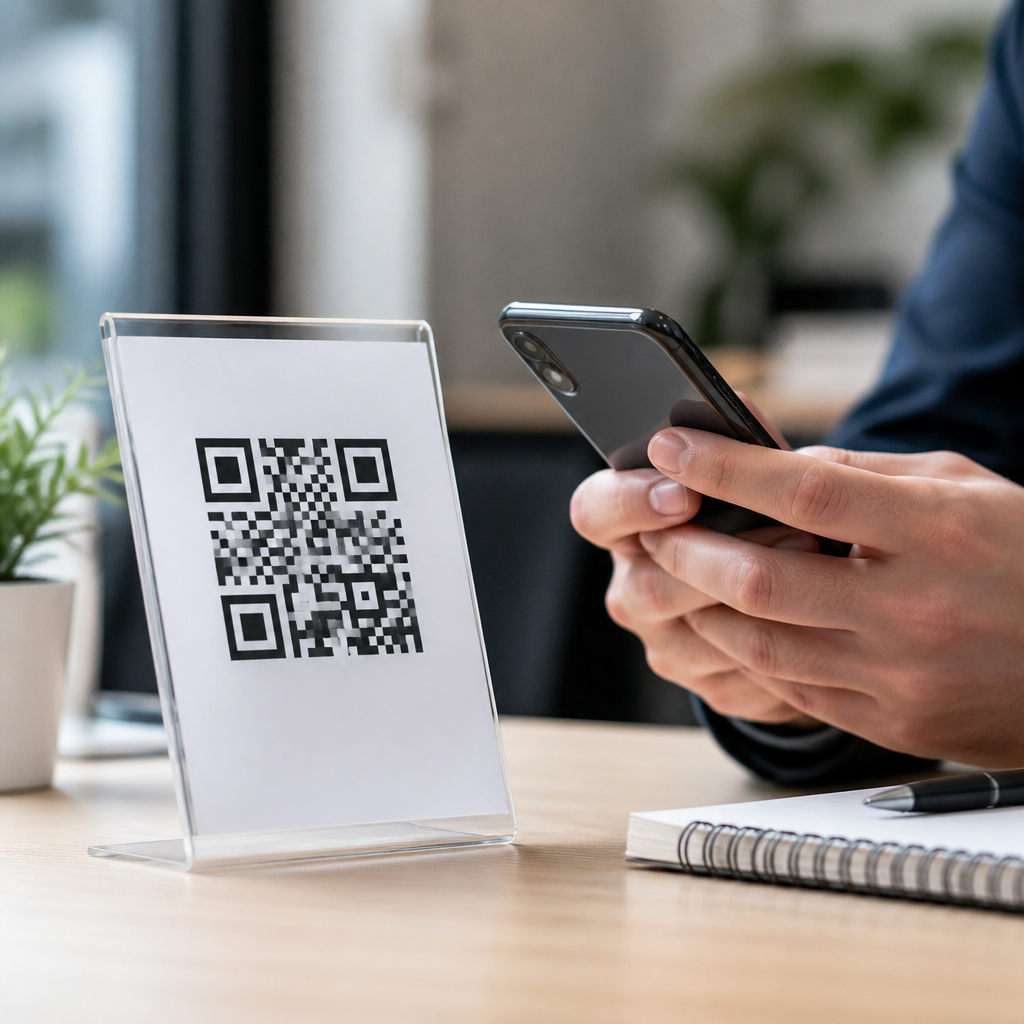
QR code CTAs can turn a passive scan into a measurable lead when the message, destination, and mobile experience are designed as one system. In lead generation campaigns, a call to action is the short prompt placed beside, above, or inside the QR code that tells people what they will get and why they should scan now. CTA optimization for QR codes means refining that prompt, the visual treatment, the landing page, and the follow-up path so more scans become form fills, bookings, demo requests, or newsletter signups. I have used QR codes across trade shows, direct mail, packaging, retail signage, and field sales leave-behinds, and the same lesson repeats: the code itself does not persuade people. The offer and the context do. This matters because QR traffic is usually high intent but low patience. If the CTA is vague, or the destination feels slow or mismatched, response drops fast. Strong QR code lead generation combines clear value exchange, friction control, and rigorous tracking. When those elements align, a small square on a poster or product insert becomes a reliable acquisition channel that connects offline attention to digital conversion data.
What Makes a QR Code CTA Convert
A high-performing QR code CTA answers four questions before the scan happens: what is this, what do I get, how long will it take, and why should I trust it. The best wording is specific and benefit-led. “Scan to get a custom quote in 60 seconds” outperforms “Scan here” because it names the outcome and sets effort expectations. In my campaign audits, the most common failure is generic language paired with a code dropped into empty space. People need a reason. Use action verbs tied to lead intent: book, claim, compare, calculate, register, unlock, or request. Then attach a concrete benefit such as pricing, sample access, consultation, discount, or checklist download. Clarity beats cleverness almost every time.
Placement and visual hierarchy also influence conversion. A QR code CTA should sit where the eye naturally lands after the main message, with enough white space to preserve scan reliability. Contrast matters; dark code on a light background remains safest, and decorative patterns often hurt readability. Add a short supporting line if trust is a barrier, such as “No app required” or “Takes 30 seconds.” For regulated industries, mention privacy expectations plainly: “Get the guide. We’ll email it once.” This reduces uncertainty without bloating the design.
Match the CTA to the Stage of Buyer Intent
Not every lead generation campaign should ask for the same action. The CTA must fit the audience’s awareness level and the environment in which the scan occurs. Top-of-funnel QR campaigns work best with low-friction offers: checklists, calculators, coupon delivery, event registration, or educational guides. Mid-funnel campaigns can ask for stronger intent signals such as demo requests, showroom appointments, or product comparison tools. Bottom-funnel uses often perform well with “Get pricing,” “Talk to a specialist,” or “Start your application.” When the ask is too ambitious for the setting, conversion rates fall even if scan volume looks healthy.
Context changes behavior. At a trade show booth, visitors expect immediate relevance and minimal typing, so “Scan for the product spec sheet and book a 10-minute demo” can work if the form is prefilled from badge capture or asks for only name and email. On retail packaging, the better lead offer may be “Scan for setup tips and warranty registration,” which creates value before asking for marketing consent. In direct mail, I have seen response improve when the CTA reflects exclusivity: “Scan to see your local savings” beats broad national messaging because it feels personally useful. Intent-based CTA design is the difference between collecting accidental traffic and generating qualified leads.
Build the Landing Experience Around Mobile Friction
A QR scan is a mobile moment, so the destination must be designed for thumbs, small screens, and spotty connections. The landing page should continue the exact promise made in the CTA. If the printed asset says “Get a free site audit,” the headline on the landing page should repeat that offer immediately. Message match reassures users they scanned the right code and prevents bounce. Keep forms short. For most lead magnets, ask only for fields needed for follow-up and segmentation. Every extra field increases abandonment unless the value is obviously worth it.
Page speed and page weight are operational issues, not cosmetic details. Compress images, defer nonessential scripts, and avoid heavy popups that cover the first view. Use large buttons, visible form labels, and autofill-friendly inputs. If you need more qualification, collect it after the first conversion through progressive profiling in tools like HubSpot, Marketo, or Salesforce forms. For local business campaigns, opening to a mobile-friendly booking page or click-to-call destination may outperform any downloadable asset. The rule is simple: remove every step that does not directly help the user complete the promised action.
Use Offer Design and Testing to Improve Lead Quality
Lead generation is not only about maximizing scans or form fills; it is about attracting prospects your sales team can actually close. Offer design shapes lead quality. Discounts can produce volume but may pull in price-sensitive contacts with weak fit. Assessments, calculators, consultations, and comparison guides usually produce fewer leads but stronger buying intent. I recommend aligning the offer with the sales cycle. Complex B2B services often benefit from “Get a benchmark report” or “Request an implementation review,” while consumer services may convert better with “Claim your free estimate” or “Unlock member pricing.”
Testing should focus on the whole conversion path, not just button color. Compare value propositions, proof elements, field count, CTA phrasing, and destination type. Dynamic QR codes are essential because they let you update the landing page and track performance without reprinting physical materials. UTM parameters should identify source, medium, campaign, creative, and placement so you can separate booth banner scans from brochure scans or in-store counter cards from window decals. Use analytics platforms such as GA4 and CRM attribution reports to connect scan sessions to downstream outcomes like meetings booked, opportunities created, and revenue influenced.
| Campaign setting | Best CTA style | Likely lead offer | Main metric |
|---|---|---|---|
| Trade show booth | Fast and specific | Demo booking or spec sheet | Meetings scheduled |
| Direct mail postcard | Personal and local | Quote, savings check, consultation | Form completion rate |
| Product packaging | Help-first | Warranty registration or setup guide | Qualified opt-ins |
| Retail signage | Immediate value | Coupon, inventory check, appointment | Scan-to-visit rate |
Tracking, Compliance, and Offline-to-Online Attribution
Reliable measurement is what makes QR code CTA optimization sustainable. Every code should have a documented naming convention, a mapped destination, and a defined conversion event. Dynamic QR platforms such as Bitly, Flowcode, Beaconstac, and QR Code Generator Pro support scan analytics, device data, and destination management, but they should feed into your broader reporting stack rather than sit in isolation. GA4 event tracking, call tracking numbers, CRM campaign objects, and marketing automation workflows are what transform scans into attributable leads.
Compliance deserves equal attention. If a QR code sends users to a form, disclose how contact information will be used and link to a privacy notice. For SMS opt-in flows, follow carrier and regional consent requirements explicitly. If location or camera access is involved, explain why. Trust signals matter even more on mobile because users decide quickly whether a page feels legitimate. Branded domains, HTTPS, concise copy, and visible company details reduce hesitation. For teams managing multiple physical assets, maintain a simple governance sheet listing each QR code’s live URL, owner, placement date, and retirement plan. I have seen old codes continue circulating months after campaigns ended, creating lost leads and poor user experiences. Good governance prevents that leakage.
Common QR CTA Mistakes and How to Avoid Them
The most damaging mistake is using a CTA that says nothing beyond “Scan me.” It wastes valuable real estate and shifts too much cognitive work to the audience. Another frequent problem is asking for too much too soon, such as a long consultation form from a sidewalk poster. Misaligned incentives are also common: a premium-looking ad leads to a generic homepage instead of a focused lead page, breaking message continuity. Technical errors matter too. Tiny codes, reflective surfaces, low contrast, and awkward placement on curved packaging can all suppress scan rates before the landing page even has a chance.
Avoid these issues by treating the QR code, CTA, and destination as one conversion unit. Print-test at real viewing distances. Confirm the code scans on both iPhone and Android cameras. Add a fallback short URL for accessibility and edge cases. Write CTAs that state the value clearly, and support them with one line of proof or reassurance where needed. Most importantly, review results by lead quality, not vanity metrics alone. A campaign with fewer scans but more sales-qualified leads is the better campaign. That perspective keeps optimization grounded in business outcomes rather than surface-level engagement.
QR code CTAs for lead generation campaigns work best when they combine a clear benefit, an intent-matched offer, and a mobile-first landing path. The strongest campaigns answer the user’s questions before the scan, reduce friction after the scan, and connect every touchpoint to measurable outcomes in analytics and CRM systems. Specific wording, message match, short forms, dynamic codes, and disciplined attribution are the fundamentals. So is restraint: not every environment supports a hard conversion ask, and sometimes the best route to a lead is a useful first interaction like setup help, a calculator, or a localized quote tool.
As a hub within mobile QR code design and UX, CTA optimization sits at the center of scan behavior, landing page performance, and lead quality. When you improve it, you improve the entire channel. Start by auditing your current QR assets: rewrite vague prompts, verify scan reliability, align each code with a dedicated mobile destination, and tag every campaign consistently. Then test offers and form friction against qualified lead outcomes, not just scan counts. Do that well, and your QR codes will stop acting like passive utilities and start performing like accountable lead generation assets.
Frequently Asked Questions
What makes a QR code CTA effective in a lead generation campaign?
An effective QR code CTA does much more than tell someone to “scan here.” It clearly communicates the value of scanning, reduces uncertainty, and gives the user a reason to act immediately. In lead generation campaigns, the strongest CTA usually answers three questions at a glance: what the person will get, why it is useful, and what happens next. For example, “Scan to get a free quote,” “Scan to book a demo,” or “Scan to download the pricing guide” performs better than a vague instruction because it frames the scan as a direct path to a specific benefit.
Strong QR code CTAs also depend on context. A flyer, product package, trade show booth, direct mail piece, or in-store display each attracts people in different stages of intent, so the CTA should match that mindset. Someone at a conference may respond well to “Scan to schedule a 10-minute consult,” while someone seeing a poster in a retail environment may need “Scan for today’s offer and expert recommendations.” Relevance is often the difference between a passive scan and a qualified lead.
Design matters too. The CTA should be visually connected to the QR code, easy to read from the expected viewing distance, and supported by trust signals such as brand identity, a short explanation, or a privacy reassurance. If the CTA promises one thing but the landing page delivers something broader, slower, or less clear, conversions drop quickly. The most effective campaigns treat the QR code, CTA, landing page, and follow-up as one continuous experience designed around user intent.
What should a QR code CTA say to generate more leads?
The best QR code CTA language is specific, benefit-driven, and action-oriented. Instead of using generic phrasing like “Learn more” or “Scan now,” focus on the concrete outcome the user will receive. Good lead generation CTAs often include words tied to value, access, savings, speed, or problem-solving. Examples include “Scan to get your free estimate,” “Scan to book a live demo,” “Scan for the buyer’s checklist,” or “Scan to claim your consultation.” These phrases set clear expectations and make the next step feel worthwhile.
Urgency can also improve response rates when used honestly. Adding time-sensitive or exclusive framing such as “today,” “limited spots,” “instant access,” or “first-time offer” can encourage immediate action, especially in offline settings where attention is brief. However, urgency should support the offer rather than compensate for a weak one. If the CTA feels pushy or vague, people are less likely to trust it enough to scan.
It is also smart to align the CTA with the audience’s stage in the funnel. Top-of-funnel prospects often respond better to educational offers such as guides, calculators, assessments, or checklists. Mid-funnel users may prefer comparison sheets, case studies, or webinars. Bottom-of-funnel prospects are more likely to convert on CTAs tied to consultations, demos, quotes, trials, or appointments. The wording should reflect not only what you want from the user, but what they are ready to do in that moment.
How do the landing page and mobile experience affect QR code lead generation results?
The landing page is where a promising QR code CTA either becomes a lead or loses momentum. Because QR codes are typically scanned on mobile devices, the destination must load quickly, display cleanly on smaller screens, and continue the exact message introduced by the CTA. If the code says “Scan to get a free audit,” the landing page should immediately reinforce that offer with a clear headline, a concise explanation, and a simple form or booking option. Any disconnect between the CTA and the page creates friction and lowers trust.
Mobile usability is especially important. A landing page with tiny text, cluttered layouts, distracting navigation, or long form fields will stop conversions fast. Lead generation pages tied to QR scans usually perform best when they focus on one action, minimize distractions, and keep completion effort low. That could mean limiting the number of required fields, using autofill-friendly forms, including click-to-call options, or embedding a simple scheduler. The goal is to make the next step feel easy enough to complete immediately.
Trust and clarity also matter on the destination page. Include concise proof points such as testimonials, logos, brief credibility statements, or a privacy note near the form if appropriate. Users scanning a QR code are making a quick decision in real time, so they need instant confirmation that they are in the right place and that sharing their information is worthwhile. When the CTA, landing page, and post-submit experience are tightly aligned, more scans turn into measurable lead actions like form fills, demo requests, bookings, or consultations.
How can you test and optimize QR code CTAs for better conversion rates?
Optimizing QR code CTAs starts with testing one meaningful variable at a time and measuring how each change affects both scan volume and lead quality. Many teams focus only on the number of scans, but for lead generation campaigns, the more useful metrics are scan-to-landing-page engagement, form completion rate, booking rate, cost per lead, and downstream sales outcomes. A CTA that increases scans but attracts low-intent users may look successful on the surface while reducing overall campaign efficiency.
Useful elements to test include the CTA wording, offer type, visual placement, color contrast, size of the QR code, supporting text, and surrounding design elements. You can also test whether a CTA performs better above the code, beside it, or integrated into a branded frame. On the conversion side, experiment with landing page headlines, form length, incentive framing, button copy, trust signals, and follow-up methods. Even small differences such as “Get My Quote” versus “Request a Quote” can influence response rates depending on the audience and channel.
Contextual testing is especially valuable because QR performance varies widely by environment. A CTA on packaging may need simplicity and fast-access offers, while a CTA at an event may work better with stronger qualification language. Use trackable URLs, dynamic QR codes, UTM parameters, and CRM attribution wherever possible so you can connect offline scans to online lead outcomes. The most effective optimization process combines creative testing with practical analytics, helping you refine not just the scan prompt, but the entire lead capture system behind it.
What are the most common mistakes that reduce QR code CTA lead generation performance?
One of the most common mistakes is using a vague CTA that gives no compelling reason to scan. Phrases like “Scan me” or “For more information” often underperform because they do not communicate value, urgency, or relevance. People need a clear incentive, especially in offline settings where attention is limited and the cost of ignoring the code is low. A QR code should never force the audience to guess what comes next.
Another frequent problem is poor alignment between the CTA and the destination. If the callout promises a quote, guide, consultation, or demo, the landing page should deliver that exact next step immediately. Sending users to a homepage, a cluttered product page, or a generic contact form creates friction and lowers trust. Similarly, asking for too much information too soon can suppress lead conversions. If a campaign is meant to capture interest quickly, lengthy forms and multi-step processes often hurt performance more than they help qualification.
Brands also lose leads when they overlook design fundamentals. QR codes that are too small, placed in low-visibility areas, printed with weak contrast, or positioned without enough scanning room can fail before the CTA even has a chance to work. Missing mobile optimization is another major issue, as many scans happen on the go. Finally, failing to track campaign performance makes improvement almost impossible. Without scan data, page analytics, and lead attribution, you cannot tell which CTA, placement, or offer is truly driving results. Avoiding these mistakes gives your QR code campaign a much better chance of turning interest into qualified, measurable leads.





