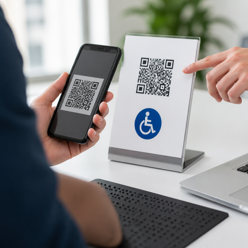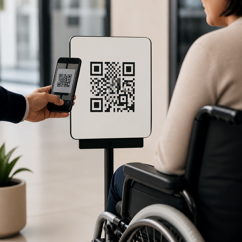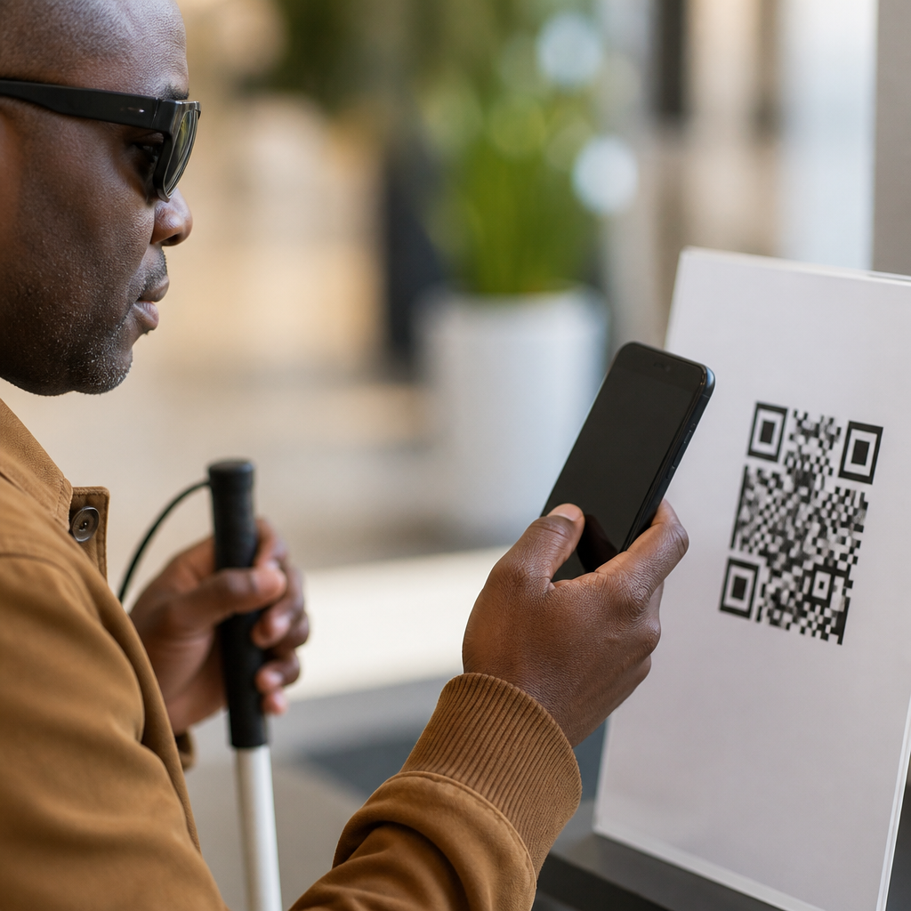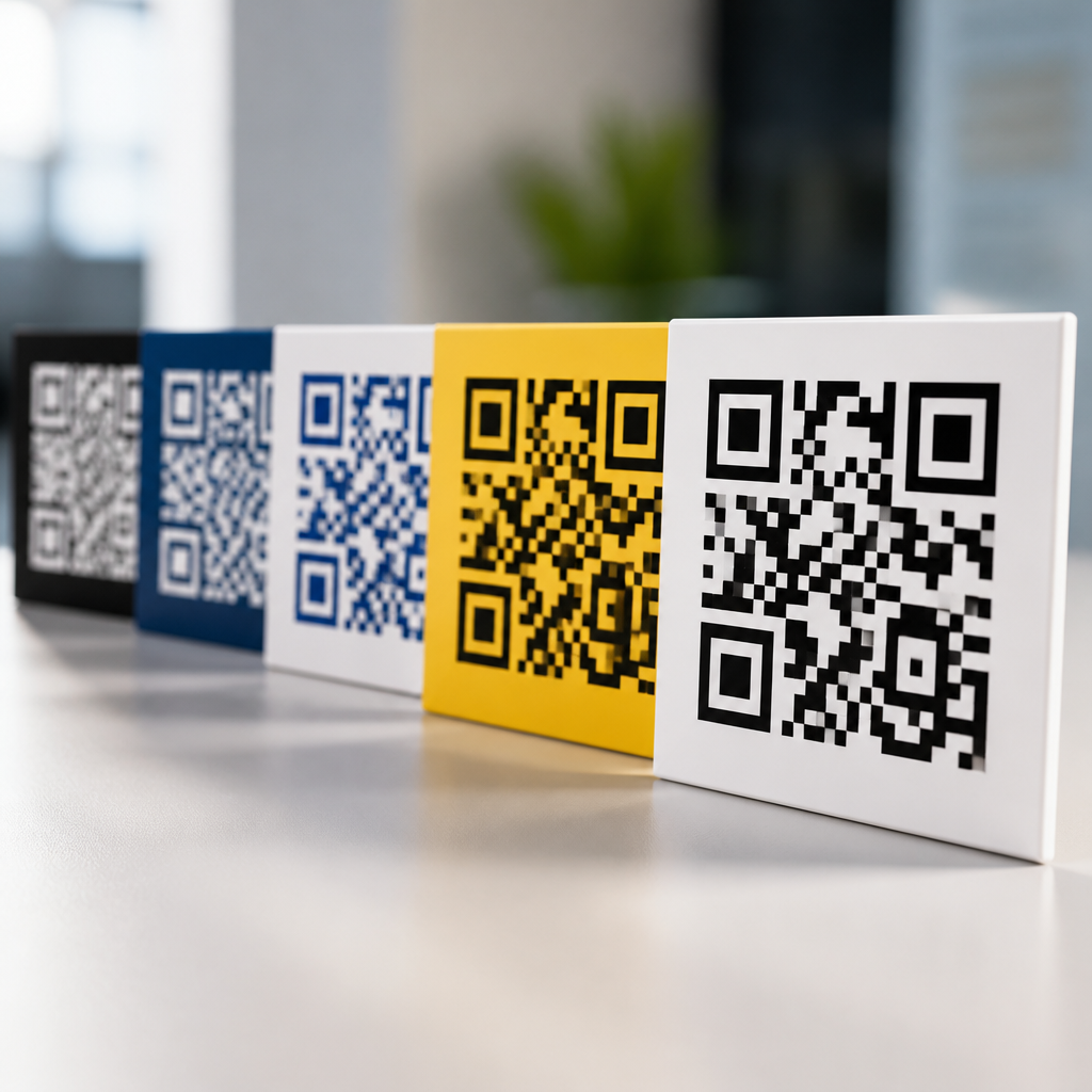
QR codes rarely fail because the technology breaks; they fail because the design and the call to action do not work as one system. In mobile marketing, a QR code is the scannable bridge between a physical touchpoint and a digital destination, while a CTA, or call to action, is the prompt that tells people why they should scan now. When those two elements are aligned, scan rates rise, landing page engagement improves, and campaigns become measurable rather than speculative. I have worked on retail packaging, restaurant table tents, direct mail, and event signage where the same code generated radically different results depending on layout, copy, size, contrast, and placement. That is why CTA optimization for QR codes sits at the center of mobile QR code design and UX.
A useful way to think about QR performance is this: the code handles access, but the CTA creates intent. Most people already know how to scan with a smartphone camera, yet they still hesitate when the value is unclear, the destination feels risky, or the design looks low quality. A strong CTA answers the silent questions immediately: What happens after I scan? Is it worth my time? Is this safe? How long will it take? Good QR design reinforces those answers visually through white space, brand cues, readable hierarchy, and placement in the natural line of sight. Poor design creates friction even before the scan begins.
This matters because QR codes now sit across the full customer journey, from awareness and consideration to purchase, onboarding, support, and loyalty. Restaurants use them for menus and reorders, retailers for product details and reviews, healthcare systems for intake forms, and B2B exhibitors for lead capture. In each case, the code alone is not persuasive. The pairing of design and CTA determines whether the user sees convenience or effort. For a sub-pillar focused on CTA optimization for QR codes, the practical goal is simple: make the next action obvious, useful, and trustworthy at a glance.
Why QR code performance depends on both design and CTA
QR codes are often treated like purely technical assets, but performance depends on behavioral design. The square pattern must be technically scannable, yet the surrounding composition determines whether anyone tries. In campaigns I have audited, the biggest lift often came from changing a vague prompt like “Scan me” to a benefit-led CTA such as “Scan to see today’s price” or “Scan for a 10% welcome offer.” Those versions work because they reduce ambiguity. Users understand the reward before they commit, and that lowers hesitation.
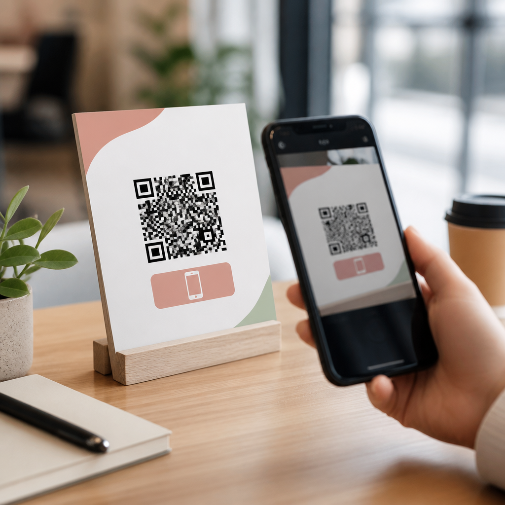
Design carries equal weight. A QR code placed too low on a poster, printed too small on shelf wobblers, or surrounded by competing visual noise underperforms even when the offer is strong. Smartphones need enough code size, contrast, and quiet zone to read quickly. ISO/IEC 18004 defines the QR Code specification, but practical usability goes beyond the standard. On a package, the code should sit where the hand does not cover it. On a storefront window, it should be reachable from normal standing distance. On a digital screen, it needs enough dwell time for the camera to focus. CTA optimization starts with these physical realities.
Trust also affects scan behavior. Users are more likely to scan when the design clearly reflects a recognized brand, the destination is previewed, and the CTA is precise. “Scan to register your warranty” signals a legitimate task. “Scan for details” is weaker because it does not explain value. The best-performing combinations tell people what they get, how fast it will be, and why it matters now.
Core principles for effective QR code CTA optimization
Effective QR CTAs are specific, benefit driven, context aware, and visually connected to the code. Specific means naming the result: menu, coupon, demo, directions, payment, review, or troubleshooting guide. Benefit driven means clarifying the payoff: save time, unlock content, claim a discount, compare options, or get support. Context aware means matching the user’s moment. A commuter at a transit shelter may respond to “Scan for the nearest store” differently than a conference attendee seeing “Scan to download the slide deck.” Visually connected means the CTA sits close enough to the code that users read both as one action.
In practice, high-performing CTA copy is short, concrete, and active. “Scan to book a test drive” outperforms “Learn more.” “Scan for assembly video” beats “Product information.” Time and effort cues can help when they are truthful. Phrases like “takes 30 seconds” or “no app required” remove uncertainty. Security cues matter for higher-friction actions such as payments or form submission. Naming the destination, such as “Scan to pay securely” or “Scan to access the official event agenda,” strengthens confidence.
Design should reinforce the CTA through hierarchy. The prompt should be the most readable text near the code, supported by a short subline if needed. Use contrast that remains legible in bright light, preserve a clean quiet zone around the code, and avoid decorative edits that interfere with finder patterns. Brand customization can help recognition, but it should never compromise error correction or contrast.
Matching QR code design to user context and placement
The same QR code CTA will not perform equally across environments. Placement changes user attention, scanning distance, and available time. On product packaging, shoppers are comparing options quickly, so the CTA should answer a buying question: ingredients, setup, reviews, fit guide, or refill options. On restaurant tables, speed matters more than persuasion, so “Scan for menu” works because the need is immediate. At trade shows, visitors are overloaded with stimuli, so the CTA should promise a clear asset: “Scan for pricing sheet” or “Scan to book a live demo.”
Distance and motion affect design choices. Outdoor posters need larger codes and fewer words because people may be walking. In-store shelf tags can use smaller codes if they sit at hand level and the CTA is tightly framed. On TV or presentation slides, a short URL backup is smart because not everyone can scan before the screen changes. In every case, CTA optimization for QR codes depends on respecting the user’s physical context, not just refining the wording.
| Placement | User intent | Best CTA style | Design priority |
|---|---|---|---|
| Packaging | Evaluate or use product | Scan for setup, reviews, ingredients, or warranty | Readable at close range, unobstructed by hands |
| Restaurant table | Access menu or pay | Scan for menu or scan to pay securely | Fast scan, spill-resistant print, high contrast |
| Event booth | Capture details for follow-up | Scan for pricing sheet or schedule a demo | Strong headline, visible from aisle, clear benefit |
| Direct mail | Respond to offer | Scan to claim your offer or book a consultation | Prominent placement near headline and offer copy |
Design elements that increase scans without hurting usability
Scannability comes first. Keep strong contrast between the dark modules and the background, preserve the quiet zone, and test printed samples under realistic lighting. Rounded modules, embedded logos, and brand colors can work, but only if the code still scans instantly on both iPhone and Android camera apps. I usually test on older devices as well because if a code only works on the newest phones, it is not robust enough for broad campaigns.
Size matters more than many teams expect. A common field guideline is a scanning distance ratio of about 10 to 1, meaning a code scanned from ten inches away should be roughly one inch wide. That is not a law, but it is a useful starting point. Material matters too. Glossy surfaces create glare, curved bottles distort the pattern, and low-resolution printing softens edges. These production factors directly influence whether a CTA gets a chance to work.
Visual hierarchy should guide the eye in a clear sequence: headline or product cue, CTA, QR code, reassurance. Reassurance can be simple: “No app required,” “Official site,” or “Takes 1 minute.” When campaigns involve dynamic QR codes, marketers gain flexibility to update destinations and track scans by location or creative version, but the user should never feel tricked. The landing page must match the CTA exactly.
Measurement, testing, and common mistakes
The best QR code CTA strategy is tested, not guessed. Track scan-through rate, landing page bounce rate, completion rate, and downstream conversion. Use UTM parameters, dynamic QR platforms, and analytics tools such as Google Analytics 4 or Adobe Analytics to compare variants. If scans are low, the problem is usually visibility, motivation, or trust. If scans are high but conversions are low, the issue is often message mismatch or a weak mobile landing page.
A/B testing should isolate one variable at a time: CTA wording, incentive, color contrast, placement, or supporting copy. For example, a retailer may test “Scan for size guide” against “Scan to find your fit.” A service business may compare “Scan to get a quote” with “Scan for instant pricing.” Results often vary by audience sophistication. New prospects prefer clarity; repeat customers may respond to speed and convenience.
Common mistakes are consistent across industries. Teams hide the QR code in cluttered layouts, use generic CTAs, send users to a desktop page, or fail to explain why the scan is worth it. Another frequent error is treating every scan opportunity the same. Menu access, coupon redemption, registration, and payment each require different trust cues and different CTA language. Precision wins.
Building a stronger QR code hub strategy
As the hub page for CTA optimization for QR codes, this topic should connect naturally to related guidance on QR code size, contrast, placement, dynamic versus static codes, landing page UX, analytics, and testing methods. That structure helps teams move from principle to execution. More important, it reflects how real campaigns work: no CTA succeeds in isolation. Scan behavior is shaped by design, context, destination quality, and measurement discipline.
The central lesson is straightforward. A QR code is not the message; it is the gateway. The CTA tells users why they should enter, and the design makes that choice feel easy and safe. When both are engineered together, brands earn more scans, cleaner attribution, and better mobile experiences. Review your current QR touchpoints, rewrite one vague CTA into a specific benefit, test it in context, and improve from there.
Frequently Asked Questions
1. Why do design and CTA need to work together for a QR code campaign to succeed?
A QR code is not just a technical tool; it is part of a decision-making moment. People do not scan because a code exists. They scan because the design catches their attention, the placement makes scanning easy, and the call to action clearly explains what they will get in return. When design and CTA work together, they remove hesitation. The visual presentation signals relevance and trust, while the CTA answers the most important user question: “Why should I do this right now?”
In practice, this means the QR code should feel integrated into the marketing piece instead of added as an afterthought. If the surrounding design highlights the benefit and draws the eye naturally toward the code, the CTA can reinforce urgency, value, or convenience. For example, “Scan to see today’s in-store offers” performs better than a generic “Scan me” because it sets an expectation and gives the user a reason to act immediately. Strong campaigns treat the QR code and CTA as one conversion unit, not two separate elements.
This alignment also improves measurement. If the message, design, and destination are consistent, you can more accurately evaluate scan-through performance, landing page engagement, and downstream conversions. When scans are low, the issue is often not the QR technology itself, but a mismatch between what the design implies, what the CTA promises, and what the landing page delivers.
2. What makes a QR code CTA effective in mobile marketing?
An effective QR code CTA is specific, benefit-driven, and easy to understand at a glance. In mobile marketing, attention is limited, especially when users encounter QR codes in retail stores, packaging, posters, events, or direct mail. A CTA needs to communicate the reward for scanning in plain language. The best CTAs focus on immediate value, such as accessing a discount, unlocking a menu, watching a demo, joining a waitlist, claiming a reward, or getting more product information.
Clarity matters more than cleverness. Phrases like “Scan to get 20% off,” “Scan to book your appointment,” or “Scan to view the full collection” work because they tell the user exactly what will happen next. A vague CTA forces the audience to guess, and guesswork reduces scan rates. Strong CTAs also match the context. In a retail environment, shoppers may want fast product details or exclusive offers. At an event, they may want schedules, speaker bios, or instant registration. On packaging, they may be looking for setup instructions, recipes, or loyalty rewards.
Urgency can improve performance when it feels authentic. Time-sensitive language like “today,” “now,” or “limited offer” can motivate action, but only if the landing experience fulfills that promise. Trust is equally important. If the CTA overpromises or feels misleading, people may skip the scan entirely. The most effective CTA is one that is honest, relevant, and immediately connected to a useful mobile experience.
3. How should a QR code be designed so it gets noticed and scanned easily?
Good QR code design balances visibility, scannability, and brand consistency. The first priority is functionality. A QR code must be large enough to scan from the expected viewing distance, printed with strong contrast, and placed where lighting, angles, and physical barriers will not interfere with smartphone cameras. If a code is too small, distorted, low-contrast, or crowded by other visual elements, even a strong CTA may not save performance.
From a design perspective, the code should stand out without feeling disconnected from the rest of the creative. White space around the code is essential because it helps scanning apps recognize the code boundaries quickly. Placement matters just as much. The QR code should be positioned where the eye naturally lands after reading the headline, offer, or CTA. If people have to hunt for the code, conversion drops. This is why hierarchy is so important: first capture interest, then explain the value, then present the scan action clearly.
Branding can be incorporated carefully through color, frames, short instructional text, or subtle logo use, but aesthetics should never interfere with readability. Many brands make the mistake of over-stylizing QR codes to match a campaign visual identity. While custom design can work well, scannability must always come first. Testing across different phone models, screen settings, print finishes, and real-world distances is critical. A well-designed QR code does not just look attractive; it removes friction and supports fast, confident action.
4. What are the most common mistakes that cause QR code campaigns to underperform?
The most common mistake is using a QR code without a compelling reason to scan. A code by itself does not create motivation. When brands rely on generic prompts like “Scan here” or place a QR code into creative without context, they miss the opportunity to communicate value. Another frequent problem is weak alignment between the physical asset and the digital destination. If the design suggests one benefit but the landing page delivers something unrelated, users lose trust and drop off quickly.
Poor visual execution is another major issue. Codes that are too small, placed on curved surfaces, printed on reflective materials, or positioned in areas with low visibility often fail before the user even gets to the CTA. Cluttered layouts can also hurt performance by competing for attention instead of guiding it. In many campaigns, the QR code is present, but the visual hierarchy does not prioritize it. That means people may notice the ad or packaging but never reach the scan action.
Another mistake is sending traffic to a generic homepage instead of a dedicated mobile-optimized landing page. The user has already taken a high-intent action by scanning. If the destination does not continue the same message, provide immediate relevance, and load quickly on a phone, the campaign loses momentum. Finally, many teams fail to test and track results properly. Without scan analytics, A/B testing, and destination-level conversion tracking, it becomes difficult to tell whether the issue is the CTA, the design, the offer, the placement, or the landing experience. Strong QR code campaigns succeed because they are treated as measurable conversion systems, not decorative add-ons.
5. How can businesses measure whether their QR code design and CTA are actually working?
The best way to measure performance is to evaluate the full path from exposure to scan to post-scan action. Start with scan rate, which helps indicate whether the design, placement, and CTA are motivating people to take action. If impressions are high but scans are low, the issue may be visibility, message clarity, or lack of incentive. If scans are strong but engagement is weak after the scan, the problem is usually on the landing page side rather than the printed asset itself.
Businesses should use trackable QR codes with analytics that show scan volume, time of day, location, device type, and campaign source when possible. This data can reveal patterns that help optimize creative decisions. For example, one placement may outperform another simply because the CTA is more specific or the code is easier to access in that environment. Comparing versions of the same campaign can also uncover whether wording changes like “Scan for details” versus “Scan for your free sample” make a meaningful difference.
Post-scan metrics are just as important as the scan itself. Look at bounce rate, time on page, click-through rate, form completions, purchases, coupon redemptions, or appointment bookings depending on the campaign goal. These metrics show whether the promise made by the CTA is being fulfilled by the destination. Businesses that approach QR campaigns strategically will often test variables such as code size, CTA language, color contrast, incentive type, and landing page content. Over time, this creates a feedback loop that turns QR code marketing from a guess into a reliable, optimizable channel.