
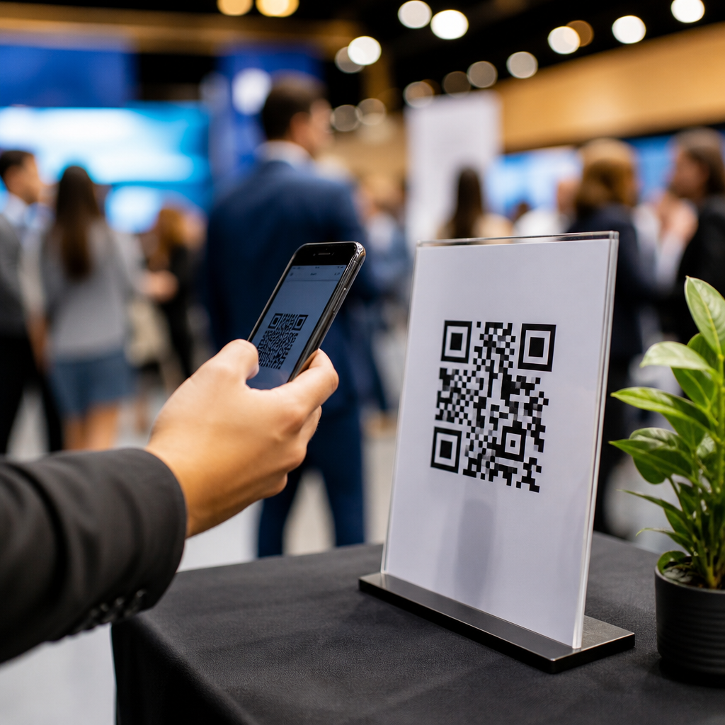
QR code CTAs for events and experiences turn a passive square into a clear invitation to act, and that difference determines whether people scan or walk past. In this context, CTA means the call to action: the short message, visual cue, and surrounding design that tells someone what they gain by scanning. For event marketers, venue operators, museums, festivals, trade shows, and hospitality teams, CTA optimization for QR codes is not a cosmetic task. It directly affects scan rate, completion rate, dwell time, lead capture, app adoption, and post-event follow-up. I have tested QR placements on badges, posters, menus, wayfinding signs, booth counters, and stage screens, and the pattern is consistent: the code itself rarely persuades anyone. People respond to relevance, clarity, speed, and trust. A high-performing event QR code CTA answers four questions instantly: what is this, why should I scan, what happens next, and is it worth my time? When those answers are visible, friction drops. When they are vague, even beautifully branded codes underperform.
This article serves as the hub for CTA optimization for QR codes within mobile QR code design and UX. It covers the principles that govern effective event calls to action, the contexts where messaging must change, and the metrics that reveal whether a CTA is doing its job. It also connects strategy to execution: landing page continuity, accessibility, compliance, testing methods, and common mistakes. Events are a uniquely demanding environment because attention is fragmented, network conditions vary, lighting changes, and visitors make split-second choices while standing, walking, waiting, or socializing. A QR code CTA that works on a desktop mockup can fail on a crowded concourse or dim exhibition hall. The goal is not simply more scans. The goal is better intent-matched scans from people who complete the desired next step. That is why strong CTA design combines plain-language instruction, contextual value, and friction-aware mobile UX rather than relying on novelty alone.
What makes a QR code CTA effective at events
An effective QR code CTA is specific, benefit-led, and context aware. Specific means the message names the action or outcome: “View today’s schedule,” “Join the giveaway,” “See the menu,” or “Download your photo.” Benefit-led means it explains why scanning helps the attendee right now. Context aware means it matches the moment, location, and audience. At a registration desk, “Check in here” is appropriate. Near a stage entrance, “Vote for the next topic” creates immediacy. In a museum gallery, “Hear the curator explain this piece” promises added value. Generic lines such as “Scan me” or “Learn more” waste attention because they force the user to infer the benefit. In usability reviews I have run, generic prompts consistently lower confidence because attendees cannot predict the destination or time commitment. Predictability matters on mobile. People are far more likely to scan when they know the code will open a mobile-optimized page, not a PDF, desktop form, or slow app store detour.
Good event CTA copy is usually short, but not simplistic. The best-performing versions pair a verb with a concrete reward. Examples include “Reserve your demo,” “Get the speaker slides,” “Enter to win,” “Find your seat,” and “Unlock backstage content.” Strong visual hierarchy reinforces that message. The CTA text should be larger than supporting copy, placed adjacent to the code, and readable at the expected viewing distance. Contrast must be high enough for low-light venues, and the quiet zone around the QR code must remain intact so the code scans quickly. According to ISO/IEC 18004, the symbol requires a clear margin, and violating that technical rule to squeeze in branding often harms reliability. Reliability is part of persuasion. If the first scan attempt fails, trust drops sharply. Effective CTAs therefore combine wording, placement, sizing, error correction, and mobile destination quality into one coherent experience.
Matching CTA messaging to event moments and environments
Different event moments require different CTA strategies because user intent changes throughout the attendee journey. Before arrival, QR codes often support registration, ticket wallet downloads, parking maps, or agenda building. Here the CTA should reduce uncertainty: “Add your pass to Apple Wallet,” “Get directions,” or “Build your schedule in 60 seconds.” At entry, speed is the main value proposition, so “Express check-in” or “Open your ticket now” works better than broad educational language. During sessions, people need low-friction utility. Stage-side QR code CTAs such as “Ask the speaker a question,” “Download this case study,” or “Vote in the live poll” convert because they relate directly to what is happening in the room. After sessions, networking and follow-up matter more, so “Swap contact details,” “Book a consultation,” or “Get continuing education materials” are stronger.
Environment affects readability and behavior just as much as message intent. A QR code on a moving slideshow gets only a few seconds of attention and should use a CTA that can be understood immediately, plus a short URL backup. A table tent in a restaurant lounge can support more explanatory copy because users are seated and have dwell time. Outdoor festivals introduce glare, weather, and distance, so larger codes and fewer words are necessary. Trade show booths are especially competitive; attendees compare dozens of offers while walking fast. There, a CTA must earn the stop with explicit value, such as “See the 2-minute product demo” or “Claim your sample.” If the booth team wants qualified leads, “Get the pricing guide” often outperforms “Contact us” because it offers a tangible asset while signaling commercial intent. The right CTA is not universal. It is chosen for the user’s immediate job to be done.
Core CTA patterns and when to use them
Most successful event QR code CTAs fall into a small number of repeatable patterns. Utility CTAs help people complete a task: check in, find directions, access Wi-Fi, browse a menu, or retrieve documents. Engagement CTAs invite participation: vote, ask, rate, play, share, or unlock content. Conversion CTAs move visitors toward revenue or lead capture: book, buy, reserve, subscribe, request a quote. Retention CTAs extend the relationship after the event: join the community, download the recap, claim your certificate, or receive updates. Choosing the wrong pattern creates friction. For example, a first-time booth visitor may not be ready for “Book a sales call,” but may willingly scan “Compare plans” or “See customer results.” The CTA should reflect the commitment level that the audience is ready to make.
| Event context | Best CTA pattern | Example CTA | Primary metric |
|---|---|---|---|
| Registration desk | Utility | Open your ticket now | Check-in completion rate |
| Conference session | Engagement | Ask the speaker a question | Participation rate |
| Trade show booth | Conversion | Get the pricing guide | Qualified lead rate |
| Museum exhibit | Engagement | Hear the curator explain this piece | Audio play rate |
| Post-event email follow-up | Retention | Download the event recap | Return visit rate |
These patterns become more powerful when paired with urgency, exclusivity, or certainty without sounding manipulative. “Join today’s giveaway before 4 PM” adds a real deadline. “Access attendee-only resources” signals exclusivity. “See the menu instantly” emphasizes certainty and speed. I recommend avoiding forced curiosity and overstated promises. In field tests, “Scan to discover” underperforms “See today’s lineup” because the latter names the reward. Likewise, “Win amazing prizes” is weaker than “Enter to win two VIP upgrades” because specificity builds credibility. The best CTA pattern is the one that reduces cognitive effort while aligning with the actual landing page and the event’s operational goals.
Designing the mobile journey after the scan
A QR code CTA succeeds only if the destination fulfills the promise immediately. Message match is essential. If the printed CTA says “View the menu,” the landing page should open directly to the menu, not to a homepage with multiple choices. If it says “Get the slides,” the form, if any, should be minimal and mobile friendly. On event networks, page speed matters because latency amplifies abandonment. Compress images, avoid unnecessary scripts, and test under weak connectivity. Google’s Core Web Vitals are useful here, but practical event testing matters more: open the page on real devices in the venue, in portrait mode, with average signal strength. I have seen excellent booth CTAs fail because the destination used an autoplay hero video that delayed the form by several seconds. Users simply backed out.
Trust signals also belong in the post-scan experience. Use a recognizable domain, HTTPS, concise privacy language, and clear branding that matches the sign or badge where the code appeared. For lead generation, tell people what they will receive and how often you will contact them. For contests, state the eligibility rules. For app downloads, explain why the app is worth installing instead of forcing the store page with no context. Accessibility should be built in: readable type, sufficient contrast, form labels, keyboard-friendly fields, captions for media, and language that screen readers can interpret. Not every attendee can or wants to scan, so provide a fallback short link where practical. QR UX is strongest when the CTA, the code, and the landing page feel like one uninterrupted, trustworthy path.
Measuring, testing, and improving QR code CTA performance
QR code CTA optimization should be measured with more than scan count. Scans indicate interest, but completion metrics show business value. For events, useful measures include scan-through rate by placement, destination load time, form completion rate, poll participation, coupon redemption, average time on page, repeat scans, and assisted conversions captured later in CRM or analytics tools. Dynamic QR platforms such as Bitly, QR Code Generator Pro, Uniqode, and Beaconstac can segment scans by location, time, and device. Pair those logs with GA4 events, UTM parameters, and event management systems to see which CTA language produces meaningful outcomes. A poster near the keynote may generate fewer scans than a booth counter card, yet deliver higher-quality leads because the audience intent is stronger.
Testing should be disciplined and situational. Change one major variable at a time: CTA wording, color contrast, placement height, incentive, or destination page. Compare “Get the case study” versus “See how this works” rather than redesigning everything simultaneously. Run tests across similar traffic periods, because morning registration behavior differs from afternoon expo behavior. Observe actual use in the venue. Are people stepping closer to scan? Do they hesitate because the text is too small? Are staff members verbally explaining the CTA because the sign is unclear? Those observations reveal friction that dashboards miss. Over time, build a library of proven patterns by event type. A conference, a food hall, a live performance, and a museum all reward different CTA structures. Optimization becomes easier when teams document what message, placement, and destination combination produced the highest completion quality, not just the highest scan volume.
QR code CTAs for events and experiences work when they remove uncertainty and make the next step feel obviously worthwhile. The code is only the trigger; performance comes from the surrounding promise, the event context, and the mobile path that follows. Specific, benefit-led wording beats generic prompts. Placement, readability, scan reliability, and landing page continuity matter as much as copy. Event teams should match CTA patterns to attendee intent, whether the goal is utility, engagement, conversion, or retention, then validate decisions with real venue testing and completion metrics. This hub page establishes the framework for every deeper article in CTA optimization for QR codes, from signage language and incentive strategy to analytics and accessibility. Use it as your baseline, audit every event touchpoint where a code appears, and rewrite each CTA so attendees instantly understand what they get, why it matters now, and how quickly they can act.
Frequently Asked Questions
What does a CTA mean on a QR code for events and experiences, and why does it matter so much?
A CTA, or call to action, is the message and visual prompt that tells people exactly why they should scan a QR code and what they will get in return. On its own, a QR code is just a graphic. Many attendees, guests, and visitors will not scan unless the surrounding design answers a simple question immediately: “What’s in it for me?” That is why the CTA is so important. It transforms a passive square into a clear invitation, whether that invitation is to view a schedule, unlock a map, claim a discount, vote in a live poll, access exclusive content, join a waitlist, or check in for an experience.
In event and experience settings, attention is limited and distractions are everywhere. People are moving through lobbies, exhibit halls, festival grounds, galleries, and venues quickly. They do not stop to decode vague messaging. A generic instruction like “Scan me” can work, but a benefit-driven CTA such as “Scan to see today’s lineup,” “Scan for exhibit audio,” or “Scan to claim your free drink voucher” is usually much more compelling because it gives immediate context and value. That clarity can make the difference between strong participation and missed engagement.
From a performance perspective, the CTA directly affects scan rate and what happens after the scan. A good CTA sets expectations before the user even opens the landing page, which improves completion rates because the experience feels relevant and consistent. In short, QR code success at events is not just about placement or design quality. It depends heavily on how clearly and persuasively the CTA communicates the next step and the benefit behind it.
What makes an effective QR code CTA for an event, venue, museum, festival, or trade show?
An effective QR code CTA is clear, specific, useful, and easy to act on in the moment. The strongest CTAs do more than tell people to scan; they explain what the scan unlocks. That benefit should be obvious in a few words and tailored to the attendee’s context. For example, “Scan for session times” works better near a conference entrance than a broad message like “Learn more.” At a museum, “Scan for the curator’s audio guide” is stronger because it is directly tied to the visitor’s immediate experience. At a food festival, “Scan to view menus and wait times” is practical and timely.
Good QR CTAs also match the stage of the audience journey. Someone arriving at an event may need directions, registration details, or a program. Someone already inside may respond better to “Scan to vote live,” “Scan to enter the giveaway,” or “Scan to unlock backstage content.” Someone leaving may be more likely to engage with “Scan for photos,” “Scan to book your next visit,” or “Scan for your post-event offer.” Relevance to time and place is one of the biggest drivers of performance.
Design matters as much as wording. The CTA should be visible from the expected viewing distance, supported by strong contrast, and placed close enough to the QR code that there is no ambiguity. If the code appears on signage, wayfinding, table tents, badges, packaging, wristbands, or digital displays, the CTA should still remain readable and prominent. Adding a directional cue such as an arrow, icon, or short supporting line can further reduce hesitation. The overall goal is to make the action feel low-effort and worthwhile.
Finally, the post-scan experience has to fulfill the promise of the CTA. If the sign says “Scan to skip the line,” the landing page should quickly help the user do exactly that. If the sign says “Scan for event map,” the map should load fast and display well on mobile. The best CTA in the world cannot compensate for a confusing or slow destination. Effective QR code campaigns align message, design, placement, and mobile experience into one seamless path.
How should businesses write CTA copy for QR codes so more people actually scan?
The best CTA copy for QR codes is short, direct, and benefit-led. Instead of focusing only on the action, focus on the outcome. “Scan to register,” “Scan to view tonight’s set times,” “Scan to hear this artwork,” “Scan to order from your seat,” and “Scan to unlock VIP perks” all work because they communicate a concrete reason to engage. In a crowded event environment, people make decisions quickly, so generic phrases usually underperform compared with copy that highlights immediate value.
It also helps to use language that fits the tone and purpose of the experience. A trade show booth might use practical CTAs such as “Scan for product specs” or “Scan to book a demo.” A hospitality venue might use warmer language such as “Scan for room service menu” or “Scan to explore local recommendations.” A music festival can be more energetic with messaging like “Scan to build your lineup” or “Scan to find your stage.” The copy should feel natural for the brand and the audience, but clarity should always come first.
Specificity improves trust. If people know exactly what they will get, they are more comfortable scanning. Phrases like “Scan for floor map and booth list” or “Scan for 10% off your next visit” outperform vague prompts because they remove uncertainty. If there is urgency, exclusivity, or convenience involved, say so honestly. Examples include “Scan to claim today’s offer,” “Scan to join the live Q&A,” or “Scan to access members-only content.” These signals can increase motivation when they reflect a real benefit.
Testing is essential. Small wording changes can produce meaningful differences in scan rate and conversion. Compare versions such as “Scan for tickets” versus “Scan to reserve your spot,” or “Scan for showtimes” versus “Scan to see what starts next.” Event teams should review not only scans, but also what happens after the scan: registrations completed, coupons redeemed, videos watched, forms submitted, or purchases made. The most successful CTA copy is not based on guesswork. It is refined through testing in the real environment where people actually encounter the code.
Where should QR codes and their CTAs be placed at events to get the best results?
Placement has a major effect on whether a QR code gets noticed and scanned. The best placements are locations where people naturally pause, wait, decide, or look for information. At events, that often includes entry points, registration desks, lobbies, queue areas, concession zones, tabletops, booth walls, seat backs, elevator areas, gallery labels, hotel rooms, and wayfinding signs. If a person is already in decision mode or has a moment of downtime, they are much more likely to engage with a well-positioned QR code.
The CTA should match the location. Near an entrance, the audience may need “Scan for map and schedule.” In a queue, “Scan to pre-order” or “Scan to explore while you wait” can work well. On a trade show stand, “Scan for pricing,” “Scan to enter the giveaway,” or “Scan to download the brochure” may be more effective. In a museum or exhibit, “Scan to hear the story behind this piece” connects directly to the object in front of the visitor. Context increases relevance, and relevance increases scans.
Physical usability is equally important. People need enough space and time to scan without frustration. Codes should be large enough for the expected scanning distance, not placed too high or too low, and not hidden by glare, folds, reflections, or visual clutter. The CTA should be readable before someone is close enough to scan. If attendees are moving quickly, like in a hallway or on a concourse, large-format signage with bold messaging will perform better than a small code tucked into dense text.
Teams should also think in terms of journey mapping rather than one placement. Different QR code CTAs can support different goals across the full experience: pre-arrival information, on-site navigation, engagement during the event, and follow-up after it ends. A well-planned system of placements usually outperforms a single code used everywhere. The best results come from matching each code’s CTA, location, and landing page to a specific need at a specific point in the visitor experience.
How can event teams measure whether their QR code CTAs are working and improve results over time?
Measuring QR code CTA performance starts with defining what success looks like. A high scan rate is useful, but scans alone do not tell the full story. Event teams should track the complete path from impression to action: how many people saw the code, how many scanned, how many loaded the landing page, and how many completed the intended goal. That goal might be registration, check-in, menu views, content downloads, lead submissions, purchases, contest entries, survey responses, or repeat bookings.
To evaluate CTA effectiveness properly, use unique QR codes for different placements, audiences, or messages whenever possible. This makes it much easier to see which CTA wording, sign format, and location generate the best results. For example, a festival could compare “Scan for schedule” on entrance signage against “Scan to see who’s on next” near a stage. A museum could test “Scan for audio guide” against “Scan to hear the story behind this piece.” A trade show booth could compare “Scan for brochure” with





