
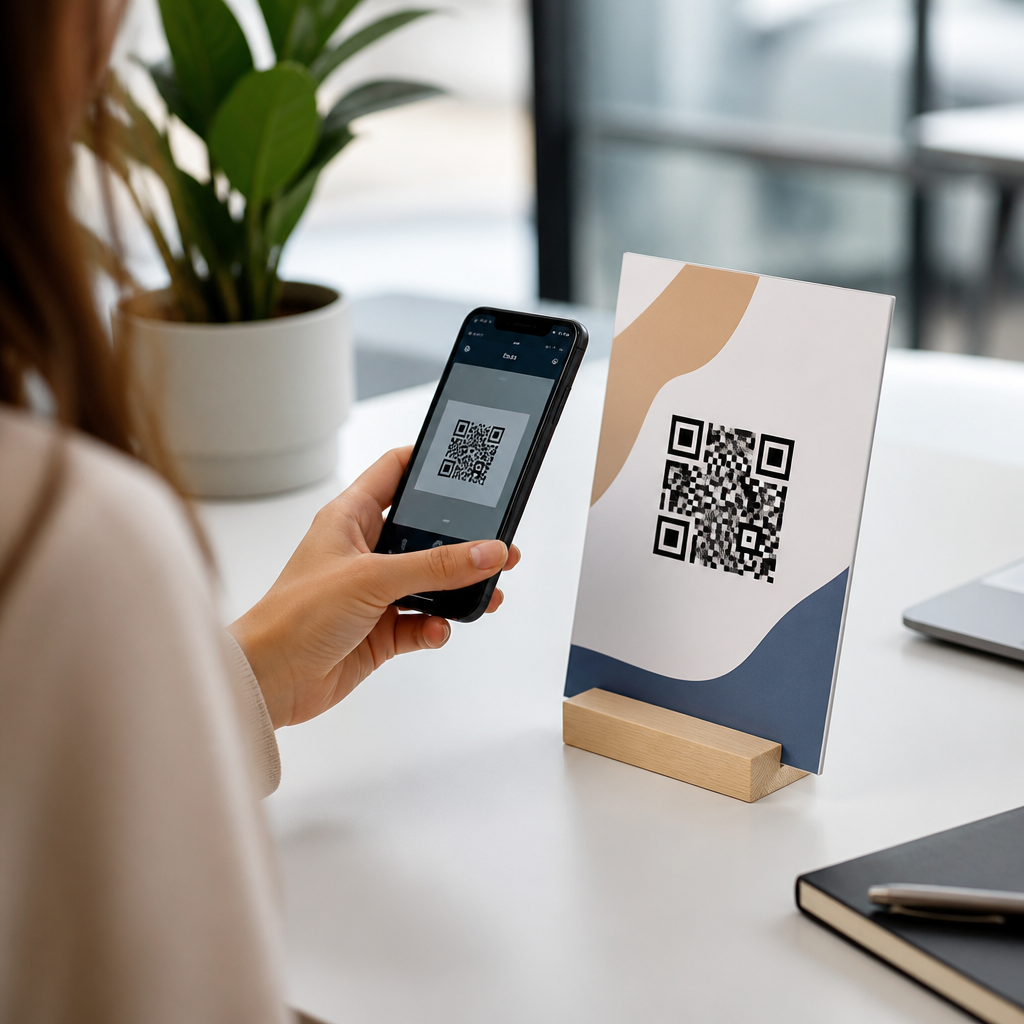
Personalizing QR code CTAs is one of the fastest ways to improve scan rates, reduce hesitation, and turn a generic square into a measurable conversion tool. A QR code CTA, or call to action, is the short message placed beside, above, below, or inside a code that tells people what they will get and why they should scan now. In mobile QR code design and UX, CTA optimization for QR codes means tailoring that message to the audience, context, device behavior, and destination experience so the promise of the scan matches the result on the phone. I have tested QR signage in retail aisles, packaging, direct mail, event booths, and restaurant tables, and the pattern is consistent: when the CTA is specific, relevant, and visually connected to the next step, scans increase and abandonment falls. This matters because most people decide in seconds whether a code looks useful, safe, and worth interrupting their current task. Personalization closes that gap by replacing vague language such as “Scan Me” with intent-based prompts like “Scan to compare sizes,” “Scan for today’s menu,” or “Scan to claim your member price.”
Good QR code CTA optimization sits at the intersection of copywriting, usability, analytics, and mobile landing page design. The CTA must answer four questions immediately: what happens after the scan, what benefit the user gets, how long it takes, and whether the destination can be trusted. If any of those are unclear, the code becomes decorative instead of functional. Personalized CTAs matter even more now because smartphone cameras detect codes instantly and users have less patience for generic prompts, slow pages, or irrelevant offers. For brands building a hub around mobile QR code design and UX, this topic is foundational because every supporting article, from QR placement to dynamic code testing, ultimately affects whether the CTA earns action. The strongest programs treat CTA optimization as a repeatable discipline, not a one-time label choice, and they measure performance by scan-through rate, unique scans, landing page engagement, and conversion quality.
Start with user intent, not the code itself
The most effective personalized QR code CTAs begin by identifying why someone is standing in front of the code in that moment. In practice, I map intent into simple categories: discover, compare, save, verify, order, register, or get support. Each intent demands different language. A shopper holding a product wants reassurance and detail, so “Scan to see ingredients and allergy info” outperforms “Learn more.” A conference attendee walking past a booth wants speed, so “Scan for the 2-minute product demo” beats “Explore our platform.” The CTA should describe the immediate outcome, not the technology. People do not care that a QR code exists; they care what the scan unlocks.
Context sharpens personalization further. The same brand may need several CTA versions across one campaign because audience mindset changes by location. On shelf tags, I have seen “Scan to compare models” work better than discount language because shoppers are still evaluating. On post-purchase inserts, “Scan to activate your warranty in 30 seconds” performs better because the product is already bought and the next job is setup or registration. In healthcare settings, direct language such as “Scan to check in securely” lowers uncertainty because it states both the action and the trust signal. Personalization is therefore less about adding a customer’s name and more about matching copy to situational intent with precision.
Use benefit-led language that reduces ambiguity
A personalized QR code CTA should be concrete enough that a user can predict the next screen before scanning. The formula I rely on is benefit plus action plus qualifier. Benefit explains the value, action tells the user what to do, and qualifier sets expectations around time, exclusivity, or format. For example, “Scan to get your 10% reorder code,” “Scan to watch the 90-second setup video,” and “Scan to book a fitting appointment” all communicate a specific reward. By contrast, “Scan now” provides no value proposition and often underperforms unless the surrounding design already carries the message.
Trust language also belongs in the CTA when risk or friction is high. If a code leads to payment, forms, or account access, state that clearly and avoid bait-and-switch phrasing. “Scan to pay your invoice securely” is stronger than “Quick payment here” because it names the task and signals safety. If the destination is a messenger app, PDF, app store page, or browser-based form, say so. This reduces surprise and drop-off. Across print campaigns, I have repeatedly found that adding one clarifying word such as “menu,” “video,” “coupon,” or “registration” can improve scan quality because the audience self-selects based on genuine interest, which leads to better downstream conversion rates.
Match the CTA to placement, audience, and funnel stage
Placement determines reading distance, dwell time, and competing distractions, so it should directly shape CTA wording. A poster in a train station allows only a few seconds of attention, which means the CTA must be short, benefit-led, and legible from several feet away: “Scan for live departures” or “Scan for the map.” A product insert inside a shipped box allows more explanation because the recipient is already engaged. There you can use two-line CTAs such as “Scan to register your device and unlock support videos.” In restaurants, tabletop codes succeed when the CTA reflects the immediate task: “Scan to view the menu,” “Scan to split the bill,” or “Scan to reorder your last round.”
Audience segmentation is equally important. First-time visitors usually need confidence and orientation; returning customers want speed and recognition. A loyalty member sign might say, “Scan to redeem your points today,” while a general audience sign says, “Scan to join and get your first reward.” B2B environments often benefit from utility language rather than hype. At trade shows, “Scan for pricing and implementation checklist” tends to attract more qualified leads than broad promises about transformation. Funnel stage should guide urgency too. Early-stage CTAs should educate or compare. Mid-stage CTAs should prove value with demos, calculators, or case studies. Late-stage CTAs should remove barriers with booking, checkout, or support actions.
Test message variants and measure the right metrics
QR code CTA optimization is only reliable when it is measured systematically. Dynamic QR codes make this possible because you can keep the printed code constant while changing the destination, campaign parameters, or surrounding CTA. In my projects, I test one primary variable at a time: benefit framing, urgency, format, or trust signal. For example, a museum label can compare “Scan to hear the curator’s audio note” against “Scan for the 1-minute story behind this piece.” Both may generate scans, but the second may produce more complete listens if it sets clearer expectations.
| CTA Variant | Best Use Case | Primary Metric | Common Risk |
|---|---|---|---|
| Scan to get 15% off today | Retail promotion | Scan-to-redemption rate | Attracts low-intent bargain seekers |
| Scan to compare plans | Consideration stage | Landing page engagement | Too broad if plans are complex |
| Scan to watch the 60-second demo | B2B events | Video completion rate | Weak mobile playback experience |
| Scan to verify authenticity | Packaging and anti-counterfeit | Unique scans by unit | Creates concern if design feels unofficial |
The most useful metrics go beyond raw scans. Track unique scans, repeat scans, device type, time to load, bounce rate, form completion, coupon redemption, add-to-cart rate, and assisted conversion. UTM parameters in Google Analytics 4, event tracking in Tag Manager, and dashboards from platforms such as Bitly, QR Code Generator PRO, or Beaconstac can show where the CTA succeeds or fails. A high scan rate with low conversion often means the CTA overpromised or the landing page failed to match the promise. A lower scan rate with high conversion can still be a win if the CTA filters for stronger intent. Performance should be judged by business outcome, not curiosity clicks alone.
Align the post-scan experience with the promise
The most personalized QR code CTA in the world will fail if the landing experience breaks trust. Message match is nonnegotiable: if the CTA says “Scan to book a repair,” the first screen should open to booking, not a generic homepage. Mobile page speed matters because camera scanning creates immediate momentum that is easy to lose. Keep forms short, prefill known fields where consent allows, and remove distractions. If the destination is app-dependent, offer a browser fallback. If the experience requires location, login, or payment, explain that before the user scans. Hidden friction is the enemy of QR performance.
Design and accessibility also influence CTA effectiveness. Use sufficient contrast, readable type, and whitespace around both the code and the CTA. Follow common accessibility guidance such as meaningful link destinations, plain language, and touch-friendly mobile layouts. Short URLs or branded domains visible near the code can reassure users that the destination is legitimate. In multilingual environments, localize the CTA rather than relying on a one-language default. Finally, build internal pathways from this hub to deeper resources on QR copywriting, dynamic QR testing, mobile landing pages, analytics setup, and print placement standards so teams can operationalize CTA optimization across campaigns.
Personalizing QR code CTAs works because it turns a passive graphic into a clear promise tailored to user intent, context, and next-step value. The best CTAs are specific, benefit-led, and honest about what happens after the scan. They reflect placement, audience segment, and funnel stage, then connect to a fast mobile experience that fulfills the message exactly. Measured correctly, personalized CTAs improve not only scan rate but conversion quality, customer trust, and campaign efficiency across packaging, signage, direct mail, events, and in-store environments. Generic phrases leave too much uncertainty; personalized wording removes guesswork.
As the hub for CTA optimization for QR codes, this topic should guide every related decision in mobile QR code design and UX, from copy length and visual hierarchy to analytics and landing page structure. Start by auditing every existing code and rewriting the CTA to answer one simple question: why should this person scan right now? Then test variants, review the data, and tighten the post-scan journey until the promise and outcome are perfectly aligned. If you want stronger QR performance, begin with the CTA and treat personalization as a disciplined conversion practice, not an afterthought.
Frequently Asked Questions
What does it mean to personalize a QR code CTA?
Personalizing a QR code CTA means adapting the message around the code so it feels specific to the person scanning, the situation they are in, and the action you want them to take next. Instead of using a vague instruction like “Scan Me,” a personalized CTA tells people exactly what they will get and why it is worth doing right now. That could mean changing the wording based on location, product type, customer intent, campaign stage, or device behavior. For example, “Scan to See Today’s Lunch Menu,” “Scan to Claim Your 15% Discount,” or “Scan to Watch the Setup Demo” is far more useful than a generic label because it reduces uncertainty and sets a clear expectation.
In practice, personalization can happen at several levels. You can personalize by audience, such as first-time visitors versus returning customers. You can personalize by context, such as in-store signage, packaging, trade shows, direct mail, or event booths. You can also personalize by destination, making sure the CTA matches what the user will actually see after the scan, whether that is a landing page, coupon, app download, form, video, or product guide. When the CTA promise and destination experience align closely, people are more likely to trust the code, scan it, and complete the intended action.
This matters because QR code performance is heavily influenced by clarity and relevance. A personalized CTA removes friction, answers the unspoken question of “What happens if I scan this?” and gives users a reason to act immediately. That makes the QR code not just a scannable graphic, but a conversion tool tied directly to user intent and measurable outcomes.
Why do personalized QR code CTAs improve scan rates and conversions?
Personalized QR code CTAs improve performance because they reduce hesitation. Most people will not scan a code simply because it exists. They scan when the benefit is obvious, the outcome feels safe, and the timing makes sense. A strong CTA addresses all three. It tells users what they get, reassures them that the action is worthwhile, and creates a clear connection between the physical moment and the digital next step. When that message is tailored to the audience and setting, it becomes even more persuasive.
Generic CTAs often fail because they create ambiguity. “Learn More” can mean almost anything. “Scan for Warranty Registration,” “Scan to Compare Models,” or “Scan to Reserve Your Spot” is much stronger because each version speaks to a concrete need. That specificity helps users self-qualify. The right people scan because they recognize immediate value, and the wrong people are less likely to bounce after scanning. This leads to better engagement metrics, higher-quality traffic, and stronger conversion rates downstream.
There is also a trust factor. QR codes can still create uncertainty if users do not know where they lead. A personalized CTA acts like a micro-promise. It frames the destination before the scan happens. If the code says “Scan to View Ingredients and Allergens,” users expect a simple, useful mobile page with that information. Delivering that exact experience builds confidence and makes future scans more likely. In other words, personalized CTAs improve not only the first interaction but also the broader perception of your brand’s QR code experience.
From a measurement standpoint, personalized CTAs also support better optimization. If you vary messaging by audience segment, placement, or campaign goal, you can compare results and identify which CTA language generates the highest scan rate, click-through rate, and final conversion rate. That turns CTA personalization into a practical testing strategy, not just a copywriting exercise.
How do you write an effective personalized CTA for a QR code?
An effective personalized QR code CTA starts with one simple principle: tell people what they get, why it matters, and why they should do it now. The best CTAs are specific, benefit-driven, and easy to understand at a glance. Since QR codes are often scanned in fast, real-world environments, your message should be short enough to process instantly but informative enough to remove doubt. Strong examples include “Scan to Get Your Boarding Info,” “Scan to Unlock the Full Tutorial,” or “Scan for Member-Only Pricing.”
To write one well, first identify the user’s context. Ask where they are, what they are doing, and what problem they want solved in that moment. Someone standing in a retail aisle may want reviews, comparisons, or a discount. Someone looking at product packaging may want setup help, care instructions, or authenticity verification. Someone at an event may want the agenda, speaker bios, or a quick way to enter a giveaway. Once you understand the moment, write the CTA around that immediate value rather than around your internal marketing goal.
Next, make sure the CTA matches the destination precisely. If the code leads to a form, say so. If it opens a menu, coupon, video, or booking page, say that directly. Avoid promising one thing and delivering another. Misalignment damages trust and depresses conversion. It also helps to use action words that fit the experience, such as “see,” “claim,” “watch,” “book,” “compare,” “download,” or “start.” These verbs signal what will happen and make the interaction feel more concrete.
Urgency can help, but it should feel natural rather than forced. “Scan for today’s offer” or “Scan to check in now” works because the timing is real. Overly aggressive language can weaken trust, especially if the actual destination does not support the promise. Finally, keep mobile behavior in mind. The CTA should lead to a mobile-optimized destination that loads quickly, looks clean on a small screen, and continues the promise made by the CTA without extra friction.
Where should a personalized QR code CTA appear in the design?
A personalized QR code CTA should appear wherever users can see and understand it before they decide to scan. In most cases, that means placing the CTA directly above or below the QR code, where it is visually connected and easy to read in one glance. The goal is to make the relationship between the message and the code unmistakable. If the CTA is too far away, too small, or visually disconnected, users may miss the value proposition entirely.
The best placement depends on the format and environment. On posters, flyers, packaging, table tents, shelf displays, and signage, the CTA typically works best immediately adjacent to the code, supported by a short line of benefit-focused copy if needed. On product packaging, it may also help to place a contextual label nearby, such as “Setup,” “Recipes,” “Support,” or “Offers,” so users understand the purpose even faster. In digital layouts that display a QR code for cross-device action, such as TV screens or presentations, the CTA should be large, high-contrast, and readable from a distance.
Design hierarchy matters. The CTA should be prominent enough to guide attention but not so dominant that it competes with the code itself. Good spacing, legible typography, and contrast are essential. If you include additional supporting text, keep it concise and practical. For example, “Scan to Compare Plans” could be followed by a smaller line like “Takes 10 seconds on your phone.” That kind of detail can reduce hesitation without cluttering the design.
You can also personalize placement based on behavior and device expectations. For example, if a user is likely to scan while walking through a store, the CTA should be positioned for quick visibility at eye level. If the code appears on packaging that is handled up close, you have more flexibility to include a slightly more detailed promise. In every case, the CTA should be readable before the scan and should make the next step feel obvious and worthwhile.
How can you test and optimize personalized QR code CTAs over time?
Testing and optimizing personalized QR code CTAs begins with tracking the full journey, not just the scan itself. A high scan rate is useful, but it only tells part of the story. You also need to know what happens after the scan: whether users stay on the page, click through, complete a form, redeem an offer, make a purchase, or take whatever action defines success for the campaign. The strongest CTA is the one that attracts the right users and leads to meaningful conversions, not simply the one that generates curiosity clicks.
Start by creating variations based on one factor at a time. You might test benefit-driven language against utility-driven language, such as “Scan to Save 20%” versus “Scan to See Product Details.” You can test audience-specific phrasing, such as a version for first-time buyers versus one for loyal customers. You can also compare urgency levels, message length, or the placement of supporting text. If possible, use dynamic QR codes or segmented campaign URLs so you can attribute performance accurately to each CTA version.
As results come in, look beyond raw scan volume. Evaluate scan-to-landing-page completion, bounce rate, time on page, click-through behavior, and final conversion rate. A CTA that generates fewer scans but better-qualified traffic may outperform a broader CTA that attracts more low-intent users. This is especially important when the destination involves a deeper action like booking, sign-up, or purchase. Effective optimization is about message-to-intent match, not just visibility.
It is also smart to evaluate external factors. The same CTA may perform differently depending on location,





