
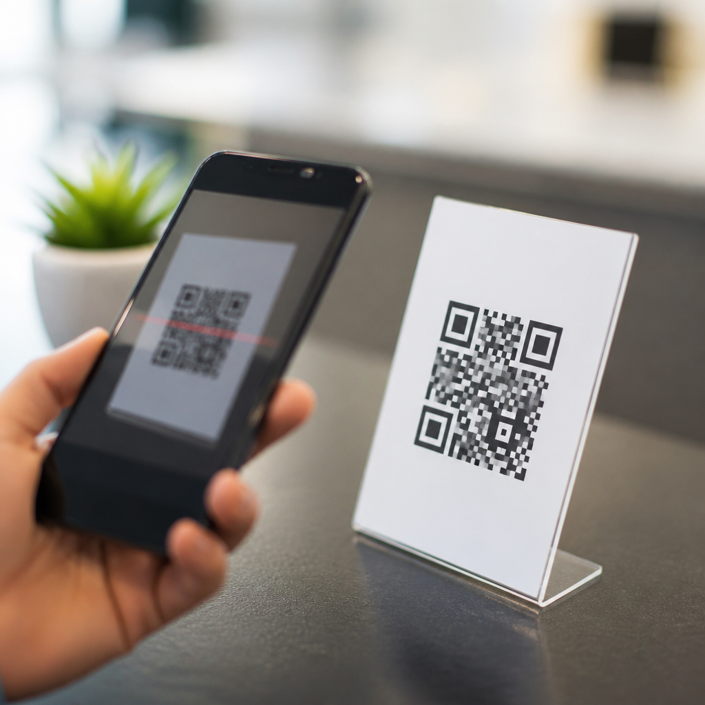
QR codes fail less often because of technology than because of weak calls to action. In mobile QR code design and UX, the call to action, or CTA, is the short instruction that tells people why they should scan, what they will get, and what happens next. CTA optimization for QR codes means improving that instruction so scanning feels useful, safe, and immediate. I have audited retail displays, restaurant tables, packaging inserts, trade show booths, and direct mail pieces, and the same pattern appears repeatedly: the code is present, but the reason to scan is vague, buried, or missing. When that happens, even well-placed, technically flawless QR codes underperform.
This matters because QR codes compress a full mobile journey into a single decision point. A passerby has only seconds to notice the code, interpret the message, judge the value, and decide whether opening a camera app is worth the effort. Unlike a text link on a webpage, a printed or on-object QR code competes with physical context, lighting, distance, motion, and trust concerns. If the CTA does not resolve basic questions such as “What will I get?” “How long will this take?” and “Is this safe?” response rates drop sharply. Effective QR CTA optimization improves scan-through rate, landing-page engagement, and downstream conversion, while reducing wasted print spend and missed in-store opportunities. Understanding the most common mistakes is the fastest way to design QR experiences that actually get used.
Using Generic Language Instead of a Specific Benefit
The most common CTA mistake with QR codes is generic wording such as “Scan me,” “Learn more,” or “Click here” transplanted from digital habits into physical environments. These phrases describe the action but not the reward. In testing, specific benefit-led prompts consistently outperform generic ones because they answer the user’s first question immediately: what’s in it for me? “Scan for today’s menu,” “Scan to claim 10% off,” and “Scan for setup instructions” are clear, concrete, and relevant to the context in which the code appears.
Benefit language also needs to match user intent at that exact moment. On product packaging, the strongest CTA is often post-purchase support, not pre-purchase persuasion. A coffee machine box should not say “Discover our brand”; it should say “Scan for 5-minute setup video.” In a restaurant window, “View menu and wait time” is stronger than “Find out more” because it solves an immediate problem. The rule is simple: name the outcome, not the mechanism. People do not want to scan a QR code; they want the coupon, instructions, reservation page, warranty registration, or tutorial behind it.
Hiding the Value Exchange and Friction Level
A good QR CTA sets expectations about both value and effort. One recurring mistake is promising something ambiguous without signaling how fast or easy the experience will be. If the destination requires a login, long form, app download, age gate, or location permission, users should know in advance. Otherwise, the CTA creates false expectations, and abandonment rises after the scan. In campaigns I have reviewed, codes tied to a simple mobile web page consistently outperformed those that dropped users into mandatory app install flows unless the reward was unusually strong.
Strong CTAs reduce uncertainty with microcopy. Phrases like “30-second survey,” “No app needed,” “Instant PDF,” or “Takes 1 minute” lower perceived risk and help qualify intent. Safety signals matter too. Many people still hesitate to scan unknown codes because QR phishing is real. Adding a branded domain in the design, plus CTA text such as “Opens brandsite.com” or “Secure product registration,” improves trust. This is especially important in healthcare, finance, and events, where users are trained to be cautious with links they cannot preview.
Missing Context Across Different Physical Environments
CTA optimization for QR codes is inseparable from placement. The same wording will perform differently on a shelf wobble, shipping carton, billboard, or tabletop tent because attention, distance, and user motivation change. A common mistake is using one universal CTA across all assets. That saves design time but ignores context. Billboards need ultra-short, high-clarity CTAs that can be understood at a glance, such as “Scan for nearest store.” Tabletop codes can support slightly more detail, such as “Scan to split the bill and reorder drinks.”
Environmental constraints also affect readability and actionability. In transit stations, users may be walking quickly, so a CTA should emphasize immediacy and simple outcomes. At trade shows, people often collect information for later, so “Scan to get the spec sheet emailed now” works better than “Explore our platform.” In product manuals, users are already committed and often frustrated, so “Scan for troubleshooting video” is ideal. Good QR UX starts by asking where the code lives, what the user is doing there, and what problem they need solved in that moment.
Overloading the Design or Undersizing the CTA
Another frequent mistake is treating the QR code itself as the centerpiece and the CTA as an afterthought. In practice, the instruction and reward statement are often more important than visual embellishments around the code. Designers sometimes add brand patterns, frames, or decorative icons while shrinking the CTA to tiny text that disappears at normal viewing distance. That reverses the decision hierarchy. Users must first understand why to scan; only then does the code matter.
Readable CTA text requires contrast, size, and spacing suited to the environment. A useful guideline is that the instruction should be legible from the same distance at which the code is intended to be scanned. If a poster is scanned from three feet away, the CTA cannot be six-point text under the code. Keep the message adjacent to the code, not separated by competing elements or blocks of copy. White space matters because it visually binds the CTA and code into one unit. When teams increase code size but leave the CTA weak, scan rates rarely improve as much as expected.
Failing to Match the CTA With the Landing Experience
A QR code CTA makes a promise, and the landing page must fulfill it immediately. One of the most damaging mistakes is message mismatch. If the sign says “Scan for 15% off” and the landing page opens to a generic homepage, users feel misled. If the CTA says “Watch installation video” and the link opens a product category page, trust drops. Every scan should land on the shortest possible path to the promised content, ideally above the fold on mobile.
This alignment is measurable. Compare scan rate, bounce rate, time to content, and completion rate for each QR destination. Tools such as GA4, Adobe Analytics, Bitly, and dynamic QR platforms can track scans by asset, location, and time. Use UTM parameters, but keep destination URLs clean through redirects. If a CTA underperforms, inspect not only the wording but also the first screen after the scan. In many audits, improving landing-page relevance raised conversion more than changing the printed creative because the core problem was broken expectation, not lack of curiosity.
Weak Testing Discipline and No Ownership
Teams often assume QR CTA performance cannot be tested rigorously because the asset is physical. That is incorrect. Dynamic QR codes make it possible to compare CTAs across locations, packaging runs, or in-store signage versions without changing the visible design. You can test “Scan for directions” against “Scan to find your size,” or “Get the coupon” against “Unlock 10% off,” then compare scan-through and conversion rates. Without this discipline, opinions dominate, and mediocre CTAs survive because no one owns the result.
| Mistake | Weak CTA | Better CTA | Why It Performs Better |
|---|---|---|---|
| Generic wording | Scan me | Scan for today’s menu | States exact benefit and intent |
| Hidden friction | Get started | Scan for a 30-second quote, no app needed | Sets effort and reduces uncertainty |
| Context mismatch | Learn more | Scan to see real-time booth demo times | Fits the event environment |
| Message mismatch | Claim your discount | Scan to apply 15% off at checkout now | Connects promise to immediate action |
Ownership matters just as much as testing. The best QR programs assign one team to the entire flow: CTA copy, code generation, destination management, analytics, and periodic review. When design owns the print, ecommerce owns the landing page, and retail ops owns placement, gaps appear. I recommend a simple governance checklist: purpose, audience, CTA, destination, fallback plan, tracking, and refresh date. QR codes are not “set and forget” assets. Offers expire, links break, and user expectations change.
Ignoring Accessibility, Trust, and Fallback Paths
The final CTA mistake is assuming everyone can or will scan under ideal conditions. Accessibility and trust are part of conversion, not extras. Users may have older devices, cracked screens, low light, poor connectivity, or limited dexterity. A good CTA is supported by a fallback path such as a short URL, NFC option, SMS keyword, or plain-language instructions. If a transit poster only works through scanning, some interested users are lost even when the CTA is strong.
Trust cues should be explicit. Use brand recognition, destination previews where appropriate, and concise privacy language when data collection is involved. For regulated industries, include necessary disclosures near the CTA without overwhelming the primary message. Accessibility also includes language simplicity. “Scan to renew prescription pickup preferences” is clearer than “Initiate fulfillment preference management.” Plain wording is not simplistic; it is effective. The strongest QR code experiences reduce doubt, support multiple paths, and respect the user’s time and context.
Common CTA mistakes with QR codes are fixable once teams stop treating the code as the strategy. The strategy is the promise around the code: a specific benefit, clear effort level, contextual relevance, readable presentation, accurate landing experience, measurable testing plan, and accessible fallback path. When those elements work together, CTA optimization for QR codes improves far more than scan rate. It lifts trust, speeds task completion, and turns static printed surfaces into useful mobile touchpoints.
For any brand building a stronger mobile QR code design and UX program, the next step is straightforward. Audit every live QR code and ask six questions: what is the user getting, how hard is it, why here, can they read it, does the page match, and what happens if they cannot scan? Rewrite weak CTAs first, because that change is usually the fastest win. Then test variants systematically and keep the best performers in rotation. Better QR calls to action create better user journeys, and better user journeys convert.
Frequently Asked Questions
What is the most common CTA mistake people make with QR codes?
The most common mistake is assuming the QR code explains itself. It does not. A QR code is only the mechanism for access, not the reason to act. When people see a code with no clear instruction, they have to guess what will happen if they scan it. That uncertainty creates friction, and friction lowers scan rates. In real-world environments like retail shelves, restaurant tables, packaging inserts, trade show booths, and direct mail, people make fast decisions. If the value is not instantly obvious, they move on.
A weak CTA usually sounds vague, generic, or incomplete. Phrases like “Scan here,” “Learn more,” or “Check this out” tell people almost nothing about the benefit. They do not answer the three questions users care about most: why should I scan, what will I get, and what happens next? A stronger CTA gives a specific promise and sets clear expectations, such as “Scan to view today’s menu,” “Scan for 15% off your first order,” or “Scan to watch the 30-second setup demo.” That kind of wording reduces hesitation because it makes the action feel useful and immediate.
The best CTA also matches context. On packaging, people may want setup help, instructions, warranties, or reorder options. In a restaurant, they may want menus, allergen details, or quick payment. At an event booth, they may want a product demo, a giveaway entry, or a follow-up resource. The biggest CTA mistake is not technology-related at all. It is failing to connect the scan to a clear, relevant outcome that matters in that moment.
Why does “Scan me” usually underperform as a QR code call to action?
“Scan me” underperforms because it focuses on the action, not the reward. It tells users what to do, but not why they should do it. From a UX perspective, that is a weak value proposition. People do not scan QR codes for the sake of scanning them. They scan because they expect some kind of benefit, whether that is saving money, getting information, speeding up a task, or unlocking something useful. If the CTA does not communicate that benefit, the code feels optional at best and suspicious at worst.
There is also a trust issue. Users have become more cautious about where links lead, especially on mobile. A generic CTA gives no confidence about destination, content, or safety. Compare “Scan me” with “Scan to download the installation guide” or “Scan to see verified customer reviews.” The second version is more persuasive because it explains the purpose and reduces uncertainty. It frames the scan as a meaningful next step instead of a random interaction.
Another reason “Scan me” performs poorly is that it wastes valuable visual real estate. Space near a QR code is limited, and every word should work hard. A CTA should communicate utility, urgency, and relevance. Instead of using that space for filler language, use it to highlight a real benefit: “Scan for today’s specials,” “Scan to reorder in 10 seconds,” or “Scan to claim your sample.” Better CTAs create stronger intent, and stronger intent usually leads to better scan-through behavior and more qualified engagement after the scan.
How detailed should a QR code CTA be?
A QR code CTA should be brief enough to read instantly but detailed enough to remove doubt. That balance is the goal. In most cases, one short line can do the job if it clearly states the benefit and next step. A good CTA does not need to explain everything, but it should eliminate the user’s biggest questions. The ideal level of detail depends on the setting, the audience, and the value being offered.
For example, in a fast-moving retail environment, the CTA should be simple and highly specific: “Scan for ingredients and nutrition facts” or “Scan for a 20-second product demo.” On a packaging insert, you may have room for a slightly fuller CTA such as “Scan to register your product and activate your warranty.” At a trade show, where attention is split and competition is high, specificity matters even more: “Scan to get the case study and book a live demo.” In each case, the CTA works because it tells the user exactly what they gain.
If the action involves any commitment, include that expectation. If users will land on a form, say so. If they will watch a video, mention the video. If they will receive a discount code, state the offer clearly. This kind of transparency improves user trust and often improves conversion quality because people self-select based on real interest. The CTA does not need to be long. It just needs to be precise. In QR code UX, clarity beats cleverness almost every time.
How can I make a QR code CTA feel safer and more trustworthy?
Trust starts with expectation-setting. People are more likely to scan when they know where the code leads and what they will experience next. A trustworthy CTA is specific, honest, and aligned with the surrounding context. If a code appears on a restaurant table, users should reasonably expect a menu, ordering system, or payment option. If it appears on product packaging, they should expect instructions, support, registration, or product details. When the CTA fits the environment, the scan feels legitimate.
The wording itself also matters. Vague CTAs can trigger hesitation because they sound promotional without being informative. Stronger trust-building language includes concrete outcomes such as “Scan to view care instructions,” “Scan to verify product authenticity,” or “Scan to access your receipt and warranty details.” These phrases help users understand the destination and reduce fear of being redirected somewhere irrelevant, intrusive, or unsafe.
Design cues around the code can reinforce trust too. Place the QR code near recognizable branding, a short explanation, and, when appropriate, a visible URL or domain reference. If privacy matters, say what will not happen as well as what will. For example, “Scan to download the guide—no app required” or “Scan to view the menu—no signup needed.” Those details lower perceived risk. In many audits, scan performance improves not because the code changes, but because the CTA and supporting text make the interaction feel predictable, useful, and low-friction.
What are the best practices for writing high-performing QR code CTAs?
High-performing QR code CTAs usually follow a simple formula: clear action, clear benefit, clear expectation. Start with a direct verb such as scan, view, get, watch, unlock, claim, compare, order, or register. Then pair that action with a specific user benefit. Instead of “Scan for more,” say “Scan to compare models,” “Scan to get your coupon,” or “Scan to watch the setup video.” That small shift changes the CTA from passive and generic to purposeful and outcome-driven.
Relevance is equally important. The best CTA for a retail display may be very different from the best CTA for direct mail or hospitality. In retail, shoppers may want quick proof points, reviews, pricing, or availability. In restaurants, they may want menus, allergen details, waitlist access, or mobile payment. On packaging inserts, they may want onboarding, troubleshooting, reorder links, or registration. On trade show booths, they may want a brochure, meeting scheduler, giveaway entry, or product walkthrough. The more closely the CTA matches the user’s immediate need, the stronger the response tends to be.
Finally, optimize for mobile reality. People are scanning on the move, often with limited time and attention. Keep the CTA short, readable, and visually close to the code. Make the promise immediate and believable. If there is urgency, use it honestly: “Scan to claim today’s offer” works better than exaggerated hype. If there is a next step after landing, mention it. And whenever possible, test variations. Even small changes in wording, such as replacing “Learn more” with “See pricing and features,” can meaningfully improve scan intent. The strongest QR code CTAs do not just instruct; they motivate by making the payoff obvious.





