
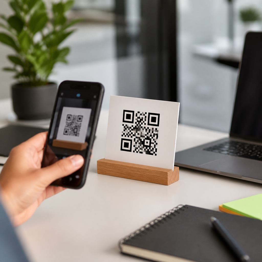
High-converting QR code CTAs turn a passive scan opportunity into a measurable action by telling people exactly what they will get, why it matters, and what happens next. In this context, a CTA is the short prompt placed beside, above, or inside the campaign around a QR code that motivates the scan, such as “Scan to see today’s menu” or “Scan to claim your warranty.” QR code CTA optimization means improving that prompt so more people notice the code, trust it, scan it, and complete the intended action on mobile. This matters because QR performance is rarely limited by the code itself. In most campaigns I have audited, the biggest lift came from changing the language, context, and landing-page alignment around the code, not from altering the pattern. A strong CTA reduces friction, sets expectations, and filters for motivated users. A weak one creates uncertainty: what is this code for, is it safe, and is the destination worth my time? Those questions decide conversion rates in retail, packaging, events, direct mail, out-of-home advertising, hospitality, and B2B sales materials.
CTA optimization for QR codes sits at the intersection of copywriting, mobile UX, behavioral psychology, and analytics. It includes message clarity, value proposition, urgency, incentive design, visual hierarchy, accessibility, placement, and post-scan continuity. It also depends on practical constraints like scan distance, lighting, print quality, and network conditions. If the CTA promises one thing and the mobile page delivers another, conversion drops immediately. If the CTA uses vague verbs like “learn more,” scan rates usually lag behind specific outcome-led prompts. The goal of this hub is to explain how to write QR code CTAs that convert consistently, how to match them to user intent and channel, and how to test them with confidence across real campaigns.
What a High-Converting QR Code CTA Must Communicate
A high-converting QR code CTA answers three questions in seconds: what the user should do, what they will get, and why they should do it now. The highest-performing prompts I have seen are concrete, benefit-first, and low ambiguity. “Scan to view the installation guide” beats “Scan here.” “Scan for 15% off your first order” beats “Discover more.” Specificity matters because people make a fast risk-reward calculation before pulling out their phone. The CTA must reduce uncertainty enough to justify the effort.
Effective QR code CTA copy usually combines a strong verb, a clear destination, and an incentive or outcome. Verbs that perform well include scan, unlock, claim, view, compare, book, activate, register, and reorder. Outcome language depends on intent: save money, get directions, watch a demo, check ingredients, join the waitlist, or redeem points. In regulated categories like healthcare, finance, or alcohol, clarity is even more important because legal review often strips emotional language; precise utility then becomes the conversion lever.
Trust signals are part of the CTA, even when they sit nearby rather than in the line itself. Adding “No app required,” “Secure mobile checkout,” or “Takes 30 seconds” can significantly increase scans because it removes hidden objections. For packaging, adding the destination brand name helps: “Scan to verify authenticity at BrandName” is stronger than a generic scan prompt. For public signage, a short explanation like “Opens Google Maps” can reassure users who worry about malicious links. High conversion begins with explicitness.
Match CTA Language to User Intent and Context
The best QR code CTA depends on where the code appears and what the user is trying to accomplish at that moment. A shopper standing in an aisle has different intent from a conference attendee or someone opening a direct mail piece at home. Context determines how much attention you have, how urgent the need is, and what value proposition will trigger a scan. When teams reuse the same CTA across every touchpoint, performance usually falls because intent is mismatched.
In retail packaging, users often want instructions, authenticity, ingredients, reviews, or rewards. “Scan for nutrition facts and recipes” works because it bundles immediate utility with discovery. In restaurants, the intent is speed and certainty, so “Scan to see the menu and order now” outperforms more promotional language. In events, practical CTAs such as “Scan for session schedule and venue map” typically beat brand slogans because attendees are navigating in real time. For B2B brochures, “Scan to compare models and request a quote” aligns better with evaluation-stage behavior than “Explore our solutions.”
Channel also changes copy strategy. On a billboard, the CTA must be short enough to read at distance and process instantly. On product packaging, you can afford one extra qualifier because the user is physically closer. In email signatures or printed proposals, credibility matters most, so naming the destination resource helps. The core rule is simple: write for the task the user wants to complete in that environment, not for the message the brand wants to repeat.
Use Proven CTA Formulas and Test Them Systematically
There is no universal best QR code CTA, but there are repeatable formulas that consistently outperform vague prompts. The most reliable formulas are benefit-first, action-plus-outcome, and incentive-plus-urgency. Benefit-first starts with the reward: “Get the assembly video—scan here.” Action-plus-outcome states the next step clearly: “Scan to book your test drive.” Incentive-plus-urgency adds a time or scarcity trigger: “Scan to claim today’s event-only offer.” These formulas work because they compress value, action, and relevance into a few words.
Testing should be disciplined. Change one major variable at a time: verb, benefit, incentive, urgency, or reassurance. If you alter all five at once, you will not know what caused the lift. Dynamic QR platforms such as Bitly, QR Code Generator PRO, Beaconstac, and Scanova allow campaign-level tracking, destination updates, and segmentation by location or device. That makes it practical to compare CTAs across versions of the same poster, package insert, or shelf talker.
| Context | Weak CTA | Stronger CTA | Why It Converts Better |
|---|---|---|---|
| Product packaging | Scan here | Scan for setup video and warranty | Names two immediate benefits and lowers uncertainty |
| Retail shelf | Learn more | Scan to compare sizes and prices | Matches in-aisle decision intent |
| Event badge | Connect with us | Scan to book a 10-minute demo | Defines the action and time commitment |
| Restaurant table tent | Mobile menu | Scan to order and pay from your table | Promises speed and convenience |
Measure more than scan rate. A CTA can increase scans while reducing downstream conversions if it overpromises or attracts low-intent users. Track scans, landing-page bounce rate, form completion, cart starts, purchases, coupon redemptions, and assisted conversions. A useful test result is not “more scans”; it is “more qualified actions at lower friction.”
Design, Placement, and Landing-Page Alignment
Even excellent QR code CTA copy fails when design and placement undermine readability. The CTA should sit immediately adjacent to the code, preferably above or below it, with enough white space to separate it from surrounding clutter. Contrast must be strong. Tiny captions, low-contrast type, or crowded layouts reduce noticeability before copy can do its job. For print, scan distance matters: the further away the audience, the fewer words your CTA can carry. Outdoor placements also need a code size large enough to scan reliably; a common practical guideline is roughly one inch of code width for every ten feet of scanning distance, adjusted for lighting and motion.
Landing-page alignment is where many campaigns leak conversion. If the CTA says “Scan to get 20% off,” the first mobile screen must show that discount immediately, not a generic homepage. If it says “Scan for installation guide,” users should arrive at the guide, not a navigation menu. Message match is not a nice-to-have; it is the basis of trust. I have seen simple destination changes outperform full creative redesigns because they remove one extra tap, search, or pinch-zoom moment on mobile.
Technical details matter as well. Use dynamic QR codes when possible so you can fix destinations without reprinting assets. Tag links with UTM parameters for campaign attribution in analytics platforms. Make sure the destination is fast, mobile-optimized, and accessible, with readable type, touch-friendly controls, and compressed images. A CTA can win the scan and still lose the conversion if the page loads slowly on cellular data.
Common Mistakes and How to Improve Them
The most common QR code CTA mistake is vagueness. “Scan me” is clever only until it underperforms. People need a reason, not a command. Another frequent error is leading with brand messaging instead of user benefit. “Experience innovation” may sound polished, but “Scan to see pricing and delivery times” is more useful and usually more effective. Brands also hurt performance by burying the CTA in legal text, placing the code where camera focus is difficult, or using a destination that is not mobile-native.
Another problem is misaligned incentives. If you offer a discount, say what it applies to and whether conditions exist. If you promise exclusive content, make sure it is genuinely exclusive. Users remember bait-and-switch experiences, and trust drops fast. Security perception also matters. In physical environments where phishing awareness is high, adding the destination domain in plain text or branding the landing page clearly can improve confidence. Accessibility should not be ignored either; nearby text should be readable, and alternative short URLs can help users who cannot scan easily.
Improve weak CTAs by making them more specific, more relevant to context, and more honest about the outcome. Replace generic verbs with task-oriented ones. Replace broad claims with concrete benefits. Remove extra steps after the scan. Then test again. Strong QR code CTA optimization is iterative, not decorative.
High-converting QR code CTAs work because they remove doubt and increase motivation at the exact moment a user decides whether to scan. The formula is straightforward: state the action clearly, promise a relevant benefit, support trust, and deliver a landing experience that matches the promise immediately. When you tailor the CTA to context, use specific language, and measure full-funnel results rather than scans alone, QR campaigns become far more reliable. This is especially important within mobile QR code design and UX, where small wording changes can influence not only scan rate but purchase intent, support deflection, loyalty enrollment, and repeat engagement.
As the hub for CTA optimization for QR codes, this article establishes the fundamentals that every deeper topic builds on: copy formulas, intent matching, test design, placement, analytics, and post-scan continuity. Apply these principles to packaging, posters, menus, mailers, event materials, and in-store signage, then document what changes conversion behavior in your audience. Start with your highest-traffic QR asset, rewrite the CTA so the value is unmistakable, align the mobile destination, and run a controlled test this week.
Frequently Asked Questions
What makes a QR code CTA high-converting?
A high-converting QR code CTA does more than tell someone to “scan here.” It clearly explains the value of scanning, reduces uncertainty, and sets the right expectation for what happens next. In practical terms, the best QR code calls to action answer three questions immediately: what the user gets, why it is worth doing, and what will happen after the scan. For example, “Scan to get 15% off your first order” is far more persuasive than a generic prompt because it gives a specific benefit and a clear reason to act.
Strong QR code CTAs also match user intent and placement. Someone seeing a code on product packaging may be interested in setup instructions, warranty registration, or exclusive support. Someone seeing a code in a restaurant window may want a menu, hours, or ordering options. The more relevant the CTA is to the moment, the better it will perform. Relevance increases attention, and attention increases scans.
Clarity is equally important. If people are unsure where the code leads, they hesitate. Words like “Scan to watch the demo,” “Scan to book your appointment,” or “Scan to download the guide” are effective because they remove ambiguity. High-converting CTAs also build trust by sounding credible and straightforward, not pushy or vague. In many cases, adding a short reassurance such as “No app required” or “Takes 30 seconds” can improve conversion because it lowers friction and perceived risk.
Finally, the CTA should support the full conversion path, not just the scan itself. A campaign is only truly successful if users complete the intended action after landing. That means the message beside the QR code should align tightly with the landing page experience. If the CTA promises a coupon, the destination should deliver that coupon immediately. If it promises a menu, users should not have to dig through unrelated pages. High-converting QR code CTAs work because they connect message, action, and outcome in one seamless experience.
How long should a QR code CTA be?
The ideal QR code CTA is usually short, direct, and easy to understand at a glance, but it still needs to communicate value. In most cases, one concise sentence or phrase works best. The goal is not to say everything possible. The goal is to say the most persuasive thing in the fewest words needed. A CTA like “Scan to view today’s menu” is compact and effective because it tells the user exactly what they will get without making them work to interpret it.
That said, “short” should never come at the expense of clarity. A CTA that is too brief can become generic and underperform. “Scan now” is technically short, but it lacks context, benefit, and motivation. By contrast, “Scan to claim your free sample” is still short, yet much stronger because it offers a clear reward. If you need slightly more text to reduce hesitation, it is often worth it. For example, a short secondary line such as “No signup required” or “Ready in under a minute” can improve results by addressing a likely objection.
Length should also reflect where the QR code appears. In fast-moving environments such as transit ads, retail displays, event signage, or packaging viewed from a distance, brevity matters more because people have limited time and attention. In more stationary environments like brochures, tabletop displays, direct mail, or in-store product inserts, you have a little more room to explain the benefit and next step. The best approach is to keep the core CTA concise and, when needed, add a brief supporting line that reinforces value or trust.
As a rule, focus on specificity rather than word count alone. A good QR code CTA is not successful because it is short; it is successful because it is instantly understandable. If someone can look at the prompt and immediately know why they should scan and what they will receive, the length is probably right.
What words or phrases improve QR code scan rates?
Words that improve QR code scan rates usually do one of four things: create clarity, highlight value, introduce urgency, or reduce friction. Clear action phrases such as “Scan to order,” “Scan to register,” “Scan to watch,” or “Scan to compare plans” work well because they make the next step obvious. When users know exactly what the scan unlocks, they are more likely to act. Confusion is one of the biggest conversion killers, so direct wording almost always outperforms vague language.
Value-driven phrases are also powerful. Terms like “get,” “claim,” “unlock,” “save,” “discover,” and “access” can help communicate a reward or advantage. For example, “Scan to unlock member pricing” feels more compelling than “Scan for details” because it emphasizes a concrete benefit. Similarly, “Scan to get setup instructions” is stronger than a generic “Learn more” because it speaks to a practical need. The best phrasing depends on the offer, but the principle is consistent: lead with what matters to the user.
Urgency can improve performance when it is authentic. Phrases such as “today only,” “limited-time offer,” “before it’s gone,” or “ends Friday” can increase response because they give people a reason to act now instead of later. However, urgency should be used carefully. If it feels exaggerated or misleading, it can damage trust. QR code CTAs tend to perform best when they sound useful and credible, not overly promotional.
Friction-reducing phrases are especially effective for people who may feel uncertain about scanning. Examples include “No app needed,” “Takes 30 seconds,” “Instant access,” or “See results immediately.” These small additions can have a big impact because they address common concerns before they stop the user from taking action. In many campaigns, the highest-performing QR code CTA combines all of these elements: a clear action, a specific benefit, and a subtle reassurance that the process will be quick and easy.
Where should a QR code CTA be placed for the best results?
The best place for a QR code CTA is wherever people can see the message and the code together without effort. The CTA should sit immediately beside, above, or integrated with the QR code so that the instruction and the action feel connected. If the prompt is separated from the code, people may notice one but miss the other, which weakens response. Good placement makes the relationship obvious: the text explains why to scan, and the code makes it possible right away.
Visual hierarchy matters just as much as physical placement. The CTA should be prominent enough to catch attention before the QR code is ignored as background design. In many layouts, the CTA should be more visually assertive than the code itself because people respond to meaning before they respond to symbols. A bold line like “Scan to see available colors” can pull the eye in and make the code feel purposeful. Without that context, the code may be seen as optional or confusing.
Placement should also reflect user behavior in the real environment. On posters and signs, put the CTA and code at a natural viewing height and in a location where people can pause long enough to scan comfortably. On product packaging, place them where users are likely to look during consideration or after purchase, depending on the goal. On restaurant tables, event booths, retail shelves, and direct mail pieces, make sure lighting, distance, and surrounding clutter do not interfere with usability. Even a strong CTA can underperform if the code is hard to access physically.
It is also smart to support the CTA with small design cues that reinforce action, such as directional spacing, contrast, framing, or a short subtext line. For example, a CTA above the code and a reassurance below it can work well: “Scan to activate your warranty” followed by “Takes less than 1 minute.” This arrangement gives users motivation first and confidence second. Ultimately, the highest-converting placement is the one that makes scanning feel obvious, easy, and immediately worthwhile.
How can you test and optimize QR code CTAs for better conversions?
Optimizing QR code CTAs starts with measuring more than just scans. A high scan count is useful, but it does not automatically mean the CTA is effective if users do not complete the intended action afterward. To improve performance, track the full funnel: impressions if available, scans, landing page visits, form completions, purchases, registrations, downloads, or whatever outcome matters most. This broader view helps you distinguish between a CTA that creates curiosity and one that drives real results.
From there, test one variable at a time. The most common and valuable QR code CTA tests include wording, benefit framing, urgency, reassurance, placement, size, color contrast, and supporting copy. For example, you might compare “Scan to learn more” against “Scan to get your free buyer’s guide” or test “Scan to claim your discount” against “Scan to save 20% today.” These variations may seem small, but they can produce meaningful differences in both scan rate and downstream conversion rate because they change how users perceive value and effort.
Context-specific testing is especially important. A CTA that works on product packaging may fail on a trade show banner because the user mindset is different. Likewise, language that performs well in one industry may not resonate in another. Test copy that reflects real user intent in each setting. If





