
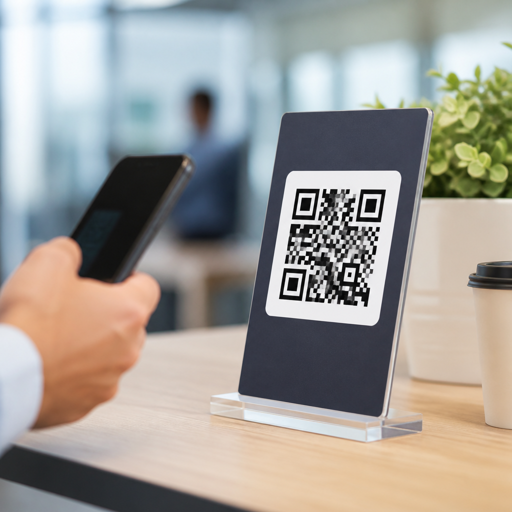
QR codes do not fail because the technology is weak; they fail because the prompt around them is vague, timid, or disconnected from user intent. In QR campaigns, the call to action is the short line of copy, design cue, or surrounding message that tells someone what will happen after scanning and why it is worth the effort. CTA optimization for QR codes means improving that prompt so more people notice the code, trust it, scan it, and complete the next step. Within mobile QR code design and UX, this matters because scanning is never automatic. Users make a fast judgment about relevance, safety, effort, and reward. I have seen identical codes perform very differently based solely on wording such as “Scan to view menu” versus “Scan for today’s menu and order ahead.” Better CTAs raise scan-through rate, reduce hesitation, and align the physical moment of discovery with a useful mobile experience. This hub explains the best call-to-action examples for QR codes, the psychology behind them, and the practical rules that consistently improve results across retail, hospitality, events, packaging, and service environments.
What makes a QR code CTA effective
The best QR code CTA answers three user questions immediately: what do I get, what do I do, and what happens next. If any of those answers are unclear, scan intent drops. Effective CTA optimization for QR codes starts with specificity. “Scan here” is weaker than “Scan to see sizes in stock” because it names the payoff. Good CTAs also reduce perceived risk. Phrases such as “No app needed,” “View the menu,” or “Get setup instructions” reassure users that the action is simple and predictable. In practice, high-performing CTAs usually combine a verb, a benefit, and a context cue. For example, “Scan to claim your 10% in-store discount” outperforms a generic “Learn more” because the value is immediate and measurable.
Placement and visual hierarchy matter as much as wording. On shelf talkers, product packaging, posters, table tents, and direct mail, the CTA should sit directly above or beside the code, not buried in a paragraph below it. Size contrast helps users connect the message to the code in one glance. I usually recommend pairing the CTA with a micro-support line when trust is essential, such as “Opens our secure booking page” or “Takes you to installation steps.” According to GS1 guidance and common mobile usability standards, predictability and context improve adoption because users are more likely to engage when the outcome is transparent. A QR code is only the bridge; the CTA is what persuades people to cross it.
Best call-to-action examples for common QR code goals
Different goals require different language. For transactional goals, use direct outcome-based copy: “Scan to order now,” “Scan to pay your bill,” or “Scan to book your appointment.” For information goals, be explicit about the content: “Scan for assembly instructions,” “Scan to compare plans,” or “Scan to watch the product demo.” For retention goals, the CTA should promise ongoing value: “Scan to join our rewards program,” “Scan to reorder in seconds,” or “Scan for care tips and warranty registration.” The best call-to-action examples for QR codes are concrete because users rarely scan out of curiosity alone; they scan to solve a problem or get a benefit.
Context also changes the right tone. In restaurants, “Scan to view today’s menu” works better than “Discover our offerings” because diners need speed. At conferences, “Scan to download the speaker slides” converts because the value is tied to the session they just attended. On consumer packaging, “Scan for ingredients, allergens, and sourcing” is strong because it addresses common purchase concerns. In property management, “Scan to submit a maintenance request” beats “Contact us” because it shortens the path to action. Each example succeeds because it matches a real user task at the moment the person encounters the code.
CTA patterns that increase scans and conversions
Several CTA patterns repeatedly outperform generic language. First is utility-first wording, where the user benefit comes before brand messaging. “Scan to activate your warranty” is stronger than “Experience the Acme difference.” Second is immediacy. Words like “today,” “now,” or “in seconds” can lift response when the promise is genuine. Third is exclusivity, used carefully: “Scan for event-only pricing” or “Scan for backstage content” works when the audience values access. Fourth is friction reduction: “Scan to check out—no login required” removes a common barrier. Fifth is proof of relevance: “Scan to see customer photos” or “Scan to compare side-by-side specs” signals useful, decision-supporting content.
One practical rule I use is that the CTA should preview the landing page. If the code opens a PDF, say so. If it starts WhatsApp, say so. If it launches Apple Wallet or a review page, say that clearly. Mismatch is one of the fastest ways to damage trust and depress repeat scans. Another rule is to keep the primary CTA short enough to read in under two seconds. Long, abstract copy is rarely effective in physical environments where people are walking, waiting, shopping, or multitasking. Strong QR CTAs respect attention limits and reward action quickly.
| Use case | Weak CTA | Better CTA | Why it works |
|---|---|---|---|
| Restaurant table | Scan here | Scan to view the menu and order | Names the task and next step |
| Retail shelf | Learn more | Scan to see colors, sizes, and reviews | Adds specific purchase information |
| Event signage | More info | Scan to download slides from this session | Matches immediate attendee intent |
| Product packaging | Discover | Scan for setup steps and warranty registration | Combines utility and post-purchase value |
| Service business | Contact us | Scan to book a 15-minute consultation | Defines time, action, and commitment |
How to write QR code CTAs by industry and funnel stage
Industry context shapes the best CTA optimization for QR codes. In retail, shoppers often need confidence before purchase, so CTAs should surface decision aids: “Scan to see customer reviews,” “Scan to find your size,” or “Scan for in-stock options.” In hospitality, speed and service dominate: “Scan to request towels,” “Scan to check out,” or “Scan to order room service.” In healthcare settings, clarity and privacy matter most: “Scan to complete intake forms securely” is better than promotional language. For education, “Scan to access course materials” or “Scan to join office hours” tells students exactly what the code unlocks.
Funnel stage matters too. At the awareness stage, educational CTAs perform well, such as “Scan to see how it works.” At consideration, users need comparison and proof: “Scan to compare models” or “Scan to read verified reviews.” At conversion, remove ambiguity: “Scan to buy now,” “Scan to reserve your seat,” or “Scan to start your free trial.” After purchase, use support and loyalty CTAs to extend value: “Scan for care instructions,” “Scan to reorder,” or “Scan to refer a friend.” Building a hub around CTA optimization means mapping these moments deliberately so every QR placement supports a clear business and user outcome.
Design, testing, and measurement for better QR CTA performance
Copy alone will not rescue poor execution. The code must be easy to scan, with sufficient quiet zone, contrast, and print quality. The CTA should be readable at the expected viewing distance and paired with a landing page built for mobile speed. Google’s Core Web Vitals remain relevant here because a slow page wastes the scan you worked to earn. Dynamic QR platforms such as Bitly, QR Code Generator, Flowcode, Beaconstac, and Scanova help teams update destinations and track scans by time, location, and device. Those metrics are useful, but the key measurement is not scans alone. Track scan-to-load rate, bounce rate, form completion, add-to-cart, booking completion, or coupon redemption based on the actual goal.
A disciplined testing process improves results quickly. Start by testing one variable at a time: CTA wording, incentive, placement, or support line. Compare “Scan to get 15% off” against “Scan to unlock your in-store discount.” Test benefit-led versus task-led language. On printed assets, even small placement changes can matter; moving the code from the bottom margin to eye level often increases engagement because users notice the CTA sooner. Also test the trust layer. I have repeatedly seen conversion lift when adding a line like “Opens our official site” in environments where fake QR codes are a known risk. Effective CTA optimization for QR codes is measurable, iterative, and rooted in the full user journey, not just the scan itself.
Common mistakes to avoid when creating QR code CTAs
The most common mistake is using generic commands with no benefit. “Scan me” may look clever, but it does not answer why the user should care. Another mistake is hiding the payoff behind brand slogans or vague curiosity language. QR interactions happen quickly, so clarity beats cleverness almost every time. A third mistake is promising one thing and delivering another, such as saying “Scan for reviews” and sending users to a homepage. That mismatch increases abandonment and undermines future trust. Brands also hurt performance by placing codes where scanning is awkward, such as reflective windows, moving vehicles, or areas with weak connectivity.
Security perception is another frequent blind spot. Because malicious QR substitutions exist, users are justified in being cautious. Your CTA and surrounding design should signal legitimacy through official branding, clear destination language, and clean production quality. Avoid overloading the area with multiple competing actions. If the user can scan, text, call, and download in the same small space, attention fragments and response drops. Finally, do not treat every audience the same. A warehouse technician scanning for maintenance logs needs a very different CTA from a festival attendee scanning for VIP upgrades. Precision is what makes a QR code CTA feel helpful instead of intrusive.
The best call-to-action examples for QR codes are specific, useful, and tightly matched to the moment in which a person sees the code. Strong QR CTAs state the action, preview the benefit, reduce uncertainty, and connect to a mobile landing experience that fulfills the promise quickly. As the hub for CTA optimization for QR codes within mobile QR code design and UX, this page establishes the core rule that drives performance across every subtopic: people scan when the value is obvious and the next step feels safe and easy. Use benefit-led wording, tailor the message to industry and funnel stage, support it with scannable design, and measure outcomes beyond the scan. Review your current QR placements, rewrite one vague CTA today, and test a clearer, more specific version against it.
Frequently Asked Questions
What makes a strong call to action for a QR code?
A strong QR code call to action clearly tells people what they will get, why it matters, and what to do next. The best examples remove guesswork. Instead of a generic prompt like “Scan me,” effective CTA copy sets an expectation, such as “Scan to view today’s menu,” “Scan for 20% off,” or “Scan to watch the demo.” This works because users are far more likely to engage when the value is immediate and specific. A QR code by itself is only a tool; the CTA is what gives it purpose and turns curiosity into action.
Strong QR CTAs also align closely with user intent and context. If someone is in a store, they may want pricing, reviews, or a coupon. If they are at an event, they may want registration details, a schedule, or exclusive content. The strongest examples feel natural in the moment because they match what the user is already thinking about. Good CTA design reinforces this message visually through placement, contrast, directional cues, and surrounding copy that builds trust. In short, the most effective QR code calls to action are specific, benefit-driven, context-aware, and easy to follow.
What are some of the best call-to-action examples for QR codes?
The best call-to-action examples for QR codes are direct, benefit-led, and tied to a clear next step. High-performing examples include “Scan to get 15% off your first order,” “Scan to see the full product demo,” “Scan to book your free consultation,” “Scan to download the app,” and “Scan to unlock the menu.” Each of these works because it answers the user’s unspoken question: “Why should I scan this?” It frames the action around a reward, a useful outcome, or access to something valuable.
Other excellent examples depend on the setting. In retail, “Scan to compare colors and sizes” or “Scan for customer reviews” can reduce purchase hesitation. In restaurants, “Scan to order and pay from your table” is highly effective because it saves time. In real estate, “Scan for the virtual tour” gives immediate relevance. At trade shows, “Scan to get the presentation deck” or “Scan to enter the giveaway” can drive lead capture. The best examples are not clever for the sake of being clever; they are practical, clear, and persuasive. They make the outcome obvious and lower the mental effort required to act.
Why do vague QR code prompts usually perform poorly?
Vague QR code prompts underperform because they create uncertainty at the exact moment users need clarity. When people see a QR code with little or no explanation, they have to guess what will happen after scanning. That uncertainty introduces friction. They may wonder whether the code leads to a coupon, a homepage, a form, a video, or something irrelevant. They may also question whether the destination is trustworthy or worth the time. In most environments, especially busy retail, outdoor, or event settings, that hesitation is enough to stop the scan entirely.
Weak prompts also fail to connect with intent. A generic phrase like “Scan here” does not communicate value, urgency, or relevance. It tells users what to do, but not why they should do it. In contrast, a more precise CTA such as “Scan to see installation instructions” or “Scan to claim your free sample” immediately frames the benefit. This is why QR code success is rarely about the code itself. It is about the surrounding message, visual hierarchy, and promise being made to the user. If the CTA is timid, abstract, or disconnected from context, even a perfectly functional QR code can perform badly.
How can I improve QR code CTA conversion rates?
Improving QR code CTA conversion rates starts with sharpening the message. Focus on the user benefit first, not the action first. “Scan to save 10 minutes at checkout” is stronger than “Scan now” because it gives a reason. Use simple, concrete language that tells users exactly what happens next. If possible, mention the outcome, incentive, or time-sensitive value. Phrases like “Scan to get the guide,” “Scan for instant access,” or “Scan to reserve your spot” tend to perform better than broad or overly creative wording because they reduce ambiguity.
Design and placement matter just as much as copy. Make the CTA easy to notice with strong contrast, enough white space, and visual cues that draw attention to the code. Place it where the user can act comfortably, with enough time and physical proximity to scan. The landing experience must also match the promise in the CTA. If the prompt says “Scan for 20% off,” the user should arrive directly at that offer, not a general homepage. Finally, test variations. Compare short versus slightly more detailed copy, incentive-based versus information-based messaging, and different placements or formats. QR code optimization is often won through small improvements in clarity, relevance, and follow-through.
Should a QR code CTA focus on urgency, value, trust, or convenience?
The best QR code CTAs usually blend several of these elements, but the right emphasis depends on the situation. Value is often the strongest foundation because people want a clear payoff for scanning. That payoff might be a discount, useful information, faster service, exclusive content, or a better overall experience. Convenience is especially powerful in mobile-first environments, where users respond well to messages like “Scan to order ahead,” “Scan to pay,” or “Scan to get directions.” These CTAs succeed because they save effort and deliver immediate utility.
Trust becomes critical when the scan leads to a purchase, form, or personal data exchange. In those cases, surrounding copy can reinforce legitimacy by clarifying what the user will access and why it is safe or worthwhile. Urgency can boost action too, but it must feel credible. “Scan today for early access” or “Scan before midnight for the bonus” can work well when the offer is genuine. The most effective CTA strategy is not choosing one element in isolation, but balancing them based on context. A high-performing QR prompt often says, in effect, “This is useful, easy, and worth doing right now.” That combination is what drives scans and next-step completion.





