
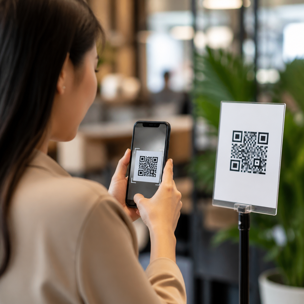
People scan QR codes when the perceived reward is immediate, the effort feels low, and the call to action makes the outcome unmistakably clear. In mobile QR code design and UX, CTA optimization for QR codes is the discipline of shaping that moment of decision: the words, placement, context, visual framing, and trust cues that persuade someone to open their camera and act. I have tested QR campaigns on packaging, retail displays, event signage, restaurant tables, and direct mail, and the pattern is consistent. Scans rise when users know exactly what they will get, why it matters now, and what will happen after the scan. That is why this topic matters. A QR code itself is only a bridge. The conversion depends on motivation, clarity, and user confidence. If the CTA is vague, hidden, or disconnected from the user’s goal, even a perfectly printed code underperforms. If the CTA is specific, relevant, and friction-aware, the same code can become a strong acquisition, support, or sales channel. Understanding what makes people scan QR codes starts with understanding human attention, mobile behavior, and the mechanics of persuasive prompts.
The psychology behind a QR code scan
People do not scan because a square pattern looks interesting. They scan because they expect value. In practice, that value usually falls into a few clear categories: saving money, getting information, accessing an experience, completing a task faster, or proving authenticity. A strong QR code CTA names that value directly. “Scan to see the menu” beats “Scan here.” “Scan for 20% off today” beats “Learn more.” The first versions reduce uncertainty, and uncertainty is what kills response.
From repeated campaign audits, I have seen three psychological triggers outperform the rest. First is relevance: the CTA matches the user’s immediate context. On product packaging, users want setup help, ingredients, reviews, or warranty registration. In a store aisle, they want comparisons, stock information, or a coupon. At a conference booth, they want a demo, a spec sheet, or an easy way to exchange details. Second is urgency: a time-bound or moment-bound reason to act now. Third is cognitive ease: the CTA uses plain language and promises a simple next step.
Trust also determines scan behavior. Since mobile operating systems now preview many QR destinations before opening them, people are more aware of link safety. They scan more readily when the brand is visible, the destination is expected, and the environment feels legitimate. That is why branded frames, recognizable domain names, and concise CTA copy matter together. The user wants reassurance before they commit.
What a high-performing QR code CTA must communicate
A high-performing CTA answers four questions instantly: What is this? Why should I scan? What will I get? What happens next? If any answer is missing, response rates fall. The CTA does not need cleverness; it needs precision. In most environments, direct benefit language wins. “Scan to watch the installation video” tells the user exactly what follows. “Unlock member pricing” identifies both reward and exclusivity. “Scan to reorder in 30 seconds” combines speed with utility.
Specificity matters because QR interactions happen in compressed attention windows. Users are standing, walking, shopping, eating, commuting, or multitasking. They are not studying your sign. Effective CTA optimization for QR codes therefore relies on concrete nouns and active verbs. Use “download,” “view,” “compare,” “book,” “join,” “verify,” “pay,” or “track.” Avoid filler such as “discover,” “explore,” or “engage” unless the context already supplies detail.
The best CTA also pre-qualifies the landing experience. If the scan opens a PDF, say so. If it starts a payment flow, state that. If it launches Wi-Fi access or app download, make it explicit. This honesty improves both trust and conversion quality. More scans are not always better than better scans. Qualified scans from users who know what they are doing typically lead to stronger completion rates.
Where context changes what people will scan
Location changes motivation. The same CTA can win in one setting and fail in another because user intent shifts with environment. In retail, shoppers respond to utility and savings. “Scan for reviews and size guide” works because it reduces purchase risk. On restaurant tables, speed and convenience dominate. “Scan to pay at your table” or “Scan to split the bill” performs because it removes waiting. On product packaging at home, support content is often strongest. “Scan for setup in two minutes” meets a practical need at the exact moment of friction.
Outdoor placements require especially disciplined messaging. A transit poster or storefront window gets only seconds of attention, often from several feet away. The CTA must be short, legible, and worth interrupting movement for. In those situations, broad awareness CTAs usually underperform. Narrow offers with obvious value, such as “Scan for today’s route map” or “Scan for showtimes,” are more effective.
Audience familiarity matters too. Younger mobile-native users scan readily for payments, menus, and social follows. Older audiences often need stronger trust and clearer explanations. For mixed audiences, remove assumptions. A line such as “Open your camera and scan to register” can improve usability without cluttering the design. Good UX respects skill variance.
CTA patterns that consistently outperform vague prompts
Across campaigns, certain CTA structures repeatedly deliver stronger scan-through rates because they align with user intent and lower ambiguity.
| CTA pattern | Best use case | Why it works |
|---|---|---|
| Scan to get [specific benefit] | Coupons, downloads, loyalty offers | States the reward clearly and immediately |
| Scan to [complete task] | Payments, registration, setup, reorder | Focuses on convenience and speed |
| Scan to see [information] | Menus, manuals, reviews, schedules | Reduces uncertainty before a decision |
| Scan to unlock [exclusive access] | Members-only content, gated offers | Adds perceived value through exclusivity |
| Scan to verify [authenticity/status] | Anti-counterfeit, tracking, warranty | Builds trust where risk is present |
These patterns work because they describe the post-scan outcome, not the scan itself. That distinction is critical. Users care about the destination experience, not the technology. When I rewrite weak prompts, I remove generic labels and lead with the result. “More info” becomes “Scan to compare models.” “QR menu” becomes “Scan to view allergen details and order.” The improvement is often immediate because the user can judge relevance in a fraction of a second.
Design factors that support the call to action
Even the best CTA copy fails if the design around it creates friction. The QR code must look scannable, the surrounding text must be readable at expected distance, and contrast must be strong enough for varied lighting conditions. ISO/IEC 18004 sets the underlying QR code standard, but practical performance depends on more than technical validity. Quiet zone spacing, module contrast, print quality, and error correction all affect scan reliability.
For CTA optimization, hierarchy matters most. The eye should land first on the benefit, second on the code, and third on any supporting instruction. If the code is large but the reason to scan is tiny, response suffers. If the CTA promises one thing but the visual context suggests another, hesitation increases. I have seen restaurant table tents improve simply by moving “Pay your bill in seconds” above the code and reducing competing promotional text below it.
Branding helps when used carefully. A branded frame or logo can increase trust, but over-customization can harm readability if contrast drops or finder patterns are altered improperly. Test on both iOS and Android, under bright and dim conditions, before deployment. QR design is not finished when it looks good on a desktop mockup; it is finished when it scans reliably in the real environment where people will use it.
How to test and improve scan performance
CTA optimization for QR codes should be measured, not guessed. Start with a baseline by tracking scans, unique visitors, bounce rate, completion rate, and downstream conversion. Use UTM parameters, dynamic QR platforms, and analytics in tools such as Google Analytics 4, Adobe Analytics, Bitly, or specialized QR management systems. Dynamic codes are usually the better choice for campaign work because you can change destinations without reprinting and compare placements or copy variants over time.
A practical testing plan isolates one variable at a time. First test the promise: discount versus convenience, information versus exclusivity. Then test phrasing length, supporting instruction, and placement. For example, on product packaging, compare “Scan for setup help” against “Scan to watch a two-minute setup video.” If the second version wins, the additional specificity is doing useful work. Also test the landing page match. A strong CTA paired with a slow, cluttered, or non-mobile-optimized page wastes intent and depresses repeat behavior.
Scan quality should be evaluated alongside quantity. If one CTA drives many scans but few completions, it may be attracting curiosity rather than qualified intent. The best result is not maximum traffic; it is efficient movement from scan to outcome. That principle should guide every supporting article in a mobile QR code design and UX hub, from placement strategy to landing page design and trust signaling.
Common mistakes that stop people from scanning
The most common mistake is asking for a scan without offering a reason. “Scan me” is not a strategy. Another frequent failure is burying the value proposition in surrounding copy or placing the code where people cannot comfortably use a phone camera. Poor lighting, reflective surfaces, awkward height, and motion-heavy environments all reduce response.
Teams also underestimate post-scan friction. If the CTA promises speed but the destination asks for multiple fields, app installation, or slow-loading media, users abandon quickly. Misaligned expectations damage trust. So does sending users to a generic homepage rather than a dedicated mobile landing page tied to the CTA.
Finally, many brands skip accessibility and clarity. Small type, low contrast, and unexplained jargon exclude users. Good CTA optimization respects real conditions and real people. Make the value obvious, the scan easy, and the destination relevant.
What makes people scan QR codes is not the code itself but the quality of the promise around it. When the CTA is specific, contextual, trustworthy, and easy to act on, scans increase and conversions improve. The most effective prompts tell users exactly what they get, why it matters now, and what happens after they scan. They are supported by strong visual hierarchy, reliable code production, mobile-friendly destinations, and measurement that tracks real outcomes instead of vanity metrics.
As the hub for CTA optimization for QR codes, this topic connects directly to placement, landing page design, trust cues, accessibility, testing, and analytics. Every one of those areas shapes whether a user feels motivated enough to scan and confident enough to continue. In practice, the winning formula is simple: match the user’s moment, state the benefit clearly, remove uncertainty, and deliver on the promise fast.
If you want better performance from QR campaigns, start by rewriting the CTA before redesigning the code. Then test it in the real environment, measure completion, and refine based on user behavior.
Frequently Asked Questions
What is the main reason people decide to scan a QR code?
The biggest driver is simple: people scan when the value is obvious and the effort feels minimal. Most users make a split-second decision. They ask themselves, often without realizing it, “What do I get if I scan this?” and “Is this worth doing right now?” If the answer is immediate, relevant, and low-friction, scan rates go up. That reward might be a discount, a menu, event details, a quick payment option, product information, a how-to video, or access to something exclusive. What matters most is that the benefit is clear before the scan happens, not after.
In practice, that means a QR code by itself is rarely persuasive. The surrounding message does the real work. A label like “Scan me” is weak because it describes the action but not the outcome. A stronger call to action such as “Scan to get 20% off today,” “Scan to view the menu instantly,” or “Scan to watch setup instructions” removes ambiguity and gives the user a concrete reason to engage. When people understand the payoff immediately, they are much more likely to act.
Context also plays a major role. Someone standing in a store aisle, sitting at a restaurant table, walking past event signage, or opening direct mail has different needs and attention levels. The most effective QR experiences match the moment. If the offer aligns with what the person is already trying to do, scanning feels natural rather than interruptive. That is the core reason people scan: the code promises a fast, useful outcome at exactly the right time.
How important is the call to action in getting more QR code scans?
The call to action is one of the most important factors in QR code performance because it translates a black-and-white square into a clear user decision. Without a strong CTA, many people will notice the code but ignore it. With a well-written CTA, the code becomes a shortcut to something valuable. This is why CTA optimization for QR codes matters so much in mobile UX and campaign design. It shapes the exact moment when curiosity turns into action.
Effective QR CTAs do three things well. First, they name the benefit. Second, they set expectations about what happens next. Third, they reduce hesitation. For example, “Scan for ingredients and allergy info” is stronger than “Learn more,” because it tells the user exactly what they will get. “Scan to reserve your seat in 30 seconds” adds both a benefit and a time expectation, making the process feel faster and easier. Specificity consistently outperforms vagueness because people are more likely to scan when the outcome feels certain.
Tone matters too. The best CTAs are direct, helpful, and relevant to the environment. On packaging, people may want product details, instructions, or rewards. In retail, they may respond better to savings, reviews, or inventory checks. At events, urgency and exclusivity often work well, such as “Scan for today’s schedule” or “Scan to enter the giveaway before 3 PM.” The strongest CTAs are not generic. They are tailored to user intent, physical setting, and timing. That is what makes them persuasive.
What design and placement choices make a QR code more likely to be scanned?
Design and placement have a direct impact on whether people even notice the code, let alone trust it enough to scan. A QR code should be easy to spot, easy to reach, and easy to understand in context. If it is too small, poorly contrasted, crowded by other elements, or placed where people cannot comfortably scan with a phone, performance drops quickly. Visibility and usability are not minor details here; they are core conversion factors.
Good placement starts with physical behavior. People need enough time and space to take out their phone, open the camera, and align the code. A code on product packaging may work best on a flat, front-facing panel. A restaurant table code should be visible from a seated angle and not buried among clutter. Event signage should place the code where foot traffic naturally pauses, not where people are moving too quickly to engage. Direct mail should make the code prominent and support it with a strong message nearby. In every case, the question is the same: can someone scan this comfortably in the real world, in the moment they see it?
Visual framing also matters. White space around the code helps it stand out. A nearby headline should explain the benefit. A supporting line can address objections or reinforce urgency. Branded design can improve trust, but it should never interfere with scannability. Contrast must remain high, and the code must be tested across devices and lighting conditions. The best-performing QR placements feel intentional, noticeable, and frictionless. People should not have to search for the purpose of the code or struggle to access it.
Do trust cues affect whether people scan QR codes?
Yes, trust cues are a major factor, especially because QR codes hide the destination until after the scan. That uncertainty creates hesitation. People want to know whether the code is safe, legitimate, and worth their attention. If anything about the code or its environment feels suspicious, random, or low quality, many users will avoid it. Trust is often the difference between interest and action.
Several cues can improve confidence. Strong branding is one of the most effective. When the code appears on official packaging, in-store materials, event signage, or professionally designed direct mail, users are more likely to believe it leads somewhere credible. Clear copy also helps. Phrases such as “Scan to view our official menu,” “Scan for product verification,” or “Scan to access the brand’s tutorial” reduce uncertainty by clarifying both ownership and purpose. In some cases, adding a visible URL, brand name, or reassurance like “No app required” can further lower resistance.
Trust is also built through consistency. If the surrounding design looks polished, the message is coherent, and the destination experience matches what was promised, users learn that scanning is safe and useful. On the other hand, misleading CTAs, irrelevant landing pages, or poor mobile experiences damage trust quickly. People remember when a scan wastes their time. The most effective QR campaigns treat trust as part of conversion strategy, not as an afterthought. They make the destination feel predictable, legitimate, and helpful before the user ever opens their camera.
What happens after the scan, and why does that affect future scan behavior?
What happens after the scan is critical because it validates or breaks the promise made by the QR code. A successful QR interaction does not end at the scan; it ends when the user gets the expected result quickly and easily. If the landing experience is slow, confusing, irrelevant, or poorly optimized for mobile, the campaign underperforms even if the code itself gets attention. Scan motivation and post-scan UX are tightly connected.
The destination should match the CTA exactly. If the code says “Scan to get 15% off,” the user should land directly on the offer, not a generic homepage. If it says “Scan to view the menu,” the menu should open immediately without unnecessary steps. Fast-loading, mobile-friendly pages are essential because users are often scanning in busy, real-world environments where patience is limited. Every extra tap, delay, or surprise reduces satisfaction and weakens the likelihood of future engagement.
This matters beyond a single campaign. People build habits based on previous experiences. When QR codes consistently deliver immediate value, users become more willing to scan again in other contexts. When scans lead to friction or disappointment, users become skeptical and harder to convert next time. That is why strong QR performance comes from the whole journey: a clear reason to scan, low perceived effort, visible trust cues, and a destination that fulfills the promise instantly. The campaigns that perform best understand that the scan is not the goal. The successful outcome is the goal, and the scan is only the doorway.





