
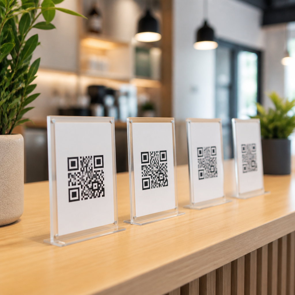
Best practices for multi-QR code placement start with a simple principle: every code must have a distinct job, a clear visual hierarchy, and enough physical space to be scanned without hesitation. In retail, events, packaging, museums, restaurants, and transit environments, teams often add several QR codes to one surface because they want to support different user goals, such as payment, product details, app download, support, or loyalty signup. The problem is that adding more codes usually increases decision friction, scanning errors, and visual clutter. I have seen well-designed campaigns fail because codes were technically readable but contextually confusing, while simpler layouts with fewer distractions produced much higher scan-through rates.
Multi-QR code placement means arranging two or more QR codes within the same physical environment so each one remains discoverable, understandable, and reliably scannable. Placement strategy includes distance between codes, surrounding copy, size, contrast, mounting height, sightlines, lighting, print substrate, and the user’s likely position when scanning. It also includes the relationship between codes: whether they are alternatives, sequential steps, audience-specific options, or linked to different conversion points. This matters because QR interactions often happen in low-attention moments. A customer is standing in an aisle, walking through a station, or holding a coffee in one hand. If the next action is not obvious within seconds, the scan is lost.
As a hub topic within mobile QR code design and UX, QR code placement strategies connect directly to labeling, sizing, accessibility, testing, analytics, and destination page design. ISO/IEC 18004 defines the QR Code symbology itself, but strong results come from execution choices around the symbol. A successful placement strategy reduces failed scans, increases completion rate after the scan, and prevents one code from cannibalizing another. The goal is not merely to fit multiple QR codes into a layout. The goal is to guide intent clearly enough that the right person scans the right code at the right moment, with minimal effort and maximum confidence.
Define the role of every QR code before designing the layout
The best multi-QR code systems begin before design software opens. Each code needs one primary user intent. If two codes answer the same need, combine them or route users through a single landing page with options. In practice, I use a placement brief that lists the code label, destination URL, audience, expected scanning distance, and conversion goal. For example, on a product display, one code may open assembly instructions, another may launch warranty registration, and a third may show replacement parts. Those are different tasks, so they can coexist if the labels and placement reflect the user journey.
Problems start when businesses place multiple QR codes simply because several departments request space. A packaging panel might include a code for recipes, another for reviews, another for social media, and another for recycling guidance. That looks comprehensive but often performs poorly because the shopper cannot quickly decide what matters. A better approach is task ranking. Put the highest-value code in the primary visual zone, then move lower-priority functions to a follow-up page or a secondary panel. In other words, placement strategy is also content governance.
Distinct naming is essential. Avoid generic labels like “Scan here” repeated under every code. Use direct action language: “Pay invoice,” “View menu,” “Download manual,” or “Track order.” Clear microcopy lowers cognitive load and acts as a filter before the camera opens.
Use spacing, hierarchy, and orientation to prevent scan confusion
When several QR codes appear close together, users and camera software can struggle to determine the intended target. The safest rule is to separate codes enough that one code dominates the camera frame at normal scanning distance. In field work, I have found that side-by-side codes without adequate white space cause mis-scans, especially on older Android devices and in low light. A practical baseline is to leave generous margins around each symbol and avoid placing them in a tight grid unless users are meant to compare choices deliberately.
Visual hierarchy should answer three questions instantly: which code matters most, what each code does, and where the user should stand. Size can communicate priority, but size alone is not enough. Use headings, directional cues, and grouping. If codes serve different audiences, place them in separate zones with section titles. On a conference sign, attendee registration and exhibitor setup should not sit in one undifferentiated block. Put them on opposite sides or in clearly titled modules.
Orientation also matters. Keep codes upright whenever possible. Although QR codes can be read at different rotations, supporting text cannot. Users scan faster when labels and symbols share a consistent reading direction. In windows or curved packaging, test distortion carefully. Reflections and curvature can reduce effective readability even when the print file looks correct.
| Placement factor | Best practice | Why it matters |
|---|---|---|
| Code spacing | Leave enough separation so one code fills the camera view at expected scan distance | Reduces accidental scans and autofocus confusion |
| Labeling | Use a unique action label for each code | Helps users choose before opening the camera |
| Hierarchy | Make the primary code visibly dominant | Prevents choice paralysis and supports conversion goals |
| Mounting height | Place near natural hand-and-eye level when stationary scanning is expected | Improves comfort and scan speed |
| Contrast | Use dark code on a light matte background | Improves detection under varied lighting |
| Context copy | Explain the value of scanning in one short sentence | Increases trust and completion rate |
Match placement to environment, movement, and scanning distance
Good QR code placement strategies are environmental, not just graphical. A code on a shelf talker, a tabletop tent, and a train platform sign each operate under different conditions. The first question is whether the user is stationary or moving. In moving environments, such as wayfinding corridors or station entrances, one code per decision point is usually best. Multiple codes can work, but only if each is tied to a separate lane or physical destination. For example, airport kiosks often succeed when each queue has its own clearly mounted code for check-in, baggage rules, or upgrades, instead of one board with many equal options.
Scanning distance determines minimum size and placement height. A tabletop code scanned from 12 to 24 inches can be relatively compact, while a wall poster scanned from several feet away needs a larger symbol, stronger contrast, and a simpler surrounding design. In stores, I generally place high-priority QR codes between chest and eye level because shoppers scan fastest there. Floor-level codes are easy to miss, and overhead codes can be awkward unless the user is already looking up, as in transit halls or exhibitions.
Lighting, glare, and substrate are common failure points. Gloss laminate, glass, metallic inks, and wrinkled stickers all reduce scan reliability. If two or more codes must live on the same reflective surface, create matte white backing panels behind them. Also account for line of sight. A code hidden by a shopping basket rail or door handle is effectively invisible. Placement should be verified from the real user position, not from the designer’s screen.
Build user pathways, not collections of links
The most effective multi-QR layouts reflect a sequence. One code starts the journey, while others support adjacent needs before or after conversion. In restaurants, for instance, a table may need a menu code, a payment code, and a feedback code. Those should not compete equally. The menu belongs in the primary position because it is the entry action. Payment belongs where the bill arrives. Feedback works best near the exit or on the receipt. The same logic applies to packaging, exhibits, and service counters.
A strong hub strategy also considers what should happen after the scan. Sometimes one “master” QR code linked to a mobile landing page is better than three separate codes. That page can present options with accessible buttons, tracking parameters, language selection, and updated content without reprinting assets. Separate codes are better when speed matters, when the audience segments are distinct, or when offline signage must minimize taps. In practice, I recommend separate codes only when each one saves the user time compared with a single options page.
Trust signals matter as much as placement. Add a short explanation of destination, brand the frame or adjacent copy, and avoid unlabeled redirects. People are more likely to scan when they know exactly what they will get and why it is worth the action.
Test with real devices, track outcomes, and refine the system
No multi-QR code placement strategy is complete without field testing. I test with current iPhone and Android devices, at least one older model, and both native camera apps and common third-party scanners. Measure first-scan success, time to correct code selection, and completion on the destination page. Small changes can produce meaningful gains. Moving two codes farther apart, changing one label from “Learn more” to “Care instructions,” or shifting a sign six inches away from glare can improve scan performance dramatically.
Analytics should map to each code’s purpose. Use unique URLs or UTM parameters, and review scan volume by location, time, and asset version. If one code underperforms, do not assume low interest immediately. Check whether its placement is blocked, too low, too high, or visually overshadowed by a neighboring call to action. I have seen support QR codes on product boxes jump in usage after moving from the crowded side panel to the inside flap where users actually looked during setup.
Accessibility deserves explicit attention. Provide human-readable alternatives for essential actions, maintain sufficient color contrast, and ensure surrounding text is legible for low-vision users. If a task is critical, such as medication instructions or transit ticket retrieval, never make QR the only path. The strongest systems are redundant by design and graceful under imperfect conditions.
Best practices for multi-QR code placement come down to clarity, separation, and context. Every code needs a defined purpose, a distinct label, and enough space to be scanned accurately from the user’s natural position. The environment matters as much as the symbol itself: lighting, glare, height, movement, and sightlines all affect scan success. Strong layouts also reflect the user journey, so codes support a sequence instead of competing for attention at the same moment.
For teams building a QR code placement hub, the practical takeaway is simple. Reduce unnecessary choices, prioritize the most valuable action, and test placements in the real world with real devices. When multiple QR codes are necessary, structure them as a system with hierarchy, clear copy, and measurable goals. That approach improves usability, protects conversion rates, and makes every scan more intentional. Review your current signs, packaging, or displays, identify where codes overlap or confuse, and redesign the experience around one user need at a time.
Frequently Asked Questions
What is the most important rule when placing multiple QR codes on the same surface?
The most important rule is that each QR code should serve one distinct purpose, and that purpose should be immediately obvious to the user. When multiple codes appear together without clear differentiation, people hesitate, choose the wrong one, or ignore all of them. Effective multi-QR code placement starts by assigning a single job to each code, such as payment, product information, app download, support, ticket validation, or loyalty enrollment. Once those jobs are defined, the layout should reflect priority. The primary action should be the most visually prominent, while secondary actions should be smaller or placed farther away.
Just as important, each code needs enough physical separation so scanners can detect the correct target without interference. If codes are too close together, users may accidentally open the wrong destination or struggle to get a clean scan. Labels should be plain, action-oriented, and specific, such as “Pay Now,” “View Ingredients,” or “Join Rewards,” rather than generic wording like “Scan Me.” In practice, the best multi-code layouts reduce decision-making, guide attention in a logical order, and remove any doubt about what will happen after the scan.
How far apart should multiple QR codes be placed to avoid scanning errors?
There is no single universal distance that works in every setting, because ideal spacing depends on code size, print quality, viewing angle, lighting, and expected scan distance. However, the general best practice is to leave generous space between codes so a smartphone camera can isolate one symbol at a time. When several QR codes are clustered too tightly, the camera may lock onto the wrong one, especially on glossy packaging, posters behind glass, menu boards, kiosks, or transit signage where users scan quickly and from uneven angles.
A practical approach is to treat each QR code as its own interaction zone rather than just a printed square. That means leaving room not only around the code itself, but also around its label, call to action, and any surrounding design elements. The larger the code and the farther away people are expected to scan from, the more separation you typically need. In busy environments, physical grouping also matters. If one code is for payment and another is for support, placing them in clearly separate content blocks helps users understand they are different actions before they ever lift their phone.
Testing is essential. Print the layout at actual size, place it in the intended environment, and try scanning with different phones under real lighting conditions. Observe whether the camera instantly recognizes the intended code or whether users need to reposition repeatedly. If there is any hesitation, increase spacing, simplify the layout, or reduce the number of codes shown at once. In multi-QR placement, scan reliability should always take priority over squeezing more options into limited space.
How can you create a clear visual hierarchy when several QR codes are needed?
A clear visual hierarchy helps people understand what to scan first, what is optional, and what each code will do. Without hierarchy, multiple QR codes compete equally for attention, which creates friction and lowers engagement. Start by identifying the primary user goal in that setting. In a restaurant, that may be the menu or payment. On product packaging, it may be usage instructions or authenticity verification. At an event, it may be ticket check-in or schedule access. The code tied to that main goal should be the most prominent in size, position, contrast, and supporting text.
Secondary codes should still be easy to find, but they should not visually overpower the main action. You can establish hierarchy through layout, grouping, typography, color, and spacing. For example, place the primary QR code in the center or upper portion of the design, use a larger call to action, and keep supporting explanatory text close by. Secondary functions can be arranged below, off to the side, or under a small heading such as “More Options” or “Need Help?” This approach preserves usability while still offering multiple paths for different user needs.
Consistency also matters. If each code uses a different style, icon set, or wording pattern, the overall surface becomes harder to process. Use a predictable structure: label first, then QR code, then a brief explanation if needed. Pairing each code with a recognizable icon can also help users scan the page visually before they scan digitally. The best visual hierarchy makes the intended journey feel obvious and reduces the mental effort required to choose the right code.
When should you reduce the number of QR codes instead of adding more?
You should reduce the number of QR codes whenever the added choices create confusion, crowd the design, or lower the likelihood that users complete the main action. More QR codes do not automatically mean better functionality. In many cases, they dilute attention and make the entire experience less effective. If users need to stop and compare several labels before deciding what to scan, the layout is already too complex for quick interaction. This is especially true in fast-moving environments such as retail aisles, public transit, event entrances, takeaway counters, and product shelves.
A good decision framework is to ask whether each code supports a meaningful user need in that exact moment and location. If two codes serve related purposes, it may be better to route both actions through one landing page where users can choose after scanning. For example, instead of showing separate codes for product details, warranty registration, and customer support, one code could open a mobile hub with those options clearly organized. This preserves physical simplicity while still providing multiple digital paths.
You should also remove codes that are low priority, redundant, rarely used, or better delivered through another channel. In some cases, a short URL, NFC tap option, printed instruction, or single primary QR code paired with an on-screen menu will outperform a crowded multi-code arrangement. Strong multi-QR placement is not about fitting in every possible destination. It is about presenting only the actions that are useful, relevant, and scannable in context.
How do you test whether a multi-QR code layout actually works in real-world conditions?
Real-world testing is one of the most important steps because a layout that looks clean on a screen can fail once it is printed, mounted, and used by actual people. Start by testing the final design at full production size, not a digital mockup. Check scan performance from the likely user distance, angle, and speed. For example, packaging may be scanned at close range under indoor lighting, while transit signage may be scanned from farther away, in motion, or in bright outdoor conditions. Every environment changes how users interact with the codes.
Use multiple phone models and camera apps to see whether scan behavior is consistent. Pay attention to first-attempt success rate, time to choose the correct code, and whether users understand the labels without explanation. If participants ask, “Which one do I scan?” or accidentally open the wrong destination, the problem is usually not the code itself but the placement, spacing, labeling, or hierarchy. Also test material conditions such as glare, curved surfaces, low contrast, shadows, folds, and crowded background graphics, all of which can undermine performance.
It is equally valuable to test user comprehension, not just technical scannability. Ask whether people can explain what each code does before scanning and whether the offered actions match what they expect in that context. Then review analytics after launch. Compare scan volume by code, abandonment after scan, destination performance, and completion of the intended action. If one code dominates and others are rarely used, that may indicate poor placement, weak messaging, or unnecessary options. The most effective teams treat multi-QR placement as an iterative system: test, learn, simplify, and improve based on actual behavior.





