
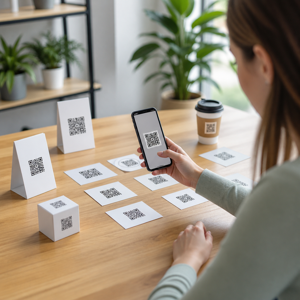
Testing QR code placement is one of the fastest ways to improve scan rate, reduce user friction, and make mobile campaigns perform like they were designed to perform. Placement refers to the exact physical or digital location of a QR code within an environment: on packaging, posters, menus, retail shelves, mailers, email graphics, app screens, event signage, or point-of-sale displays. In practice, placement is never just about where the code sits on a layout. It includes viewing distance, height, lighting, surrounding clutter, motion, user intent, and whether a person has enough time and space to open a camera and complete the scan.
I have tested QR deployments in stores, trade show booths, direct mail, transit posters, and product packaging, and the same lesson keeps repeating: a well-designed code can underperform badly if the placement forces awkward behavior. A perfect print file cannot overcome a code positioned too high on a window, too close to a fold, or buried among competing calls to action. Conversely, average creative often produces strong results when the code appears exactly where a user expects it, with clear sight lines and a reason to scan.
Why does QR code placement matter so much? Because scanning is a micro-conversion. Users make a split-second decision about whether the effort is worthwhile. If the code is easy to notice, easy to physically access, and paired with a relevant prompt, friction drops. If any of those elements fail, people move on. This is especially important on mobile, where screen glare, shaky hands, poor reception, and short attention windows already create resistance. Better placement solves part of that resistance before it begins.
Good placement strategy also affects measurement. When teams test one variable at a time, such as moving a QR code from the bottom right of a package to the principal display panel, they learn which context drives scans, not just which code design looks attractive. That makes this topic central to mobile QR code design and UX. It connects creative decisions to user behavior, analytics, accessibility, and revenue outcomes. A placement strategy turns QR codes from decorative add-ons into intentional entry points that support discovery, education, support, loyalty, or purchase.
What Effective QR Code Placement Actually Means
Effective QR code placement means matching the code’s location to user intent, environment, and scanning mechanics. The first question is not “Where is there empty space?” It is “Where will the user naturally pause long enough to scan?” On product packaging, that may be near usage instructions, recipes, warranty registration, or refill ordering. On a poster, it is usually at eye level or slightly below, where the code remains visible without forcing users to step back into traffic or crouch. On restaurant materials, tabletop tents often outperform wall posters because diners are stationary and already holding phones.
There are several placement variables worth testing systematically. Height affects comfort. Reach matters if the code is behind glass, across a counter, or attached to a moving object. Angle changes readability because perspective distortion makes modules harder for phone cameras to interpret. Contrast with the immediate background influences detection speed. Nearby text determines whether people understand the benefit of scanning. Competing elements, including logos, pricing bursts, and product claims, can pull attention away from the code. In audits, I routinely find that the code itself scans fine, but the surrounding context suppresses use.
Distance rules are practical, not theoretical. A general guideline many printers use is a 10:1 viewing ratio: for every inch of QR code width, aim for a comfortable scan distance of roughly ten inches. That means a one-inch code works best when people can get within about ten inches, while a three-inch code is more realistic on a poster viewed from several feet away. ISO/IEC 18004 governs QR code symbology, but field performance still depends on camera quality, motion, and lighting, so real-world testing matters more than abstract compliance.
Placement Strategies by Channel and Use Case
Different channels demand different QR code placement strategies because user behavior changes with context. On consumer packaged goods, the principal display panel gets attention first, but not every use case belongs there. If the QR code leads to a recipe, product story, or loyalty program, the side or back panel can work better when paired with a clear prompt because shoppers who pick up the item are already in an evaluation mindset. If the code supports post-purchase onboarding, setup, or support, placement near opening instructions or the serial label often produces better scans than front-of-pack branding areas.
In retail stores, shelf talkers and endcap signage can be effective, but only when the code is reachable and not obstructed by merchandise. I have seen shelf-edge QR codes fail because carts blocked the line of sight and labels curved around rails. A freestanding sign angled toward foot traffic performed better, even with the same landing page and offer. For windows, avoid placing codes where reflections compete with the camera. Indoor-facing placement often beats outward-facing placement during daylight because glare drops and users have a safer place to stop.
Print mail and brochures usually perform best when the code sits near the primary offer, not isolated on a back panel like an afterthought. Menus are another distinct case. A code placed at the top right corner may be technically visible but ignored if diners focus first on categories and prices. Positioning near the “Order,” “Pay,” or “View Photos” action often increases interaction because intent is explicit. At events, registration desks, badge pickup, and exit areas generate different motivations, so placement should align with the attendee journey rather than a single universal template.
| Channel | Best placement pattern | Common mistake | Why it works or fails |
|---|---|---|---|
| Packaging | Near instructions, benefits, or loyalty prompt | Hiding code on crowded legal panel | Users scan when context explains value |
| Posters | Eye-level with standing room nearby | Placing too high or too low | Comfort and line of sight determine completion |
| Retail signage | Angled toward shopper flow | Mounting behind product obstruction | Visibility beats decorative placement |
| Direct mail | Adjacent to offer and CTA | Separating code from message | Relevance improves scan intent instantly |
| Menus | Near ordering or payment action | Putting code in header clutter | Users act when task and code align |
How to Test QR Code Placement Methodically
The most reliable way to improve QR code performance is controlled testing. Start by defining one measurable goal: more scans, higher completed sessions, more purchases after scan, or better support deflection. Then isolate placement as the variable. Use unique dynamic QR codes or tagged URLs for each version so attribution is clean in Google Analytics 4, Adobe Analytics, or a QR platform such as Bitly, Flowcode, Beaconstac, or QR Code Generator PRO. Without separate tracking, teams end up debating design opinions instead of reading behavior data.
Use an A/B or multivariate structure only if sample size justifies it. For a packaging run, version A might place the code on the front panel near a benefit statement, while version B places it near usage instructions on the back. For in-store signage, one test can compare eye-level placement against waist-level placement. On print materials, compare adjacency to the CTA versus footer placement. Keep the destination, incentive, and code size consistent so the test reveals the effect of location rather than mixed variables.
Field observation adds insight that analytics alone cannot provide. Watch whether users notice the code, reposition themselves, hesitate, or abandon the attempt. Heat-mapping tools help on digital screens, but in physical environments a simple observational checklist is often more useful: sight line clear, glare present, phone raised comfortably, queue pressure, and scan completed. In one trade show test I ran, scans increased after moving the code from a looping monitor to a printed counter card. The digital version looked modern, but motion and refresh interference made scanning less reliable than the static print display.
Set a meaningful testing window and review both leading and lagging metrics. A high scan count is useful, but it is not enough if bounce rate spikes because the context overpromised. Compare scan-through rate, landing-page engagement, downstream conversion, and completion by device type. iPhone and Android camera behavior is broadly strong now, but older devices still struggle in dim conditions and at steep angles. Winning placement is the version that reduces friction and improves completed outcomes, not merely the version that generates curiosity clicks.
Design, Accessibility, and Environmental Factors That Change Results
Placement cannot be separated from design and accessibility. A QR code near the ideal action point can still fail if low contrast, glossy lamination, or cramped whitespace interferes with recognition. Maintain a quiet zone around the code, avoid placing it across folds, seams, curves, or perforations, and be careful with transparent surfaces. On bottles and flexible pouches, distortion increases rapidly when users grip the package. In those cases, a hang tag, neck label, or secondary panel may outperform the visually obvious front placement because the code stays flatter during scanning.
Accessibility should shape placement decisions from the start. Not every user can bend down, reach up, or step back easily. Placing a code too low on kiosks or too high on displays excludes people with mobility limitations. Supporting text should explain what happens after the scan, using plain language such as “Scan for setup video” or “Scan to reorder.” That helps users decide whether the action is worth the effort and improves trust. It also matters for screen-reader-assisted workflows when the QR code appears within digital documents that may later be interpreted in alternate formats.
Environmental conditions often explain underperformance more than teams expect. Sunlight glare on storefront glass, flicker from LED screens, low light in bars, and constant movement in transit environments all reduce scan success. If users have only two or three seconds to react, as on escalator signage or moving queues, placement must be larger, cleaner, and closer to the natural line of travel. In practical terms, the best QR code placement strategy is the one that respects how people actually stand, walk, wait, browse, and decide in a specific setting.
Building a Repeatable QR Code Placement Program
A strong QR code placement program treats each deployment as part of a system, not a one-off artwork task. Create placement guidelines by channel, document previous test results, and link this hub to deeper resources on QR code size, quiet zone requirements, CTA writing, landing-page optimization, packaging applications, poster design, and retail signage testing. Standardize review steps with marketing, design, print production, store operations, and analytics so no code goes live without a purpose, a readable environment, and measurable tracking.
The key takeaway is straightforward: better placement produces better results because it removes friction at the exact moment a user considers scanning. Test where the code appears, not just how it looks. Match placement to intent, channel, distance, and accessibility. Measure the full path from scan to outcome. When teams do that consistently, QR codes stop being passive graphics and become dependable mobile entry points. Audit your current placements, run one controlled test this month, and use the findings to build a smarter QR code strategy.
Frequently Asked Questions
Why does QR code placement have such a big impact on scan rate?
QR code placement affects far more than visibility. It directly influences whether someone notices the code, understands why they should scan it, and can comfortably complete the scan without friction. A code may be technically scannable, but if it is placed too low, too high, too far away, at an awkward angle, or in a visually crowded area, people are much less likely to engage with it. In real-world campaigns, small placement decisions often determine whether a QR code feels intuitive or inconvenient.
Good placement matches the environment and the user’s behavior in that moment. On a retail shelf, for example, shoppers are moving quickly and comparing products, so a code needs to be easy to spot and positioned where the phone can point naturally. On a poster or event sign, viewing distance matters more, and the code must remain large enough to scan from where people are likely to stand. In digital settings, placement within an email, landing page, or app screen affects whether users even notice the code before scrolling away.
Placement also shapes trust and intent. When a QR code appears next to a clear call to action, product benefit, offer, or instruction, users immediately understand its purpose. When it is isolated, squeezed into a corner, or buried among competing elements, it can look decorative, confusing, or even suspicious. That is why testing QR code placement is one of the fastest ways to improve results: it removes unnecessary obstacles between interest and action.
What factors should be tested when deciding where to place a QR code?
The most effective QR code placement tests look beyond simple left-versus-right positioning. You should evaluate the full scan experience, including viewing distance, height, surrounding design, lighting, angle, nearby distractions, and the user’s likely movement through the space. A QR code on packaging is experienced differently from one on a storefront window, tabletop menu, direct mail piece, or point-of-sale display, so testing should reflect the actual conditions in which people encounter it.
Size and distance are two of the most important variables. A code placed on a large sign may need to be substantially bigger than one on a product label because users are scanning from farther away. Height matters too. If the code is too low, users may have to crouch or tilt awkwardly; if it is too high, the scan can become uncomfortable or fail due to glare and perspective distortion. For physical placements, line of sight and ease of phone positioning should always be part of the test.
You should also test context around the code. This includes headline copy, instructions, whitespace, contrast, and directional cues. A QR code that says “Scan to see today’s menu,” “Scan for product demo,” or “Scan to claim 15% off” will usually outperform a code with no explanation because users immediately know what they will get. In digital placements, test whether the code appears above the fold, near a key offer, within the main reading flow, or after supporting information. The best-performing placement is usually the one that makes scanning feel obvious, useful, and low-effort.
How can businesses test QR code placement effectively without overcomplicating the process?
The most practical approach is to test one meaningful placement variable at a time and compare performance using real scan data. Start with a clear objective, such as increasing total scans, improving conversion rate after the scan, or reducing drop-off in a specific environment. Then create a small number of controlled variations. For example, on packaging you might test front panel versus side panel. In a restaurant, you might test tabletop placement versus menu placement. In email, you might test a QR code near the top of the message versus near the main call to action.
Dynamic QR codes are especially useful because they let you track scans by variation without changing the destination experience. You can assign different codes to different placements, monitor scan volume, time of day, device behavior, and follow-through, then compare results over a defined period. If possible, pair scan data with conversion metrics such as purchases, signups, downloads, or coupon redemptions. A placement that gets more scans is not always the one that produces the best business outcome.
It is also important to test in realistic conditions. A placement that looks fine in a mockup may perform poorly in a store aisle with glare, in an event venue with foot traffic, or on a printed mailer under uneven lighting. Walk the environment, stand where users stand, and try scanning from natural angles. Keep your tests simple, measurable, and environment-specific. Even modest placement changes can reveal clear wins quickly when the testing process is focused and grounded in actual user behavior.
What are the most common QR code placement mistakes that reduce performance?
One of the biggest mistakes is placing the QR code wherever space is available instead of where people can easily notice and scan it. This often results in codes being tucked into corners, pushed too close to edges, surrounded by clutter, or placed in areas with weak visual priority. When a code competes with too many design elements, users may overlook it entirely or fail to recognize it as an action point.
Another common problem is ignoring physical usability. Codes placed too high on signage, too low on shelves, behind reflective surfaces, on curved packaging, or at awkward angles can be difficult to scan even when they are technically large enough. Poor contrast, insufficient quiet space around the code, and low-quality printing can make matters worse. In digital contexts, placing a QR code where it feels unnecessary, such as on a mobile-first screen where the user is already on a phone, can create friction instead of convenience.
Businesses also frequently forget to explain why the code is worth scanning. A QR code without a benefit-driven call to action leaves too much guesswork for the user. People are far more likely to scan when they know what they will get and why it matters. Finally, many campaigns fail because they never test placement at all. They assume a visible code is enough, when in reality performance depends on visibility, accessibility, context, motivation, and ease of interaction working together.
How do you know if a new QR code placement is actually better?
A better placement should improve measurable outcomes, not just visual preference. The most direct indicator is an increase in scan rate relative to impressions or foot traffic, but that should not be the only metric you watch. The strongest placements typically lead to better downstream actions as well, such as higher landing page engagement, more completed forms, stronger coupon redemption, more purchases, or improved lead capture. The right evaluation depends on the campaign goal.
Context matters when reading the data. If a new placement generates more scans but lower-quality engagement, the placement may be attracting curiosity without intent. On the other hand, a placement that produces slightly fewer scans but significantly more conversions may be the better business choice. This is why it helps to measure both top-of-funnel and post-scan performance. Reviewing time, location, device patterns, and user flow can also help explain why one placement is outperforming another.
You should also look for consistency across environments and time periods. A winning placement should work under normal real-world conditions, not just during a short test window. Once a better placement is identified, continue to optimize the surrounding elements such as code size, call to action, nearby messaging, and destination experience. QR code performance is rarely driven by a single detail alone, but placement is often the leverage point that makes every other campaign element perform better.





