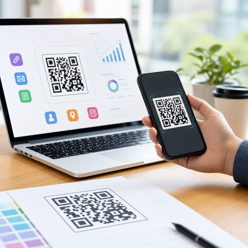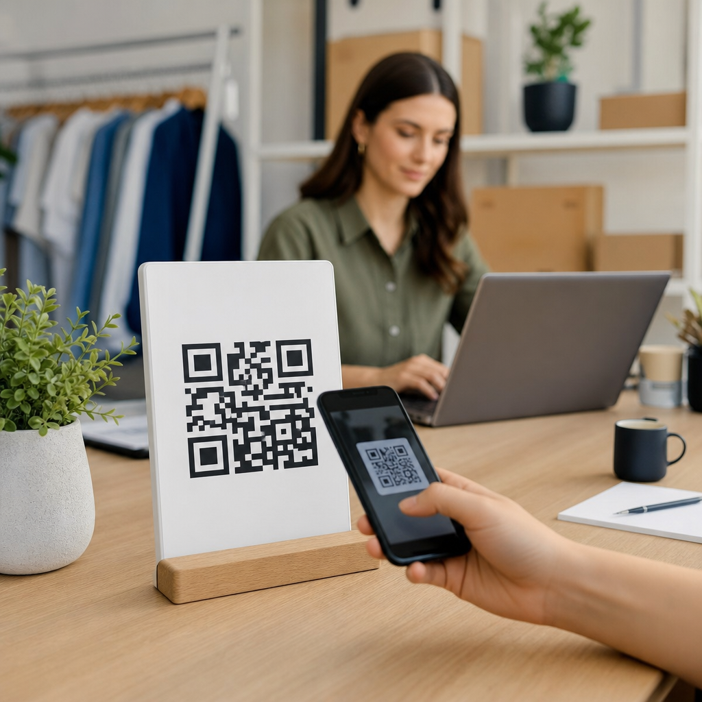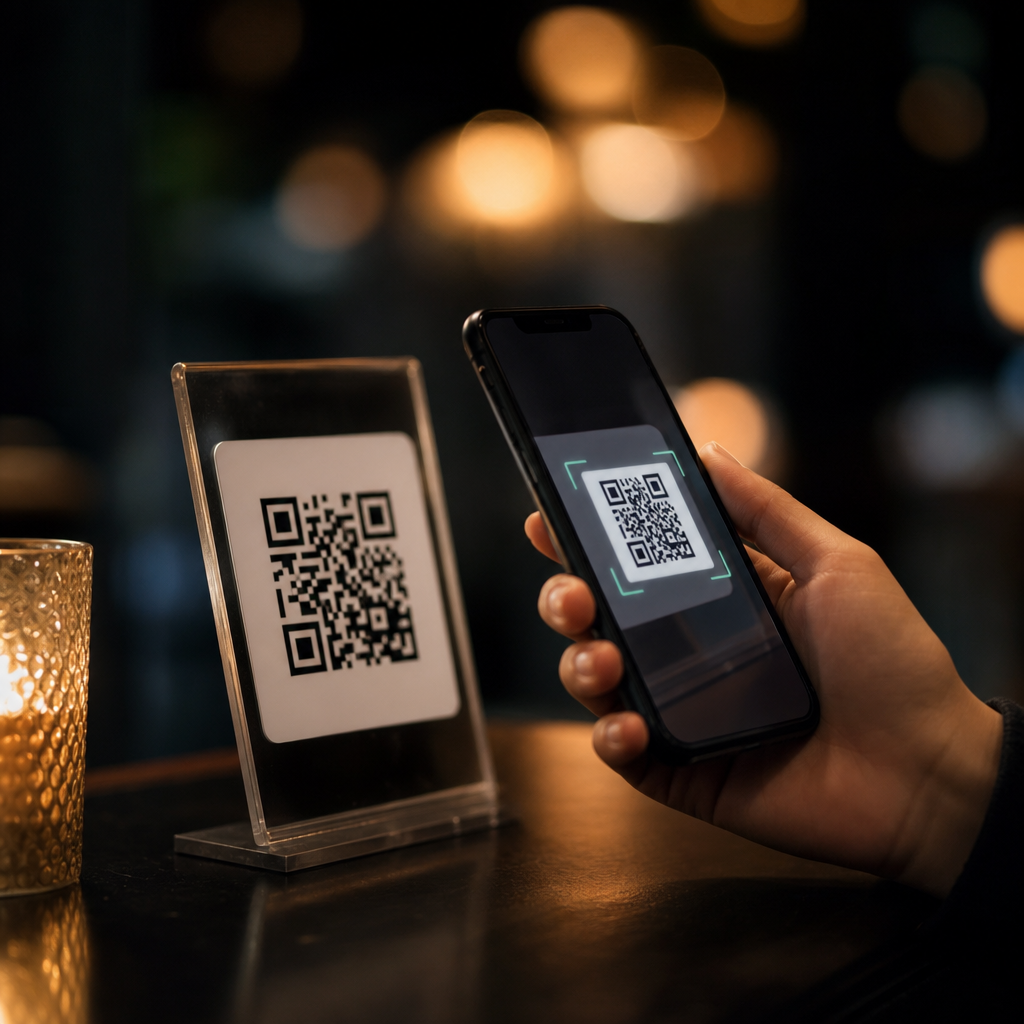
QR codes fail most often when the camera cannot separate dark modules from the background, and low-light scanning magnifies every weakness in design, print, and placement. In practical terms, optimizing QR codes for low-light scanning means building codes that remain decodable when exposure drops, motion blur increases, autofocus slows, and screen or print contrast becomes less reliable. For teams working on packaging, menus, event signage, warehouse labels, app onboarding screens, or direct mail, this matters because a code that scans easily in an office can fail in restaurants, parking garages, retail aisles, concert venues, and nighttime outdoor environments. Within the broader work of creating mobile QR codes, effective design is the controlling factor. Size, quiet zone, contrast ratio, error correction level, data density, material finish, and placement all interact. In my experience testing codes across iPhone and Android devices, low-light performance rarely depends on one magic setting. It comes from reducing visual complexity, preserving clean edges, and giving the camera enough signal to lock focus quickly and decode with minimal software guesswork.
Start with contrast, size, and quiet zone
The most important rule for low-light QR code design is simple: maximize separation between foreground and background. Black on white remains the best default because smartphone camera pipelines and decoder libraries such as ZXing and Apple Vision handle it predictably. In dim scenes, decorative color choices that seem readable to the human eye often collapse into similar luminance values on camera sensors. A dark green code on a brown box, a navy code on charcoal signage, or a metallic silver code on matte gray can all look high-end and still fail because the camera records weak edge definition. If brand colors must be used, test their grayscale difference, not just their appearance under studio lighting. The practical target is strong luminance contrast with matte surfaces that do not flare under flash.
Size also determines success. A dense code printed too small forces the camera to resolve tiny modules while fighting noise and blur. For posters and packaging, increase physical size before increasing styling complexity. As a working baseline, keep the scan distance-to-code size ratio near ten to one, then enlarge further for dim venues. The quiet zone, the blank margin around the code, is equally nonnegotiable. ISO/IEC 18004 calls for a clear border of at least four modules. In low light, I recommend treating that as the minimum, not the goal, because background graphics and shadows near the edges confuse detection algorithms. A larger quiet zone helps the camera identify the symbol boundary faster, especially when users scan one-handed while moving.
Control data density and error correction
Many low-light failures begin upstream in the payload itself. The more characters encoded, the more modules the QR code requires, and the smaller each module becomes at a given print size. That directly reduces scannability in dim conditions. A short dynamic URL almost always outperforms a long static URL stuffed with campaign parameters. If analytics are needed, route traffic through a short redirect managed in a QR platform rather than encoding a long destination. This keeps the symbol version lower and the grid simpler. In mobile QR code programs, compact payload design is one of the highest-leverage choices because it improves not only low-light scanning but also print flexibility across labels, cards, and screens.
Error correction is another tradeoff that designers often misunderstand. QR codes support L, M, Q, and H levels, allowing roughly 7 percent, 15 percent, 25 percent, and 30 percent restoration of damaged data. Higher error correction can help when codes are scratched, creased, or partially obscured, but it increases module count for the same payload. In low-light settings, that extra density can hurt more than it helps if the code is small. In production, I typically reserve Q or H for environments with likely physical damage, such as industrial labels or outdoor stickers, and use M for cleaner retail or hospitality applications. The right choice depends on print size, expected distance, and whether logos or design cutouts are being introduced.
Choose print finishes, materials, and placement for real environments
Low-light scanning is not only a design-file problem; it is a materials problem. Gloss lamination, acrylic covers, shrink wrap, curved bottles, and reflective foil all degrade camera capture by adding glare, warped geometry, or specular highlights. Matte paper, uncoated labels, and low-sheen synthetic stocks generally perform better because they preserve edge clarity under flash and ambient lighting. When a code must appear on glossy packaging, positioning matters. Avoid folds, seams, corners, and highly curved areas where modules distort. Keep the symbol on the flattest available panel and away from transparent windows that create contrast noise from the product inside.
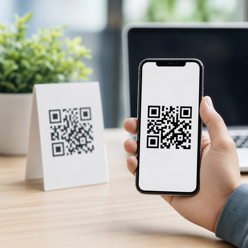
Placement should reflect how people actually scan. Restaurant table tents are often scanned from above under warm, dim lighting. Event posters may be scanned at arm’s length while the user is walking. Warehouse labels may be scanned with rugged devices in shadowed aisles. Each case changes the optimal size and placement. Put the code where the camera can approach squarely, not at a steep angle, and keep it separate from busy text or imagery. If a code appears on a mobile screen, maintain sufficient on-screen size and avoid placing it near bright animated elements that trigger exposure shifts. For digital displays in dark rooms, medium brightness usually scans better than maximum brightness because clipping and moiré artifacts are reduced.
Design styling carefully without breaking decodability
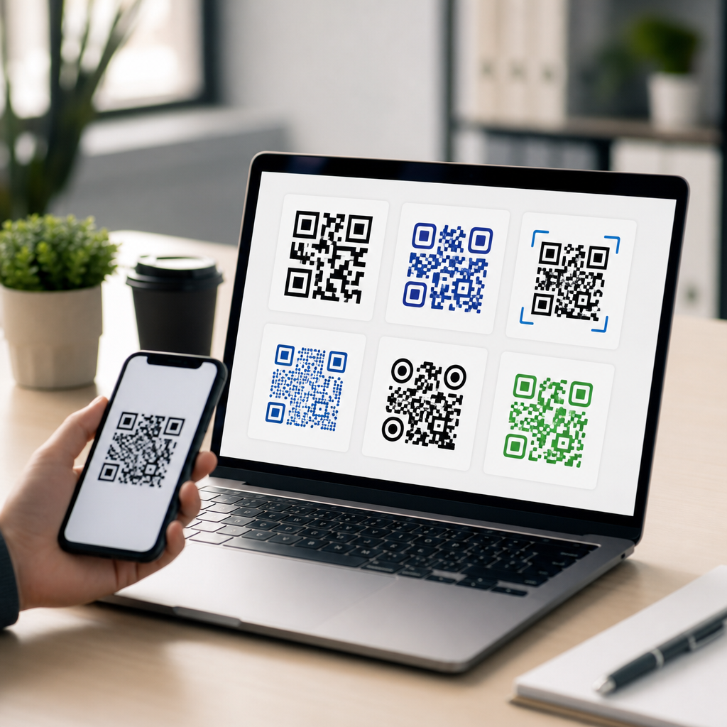
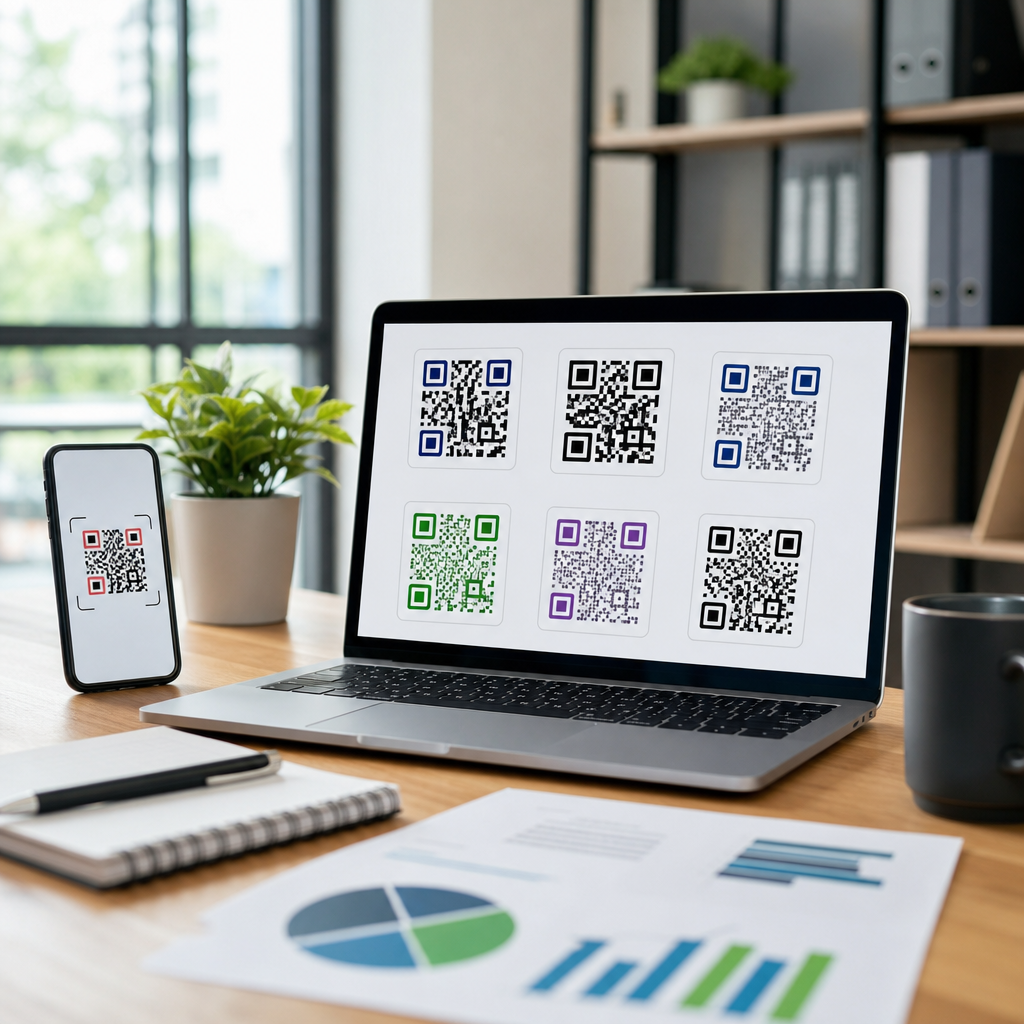
Custom QR codes can still work in low light, but every visual modification must preserve the detector patterns and module integrity. Rounded modules, gradients, embedded logos, and inverted color schemes all reduce decoder confidence if pushed too far. The finder patterns in three corners and the alignment patterns in larger versions need clean, high-contrast geometry. Once those anchors become decorative shapes or blend into surrounding art, scan speed drops sharply. In dim environments, what looks distinctive to a designer can look ambiguous to a camera. That is why conservative styling consistently wins in field testing.
A practical way to compare options is to evaluate design choices against low-light risk factors before approving final artwork.
| Design choice | Low-light impact | Best practice |
|---|---|---|
| Black code on white background | Highest contrast, fastest detection | Use as default for print and screen |
| Brand colors with similar luminance | Weak edge separation, slower scans | Check grayscale contrast before production |
| High error correction with small print | Denser grid, harder to resolve | Increase size or shorten data payload |
| Glossy or reflective finish | Flash glare obscures modules | Choose matte stock or reposition code |
| Logo covering center area | Reduces redundancy margin | Keep logo small and test across devices |
If you want a branded code, prioritize safe customization: modest logo size, square modules or slightly softened corners, strong foreground-background contrast, and generous quiet zone. Avoid thin outlines around modules, photographic textures, transparent backgrounds, and reversed light-on-dark treatments unless extensive device testing proves they work. Reversed codes can scan, but they are less forgiving in poor light because bright modules bloom and dark backgrounds absorb detail.
Test with multiple devices and realistic failure conditions
No QR code is optimized until it has been tested where it will actually be used. Desktop previews and bright-office scans miss the conditions that break performance: low lux levels, mixed color temperature, hand shake, fingerprints on screens, cracked protectors, and older phone cameras with smaller sensors. Build a test matrix that includes recent iPhone and Samsung models, at least one budget Android device, both native camera apps and any in-app scanner you expect users to use. Measure not only whether the code eventually scans, but how long first detection takes and from what distance. A code that scans in three seconds is often a failed user experience in the real world.
Simulate realistic low-light scenarios. Test at 20 to 50 lux for dim indoor conditions and lower for nightlife or outdoor evening use. Compare with flash on and flash off, because some users will not enable flash and some apps do not control it well. Print prototypes at final size, on final material, with final finishing, then place them under directional light to reveal glare. If the code will be displayed on a phone or kiosk, test different brightness settings, anti-reflective coatings, and screen protectors. I also recommend recording short videos of test sessions. Playback reveals where autofocus hunts, where glare blooms, and how much angle tolerance the design really has.
Build this hub into your mobile QR code workflow
As the hub for designing effective QR codes within a mobile QR code program, this topic should guide related work on color selection, print specifications, dynamic URL strategy, logo usage, screen-based display, packaging implementation, and scan analytics. The workflow is straightforward. First, reduce payload length so the code version stays low. Second, choose high contrast and adequate physical size with a proper quiet zone. Third, select materials and placement that minimize glare and distortion. Fourth, apply branding conservatively and only after core readability is secure. Fifth, validate the final asset on multiple devices in realistic low-light conditions. When these steps are documented as design standards, scan reliability improves across every campaign and channel.
The central benefit is simple: better low-light scanning removes friction at the exact moment you ask a user to act. It protects conversion rates, reduces support issues, and makes mobile QR codes dependable in the environments where people actually use them. Review your current codes against the principles here, update weak assets, and make low-light testing part of every launch.
Frequently Asked Questions
Why do QR codes become harder to scan in low-light conditions?
QR codes are easiest to scan when a camera can quickly distinguish the dark modules from the lighter background with strong, consistent contrast. In low light, that separation weakens. Phone cameras raise exposure and ISO to compensate, which often introduces image noise, motion blur, and softer edges. At the same time, autofocus may become slower or less precise, especially if the code is small, glossy, curved, or placed on a reflective surface. All of those factors make it harder for scanning software to identify the code’s finder patterns, alignment patterns, and module grid accurately.
Low-light scanning also exposes design decisions that may seem acceptable in bright conditions but are fragile in real-world use. A low-contrast color palette, a dense code with tiny modules, poor print quality, excessive branding in the center, or placement behind glare can all push a borderline QR code into failure once ambient light drops. That is why optimization is not just about making a code darker. It is about building enough visual resilience into the code so it remains readable when lighting, camera stability, distance, and focus all become less reliable.
What design choices improve QR code performance in dim environments?
The most important design choice is maximizing contrast. In most cases, the safest option is a very dark foreground on a very light background, ideally close to black on white. Subtle brand colors, gradients, metallic inks, transparent backgrounds, or inverted light-on-dark designs may look attractive, but they reduce decoding reliability in low-light scenarios. Scanners need clear module boundaries, and strong contrast gives them the best chance to detect those boundaries even when the camera image is noisy or underexposed.
Size also matters. Larger QR codes with bigger modules are more forgiving when the user is farther away, moving slightly, or scanning under dim conditions. If the code contains a long URL or too much embedded data, the module pattern becomes denser, which makes each square smaller and harder to resolve. Keeping the encoded content short, using a dynamic short URL when appropriate, and selecting a reasonable error correction level can all improve low-light usability. It is also critical to preserve the quiet zone, the blank margin around the code, because scanners use that space to separate the symbol from surrounding graphics and text. In dim light, a missing or cluttered quiet zone can be enough to cause repeated scan failures.
How do printing materials, screens, and surfaces affect low-light QR scanning?
The surface carrying the QR code has a major impact on whether it can be scanned consistently in poor lighting. On printed materials, sharp edges, high ink density, and a matte finish usually perform better than low-quality printing, faded output, or glossy coatings that create reflections. If a code is printed too small on packaging, bent around a curved container, or placed over textured material, the camera may struggle to capture a clean, undistorted image. Warehouse labels, menus, direct mail pieces, and event signage all benefit from testing the exact print process and substrate rather than assuming a digital proof will translate well in real use.
On screens, brightness, glare, and pixel rendering become the main variables. A QR code shown on a dim phone display in a dark room may technically have enough contrast, but if the screen auto-dims, reflects overhead light, or renders the code too small, scan success drops quickly. OLED bloom, cracked screens, protective films, and low display brightness can all reduce clarity. For app onboarding screens, kiosks, and digital signage, make the code large, keep the background simple, avoid animation near the code, and ensure the display remains bright enough for a second device to capture the pattern cleanly. Whether the code is printed or displayed, reducing reflections and preserving crisp module edges is essential for low-light performance.
What is the best placement strategy for QR codes that need to scan reliably at night or in dim indoor settings?
Placement should make scanning physically easy before software ever gets involved. A QR code that is mounted too high, too low, at an awkward angle, or on a moving or curved object becomes much harder to capture when lighting is poor. Users in low light often need a bit more time to frame and focus, so placing the code at a natural viewing height and on a flat, stable surface improves results immediately. For signage, menus, retail displays, and event environments, the code should be visible without forcing the user to tilt their phone sharply or stand in a position where glare blocks the image.
Distance is equally important. If the expected scanning distance is several feet away, the code must be physically large enough to resolve clearly from that range. If it is meant for close-up use on packaging or labels, it still needs enough open space around it so hands, seams, folds, or nearby graphics do not interfere. In dim settings, avoid placing codes near bright spotlights, reflective laminates, glass covers, or highly patterned backgrounds. The best placement strategy is one that gives the camera a straight, unobstructed, high-contrast view with minimal reflection and enough time to focus. Real-world testing in the actual environment, including evening conditions or low indoor lighting, is the fastest way to validate whether placement is helping or hurting scan reliability.
How should businesses test QR codes for low-light scanning before launch?
Testing should simulate the real situations users will face, not just ideal office lighting. That means checking scan performance under dim ambient light, uneven light, and mixed lighting conditions, including warm indoor lighting, nighttime exterior lighting, and environments where the user may be moving slightly. Test with multiple devices, including older phones with weaker cameras and slower autofocus, because a code that works instantly on a flagship device may fail on a budget model. Businesses should also test at different distances and angles, with and without glare, and on the final printed material or production display rather than a prototype alone.
A strong testing process also includes measuring how long a scan takes, not just whether it eventually works. If users need several attempts, move closer than expected, or reposition the phone repeatedly, the code is not truly optimized. Teams should review common failure points such as low contrast, insufficient size, dense encoding, poor quiet zones, reflective finishes, and weak placement. For packaging, menus, signage, warehouse labels, and direct mail, field testing in realistic use conditions is especially important because handling, wear, shadows, and environmental lighting can all affect performance. The goal is to create a QR code that decodes quickly and consistently with minimal user effort, even when exposure drops and camera performance is less forgiving.