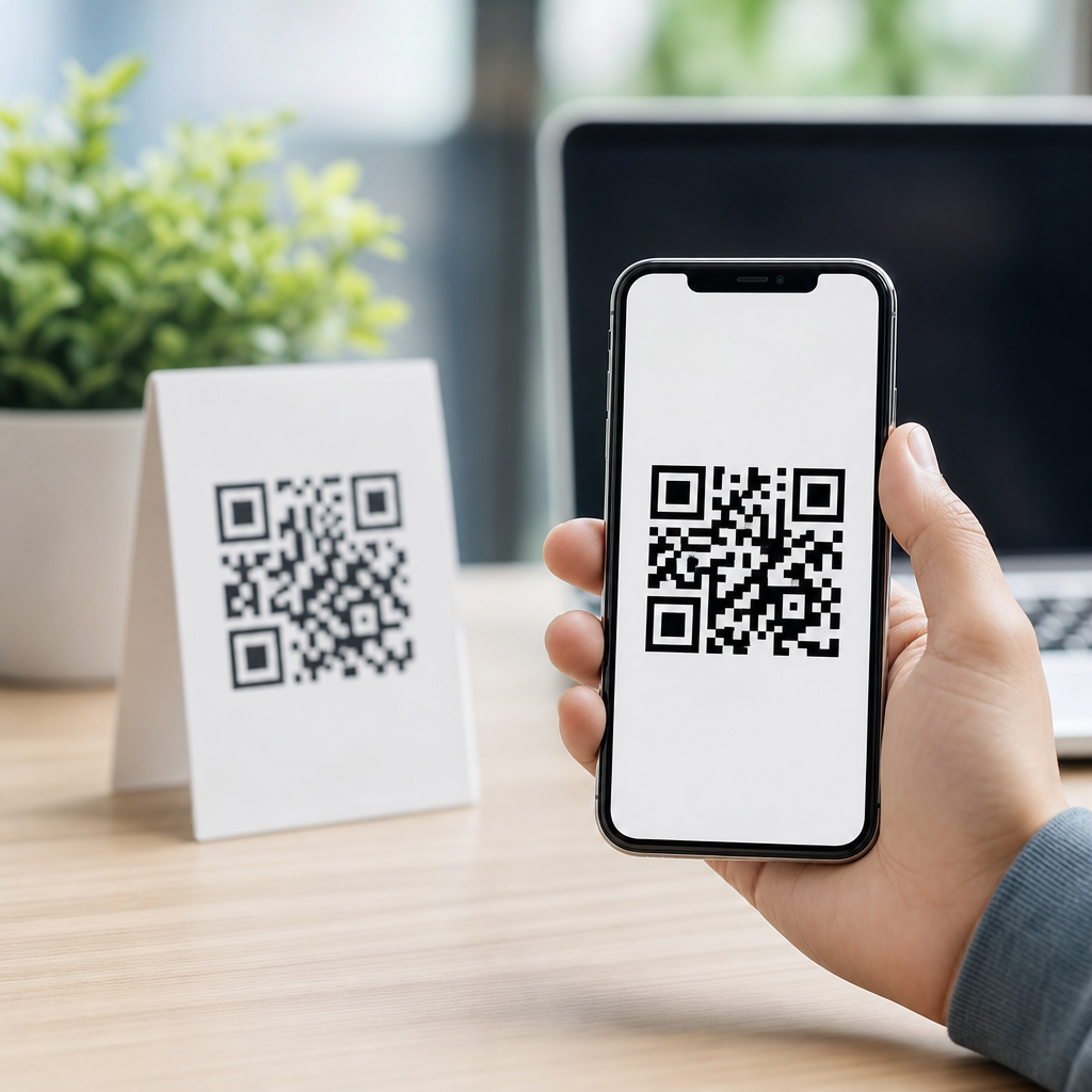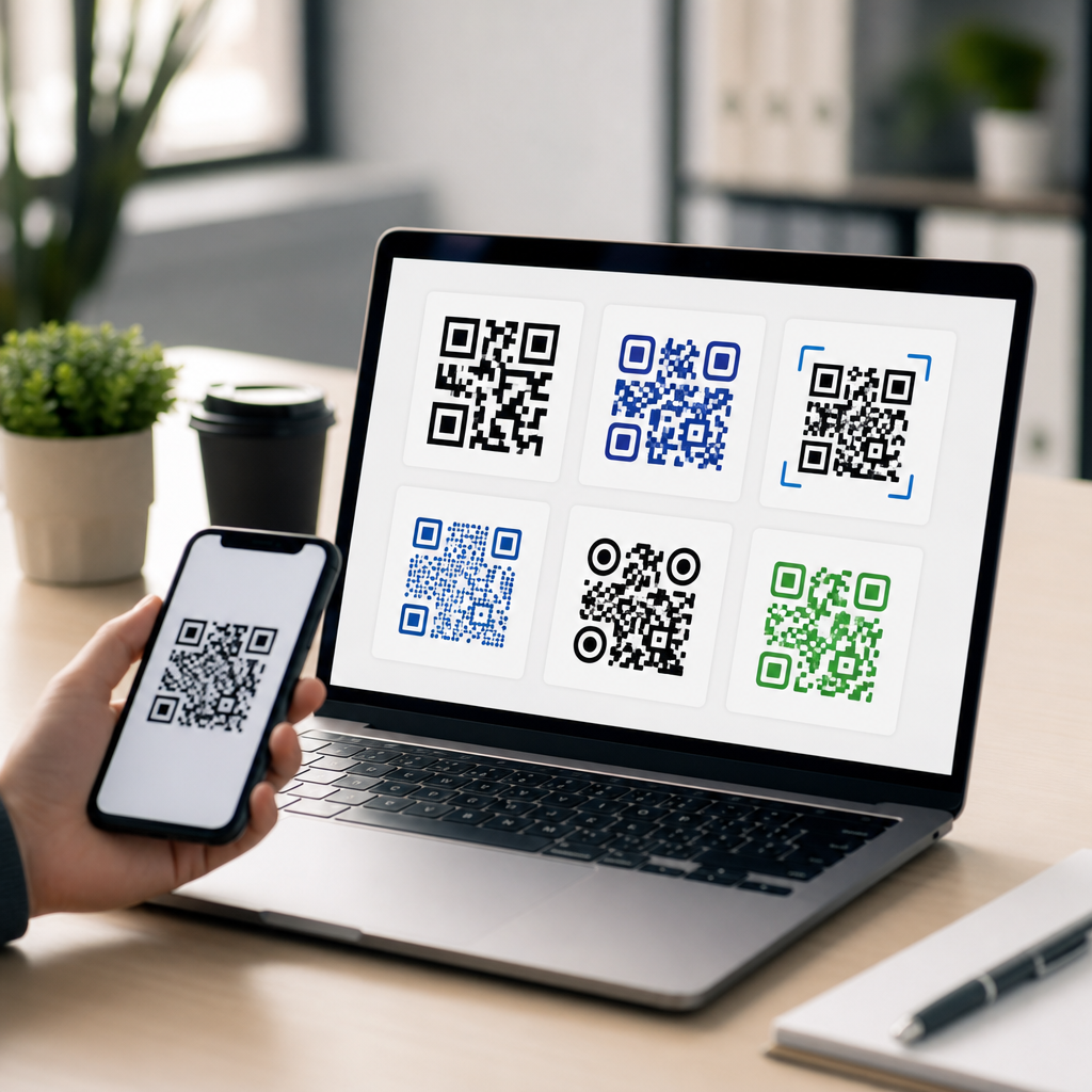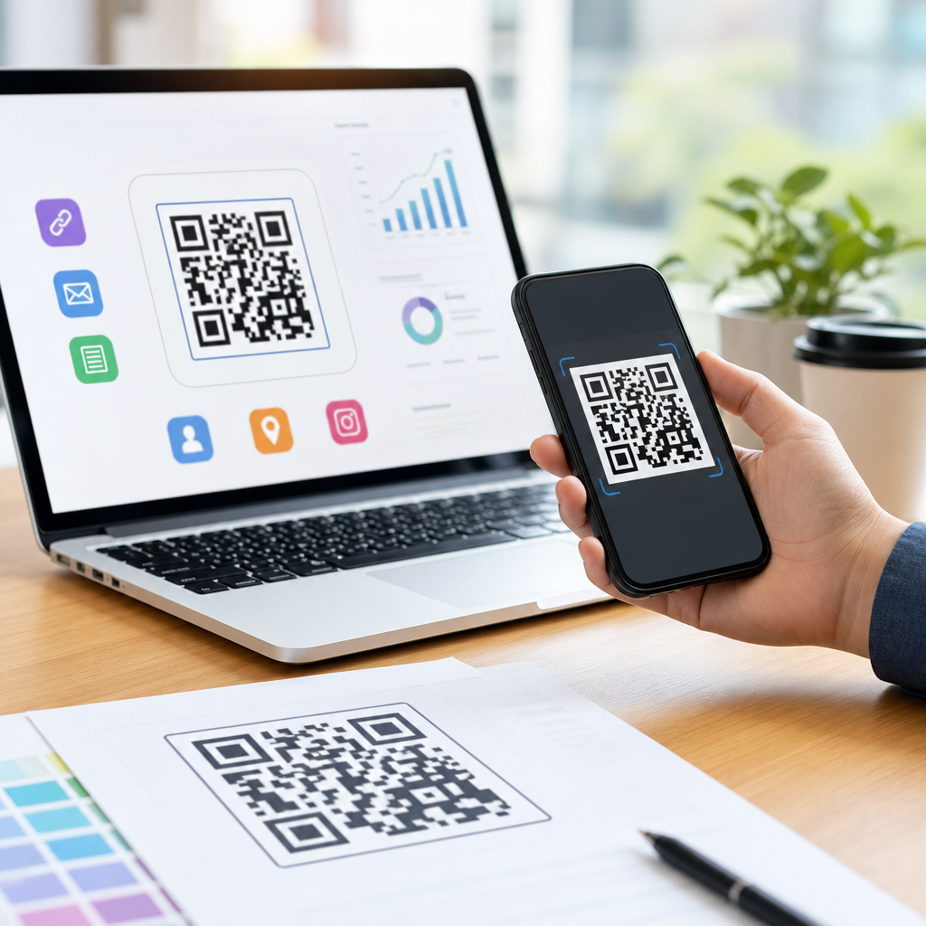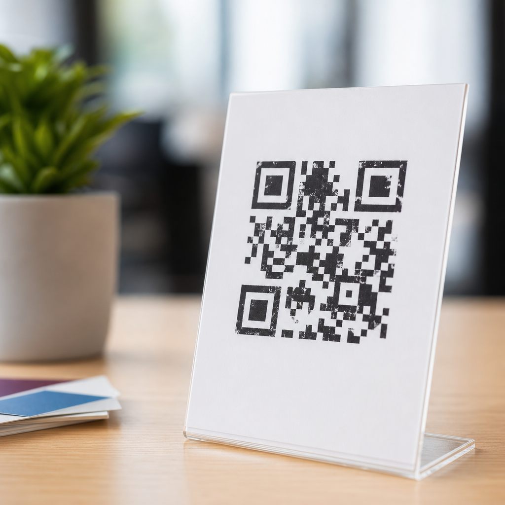
Common QR code design mistakes cost scans, frustrate users, and weaken campaigns that depend on fast mobile access. In practical terms, a QR code is a two-dimensional matrix barcode that stores data such as a URL, contact card, app link, coupon, or payment request. Designing effective QR codes means balancing machine readability with visual branding, placement, print quality, and user context. I have audited QR campaigns on packaging, retail displays, menus, event signage, and direct mail, and the pattern is consistent: most failures are not caused by bad scanners but by avoidable design decisions. This matters because mobile QR codes often sit at the final conversion point between offline attention and digital action. If the code is hard to scan, too small, visually distorted, poorly contrasted, or linked to a weak landing page, the customer journey breaks. A well-designed code should scan in one attempt, clearly signal what happens next, and lead to a mobile-optimized destination that fulfills user intent immediately.
Using Size, Quiet Zone, and Placement Incorrectly
The most common QR code design mistake is getting the physical dimensions wrong. A code that looks fine on a desktop mockup can fail completely when printed on a shelf tag, business card, or product label. The practical rule I use is simple: match code size to scanning distance. A small code may work at arm’s length, but posters, window decals, and trade show banners require much larger dimensions. Another critical factor is the quiet zone, the blank margin around the code. Without enough empty space, scanners cannot distinguish the symbol from surrounding graphics, borders, or text. ISO/IEC 18004 guidance and generator best practices support maintaining a clear margin of at least four modules on all sides.
Placement is equally important. Codes placed on curved bottles, folded boxes, glossy seams, or low corners near shelving often become partially obscured or distorted. I have seen excellent packaging teams lose scan rates simply because a code wrapped around a cylindrical can. In stores, placement below knee height creates awkward scanning angles; on billboards, placement where people pass quickly gives users no safe chance to stop and scan. Effective QR code design starts by asking where the user stands, how long they have, what device they hold, and whether lighting, glare, or motion will interfere. When those practical conditions are ignored, even technically valid codes underperform.
Breaking Readability with Low Contrast and Over-Stylization
Brand teams often want QR codes to look distinctive, but readability must come first. The safest design choice remains dark modules on a light background, ideally black on white. Problems begin when designers reverse colors, use gradients, apply shadows, place codes over photography, or choose brand palettes with weak tonal contrast. Smartphone cameras do not read design intent; they read edge definition. If the contrast ratio is poor, the code becomes unreliable under uneven lighting or older device cameras. A navy code on a charcoal background may pass in the studio and fail in a restaurant, subway station, or sunny storefront.
Over-stylization introduces another risk. Rounded modules, custom eyes, center logos, and decorative frames can work, but only within error-correction limits. QR codes use Reed-Solomon error correction, commonly labeled L, M, Q, and H, allowing a percentage of damage or obstruction. Designers sometimes assume a high error-correction setting permits unlimited branding. It does not. Every added logo, missing module, or reshaped pattern reduces tolerance. The finder patterns in three corners must remain obvious, and the overall grid must preserve structure. If the design requires repeated testing across iPhone and Android models, native camera apps, and low-light conditions, that is not excessive caution; it is basic quality control.
Encoding the Wrong Content and Ignoring Mobile Context
A QR code should connect the user to the shortest possible path to value, yet many campaigns encode the wrong destination. A common mistake is linking to a generic homepage instead of a dedicated landing page. When someone scans a code on packaging, they usually expect product-specific information, not a sitewide navigation menu. Another failure is embedding long, messy URLs directly into static codes without using a short, manageable redirect. Dynamic QR platforms such as Bitly, QR Code Generator Pro, Beaconstac, Flowcode, and Scanova allow destination edits, campaign tagging, and scan analytics without reprinting the code. That flexibility matters when offers expire, pages move, or regional routing changes.
Mobile context is where many otherwise attractive QR campaigns collapse. A code on a printed menu that opens a desktop PDF forces pinch-and-zoom. A code on a bus shelter that loads a 12-megabyte video page wastes limited bandwidth. A code on product packaging that asks users to create an account before revealing instructions guarantees abandonment. The destination should match the user’s moment: fast load time, thumb-friendly layout, clear heading, and one obvious next step. UTM parameters should be implemented for attribution, but they should never bloat the visible encoded URL if a dynamic redirect can handle tracking more cleanly. Effective QR design includes the post-scan experience as part of the design itself, not as a separate web task.
Skipping Testing, Error Correction Planning, and Production Checks
One of the most expensive mistakes is approving a QR code after only a single on-screen test. Real-world performance depends on more variables than most teams expect: print method, substrate, ink spread, laminate, lighting, camera quality, network speed, and environmental wear. Before signoff, I test with multiple devices, both major mobile operating systems, and native cameras plus at least one third-party scanner. I also test from realistic distances and angles. A code that scans from six inches on a monitor may fail from three feet on corrugated packaging or from behind reflective glass. Production proofs matter because digital files do not reveal every problem introduced during printing.
Error correction should be chosen intentionally, not left to default settings. Higher error correction can improve resilience when a logo or minor damage is present, but it also increases symbol density, which can hurt readability at small sizes. Dense codes printed too small are a classic failure mode. The amount of encoded data also affects density, which is why shortened or dynamic URLs usually outperform long static strings. Teams should also check whether bleed, trimming, foil stamping, embossing, or varnish might interfere with edges and contrast. For high-volume packaging, a verification workflow using sample scans from each production batch is worthwhile. QR codes are functional objects, and functional objects deserve manufacturing discipline.
Forgetting User Clarity, Accessibility, and Measurement
Even a perfectly readable code can underperform if users do not know why they should scan it. Contextual instructions increase scan rates because they remove uncertainty. A short call to action such as “Scan for setup video,” “Scan to view ingredients,” or “Scan to claim 15% off” tells the user what happens next and whether the action is worth their time. Vague prompts like “Scan me” provide novelty but not value. Accessibility matters too. If the code appears in a location with poor lighting, on reflective surfaces, or beside dense body text, older users and users with motor limitations may struggle. Pairing the code with a short URL is a practical fallback that improves usability and compliance.
Measurement is the final design layer that many teams forget. If you cannot connect scans to outcomes, you cannot improve the campaign. Use dynamic redirects, analytics dashboards, and event tracking to monitor total scans, unique scans, time of day, device mix, and conversion behavior after the scan. Compare placements and calls to action, not just the code artwork. In one retail program I reviewed, a visually plain shelf-talker code outperformed a heavily branded package code because the shelf sign explained the benefit and reached users before purchase friction began.
| Mistake | Why It Hurts | Better Practice |
|---|---|---|
| Code too small | Users cannot scan at intended distance | Size for viewing context and test physically |
| Insufficient quiet zone | Scanner cannot isolate symbol | Keep clear margin around all sides |
| Low contrast colors | Cameras miss module edges | Use dark-on-light combinations |
| Homepage link | Adds friction after scan | Send users to a dedicated mobile landing page |
| No call to action | Users do not know the benefit | State exactly what scanning unlocks |
| No analytics | Performance cannot be improved | Use dynamic codes with tracking |
Common QR code design mistakes are usually preventable once teams treat the code as part of a full mobile experience rather than a decorative add-on. The fundamentals are straightforward: use the right size for the scanning distance, protect the quiet zone, maintain strong contrast, avoid excessive styling, choose the right error-correction level, and place the code where real people can comfortably use it. Just as important, connect the code to a fast mobile destination that matches the user’s intent and provides immediate value. Packaging, print, signage, menus, and direct mail all impose different constraints, so design decisions should always reflect context rather than templates alone.
This hub on designing effective QR codes should serve as the reference point for every related article in your mobile QR strategy, from packaging implementation and QR code placement to dynamic tracking and landing page optimization. If you improve only one thing, improve testing: test on real devices, in real lighting, at real distances, and after real production. That single discipline catches most failures before they reach customers. Build every code with clarity, function, and measurement in mind, and your scans, conversions, and user trust will rise together. Review your current QR assets, identify the mistakes outlined here, and fix the weakest code first.
Frequently Asked Questions
What are the most common QR code design mistakes that reduce scan rates?
The most common mistakes usually come down to readability, placement, and context. A QR code may look attractive in a design mockup but still perform poorly in the real world if it is too small, has low contrast, is printed on a reflective surface, or is placed where people cannot comfortably scan it. One of the biggest errors is shrinking the code to save space. If the modules, or tiny square data cells, become too small for a phone camera to distinguish, scan reliability drops quickly. Another frequent problem is using brand colors that do not create enough contrast between the foreground and background. Light gray on white, pastel combinations, metallic ink, or transparent effects often look polished but scan inconsistently.
Over-customization is another major issue. Adding logos, changing the shape of modules, rounding corners too aggressively, or layering decorative graphics over the code can interfere with detection. Some level of branding is possible, but the code still has to function first as a machine-readable symbol. Placement mistakes are equally damaging. A QR code on the bottom of a poster, behind glass, near a fold, on a curved bottle, or in an area with glare will often be ignored or fail outright. Just as important, many campaigns forget to explain why someone should scan. If users do not see a clear value proposition, such as viewing a menu, claiming a discount, checking product information, or registering for an event, they are less likely to engage. In practice, effective QR design is not just about the code image itself. It is about making scanning easy, intuitive, and worthwhile in the exact environment where the audience encounters it.
How much can you customize a QR code without breaking its scannability?
You can customize a QR code more than many people expect, but only within limits. The safest approach is to treat customization as a layer built around strong technical fundamentals rather than as a creative exercise with no constraints. QR codes include error correction, which allows them to remain readable even if a portion of the symbol is obscured or stylized. That is why many branded codes can include a centered logo or slightly modified module shapes. However, error correction is not permission to redesign the code beyond recognition. If contrast is weak, quiet zones are missing, finder patterns are altered too heavily, or too much of the center is covered, the code may fail on some devices or in less-than-ideal lighting.
In general, the best custom QR codes preserve the essential structure: strong dark-to-light contrast, a clean background, intact finder patterns in the corners, and sufficient quiet space around the entire symbol. Logos should be modest in size, and decorative changes should be tested on both newer and older phones. Designers also need to remember that scan success is affected by context, not just by the file on screen. A code that works on a desktop monitor at full size may fail when printed small on textured packaging or displayed on a backlit sign outdoors. The practical rule is simple: branding should support recognition, not compete with readability. If a branded QR code scans one time out of three, it is not a successful brand asset. It is a conversion problem waiting to happen.
Why do size, contrast, and the quiet zone matter so much in QR code design?
These three factors are foundational because they directly affect whether a camera can detect and decode the symbol quickly. Size matters because every QR code is made of tiny modules that must remain distinguishable at the expected scanning distance. A code on a business card can be relatively small because the user holds it close. A code on a storefront window or trade show banner must be much larger because it needs to scan from farther away. If the module size becomes too fine for the distance and camera quality involved, scan attempts become slow or unsuccessful.
Contrast is equally critical. A scanner needs a clear difference between the dark data areas and the light background. Black on white remains the most reliable standard for a reason. Designs that use low-contrast brand palettes, gradients, shadows, glossy finishes, or busy backgrounds make it harder for camera software to separate the pattern from surrounding visual noise. The quiet zone, which is the blank margin around the QR code, is often overlooked but extremely important. Scanners use it to isolate the code from nearby text, borders, images, and design elements. When that space is crowded by icons, decorative frames, or background patterns, recognition suffers. In audits, I often see perfectly valid QR codes made unreliable simply because a designer pushed text or artwork too close to the edges. If you want dependable performance, protect the size, preserve the contrast, and keep the quiet zone truly clear.
Where should a QR code be placed to maximize usability and response?
The best placement depends on the environment, but the guiding principle is always user convenience. A QR code should appear where people can notice it, physically approach it if needed, and scan it without awkward angles, glare, obstruction, or time pressure. On packaging, that usually means a flat, visible panel rather than a seam, curved edge, or bottom surface. On retail displays, it should sit at a comfortable eye or chest level with enough surrounding space that a customer can pause and scan without blocking foot traffic. On menus, flyers, and direct mail, it should be easy to locate and large enough for quick scanning under normal indoor lighting. On event signage, it must account for crowd flow, viewing distance, and the possibility that multiple people may try to scan at once.
Placement is not just physical; it is also contextual. A QR code performs better when it appears next to a clear instruction and a specific benefit. For example, “Scan to view ingredients,” “Scan for event check-in,” or “Scan to redeem 15% off” gives users a reason to act immediately. It also helps to think about timing. If someone has only a few seconds to see the code, such as in transit or while walking past a sign, the design and placement must minimize friction. Avoid locations with glare from overhead lights, reflections from glass, or poor mobile connectivity if the destination page is web-based. Good placement turns the scan into a natural next step. Poor placement turns it into a chore, and people abandon chores quickly.
How can you test a QR code properly before launching a campaign?
Proper testing means going beyond a single successful scan on your own phone. A reliable pre-launch process should evaluate the QR code across different devices, camera qualities, operating systems, lighting conditions, sizes, and real-world surfaces. Start by confirming that the encoded destination is correct, secure, mobile-friendly, and fast to load. Then test the code itself in the exact formats in which it will appear: digital screens, printed proofs, packaging samples, posters, labels, or mail pieces. Scan from realistic distances and angles, not just from directly overhead at close range. If the code will appear in a store window, test it behind glass. If it will be printed on a glossy menu, test it under restaurant lighting. If it will be used outdoors, test it in sunlight and shade.
It is also important to test user flow after the scan. A QR code that technically scans but sends users to a slow page, a broken redirect, an unoptimized mobile form, or a confusing landing experience is still a failed campaign asset. Check that tracking works, redirects behave correctly, and any dynamic destination can be updated if needed. Use multiple phones, including older devices, because edge-case failures often reveal design choices that are too aggressive. Finally, test the call to action itself. Ask whether a first-time viewer immediately understands what they will get by scanning. Strong QR performance comes from a complete system: a readable code, a realistic environment test, and a destination that rewards the action. That is how you avoid the classic mistake of approving a QR code because it looked good in the design file rather than because it worked reliably in the hands of real users.