Packaging QR codes turn a printed box, label, pouch, or bottle into a digital touchpoint that customers can scan in seconds. In practical terms, designing QR codes for packaging means creating codes that scan reliably on curved, glossy, or small surfaces while still matching the brand and guiding people to useful mobile content. That balance matters because packaging lives in stores, warehouses, homes, and recycling bins, where lighting, distance, and handling conditions vary. A code that looks stylish but fails to scan wastes print space and weakens trust. A code that scans instantly can support product education, authentication, reviews, warranty registration, recipes, refill instructions, and post-purchase retention. I have seen packaging teams treat the code as an afterthought, only to reprint thousands of units after scan failures. Good QR code design avoids that cost by combining technical accuracy, visual hierarchy, print production discipline, and mobile-first destination planning from the start.
For packaging, several terms matter. The quiet zone is the empty margin around the code; remove it and scanners struggle to identify the symbol. Error correction is the built-in redundancy that lets a code survive minor damage, distortion, or logo placement. Module size refers to the tiny squares that make up the pattern; if they print too small, ink spread or low-resolution output can blur them together. Dynamic QR codes use a short redirect URL so the destination can change without reprinting packaging, while static codes permanently encode one destination. The destination itself should be mobile optimized, fast, and specific to the scan context. These details are not abstract. They determine whether a consumer on a supermarket aisle gets an instant result or gives up after two failed attempts. When brands ask how to design QR codes for packaging, the real answer is broader than graphic styling: it includes content strategy, materials, testing conditions, analytics, governance, and print specifications.
Start with the packaging use case and destination
The first design decision is not color or shape; it is the job the QR code must do. A food brand might place a code on the side panel for recipes, sourcing information, and allergen updates. A cosmetics brand may link to shade tutorials, authenticity checks, or replenishment subscriptions. Electronics packaging often uses codes for setup guides, warranty registration, and support articles. In each case, one package should ideally point to one primary action. When a single code tries to serve six unrelated goals, scan rates and completion rates drop because the landing page becomes cluttered. I recommend defining the core outcome before any design work: educate, verify, register, reorder, or support.
Once that outcome is clear, build a dedicated mobile landing page rather than sending people to the website homepage. Homepages force visitors to navigate, and packaging scans happen in short attention windows. A good destination loads quickly over cellular, uses large tap targets, and mirrors the promise made near the code. If the text beside the code says “See assembly video,” the first screen should show that video immediately. Dynamic QR platforms such as Bitly, QR Code Generator Pro, Uniqode, and Flowcode make this easier because they let teams update destinations, tag campaigns, and monitor scan volume by time, location, and device. On packaging with long shelf lives, dynamic management is often the safest option because regulations, product pages, and promotions change faster than printed stock.
Build for scan reliability before brand styling
Reliable scanning starts with size, contrast, and clear space. On most consumer packaging, a practical minimum is around 0.8 x 0.8 inches for close-range scanning, but that is not a universal rule. Small cosmetics cartons may require careful testing at larger sizes because coated paper and tight panel layouts reduce tolerance. For codes scanned from farther away, such as outer cases in warehouses or point-of-sale displays, size must increase. A common field guideline is a scan distance ratio of roughly 10:1, meaning a code intended to scan from 10 inches away should be about 1 inch wide. That rule is not perfect, but it is a useful starting point.
Contrast matters even more than decoration. Dark modules on a light background remain the most dependable choice, especially under mixed retail lighting. Reverse codes with light modules on dark backgrounds can work, but failure rates rise across older camera systems and reflective materials. Maintain a full quiet zone of at least four modules on all sides, and protect it from text, cut lines, folds, and patterns. Error correction level should match the design. If you plan to add a center logo or expect abrasion, medium to high correction can help, but excessive customization increases density and may force a larger printed size. I have found that teams often overestimate what error correction can rescue; it supports good design, but it does not fix poor contrast, tiny modules, or a missing quiet zone.
Adapt the design to packaging materials, printing, and placement
Packaging introduces physical variables that screen designers rarely face. Flexible films can wrinkle, shrink sleeves distort around curves, embossing changes shadows, and varnishes create glare. A code that scans perfectly on a flat digital proof may fail once printed on a metallic pouch. Placement therefore matters as much as artwork. Avoid seams, corners, folds, caps, and highly curved areas unless the package format leaves no alternative. On bottles and jars, a back label panel with the flattest possible area usually performs better than a wraparound edge. On cartons, side or back panels often provide stable surfaces while keeping the front panel visually clean.
Print process should also inform design. Flexographic printing on corrugated or film can introduce dot gain, where dark areas spread and close small gaps. Offset and digital printing usually hold finer detail, but coatings can still affect readability. Ask the printer for minimum line and dot tolerances, then export the code as vector artwork, typically SVG, EPS, or PDF, rather than a low-resolution raster file. Keep the code in 100% black when possible, and avoid four-color builds that can misregister. If brand colors are required, confirm contrast with printed samples, not only on screen. The table below summarizes common packaging considerations.
| Packaging format | Primary risk | Recommended design response |
|---|---|---|
| Folding carton | Panel crowding and folds | Place on back or side panel, preserve quiet zone, avoid score lines |
| Plastic bottle | Curvature and glare | Use the flattest label area, matte finish if possible, increase size |
| Flexible pouch | Wrinkling and distortion | Keep away from seals, use higher size tolerance, test filled packs |
| Shrink sleeve | Stretch distortion | Position in low-distortion zones identified by dieline testing |
| Corrugated shipper | Rough surface and ink spread | Use larger modules, strong contrast, simple square code without embellishment |
Create branded QR codes without sacrificing performance
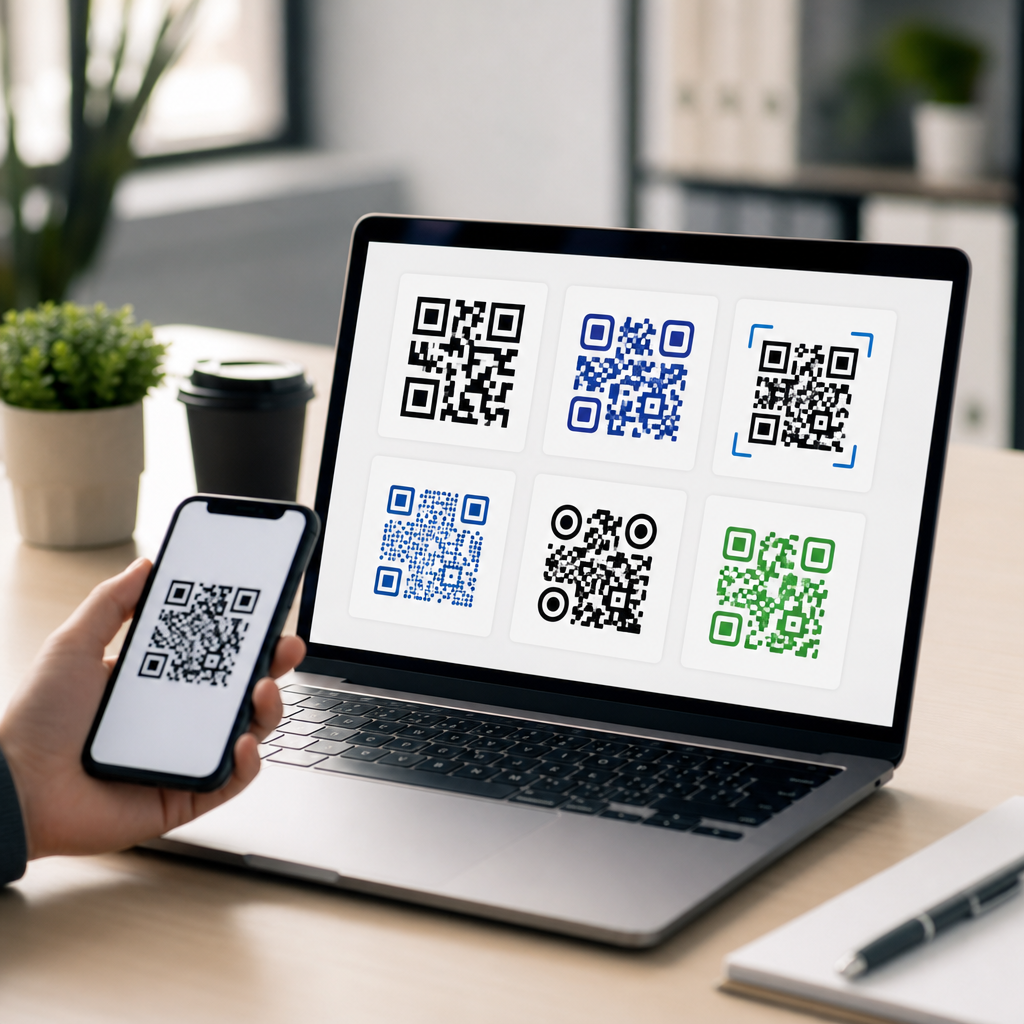
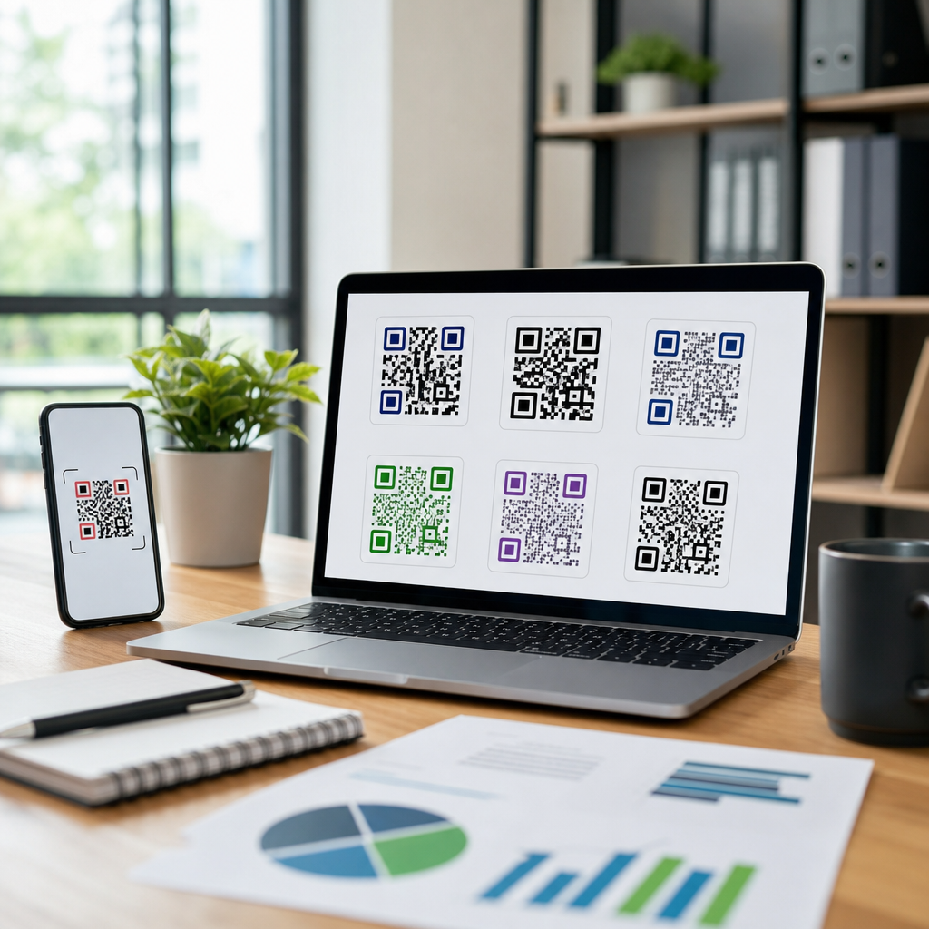
Brand teams understandably want the code to feel native to the package. The safe way to do that is through restrained customization. Rounded modules, subtle frame treatments, and a small center logo can work if the underlying geometry remains intact. The finder patterns, the three large corner markers, should stay prominent because scanners rely on them for orientation. Decorative backgrounds, gradients, and heavy illustrations behind the code are the fastest way to reduce reliability. If you use a callout frame, make it functional by adding a clear instruction such as “Scan for ingredients,” “Scan to verify,” or “Scan for setup.” Explicit prompts consistently outperform unlabeled codes because customers know what they will get.
The strongest branded QR codes on packaging usually follow a simple formula: high contrast, protected quiet zone, one accent color at most, and concise instructional text nearby. If your visual identity depends on softer tones, place the code inside a white container shape so the brand palette surrounds the symbol without weakening it. Accessibility is part of design here as well. Tiny explanatory text, low-contrast color combinations, or placement near mandatory legal copy can make the code easy to miss. In user tests I have run, shoppers scan more often when the code sits near a benefit statement and appears intentionally integrated, not buried among icons and compliance marks.
Test in real conditions and measure after launch
Before approving artwork, test printed samples with both iPhone and Android devices, using native camera apps and common retail lighting. Test unopened and filled packages, because package contents can change shape and reflectivity. Check scans at different distances, angles, and hand positions, including one-handed use. If the package will be refrigerated, frozen, or exposed to moisture, test under condensation and low-light conditions. For products sold internationally, verify that the landing page, redirects, and any app links behave correctly across regions. This final validation catches issues that design software cannot predict.
After launch, analytics should inform the next packaging run. Track scan rate relative to units sold where possible, landing page engagement, completion of the intended action, and device breakdown. If scans are high but conversions are low, the destination may be weak even if the code design is sound. If scans are low despite strong placement, the call to action may be unclear. Governance matters too. Assign ownership for destination updates, broken-link monitoring, and retirement policies. Packaging often remains in market longer than campaign media, so expired promotions and dead pages create avoidable customer frustration. Treat the QR code as a maintained product feature, not a one-time graphic element.
Designing QR codes for packaging works best when teams treat scanning reliability, print reality, and customer intent as one system. Start with a single clear use case, send scanners to a mobile-specific destination, and choose dynamic management when packaging has a long life or changing content. Protect fundamentals such as size, quiet zone, contrast, and error correction before adding brand styling. Adapt the code to the package material, print process, and placement, and validate every decision on printed samples in real-world conditions. When these elements align, a small square on a label becomes a dependable bridge between physical packaging and digital service.
The practical benefit is measurable: fewer support calls, stronger product education, better authentication, richer first-party data, and more post-purchase engagement without redesigning the entire pack. Brands that succeed here do not chase novelty; they follow disciplined design and testing. Review your current packaging, identify one high-value scan action per product line, and audit every code against the standards in this guide. Then build your next packaging QR code to scan fast, look intentional, and deliver something genuinely useful.
Frequently Asked Questions
1. What makes a QR code effective on product packaging?
An effective QR code on packaging does two jobs at once: it scans quickly in real-world conditions and it feels like a natural part of the package design. On packaging, a code is rarely viewed in perfect lighting on a flat surface. It may appear on a curved bottle, a glossy label, a small carton, a flexible pouch, or a box that gets handled, stacked, and shipped before the customer ever sees it. That means the code has to be designed for reliability first. In practice, this includes using strong contrast between the code and its background, keeping a clear quiet zone around the edges, choosing a size that can be scanned at the expected viewing distance, and avoiding distortion caused by folds, seams, shrink sleeves, or highly reflective finishes.
Just as important, the destination behind the code has to be useful. A packaging QR code should not send people to a generic homepage if the intent is to deliver product instructions, ingredient details, warranty registration, authentication, recipes, recycling guidance, loyalty offers, or a limited-time campaign. The best-performing codes create a clear connection between the physical product and the digital experience. A short call to action near the code, such as “Scan for setup,” “Scan for ingredients,” or “Scan to verify authenticity,” helps set expectations and improves scan rates.
From a branding perspective, the code should complement the package rather than fight it. Customized colors, frames, and logos can work well, but they should never reduce readability. A well-designed packaging QR code is functional, intentional, and easy to scan under everyday conditions. If it works in a warehouse, on a retail shelf, and in a customer’s kitchen or bathroom, it is doing its job.
2. How large should a QR code be on packaging to scan reliably?
There is no single perfect size for every package, but reliable sizing depends on how and where the customer will scan it. As a practical rule, the QR code needs to be large enough to be read easily by a smartphone camera at a natural scanning distance. On packaging, many brands start with a code size that is clearly visible without forcing the user to hold the item at an awkward angle. If the package is small, such as a cosmetics box or bottle label, the code still needs enough physical space to preserve each module, or square pixel, cleanly when printed. If those modules become too tiny, the code may fail under normal conditions even if it looks acceptable in a design file.
Content density also affects size. A QR code that stores more data becomes more complex, which means it usually needs to be printed larger to remain readable. For packaging, this is one reason many designers use short URLs or dynamic QR codes instead of encoding long links directly. A simpler code is easier to scan and more forgiving on smaller surfaces. This matters even more on curved containers, textured materials, or flexible films where printed detail can shift slightly during production.
The safest approach is to test size in context, not just on screen. Print prototypes at actual production scale, place them on the real substrate, and scan them with multiple phones in typical lighting. Test from the angle and distance a shopper would realistically use in a store or at home. If the code is on a bottle, test while the bottle is being held. If it is on a shipping box, test while the box is on the floor or a shelf. Packaging design is full of variables, so a code that is technically large enough may still need to be increased for consistency and ease of use.
3. Can QR codes be customized to match packaging design without hurting scan performance?
Yes, QR codes can be customized for packaging, but customization should always stay within the limits of scan reliability. Brands often want the code to match their packaging system through color, shape treatments, logo placement, custom frames, or surrounding graphics. Those design choices can absolutely make the code feel more premium and integrated, especially on consumer packaging where aesthetics influence trust and engagement. However, the scanning structure of the code must remain intact. The finder patterns, overall contrast, quiet zone, and module clarity are not decorative details; they are what make the code readable.
The safest customization strategy is to preserve high contrast and keep the core code pattern clean. Dark code elements on a light background remain the most dependable option. Reversing that relationship, using metallic inks, printing over illustrations, or adding gradients may look striking but can create failures under certain lighting conditions or with certain phone cameras. The same is true for oversized logos placed in the center of the code. Error correction can compensate for some obstruction, but it is not a license to overdesign the code. On packaging, where surfaces may be curved, reflective, or imperfectly printed, conservative customization usually performs better than aggressive styling.
A good middle ground is to customize the frame, nearby icons, and call to action while keeping the actual code highly readable. For example, a beauty brand might use a subtle brand color for the code if contrast remains strong, or a food package might include a label saying “Scan for recipes” in the brand typeface while leaving the QR itself technically standard. The test is simple: if the code still scans instantly across devices, angles, and lighting conditions, the customization is helping rather than hurting. If not, visual restraint is the smarter design choice.
4. Where should a QR code be placed on packaging for the best customer experience?
Placement has a major impact on whether people notice the code, understand why it is there, and can scan it without frustration. The best location depends on the packaging format and the purpose of the code. If the code supports purchase decisions, such as ingredients, sourcing, reviews, or product comparisons, it may belong on a visible panel shoppers can access while the product is still on the shelf. If the code supports post-purchase use, such as setup instructions, refill guidance, or loyalty enrollment, a side or back panel may be more appropriate. What matters most is that the code appears where the user naturally expects it and can access it without damaging the package or rotating it awkwardly.
Physical production constraints should also guide placement. Avoid putting QR codes near corners, folds, seals, perforations, or highly curved areas where the printed pattern may warp. Stay away from embossed textures, transparent windows, and surfaces likely to pick up glare. On bottles and tubes, choose the flattest possible zone. On pouches, avoid areas that wrinkle when filled. On cartons, make sure the code is not interrupted by flap edges or hidden by retail shelving. Placement should also account for barcodes, legal text, and design hierarchy so the QR code does not compete visually or get mistaken for another scannable element.
Finally, placement should support intent through context. A code placed in isolation can feel random, while a code paired with a short instruction feels purposeful. A nearby sentence such as “Scan for care instructions” or “Scan to see how to recycle this pack” tells the customer exactly what value they will get. That small piece of copy often matters as much as the physical position itself. The best placement is visible, scannable, and aligned with the moment the user needs the information.
5. What should brands test before printing QR codes on packaging at scale?
Before going into full production, brands should test both the printed code and the complete user journey. On the print side, start with real packaging prototypes rather than flat proofs alone. Test the code on the final substrate, with the actual print method, coating, finish, and size. A code that scans well on matte paper may behave differently on glossy film, corrugated board, foil labels, or shrink sleeves. Scan under bright retail lighting, lower indoor lighting, and natural light. Try multiple smartphone models and camera apps. Test the code when the package is flat, assembled, filled, held in hand, and placed on a shelf. These steps reveal problems that design software cannot predict.
It is also important to test durability across the package lifecycle. Packaging moves through shipping, storage, store handling, and home use. Smudging, abrasion, condensation, creasing, and slight print registration shifts can all affect performance. If the code appears on a refrigerated bottle, test after chilling. If it appears on an e-commerce box, test after normal transit wear. If the package may be crumpled or squeezed, test the code after handling. Reliability in ideal conditions is not enough; the code should still work when the package has lived a real life.
On the digital side, verify that the scan leads to a fast, mobile-friendly destination that matches the promise made on the package. Check page load speed, language localization, analytics tracking, redirects, and campaign parameters. If the code is dynamic, confirm that it can be updated without breaking the printed asset. If it supports regulated content such as ingredients, safety data, or traceability, ensure the information is accurate and easy to access. The strongest packaging QR programs are not just well printed; they are thoroughly tested systems that connect physical packaging to a dependable digital experience.