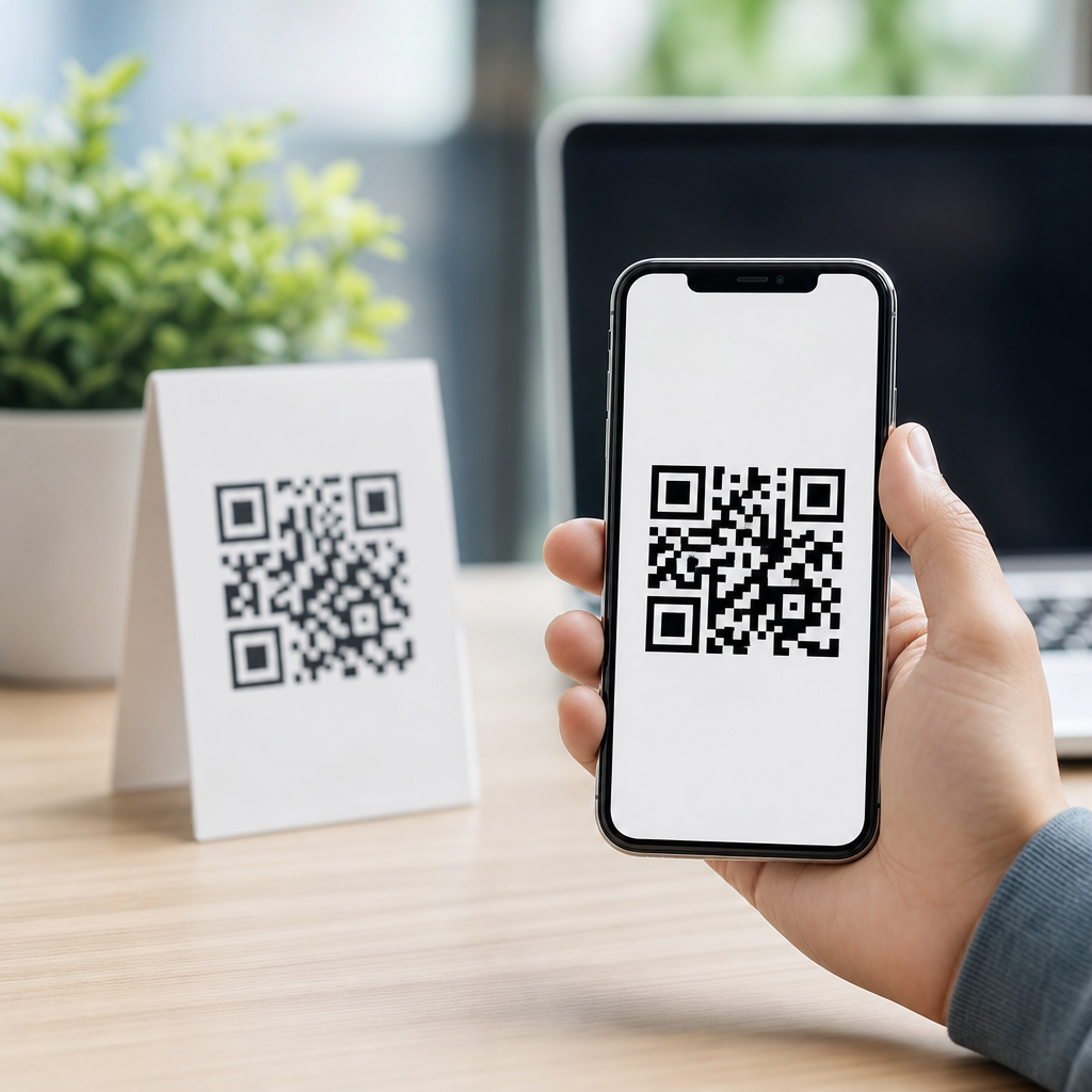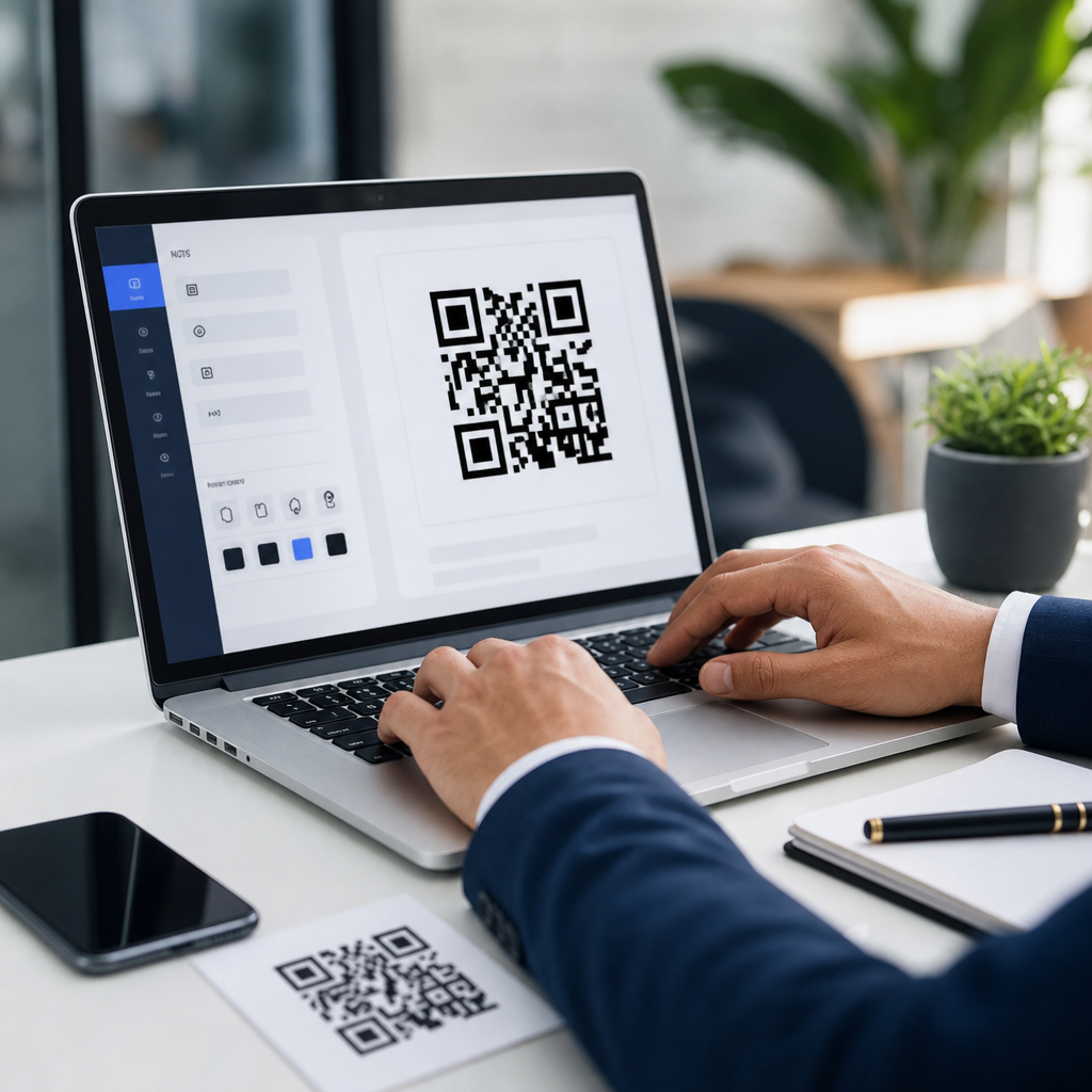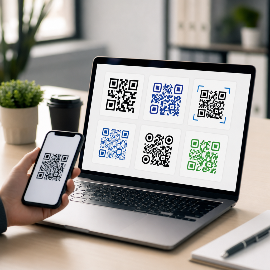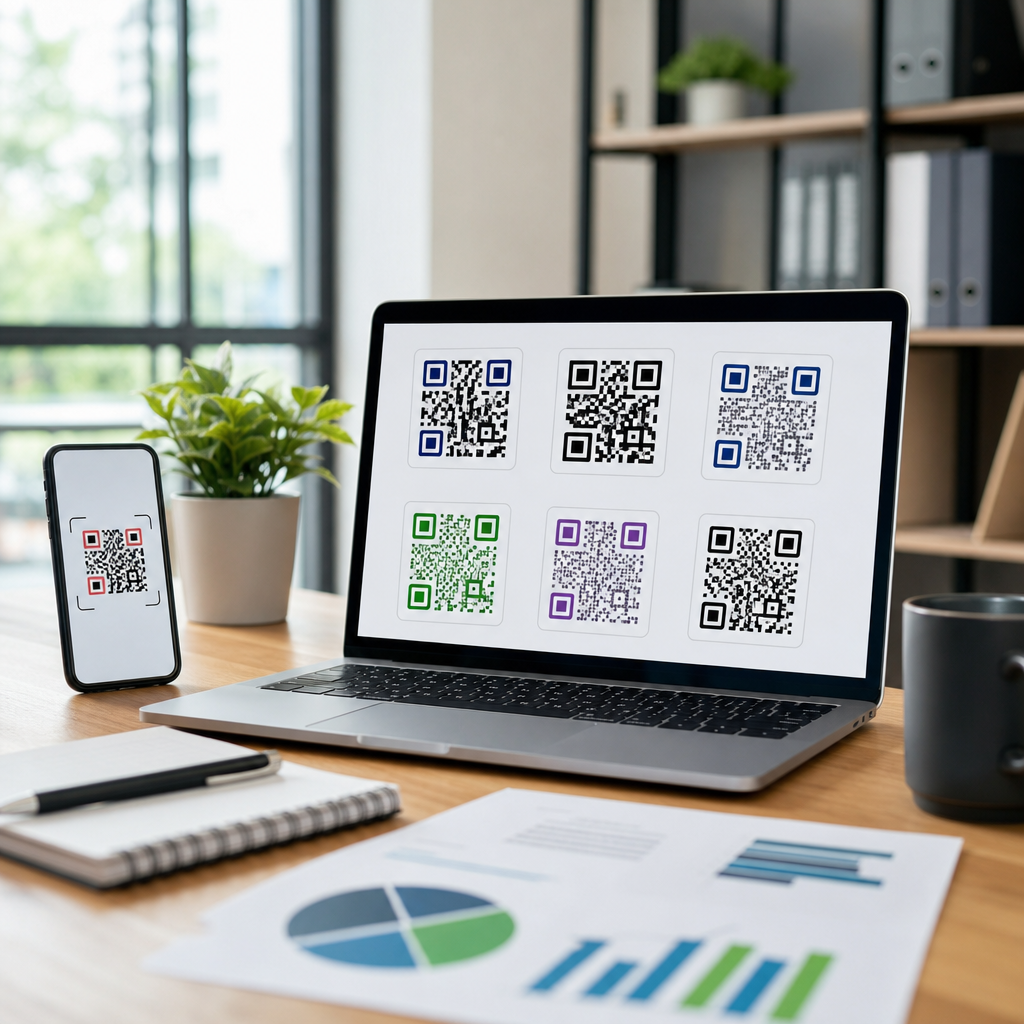
Designing QR codes for business cards is not just a graphic choice; it is a conversion decision that affects whether a printed card leads to a call, contact save, portfolio visit, booking, or sale. A QR code is a two-dimensional barcode that stores data such as a URL, vCard, PDF, menu, payment link, or app deep link. On a business card, its job is simple: remove friction between meeting someone and getting them to act. I have tested QR codes on cards for consultants, real estate agents, event teams, and local service businesses, and the pattern is consistent. Codes that look attractive but ignore contrast, size, and destination quality get fewer scans. Codes designed around mobile behavior perform better because the user is usually standing, talking, moving, or multitasking. That context matters.
Business card QR code design sits at the intersection of branding, print production, mobile usability, and tracking. Effective design means the code scans quickly, matches the brand without sacrificing readability, and sends people to a destination built for phones. Poor design means tiny modules, weak contrast, crowded layouts, or generic homepages that force extra taps. This article explains how to design QR codes for business cards that are functional, visually credible, and measurable. It also serves as a hub for designing effective QR codes more broadly, because the same principles apply across flyers, packaging, signage, and postcards. If you understand scannability, error correction, quiet zones, destination strategy, and testing, you can adapt those rules to almost any printed marketing asset.
Start with the business goal and the right QR code type
The first design decision is not color or shape. It is the action you want after the scan. A business card QR code should support one primary outcome: save contact details, book a meeting, open a portfolio, request a quote, view a menu, or connect on a specific platform. I recommend choosing one action because split intent lowers response. A card that tries to do everything usually sends users to a cluttered landing page and loses them.
Choose the QR code type based on that goal. A vCard QR code is useful when the priority is adding a contact quickly, especially for sales reps, recruiters, and field service teams. A URL QR code works well when you want to send people to a mobile landing page, Linktree-style profile, booking form, or digital business card. A dynamic QR code is often the best business choice because you can change the destination later without reprinting cards and track scans by date, device, and location. Static codes are acceptable for permanent destinations, but they offer no editability and limited measurement. Tools commonly used for this include QR Code Generator Pro, Bitly Codes, Beaconstac, Flowcode, and Uniqode.
The destination matters as much as the code. If someone scans your business card and lands on a slow desktop page, the design failed even if the code scans instantly. Build a destination that loads fast, is readable on a phone, and asks for one next step. For example, a mortgage broker may send users to a booking page with available time slots. A designer may link to a portfolio with three case studies and a contact form. A restaurant sales rep may send buyers to a digital catalog and sample request form. Every extra tap reduces conversion.
Design for reliable scanning before visual styling
The best-looking QR code is the one that scans the first time. That starts with technical fundamentals. Keep strong contrast between foreground and background, ideally dark modules on a light background. Black on white remains the most reliable option in varied lighting. If you use brand colors, test them under daylight, office lighting, and low light. Pastel foregrounds, metallic inks, and glossy finishes often reduce readability, especially on textured card stock.
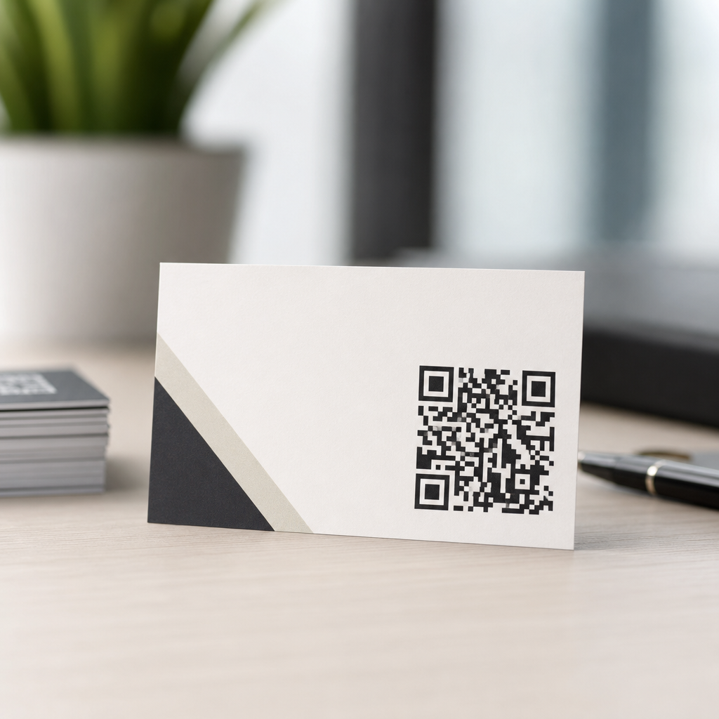
Size is critical on a business card because space is limited. In practice, I rarely go below 0.8 x 0.8 inches for a printed card, and 1 x 1 inch is safer when the audience may use older phones or scan in motion. Leave a proper quiet zone, the blank margin around the code, so phone cameras can detect edges cleanly. Many failed prints come from designers placing text, icons, or border elements too close to the code. Error correction also matters. Higher error correction lets a code remain readable when part of it is covered by a logo or minor print damage, but it increases density. Dense codes need larger print sizes. For business cards, use the shortest possible encoded data and add visual customizations only after testing.
| Design factor | Recommended practice | Why it matters |
|---|---|---|
| Code size | Minimum 0.8 x 0.8 inches; 1 x 1 inch preferred | Improves first-scan success on typical phone cameras |
| Contrast | Dark code on light background | Helps camera detection in mixed lighting |
| Quiet zone | Keep clear space around all sides | Prevents nearby graphics from breaking recognition |
| Destination | Use a short dynamic URL or vCard | Reduces code complexity and supports edits later |
| Print finish | Prefer matte over heavy gloss | Minimizes glare that interferes with scanning |
Placement also affects performance. The back of the card usually gives the code enough breathing room, while the front should only host a QR code if the layout remains uncluttered. Do not rotate the code at unusual angles or squeeze it into narrow columns. Standard square orientation is easiest for users to recognize. If the card includes social icons, a headshot, or legal text, prioritize the code and reduce nonessential elements. Scan behavior is fast and intuitive when the code looks intentional rather than decorative.
Blend the QR code with brand identity without hurting usability
Branding matters because people judge credibility in seconds. A plain black QR code is acceptable, but a branded QR code can increase trust when it clearly belongs to the company on the card. The key is restraint. Use brand color in the modules only if contrast remains strong. Add a central logo only if the code uses enough error correction and still scans from multiple devices. Rounded modules, customized eyes, and frame treatments can work, but every modification should survive testing before approval.
I have seen three branding choices work consistently on business cards. First, use a subtle frame with a short call to action such as “Scan to save my contact” or “Scan to book a call.” That text increases scans because it removes ambiguity. Second, align the code with existing brand typography and spacing so it feels integrated, not pasted on. Third, match the destination page to the card design. If the card is minimal and premium, the landing page should not look like a generic link list. Visual continuity improves trust and follow-through.
There are limits. Inverting the code to light modules on a dark background can work, but it is less forgiving in print and should be tested aggressively. Gradients are risky, especially when they reduce edge definition. Embossing, foil stamping, and spot UV may look impressive but can introduce glare and uneven surfaces. For luxury cards, keep the QR code in standard ink and use premium finishes elsewhere. The goal is a code that reflects the brand while behaving predictably on actual phones, not just in design software.
Create a mobile destination that completes the scan journey
A business card QR code succeeds only when the post-scan experience is excellent. Think of the code as the bridge, not the destination. The landing page, digital business card, or vCard download should load in seconds, explain who you are immediately, and provide one or two obvious actions. Mobile-first design is mandatory because nearly every scan from a business card happens on a smartphone.
For a personal brand or consultant, a digital business card page should include your name, role, company, photo, a short credibility statement, and buttons for save contact, email, call, and book. For a B2B salesperson, add one proof element such as client logos, a brief case result, or a product overview. For a creative professional, lead with a narrow portfolio selection, not an archive. The principle is relevance. Someone who just received your card wants confirmation and the next step, not a maze.
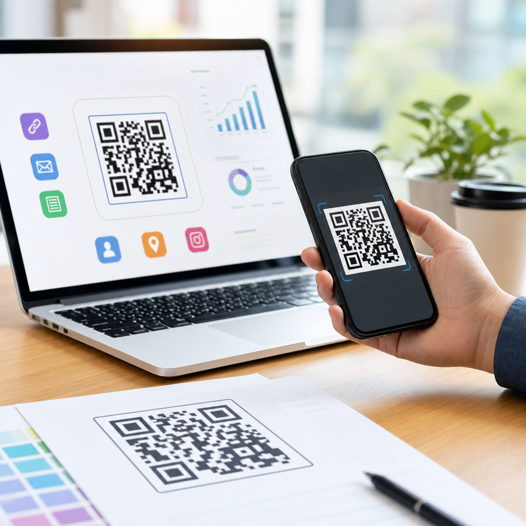
Tracking closes the loop. Dynamic QR platforms and analytics tools can show total scans, unique scans, time of day, geography, and device type. Add UTM parameters if the code points to your site so traffic appears clearly in Google Analytics 4. That data helps answer practical questions: Which card version performs better? Does a direct booking page outperform a homepage? Do event cards get more scans than office cards? In one campaign I worked on for a trade show team, changing the QR destination from the corporate homepage to a lightweight meeting-booking page roughly doubled qualified follow-up because the action became immediate.
Test printed business card QR codes in real conditions
Testing is where most preventable failures are caught. Always test from the final print file, then from an actual printed proof, because print behavior differs from screen previews. Scan with both iPhone and Android devices, using native camera apps and at least one older model if your audience is broad. Test under sunlight, office fluorescents, café lighting, and slight motion. If users need to tilt the card repeatedly or move closer than normal reading distance, revise the design.
Run simple usability checks with people who were not involved in the design. Hand them the card without explanation and watch what happens. Do they notice the QR code quickly? Do they understand why they should scan it? Do they hesitate because the call to action is unclear? This observational testing is more valuable than internal opinions. It reveals whether the card works in the same distracted, conversational environments where it will actually be used.
Finally, treat design as iterative. Print small batches before ordering thousands. Compare versions with different calls to action, placements, or destinations. Keep a record of the exact code settings, print finish, dimensions, and analytics outcomes so future card runs improve rather than reset. The most effective business card QR codes are not accidents. They are the result of clear goals, disciplined design, mobile-focused destinations, and repeatable testing. If you are building your broader strategy for creating mobile QR codes, start here: define the action, protect scan reliability, brand carefully, and measure every result. Then apply the same standards across your other printed assets.
Frequently Asked Questions
What should a QR code on a business card link to?
The best destination depends on the single action you want the recipient to take after scanning. That is the core principle. A business card QR code works best when it removes one specific point of friction, not when it forces someone to choose from too many options. If your goal is to get more calls or meetings, linking to a booking page or contact card can be more effective than sending people to a full website. If you are a consultant, designer, photographer, or freelancer, a portfolio page or curated landing page often makes more sense because it shows proof of work immediately. For real estate agents, linking to a current listings page, a lead form, or a property search page can convert better than a general homepage. For service businesses, a quote request page, menu, payment link, or review page may be the most practical choice.
A good rule is to match the QR code destination to the moment in which the card is handed out. If you meet someone at a networking event and they are likely to want your contact details, a vCard QR code can be ideal because it lets them save your information directly to their phone. If you are speaking at an event, a landing page with your bio, services, and call-to-action may be stronger because it gives context and momentum. If your business depends on appointments, linking straight to a scheduling page shortens the path to conversion. The fewer steps between scan and action, the better the card performs.
It is also smart to think beyond convenience and consider measurement. A dynamic QR code linked to a trackable landing page allows you to monitor scans, update destinations later, and test different offers without reprinting cards. That flexibility matters because business cards are long-lived assets. You may change services, URLs, branding, or campaigns, and a dynamic code helps preserve the usefulness of your printed inventory. In most cases, the strongest answer is this: link your QR code to the page or asset that supports the one action you value most right after the introduction.
How big should a QR code be on a business card to make sure it scans reliably?
For most standard business cards, a QR code should usually be at least 0.8 inches to 1 inch square to scan comfortably in real-world conditions. While technically smaller codes can work, business cards are handled in less-than-perfect environments: dim lighting, motion, glossy finishes, phone cameras of varying quality, and users who hold the card at awkward angles. That means practical scan performance matters more than theoretical minimum size. If the code is too small, densely encoded, or surrounded by cluttered graphics, scan reliability drops fast.
Size is only one part of scannability. The amount of data encoded affects complexity. A short URL typically produces a simpler code with larger modules, which scans more easily than a long URL, full vCard, or dense file link. That is why many designers use a short redirect URL or dynamic QR platform rather than embedding a long string of data directly. Simpler patterns tolerate smaller print better. Equally important is the quiet zone, the blank margin around the QR code. Without enough clear space around the edges, scanners may struggle to distinguish the code from the surrounding design. Preserving that margin is non-negotiable.
Printing quality also plays a major role. Sharp contrast, crisp edges, and high-resolution output are essential. Fine details can fill in or break apart during printing, especially on textured stock or with low-quality processes. Before approving a run, print a test card at actual size and scan it with multiple phones, from different distances, under indoor and outdoor lighting. Test it in the hands of people who did not design it, because they will behave more like real recipients. A QR code that scans instantly is not just a technical success; it increases the chance that a physical introduction turns into a real business outcome.
Where should a QR code be placed on a business card for the best balance of design and performance?
The best placement is wherever the code is easy to notice, easy to scan, and does not compete with the most important printed information. In practice, the back of the card is often the strongest choice because it gives the QR code room to breathe and keeps the front focused on identity elements such as your name, title, logo, and core contact details. A full-back QR code layout can work especially well when paired with a short call-to-action like “Scan to book a meeting,” “Scan to save my contact,” or “Scan to view portfolio.” This approach reduces visual noise and gives the code enough space for reliable scanning.
That said, placement should follow the card’s job. If the front of the card has ample white space and the code supports the primary next step, a front placement can work beautifully. The key is hierarchy. The QR code should feel intentional, not squeezed into a leftover corner. It should be close to a clear label that tells people why they should scan. People are more likely to use a QR code when they know exactly what they will get. “Scan for contact info” usually outperforms an unlabeled code because it removes uncertainty.
Avoid placing the QR code too close to card edges, folds, rounded corners, or heavily patterned backgrounds. Also be cautious with overlapping graphics, logos, or decorative elements that interfere with the code structure. From a user perspective, the easiest codes to scan are those presented cleanly, with strong contrast and enough surrounding empty space. From a branding perspective, good placement integrates the code into the card without making it feel like an afterthought. The right balance is achieved when the card still looks polished and premium, but the scan path is obvious and frictionless.
Can you customize a QR code on a business card without hurting scanability?
Yes, but customization should always be secondary to scan performance. A QR code can absolutely be styled to fit your brand through color, corner shapes, embedded logos, or a more refined visual treatment, but every design choice has limits. The more heavily you customize a QR code, the more carefully you need to test it. Business cards are a high-stakes print format because the available space is limited, and the code often needs to perform instantly during face-to-face interactions. If a stylized code fails even occasionally, the design is not helping the business.
The safest approach is to keep the core structure intact and preserve strong contrast between the foreground and background. Dark code on a light background remains the most reliable option. Inverted treatments, low-contrast palettes, metallic inks, gradients, and busy image backgrounds can all reduce scan success. Adding a logo to the center can work if the code has adequate error correction and the logo does not cover too much of the pattern, but this is not something to guess on. It should be tested across devices and print finishes. Rounded modules and subtle brand styling are usually safer than dramatic visual effects.
It is also important to understand that what looks good on a screen may behave differently once printed. Gloss coatings can reflect light, textured paper can distort edges, and small customized details may blur. That is why proofing matters. Print samples at final size, test in realistic environments, and compare a branded version against a plain high-contrast version. If the plain version scans faster and more consistently, that performance advantage may outweigh the branding benefit of a stylized design. The best custom QR code is one that feels on-brand while still scanning instantly for nearly everyone who uses it.
How do you make a business card QR code actually drive more leads, bookings, or sales?
A QR code increases results when it is designed as part of a conversion path, not treated as decoration. That starts with a clear intent. Before you generate the code, decide what outcome matters most: contact saves, meeting bookings, portfolio views, product purchases, quote requests, reviews, or another action. Then build the destination page around that one outcome. A business card is a fast handoff tool, so the QR experience should continue that speed. If the landing page is slow, cluttered, generic, or not optimized for mobile, the QR code will not deliver its full value no matter how attractive the card looks.
Strong calls-to-action make a measurable difference. Many people will not scan a code simply because it is there; they scan when they understand the benefit. Replace vague labels with direct, outcome-focused language: “Scan to book a call,” “Scan to download my portfolio,” “Scan to save my contact,” or “Scan to get pricing.” This sets expectation and improves intent. The destination should then match the promise exactly. If the code says “book a call,” it should open a scheduling page immediately, not a homepage where the user has to hunt for a calendar link.
Tracking and iteration are what turn QR codes into business tools rather than novelty features. Use a dynamic QR code or trackable URL so you can see scan volume, timing, and performance by campaign or audience. This allows you to test different offers, landing pages, and CTAs over time. You can even use different card versions for events, local outreach, partnerships, or premium clients. Beyond the code itself, think about the full card ecosystem: print quality, readability, card stock, message clarity, and audience context. A well-designed QR code on a business card succeeds because it reduces friction at the exact moment interest exists, making the next action effortless and immediate.