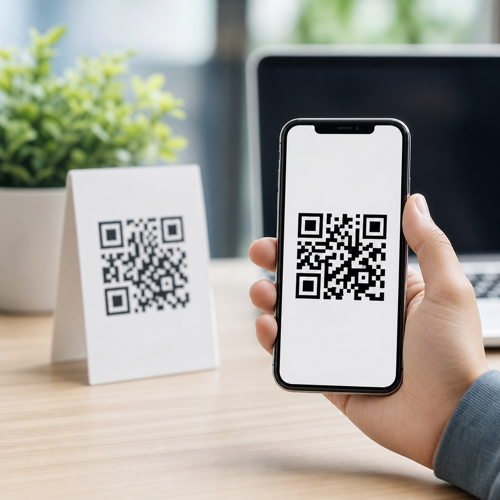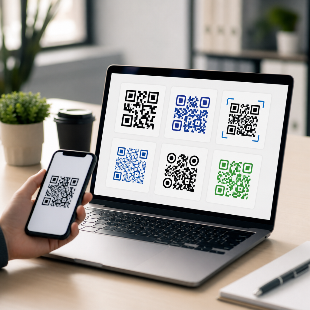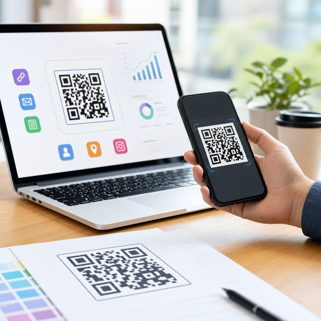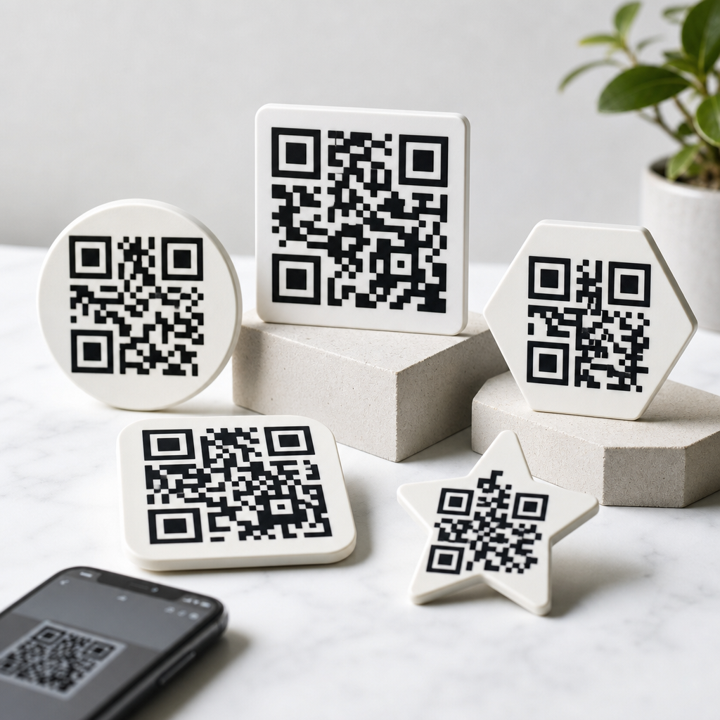
QR code shape affects scannability, branding, print reliability, and user trust, so choosing the best QR code shapes is not just a design preference but a performance decision. In practice, “shape” can mean the outer frame, the dots or modules inside the code, the finder patterns in three corners, and decorative treatments such as rounded pixels, circles, diamonds, or custom eyes. Designing effective QR codes requires balancing visual customization with the error-correction logic defined in ISO/IEC 18004, because scanners still need clear position markers, sufficient contrast, and intact data patterns to decode quickly. This matters for any business creating mobile QR codes for packaging, menus, posters, product labels, direct mail, and in-store signage. I have tested standard square codes, rounded styles, branded frames, and logo-centered variants across iPhone and Android camera apps, and the pattern is consistent: shape influences performance when it reduces contrast, distorts finder patterns, or shrinks quiet zones. The hub question is straightforward: do custom QR code shapes work? Yes, but only within technical limits. The best-performing designs preserve scanner-readable structure while improving visual appeal. That is the foundation of designing effective QR codes that scan fast, look intentional, and support campaign goals across print and digital touchpoints.
What QR code shapes actually change performance
The square QR code remains the baseline because the symbol is built on a square module grid. Every black and white cell carries positional or payload information, so heavy reshaping can interfere with detection. In real scanning environments, the most important visual elements are the three finder patterns, the alignment patterns on larger versions, the timing patterns, and the quiet zone around the code. When designers ask whether circular QR codes scan, the honest answer is that fully circular symbols are often less reliable than square ones unless they are simulated inside a square boundary with enough preserved module geometry. Rounded modules usually perform well because they soften the appearance without changing the grid coordinates. By contrast, decorative styles that replace too many square modules with tiny dots can fail on low-resolution prints or when viewed at an angle. Shape also affects perceived legitimacy. A clean square or gently rounded code usually signals “scan me” faster than an experimental abstract mark, especially for users moving past retail displays or street posters. The performance question therefore includes both machine readability and human recognition, and strong QR code design must support both.
Best QR code shapes for reliable scanning
The best QR code shapes for performance are square modules, slightly rounded modules, and conservative custom finder patterns that retain strong contrast and clear edges. Square modules deliver the highest tolerance across weak lighting, glossy surfaces, and small print sizes because each cell occupies maximum area. Rounded modules are a close second and are often ideal for branded campaigns because they look modern while maintaining enough mass for camera recognition. Circles, diamonds, starbursts, and highly stylized cells can work in premium design contexts, but they demand larger physical sizes and stricter print quality control. I typically recommend keeping the overall code square even if the interior modules are softened, because camera software looks for those expected corner anchors. For restaurant table tents, real estate flyers, and product packaging, a standard square with rounded dots and a framed call to action like “Scan for menu” or “See demo” consistently outperforms novelty shapes. Dynamic QR code platforms such as QR Code Generator Pro, Bitly Codes, Flowcode, and Beaconstac all allow module styling, but their strongest templates generally stay close to the native geometry. The reason is simple: restrained customization preserves first-scan success, which is the metric that matters most.
How customization affects readability on mobile devices
Mobile scanning performance depends on camera autofocus, sensor quality, decoding software, screen glare, movement, and distance, so shape choices have to account for imperfect real-world conditions. Apple’s Camera app, Google Lens, Samsung Camera, and many in-app scanners are forgiving, but they are not magical. When module shapes become too thin or too ornate, the phone must work harder to separate foreground from background. This is where contrast ratio and quiet zone matter more than aesthetics. A dark code on a light background remains the safest combination. Reversing colors, placing the code over photography, or using metallic inks often creates failures that get blamed on “bad phones” when the real issue is design. Logo insertion compounds the risk because it removes data area from the center. Higher error correction levels, especially level H, can offset some loss, but higher redundancy also increases symbol density, which can hurt small-format print readability. In other words, there is no free customization. Effective QR code design starts with use case: a shipping label can favor maximum robustness, while a cosmetics package may justify moderate styling if scan distance is short and print quality is high. Testing on multiple devices under normal lighting remains nonnegotiable because desktop previews never reveal every failure mode.
Practical design rules for effective QR codes
The most dependable way to design effective QR codes is to protect the structure first and style second. Keep a quiet zone of at least four modules on all sides, use strong contrast, print at a size appropriate to scanning distance, and avoid altering the finder patterns beyond recognized templates. A common rule for print is a minimum of about 2 x 2 centimeters for short URLs at close range, but posters and storefront graphics need far more. If people will scan from one meter away, larger symbols are essential. Error correction should match the design load: level M or Q is often enough for lightly branded codes, while level H is useful when adding a centered logo. URL length matters too. Long static URLs generate denser codes, which reduces tolerance for decorative shapes; dynamic QR codes with short redirect URLs are easier to style because they create simpler matrices. I also advise adding a clear call to action near the code. In campaigns I have worked on, “Scan to book,” “Scan for sizing,” and “Scan for setup guide” consistently improved scan intent compared with unlabeled symbols. Design quality is not only about whether a scanner can decode the code; it is about whether a person notices it, trusts it, and understands the reward for interacting.
Shape comparison by use case
| Shape style | Scan reliability | Best use cases | Main risk |
|---|---|---|---|
| Standard square modules | Highest | Packaging, labels, logistics, forms | Less distinctive branding |
| Rounded modules | High | Retail, restaurants, events, business cards | Failure if contrast is weak |
| Custom finder patterns | Medium to high | Marketing campaigns with strong brand guidelines | Corner detection issues if overstyled |
| Circular or dot-heavy styles | Medium | Large-format signage, premium print pieces | Poor decoding at small sizes |
| Highly decorative shapes | Low to medium | Controlled environments with testing | User confusion and inconsistent scans |
This comparison reflects what shows up repeatedly in production. The more a design departs from the square module logic, the more it depends on ideal printing, generous sizing, and newer smartphones. That does not make custom shapes wrong; it makes them conditional. For a mobile QR code on coffee packaging, rounded modules often deliver the right mix of brand polish and reliable scans. For warehouse inventory, visual experimentation adds no value, so standard square symbols win. For event signage seen from several feet away, a code can support moderate stylization if it is printed large and isolated from busy backgrounds. Context determines the acceptable risk threshold.
Testing methods, mistakes, and hub topics to explore next
If you want to know whether a QR code shape impacts performance, test the finished asset, not the design mockup. Print samples at actual size, place them on the intended material, and scan with current iPhone and Android devices from realistic distances and angles. Test in bright light, indoor light, and low light. Use both native camera apps and common third-party scanners. Verify not only that the code opens, but also how long it takes to decode and whether users hesitate before scanning. Slow scans are costly in the real world because friction reduces completion rates. The most common mistakes are shrinking the quiet zone, using low contrast brand colors, placing codes on curved surfaces, adding oversized logos, and exporting raster files too small for print. SVG or EPS output is better for press production because edges stay crisp. As the hub page for designing effective QR codes, this topic connects naturally to deeper guides on QR code size, QR code color contrast, logo placement, error correction levels, print materials, dynamic versus static QR codes, call-to-action copy, and scan testing workflows. Start with a reliable square or rounded design, customize conservatively, and validate every version in the environment where people will actually use it.
The short answer is that QR code shapes do impact performance, but not all customization carries the same risk. Safe customization improves appearance and brand fit without harming scan speed. Aggressive customization can reduce readability, especially on small prints, reflective materials, or older phones. For most mobile QR code campaigns, the best choice is a square overall shape with high contrast, a protected quiet zone, and either standard or gently rounded modules. That design gives you the highest chance of first-scan success while still leaving room for color, framing, and a modest logo. If your team is building a broader creating mobile QR codes strategy, treat design as a system rather than an isolated graphic decision. Shape, size, destination URL, print process, placement, and user instruction all work together. Use this hub as the starting point, then review the related topics on sizing, contrast, logos, and testing before finalizing production files. Better QR code design is rarely about making the code look unusual; it is about making scanning feel effortless. Choose a shape that supports that goal, test it under real conditions, and publish only what performs reliably.
Frequently Asked Questions
Do different QR code shapes actually affect scanning performance?
Yes, they can. While a QR code’s encoded data follows a technical standard, the way that data is visually styled can influence how easily cameras and scanning apps recognize it. In practical terms, shape affects performance when customization changes the clarity of the modules, the visibility of the three finder patterns, the contrast between foreground and background, or the amount of quiet zone around the code. Square modules are the default because they align cleanly on a grid and are easiest for scanners to interpret, but rounded dots, circles, and other stylized elements can still perform well when they remain distinct and preserve the code’s underlying structure.
The biggest issue is not whether a shape looks modern or branded, but whether it interferes with detection. If decorative shapes cause neighboring modules to blur together, reduce edge definition, or distort the corners used for orientation, scan reliability can drop quickly, especially on lower-quality phone cameras, glossy packaging, or small print sizes. A well-designed custom QR code can scan just as effectively as a standard one, but only when the styling respects the code’s geometry, contrast, and spacing requirements. So yes, shape matters, and it matters most when design choices begin to compete with readability.
Which QR code shapes are generally considered the best for balancing style and reliability?
The most dependable option is still the classic square-module QR code with clear square finder patterns, because it offers the strongest consistency across devices, surfaces, and lighting conditions. That said, many brands want something more visually distinctive, and several stylized approaches can work without sacrificing too much performance. Rounded modules are often one of the safest design upgrades because they soften the look of the code while usually preserving enough separation between individual elements. Subtle circular or slightly rounded pixels can also improve aesthetics without making the code difficult to scan.
Shapes become riskier as they move farther from the original grid logic. Diamonds, heavily stylized dots, ornate custom eyes, and decorative outer frames can all be effective, but only when used carefully. In most cases, the best-performing customized QR codes keep the finder patterns obvious, maintain a strong quiet zone, use dark-on-light contrast, and avoid extreme shape transformations. If the goal is to combine branding with dependable scans, a conservative customization strategy usually wins: slightly rounded modules, recognizable corner markers, minimal visual clutter, and enough size for the intended viewing distance. In other words, the best QR code shapes are usually the ones that look custom without making the code look unfamiliar to a scanner or a user.
Are rounded, circular, or decorative QR code dots safe to use?
They can be, but safety depends on execution. Rounded dots are widely used and often scan well because modern cameras and software are fairly tolerant, especially when the code has sufficient size, high contrast, and appropriate error correction. The danger appears when rounded or circular modules become too small, too spaced out, or too decorative to be interpreted as clean binary data. If the styling causes modules to merge into one another or creates ambiguous gaps, scanners may struggle to reconstruct the pattern accurately.
Decorative treatments such as circles, blobs, diamonds, or custom pixel shapes should be tested more aggressively than basic rounded designs. They may work perfectly in a large digital placement but fail when printed smaller on labels, menus, product packaging, or textured materials. Another factor is user trust: highly artistic QR codes sometimes look less immediately recognizable, which can reduce engagement even if they remain technically scannable. A good rule is to customize the interior modules moderately, preserve the three corner finder patterns clearly, and validate the design under real-world conditions such as different phones, angles, distances, and lighting. If a decorative style passes those tests consistently, it can be considered safe for use.
How do finder pattern shapes and outer frames influence QR code usability?
Finder patterns, the three prominent corner markers, are among the most important visual elements in any QR code because they help scanning software detect orientation and alignment. If those corner elements are overly stylized, partially obscured, or made too similar to the rest of the modules, performance can suffer. Custom “eyes” can be effective from a branding standpoint, but they should still remain bold, well-defined, and easy for scanners to distinguish from the surrounding matrix. In most cases, keeping the finder patterns visually prominent is more important than making them decorative.
Outer frames also play a usability role, though indirectly. A frame can draw attention, support branding, and make a call to action more obvious, which may increase scan rates. However, the frame must not intrude into the quiet zone, the empty margin around the QR code that scanners rely on to separate the symbol from nearby content. If the frame crowds the code or blends too closely with it, detection can become less reliable. The best approach is to use frames as supportive design elements rather than functional parts of the code itself. Keep them outside the required clear space, make sure they do not reduce contrast, and use them to improve visibility and user confidence rather than to reshape the core scanning structure.
What design rules should you follow if you want a custom-shaped QR code that still performs well?
Start with the fundamentals. Maintain strong contrast, ideally a dark code on a light background. Preserve the quiet zone on all sides. Keep the finder patterns distinct and avoid covering or distorting them with logos, textures, or artistic effects. Choose a reliable size for the placement context, because even a beautifully designed code will fail if it is too small for the expected scanning distance. Use an appropriate error-correction level, especially if you plan to add branding elements or stylized shapes, but remember that error correction is a backup feature, not permission to overdesign the code.
From there, customize gradually. Rounded modules are usually safer than highly abstract shapes. If using circles, diamonds, or custom eyes, make sure the overall grid remains readable and the modules do not visually collapse into one another. Avoid low-contrast color combinations, metallic finishes that create glare, and busy backgrounds that interfere with edge detection. Test the QR code in every environment where it will appear, including print and digital, because performance can vary significantly by size, material, lighting, and camera quality. Finally, consider user perception as part of performance. The best QR code shapes are not just technically scannable; they also look trustworthy, recognizable, and intentional. A QR code that people instantly understand and can scan on the first try is almost always the best-performing design.