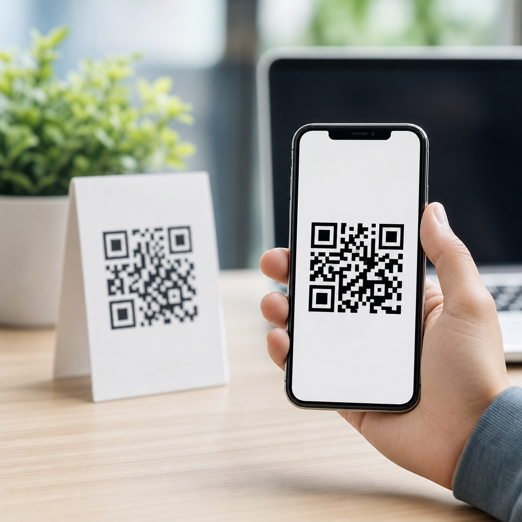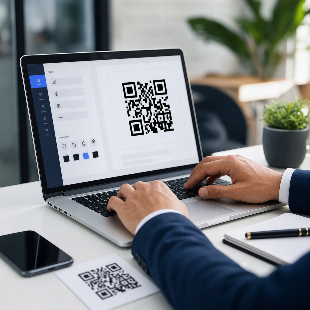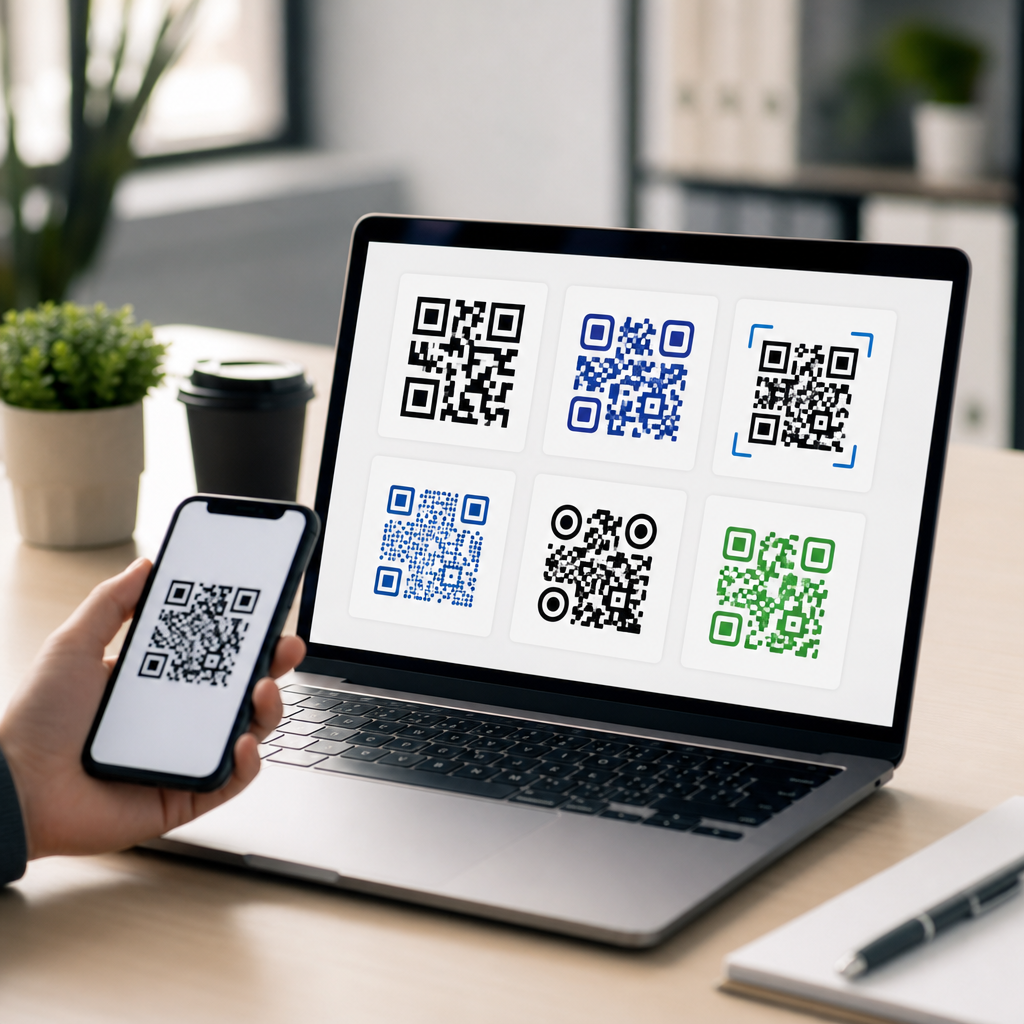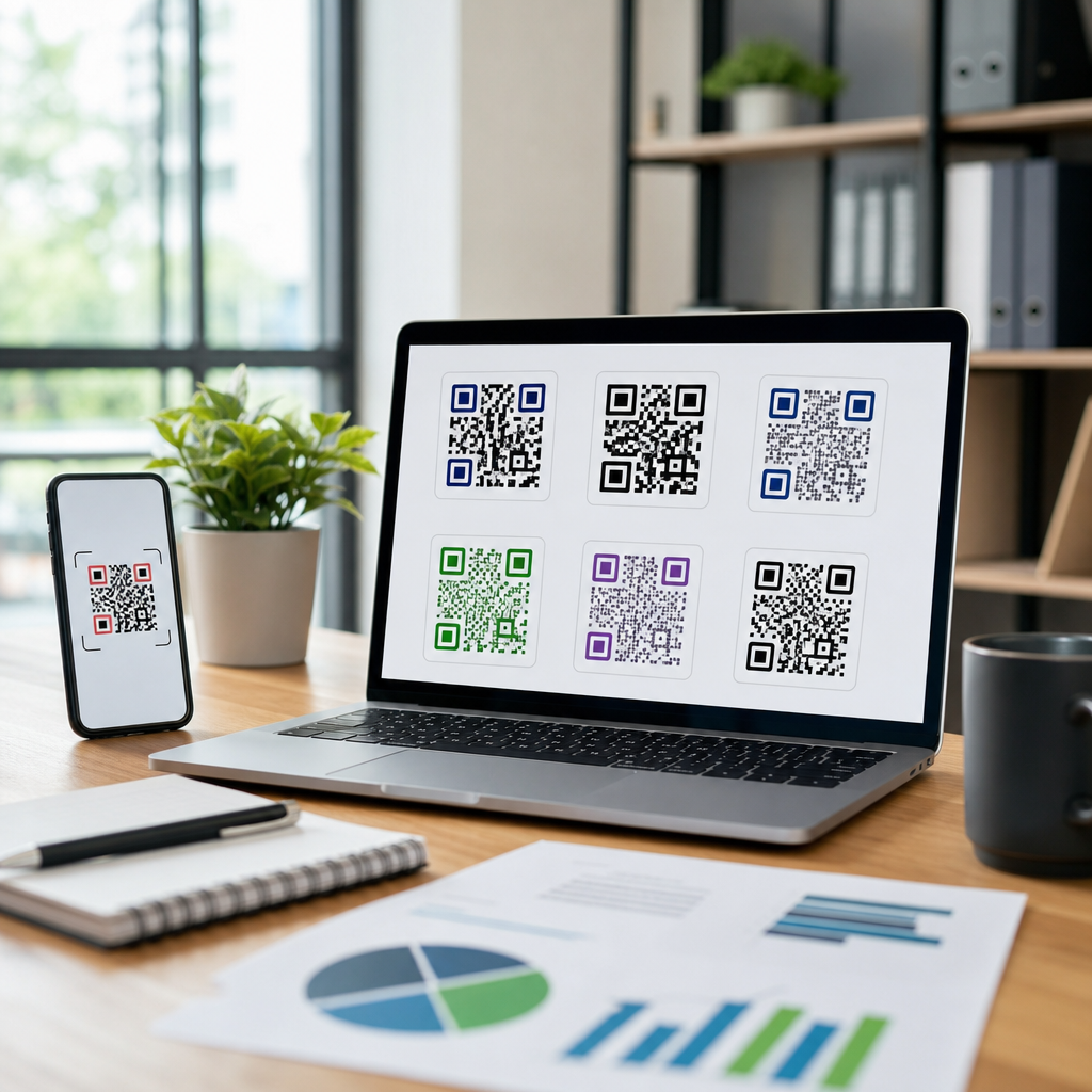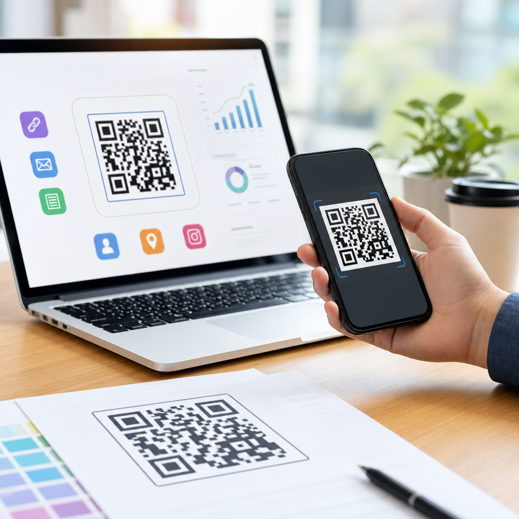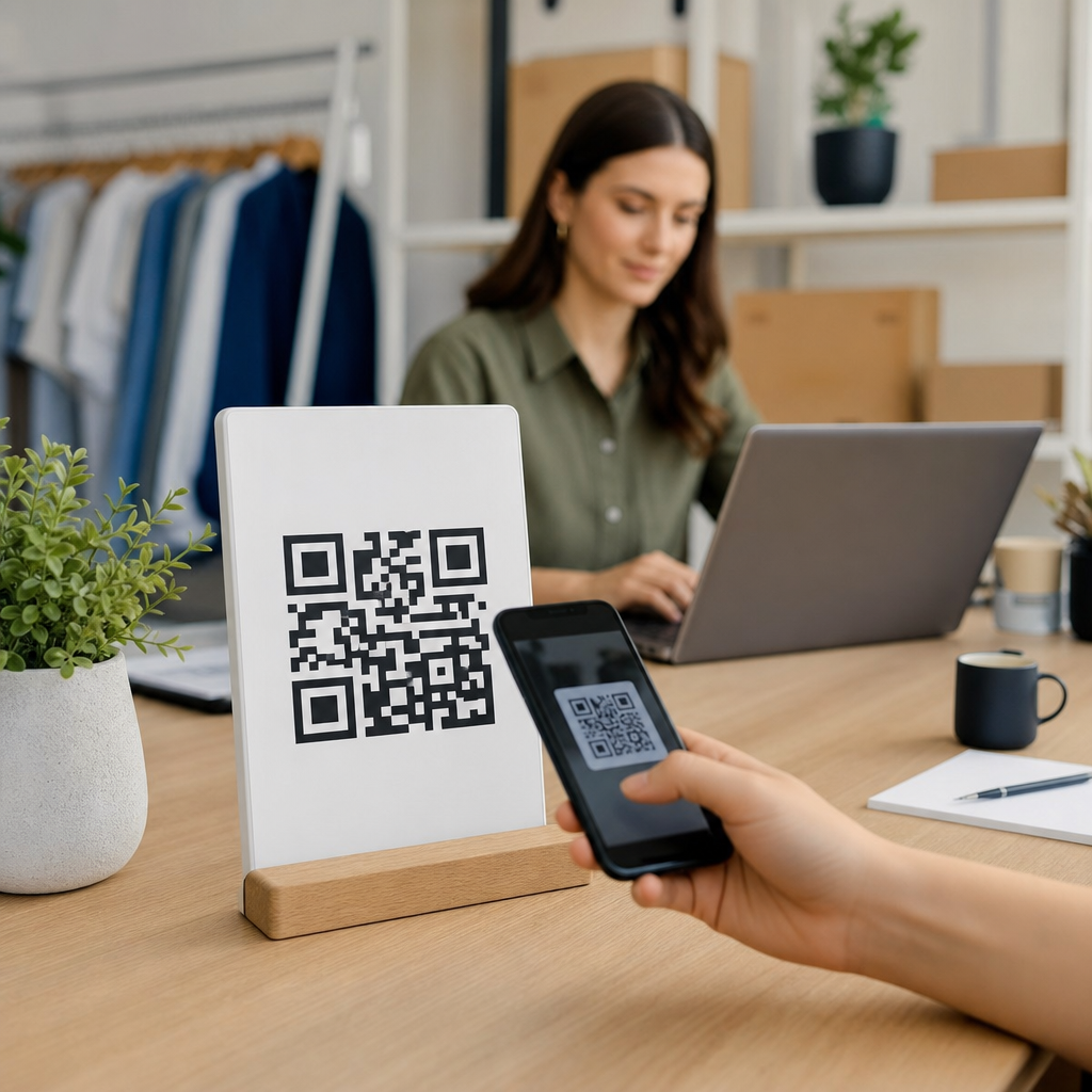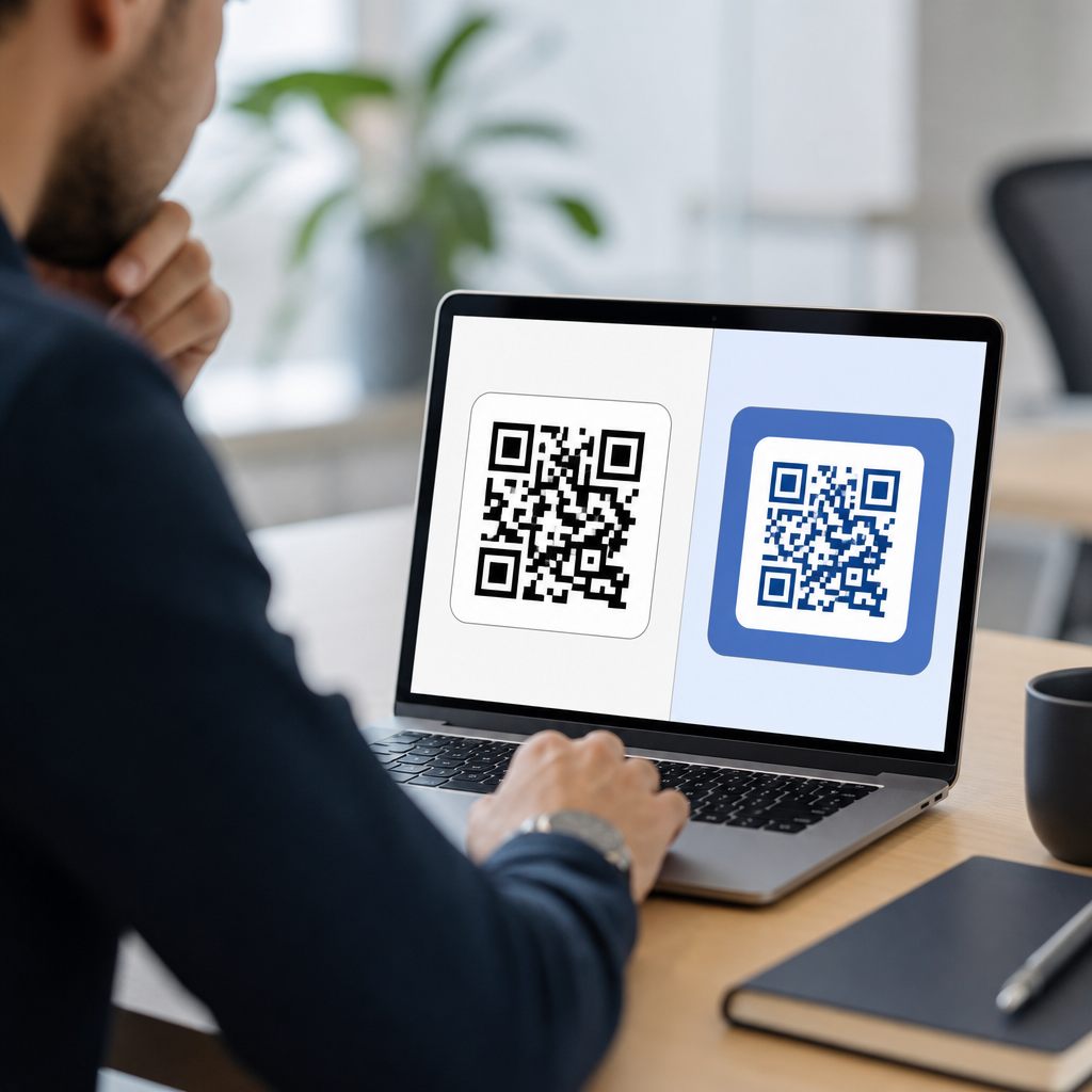
How to A/B test QR code designs starts with a simple idea: a QR code is not just a technical pattern, but a visual gateway that must earn attention, trust, and scans. A/B testing compares two or more versions of a QR code design under similar conditions to measure which one performs better against a defined goal, usually scan rate, landing-page visits, or completed actions after the scan. In mobile marketing, packaging, retail signage, direct mail, and event materials, design choices such as size, contrast, quiet zone, call to action, placement, and branded styling can materially change results. I have seen campaigns fail with perfectly valid codes because the design asked too much of the camera, blended into the background, or gave users no reason to scan. This matters because QR codes connect offline impressions to digital conversions, and each missed scan is lost intent. A disciplined testing process turns design from opinion into evidence, helping teams build effective QR codes that are attractive, readable, and commercially useful.
What should you test in a QR code design?
The best A/B tests isolate one meaningful variable at a time. For QR code design, the highest-impact variables are usually size, foreground and background contrast, call-to-action copy, placement, surrounding whitespace, use of a frame, and the degree of branding applied to the modules and finder patterns. Start with hypotheses linked to user behavior. For example, if a poster gets views but few scans, test whether a stronger CTA such as “Scan to get 15% off” beats generic wording like “Scan me.” If a shelf talker is placed low and viewed from a distance, test larger dimensions before changing colors or adding a logo. In my work, scan lift often comes faster from clearer incentives and better physical placement than from decorative styling.
Technical readability remains the foundation. ISO/IEC 18004 defines the QR Code symbology, and camera apps still depend on adequate contrast, clean finder patterns, and error correction that is not stretched beyond reason. A branded code can work well, but the safer path is to keep a dark foreground on a light background, preserve the quiet zone, and avoid glossy print finishes that create glare. Dynamic QR codes are especially useful during testing because the destination can be changed without reprinting the code, while analytics platforms can separate scans by version. If you are building a broader system for creating mobile QR codes, this hub topic connects naturally to related work on QR code size guidelines, QR code placement best practices, CTA copy for QR campaigns, and dynamic versus static QR code strategy.
How to structure an A/B test that produces reliable results
A reliable QR code A/B test begins with one conversion goal and one audience context. Define the primary metric first: scans per 1,000 impressions, unique scans, click-through to the mobile landing page, or downstream conversion such as coupon redemption. Then choose a test environment you can control. On packaging, you might split inventory evenly across two regional stores. In email signatures or printed inserts, you can randomize versions by batch. At trade shows, alternate signage by hour or day while keeping staff scripts constant. The objective is to minimize confounding factors, because traffic source, lighting, viewing distance, and user intent can distort results more than design changes do.
Sample size matters. A difference of a few scans is usually noise unless exposure is high. Use a basic significance calculator before declaring a winner, and keep the test running long enough to capture weekday and weekend behavior if the material stays in market. I also recommend tagging every variant with unique UTM parameters and a separate dynamic QR short link so analytics in Google Analytics 4, Adobe Analytics, or a QR management platform can attribute performance correctly. Measure scan quality, not just volume. If version B gets more scans but lower completion on the landing page, the design may be attracting curiosity rather than qualified intent. Good testing balances readability, relevance, and post-scan outcomes.
Core design elements that most affect scan performance
Not every design choice deserves equal attention. In practice, four elements shape scan performance most consistently: visibility, comprehension, trust, and technical tolerance. Visibility includes size, contrast, and placement in the user’s natural line of sight. Comprehension comes from nearby copy that explains what happens after scanning. Trust is influenced by brand cues, clean printing, and whether the code appears intentional rather than suspicious. Technical tolerance refers to how much styling the code can carry while remaining easy for camera software to decode across older Android devices, low-end lenses, or poor lighting. Designers often overestimate the benefit of visual novelty and underestimate the value of simple contrast and spacing.
| Element to Test | Version A | Version B | What to Measure |
|---|---|---|---|
| CTA copy | Scan for details | Scan for 15% off today | Scan rate and redemption rate |
| Size | 1.5 inch code | 2.25 inch code | Scans per 1,000 impressions |
| Color treatment | Black on white | Brand navy on pale cream | Successful scans and scan time |
| Branding | Standard code | Logo centered with frame | Scan rate and decode failures |
| Placement | Bottom-right corner | Centered near headline | Exposure-adjusted scan rate |
Real-world examples make these variables concrete. A restaurant table tent I optimized improved scans when the code moved from the lower panel to the top third, paired with “Scan to view the menu and pay.” A retail window sign performed worse after a logo was enlarged in the center, even though the code still scanned on newer phones; older devices hesitated, and glare from the glass amplified the problem. On product packaging, matte lamination and a white border around the code often outperform glossy full-bleed designs. These are the kinds of practical lessons that inform designing effective QR codes across campaigns, not just isolated tests.
How to run tests across print, packaging, and on-screen placements
Context changes the test plan. For print ads, distance and dwell time are the main constraints. A magazine reader may have decent lighting and a stable page, so you can test CTA language and styling more aggressively. For out-of-home signage, motion and angle dominate, so larger size, stronger contrast, and fewer decorative changes are safer variables. Packaging introduces handling, curvature, and material issues. Codes printed over seams, folds, metallic inks, or textured surfaces routinely underperform. On screens, moiré effects, low brightness, and competing taps matter, especially if the QR code appears inside a mobile app intended to be scanned by another phone.
Because environments differ, do not generalize one winning design to every channel. I have seen a branded code win on direct mail but lose on corrugated shipping boxes where ink spread softened edges. Use field testing before rollout: scan under dim light, from multiple angles, on iPhone and Android, with native camera apps and common third-party scanners. Record first-scan success rate and average time to detect the code. If a design increases hesitation by even one or two seconds, user drop-off rises. This hub page should guide teams toward deeper companion content on QR code printing standards, mobile landing page optimization, and QR analytics setup, because design tests only create value when the full scan journey is measured end to end.
Common mistakes that invalidate QR code design tests
The most common mistake is changing too many variables at once. If version B uses a new color, larger size, stronger CTA, and different placement, you cannot know what caused the lift. Another frequent error is ignoring the destination experience. A high-performing code that sends users to a slow, non-mobile-friendly page creates false confidence. Teams also forget exposure normalization. One poster near the entrance may naturally get more traffic than another at the back of the store, so raw scan counts can mislead. Use matched locations, rotate placements, or calculate scans relative to estimated impressions.
Technical shortcuts cause their own problems. Downloading low-resolution PNG files for large-format print can blur module edges. Trimming the quiet zone to fit a layout can reduce decode reliability. Reversing colors, placing a code over a photo, or using insufficient contrast may work in the design mockup and fail in the real world. Finally, beware of declaring winners too early. If a test runs during a promotion, weather event, or holiday traffic spike, results may not hold. A valid A/B test for QR code designs requires controlled variables, adequate sample size, and a documented reason for each design decision.
How to interpret results and build a repeatable design system
The goal of testing is not to find one perfect QR code but to build a repeatable design system for future campaigns. After each test, document the hypothesis, environment, audience, creative differences, sample size, metrics, and outcome. Translate winners into practical standards: minimum print size by viewing distance, approved color combinations, acceptable logo scale, preferred CTA formulas, and placement rules by format. Over time, these standards reduce creative debate and speed production while preserving scan performance. They also help new team members understand why certain choices are nonnegotiable, such as maintaining quiet zones or avoiding reflective stock.
The strongest programs keep iterating. Once you prove that CTA wording lifts scans, test whether the same wording holds across packaging, mailers, and in-store displays. Once a branded frame performs well, test smaller changes like iconography or offer language. Effective QR codes are the result of measured decisions, not guesswork. If you are responsible for creating mobile QR codes at scale, treat this article as the hub for designing effective QR codes: start with readability, test one variable at a time, measure the full post-scan journey, and codify what works. Build your next QR campaign around a clear hypothesis, and let real scan data choose the design.
Frequently Asked Questions
What does A/B testing a QR code design actually mean?
A/B testing a QR code design means comparing two or more versions of a QR code under similar real-world conditions to see which one produces better results. The goal is not just to check whether the code scans, but to measure how design choices influence user behavior. In most cases, marketers track outcomes such as scan rate, click-throughs to the landing page, form completions, purchases, registrations, or other post-scan conversions. This is important because a QR code functions as both a technical tool and a visual call to action. If people do not notice it, trust it, or feel motivated to scan it, technical functionality alone will not deliver strong performance.
In practice, one version might use a larger code size, a stronger call to action, a branded frame, or higher color contrast, while another version changes only one of those elements. By keeping the distribution environment as consistent as possible, such as similar placement, audience, timing, and offer, you can more confidently attribute differences in performance to the design itself. A well-run QR code A/B test turns subjective opinions like “this looks better” into measurable evidence about what actually drives scans and conversions.
Which QR code design elements should I test first?
The best place to start is with the design variables most likely to affect visibility, trust, and ease of scanning. Common high-impact elements include code size, placement, surrounding white space, color contrast, frame style, logo use, and the wording of the call to action. For example, a QR code that is too small may be overlooked or difficult to scan from a normal viewing distance, while a low-contrast color scheme may weaken readability even if it fits the brand. A simple change such as increasing the size or adding a clear instruction like “Scan to get 20% off” can significantly improve scan rates.
It is also smart to test contextual presentation, not just the pattern itself. A QR code on packaging, retail signage, direct mail, or event materials competes with other visual elements, so how it is introduced matters. You may find that a code inside a branded frame with concise supporting copy performs better than a plain standalone code. In general, begin with the variables that most directly influence user attention and scan confidence. Once those fundamentals are optimized, you can move to secondary refinements such as rounded modules, custom brand colors, or more decorative styling. The key is to test one major variable at a time whenever possible so the results remain clear and actionable.
How can I run a fair QR code A/B test and avoid misleading results?
A fair QR code A/B test depends on controlling as many outside factors as possible. Each version should be shown to a comparable audience in a similar environment, with the same offer, destination experience, and timing whenever feasible. If one version appears in a high-traffic store entrance and another is placed in a less visible aisle, the results may reflect placement rather than design. The same problem happens if one code is tied to a stronger promotion or shown during a busier time period. To draw useful conclusions, the main difference between variants should be the design element you are testing.
Using dynamic QR codes is especially helpful because they allow you to assign unique tracking to each design variation without changing the destination URL visible to the user. You can then measure scans, device data, time of scan, and downstream actions more accurately. It is also important to define success before the test starts. If your objective is scan rate, measure scans relative to impressions or audience exposure. If your objective is revenue or lead generation, track what happens after the scan. Finally, let the test run long enough to gather meaningful data. Making decisions too early based on a small sample can lead to false winners. Good QR testing is less about quick guesses and more about disciplined comparison.
What metrics should I track when testing QR code designs?
The most obvious metric is scan rate, but it should not be the only one. A design that gets more scans is not always the best performer if those scans do not lead to meaningful action. A strong QR code A/B test often tracks multiple layers of performance, starting with impressions or estimated views, then scans, landing-page visits, bounce rate, time on page, conversions, and even revenue where relevant. This fuller view helps you understand whether a design is attracting the right kind of engagement rather than just curiosity clicks.
For example, one QR code design may generate fewer scans but produce a higher conversion rate because it sets clearer expectations with the call to action. Another may attract many scans simply because it is more prominent, yet underperform after the scan because the audience is less qualified or confused about the offer. Depending on the campaign, you may also track metrics such as coupon redemptions, app downloads, event check-ins, product registrations, or contact form submissions. The most useful approach is to tie the test metrics directly to your business goal. If the QR code exists to drive sales, optimize for sales. If it exists to increase engagement at an event, optimize for registrations or check-ins. The design winner should be the one that best supports the actual objective, not just the top-line scan count.
How long should a QR code A/B test run, and when should I declare a winner?
A QR code A/B test should run long enough to collect a reliable volume of data and account for normal fluctuations in audience behavior. There is no universal timeframe because it depends on traffic levels, campaign reach, and how large a performance difference you expect to detect. A QR code on high-traffic retail signage may gather enough scans in a few days, while a direct mail or packaging test may require weeks to accumulate meaningful results. Ending the test too early is one of the most common mistakes because short-term variation can make one version look better than it really is.
You should declare a winner only when the data shows a consistent and credible performance difference against your primary goal. In practical terms, that means having enough sample size to feel confident the result is not random and reviewing both scan behavior and downstream conversion data. It is also wise to examine whether the winning design performed well across different contexts, such as locations, times, or audience segments, rather than excelling in only one narrow scenario. Once a clear winner emerges, apply that learning to future campaigns and continue testing new refinements. QR code optimization is rarely a one-time task. The strongest-performing design today can often be improved further with ongoing, structured experimentation.