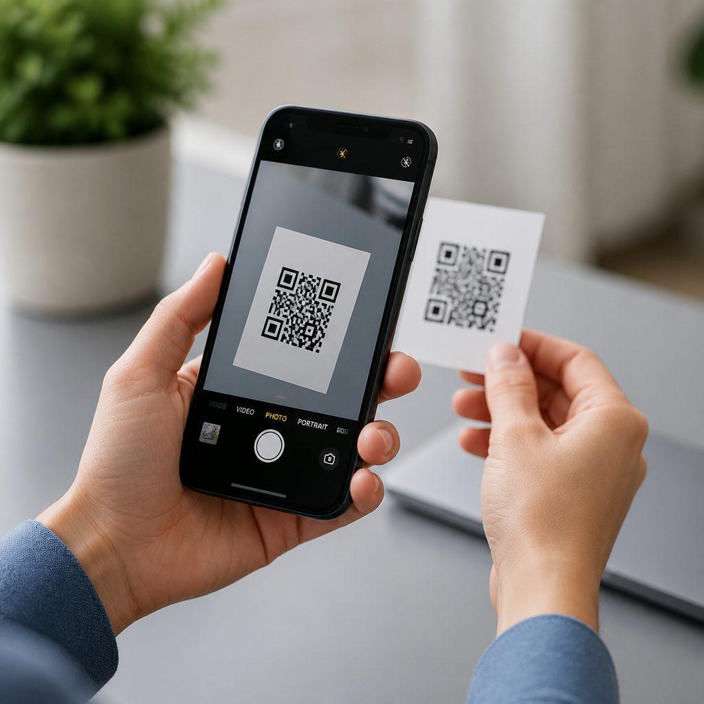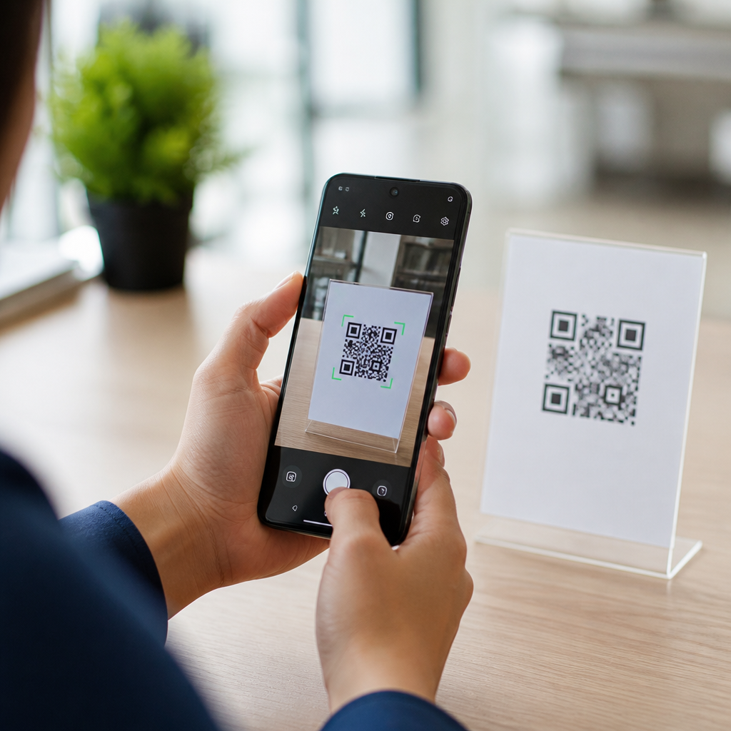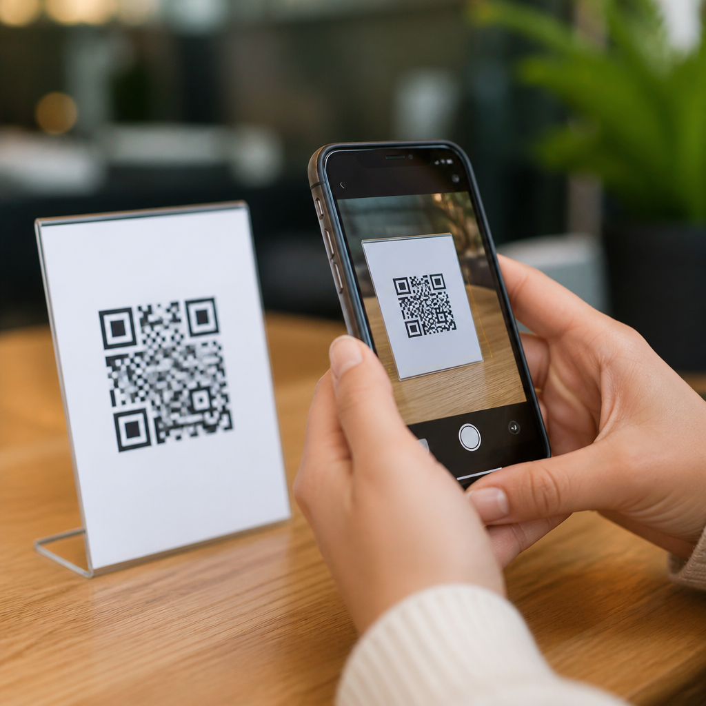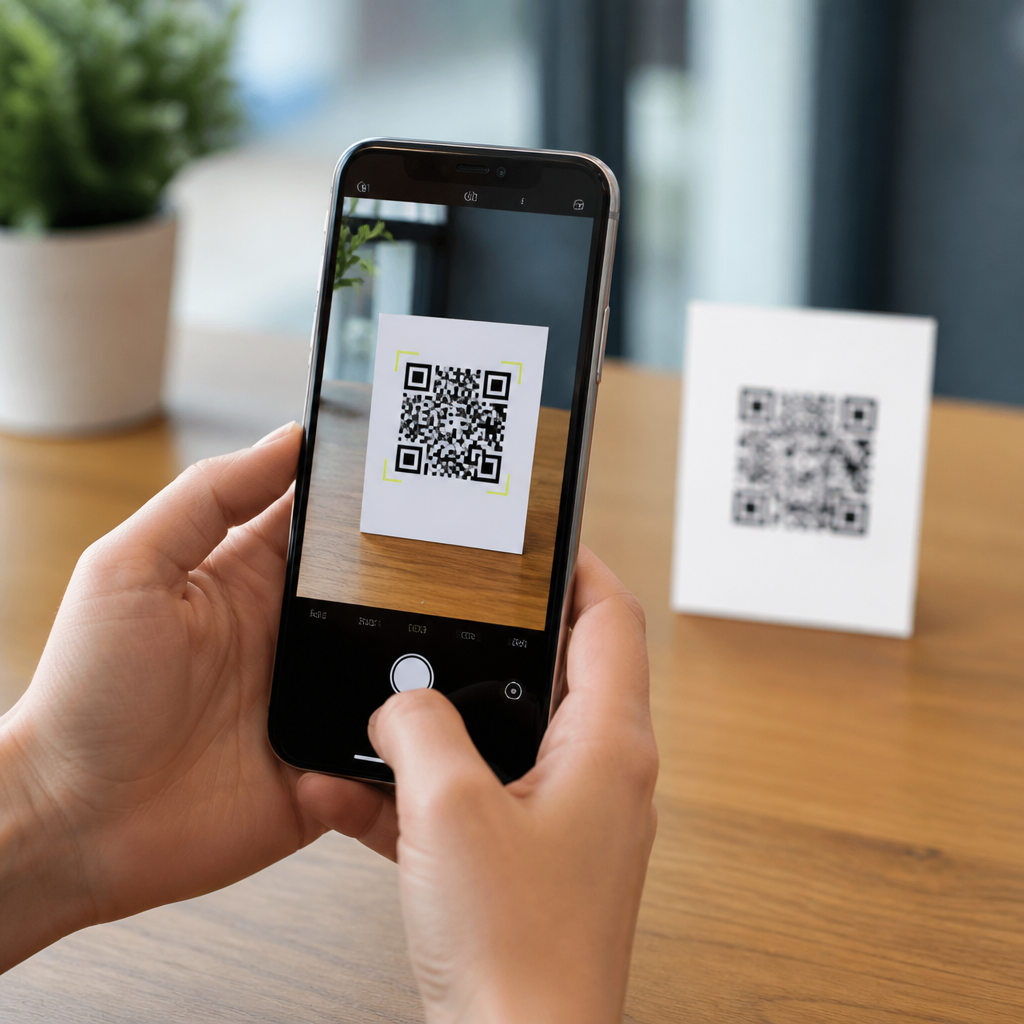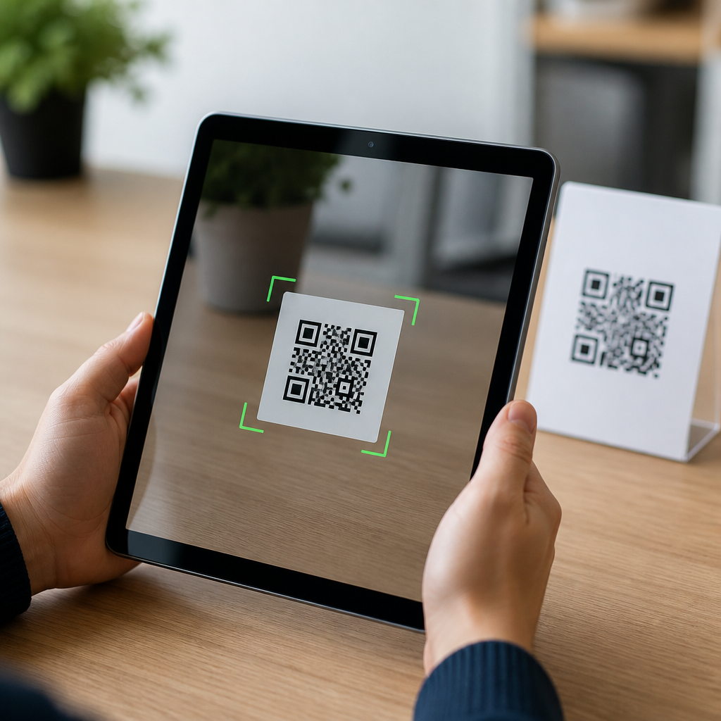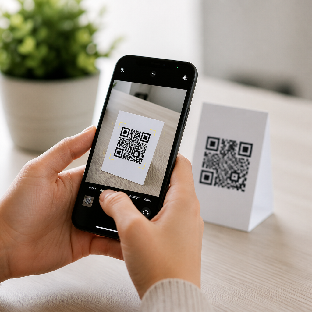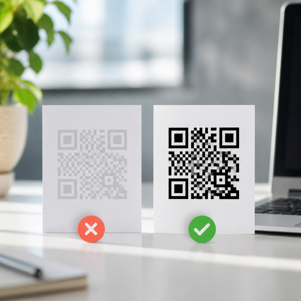
Low-contrast QR codes fail for a simple reason: scanners need a strong luminance difference between dark modules and light background, and when that separation drops, detection, focusing, and decoding all become unreliable. In practical terms, a low-contrast QR code is any code where the squares do not stand out clearly enough from the surface behind them, whether because of poor color choices, faded ink, glossy materials, dim lighting, or aggressive branding. This matters across packaging, menus, event badges, direct mail, warehouse labels, and device screens, because a scan failure is not a minor inconvenience; it interrupts checkout, blocks authentication, loses attribution, and reduces campaign performance. I have tested QR codes on thermal labels, retail signs, laminated table tents, and smartphone displays, and the pattern is consistent: people blame the camera, but the root cause is usually contrast, quiet zone violations, size, or print quality. Fixing low-contrast QR codes starts with understanding the scanning chain. A phone camera captures the symbol, image processing locates finder patterns, software estimates perspective and module size, then the decoder applies error correction to recover data. If the image lacks separation between foreground and background, the system struggles before error correction even helps. That is why “it works on my phone” is not a reliable standard. A code must scan across older Android devices, budget phones, cracked screens, outdoor glare, and fast-moving users. As a troubleshooting hub, this guide explains how to diagnose low contrast, what technical thresholds matter, how color, materials, printing, and display conditions affect readability, and which fixes reliably improve scan success in the real world.
What causes low-contrast QR code scan failures
Most low-contrast failures come from design decisions that look acceptable to the eye but confuse machine vision. Common examples include dark gray modules on a black box, navy on forest green packaging, pastel colors on matte kraft paper, metallic foil over reflective stock, and transparent overlays placed on photographs. QR readers do not judge aesthetics; they look for high-contrast geometry. ISO/IEC 18004 defines QR code symbol requirements, and while it does not prescribe one universal color pair, industry practice strongly favors dark modules on a light background because cameras and decoders are optimized for that relationship. Reverse codes, such as white modules on black, can work in some apps, but they remain less dependable under poor lighting and lower-end cameras. Another frequent cause is inadequate quiet zone, the empty margin around the code. If contrast is already weak and surrounding graphics intrude, the detector may not separate the symbol from the layout. Size also interacts with contrast. A tiny code with low contrast gives the camera too little information per module, especially when users scan from a distance. Damage and printing defects further reduce effective contrast. Dot gain can blur edges on uncoated stock, while thermal transfer ribbons may streak on synthetic labels. On screens, brightness reduction, night mode, cracked glass, and screen protectors can flatten differences between light and dark areas.
How to diagnose a low-contrast QR code quickly
The fastest diagnosis method is controlled comparison. Test the same QR content in two versions: the original design and a plain black-on-white version exported at the same error correction level. If the plain version scans instantly and the branded version fails or requires hunting for focus, contrast is the issue. I also recommend testing under three lighting conditions: bright daylight, typical indoor lighting around 300 to 500 lux, and dim light. A code that scans only in ideal lighting is not production ready. Use at least one recent iPhone, one midrange Android phone, and one lower-cost Android device, because camera sensors, autofocus quality, and decoding software vary significantly. A practical field checklist helps isolate the exact fault.
| Symptom | Likely Cause | Most Reliable Fix |
|---|---|---|
| Code appears visible but scanner never detects it | Low luminance contrast or missing quiet zone | Switch to near-black on white and add clear margin equal to four modules |
| Scanner detects code box but fails to open link | Blurred modules, oversimplified logo cutout, or print distortion | Increase size, reduce logo intrusion, re-export at higher resolution |
| Works on one phone but not older devices | Marginal contrast, small module size, weak autofocus support | Boost contrast, enlarge code, test across devices before release |
| Fails outdoors or under venue lights | Glare, reflective finish, or screen brightness too low | Use matte substrate, reposition lighting, or raise display brightness |
If you need a measurable check, convert the artwork to grayscale and inspect whether the modules remain clearly darker than the background. Tools such as Adobe Illustrator, Photoshop, Figma, and contrast analyzers can reveal when two brand colors that feel different actually collapse into similar luminance values. In production, I treat poor grayscale separation as a warning sign even before test scans begin.
Color, print, and material choices that improve QR readability
The safest fix for low-contrast QR codes is still the simplest: use black modules on a white background. When brand guidelines require color, choose a foreground that is visually close to black and a background that is very light. Deep navy, dark green, and dark maroon can work if the background stays near white, cream, or pale pastel with strong tonal separation. Avoid yellow, orange, and light gray for modules, because smartphone cameras often render them too lightly. Likewise, avoid transparent backgrounds over photography; even if the code looks stylish in a mockup, the image texture behind it interferes with detection. On printed pieces, substrate matters as much as color. Gloss lamination and metallic inks create specular highlights that erase edge definition. Matte paper, uncoated stock with controlled ink spread, and high-opacity white underprint on clear materials generally perform better. For labels, thermal transfer printing usually yields sharper edges than low-end direct thermal output when exposed to heat or abrasion over time. If you print on corrugated boxes, increase code size because the uneven surface softens module boundaries. For digital displays, set brightness high, disable night shift or blue-light filters during scanning flows, and avoid placing a QR code over animated backgrounds. OLED screens can also show slight bloom around bright elements in dark mode, so a dedicated light panel around the code improves consistency.
Design rules that prevent troubleshooting later
Contrast is the headline issue, but strong QR design depends on a full set of constraints working together. Keep the quiet zone at least four modules wide on all sides. Preserve the three finder patterns and alignment pattern area without decorative interference. If you add a logo, keep it small and centered, and raise error correction only as needed; high error correction can recover some damage, but it also increases symbol density, which may hurt small-format print applications. Export vector artwork for print whenever possible, and raster only at sufficiently high resolution, typically 300 dpi or more at final size. For sizing, a common baseline for short-range consumer scanning is at least 2 by 2 centimeters, but real requirements depend on distance, camera quality, and data density. A useful rule from signage practice is a scan distance ratio near 10:1, meaning a 1-inch code is comfortable around 10 inches away, with larger sizes needed for posters, menus behind counters, or warehouse aisles. URL length also affects robustness. Dynamic QR codes that redirect through a short domain produce less dense symbols than long static URLs packed with tracking parameters. That extra simplicity often matters more than designers expect.
Step-by-step fixes for common real-world scenarios
On restaurant menus, low contrast often comes from beige paper, decorative textures, and low ambient light. The fix is a white patch behind the code, matte finish, and a larger symbol placed where hands do not cast shadows. On product packaging, the common failure is printing a dark code on a saturated brand panel. Instead, carve out a dedicated light box and keep folds, seams, and curves away from the symbol. For event badges, clear plastic sleeves create glare, so move the code off the reflective pocket or print it on a matte insert. In warehouses, labels fade, scuff, and collect dust; use high-density black printing, synthetic label stock, and larger module size for long-range scanners. For screen-based codes used in payments, login, or ticketing, avoid dim mode and present the code at full brightness with enough white space around it. If an already deployed code underperforms, do not guess. Recreate it in a controlled black-on-white version, measure scan success by device and lighting condition, then change one variable at a time: contrast first, quiet zone second, size third, finish fourth. That order saves time because contrast problems mask other defects. Also check the destination itself. Some users interpret a failed redirect, captive portal block, or expired dynamic link as a scan failure. The best troubleshooting process verifies both symbol readability and post-scan behavior.
Low-contrast QR codes are fixable when you treat scanning as a system, not a graphic decoration. The key takeaway is straightforward: maximize luminance contrast, preserve a clean quiet zone, choose materials that do not introduce glare or blur, and test across real devices in real lighting. In every audit I have run, the highest scan-rate gains came from simple corrections, usually replacing branded mid-tone colors with near-black modules on a light field and enlarging the code slightly. That improvement is measurable because detection happens faster, from more angles, and on less capable phones. As the hub for troubleshooting QR code scans, this page should guide your next steps on sizing, print quality, damaged codes, reflective surfaces, and screen-based scanning workflows. Start with the current code in grayscale, compare it against a plain black-on-white control, and fix the contrast before anything else. That one change solves more scan failures than any other adjustment.
Frequently Asked Questions
What causes a QR code to be low contrast, and why does that make it hard to scan?
A QR code becomes low contrast when the dark modules and the light background do not differ enough in brightness for a scanner to separate them quickly and accurately. While many people think only in terms of color, scanners primarily depend on luminance contrast, meaning the relative lightness and darkness of the code elements. If the foreground and background are too similar in brightness, the camera may struggle to identify the three finder patterns, lock focus, distinguish module edges, and decode the data reliably.
In real-world use, low contrast often comes from poor design and production decisions rather than from the QR code file itself. Common causes include printing dark gray on black, medium blue on dark green, metallic ink on reflective packaging, or pastel colors with only a slight tonal difference. It can also happen when ink fades over time, when a matte proof is replaced with glossy final materials, or when branding teams prioritize aesthetics over scan performance. Even a code that looks acceptable to the human eye can fail under typical scanning conditions if the camera sees glare, shadow, blur, or insufficient tonal separation.
This matters because scanning is not happening in ideal lab conditions. People scan from different angles, on older phones, in low light, while moving, or with dirty camera lenses. If the QR code starts with weak contrast, every additional challenge reduces performance further. A code that scans occasionally on a designer’s phone may fail repeatedly in stores, restaurants, warehouses, event venues, or outdoor environments. In short, low contrast reduces the scanner’s ability to detect structure first and decode content second, which is why improving contrast is one of the fastest and most effective ways to fix unreliable QR code performance.
How can I tell if my QR code has a contrast problem before customers try to scan it?
The most practical way to identify a contrast problem is to test the code in realistic conditions, not just on a bright monitor at close range. Start by looking at the code in grayscale. If the dark modules do not clearly stand apart from the background when color is removed, there is a strong chance the code is underperforming because the luminance difference is too low. This is especially useful for branded QR codes that rely on color combinations that appear visually attractive but do not translate well for camera-based detection.
Next, test the code across multiple devices, distances, and lighting conditions. Use both newer and older smartphones, scan indoors and near windows, and try the code from the expected user distance rather than from just a few inches away. If the code only scans after several attempts, only works under bright direct light, or requires the user to tilt the phone carefully, that is a strong sign the contrast margin is too weak. Good QR codes should scan quickly and consistently without requiring users to hunt for the right angle.
You should also inspect the production environment. Printed codes can degrade because of substrate texture, ink spread, gloss coating, lamination, or low-resolution output. A file that scans perfectly on screen may fail once printed on cardboard, plastic, labels, menus, or flexible packaging. Compare the final printed piece to the original digital artwork, and look for fading, muddiness, reflections, or background interference. If possible, print several versions with stronger dark-light separation and test them side by side. That simple comparison often reveals that contrast, not size or data content, is the real issue.
What is the best way to fix a low-contrast QR code without ruining the design?
The best fix is to increase the luminance difference while preserving the overall brand look as much as possible. In most cases, that means making the QR code modules significantly darker, making the background significantly lighter, or both. You do not necessarily need to abandon brand colors entirely, but you do need to choose combinations that create a clear light-dark relationship. Deep navy on white may work far better than medium blue on gray, and dark charcoal on a pale background usually performs better than muted tones placed too close together in brightness.
A very effective design compromise is to keep the surrounding artwork fully branded while placing the QR code itself inside a clean, high-contrast scan zone. For example, you can use a white box or light panel behind the code, then keep logos, patterns, and campaign colors around it. This maintains visual consistency without forcing the code to compete with complex graphics, gradients, shadows, or photographic backgrounds. If the code must be stylized, make those changes conservative. Preserve square module structure, quiet zone spacing, and strong finder pattern visibility above all else.
It is also wise to simplify finishes and materials. Glossy coatings, metallic substrates, transparent labels, and reflective packaging can reduce effective contrast even when the printed colors look correct. Switching to matte finishes, opaque backgrounds, darker ink values, or cleaner print methods can produce a major improvement. After revising the design, retest with actual production samples, not mockups. A QR code is functional infrastructure, not just decoration, so the final decision should be based on repeated scan success in realistic use rather than visual preference alone.
Are some color combinations safe for QR codes, and which ones should I avoid?
Yes, some color combinations are much safer because they create strong luminance contrast that scanners can interpret easily. The most dependable choice is a dark foreground on a light background, such as black on white, dark charcoal on cream, or deep navy on pale gray. These pairings keep the module edges distinct and support detection across a wide range of cameras and lighting conditions. In general, if the code looks obviously dark against an obviously light surface even in grayscale, it is much more likely to scan well.
Combinations to avoid are those where the foreground and background are close in brightness, even if they appear different in hue. Examples include red on green, blue on purple, dark gray on black, gold on beige, or pastel colors against other pastel colors. Metallic, fluorescent, translucent, or highly reflective treatments can also create problems because the apparent contrast changes depending on angle and lighting. A code printed on glossy packaging might seem legible in the studio but become difficult to scan under store lighting because glare washes out the dark modules or bright hotspots interrupt the pattern.
If brand standards require specific colors, the best approach is to test approved variants rather than assuming any branded palette will work. You can often preserve visual identity by choosing the darkest brand tone available for the code and the lightest neutral or brand-adjacent tone for the background. Avoid reversing that relationship. Light-colored modules on a dark background are generally less reliable than dark modules on a light background, especially in challenging environments. When in doubt, prioritize function over novelty. A QR code that perfectly matches the brand but fails to scan creates a worse brand experience than a slightly more conventional code that works instantly.
Besides contrast, what other factors can make a QR code fail, and how do they relate to fixing low-contrast issues?
Contrast is one of the biggest factors in scan reliability, but it works together with several other technical and production details. Size is a major one. If the code is too small for the scanning distance, the camera may not capture enough detail to resolve the modules clearly, and low contrast makes that even worse. Print quality matters as well. Blurry edges, ink bleed, low-resolution artwork, or distorted shapes can make the modules merge together, reducing both effective contrast and overall readability.
The quiet zone is another common issue. A QR code needs clear empty space around all four sides so the scanner can distinguish the code from nearby text, graphics, borders, or patterns. When that space is missing, the code may look crowded and be harder to detect, especially if contrast is already weak. Surface conditions also play a role. Curved bottles, textured cardboard, glossy menus, laminated signs, or wrinkled labels can interfere with focus and pattern recognition. In those cases, improving contrast helps, but the code may still need to be enlarged, repositioned, or printed on a flatter, cleaner panel.
Data density should be considered too. Codes carrying large amounts of data have smaller individual modules, which makes them less forgiving when contrast drops or printing quality declines. Using a short URL instead of embedding too much information directly in the code can reduce complexity and improve scan performance. The key takeaway is that fixing low contrast should be part of a broader usability check. The most reliable QR codes combine strong dark-light separation, adequate size, proper quiet zones, clean printing, suitable materials, and realistic testing. Addressing all of these together produces a code that scans quickly and consistently where people actually use it.