
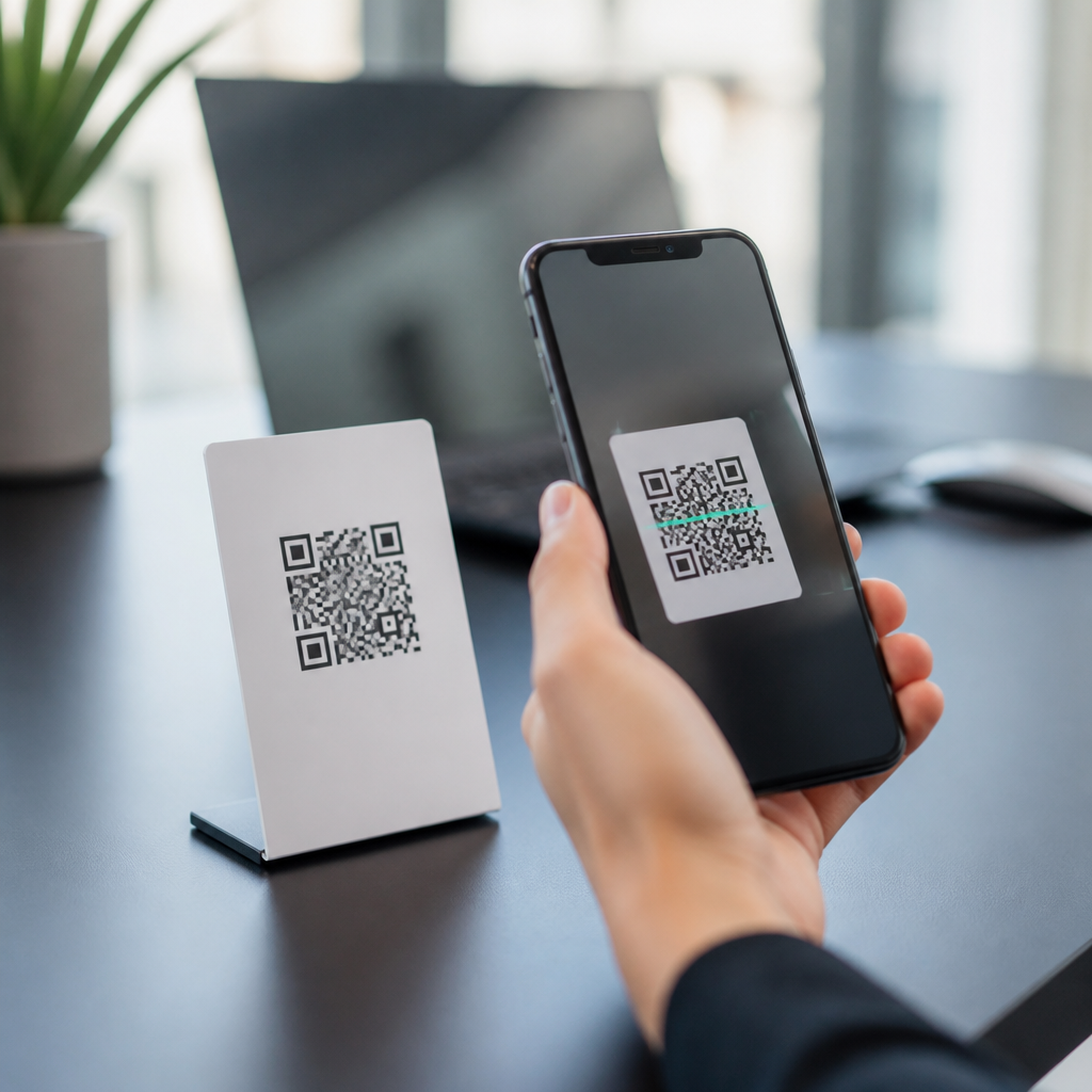
Fast-loading QR code experiences turn a quick scan into a smooth mobile journey instead of a frustrating delay. In practical terms, this means designing every step after the scan so the destination page, app action, or digital asset opens almost instantly, displays correctly on a phone, and guides the user to one clear next action. I have seen strong campaigns underperform simply because the QR code worked technically while the landing experience stalled on oversized images, slow scripts, or confusing layouts. When people scan from packaging, posters, menus, mailers, or in-store signage, they are often standing, multitasking, and using mobile data. They will not wait long. Speed, therefore, is not a cosmetic enhancement; it is the foundation of mobile QR code UX.
A QR code experience includes the code itself, the encoded destination, the redirect logic, the landing page, and the interaction flow that follows. Fast-loading performance means reducing time to first byte, optimizing Core Web Vitals such as Largest Contentful Paint and Interaction to Next Paint, and minimizing anything that blocks rendering on small screens. Good mobile UX means readable text, thumb-friendly controls, concise forms, accessible color contrast, and content that answers intent immediately. These elements belong together. A lightweight page that loads in one second but hides the offer below clutter still fails. Likewise, a beautiful page that takes five seconds to appear loses users before design can help. The goal is simple: immediate value after scan, with minimal friction and complete clarity on what happens next.
This matters because QR scans happen in compressed moments. A restaurant guest scans to see a menu, a shopper scans for product details, an event attendee scans for check-in, and a patient scans for instructions. In each case, the user expects instant utility. Industry research from Google has long shown that mobile abandonment rises sharply as page load time increases, and field data from campaign audits consistently confirms it. The best-performing QR landing pages I have worked on shared common traits: direct destinations, compressed assets, server-side caching, and content structured for a narrow mobile context. As the hub for best practices in mobile UX, this article maps the design, technical, and measurement decisions that make QR code destinations fast, usable, and conversion-ready across campaigns.
Start with scan context and user intent
The fastest QR code experience begins before the page loads. You need to define where the scan happens, what the user expects, and how much attention they can spare. A code on outdoor signage may be scanned in bright light with weak connectivity. A code on product packaging may be scanned at home over Wi-Fi. A table tent in a café often leads to quick, repeatable actions such as viewing a menu, paying, or joining loyalty. These contexts shape technical choices. For example, if a user is likely on cellular data, avoid large hero videos and load only essential assets. If the user needs a coupon immediately, place the barcode or offer code above the fold instead of beneath brand storytelling.
Intent mapping also improves information architecture. I recommend writing the primary post-scan question in one sentence: “What does the user need right now?” Then build the page to answer it in the first screen. For a warranty registration flow, that answer may be “register this product in under one minute.” For a museum exhibit, it may be “hear the audio guide for this object.” This method keeps the destination page short, specific, and fast. It also supports internal linking strategy for the broader hub. Pages about QR menu design, QR forms, QR code payments, and QR analytics should all connect back to this central guidance, while this hub links out to those deeper workflows in a structured way.
Build lean landing pages for mobile-first performance
Most slow QR code experiences are not caused by the QR symbol. They are caused by bloated landing pages. The fix is disciplined page weight control. Keep the initial payload small by compressing images to modern formats such as WebP or AVIF, serving responsive image sizes with srcset, removing unused CSS, deferring noncritical JavaScript, and limiting third-party tags. On mobile, every script competes for CPU time, not just bandwidth. A page can download quickly and still feel slow if it executes heavy client-side code before rendering the main content. For QR destinations, server-rendered or statically generated pages usually outperform script-heavy app-like pages for simple tasks.
Core Web Vitals offer a useful benchmark. Aim for Largest Contentful Paint under 2.5 seconds, Cumulative Layout Shift below 0.1, and responsive input behavior immediately after first render. Use PageSpeed Insights, Lighthouse, and WebPageTest to diagnose issues, then confirm results in field data through Google Search Console or a real user monitoring tool such as SpeedCurve or New Relic. In campaigns where I trimmed a QR landing page from roughly 3.8 MB to under 900 KB, scan-to-conversion rates improved because users reached the offer page before attention dropped. Fast-loading QR code experiences are usually the outcome of ruthless simplification, not visual compromise.
Reduce redirects and delivery friction
Every redirect adds latency, and many QR campaigns stack too many of them. A common chain is QR code to tracking URL, then to shortener, then to campaign platform, then to final page. That sequence may be manageable on desktop broadband, but on mobile it can waste valuable seconds. The best practice is to use one reliable redirect layer at most, ideally from a custom domain you control. If you need dynamic destination rules for location, device type, language, or time-based campaigns, configure them in that single layer and audit them regularly. Broken or looping redirects are among the most expensive QR UX failures because the user has already shown intent by scanning.
Delivery friction also includes DNS resolution, TLS negotiation, and geographic server distance. Use a content delivery network such as Cloudflare, Fastly, or Akamai to reduce latency, enable HTTP/2 or HTTP/3, and cache static assets aggressively. Set sensible cache-control headers, preconnect to critical origins when necessary, and avoid forcing the browser to fetch assets from multiple slow third-party domains. If your QR code opens a PDF, ask whether the information should instead live on a mobile web page. PDFs are often slow, hard to navigate on phones, and poor for analytics. A lightweight HTML page almost always delivers a better mobile QR code design outcome.
Design for immediate comprehension and action
Once the page loads, the user should understand it in seconds. Put the page headline, core benefit, and primary action in the first screen. Use short headings, one dominant button, and supporting copy that removes hesitation. If a restaurant QR code opens a menu, lead with menu categories and hours, not a brand manifesto. If a product QR code opens setup instructions, begin with the exact model and first step. Clarity improves perceived speed because users do not have to search for relevance. This is especially important on small screens where visual hierarchy determines whether the scan feels effortless or messy.
Touch design matters too. Buttons should be comfortably tappable, typically at least 44 by 44 CSS pixels following common mobile guidance. Forms should use the right input types, autocomplete attributes, and as few fields as possible. Avoid pop-ups that cover the screen immediately after load, and be careful with cookie banners that interrupt primary tasks. Accessibility is part of mobile UX, not an optional layer. Maintain sufficient color contrast, support screen readers with semantic labels, and ensure orientation changes do not break the layout. Fast-loading QR code experiences succeed when the page is both technically efficient and cognitively easy to use.
Choose destination types that match the task
Not every QR code should lead to the same kind of destination. The format should match user intent, device constraints, and business goals. In practice, I group QR destinations into a few common patterns and evaluate them for speed, friction, and measurability before launch.
| Destination type | Best use case | Mobile UX impact | Key speed consideration |
|---|---|---|---|
| Mobile web page | Menus, product info, offers, FAQs | Low friction, broad compatibility | Keep page weight low and cache assets |
| App deep link | Loyalty, account actions, in-app content | Excellent for existing users, weak for non-users | Use deferred deep linking and fallback pages |
| Payment link | Checkout, invoices, donations | Fast when trusted and prefilled | Minimize redirects and form fields |
| File download | Spec sheets, certificates, forms | Often clumsy on phones | Prefer HTML unless download is essential |
This comparison highlights a consistent rule: default to mobile web unless a different destination clearly reduces friction. Deep links are powerful for logged-in app users, but they need fallbacks for everyone else. Payment links work well when trust signals are visible and the page loads fast enough that users do not abandon before seeing the amount. Downloads should be rare. Matching destination type to task is one of the fastest ways to improve scan completion.
Measure the full journey and iterate
A fast-loading QR code experience is not finished at launch. Measurement should cover scan rate, destination load performance, engagement, and completion. At minimum, track QR placement, campaign source, device category, bounce rate, Core Web Vitals, and the primary conversion event. UTM parameters help with campaign attribution, but they should be implemented cleanly and not trigger unnecessary redirects. Dynamic QR platforms can report scans by time and location, while web analytics tools show what happens after the page opens. You need both views to diagnose drop-off accurately.
Testing should include low-connectivity environments, older phones, and real outdoor conditions. I routinely test by scanning while walking, in glare, and on throttled 4G because lab-perfect experiences often fail in the field. Run A/B tests on page length, CTA wording, image presence, and redirect strategies. If scans are high but conversions are low, inspect the first screen and the load timeline before rewriting copy. If landing speed is strong but engagement is weak, revisit intent alignment and content order. The highest-performing teams treat QR campaigns like product surfaces: measured, optimized, and continuously improved rather than printed once and forgotten.
Designing fast-loading QR code experiences requires one discipline above all: respect for the mobile moment. Users scan because they want immediate help, not because they want to explore a heavy digital destination. The most effective approach is to define scan context, choose the right destination type, reduce redirects, optimize page performance, and present one clear action above the fold. When these decisions are made together, QR codes become reliable bridges between physical and digital touchpoints instead of fragile campaign gimmicks.
As the central guide to best practices for mobile UX in QR design, this hub should anchor your broader content strategy. Supporting pages can go deeper into topics such as QR landing page copy, menu UX, app deep linking, analytics setup, accessibility, and testing workflows, while this article provides the operating principles behind them. If you audit your current QR journeys using the standards outlined here, you will quickly find avoidable latency, clutter, and friction. Start with one high-traffic code, measure the load path, simplify the first screen, and improve from there. Small speed gains often produce outsized results in scan completion, satisfaction, and conversion.
Frequently Asked Questions
What makes a QR code experience feel fast to users?
A fast QR code experience is not just about how quickly the code scans. It is about the entire path that follows the scan feeling immediate, stable, and easy to understand on a mobile device. When someone scans a QR code, they expect near-instant feedback. If the destination takes too long to load, shifts around while assets download, or presents a cluttered page that makes the next step unclear, the experience feels slow even if the technical load time is only a few seconds.
In practice, a fast experience starts with a lightweight destination. That usually means a mobile-first landing page, app deep link, digital coupon, menu, form, or file that opens quickly on common cellular connections. It also means reducing anything that delays first paint, such as oversized hero images, autoplay media, third-party scripts, custom fonts, or unnecessary tracking tags. The design should present one clear action immediately, whether that is “view offer,” “download file,” “check in,” or “buy now.” The faster a user can understand what happened after the scan, the faster the experience feels.
Perceived speed matters as much as raw speed. Clean layouts, readable text, visible buttons, and instant confirmation that the scan worked all improve user confidence. If the destination is optimized for mobile, loads core content first, and avoids friction like popups or forced redirects, users are much more likely to stay engaged and complete the action you want.
How can I design a landing page that loads quickly after a QR code scan?
The best approach is to design the destination page specifically for scan traffic rather than sending users to a general website page. QR visitors usually arrive with a narrow intent and little patience, so the landing page should be focused, lightweight, and structured around one primary conversion goal. Start by trimming the page to essentials: a concise headline, a short supporting message, one main image if necessary, and a single prominent call to action. Every extra section, animation, or embedded widget increases load time and distracts from completion.
From a performance perspective, compress all images, use modern file formats where possible, and size visuals for mobile screens rather than desktop layouts. Minify CSS and JavaScript, remove unused code, delay nonessential scripts, and avoid loading multiple analytics, ad, or social tools on the initial screen. If the page relies on a CMS or website builder, test whether templates are introducing heavy resources you do not need. Often, the biggest improvements come from simplifying the tech stack behind the page, not just the design on top of it.
Design choices also affect speed indirectly. A simple page hierarchy reduces rendering complexity and helps users act faster. Use large tap targets, short forms, fast-loading system fonts when possible, and a layout that does not shift as content loads. Ideally, the key message and call to action appear above the fold within moments of the scan. Test the page repeatedly on real phones using mobile data, because a page that feels fast on office Wi-Fi may underperform in actual campaign conditions.
Should a QR code send users to a website, a file, or an app experience?
The right destination depends on the user’s intent, context, and device readiness, but speed and clarity should guide the decision. In many cases, a mobile-optimized web page is the most reliable option because it opens instantly in the browser without requiring an app install or a large file download. Web destinations are also easier to update, test, and measure over time, which makes them a strong default for campaigns where flexibility and broad accessibility matter.
Sending users directly to a file such as a PDF can work, but it often creates avoidable friction. Large files take longer to open, may display inconsistently across devices, and usually offer a worse mobile reading experience than a dedicated page. If the content must exist as a downloadable asset, consider first sending users to a lightweight landing page with a short summary and a clear download button. That approach lets the page load quickly, gives users context, and offers a better fallback if the file is slow or unsupported.
App-based experiences can be extremely fast and seamless when deep linking is configured properly and the user already has the app installed. However, they can become frustrating if users are routed to an app store unexpectedly or if the deep link fails. For that reason, it is smart to design graceful fallbacks. A strong QR strategy often checks for app availability, opens the relevant in-app screen when possible, and sends everyone else to a fast mobile web page that completes the task without confusion. The fastest experience is the one that works immediately for the widest share of users.
What are the most common mistakes that slow down QR code campaigns?
One of the biggest mistakes is assuming that if the QR code scans correctly, the job is done. In reality, many campaigns fail after the scan because the destination experience was not built for mobile speed. A common issue is sending users to a homepage or a general product page filled with heavy navigation, large banners, sliders, chat widgets, popups, and tracking scripts. Those elements may have a role elsewhere on a site, but they often sabotage scan-driven traffic where users want instant access to one specific piece of content.
Another frequent problem is oversized media. Large images, uncompressed PDFs, background videos, and animation-heavy pages can dramatically increase load times, especially on cellular networks. Too many redirects also create delays. For example, a QR code might route through a tracking URL, then a campaign tool, then a localization step, and finally the destination page. Each redirect adds time and more chances for failure. If analytics are needed, they should be implemented with as little overhead as possible.
Teams also overlook real-world testing. A page may seem fine on a modern iPhone connected to fast Wi-Fi, but actual users could be scanning in a retail aisle, on a sidewalk, in a stadium, or inside a building with weak signal. Other mistakes include using forms that are too long, presenting multiple calls to action, failing to optimize for different phone screen sizes, and not caching repeat assets. The most effective campaigns remove anything that does not directly support the immediate user goal and validate performance under realistic conditions before launch.
How do I measure whether a QR code experience is truly fast and effective?
Measuring success requires looking at both technical performance and user behavior. Start with core speed indicators such as time to first byte, largest contentful paint, first contentful paint, total blocking time, and cumulative layout shift. These metrics reveal whether the page is reaching the user quickly, displaying meaningful content early, staying stable during load, and avoiding script-related delays. For QR traffic specifically, mobile testing is essential, since desktop results rarely reflect real scan conditions.
Behavioral metrics tell you whether the experience feels fast enough to support action. Monitor bounce rate, engagement rate, click-through rate on the primary call to action, form completion rate, app open rate, download starts, and final conversion rate. If users scan but quickly abandon the destination, there is usually friction somewhere in the post-scan journey. You should also compare performance by device type, operating system, browser, network quality, location, and time of day to uncover hidden bottlenecks.
The best evaluation combines analytics with hands-on testing. Scan the code yourself in the same environments where customers will use it. Time how long it takes to reach useful content, not just when the page technically begins loading. Watch for layout jumps, blocked buttons, difficult form fields, and awkward redirects. A truly fast QR code experience is one where users move from scan to understanding to action with almost no hesitation. If that flow feels effortless in real conditions and the data shows strong completion rates, your design is working.





