
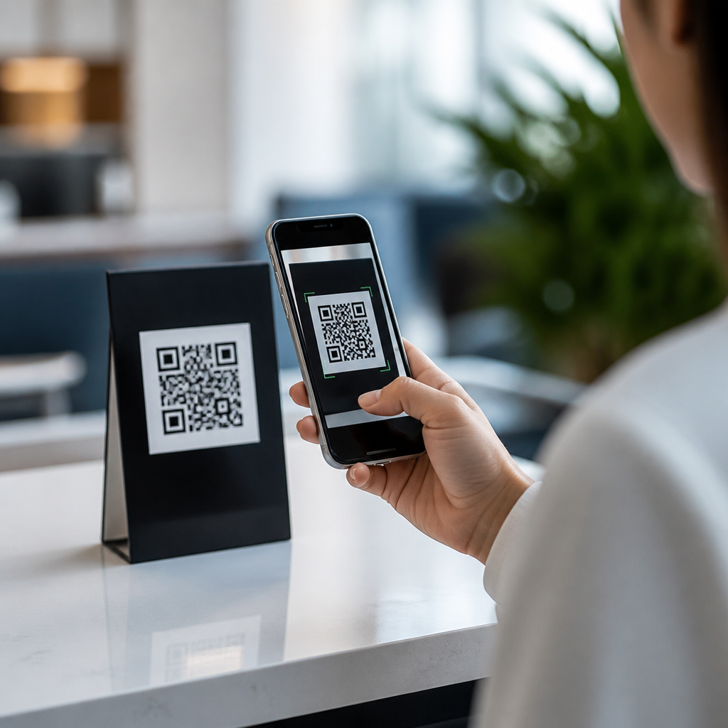
Best mobile navigation practices for QR code users determine whether a scan becomes a conversion or a bounce. When someone opens a QR code destination, they are already on a phone, often in motion, under time pressure, and expecting immediate clarity. Mobile navigation is the structure that helps them move from the landing screen to the action they intended, such as reading a menu, redeeming an offer, registering for an event, or completing a payment. In QR code campaigns, navigation is not a cosmetic layer. It is the mechanism that translates offline intent into digital completion.
I have worked on QR landing flows for restaurants, retail promotions, packaging inserts, venue signage, and field service teams, and the pattern is consistent: users forgive a plain interface faster than they forgive confusing navigation. Analytics usually show the same friction points. People scan, hesitate, pinch to zoom, tap the wrong element, or abandon after one screen because the page makes them search for the obvious next step. Good mobile UX removes that search cost. It uses visible hierarchy, touch-friendly controls, concise labels, stable layouts, and short paths to the task.
This matters because QR traffic behaves differently from other mobile traffic. A search visitor may compare options and browse. A QR visitor usually has a narrow intent created by context: a poster, table tent, product box, receipt, or window decal. That context should shape navigation decisions. Best practices for mobile UX in QR experiences therefore focus on speed, orientation, and action. The goal is to reduce cognitive load, preserve the promise made near the code, and create a predictable route through content. Strong mobile navigation also supports accessibility, improves completion rates, and gives clearer data for optimization across the broader Mobile QR Code Design & UX hub.
Start with scan context and intent
The first rule is simple: navigation should reflect why the user scanned. If a QR code on a restaurant table says “View Menu,” the first screen should open directly to the menu, not a generic homepage with five competing choices. If a code on product packaging says “Setup Guide,” the page should prioritize instructions, not lead generation banners. Context matching is the foundation of useful navigation because it aligns the information scent between the physical trigger and the mobile destination.
In practice, that means building dedicated landing routes instead of sending all scans to one universal page. Use campaign-specific URLs, dynamic QR routing, and clear page titles. I recommend writing a one-sentence intent statement before designing navigation: “User scanned this code to do X in Y environment.” That statement helps teams remove unnecessary links and secondary pathways. It also clarifies whether the right pattern is a single focused page, a short branching menu, or a progressive flow with steps.
Keep the primary action visible and singular
QR users respond best when the page presents one dominant next step above the fold. This may be “Order Now,” “Open Ticket,” “Download Instructions,” or “Pay Bill.” Navigation supports that action by making alternatives available without competing visually. When every element shouts, users slow down. A single high-contrast primary button, anchored near the top and repeated lower on the page, consistently outperforms scattered equal-weight options.
A practical benchmark is to make the main path obvious within three seconds of page load. Use action labels, not generic terms like “Continue” when context is unclear. “Start Return,” “Claim Discount,” and “Book Appointment” are stronger because they reduce ambiguity. Secondary links such as FAQs, support, store hours, or policy details should remain accessible in a compact section or footer. For QR journeys, a minimal top navigation often works better than a traditional multi-item menu because the user did not come to explore broadly.
Design touch targets and menus for real hands
Mobile navigation fails when links are technically present but physically hard to use. QR scans happen in stores, lobbies, streets, transit stations, and event venues where one-handed use is common. Follow established touch guidelines: interactive controls should generally be at least 44 by 44 CSS pixels, with adequate spacing to prevent accidental taps. Labels need plain language, and expandable menus should show clear affordances such as chevrons or plus icons with sufficient contrast.
I have seen common problems repeat across campaigns: tiny text links placed too close together, sticky headers that consume half the viewport, and hamburger menus hiding the only important pathways. Avoid hover-dependent behavior entirely. If you use accordions, ensure the tap area includes the full row, not just the icon. If you use a fixed bottom bar for actions, test it against mobile keyboards and browser toolbars so it does not cover form buttons or legal consent text. Navigation should feel forgiving, especially for older devices and outdoor glare.
Reduce choices and shorten paths
The best practices for mobile UX emphasize decision reduction. Every extra branch increases friction, especially after a QR scan when attention is fragile. A good rule is to remove any navigation item that does not support the immediate task or a high-frequency fallback need. This is not about hiding information permanently; it is about sequencing information so the first screen handles the first job.
| QR use case | Best navigation pattern | Why it works |
|---|---|---|
| Restaurant table code | Direct menu categories with sticky “Order” or “Call Server” action | Users need fast access to items, not corporate content |
| Retail shelf display | Single product page with specs, price, reviews, and “Add to Cart” | Matches in-aisle comparison behavior and reduces detours |
| Event poster | Landing page with event summary, date, location, and “Register” | Preserves the promise of the poster and accelerates sign-up |
| Product packaging support code | Task-first menu: Setup, Troubleshooting, Warranty, Contact | Reflects common support intents better than a full site nav |
Shorter paths also improve measurement. When there are fewer navigation branches, it becomes easier to see whether drop-off comes from content relevance, page speed, form friction, or trust concerns. Platforms like GA4, Adobe Analytics, and Mixpanel reveal this quickly when events are mapped to the primary journey. A concise flow is not simplistic; it is diagnostic.
Use orientation cues that prevent getting lost
Even short QR journeys need orientation. Users should always know where they are, what comes next, and how to go back without penalty. Clear page headings, step indicators, selected states in tabs, and persistent section labels help users maintain confidence. For multi-step flows such as ticket redemption or onboarding, numbered progress markers reduce uncertainty and increase completion because users can estimate effort.
Orientation matters especially when QR destinations contain deeper content, such as manuals, venue guides, or multi-category menus. In those cases, anchor links, category chips, and sticky subnavigation can work well if they remain compact and do not jump unpredictably. Avoid layouts that reset scroll position after a tap or load content above the current reading point. Stable navigation is part of perceived quality. If users feel lost, they blame the brand, not the browser.
Make speed, accessibility, and trust part of navigation
Navigation quality is inseparable from performance. A well-labeled button that appears late is still bad navigation. Compress images, defer noncritical scripts, and keep mobile payloads lean so the first interactive elements render quickly. Core Web Vitals are useful guardrails here, especially Largest Contentful Paint and Interaction to Next Paint. In QR campaigns, fast rendering matters more because the user often scans in a transitional moment and will not wait through delays.
Accessibility should also shape every navigational choice. Use semantic headings, descriptive link text, sufficient color contrast, visible focus states, and screen-reader-friendly labels. Avoid relying on color alone to indicate the active step or selected tab. If a page auto-opens a PDF after scanning, provide an accessible HTML option as well; PDFs remain common in QR deployments but frequently create pinch-zoom and navigation barriers on phones.
Trust cues belong in the navigation layer too. The landing page should clearly show the brand name, page purpose, and secure connection. If the user is about to pay, sign in, or share contact details, surface privacy, support, and return links at the point of decision. QR users are alert to scams for good reason. Transparent navigation reduces suspicion and supports completion.
Test with real QR scenarios, not desktop assumptions
The most reliable improvements come from testing the actual scan environment. Open the page by scanning from print, packaging, signage, and screens under realistic conditions. Test bright light, weak connectivity, one-handed use, and interrupted sessions. Watch how long it takes a new user to identify the primary action. Note whether they scroll before understanding the page or enter the wrong branch. These are navigation findings, not just usability trivia.
I recommend combining field observation with quantitative review. Session recordings from tools like Hotjar or Microsoft Clarity can reveal rage taps and dead zones, while GA4 funnel reports show abandonment by screen. A/B tests are helpful, but only when the variable is meaningful: changing “Menu” to “View Menu,” moving the primary button higher, or replacing a hamburger menu with visible category tabs can materially affect scan-to-action rate. Small navigation changes often produce larger gains than headline rewrites because they remove friction at the decision point.
Best mobile navigation practices for QR code users are straightforward but demanding in execution. Match the destination to scan intent, keep the primary action unmistakable, build for thumbs and small screens, reduce unnecessary choices, and provide orientation throughout the journey. Treat speed, accessibility, and trust as navigation requirements rather than separate checklists. Most important, validate decisions in the real conditions where QR scanning happens, because context changes behavior.
As the hub for Best Practices for Mobile UX within Mobile QR Code Design & UX, this topic connects directly to related work on QR landing page speed, mobile forms, tap target design, QR code placement, and scan analytics. When navigation is clear, every other optimization performs better. Review your top QR destinations, identify the first intended action for each, and simplify the path until that action feels obvious on a phone. That is where better scans turn into better outcomes.
Frequently Asked Questions
Why is mobile navigation so important for QR code users?
Mobile navigation matters so much for QR code users because the scan already represents high intent, but that intent is fragile. Unlike someone casually browsing a website from a desktop, a person opening a QR code destination is usually trying to complete a specific task quickly. They may be standing in a store, walking through a venue, sitting at a restaurant table, commuting, or trying to act on an offer before it expires. In that moment, they do not want to figure out where to go next. They want immediate orientation, clear choices, and a friction-free path to the action that motivated the scan.
Strong mobile navigation reduces confusion in the first few seconds after the page loads. It tells users where they are, what the page is about, and what to do next. That might mean showing a prominent menu category, a “Redeem Offer” button, an event check-in option, a payment flow, or a product detail page with a clear next step. If navigation is cluttered, hidden, inconsistent, or overloaded with too many options, the user is more likely to abandon the experience entirely. QR traffic is especially sensitive to this because users often arrive without patience for exploration.
Good mobile navigation also supports conversion by removing unnecessary decision points. The best QR code journeys are focused and intentional. Instead of forcing people to dig through a full site architecture, they present a streamlined path matched to scan intent. In practice, that means limiting top-level choices, making labels obvious, keeping buttons thumb-friendly, and ensuring the most important action is visible without hunting through menus. When mobile navigation is designed around speed, clarity, and context, QR code scans are much more likely to turn into completed actions rather than bounces.
What should users see first after scanning a QR code on mobile?
The first screen after a QR code scan should answer three questions immediately: what this page is, why the user is here, and what they should do next. That means the most important content should appear above the fold and should match the expectation created by the QR code’s placement and message. If the code was on a restaurant table, users expect quick access to a menu. If it was on an event poster, they expect registration details or ticket information. If it was attached to a product display, they expect product specs, pricing, or a purchase path. The opening view should confirm that they landed in the right place.
Clear hierarchy is essential. A strong mobile landing experience typically includes a concise headline, a short supporting message, and one dominant call to action. It should avoid forcing people to open a hamburger menu just to begin. Important actions should be visible immediately, with generous tap targets and straightforward wording such as “View Menu,” “Claim Discount,” “Check In,” or “Pay Now.” Navigation should support the main task, not compete with it.
It also helps to reduce distractions on the initial screen. QR code visitors do not usually need a full homepage experience with rotating banners, dense navigation bars, pop-ups, and unrelated promotional content. Instead, they benefit from focused content pathways, lightweight page design, and contextual shortcuts. If additional navigation options are needed, they should be secondary and easy to access without overwhelming the first interaction. The best first-screen experience creates instant confidence and momentum, which is exactly what QR code traffic needs.
How can businesses simplify mobile navigation for QR code landing pages?
Businesses can simplify mobile navigation by designing around the user’s likely intent rather than around the site’s full information structure. A QR code landing page should not feel like a generic website entry point. It should feel like a guided destination built for one job. The fastest way to improve navigation is to identify the primary conversion action for that QR code and build the page flow around it. If the goal is coupon redemption, the page should prioritize the offer and redemption steps. If the goal is event registration, the page should lead directly into event details and signup. Every extra navigation branch should be evaluated based on whether it helps or delays that outcome.
Another best practice is to limit menu complexity. On mobile, too many choices create hesitation and confusion. Keep navigation labels short, familiar, and action-oriented. Group related options logically, and avoid jargon that forces interpretation. Sticky buttons, anchored action bars, and visible back navigation can be especially helpful because they reduce the need for users to scroll up and down or retrace their steps manually. Search can also be valuable in some contexts, but only if the destination contains enough content to justify it and if the search function is easy to use on a phone.
Businesses should also pay close attention to usability details that directly affect navigation success. These include fast load times, readable font sizes, strong contrast, thumb-friendly spacing, and forms that require as little typing as possible. QR code users often interact in less-than-ideal environments, so simplicity is not just a design preference; it is a practical necessity. The best mobile navigation feels almost invisible because it lets users complete their task without stopping to think about how the site works.
What are the most common mobile navigation mistakes in QR code campaigns?
One of the most common mistakes is sending QR code users to a general homepage instead of a task-specific destination. This creates immediate friction because the user must then navigate through multiple layers to find what they expected. In QR campaigns, that extra effort can easily lead to abandonment. Another major issue is burying the primary action behind menus, tabs, or long scroll sequences. If the goal is to order, pay, register, or redeem, that action should be obvious and reachable within seconds.
Overloaded navigation is another frequent problem. Many businesses try to preserve the full website menu on a QR landing page, but that often works against conversion. Too many top-level options, unclear labels, and competing calls to action make the experience feel heavy and unfocused. Pop-ups, chat widgets, cookie banners, and promotional overlays can make this even worse on small screens by blocking key content or making buttons hard to tap. These elements may seem minor individually, but together they can disrupt the user journey at the exact moment when clarity matters most.
Technical and usability issues also undermine navigation performance. Slow-loading pages, tiny text, weak contrast, inconsistent button styles, broken back behavior, and forms that are difficult to complete on mobile all create friction. Some pages are technically accessible from a phone but not truly optimized for mobile movement and decision-making. In QR code campaigns, where users are often in motion and operating with limited attention, these flaws become especially costly. The most successful campaigns remove ambiguity at every step and make each navigation choice feel obvious, safe, and easy.
How do you measure whether mobile navigation is working well for QR code users?
To measure mobile navigation effectively, businesses should look beyond scan volume and focus on what happens after the landing page opens. A high number of scans does not mean the navigation is successful if users leave quickly or fail to complete the intended action. Key indicators include bounce rate, time to first action, scroll depth, click patterns, form completion rate, and final conversion rate. For example, if many users scan but very few tap the main call to action, that may signal that the page is unclear, the navigation is distracting, or the next step is not prominent enough.
Behavioral analysis is especially valuable. Session recordings, heatmaps, and funnel tracking can reveal where users hesitate, what they ignore, and where they drop off. If people repeatedly open a menu but do not select anything, labels may be unclear. If they scroll up and down without engaging, the content hierarchy may not match their expectations. If they abandon midway through a process, the flow may have too many steps or the navigation may not reassure them about what comes next. These observations help turn navigation from a design guess into an evidence-based optimization effort.
It is also important to test navigation in realistic QR usage scenarios. Review the experience on different phones, network speeds, and physical contexts. Test with users who are standing, moving, or using one hand. Compare variants with different button placement, menu structures, and CTA wording. The best measurement approach combines analytics, usability testing, and conversion results. When mobile navigation is working well, users move confidently from scan to action with minimal delay, minimal confusion, and a noticeably higher completion rate.





