
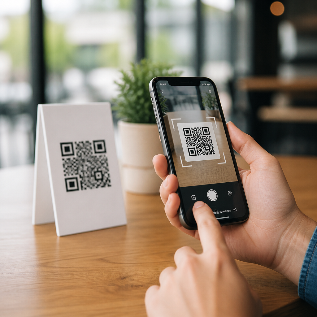
Mobile UX testing for QR code campaigns determines whether a scan turns into action or abandonment. In this context, mobile UX means the full experience on a smartphone after someone notices a QR code, scans it with a camera or app, lands on a page, and tries to complete a task. I have tested QR activations for retail packaging, restaurant menus, event signage, and field service labels, and the pattern is consistent: small usability flaws destroy response rates. A code can scan perfectly and still fail commercially because the landing page is slow, the form is awkward, or the call to action is unclear. That is why best practices for mobile UX matter so much within mobile QR code design and UX.
A QR code campaign is not just the printed square. It is a connected journey that includes placement, lighting, camera recognition, redirect behavior, page rendering, accessibility, analytics, and conversion flow. Testing must cover all of it. Teams often validate only technical scanability, but that is the minimum threshold, not the success standard. Real users scan while walking, standing in bright sun, switching between weak mobile networks, and juggling one-handed interactions. Mobile UX testing reveals friction under these real conditions and shows which fixes improve completion rates. For brands using QR codes in packaging, out-of-home ads, direct mail, stores, or product onboarding, this hub explains the best practices, methods, and metrics that make campaigns easier to use and more profitable.
What mobile UX testing for QR code campaigns should evaluate
Effective testing starts with a broad definition of success. The question is not only, “Does the QR code scan?” It is, “Can the intended audience complete the intended task quickly, confidently, and accessibly on a phone?” In practice, I evaluate five stages: notice, scan, load, understand, and convert. Notice covers whether the code is visible, large enough, and supported by a clear instruction such as “Scan to view sizing guide” or “Scan for installation video.” Scan covers error correction level, contrast, quiet zone, print quality, and distance from the user. Load covers redirect speed, page weight, responsive layout, and how the experience behaves on iOS and Android. Understand covers message clarity, trust cues, and content hierarchy. Convert covers taps, scroll depth, form completion, add-to-cart actions, or whatever outcome the campaign targets.
Different campaign contexts shift the testing criteria. A menu QR code in a dim restaurant needs fast loading and readable typography in low light. A QR code on transit posters must scan at awkward angles and lead to a page that works over cellular data, not assumed Wi-Fi. A product packaging QR code may need multilingual routing, regulatory information, and repeat-visit usefulness. This is why mobile UX testing should be scenario-based. Build test cases around where the code appears, what the user needs in that moment, and what environmental limitations apply. When teams do this early, they uncover issues that synthetic desktop reviews miss entirely.
Best practices for the scan-to-landing-page journey
The strongest QR experiences reduce decision points. Start by matching the promise near the code to the first screen after the scan. If the package says “Scan for warranty registration,” the landing page should open directly to registration, not a generic homepage. Deep linking is usually the right choice when an app is installed, while a mobile web fallback protects reach for everyone else. Keep redirects short; every extra hop adds latency and another chance for tracking or privacy settings to interrupt the flow. In my testing, campaigns with one clear destination consistently outperform campaigns that force users to navigate after arrival.
Page speed is the next major lever. Google’s Core Web Vitals are useful here, especially Largest Contentful Paint, Interaction to Next Paint, and Cumulative Layout Shift. For QR campaigns, the tolerance is lower than in ordinary browsing because the user did not begin with strong browsing intent; they took a quick action and expect an immediate payoff. Compress images, defer noncritical scripts, reduce third-party tags, and serve modern image formats such as WebP or AVIF where supported. A restaurant chain I worked with cut landing-page load time from 4.8 seconds to 2.1 seconds on midrange Android devices simply by replacing oversized hero images and removing a chat widget. Menu views increased noticeably because fewer users bounced before content appeared.
Responsive layout must be tested on actual devices, not only in browser emulators. Emulators are helpful for early QA, but they do not fully reproduce camera handoff, viewport quirks, keyboard behavior, browser UI chrome, or brightness-related readability. Test with recent iPhones, common Samsung Galaxy devices, lower-end Android handsets, and at least one older device still represented in analytics. Check portrait orientation first, then landscape if the use case supports it. Buttons should be thumb-friendly, forms should use proper input types, and content should remain legible without pinch zoom. Accessibility is part of UX, not an optional layer. Follow WCAG guidance on contrast, focus states, semantic labels, and readable text size so the QR campaign works for more people in more settings.
How to run mobile UX tests that reflect real behavior
Useful testing combines moderated observation, unmoderated tasks, technical QA, and analytics review. Moderated testing is best for seeing confusion in real time. Give participants a realistic prompt, such as “You are in a store comparing two skincare products. Scan this code and decide whether this one is fragrance free.” Then watch how they hold the phone, whether they hesitate, what they expect after the scan, and where they struggle. Even five to eight participants per important audience segment can expose repeat issues. Unmoderated mobile tests add scale and can surface device-specific problems when distributed across broader panels.
Technical QA should cover scan reliability across print finishes, code sizes, and environmental conditions. Glossy packaging can produce glare; curved bottles can distort the code; low contrast brand styling can hurt recognition. Use ISO/IEC 18004 as the relevant QR Code standard reference, then validate with multiple scanning methods, including native camera apps. Instrument analytics so each stage is measurable: scan event, landing-page view, engaged session, CTA tap, form start, form completion, and downstream conversion. Pair quantitative data with tools such as GA4, Adobe Analytics, Hotjar, Contentsquare, or FullStory to understand where drop-off occurs. Session replay is especially useful for identifying rage taps, failed field validation, and hidden sticky elements that block content.
| Testing area | What to check | Common failure | Practical fix |
|---|---|---|---|
| Scanability | Contrast, quiet zone, size, glare, curvature | Camera fails to detect code quickly | Increase size, preserve white space, avoid reflective placement |
| Load performance | Redirects, page weight, script execution | Users bounce before content appears | Trim assets, limit tags, send users to a direct destination |
| Content clarity | Headline match, value proposition, trust cues | Users do not know what to do next | Use explicit CTA and align first screen to scan prompt |
| Form usability | Field count, keyboard type, autofill, errors | High abandonment on mobile input | Reduce fields, enable autofill, show inline validation |
| Accessibility | Contrast, text size, focus order, labels | Content unreadable or controls hard to use | Apply WCAG-based design and test with assistive settings |
Metrics, segmentation, and experimentation that improve results
Good QR code UX measurement separates channel curiosity from business impact. Start with scan rate when impressions are known, then track landing-page engagement, task completion rate, and conversion rate by device, OS, browser, network type, creative variant, and physical placement. Segmentation matters because averages hide operational problems. If iOS converts well but older Android devices stall on script-heavy pages, the fix is not more media spend; it is a lighter experience. If one store poster performs worse than others, inspect height, surrounding clutter, and lighting before rewriting copy.
Experimentation should focus on the variables users actually feel. Test CTA wording near the code, destination type, page length, form friction, and whether the first screen uses video, static imagery, or utility-first content. In one event campaign, replacing an autoplay video intro with a schedule card and map link reduced early exits and increased agenda saves. In another packaging test, changing “Learn more” to “Scan for ingredients and allergy info” improved qualified engagement because the benefit was specific. Dynamic QR platforms such as Bitly, QR Code Generator PRO, Flowcode, and Uniqode can support redirects, tagging, and update control, but the platform itself does not create good UX. The outcome still depends on disciplined testing and clear user intent alignment.
This hub should guide decisions across every article in mobile QR code design and UX because the same principles recur. Users need a visible code, a clear reason to scan, a fast mobile destination, accessible content, and a path to complete the next step without friction. Teams need a repeatable testing framework that blends field conditions, device diversity, analytics instrumentation, and iterative experiments. When you treat the QR code as the start of a mobile product experience rather than a graphic asset, performance improves measurably. Audit your current campaigns, test them on real phones in real environments, and fix the journey end to end.
Frequently Asked Questions
What is mobile UX testing for QR code campaigns, and why does it matter so much?
Mobile UX testing for QR code campaigns is the process of evaluating everything that happens after a person notices a QR code and decides to interact with it on a smartphone. That includes scan recognition, camera behavior, the speed and clarity of the landing page, the readability of content on a small screen, the ease of tapping buttons and completing forms, and the overall path from curiosity to action. In practice, it is not enough for a QR code to be technically scannable. The campaign only succeeds if the mobile experience that follows is fast, intuitive, and friction-free.
This matters because QR interactions usually happen in imperfect real-world conditions. People scan from packaging in a store aisle, from a restaurant table while multitasking, from an event sign while walking, or from a field label while on the job. They may have glare on the screen, weak connectivity, one hand free, limited patience, and no interest in solving usability problems. If the page loads slowly, the offer is unclear, text is too small, buttons are hard to tap, or the form asks for too much, the user leaves. That abandonment often gets misdiagnosed as a poor campaign concept when the real problem is a weak mobile experience.
Good mobile UX testing helps identify those invisible conversion killers before a campaign goes live. It shows whether the scan leads smoothly into action or drops users into confusion. It also protects media spend and print investment. A beautifully designed QR placement can still underperform if the destination page feels clumsy on a phone. In short, mobile UX testing matters because the scan is only the beginning. The outcome depends on what happens next.
What should be tested in a QR code campaign beyond whether the code scans successfully?
A complete test should cover the entire post-scan journey, not just the code itself. Start with scan context. Test whether users can easily recognize that the QR code is worth scanning, whether there is a clear call to action nearby, and whether the code can be scanned from realistic distances and angles. Then move into the transition from scan to destination. Confirm that the browser opens correctly, the destination URL resolves without errors, and any redirects are fast and reliable.
Next, evaluate landing page performance. Page speed is one of the biggest factors in mobile drop-off, especially in public spaces where mobile networks may be unstable. Test on both strong and weak connections. Then review content hierarchy. Users should instantly understand where they landed, what the value is, and what action to take next. Headlines, offers, instructions, and buttons need to be visible without pinching or hunting. If the page feels like a generic desktop layout squeezed onto a phone, response rates usually suffer.
Task completion is another critical area. If the user needs to order, register, book, download, pay, or submit information, every step should be tested for effort and clarity. Look at form length, keyboard behavior, autofill support, error messaging, dropdown usability, checkbox size, and payment flow. Also test whether elements are accessible under real usage conditions, including bright light, older devices, and different operating systems. Finally, check measurement. Confirm that analytics, event tracking, campaign parameters, and conversion reporting work properly so you can connect UX performance to campaign results. A QR code campaign should be tested as a full mobile funnel, not as a single scan event.
What are the most common mobile UX problems that reduce QR code campaign conversions?
The most common problems are usually small, but they have outsized impact. Slow landing pages are a major one. A person who scans in a moment of intent will not wait long for a page to load, especially if they are standing, walking, shopping, or in a social setting. Another frequent issue is message mismatch. The text near the QR code may promise a menu, product details, discount, video, or service form, but the landing page opens with vague branding or forces extra navigation. That break in expectation causes immediate drop-off.
Poor mobile layout is another frequent conversion killer. Tiny text, cramped spacing, oversized pop-ups, sticky banners that block content, and buttons placed too close together make the page feel difficult on a phone. Long forms also create unnecessary abandonment. If a campaign asks for too much information too early, users often quit. In many QR journeys, the right move is to reduce fields, delay account creation, and streamline the first conversion step.
There are also technical issues that marketers overlook. Some pages fail on certain devices or browser versions. Some QR destinations trigger unnecessary redirects that slow everything down. Some pages are not optimized for one-handed use. Others bury the call to action below dense copy or fail to support mobile wallets, autofill, or click-to-call behaviors that would make completion easier. In physical environments, glare, motion, time pressure, and weak signal amplify every flaw. That is why even minor usability issues can sharply reduce results. In QR campaigns, friction compounds quickly.
How do you properly test a mobile landing page for a QR code campaign in real-world conditions?
The best approach is to test the page the way actual users will experience it, not just from a desk on a fast Wi-Fi connection. Start by identifying the campaign context. A QR code on retail packaging should be tested in store-like lighting and with limited user attention. A restaurant menu QR should be tested while seated, possibly with slower guest Wi-Fi or no Wi-Fi. Event signage should be tested from a distance and under crowd movement. Field service labels should be tested outdoors, in bright light, and sometimes with gloves or one-handed use. Context changes behavior, and behavior changes what matters in the UX.
From there, test across multiple phones, screen sizes, browsers, and operating systems. Include newer and older devices because performance and rendering issues often appear on less powerful phones. Check scan-to-load time, visual stability, button placement, scrolling behavior, and how quickly users can identify the next step. Give testers realistic tasks such as “find product instructions,” “book the appointment,” “download the coupon,” or “submit the service request,” and watch where they hesitate. Those hesitation points usually reveal the design problems that analytics later confirms.
It is also important to test under different network conditions, including slower mobile data. Review any redirects, scripts, cookie banners, consent prompts, and third-party tools that may delay the experience. Record not only whether users complete the task, but how many taps it takes, where confusion occurs, and how long the process feels. After launch, combine observational testing with analytics, heatmaps, and funnel data to see where real users abandon. The strongest QR campaign testing process blends usability review, technical QA, and real environmental testing because QR interactions happen in the physical world, not in ideal lab conditions alone.
How can businesses improve conversion rates from QR code campaigns through better mobile UX?
The fastest gains usually come from simplification. Make the value proposition obvious before and after the scan. If the QR code offers a menu, coupon, video, registration, support guide, or service form, the first mobile screen should confirm that immediately. Reduce load time aggressively by trimming unnecessary scripts, compressing assets, and minimizing redirects. A fast, focused landing page consistently outperforms a cluttered one. Every extra second and every extra decision increases abandonment risk.
Design the mobile page around one primary action. Avoid forcing users to navigate a full website when a campaign-specific page can take them directly to the goal. Keep text short, readable, and structured for scanning. Use large tap targets, clear contrast, and a visible call to action above the fold when possible. If a form is necessary, ask only for essential information and support autofill, mobile-friendly keyboards, and concise error handling. For commerce or booking flows, support common mobile payment and scheduling behaviors so users can finish quickly.
Just as importantly, keep testing and iterating. Measure scan-to-landing rate, bounce rate, task completion, form completion, and final conversion. Compare results by device type, traffic source, and placement context. If one QR placement gets scans but weak completion, the issue may be downstream UX rather than audience quality. Small changes such as shortening a form, rewriting a headline, moving a button, or removing a pop-up can produce meaningful lift. Businesses that treat QR code campaigns as end-to-end mobile experiences, rather than simple print add-ons, usually see stronger engagement and better conversion performance over time.





