
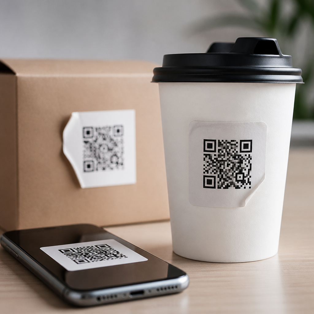
QR codes can strengthen a brand, but they often fail because companies treat them as disposable utilities instead of designed customer touchpoints. In the context of branding with QR codes, a QR code is not just a scannable square that opens a link; it is a bridge between physical and digital experience, carrying visual identity, message clarity, and user trust in a single interaction. I have audited restaurant menus, packaging systems, event signage, retail displays, and direct mail campaigns where the code itself worked technically yet weakened the brand because it looked generic, led to an off-brand landing page, or asked for a scan without a clear reason. These mistakes matter because mobile users decide in seconds whether a code feels safe, useful, and worth their attention.
Branding with QR codes means shaping every element around the scan: the code design, the call to action, the placement, the destination, and the post-scan journey. The goal is simple: make scanning feel like a natural extension of the brand. That requires balancing aesthetics with usability. Unlike a logo, a QR code must remain highly readable under different lighting conditions, distances, printing methods, and device cameras. Unlike a standard URL, it also appears in the physical world, where context changes fast. A code on luxury packaging has different expectations than one on warehouse signage or a museum label. The most common branding mistakes happen when teams push visual customization too far, ignore user intent, or separate creative decisions from scanning performance.
This hub article explains the branding mistakes that most often reduce scans, trust, and conversions, while showing how to build QR experiences that feel consistent and credible. It covers design errors, messaging problems, destination issues, channel-specific pitfalls, and governance practices that keep branded QR campaigns reliable at scale.
Overdesigning the code and damaging scan reliability
The most frequent mistake is assuming that stronger branding always means heavier visual customization. In practice, scan reliability is the first brand promise a QR code must keep. I have seen teams insert large centered logos, remove the quiet zone, use low-contrast brand palettes, round off too many modules, or place codes over textured backgrounds to match campaign art. These choices may look polished in a design mockup, but they often fail in real environments where glare, motion, low ink density, or older cameras reduce readability. ISO/IEC 18004 defines the technical structure of QR codes, and respecting that structure is not optional if the code is meant to perform.
Good branded QR design starts with contrast, error correction, and protected spacing. Dark modules on a light background still outperform most stylized combinations. A quiet zone of at least four modules around the code is essential. Logos should be small enough that the selected error correction level can absorb the obstruction; in most commercial uses, level Q or H is appropriate when a logo is added, but higher error correction also increases code density, which can hurt performance on tiny labels. The practical rule is to test the final printed size on multiple devices, not just validate the generator preview. A beautiful code that fails from arm’s length on a midrange Android phone is a branding failure, not a design win.
Using QR codes without a clear brand message or user benefit
Another common mistake is placing a QR code beside a vague instruction such as “Scan me” or no instruction at all. People do not scan because a code exists; they scan because the value proposition is obvious. Strong branding with QR codes explains what happens next and why it matters. For example, “Scan to see ingredients,” “Scan for a two-minute setup video,” or “Scan to register your warranty” sets expectations immediately. In retail, “Scan for colors in stock” performs better than a generic invitation because it answers a specific shopping question. On packaging, “Scan for care instructions” aligns utility with the product experience and feels intentional rather than promotional.
This is where brand voice matters. A premium skincare brand may use concise reassurance, while a sports venue may use energetic action language, but both must still be explicit. The message should answer three questions before the scan: what will I get, how long will it take, and can I trust it? Trust rises further when the destination domain is recognizable. Branded short domains, used carefully, can help printed materials stay clean while confirming legitimacy. The worst pattern is a stylish code paired with vague copy that leads to an unfamiliar URL and a generic page. That combination makes users hesitate, especially in public settings where scam awareness is high.
Breaking brand continuity after the scan
Many QR campaigns fail not at the code but at the landing experience. A customer scans a beautifully branded sign and lands on a slow page, a desktop layout, a social profile with unrelated posts, or a form asking for too much information. That disconnect weakens credibility. The post-scan experience should match the promise of the physical asset in design, message, and task flow. If the sign offers a menu, open the menu directly. If the package promises assembly help, take the user to the exact video or step-by-step guide. Every extra tap reduces completion rates.
Mobile performance is part of branding. Google’s Core Web Vitals are not just technical benchmarks; they shape perceived quality. A brand that looks premium in print but loads slowly on mobile feels inconsistent. I recommend using dedicated mobile landing pages with concise headlines, clear primary actions, compressed images, and analytics tagging. Include accessibility basics such as legible type, sufficient color contrast, and controls large enough for thumbs. Also keep legal and privacy obligations in view. If a QR code opens a lead form, explain data use clearly. Trust is cumulative, and the fastest way to damage it is to ask for personal information before delivering the value that motivated the scan.
Ignoring context, placement, and environmental conditions
Branding with QR codes is highly context dependent, yet teams often approve one design and deploy it everywhere. A code that works on a countertop display may fail on a bus shelter, bottle neck tag, trade show banner, or outdoor poster. Distance determines minimum size; lighting affects contrast; curved surfaces distort readability; and placement changes whether users can scan comfortably. In field tests, I have seen codes placed too low on product stands, too high on lobby walls, and too close to reflective laminates. Each decision reduced scans before brand message even had a chance to work.
The table below summarizes the most common placement-related branding mistakes and the practical correction.
| Mistake | Why it hurts the brand | Better approach |
|---|---|---|
| Code printed too small | Users struggle to scan and blame the company, not their camera | Size for expected scanning distance; test in real conditions |
| Low contrast brand colors | Stylish appearance reduces readability and trust | Use dark-on-light combinations with strong contrast ratios |
| Placed on reflective or curved surfaces | Glare and distortion make scanning inconsistent | Choose matte finishes and flatter placement zones |
| No surrounding instruction | Users do not know why they should engage | Add a concise call to action with a clear benefit |
| Generic landing page | Breaks continuity and lowers conversion | Deep-link to a branded, mobile-specific destination |
Context also includes timing and motivation. A QR code at a point of sale should remove friction fast, while a code in a magazine can support discovery with richer storytelling. In hospitality, guests scanning room collateral usually want immediate answers, not campaigns. In manufacturing, technicians scanning equipment labels need precise service documents, serial-specific records, or replacement part pages. The right branded experience reflects the job the user is trying to do in that moment.
Failing to govern QR code branding across teams and campaigns
As brands scale, inconsistency becomes the hidden QR problem. Marketing may create dynamic campaign codes in one platform, packaging may use static codes generated ad hoc, retail may print signage from local templates, and support may add codes to manuals without any central standards. The result is fragmented visual treatment, uneven tracking, expired destinations, and conflicting calls to action. Customers experience all of this as one brand, even when internal teams operate separately.
The fix is governance: a documented QR code design system with technical rules and workflow controls. In mature programs, brand teams define approved color ranges, minimum sizes, logo treatments, quiet-zone requirements, CTA templates, and landing page standards. Operations teams maintain print specifications, material guidance, and testing checklists. Analytics teams define UTM conventions, campaign naming, scan event taxonomies, and reporting dashboards in GA4, Adobe Analytics, or similar tools. If dynamic QR codes are used, ownership of redirects, domain renewals, and archival policies must be explicit. I have seen valuable packaging inventory become unusable because a temporary campaign URL expired. A durable hub strategy avoids that risk by linking to evergreen destination structures and updating content behind stable redirects.
This page serves as a hub because branding with QR codes is not one decision; it is a system. The strongest programs connect related guidance on visual customization, mobile landing pages, print production, analytics, accessibility, security, and industry-specific use cases. When those elements are managed together, QR codes stop looking like tactical add-ons and start functioning as dependable branded pathways.
Conclusion
Common branding mistakes with QR codes usually come down to one false assumption: that appearance matters more than experience. In reality, the brand is expressed through the entire scan journey. If the code is hard to scan, the value is unclear, the landing page feels disconnected, or the deployment context is ignored, users notice immediately. The best branded QR codes are readable first, purposeful second, and visually aligned throughout. They protect technical fundamentals, state a specific benefit, respect mobile behavior, and maintain continuity from print or signage to the destination.
For teams building a stronger Mobile QR Code Design & UX program, the practical next step is to audit every live code against five checkpoints: scan reliability, call-to-action clarity, destination relevance, environmental fit, and governance. Fixing those areas will improve trust, increase scans, and make QR codes feel like a coherent part of the brand rather than an afterthought. Use this hub as the foundation for deeper work across your QR design standards, testing process, and post-scan user experience.
Frequently Asked Questions
1. What is the most common branding mistake companies make with QR codes?
The most common mistake is treating the QR code as a purely functional tool instead of a branded customer touchpoint. Many companies focus only on whether the code scans, but ignore how it looks, where it appears, what message surrounds it, and what experience follows after the scan. That approach weakens the brand because the QR code becomes disconnected from the rest of the customer journey. In practice, this often shows up as a generic black-and-white code dropped onto packaging, menus, signage, or mailers with no explanation, no visual alignment, and no attention to the destination page.
A QR code should support the same brand standards as any other customer-facing asset. It sits at a critical moment where physical experience meets digital experience, so it influences recognition, trust, and conversion all at once. If the code looks out of place, lacks context, or leads to a page that feels unrelated to the original brand environment, users may hesitate to scan or abandon the experience after the first click. Strong branding with QR codes means thinking through design, placement, messaging, landing page continuity, and user expectations as a unified system rather than a last-minute utility layer.
2. How can poor QR code design hurt brand trust and scan performance?
Poor QR code design can damage both usability and credibility. From a performance perspective, codes fail when brands push customization too far, such as using low contrast colors, shrinking the code excessively, distorting its shape, cluttering it with oversized logos, or placing it on busy backgrounds. Even if the code technically works in testing, real-world conditions are less forgiving. Customers scan in low light, at awkward angles, while moving, or with older devices, so a code that is only marginally readable can quickly become a point of friction.
From a branding standpoint, bad design creates uncertainty. If a QR code appears sloppy, inconsistent, or visually disconnected from the brand, users may question whether it is official, safe, or worth their time. Trust matters because scanning a code is an action that asks customers to hand over attention and enter a digital experience they cannot fully preview. Brands can improve both trust and performance by keeping strong contrast, preserving quiet space around the code, using customization carefully, and integrating the code into the surrounding design in a way that feels intentional. A well-designed QR code should look unmistakably on-brand while still prioritizing fast, reliable scanning in everyday conditions.
3. Why is the landing page experience so important for branded QR code campaigns?
The landing page is where the promise of the QR code is either fulfilled or broken. One of the biggest branding mistakes is investing effort into the printed or physical QR code placement, then sending users to a generic homepage, an outdated mobile experience, or a page that does not match the message they saw before scanning. This creates disconnect. If the signage says “View today’s specials,” “Unlock your event schedule,” or “See product care instructions,” the landing page should deliver exactly that content immediately and clearly.
Branding does not stop at the scan. In fact, the post-scan experience often has a greater impact on how the brand is remembered. Customers expect continuity in tone, visuals, speed, and relevance. The colors, language, offer, and purpose should feel like a direct extension of the original menu, package, display, or mail piece. Mobile optimization is especially critical because most scans happen on phones, and slow load times or poor formatting can undermine confidence instantly. A successful branded QR experience creates a seamless transition from physical touchpoint to digital interaction, reinforcing professionalism, clarity, and trust at every step.
4. What role do messaging and call-to-action play in QR code branding?
Messaging is one of the most overlooked parts of QR code branding. A code placed on its own without explanation forces the customer to guess why they should scan it, and uncertainty reduces engagement. People are far more likely to scan when the benefit is specific, immediate, and easy to understand. Generic prompts like “Scan here” are weaker than clear, value-driven calls to action such as “Scan to see the full menu,” “Scan for assembly instructions,” “Scan to claim your event pass,” or “Scan to watch the demo.”
From a brand perspective, messaging also shapes tone. The words around the QR code should sound like the brand, whether that voice is polished, playful, premium, helpful, or direct. This is especially important across environments like restaurants, retail displays, packaging, and direct mail, where space is limited and every word must carry meaning. Good QR messaging reduces friction by setting expectations before the scan and makes the interaction feel intentional rather than accidental. When companies fail to explain the purpose of the code or do so in language that clashes with their brand voice, they miss an opportunity to improve both user confidence and campaign performance.
5. How should businesses evaluate whether their QR codes are strengthening or weakening their brand?
Businesses should evaluate QR codes as both functional assets and brand experience assets. The first layer is operational: does the code scan quickly, consistently, and across multiple devices and lighting conditions? Is it placed at a usable size and height? Does it have enough contrast and clear surrounding space? Does the destination load quickly and display properly on mobile? These are the baseline requirements. If the code fails here, brand value is already being lost through friction and frustration.
The second layer is strategic: does the QR code look and feel like it belongs to the brand, and does it support a coherent customer journey? Businesses should review whether the code is integrated into layouts thoughtfully, whether the call-to-action is clear, whether the landing page matches the original promise, and whether the digital experience reinforces the brand’s visual identity and tone. They should also look at engagement metrics such as scan rate, bounce rate, time on page, and downstream conversion, while pairing those metrics with qualitative review of customer experience. A QR code can generate scans and still weaken the brand if the interaction feels confusing, off-brand, or low quality. The most effective audits treat the QR code not as a technical checkbox, but as a visible extension of brand strategy across physical and digital channels.





