
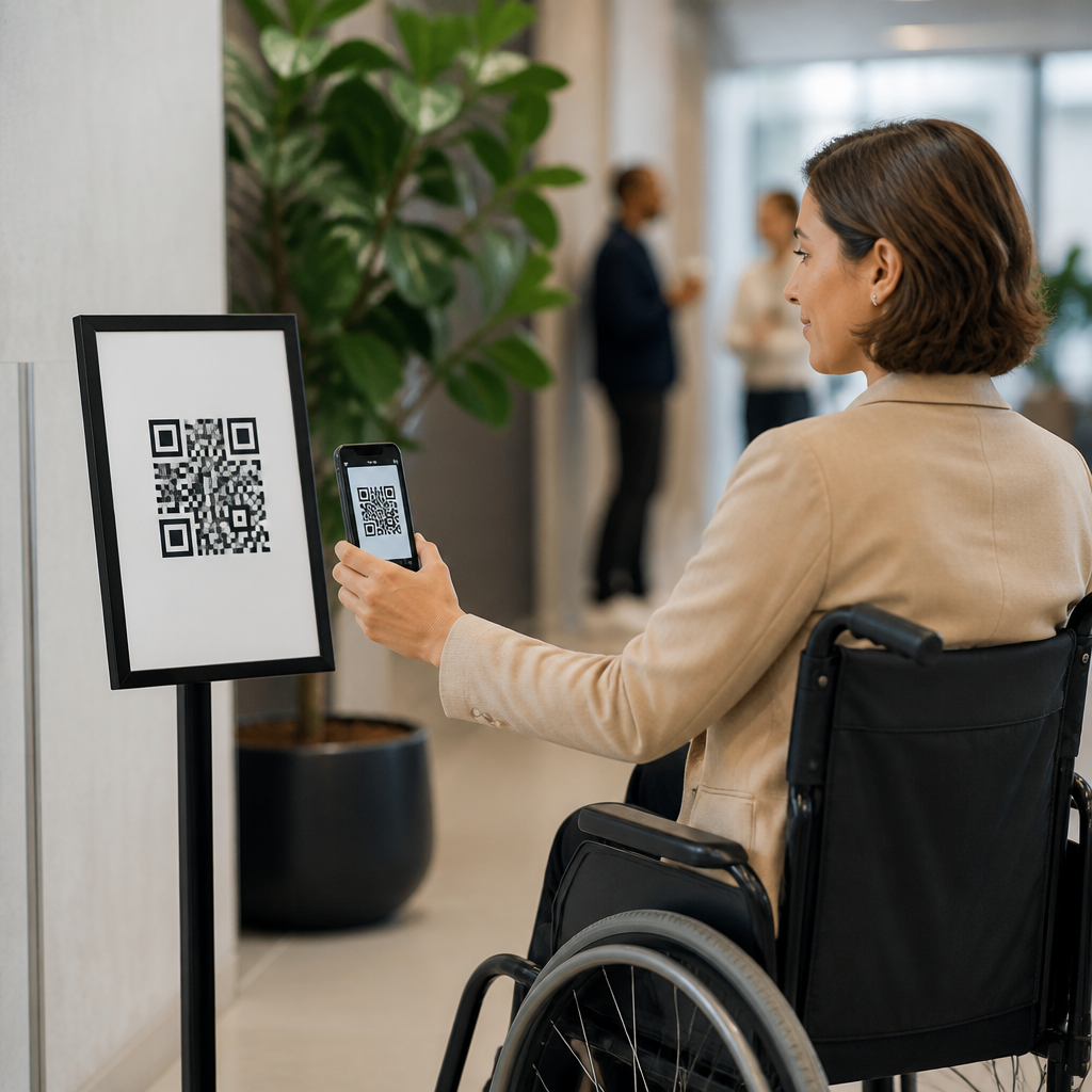
Accessible QR code campaigns expand reach, reduce friction, and make mobile interactions usable for people with different visual, motor, cognitive, and situational needs. In practice, accessibility means designing every part of the QR experience so people can find the code, scan it, understand what will happen next, and complete the intended action without unnecessary barriers. That includes the printed or digital placement of the code, color contrast, surrounding instructions, landing page performance, form fields, media captions, and fallback options for people who cannot or do not want to scan. I have audited QR deployments in retail stores, transit signage, healthcare waiting rooms, and event venues, and the same pattern appears repeatedly: teams focus on scan rates but overlook whether the campaign works for older adults, screen reader users, people with low vision, or anyone standing in glare, motion, or low bandwidth. Accessibility matters because QR codes now connect physical environments to digital services such as menus, tickets, payments, product details, and customer support. When the bridge is inaccessible, users are excluded at the exact moment of intent. Better accessibility also improves usability for everyone, lowers support requests, strengthens compliance with standards such as WCAG 2.2 and ADA expectations, and usually lifts conversion by making the path clearer and faster.
Start with discoverability, context, and physical usability
The first accessibility problem in many QR code campaigns is not scanning technology; it is whether people can locate and approach the code comfortably. A code placed too high on a wall, behind reflective glass, on a curved bottle, or in a crowded visual layout creates barriers before the camera opens. Best practice is to position QR codes within a comfortable viewing zone, keep them flat when possible, and leave generous quiet space around the symbol so camera software can isolate it. On posters and signs, surrounding the code with a plain background and clear directional hierarchy helps users identify the next step quickly. I recommend treating the code as a functional control, not decorative artwork. Give it prominence equal to the task importance.
Instructional text is essential. People should not have to guess what the code does. Add a plain-language label such as “Scan to view the accessible menu” or “Scan to pay your parking session.” State whether a download, form, video, or payment is coming next. This reduces cognitive load and helps users decide whether to proceed. It also improves trust, which matters because many users are wary of unknown QR destinations. For physical environments, provide a non-scan alternative beside the code: a short URL, NFC option, staffed assistance, or SMS keyword. In a clinic, for example, “Scan to complete intake forms” should be paired with a printed URL and front-desk support, because some patients will not have a camera-enabled phone, dexterity to hold it steady, or confidence using mobile forms.
Design the QR code itself for reliable scanning
Accessible QR code design begins with scan reliability. If a user has tremor, limited reach, low vision, or only a few seconds to act, the code must scan quickly. Use sufficient size for the expected distance; a common rule is roughly one inch of code size for every ten inches of scanning distance, then validate with real devices. Keep contrast high, ideally dark modules on a light background. Reversed codes, gradients, busy photographic backgrounds, and low-contrast brand colors may look attractive but often reduce recognition. Error correction can help when a logo is embedded, yet over-stylization still harms performance. In campaigns I have tested, standard black on white consistently outperformed heavily branded variants under glare and older camera hardware.
Do not rotate the code into unusual angles if it is not necessary, and avoid placing it across folds, seams, or transparent surfaces. For digital displays, account for refresh rate, brightness, and moiré effects, especially on large LED signage. For print, use vector output, verify edge sharpness, and test final production samples rather than relying on proofs. If you include a frame or callout, make sure it does not intrude into the quiet zone. Accessibility here is about tolerance: the more forgiving the code is under imperfect lighting, shaky hands, cracked screens, or budget phones, the more equitable the campaign becomes.
Support low vision, cognitive accessibility, and multilingual audiences
Many QR campaigns fail because the surrounding communication assumes high literacy, perfect eyesight, and familiarity with scanning conventions. Keep nearby text concise and concrete. Use high-contrast typography, readable font sizes, and plain verbs that describe the result. If the destination includes critical information such as medication instructions, transport updates, or safety guidance, do not make the QR code the sole channel. Redundancy is an accessibility feature. Pair the code with visible essentials in text and reserve the scan for extended details, audio, translation, or interactive tasks.
Language access matters too. If the physical setting serves multilingual audiences, indicate available languages before scan and route users accordingly after scan. Icons can help, but they should support rather than replace text. For users with cognitive disabilities, consistent labels and predictable outcomes are more important than clever copy. Avoid forcing users through long chains of redirects, app-store detours, or pop-ups before they reach the promised content. In museums and public spaces, I have seen engagement improve when each code had a short benefit statement, a language indicator, and a visible fallback number. Those cues reduce uncertainty and make the interaction feel manageable.
Make the destination mobile page fully accessible
A QR code campaign is only as accessible as the page it opens. The landing page should meet mobile accessibility fundamentals: semantic headings, keyboard operability, visible focus states, descriptive link text, form labels, error identification, sufficient color contrast, responsive layout, and support for screen readers on iOS and Android. If a user scans a code to order food, register for an event, or unlock a coupon, every step after the camera matters. Avoid PDFs for primary tasks unless they are tagged properly and genuinely necessary. Native web pages are usually easier to navigate, zoom, reflow, and translate.
Performance is part of accessibility. Slow pages punish users on weak connections and older devices, which is common in transit hubs, stadiums, and outdoor retail settings. Compress images, minimize scripts, and prioritize content above the fold. If autoplay media is used, keep audio off by default and provide captions and transcripts. Authentication flows deserve special scrutiny; one-time codes, captchas, and timeout windows can block users with disabilities. Where verification is required, offer accessible alternatives. Payments should support wallet options and clear confirmation states. After form submission or purchase, provide a human-readable success message rather than relying only on color or animation.
| Campaign element | Accessibility best practice | Common failure | Better fallback |
|---|---|---|---|
| Printed poster QR | High contrast, clear label, reachable placement | Small code on glossy surface | Short URL beneath code |
| Restaurant menu | Accessible mobile menu with proper headings | Image-only PDF | Printed menu on request |
| Event check-in | Fast-loading page, large buttons, wallet support | Forced app download | Staffed manual check-in line |
| Product packaging | Flat placement and concise value statement | Code wrapped around curve | Customer service phone number |
Test with real users, real devices, and accessible workflows
Accessibility cannot be confirmed by visual inspection alone. Effective QR code testing combines scan validation, usability review, and assistive technology checks. Test across iPhone and Android devices, different camera apps, older hardware, dark mode conditions, zoom settings, and network speeds. Use screen readers such as VoiceOver and TalkBack on the landing page. Check orientation changes, text resizing to 200 percent, and external keyboard navigation for users who cannot rely on touch alone. If forms are involved, verify error messages, focus order, and recovery from mistakes. For high-volume campaigns, run field tests at the actual installation site during the lighting conditions users will experience.
Quantitative analytics help, but they need interpretation. A low completion rate may point to poor signage, weak connectivity, inaccessible forms, or mistrust caused by unclear labeling. Pair analytics from tools such as GA4, Adobe Analytics, or Matomo with observational research and support logs. I also recommend keeping QR destinations stable and using redirects carefully, because frequent destination changes can break trust and introduce compatibility issues. Governance matters: define who owns content updates, accessibility checks, and link monitoring over the life of the campaign. Broken links, expired promotions, and inaccessible replacement pages are common problems in long-running deployments.
Build governance, compliance, and inclusive measurement into every campaign
The strongest accessible QR programs treat accessibility as an operational requirement, not a final checklist. Create design standards for minimum code size, contrast, labeling, placement, and fallback channels. Add mobile page requirements aligned with WCAG 2.2 success criteria, especially around focus visibility, target size, reflow, and error prevention. For regulated sectors such as healthcare, government, education, and financial services, legal risk increases when essential services are reachable only through inaccessible QR pathways. Procurement should include accessibility expectations for agencies, printers, kiosks, menu platforms, and payment vendors.
Measurement should go beyond scan count. Track successful task completion, time to complete, abandonment by device type, use of fallback channels, and customer support contacts tied to the campaign. If a code for transit ticketing scans often but many users switch to the staffed desk, the campaign may be technically functional yet practically inaccessible. Include qualitative feedback from disabled users and frontline staff in your review cycle. Accessibility improvements often reveal broader UX gains: clearer copy, fewer steps, faster pages, and better trust signals. Those outcomes support business performance while making the experience more equitable.
Best practices for accessible QR code campaigns come down to one principle: the code is only the doorway, and every part of the journey must be usable. Make the code easy to find, physically reachable, high contrast, and large enough to scan quickly. Tell users exactly what will happen, provide a clear fallback, and avoid decorative treatments that compromise reliability. Then ensure the destination page is mobile friendly, screen-reader compatible, fast, understandable, and forgiving of mistakes. Test in real conditions with real users, maintain the links over time, and measure task success rather than vanity metrics.
When teams apply these accessibility considerations consistently, QR campaigns serve more people and perform better under everyday conditions like glare, motion, weak signal, and limited attention. That is the practical value of inclusive design: it reduces exclusion and friction at the same time. Use this hub as the foundation for your broader Mobile QR Code Design & UX strategy, and audit your next QR campaign from placement to completion before it goes live.
Frequently Asked Questions
What makes a QR code campaign accessible?
An accessible QR code campaign is designed so people can successfully complete the full experience, not just scan the code itself. That means users should be able to find the QR code easily, physically reach it when needed, understand what it does before scanning, and use the destination page without confusion or unnecessary effort. Accessibility applies to the entire journey: placement, size, contrast, instructions, the scanning moment, the mobile landing page, and the final action such as reading information, filling out a form, making a purchase, or downloading content.
In practical terms, accessibility starts with visibility and predictability. The QR code should be large enough to scan comfortably, placed in a well-lit and reachable location, and separated clearly from busy backgrounds. Nearby text should explain what the code is for, what users will get after scanning, and whether they need Wi-Fi, an app, sign-in, or any other requirement. This reduces uncertainty for everyone, especially people with cognitive disabilities, low vision, or limited digital confidence.
Just as important, the landing experience must be mobile-friendly and inclusive. If the code leads to a page with tiny text, poor contrast, unlabeled buttons, autoplay media, or forms that are difficult to complete with assistive technology, the campaign is not truly accessible. A strong accessible QR campaign supports screen readers, keyboard navigation where relevant, clear headings, plain language, fast load times, and touch targets that are easy to use. The goal is to reduce friction at every step so more people can participate successfully in the interaction.
How should QR codes be placed and designed for better accessibility?
Placement has a major effect on whether people can use a QR code comfortably. Codes should be positioned where users can approach them safely and steadily, without awkward body movement, glare, or crowding. For printed materials, avoid placing codes too low, too high, around corners, on moving surfaces, or behind reflective coverings. For posters, packaging, signage, and displays, consider the scanning distance and user posture. Someone using a wheelchair, someone with limited hand mobility, or someone carrying bags or managing children may need a simpler, more forgiving setup than a typical campaign assumes.
Design also matters. The QR code needs strong contrast between the foreground and background, and it should not be stylized so heavily that scanning becomes unreliable. While branded QR codes can work well, accessibility and functionality should come before decoration. Keep enough quiet space around the code, avoid clutter nearby, and make sure the code remains crisp and readable in print and on screen. A code that is technically attractive but difficult to detect or scan creates unnecessary failure points for all users.
It is also a best practice to include clear companion instructions next to the code. A short line such as “Scan to view the menu,” “Scan to check in,” or “Scan to access video captions and transcripts” gives users context before they commit. If there is a time-sensitive action or a requirement such as account login, state that upfront. Whenever possible, provide a short URL or alternative access method in addition to the QR code. This helps people whose devices cannot scan easily, who prefer not to use QR codes, or who rely on another path for access.
Why are instructions and surrounding text so important in an accessible QR code campaign?
Instructions reduce uncertainty, and reducing uncertainty is a core part of accessibility. A QR code by itself does not explain what will happen next, how much time the task will take, whether a download will begin, or if personal information will be required. For many users, especially those with cognitive disabilities, anxiety around unfamiliar digital interactions, or limited technical experience, that missing context can become a barrier. Clear surrounding text helps users decide whether and how to engage.
Good instruction copy should answer a few simple questions right away: What is this for? What happens after I scan it? Is there another way to access the same content? Do I need internet access, headphones, an account, or a specific app? This kind of guidance improves trust and usability. It also helps in noisy, rushed, bright, crowded, or otherwise imperfect real-world environments where people may not have ideal conditions for figuring things out on the fly.
Accessible instruction text should be concise, plain-language, and visually readable. Use legible font sizes, strong contrast, and clear formatting. Avoid vague calls to action like “Scan here” when something more specific would be more useful, such as “Scan to open the accessible event schedule” or “Scan to complete your 2-minute registration form.” If the campaign includes audio, video, forms, coupons, or location-based actions, say so clearly. Strong instructions do more than support accessibility compliance; they improve conversion by helping users feel informed and in control.
What should the landing page include to support accessibility after someone scans the QR code?
The landing page should be fast, simple, and fully usable on a mobile device. Since QR codes are most often scanned on phones, the destination experience needs responsive design, readable text, logical structure, and controls that are easy to tap. Accessibility on the landing page means users should be able to understand the content quickly, move through it with assistive technologies, and complete the intended task without encountering avoidable obstacles. If the landing page fails, the QR code campaign fails, even if the scan itself worked perfectly.
At a minimum, the page should use proper headings, descriptive link text, sufficient color contrast, and form labels that are correctly associated with inputs. Buttons should be large enough to tap comfortably, and content should not depend on gestures, hover states, or visual cues alone. Media should include captions, transcripts, or other appropriate alternatives. Pop-ups, autoplay video, countdown timers, and cluttered overlays often create major accessibility problems and should be used with great caution, if at all.
Performance is also a key accessibility factor. People may be scanning on slower networks, in public spaces, or while multitasking. Heavy pages, long forms, and unnecessary redirects create friction for everyone and can disproportionately affect users with cognitive fatigue, limited dexterity, older devices, or limited data plans. The best landing pages are focused and predictable. They tell users immediately they are in the right place, explain the next step clearly, and provide confirmation or feedback as actions are completed. If there is an error, the page should explain it in plain language and make recovery easy.
Should accessible QR code campaigns offer alternatives to scanning?
Yes, absolutely. Providing an alternative access method is one of the most practical ways to make a QR code campaign more inclusive. Not everyone can or wants to scan a QR code in the moment. A person may have a device with a damaged camera, limited familiarity with QR scanning, low battery, poor lighting, shaky hands, or privacy concerns about using their phone in public. Others may use assistive technology in ways that make scanning inconvenient or unreliable. An accessible campaign plans for these scenarios instead of treating them as exceptions.
The most common and effective alternative is a short, easy-to-type URL placed near the QR code. Depending on the context, alternatives might also include NFC, a printed phone number, SMS keyword access, email follow-up, on-site staff assistance, or a printed version of the content. The right option depends on the use case, but the principle is consistent: users should not be blocked from important information or services because scanning is difficult for them. This is especially important for essential interactions such as healthcare forms, transportation updates, menus, event access, public services, and product safety information.
Offering alternatives also improves resilience and campaign performance. If connectivity is weak, if a poster is damaged, or if the QR code is partially obstructed, users still have a path forward. From both accessibility and user experience perspectives, redundancy is a strength. The best QR code campaigns assume real-world conditions will be messy and design multiple clear entry points. That approach expands reach, builds trust, and ensures more people can complete the intended action successfully.





