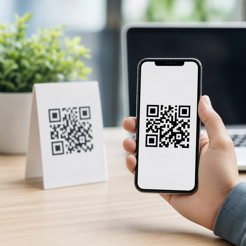
QR code design best practices for mobile start with a simple truth: a code that looks attractive but scans poorly fails its only job. In mobile contexts, that job is demanding because users scan from different distances, under uneven lighting, on cracked screens, through smudged camera lenses, and often while moving. A well-designed mobile QR code must survive those conditions while still reflecting the brand behind it. That balance between usability and visual design is the core of effective QR code design.
A QR code, or Quick Response code, is a two-dimensional matrix barcode that stores data such as a URL, app deep link, contact card, Wi-Fi credential, payment token, or event check-in reference. Mobile QR codes are QR codes intended to be scanned primarily with smartphone cameras, which changes design priorities. Screen glare, smaller print surfaces, responsive landing pages, and varied camera quality all affect performance. In practice, designing effective QR codes means controlling contrast, size, error correction, quiet zone spacing, destination experience, and testing conditions so the code remains readable on the first attempt.
This matters because scan friction directly reduces conversion. In campaigns I have audited, the biggest drop-off usually happens before the landing page loads: the code is too dense, too small, too stylized, or placed where a phone cannot focus quickly. Industry guidance from GS1 Digital Link, ISO/IEC 18004, and major QR generation platforms consistently points to the same principle: machine readability comes first. Once the code scans reliably, visual customization can improve recognition and trust, but never at the expense of performance. For brands building a content cluster around creating mobile QR codes, design is the hub topic because every use case depends on it.
Start with scan reliability, not decoration
The most important design decision is choosing reliability over novelty. A QR code consists of modules, the small dark and light squares that encode information, plus finder patterns in three corners, alignment patterns, timing patterns, and a mandatory quiet zone around the outside. If any of those elements are distorted too aggressively, scan success drops. When teams ask how to design a QR code for mobile, the direct answer is this: keep the structure intact, preserve high contrast, and leave enough empty space around the code.
Contrast is non-negotiable. Dark modules on a light background remain the best choice because mobile cameras and scanning software detect luminance differences faster than decorative color pairings. Black on white is ideal, dark navy on pale cream can work, and light gray on white usually fails. In one retail rollout I reviewed, a pastel seasonal palette cut scan rates because the camera could not separate foreground from background under warm indoor lighting. Reverting to a darker foreground restored performance immediately.
Quiet zone is just as critical. The blank margin around the QR code should be at least four modules wide on all sides. Designers often violate this rule by crowding the code with borders, badges, or nearby text. The result is that scanners cannot determine where the symbol begins and ends. If you place a QR code on packaging, posters, shelf talkers, restaurant tents, or mobile screens, protect that quiet zone as if it were part of the code itself, because functionally it is.
Choose the right size, density, and error correction
How big should a mobile QR code be? The practical answer depends on scan distance, data density, and the surface where the code appears. A common field rule is a 10:1 ratio: for every 10 units of distance, provide at least 1 unit of code width. If a user scans from 20 inches away, a code about 2 inches wide is a safe starting point. For packaging read at arm’s length, 1.2 to 1.5 inches often works. For posters scanned from several feet away, 3 to 5 inches is more realistic.
Data density affects size because more encoded characters create more modules, making each square smaller at the same physical dimensions. That is why using short dynamic URLs is a design best practice. A long static URL with tracking parameters can generate a dense code that demands larger print sizes and performs poorly on low-end cameras. Dynamic QR platforms such as Bitly, QR Code Generator Pro, Uniqode, and Flowcode reduce density and allow destination edits without reprinting. For a hub page on designing effective QR codes, this is a central principle: shorter encoded data produces more forgiving symbols.
Error correction determines how much damage or obstruction the code can tolerate. QR codes support four levels: L, M, Q, and H. Higher levels recover more lost data but increase density. For plain black-and-white codes with no logo, level M is often the best balance. If you place a centered logo or expect wear on printed materials, level Q or H may be justified. The tradeoff is real. I have seen teams choose H automatically, then wonder why their tiny code fails on a product label. More correction is not always better; it must match the design and use case.
| Design factor | Best practice for mobile | Why it matters |
|---|---|---|
| Foreground/background | Dark code on light background | Improves camera detection and contrast recognition |
| Quiet zone | Minimum four modules on all sides | Helps scanners isolate the symbol accurately |
| Encoded data | Use short dynamic URLs | Reduces density and improves readability |
| Error correction | M by default, Q or H for logos/damage risk | Balances resilience against module crowding |
| Physical size | Match size to distance, usually 10:1 ratio | Supports faster focus and first-scan success |
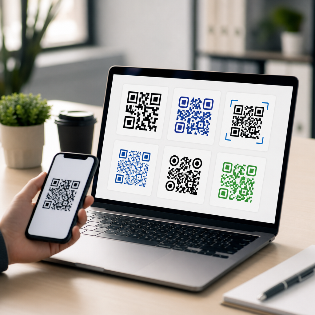
Customize branding carefully without harming performance
Branded QR codes can increase trust and lift scan intent, especially when users worry about unknown links. The safe way to customize a code is to change one variable at a time and test after each change. Logos should sit in the center and occupy only a modest portion of the total area. Rounded modules, custom eyes, gradients, and colored backgrounds can work, but each choice reduces tolerance. The strongest branded codes are restrained, not ornate.
Avoid inverted designs unless they have been tested thoroughly. White modules on a dark background may scan in some modern apps, but compatibility is less consistent than standard dark-on-light patterns. Busy photographic backgrounds are another common mistake. Even when contrast appears strong to the human eye, background texture can confuse edge detection. If a brand requires imagery behind the code, place the symbol inside a solid panel first.
Clear framing and concise instructions improve outcomes. A short call to action such as “Scan to view menu,” “Scan for setup guide,” or “Scan to pay securely” gives the user a reason to engage and sets expectations. In hospitality and events, adding the destination benefit near the code consistently increases scans more than decorative embellishment does. Design is not only the symbol; it includes the surrounding context that explains why scanning is worthwhile.
Design for the destination and the mobile environment
A QR code is only effective if the post-scan experience matches the promise and loads smoothly on mobile. The landing page should be responsive, fast, and stripped of unnecessary friction. If the code leads to a PDF that opens slowly over cellular data, users will blame the code even though the symbol worked. The best mobile QR code design therefore includes destination planning: compressed assets, readable typography, accessible buttons, and analytics tagging that does not bloat the encoded URL.
Deep links can improve app experiences by opening the exact screen a user needs, but they must include fallback behavior. If the app is not installed, users should land on a mobile web page or app store listing instead of an error message. Payment flows, digital menus, support guides, authentication prompts, and product registration forms all benefit from this approach. The code design, copy, and destination should feel like one coherent path.
Placement also shapes mobile performance. On digital displays, avoid placing a QR code near screen edges where glare and viewing angle are worse. On printed materials, keep it off folds, curved bottle surfaces, reflective laminates, and perforated areas. For vehicles, windows, and outdoor signage, test in bright sun and low light because reflections can wipe out contrast. In my experience, environmental conditions cause more failures than the generator software does, which is why physical testing is essential.
Test across devices, channels, and real-world conditions
The final rule of QR code design best practices for mobile is relentless testing. Test with iPhone and Android native cameras, older budget phones, popular social camera apps, and at least one dedicated scanner. Print samples at actual size, not just on office paper but on the real substrate if possible. Check scan speed from expected distances and angles. Verify that the destination opens correctly on Wi-Fi and cellular, and confirm analytics events fire as intended.
Use a checklist. Confirm the URL resolves with HTTPS, the page title matches the call to action, redirects are minimal, and UTM parameters are present but not encoded into an overly long visible URL. Review accessibility as well: surrounding text should explain the purpose of the code for users who cannot scan it, and critical actions should have a non-QR alternative. This is especially important in healthcare, government, transportation, and regulated environments where exclusive reliance on QR access can exclude users.
Performance monitoring should continue after launch. Dynamic QR dashboards reveal scan volume, time of day, device type, and location trends. Those insights help diagnose design issues. If one placement underperforms, compare lighting, height, surrounding copy, and destination relevance before redesigning the code itself. In many campaigns, improving placement or call-to-action text produces a bigger lift than changing module shapes or colors.
Designing effective QR codes for mobile means protecting readability first, then layering branding, context, and analytics on top. Keep contrast high, preserve the quiet zone, match size to distance, reduce data density with dynamic links, and choose error correction based on actual design needs. Treat the landing page as part of the design, and test where the code will really be used, not just where it was created.
For teams building out a complete creating mobile QR codes strategy, this hub topic connects every specialized article that follows, from logo usage and color choices to print placement, deep linking, and scan tracking. Strong design reduces friction, builds trust, and increases the chance that a user scans once and gets exactly what they expected. Audit your current codes, test them on real phones, and refine the weakest points first.
Frequently Asked Questions
What makes a QR code mobile-friendly?
A mobile-friendly QR code is one that scans quickly and reliably in real-world conditions, not just in a perfect mockup. On phones, users may scan from different angles, at varying distances, in glare, in low light, or while holding the device unsteadily. That means the code needs strong contrast, enough quiet zone around it, a clean module pattern, and a size large enough for the camera to resolve easily. In most cases, black or very dark modules on a white or very light background perform best because mobile cameras and scanning apps detect that contrast more consistently than decorative color combinations.
Mobile-friendly design also means resisting the urge to over-style the code. Rounded corners, gradients, heavy logos, or custom shapes can work, but only if they do not interfere with the finder patterns, alignment patterns, or overall readability. If branding is important, it should support scanability rather than compete with it. A code that is slightly less decorative but scans instantly will always outperform one that looks impressive but requires multiple attempts. The best test is practical: scan it on multiple phone models, in different lighting conditions, and at both close and moderate distances.
How large should a QR code be for mobile scanning?
Size depends on where the QR code appears and how far away the user will be when scanning it, but the rule is simple: the farther the scanning distance, the larger the code should be. For close-range uses such as product packaging, tabletop displays, or mobile screens, a smaller code may work well if the contrast is strong and the print or screen resolution is high. For posters, signage, window graphics, or anything viewed from several feet away, the code needs to scale up enough that a phone camera can detect and focus on it quickly.
A practical guideline many designers use is to make the QR code at least 2 x 2 cm for close physical scanning, then increase proportionally with viewing distance. On digital screens, make sure the code is rendered sharply and not compressed or blurred by the layout. Equally important is the quiet zone, the empty margin around the code. Even a sufficiently large QR code can fail if surrounding text, borders, images, or patterned backgrounds crowd that space. When in doubt, print or display the code at the intended final size and test it with several mobile devices before publishing.
Can branded QR codes still scan well on mobile devices?
Yes, branded QR codes can scan well on mobile devices, but only when branding decisions respect the technical structure of the code. The most reliable approach is to keep the core anatomy intact: the finder patterns should remain clear and recognizable, the contrast should stay strong, and any logo placed in the center should be modest in size. Error correction can help compensate for some visual customization, but it should not be treated as permission to aggressively alter the design. If too much of the data area is obscured or stylized, mobile scanners may struggle, especially on older phones or in imperfect environments.
The safest branding choices are usually color adjustments that preserve contrast, subtle shape refinements, and small central logos that do not interfere with critical scan regions. It is also wise to avoid busy backgrounds, low-contrast palettes, metallic effects, and transparent overlays that look refined in a design tool but break in real use. A branded QR code should still be immediately recognizable as a QR code. If users hesitate because it looks unfamiliar, or if cameras fail to lock onto it quickly, the branding has gone too far. Good branded QR design feels intentional and polished while remaining effortless to scan.
What are the most common QR code design mistakes for mobile?
The most common mistake is prioritizing appearance over function. Designers often reduce contrast, remove or shrink the quiet zone, place the code on a visually busy background, or distort the shape to match a campaign aesthetic. These choices can make a QR code look more integrated into a layout, but they also make it harder for mobile cameras to identify the code correctly. Another frequent problem is making the code too small, especially in print, where viewing distance and lighting conditions are not controlled. A code that works at arm’s length on a bright desktop may fail on a poster in a dim hallway.
Other mistakes include exporting the code at low resolution, stretching it out of proportion, overloading it with data so the module pattern becomes too dense, and skipping device testing altogether. Some teams also forget that users scan under messy conditions: cracked screens, fingerprints on lenses, motion blur, glare, and poor network connections all affect the experience. It is not enough for a code to scan once in ideal conditions. The goal is dependable performance. A well-designed mobile QR code should still work when conditions are less than perfect, because that is how it will be used in the real world.
How should you test a QR code before publishing it?
QR code testing should be done in the same conditions where the audience will actually encounter it. Start by scanning the code with multiple devices, including both iPhone and Android models, and if possible include newer and older phones. Test with different camera apps and common scanning methods, such as the native camera, browser-based scanners, and messaging app scanners if relevant to the campaign. Make sure the code scans at expected distances and angles, and verify that it resolves quickly without users needing to reposition their phone several times.
Next, test environmental variables. Scan in bright light, dim light, and situations with reflections or shadows. If the QR code will appear in print, test the final printed version rather than a digital proof. If it will appear on a screen, test it on the actual display type and brightness settings users are likely to see. Also confirm that the destination page loads quickly, is mobile-optimized, and matches the user’s expectations after scanning. A QR code experience is not successful just because the scan works; it is successful when the scan is easy, the destination is relevant, and the full mobile journey feels seamless from start to finish.