
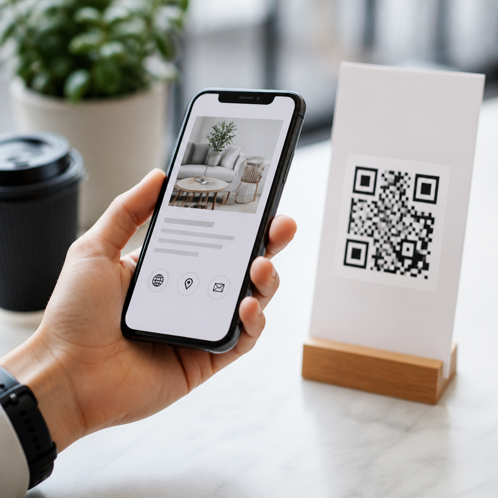
Mobile UX best practices for QR code landing pages determine whether a scan becomes a conversion or a bounce. A QR code landing page is the mobile-first destination opened immediately after someone scans a code on packaging, signage, menus, mailers, or in-store displays. Mobile UX means the usability, speed, readability, accessibility, and task completion quality of that destination on a phone. I have audited QR campaigns for retailers, restaurants, events, and B2B field teams, and the pattern is consistent: strong creative gets the scan, but friction on the landing page loses the result. Because most scans happen in distracted environments, the page must load fast, explain value instantly, and help a user finish one clear action with minimal effort. This matters for lead generation, coupon redemption, app downloads, support flows, product education, and attribution. It also matters because QR traffic behaves differently from traditional mobile traffic: users arrive with high intent but low patience, often on variable networks and with one hand on the device.
The core challenge is context matching. People scan from a poster while walking, from a table tent while eating, or from packaging in a store aisle while comparing products. They expect continuity between the physical code and the digital page. If the code promised a menu, users should not land on a generic homepage. If the code is on a product box, the page should surface setup instructions, warranty registration, and troubleshooting, not force site navigation. Best practices for mobile UX start with direct relevance, then extend into technical execution, content structure, forms, trust cues, and measurement. The most effective QR landing pages reduce cognitive load, preserve intent, and remove every unnecessary tap. Done well, they feel like the natural second half of the object someone just scanned.
Match the landing page to scan intent and physical context
The first best practice is simple but often ignored: create a destination for the exact reason the code exists. In practice, this means using dedicated QR code landing pages rather than sending all scans to a homepage or broad category page. A restaurant table QR should open a menu section optimized for immediate browsing, with categories, prices, allergen notes, and a prominent order or call-server option. A conference badge QR should open a lightweight profile or scheduling page, not a dense corporate site. I have seen conversion rates improve immediately when teams replace generic destinations with purpose-built pages that mirror the language printed next to the code.
Message match is the mechanism behind that improvement. The headline, imagery, offer, and call to action should reflect what users saw before scanning. If the code says “Get 15% off today,” the landing page should repeat that offer near the top and explain redemption terms plainly. If the code says “Watch setup in 2 minutes,” the first screen should present the video and quick-start steps. This consistency reduces uncertainty, which lowers abandonment. It also helps users who scan in bright sunlight or while moving because they can confirm instantly that they reached the right place.
Prioritize speed, stability, and mobile performance fundamentals
Performance is not cosmetic; it is part of usability. QR scans often happen on cellular connections, inside stores with weak reception, or in venues where networks are congested. Every added script, oversized image, cookie banner delay, or layout shift increases the chance of a bounce. The baseline standard should be a fast, stable page measured with Google PageSpeed Insights, Lighthouse, and Chrome DevTools. Largest Contentful Paint should be kept low through compressed hero images, modern formats such as WebP or AVIF, server caching, and minimized render-blocking resources. Cumulative Layout Shift should be controlled by reserving space for media and embedded content. Interaction delays should be reduced by limiting heavy JavaScript and third-party tags.
In QR campaigns, the speed requirement is stricter than on many normal mobile pages because intent decays quickly. A user standing in a shop aisle will not wait through a bloated analytics stack and autoplay video. When I optimize these pages, I remove unnecessary site chrome, delay nonessential scripts, and host campaign assets close to users through a content delivery network. That usually produces visible gains. A lightweight landing page with one compressed hero image, concise copy, and one conversion path consistently outperforms a full site template on scans. Technical discipline directly supports revenue, redemptions, registrations, and support completion.
Design the first screen for one-handed use and instant comprehension
The first mobile screen must answer three questions without scrolling: where am I, what do I get, and what should I do next? QR code landing pages perform best when the above-the-fold area contains a clear headline, short supporting text, a strong primary action, and, when relevant, one confirming visual. Avoid carousels, tiny links, and long introductory paragraphs. Most users do not need brand storytelling in the first five seconds. They need orientation and an obvious path forward.
Touch design is equally important. Buttons should be comfortably tappable, spaced to prevent accidental presses, and placed within natural thumb zones. Forms should use appropriate input types such as email, tel, and numeric keyboards. Sticky calls to action can help on longer pages, but only if they do not cover content or create visual noise. Typography should be legible outdoors: strong contrast, a base size that reads without zooming, and line lengths suited to small screens. Accessibility standards from the WCAG offer reliable guidance here, especially around contrast, focus states, and semantic labels. Accessible design improves outcomes for everyone, not only users with disabilities.
Structure content for scanning behavior, not desktop reading
QR visitors rarely read linearly. They scan the page, decide whether it is useful, and commit only after they see proof, instructions, or an offer. Content should therefore be layered. Start with the main value proposition, then add the most important details in descending order of urgency. Use concise paragraphs, clear section labels, and direct microcopy. If a user needs operating hours, return policy details, or setup steps, surface them quickly instead of burying them behind tabs and accordions. Hiding critical information increases pogo-sticking and support burden.
Video can work well on QR landing pages, especially for assembly, demos, or tutorials, but it should never block the primary task. Provide a transcript or bullet summary for users in silent environments. For ecommerce-related scans, include the details people use to decide fast: price, availability, variant selection, delivery timing, returns, and reviews. For service businesses, include location, hours, booking availability, and a call option. For support pages, put troubleshooting steps, model identifiers, and contact escalation near the top. Good content architecture turns a scan into a completed action because it respects how mobile users make decisions under time pressure.
Reduce form friction and choose the right conversion pattern
Many QR landing pages fail because they ask for too much too soon. On mobile, every field is a cost. If the goal is lead capture, ask only for the minimum data required to continue, then enrich later through CRM workflows. If the goal is coupon redemption, consider a tap-to-copy code or wallet save action before a full form. If the goal is contact, click-to-call, click-to-text, WhatsApp, Apple Maps, or Google Maps may outperform any form because they fit the user’s context. Matching the conversion pattern to the likely environment is one of the highest-leverage decisions in QR UX.
| Use case | Best mobile conversion pattern | Why it works after a QR scan |
|---|---|---|
| Restaurant menu | View menu with sticky order or call button | Supports fast browsing and immediate action at the table |
| Retail promotion | Tap-to-redeem coupon or wallet save | Reduces typing and preserves the offer instantly |
| Product setup | Short video plus step checklist | Solves the problem quickly in the moment of need |
| Event registration | Prefilled short form or one-tap sign-in | Lowers abandonment in busy, time-sensitive environments |
Autofill, address lookup, payment wallets, and social or email sign-in can substantially improve completion rates when implemented carefully. The tradeoff is privacy perception. Users who scan a code in public may be cautious if a page requests permissions or sensitive data immediately. Explain why information is needed, keep labels specific, and show progress on multi-step forms. Error handling should be inline and forgiving. Nothing kills mobile momentum faster than a long form that resets after one validation mistake.
Build trust with transparency, accessibility, and measurable feedback loops
Trust is especially important for QR traffic because users cannot inspect the destination before opening it. The page should reassure quickly through familiar branding, secure HTTPS delivery, a clean URL, and clear explanations of what happens next. If a code triggers a payment, registration, or download, say so upfront. If personal data is collected, link to a privacy notice near the action. Fake urgency, aggressive pop-ups, and interstitials erode confidence and hurt completion. So do redirects that bounce users through tracking domains before content appears.
Accessibility and measurement complete the system. Test pages on iPhone and Android, across Safari and Chrome, under real lighting and network conditions. Use GA4, Search Console where applicable, tag managers with restraint, and QR platform analytics to compare scans, landing page views, bounce rate, scroll depth, and conversion rate by placement. Add UTM parameters to distinguish packaging, signage, direct mail, and in-store displays. Then review session recordings or heatmaps from tools like Hotjar or Microsoft Clarity to see where thumb friction, hesitation, or rage taps occur. The main benefit of disciplined mobile UX is simple: more of the intent created by the QR code survives long enough to become action. Audit your current QR destinations, simplify the path, and test one improvement this week.
Frequently Asked Questions
What makes a good mobile UX for a QR code landing page?
A good mobile UX for a QR code landing page starts with reducing friction from the first second after the scan. Unlike a traditional webpage visit, a QR scan is highly intent-driven and highly fragile at the same time. The user is often standing in a store aisle, walking through an event, sitting at a restaurant table, or quickly checking a product package. That means the landing page has to load fast, explain itself immediately, and make the next action obvious without forcing the visitor to hunt for information. If the page feels slow, cluttered, confusing, or mismatched to what the QR code promised, people abandon it quickly.
The strongest QR landing pages are built mobile-first, not merely made responsive after the fact. They use clear headlines, concise copy, thumb-friendly buttons, readable text, strong visual hierarchy, and minimal distractions. The user should understand three things within moments: where they are, what value they get, and what to do next. Whether the goal is ordering food, redeeming an offer, viewing a product demo, downloading instructions, registering at an event, or contacting sales, that action should be prominent and easy to complete with one hand on a small screen.
Good mobile UX also depends on context alignment. The landing page should reflect the source of the scan. A code on packaging should lead to product-specific information, not a generic homepage. A code on a restaurant table should open directly to the menu or ordering flow, not force extra navigation. A code on event signage should connect instantly to schedules, maps, or check-in details. The less interpretation the visitor has to do, the better the experience and the higher the conversion rate.
Finally, strong mobile UX includes accessibility, trust, and performance. Text must be legible without zooming, forms should require minimal typing, tap targets should be large enough to use accurately, and the page should be secure and visually credible. In practice, a good QR code landing page feels immediate, relevant, and effortless. It respects the fact that scanning is a micro-moment, and it designs every element around helping the user finish their task quickly.
Why is page speed so important for QR code landing pages on mobile?
Page speed is one of the biggest conversion factors for QR code landing pages because the visitor has almost no patience buffer after scanning. In many cases, the scan happens in a real-world environment filled with distractions, limited connectivity, glare, noise, movement, or time pressure. If the page stalls, loads heavy assets, or displays content slowly, the user often exits before reading a word. That makes speed more than a technical metric; it is a direct part of the user experience and a major determinant of campaign performance.
Fast-loading landing pages create momentum. The user scans with a specific expectation, and a quick load confirms that expectation immediately. A slow page breaks that momentum and introduces doubt. People begin to wonder whether the code worked, whether their connection is weak, or whether the destination is worth waiting for. This is especially risky in environments like retail aisles, outdoor signage, trade shows, public transit ads, and restaurant tables, where attention is limited and interruption is common.
Improving speed usually comes down to disciplined page design. Keep the page lightweight. Compress images, avoid unnecessary scripts, reduce redirects, limit autoplay media, and prioritize above-the-fold content. If a QR code is sending users to a general-purpose web page with bloated assets, too many trackers, or desktop-oriented layouts, the campaign is likely losing conversions before the message even appears. In contrast, a purpose-built landing page that loads quickly over average mobile networks gives users confidence and keeps them moving toward the intended action.
Speed also affects usability indirectly. Faster pages feel easier, smoother, and more trustworthy. Form fields become less frustrating, buttons respond more predictably, and content appears in a natural sequence. For marketers and operators, this means page speed should be treated as part of the campaign strategy, not just a developer concern. When a scan is the top of the funnel, every extra second can cost measurable engagement, leads, orders, or sign-ups.
How should content be structured on a QR code landing page for mobile users?
Content on a QR code landing page should be structured for instant comprehension and easy action on a small screen. The most effective approach is to lead with the core value proposition and the primary next step, then support that action with only the information needed to build clarity and trust. Mobile users do not want to decode dense layouts or scroll through long introductions just to find the reason they scanned. The opening screen should immediately answer the user’s silent question: “What did this QR code bring me here to do?”
A strong structure usually begins with a clear headline, a short supporting sentence, and one prominent call to action. Below that, add only the most relevant supporting content, such as benefits, product details, menu sections, instructions, event information, pricing, or proof points. Break content into short sections with meaningful subheads, concise paragraphs, and adequate spacing. This makes the page easier to scan visually and reduces cognitive load. On mobile, spacing and hierarchy matter just as much as wording.
The order of content should reflect user intent from the physical touchpoint. For example, a QR code on product packaging should prioritize product details, usage guidance, ingredients or specs, and a direct buy or learn-more action. A code on a direct mail piece might lead with the offer, deadline, and redemption button. A code used by B2B field teams may need a fast path to a brochure, demo request, or contact form. Generic content structures underperform because QR scanning is usually tied to a very specific purpose.
It is also important to keep forms and decision points minimal. If users must choose among too many links, navigate multiple menu levels, or fill out long forms, drop-off increases. Good mobile content structure reduces choice paralysis by guiding attention intentionally. Every section should earn its place. If a content block does not help the visitor understand, trust, or complete the intended action, it is probably getting in the way. In QR experiences, simplicity is not about saying less; it is about organizing information so the user can act without friction.
What are the most common mobile UX mistakes that hurt QR code campaign performance?
One of the most common mistakes is sending users to a homepage instead of a dedicated landing page. This creates unnecessary navigation and forces visitors to search for the information they expected to receive immediately after scanning. A QR code is already a deep-linking opportunity, so wasting that intent on a broad, unfocused destination often leads to bounces. Users should not have to tap through menus or guess which section matches the context of the code they scanned.
Another major issue is poor mobile readability. Tiny text, cramped layouts, weak contrast, cluttered design, and buttons that are difficult to tap all make the experience harder than it needs to be. These problems are especially damaging when the audience is standing, moving, or viewing the page in poor lighting conditions. QR landing pages should be designed for real-world use, not ideal desktop review conditions. If visitors need to pinch, zoom, rotate, or re-read basic content, the page is creating friction at exactly the wrong moment.
Heavy pages are also a recurring problem. Large hero videos, oversized image files, excessive pop-ups, cookie overlays that consume the screen, intrusive chat widgets, and third-party scripts can all slow down the experience or block the primary task. In many audits, the issue is not that the campaign message is weak; it is that the mobile journey is overloaded with features that have little relevance to the scanning context. For QR campaigns, utility usually outperforms visual complexity.
Other common mistakes include asking for too much information too soon, using vague calls to action, failing to match the landing page content to the QR code’s promise, and ignoring accessibility basics. A scan that promises a coupon should not land on a general product category page. A code meant for ordering should not require account creation before showing the menu. A form should not demand ten fields when three would do. These failures damage trust and add friction. The highest-performing QR landing pages are the ones that remove barriers, respect the user’s time, and stay tightly aligned with the intent behind the scan.
How can businesses measure and improve the mobile UX of QR code landing pages?
Businesses should measure mobile UX for QR code landing pages by connecting user behavior to the specific outcome the scan is supposed to produce. Start with the basics: scan volume, landing page visits, bounce rate, time to load, call-to-action click rate, form completion rate, purchase rate, and overall conversion rate. But do not stop at top-line metrics. The most useful insights often come from segmenting by device type, operating system, traffic source, location, campaign placement, and time of day. A code on packaging may perform very differently from a code on in-store signage, even when both lead to similar content.
Behavioral analysis is especially helpful. Scroll depth, rage taps, drop-off points, abandoned forms, and repeated clicks on non-interactive elements can reveal where mobile friction is happening. Session recordings and heatmaps, when used responsibly and with privacy compliance in mind, can show whether users are struggling with layout hierarchy, unclear buttons, slow-loading sections, or hidden content.





