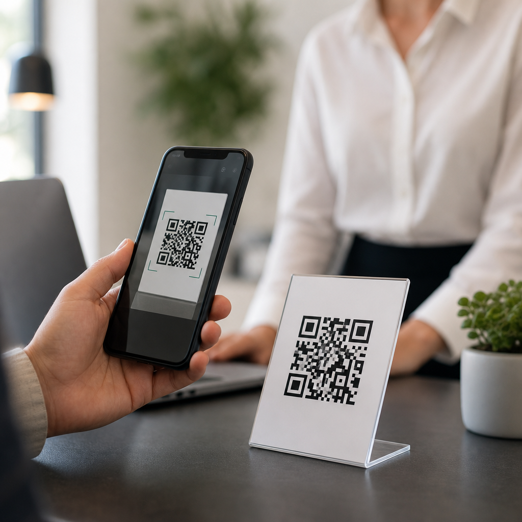
Low-contrast QR codes fail for a simple reason: scanners need a clear difference between dark modules and the light background, and when that contrast drops, detection speed and accuracy collapse. In practice, I see this most often on branded packaging, event signage, restaurant menus, labels, and direct mail where design choices overpower scan reliability. A QR code is a two-dimensional matrix barcode made of square modules, finder patterns, timing patterns, alignment marks, and a quiet zone around the symbol. “Low contrast” means the luminance difference between foreground and background is too small for a phone camera or industrial imager to separate those elements consistently. This matters because a code that looks elegant but scans poorly wastes traffic, breaks customer journeys, and creates measurable losses in conversions, check-ins, payments, or support deflection. The fix is rarely mysterious. You improve contrast, protect the quiet zone, choose the right error correction level, size the symbol correctly, and test under real lighting and print conditions before release. This technical FAQ hub explains the causes, the fastest fixes, and the standards-based checks that prevent repeat failures.
What causes a QR code to have low contrast?
Low contrast usually comes from color choices, print processes, surface materials, or environmental lighting. The safest QR code uses a dark foreground on a light matte background, typically black on white. Problems begin when teams invert that relationship, use mid-tone colors, apply gradients, print on metallic stock, laminate with gloss, or place the code over photography. Smartphone cameras do not read color the way designers view a mockup on a calibrated monitor. Most decoding pipelines convert the image to grayscale, then search for geometric patterns and threshold the image into light and dark regions. If navy sits on black, pastel gray sits on cream, or red sits on orange, the grayscale separation may become too weak even when the colors look distinct to the human eye. I have also seen thermal printers, flexographic presses, and low-ink desktop printers reduce edge sharpness, which compounds contrast problems by softening module boundaries.
Lighting can make a borderline code fail. Under warm retail lighting, outdoor glare, or dim restaurant interiors, cameras raise ISO, introduce noise, and struggle to distinguish modules. Reflective packaging adds specular highlights that wash out sections of the symbol. Curved bottles distort module geometry, while textured paper creates mottling that reduces apparent contrast. Another frequent cause is overbranding: logos placed too large in the center, colored frames that eat into the quiet zone, and decorative patterns inside modules. ISO/IEC 18004 defines the structure of QR Code symbols, and the standard is unforgiving about core readability rules. Error correction helps restore damaged data, but it cannot compensate for a code that never gets detected cleanly in the first place.
How do you fix a low-contrast QR code quickly?
The fastest fix is to rebuild the symbol using a near-black foreground and a white or very light solid background, then retest on several phones. If you need a brand color, use it only after checking luminance contrast, not just visual preference. In practical terms, dark blue, dark green, or deep maroon can work if the background is bright and uniform, but pale colors should be avoided for foreground modules. Increase the quiet zone to at least four modules on all sides. Remove shadows, gradients, transparency, and background images. If the code sits on packaging, add a white knockout box beneath it instead of printing directly over artwork. These changes solve most scan failures within minutes.
Next, confirm symbol size. A common field rule is scanning distance divided by ten for the minimum code width, though application, camera quality, and data density affect the result. For a poster scanned from two feet away, a much larger symbol than a business card code is needed. Reduce encoded content if possible. Dynamic QR codes are useful here because they shorten the visible payload and often allow a simpler, less dense symbol. Finally, export the artwork as vector, not a compressed raster image, and print a proof on the actual substrate. A code that scans on a laptop screen may fail after ink spread, varnish, trimming, or lamination.
Which technical settings matter most for reliable scanning?
Four settings have the greatest impact: contrast, quiet zone, size, and error correction. Contrast determines whether the scanner can separate modules from the background. Quiet zone gives the decoder a clean boundary to locate the symbol. Size affects whether individual modules remain resolvable at the intended scan distance. Error correction, available in levels L, M, Q, and H, allows recovery from partial damage or obstruction. Designers often assume the highest error correction level is always best, but that raises module count and can make small printed codes harder to scan. The right choice depends on use case. A clean digital display may work well at M, while a code on corrugated packaging with possible abrasion may justify Q or H.
Data density is another overlooked factor. Long URLs, multiple tracking parameters, vCard payloads, and Wi-Fi credentials create denser symbols with smaller modules. I routinely advise teams to remove unnecessary query strings, use a short redirect, and simplify payloads before trying exotic design fixes. Rendering quality also matters. Vector files such as SVG, EPS, or PDF preserve crisp module edges; low-resolution PNGs can introduce anti-aliasing or blur. For print, verify that the module size survives the press process. Flexo on porous stock may gain dot spread, while thermal transfer labels may show edge roughness if the printhead is worn. In both cases, stronger contrast and generous sizing improve tolerance.
How do color, materials, and placement affect QR code performance?
Color choices should be judged by brightness difference, not branding alone. A dark code on a light matte area consistently outperforms stylized combinations. Metallic inks, foil, gloss varnish, holographic labels, and clear packaging create reflections that interfere with autofocus and thresholding. On glass, windows, and acrylic signs, background scenes can bleed through and destroy uniformity unless a solid backing layer is added. Placement matters just as much. Codes near folds, seams, bottle shoulders, zipper pouches, or curved corners distort easily. Codes printed too close to other graphics can lose their quiet zone even when the file itself looks correct.
| Issue | Why scanning fails | Best fix |
|---|---|---|
| Dark gray on black | Insufficient luminance separation after grayscale conversion | Use black or near-black on white |
| Code over a photo | Background detail breaks module detection and quiet zone | Add a solid white knockout area |
| Glossy laminate | Glare hides modules under bright light | Switch to matte finish or reposition lighting |
| Very small label code | Modules are too fine for the camera and print process | Increase size or reduce encoded data |
| Oversized center logo | Finder pattern balance and data area are compromised | Shrink logo and raise error correction carefully |
Real-world placement examples make the rule clear. On a takeaway coffee cup, the curved wall and sleeve seam can distort the symbol, so the best location is a flatter panel with a high-contrast patch. On warehouse labels, scanners often read at angles under harsh LEDs, so matte white labels with black codes outperform branded color stock. On restaurant tables, overhead spotlights create hotspots, so a printed tent card with a non-glare coating scans better than a laminated menu cover. These are not cosmetic details; they directly determine read rates.
How should you test and troubleshoot a QR code before launch?
Testing should simulate the exact conditions in which customers will scan. Start with multiple devices: recent iPhones, mid-range Android phones, and if relevant, dedicated handheld scanners. Test at different distances, under daylight, warm indoor light, and low light. Check first-scan success rate, not just whether the code works eventually. A code that requires three attempts is already underperforming. Print on final materials and finishes, then test after trimming, folding, or applying labels. If the code will live outdoors, test with glare and partial shadow. For packaging, test around the full circumference of the container because curvature varies by placement.
When a code fails, isolate variables one at a time. First place the same symbol on a plain white screen background. If it scans there, the issue is likely substrate, finish, or surrounding artwork. Next enlarge the code. If it starts working, module size or print gain is the problem. Then swap to black on white. If performance improves immediately, contrast was the root cause. Use verification and grading tools where possible. Many barcode verifiers measure print quality attributes such as symbol contrast and modulation, and while consumer phone scans are the final judge for many campaigns, objective grading helps catch borderline designs early. Teams managing broader technical FAQs should also link this hub to articles on QR code size, quiet zone requirements, dynamic versus static QR codes, print file setup, and why a code scans on screen but not in print.
What are the best practices to prevent low-contrast QR code problems?
Build prevention into your workflow. Set design rules that require dark-on-light contrast, a four-module quiet zone, vector export, and proofing on final materials. Keep encoded data short, preferably through a managed redirect. Document minimum sizes for labels, packaging, posters, and table signage based on scan distance. Avoid placing codes over images or reflective finishes unless a solid background panel is added. If branding requires color, approve only combinations that pass practical scan tests on common phones. In my experience, organizations that treat QR codes as functional infrastructure rather than decoration avoid most failures and reduce support tickets significantly.
The main takeaway is straightforward: low-contrast QR codes are fixable when you prioritize scanner perception over visual novelty. Strong luminance contrast, clean boundaries, appropriate size, realistic testing, and sensible materials produce dependable scans. Use this technical FAQ hub as your starting point, then review the related troubleshooting guides for sizing, quiet zones, print quality, and mobile scan behavior so every code you publish works the first time.
Frequently Asked Questions
What causes a QR code to have low contrast in the first place?
Low-contrast QR codes usually happen when design decisions reduce the visual separation between the dark modules and the light background. A QR code works because scanners quickly identify the square data modules, finder patterns, timing patterns, alignment patterns, and the surrounding quiet zone. When those dark and light areas are too similar in brightness, detection becomes slower and less reliable. This is especially common when brands replace black with mid-tone colors, print codes over photographs or textures, use glossy finishes that create glare, or place a dark code on a dark background simply because it matches the overall visual style.
In real-world use, low contrast often shows up on packaging, menus, product labels, posters, event signage, and direct mail pieces where aesthetics are prioritized over scan performance. Metallic inks, transparent overlays, gradients, and tinted backgrounds can all interfere with the scanner’s ability to distinguish the code structure. Even if the code looks attractive to the human eye, phone cameras and decoding software are far less forgiving. The core issue is simple: if the scanner cannot clearly separate the foreground modules from the background and preserve the quiet zone around the symbol, the QR code becomes harder to detect and decode consistently.
How do you fix a low-contrast QR code without completely ruining the design?
The best fix is to restore strong luminance contrast while keeping the branding intact. In practice, that usually means making the QR modules significantly darker than the background, simplifying the area behind the code, and protecting the quiet zone. A dark navy, charcoal, or deep brand color can often work well instead of pure black, as long as the background stays very light and clean. Likewise, an off-white or lightly tinted background can be acceptable if it remains clearly brighter than the modules and does not include patterns, shadows, or image detail that compete with the code.
If the design requires color, focus on brightness difference rather than just hue difference. Two colors can look distinct to people but still scan poorly if their tonal values are too close. A practical approach is to place the QR code inside a dedicated white or very light panel, badge, or box so it remains visually integrated while preserving readability. Avoid reversing the code unless thoroughly tested, avoid gradients across the modules or background, and do not let artwork intrude into the quiet zone. If a logo is added in the center, keep it modest in size and ensure the code has sufficient error correction to tolerate that customization. The goal is not to remove branding, but to make the code function first and decorate second.
What colors work best for QR codes, and which ones should be avoided?
The most reliable combination is still a very dark foreground on a very light background. Black on white remains the standard because it gives scanners the strongest possible contrast and the fastest detection. However, many other combinations can work well, including dark blue on white, dark green on cream, or deep brown on a pale neutral background. What matters most is not the color name but the contrast in brightness between the modules and the background. Scanners are looking for structure and contrast, not brand elegance.
Colors that should generally be avoided include light foregrounds on light backgrounds, dark foregrounds on dark backgrounds, metallic finishes, reflective inks, and color pairings with weak tonal separation. Pastels, medium grays, low-opacity overlays, and gradients are common problems. Red can be tricky depending on lighting and camera processing, and yellow or orange often fails as a foreground because it is too light. Transparent or patterned backgrounds also create issues because they interfere with the quiet zone and introduce visual noise. If there is any doubt, test the code on multiple phones, under multiple lighting conditions, and at the actual printed size before approving production.
How can you test whether a low-contrast QR code is still scannable?
Testing should be done in realistic conditions, not just on a designer’s screen. Start by scanning the code with several different smartphones, including both iPhone and Android devices, using native camera apps as well as common third-party scanners if relevant. Test at the final display size, from normal user distance, and under different lighting conditions such as bright indoor light, low light, angled light, and daylight. If the code is printed on glossy packaging or signage, test for glare and reflections because these often reduce effective contrast even when the artwork itself looks acceptable.
You should also test across multiple production samples if the code is being printed, since ink gain, material texture, substrate color, and press variation can all affect contrast. Pay attention not just to whether the code scans eventually, but how quickly and consistently it scans. A code that works only after several attempts is not production-ready. It is also smart to verify that the quiet zone is intact, the finder patterns are crisp, and any logo or decorative element has not damaged the symbol structure. For high-value campaigns, packaging runs, or public signage, using a formal QR code verification tool or print quality assessment process can help catch borderline contrast problems before they reach customers.
Besides color contrast, what other design issues can make a QR code hard to scan?
Low contrast is one of the biggest problems, but it is far from the only one. A QR code can also fail because it is too small for the intended scanning distance, printed with blurry or distorted edges, stretched out of proportion, cropped too tightly, or placed without an adequate quiet zone around it. The quiet zone is especially important because scanners use that clear border to distinguish the code from nearby text, graphics, and background clutter. If the code is crowded by other elements, even a high-contrast symbol may become harder to detect.
Other frequent issues include excessive stylization, poorly sized embedded logos, heavy error introduced by decorative shapes, curved placement on bottles or flexible packaging, and low print quality on textured or absorbent materials. Surface conditions also matter: glare, shadows, wrinkles, folds, and transparent laminates can all interfere with scanning. In digital contexts, downsampling, compression artifacts, and tiny on-screen placement can create similar problems. The safest approach is to treat the QR code as a functional machine-readable element first. Keep the structure sharp, preserve the quiet zone, maintain strong contrast, choose an appropriate size, and test the final version in the exact environment where people will actually scan it.