Why does my QR code not work on print? In most cases, the failure comes down to a small set of technical issues: the code is physically too small, the contrast is too low, the quiet zone is missing, the print process has distorted the modules, or the linked content is broken. A printed QR code must survive real-world conditions that digital images never face, including paper texture, ink spread, glare, distance, camera autofocus, and wear. When one of those factors interferes with how a phone camera detects the square grid, scanning becomes slow, inconsistent, or impossible.
A QR code is a two-dimensional barcode made of black and white modules arranged in a square matrix. Smartphones read the finder patterns in three corners, detect the module grid, and decode the stored data or destination URL. Print adds another layer of complexity because the code is no longer displayed with perfect pixels and backlit contrast. Instead, it is reproduced through ink, toner, varnish, paper stock, and finishing steps that can alter the geometry. I have seen codes that worked perfectly in a PDF fail after being reduced by a designer, printed on uncoated stock, and placed behind reflective lamination.
This matters because printed QR codes are often the last step between attention and action. They appear on packaging, menus, flyers, posters, direct mail, event signage, retail displays, instruction sheets, and product labels. If the code fails, the customer does not usually try to diagnose it; they simply move on. That means wasted print spend, lower campaign response, weaker attribution, and avoidable support requests. The good news is that most print failures are predictable and preventable when you understand the technical constraints and test against them before production.
Start with the most common causes of print QR code failure
The fastest way to troubleshoot a printed QR code is to check the highest-probability causes first. In production work, I begin with scan destination, size, contrast, quiet zone, file format, and placement. If the URL is wrong, redirected badly, blocked by a captive page, or returns a 404, the code may technically scan while still appearing broken to the user. If the print size is too small for the intended scanning distance, many phone cameras will struggle to lock focus or resolve the modules accurately.
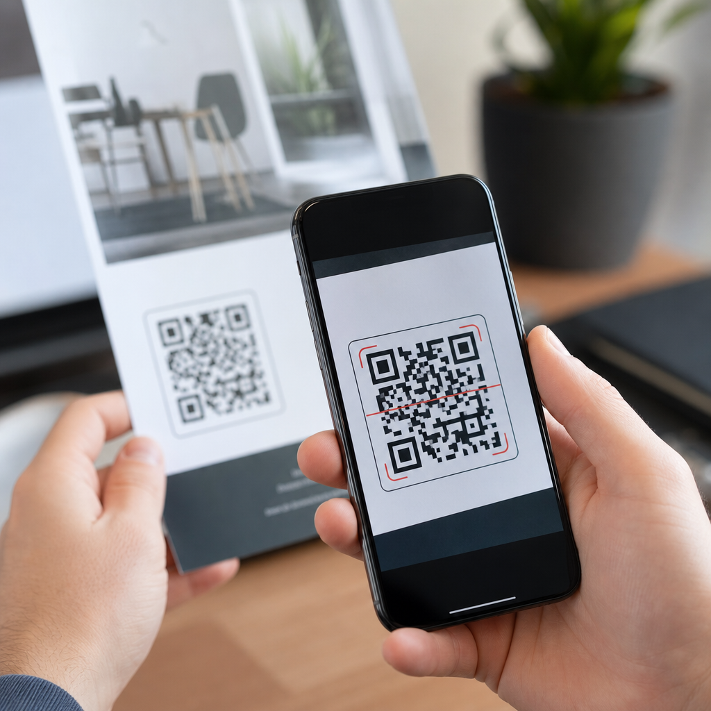
Contrast must be strong and predictable. Dark modules on a light background are the standard because scanners look for clear luminance differences. Reversed codes, pastel combinations, metallic inks, transparent backgrounds, and busy imagery behind the code reduce detection reliability. The quiet zone, which is the empty margin around the code, is equally important. As a rule, keep at least four modules of clear space on all sides. When logos, borders, text, or design elements crowd that edge, many readers fail before decoding even begins.
File quality also causes frequent issues. Vector formats such as SVG, EPS, and PDF preserve the module edges cleanly at any size, while low-resolution raster files can blur during scaling. Designers sometimes export a code from a web tool as a small PNG, then enlarge it for print, which softens the edges and introduces anti-aliasing. Another recurring problem is placing a valid code on a fold, curve, seam, or corner of packaging where the geometry becomes physically warped. A QR code should sit on the flattest practical area.
How print size, scan distance, and resolution affect readability
Size is the first technical factor to verify because it sets the tolerance for every other variable. A practical baseline for many print jobs is at least 0.8 x 0.8 inches, roughly 2 x 2 centimeters, for simple URLs scanned at close range. Larger is better when the environment is uncontrolled. Posters, shelf talkers, transit ads, and window signage need far larger codes because the user scans from farther away. A reliable field rule is a scan distance to code size ratio of about 10:1, so a code meant to be scanned from 10 feet away should be roughly 1 foot tall.
Resolution matters differently for vector and raster artwork. Vector codes are preferred because they remain crisp during resizing and export. If you must use raster, keep the source high resolution and avoid resampling. For commercial print, 300 DPI at final size is a minimum baseline, but higher effective resolution is often beneficial for smaller codes because each module needs a clear edge. What breaks performance is not only low DPI but edge smoothing from design software, JPEG compression artifacts, and ink gain that fills in white spaces between modules.
| Factor | Recommended baseline | What goes wrong if ignored |
|---|---|---|
| Print size | At least 0.8 inches for close scans | Camera cannot resolve modules |
| Quiet zone | 4 modules clear on each side | Reader cannot isolate the symbol |
| Color contrast | Dark foreground on light background | Detection becomes inconsistent |
| File format | SVG, EPS, or PDF vector output | Blurred edges after scaling |
| Placement | Flat, non-reflective surface | Warping and glare block scans |
Complexity affects size requirements too. A short URL encoded directly creates fewer modules than a long URL with tracking parameters, which means larger individual squares at the same overall dimensions. Dynamic QR codes often help because the printed code can hold a short redirect URL while destination parameters are managed behind the scenes. That reduces density and improves print tolerance. When someone asks why one small code scans and another does not, the answer is often that the failing code stores much more data in the same physical space.
Design mistakes that break QR codes in print production
Many printed QR code failures are introduced during design rather than generation. The most common mistake is decorating the code beyond what the error correction can realistically support. Adding a center logo, rounding modules, changing finder patterns, applying gradients, or using brand colors can work, but every change consumes reliability. Error correction levels L, M, Q, and H allow increasing amounts of damage recovery, with H supporting the most redundancy, yet that redundancy also increases code density. In print, dense stylized codes often become less forgiving than plain codes at larger sizes.
Background interference is another major problem. A QR code placed over photography, texture, or patterned color fields may look attractive on screen while failing in print because the camera sees false edges. Transparent knockouts can also produce unexpected results when the substrate color shifts between batches. On packaging presses, registration drift can create halos or misaligned underprints that soften the module boundaries. If the code is important, isolate it in a solid light box and protect the quiet zone from every surrounding graphic element.
Finishing choices matter more than many teams expect. Gloss coatings, foil, embossing, spot UV, and shrink sleeve distortion can all interfere with scan performance. I have tested codes on curved bottles where the same artwork scanned on the flat proof but failed on the applied label because the shrink process pinched the grid. Likewise, black printed as a rich CMYK build can produce fuzzy edges compared with a clean single-ink approach. For mission-critical applications, ask the printer about dot gain, substrate behavior, and whether a press proof can be scanned under typical lighting.
Printing, testing, and destination checks before launch
Testing should happen in stages. First, verify the destination with multiple devices before any printing. Confirm that the URL resolves quickly, uses HTTPS, and does not trigger certificate warnings, broken redirects, app-store dead ends, or region restrictions. If the landing page is mobile hostile, users may think the QR code failed even after a successful scan. Second, print the code at final size on the actual or closest possible stock. A code that scans from a desktop laser print may behave differently on porous paper, corrugated board, or glossy laminated card.
Third, test in realistic conditions. Use both iPhone and Android devices, current and older models, native camera apps, and at least one dedicated scanning app. Check bright daylight, indoor office lighting, warm retail lighting, and low-light environments. Evaluate scan speed, not just pass or fail. A code that requires several seconds, multiple angles, or perfect hand stability is not production ready. For signage, test from the intended approach distance and angle. For mailers or brochures, test with the item held naturally in the hand rather than laid flat under ideal conditions.
Finally, build a repeatable troubleshooting workflow. Confirm the encoded data, inspect the quiet zone, measure final dimensions, review contrast, verify vector output, and compare the printed piece with the approved proof. If the issue appears only after press, inspect for ink spread, trapping, registration error, or finishing distortion. If the code scans but the campaign underperforms, audit the landing experience and analytics tagging. A working QR code is not merely decodable; it is easy to notice, easy to scan, and connected to a fast, mobile-friendly destination that fulfills user intent.
What this technical FAQ hub should help you solve next
This page is the hub for technical QR code troubleshooting, so it should guide readers toward the exact failure mode they are facing. The key questions are straightforward: Is the QR code itself valid? Is it large enough for the intended distance? Does it have strong contrast and a proper quiet zone? Was it exported and printed without blur or distortion? Is the destination fast, secure, and mobile friendly? If you answer those questions methodically, you can diagnose most print failures without guesswork.
The biggest benefit of understanding printed QR code performance is prevention. Small production choices—using vector artwork, leaving four modules of clear margin, avoiding reflective finishes, shortening the encoded URL, and testing on the actual substrate—eliminate most failures before a job goes live. That protects campaign response, customer trust, and print budget. If you manage packaging, signage, direct mail, or retail materials, use this hub as your starting point, then review each related troubleshooting guide in your technical FAQ library before approving the next print run.
Frequently Asked Questions
Why does a QR code work on screen but fail when printed?
A QR code that scans perfectly on a phone, laptop, or proofing PDF can still fail once it is printed because print introduces physical variables that do not exist in digital display. On screen, the code is shown with sharp edges, strong contrast, ideal lighting, and no surface texture. In print, the camera has to interpret the code through ink spread, paper grain, glare, folds, motion blur, viewing distance, and autofocus limitations. Even a technically valid QR code can become difficult to read if the modules fill in slightly during printing, if the white space around the code is too tight, or if the final size is too small for the intended scanning distance.
Another common reason is that the printed version is not an exact reproduction of the original file. Designers may resize it disproportionately, export it at low resolution, place it over a colored background, or convert it through a process that softens edges. If the linked destination is also broken, slow, or blocked on mobile devices, users may assume the QR code itself does not work when the real problem is the content behind it. The safest approach is to treat print as a separate testing environment: verify the physical size, preserve a proper quiet zone, use strong black-on-white contrast, and scan the actual printed piece under normal lighting before approving production.
How small is too small for a printed QR code?
Physical size is one of the biggest reasons printed QR codes fail. If the code is too small, a phone camera cannot clearly separate the individual modules, especially from a normal handheld scanning distance. As a practical baseline, many printed QR codes should be at least around 2 x 2 cm to 3 x 3 cm, though the right size depends on the amount of encoded data, the error correction level, the print quality, and how far away people are expected to scan it. A simple short URL printed on smooth packaging may scan at a smaller size than a dense code on textured paper or a poster meant to be scanned from several feet away.
A useful rule is that scanning distance and code size are connected. The farther away a person stands, the larger the QR code needs to be. If someone must scan from arm’s length, a modest code may work. If the code is on a wall sign, storefront window, event banner, or product display, it must be much larger so the camera can resolve it quickly. Small codes also become more vulnerable to print gain, where ink slightly expands and closes up the tiny spaces that scanners rely on. If you want reliability, do not design to the smallest possible size. Print a real sample at full size, test it on multiple phones, and increase the dimensions if scanning takes more than a second or two under ordinary conditions.
What is a quiet zone, and why does it matter so much in print?
The quiet zone is the empty margin around the QR code, and it is essential for scanner recognition. Phones do not just read the black modules themselves; they first need to detect where the code begins and ends. If text, borders, images, patterns, or background graphics sit too close to the code, the scanner may struggle to isolate it from the surrounding design. In print, this problem becomes even more serious because physical imperfections already make decoding harder. Without enough clean space around the symbol, even a well-printed code can become unreliable.
In most cases, the quiet zone should be at least four modules wide on all sides. That means the clear margin should scale with the QR code itself, not be added arbitrarily. Designers sometimes crop too tightly, place the code inside a decorative frame, or let background artwork bleed into the edges. Those choices may look polished visually but often reduce scan performance. For print, keep the area around the code plain, uncluttered, and high contrast. If you want branding, place it nearby rather than directly against the code’s perimeter. Preserving the quiet zone is one of the simplest ways to improve reliability without changing the destination or the code content.
Can paper, ink, and printing method really affect whether a QR code scans?
Yes, absolutely. Print production has a major impact on QR code performance. Different papers absorb ink differently, which changes edge sharpness and contrast. Uncoated paper can allow more ink spread than coated stock, making small modules blur together. Glossy finishes can introduce glare, especially under overhead lighting, which makes it harder for a phone camera to lock focus and distinguish dark and light areas. Low-quality printing, misregistration, dot gain, banding, or compression artifacts can all distort the geometry of the code enough to reduce readability.
The printing method matters as well. A code produced by high-resolution digital or offset printing usually performs better than one reproduced through poor photocopying, low-end thermal transfer, or repeated generation loss. Curved surfaces, folds, seams, wrinkles, and textured packaging create additional challenges by physically warping the square grid. Even if the file is perfect, the final object may not be. That is why proofing on the actual substrate is so important. Test the code on the same material, with the same finish, at the final production size. Scan it in typical real-world conditions, not just under ideal office lighting. A QR code is only successful if the printed artifact remains readable where customers actually encounter it.
What should I check if the printed QR code looks fine but still does not open the right content?
If the code appears clear and scans inconsistently or opens the wrong destination, the issue may be with the encoded content rather than the printed symbol. Start by checking the URL or data embedded in the QR code. A typo, broken redirect, expired landing page, removed campaign link, or mobile-blocked destination can make a perfectly scannable code seem defective. It is also possible that the QR code points to a long, complex URL that generated a denser symbol than necessary, making the print less forgiving. Using a short, clean destination often improves both scan reliability and campaign management.
You should also verify that the destination works quickly on mobile devices, over cellular connections, and without requiring special app permissions or login steps. Some QR codes technically scan but lead users to slow pages, dead links, certificate warnings, or content that is not optimized for phones. In those cases, users experience failure even though the camera read the code correctly. Before sending anything to print, test the full journey: scan the physical sample on several devices, confirm the destination loads correctly, ensure redirects behave properly, and monitor the live link after distribution. A printed QR code is not just an image; it is a complete offline-to-online pathway, and every step has to work for the user experience to feel seamless.