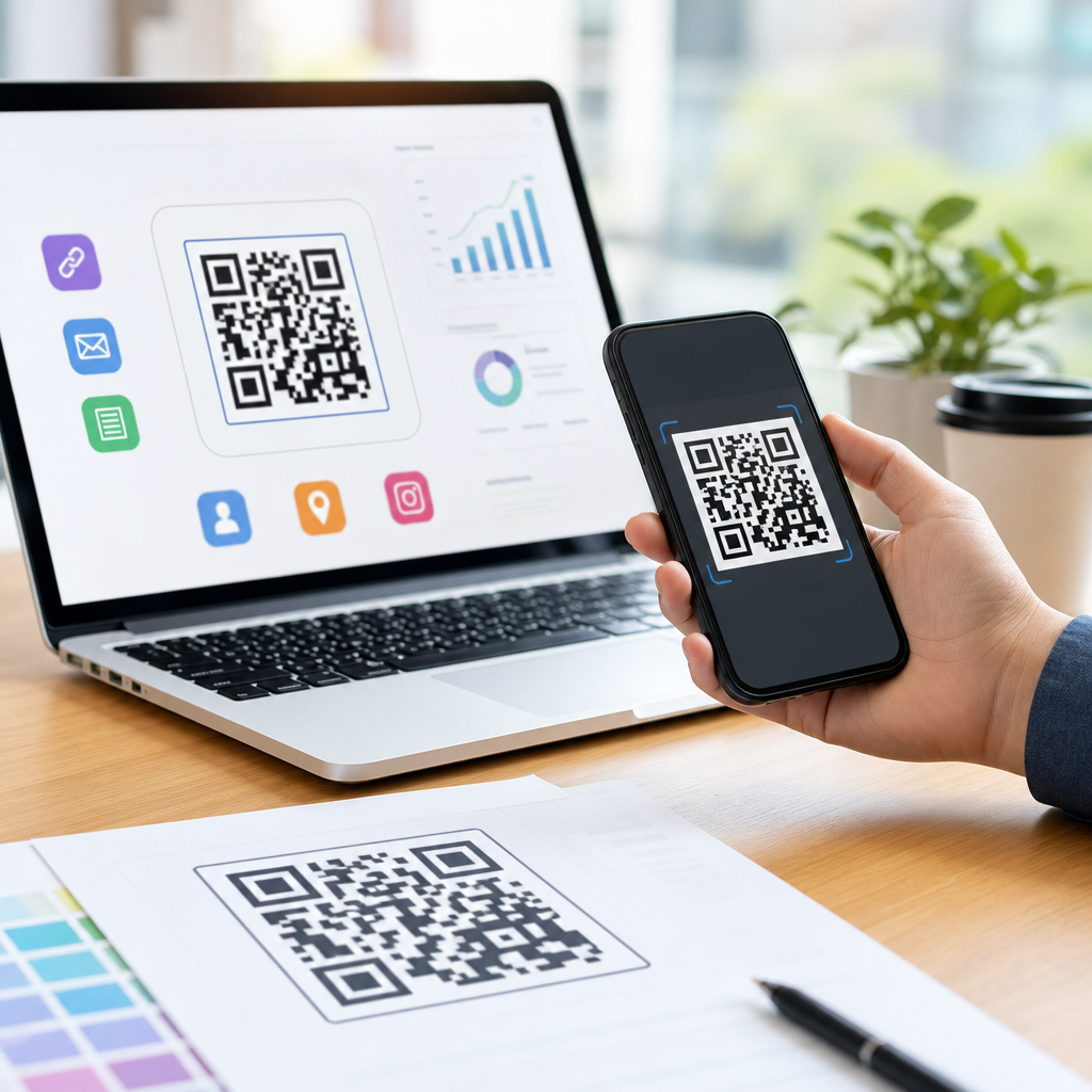
Creative QR code design ideas that work balance visual appeal with dependable scanning, because a beautiful code that fails in the camera is not effective marketing. In the mobile-first campaigns I have helped launch for retailers, events, restaurants, and product teams, the best results came from designs built around function first, then shaped for brand recognition. A QR code, or Quick Response code, is a two-dimensional barcode that stores data such as a URL, payment prompt, menu, app link, vCard, Wi-Fi credential, or coupon. Designing effective QR codes means controlling contrast, size, error correction, quiet zone, destination, and placement so people can scan quickly on real devices in real conditions. This matters because mobile attention is short, print space is expensive, and every failed scan loses measurable intent. As a hub for creating mobile QR codes, this guide explains the design principles, creative treatments, technical standards, and testing methods that make custom QR codes both distinctive and reliable.
Start with scan reliability before styling
The first rule of QR code design is simple: scanners must identify the code faster than a person can lose patience. A standard QR code includes position markers in three corners, timing patterns, data modules, and a mandatory quiet zone around the symbol. If any of those elements are obscured, distorted, or crowded by nearby graphics, scan speed drops sharply. ISO/IEC 18004 defines the structure, and most commercial generators expose the variables that matter: version, module count, mask pattern, and error correction level. In practice, I rarely let designers alter the finder patterns beyond subtle color or shape adjustments, because those large corner elements are the anchors a camera uses first.
Contrast is the next nonnegotiable. Dark foreground on a light background still outperforms inverted or low-contrast combinations, especially under glare, on older phones, and in outdoor signage. Black on white is safest, but deep navy on cream or forest green on pale gray can work if luminance separation remains strong. Avoid metallic inks, glossy laminate over dense modules, and busy photographic backgrounds. If the campaign requires a background image, place the code inside a solid light container. Minimum size should be tied to viewing distance; a common field rule is about one inch of code width for every ten inches of scanning distance, though camera quality and print sharpness can justify adjustments. For posters and shelf displays, I test from the furthest realistic point where someone would attempt a scan, not just from arm’s length at a desk.
Use brand customization that respects the QR code anatomy
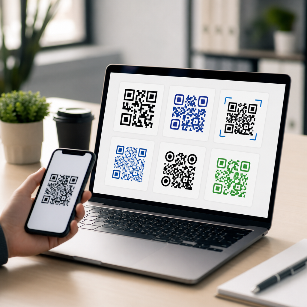
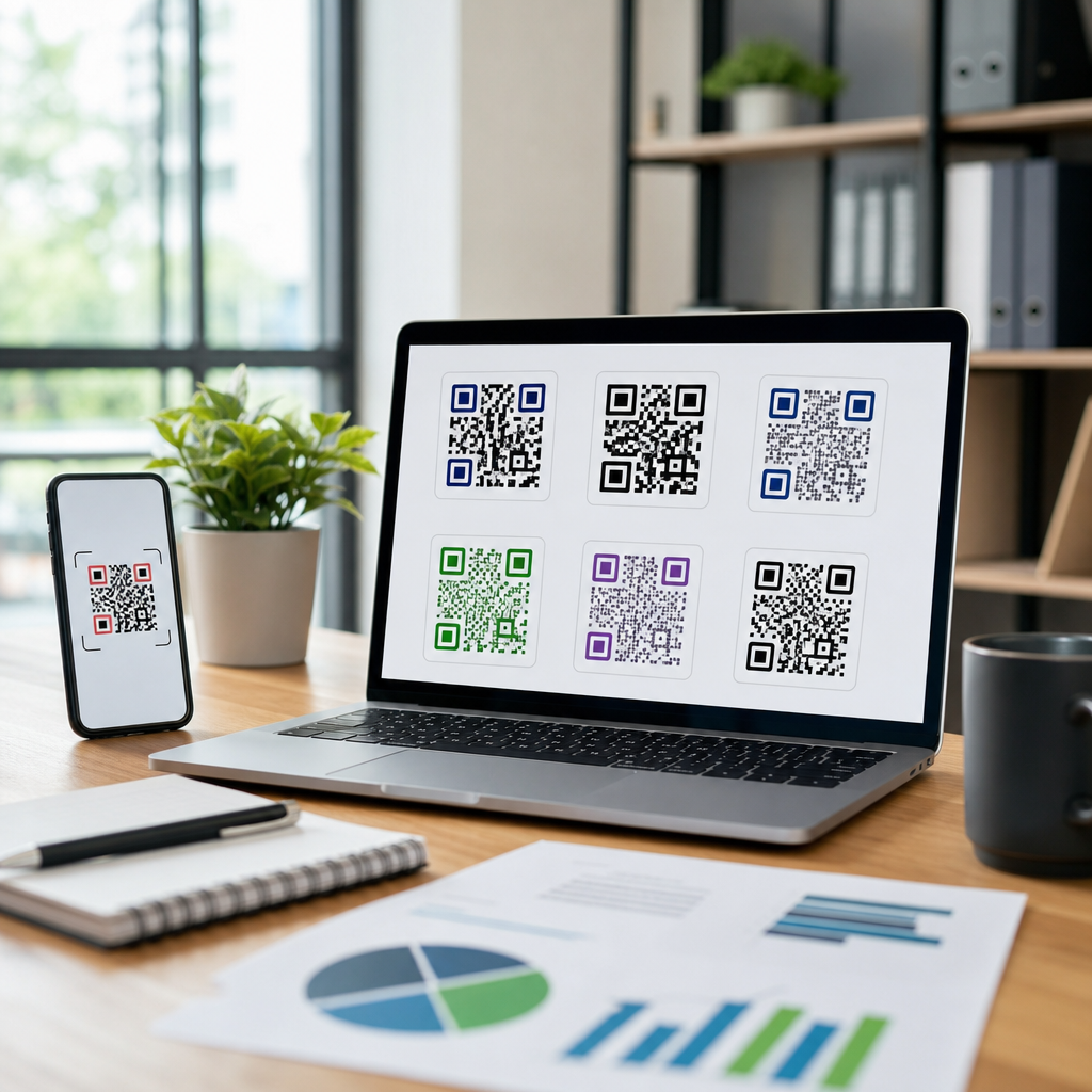
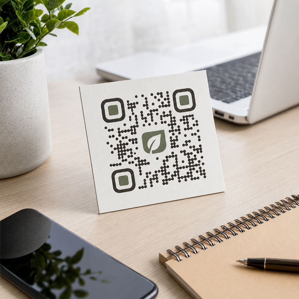
Creative QR code design works when customization enhances recognition without interfering with decoding. The most effective branded codes use restrained changes: rounded modules, softened eye shapes, a centered logo with protected clear space, and a palette borrowed from the visual identity. Error correction allows some redundancy, which is why a small logo can sit in the center, but that redundancy is not permission to cover large areas. Level H error correction provides the greatest recovery potential, yet it also increases density, which can make smaller codes harder to scan when printed. That tradeoff matters on packaging, bottle neck tags, and business cards where physical size is limited.
I advise teams to think in layers. First, choose the destination and estimate data length. Second, generate a dynamic short URL when possible so the module pattern stays simpler than a long static link. Third, apply visual changes incrementally, testing after each step. For example, a coffee chain can place a small bean icon in the center, use espresso-brown modules, and frame the code with a cream badge saying “Scan for today’s roast.” That is creative, on-brand, and still functional. What usually fails is the opposite approach: turning modules into tiny illustrations, removing the quiet zone to save space, or matching the foreground too closely to the packaging color because the mockup looked elegant on a calibrated monitor.
Match the QR code style to the use case
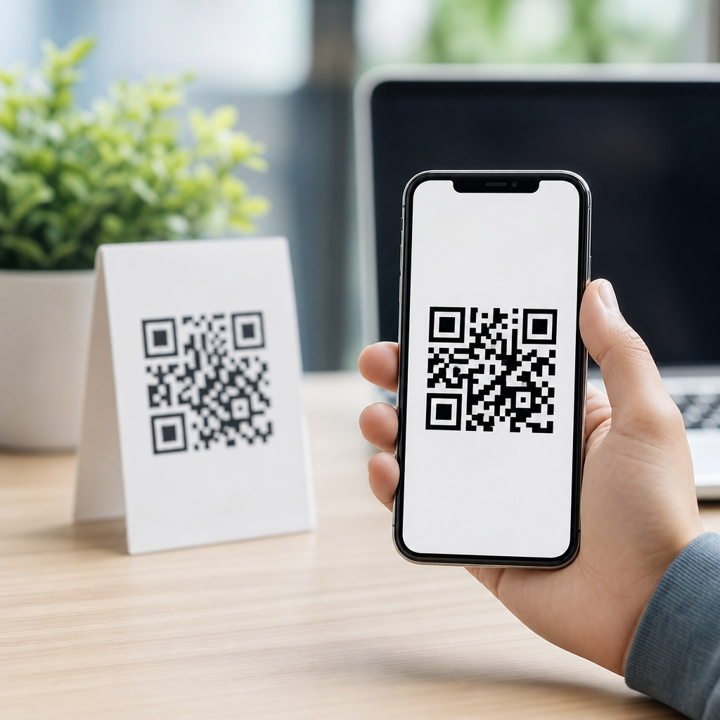
Different contexts demand different QR code design choices. On product packaging, durability and first-scan success matter more than visual novelty, because lighting in stores is inconsistent and curved surfaces distort geometry. A code on a snack pouch should sit on the flattest panel available, away from folds, seams, nutrition text, and opening notches. For restaurant table tents, speed is the priority; guests often scan one-handed in dim ambient light, so larger codes with high contrast and a short call to action perform best. Event signage benefits from distance-readable design, meaning generous size, uncluttered placement, and a landing page tailored for quick mobile action such as registration, map access, or agenda download.
In direct mail, personalized QR codes can connect offline outreach to measurable digital behavior. Real estate agents use them to open a property tour page; museums use them to launch audio guides; SaaS teams use them on trade-show badges to exchange contact details with a vCard or lead form. The design should signal the reward clearly. People scan more when the outcome is explicit: “View floor plan,” “See ingredients,” “Pay table tab,” or “Add to Apple Wallet.” Generic prompts such as “Scan me” underperform because they force the user to guess. Effective design includes not only the symbol itself but also the nearby microcopy, destination promise, and surrounding hierarchy that tells a user why the scan is worth the effort.
Apply technical settings that improve performance
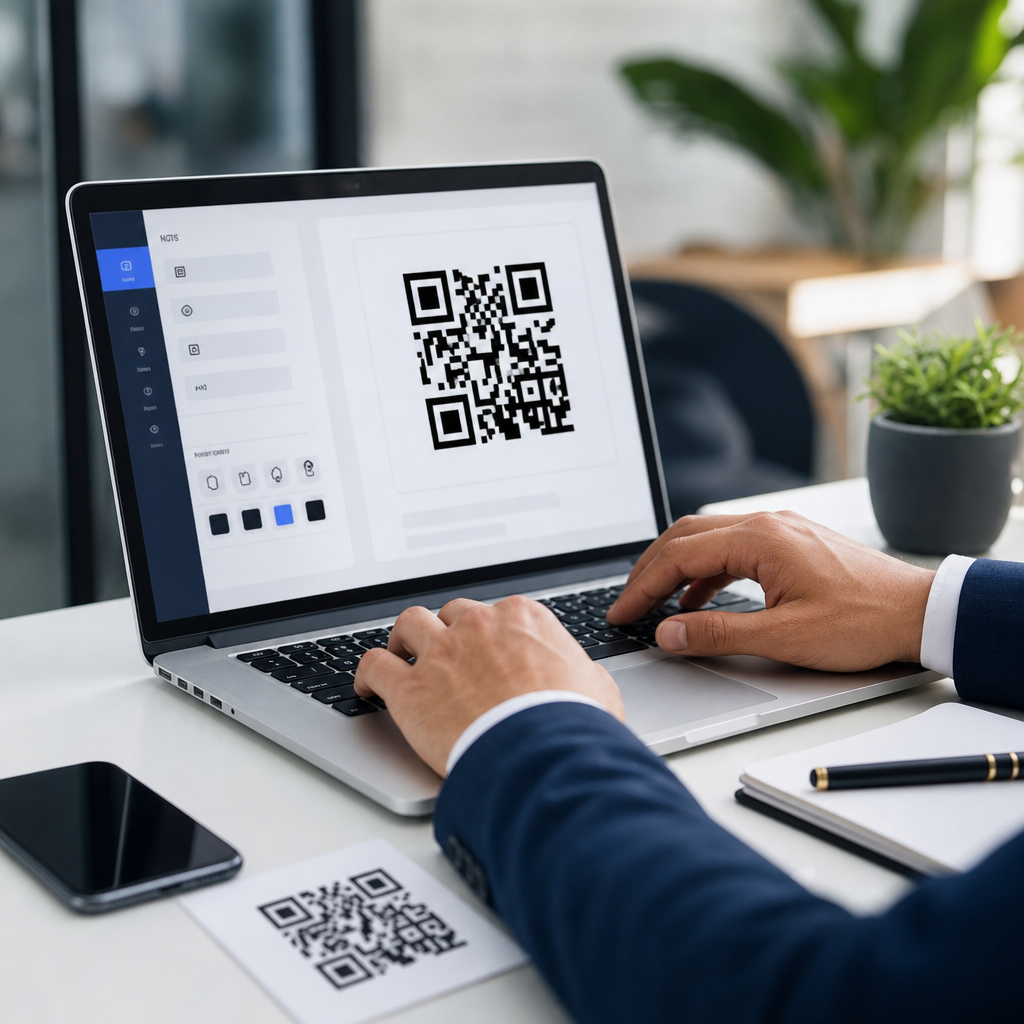
Most scanning problems I diagnose come from avoidable production choices rather than from the QR standard itself. Dynamic QR codes are usually better for campaigns because they let you change the destination, add UTM parameters, and monitor scans without reprinting the code. File format matters too. For print, vector files such as SVG, EPS, or PDF preserve sharp module edges at any size. For digital placement, high-resolution PNG is often acceptable, but screenshots from a browser preview are not. Keep the quiet zone at least four modules wide on all sides. Use a mobile-friendly landing page with fast load times, compressed images, and obvious next steps, because users blame the QR code when the destination is slow.
| Design factor | Best practice | Why it works |
|---|---|---|
| Contrast | Dark code on light background | Improves camera detection in mixed lighting |
| Size | Scale for real scanning distance | Prevents failed scans on posters and signage |
| Error correction | Use M or Q by default; H for small logos | Balances resilience with module density |
| File format | SVG or PDF for print | Maintains crisp edges and accurate output |
| Destination | Dynamic short URL to mobile page | Reduces complexity and enables analytics |
| Quiet zone | Minimum four modules clear on all sides | Helps scanners isolate the symbol quickly |
Testing should cover devices, apps, and environments. I check current iPhone and Android cameras first, then at least one low-cost Android handset because weaker autofocus exposes fragile designs quickly. Test in sunlight, under warm indoor light, and from the expected angle of approach. Print a proof on the actual material if possible; uncoated cardboard, flexible film, and textured labels all behave differently. If the QR code is part of a payment flow, verify that the destination resolves correctly across default browsers and in-app browsers from Instagram, WeChat, or other common referral sources. Design is only successful when the complete mobile journey works without friction.
Build creative concepts around clear user intent
The strongest creative QR code ideas are grounded in what the user wants at that moment. When I redesign low-performing codes, the visual treatment is rarely the root issue; the bigger problem is a weak match between placement and intent. A code at a bus stop should open a fast-loading map, offer, or timetable, not a generic homepage. A code on product packaging should support the purchase decision with reviews, how-to content, authenticity verification, refill instructions, or loyalty enrollment. On a conference booth wall, the best destination is usually a concise lead capture flow, not a dense brochure download that users will abandon on cellular data.
That is why a hub page on designing effective QR codes must connect design with strategy. Good creative choices include seasonal frames for limited campaigns, illustrated borders that never intrude into the quiet zone, color variants for audience segments, and custom landing pages that mirror the print creative so the transition feels seamless. A cosmetics brand might use one visual system for shade finder scans in stores and another for tutorial scans on packaging, while keeping the scanning mechanics consistent. Document these patterns in a design system with approved sizes, contrast ratios, logo treatments, CTA language, and print specifications. Consistency makes future QR code projects faster, safer, and easier to scale across teams.
Common mistakes and the workflow that prevents them
The most common QR code design mistakes are predictable: using low contrast, shrinking the code to fit a layout, adding an oversized logo, placing it on a curved or reflective surface, linking to a non-mobile page, and skipping real-world testing. Another frequent error is choosing a static code when the campaign will almost certainly need edits after launch. I have seen restaurant chains reprint table stickers because a menu URL changed, and consumer brands lose tracking because marketing used plain links without campaign parameters. These are operational failures disguised as design decisions.
A better workflow starts with a brief that answers six questions: who is scanning, where are they scanning, what action should happen next, what size and material will carry the code, how will success be tracked, and who owns updates after launch. Generate the code with a trusted platform, export the correct file type, place it with enough clear space, write a specific call to action, and test the full journey before approving production. After launch, review scan rate, completion rate, bounce rate, and device mix. If scans are high but conversions are low, the issue is usually the landing experience, not the code. If scans are low, revisit visibility, CTA clarity, and environmental fit. Treat QR design as part of a mobile conversion system, and creativity will support performance instead of fighting it.
Creative QR code design ideas that work are disciplined, not decorative for their own sake. The winning formula is clear: preserve the anatomy of the code, maintain strong contrast and quiet space, size it for the real environment, use dynamic destinations, and give people a direct reason to scan. Brand expression matters, but only after scan reliability is secure. When teams connect design choices to user intent, production standards, and mobile landing page quality, QR codes become dependable bridges between physical touchpoints and measurable digital action. Use this hub as the starting point for every project under designing effective QR codes, then build each campaign with testing, documentation, and iteration in mind. If you are creating mobile QR codes at scale, audit your current designs today and standardize the patterns that consistently earn fast scans and strong conversions.
Frequently Asked Questions
What makes a creative QR code design actually work in real-world marketing?
A creative QR code design works when it keeps scanning performance at the center of every visual decision. The most effective codes do more than look branded or stylish; they scan quickly across different phones, lighting conditions, print sizes, and surfaces. That means preserving strong contrast between the code and its background, keeping the quiet zone clear around the edges, avoiding excessive distortion of the modules, and testing the code in realistic environments before launch. A QR code is still a machine-readable tool first, so visual creativity should enhance recognition without interfering with readability.
In practice, the best-performing designs usually start with a functional base code and then layer on brand elements carefully. This can include using brand colors with enough contrast, softening corners, adding a logo in the center within safe error-correction limits, or integrating the code into packaging, signage, menus, posters, or product labels. What separates effective creative design from risky design is restraint. If users need to tilt their phone repeatedly, move closer, or try multiple scanning apps, the design has failed no matter how attractive it looks. The goal is a code that feels custom and memorable while remaining instant and dependable to scan.
How far can you customize a QR code before it becomes difficult to scan?
You can customize a QR code quite a bit, but only within technical boundaries. Many modern QR generators allow changes to color, eye shape, module style, frame design, and logo placement while maintaining scanability. However, every customization introduces some level of risk, especially if you reduce contrast, cover too much of the code, remove the quiet zone, or use complex backgrounds. Error correction helps, but it is not a license to redesign the code beyond recognition. It is a safety margin, not a guarantee.
A practical rule is to preserve the basic geometry and readability of the code while making cosmetic adjustments that support the brand. Dark code on a light background remains the safest option. Center logos should be modest in size. Gradients should be subtle, not decorative to the point of lowering contrast. Background images should never compete with the modules. Rounded dots, custom corner markers, and branded frames can work well when tested properly. The moment customization affects first-try scans, loading speed, or scan distance, it has crossed the line from clever branding into poor usability. The smartest teams test on multiple phone models, both iPhone and Android, under indoor and outdoor conditions, before approving final artwork.
What are the best creative QR code design ideas for brands, packaging, and promotions?
The best creative QR code design ideas are the ones that align naturally with how and where the code will be used. For product packaging, a QR code can be framed as “Scan for instructions,” “See recipes,” “Verify authenticity,” or “Unlock rewards,” making the utility obvious and increasing scan rates. On restaurant menus, table tents, and takeaway boxes, branded QR codes can link to digital menus, loyalty programs, ordering pages, or limited-time offers. For retail displays and event signage, designs that include a strong call to action and a visual frame often outperform plain standalone codes because they tell the customer exactly what happens next.
Some of the most effective ideas combine form and function. A QR code can be integrated into a label design without blending so far into the artwork that it disappears. It can use brand colors while preserving strong contrast. It can include a short URL underneath as a backup and trust signal. Seasonal campaigns may use themed frames or landing pages without changing the core scannable structure. Dynamic QR codes are especially useful here because the destination can be updated without reprinting the design. The strongest concept is rarely the most visually complicated one. It is usually the one that feels intentional, on-brand, easy to notice, and easy to scan in a split second.
Why do some visually appealing QR codes get ignored or fail to convert?
Many visually appealing QR codes underperform because design alone does not create action. Users need clarity, trust, and a reason to scan. If a code appears on a poster, package, flyer, or storefront without a clear call to action, people often skip it. They may wonder whether it leads to useful content, a download, a discount, a menu, a payment page, or something irrelevant. Even a well-designed QR code can be ignored if the surrounding message is vague. Phrases like “Scan to see colors,” “Scan for 15% off,” or “Scan to watch the demo” generally outperform a code placed without context.
Conversion problems also happen when the landing experience does not match user expectations. A customer scans expecting a menu and lands on a slow homepage. A shopper scans for product details and reaches a generic category page. A guest scans at an event and finds a form that is not mobile-friendly. That disconnect kills performance. The highest-converting QR campaigns pair a reliable code with a targeted mobile landing page, fast load speed, and a message that clearly explains the benefit. Good creative execution gets attention, but strong conversion comes from the full experience: placement, instruction, trust, speed, relevance, and mobile usability.
What are the most important best practices for testing and placing a creative QR code?
Testing and placement are where many QR campaigns succeed or fail. Before publishing, scan the code on multiple devices, at different distances, and in the actual environments where people will use it. A code that works perfectly on a desktop screen may struggle on glossy packaging, curved bottles, dim restaurant tables, sunlit windows, or large outdoor signs viewed from several feet away. Print a sample at real size, test under real lighting, and confirm that the code opens the correct mobile experience quickly. If the campaign matters, test more than once and have people unfamiliar with the design try it too.
Placement matters just as much as design. The code should be easy to notice, physically reachable, and positioned where someone can comfortably stop and scan. On posters and retail displays, avoid placing it too low, too high, or near folds and edges. On packaging, avoid seams, corners, and highly reflective materials when possible. Give it breathing room so the quiet zone stays intact. Include a clear call to action nearby, and when appropriate, a backup short link for accessibility and trust. If the code is intended for fast-moving environments like transit ads or busy event spaces, keep the scan destination simple and immediate. The most dependable creative QR code campaigns are not just attractive; they are thoughtfully tested, strategically placed, and designed around how real people behave with their phones.