
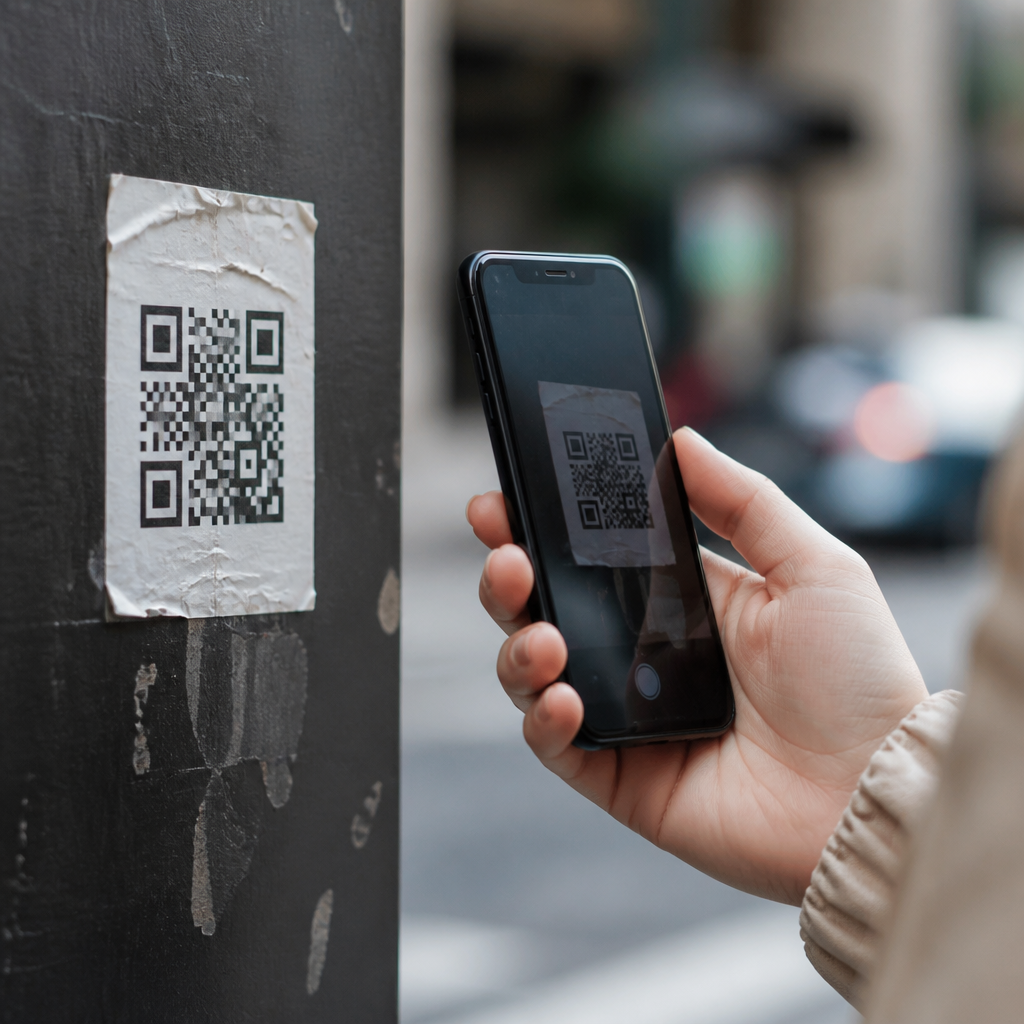
QR code campaigns often succeed or fail on mobile user experience, because the scan is only the beginning of the journey. In practice, I have seen well-designed print ads, packaging inserts, event signs, and direct mail pieces generate strong scan volume but weak conversions because the landing experience on phones created friction users would not tolerate. Mobile UX in QR code campaigns means the full path from noticing the code, scanning it with a mobile device, understanding what will happen next, loading the destination quickly, completing the intended action, and recovering gracefully when something goes wrong. Best practices for mobile UX matter because nearly every modern QR interaction happens on a smartphone, where screen space is limited, attention is fragmented, connections vary, and users expect instant clarity.
Several terms define the topic. A scan trigger is the prompt that tells people why to scan. The scan context is the physical environment, such as a store aisle, a bus shelter, product packaging, or a restaurant table. The post-scan destination is usually a mobile landing page, app deep link, menu, form, payment page, or download file. Conversion friction includes anything that delays or confuses the user, from poor contrast around the code to oversized forms and intrusive pop-ups after the page opens. This article serves as the hub for best practices under Mobile QR Code Design & UX by covering the most common mobile UX issues, explaining why they happen, and outlining proven ways to prevent them across campaigns of every size.
The most common failure starts before the scan: people do not know what the code is for, whether it is safe, or what benefit they will get. Generic labels like “Scan me” underperform because they ask for effort without offering a reason. Strong QR campaigns use explicit value-led calls to action such as “Scan to view today’s menu,” “Scan to activate warranty,” or “Scan for 15% off and in-stock sizes.” In field work for retail and events, I have consistently seen scan rates improve when the CTA states the reward, estimated time, and expected destination. Users are more willing to scan when they know whether they are opening a menu, video, registration form, or payment flow.
Scanability Problems That Block the Journey
Many mobile UX issues begin with basic scanability errors. Codes placed too high on posters, printed too small on packaging, wrapped around curved bottles, or buried in glossy reflections create unnecessary friction. A practical rule is to match code size to scanning distance and preserve a quiet zone around the code so camera software can detect it reliably. Contrast also matters. Dark modules on a light background remain the safest choice, while low-contrast brand treatments often fail under weak lighting. I have also seen problems when designers invert colors, place codes over photographs, or add decorative frames that interfere with detection. Branded QR codes can work well, but only when error correction, contrast, and testing are handled carefully across iPhone and Android devices.
Context changes performance. A code on a moving subway ad competes with time and motion, so the destination must be simple and the code large enough for a fast scan. A code on a restaurant receipt may be scanned while seated, with stronger connectivity and more time to complete a survey or loyalty sign-up. That is why testing must happen in realistic conditions, not only on a desktop mockup. Use the native camera apps on current iOS and Android versions, test from different distances, and check behavior in dim light, glare, and low bandwidth. If users cannot scan within seconds, the campaign is already leaking value.
Landing Page Friction After the Scan
A successful scan should open a destination that feels immediate, relevant, and effortless on a phone. Instead, many campaigns send users to desktop pages, cluttered homepages, PDF files, cookie walls, or app store listings that interrupt intent. The landing page should match the promise beside the code with near-perfect message continuity. If the sign says “Scan for store map,” users should not land on the general site navigation and hunt for directions. In mobile analytics, this mismatch appears as high bounce rate, short engagement time, and low task completion. Relevance is the first test of QR landing page UX, and it must be obvious in the first screen without scrolling.
Performance is the second test. Google’s Core Web Vitals remain useful here because QR users are often in variable network conditions and have low patience. Largest Contentful Paint should happen quickly, layout shifts should be minimal, and tap targets should be easy to hit with one thumb. Compress images, defer noncritical scripts, trim tag-manager bloat, and avoid autoplay video unless it is central to the task. For campaign pages, I prefer lightweight templates with a single primary action and limited navigation. A QR landing page is not a full website experience; it is a task-completion surface. Every element should support the action users came to complete right after scanning.
Forms, Inputs, and Conversion Barriers on Phones
Long forms are one of the most expensive mistakes in mobile QR campaigns. People who scan from packaging, posters, or checkout counters rarely want to type extensive information on a small screen. Ask only for what is essential to finish the transaction or deliver the asset. Use autofill, appropriate input types, and clear labels above fields. For example, an email field should trigger the email keyboard, and a phone field should trigger the numeric keypad. If age verification, shipping details, or appointment booking is necessary, break the process into small steps and show progress clearly. I have recovered conversion rates simply by reducing a seven-field registration flow to three fields and moving optional questions later.
Error handling deserves equal attention. Generic alerts such as “Something went wrong” force abandonment because users do not know how to fix the issue. Good mobile UX uses inline validation, preserves entered data, and explains the exact correction needed. Authentication can also introduce friction. If a campaign links to gated content, consider passwordless email links, SMS verification, or guest checkout rather than mandatory account creation. Mobile payment integrations like Apple Pay, Google Pay, and Shop Pay can reduce completion time dramatically for commerce campaigns. The guiding principle is simple: after the scan, every extra keystroke must justify itself.
Trust, Accessibility, and Environmental Constraints
Users hesitate when a QR code looks risky. Because phishing through QR codes has increased, campaigns should show recognizable branding, a descriptive CTA, and where possible a visible short domain users can trust. Secure destinations must use HTTPS, and consent requests should be proportionate. If a code opens a download, say so before the scan. If location, camera, or payment permissions are required, explain why in plain language at the moment they are needed. Trust is not a cosmetic layer; it directly affects whether users continue after the browser opens.
Accessibility is equally important. QR campaigns often fail people with low vision, motor limitations, or cognitive overload. Adequate color contrast, readable type around the code, and large touch targets on the landing page are basic requirements. Follow WCAG guidance for text alternatives, focus order, and form labeling. Avoid relying on color alone to communicate instructions. Environmental factors also matter: glare on outdoor signs, weak signal in venues, and one-handed use while standing can all reduce completion rates. Mobile UX best practices for QR codes must account for real conditions, not ideal ones.
| Common issue | What users experience | Best-practice fix |
|---|---|---|
| Vague CTA | Low motivation to scan | State the benefit, destination, and time needed |
| Small or low-contrast code | Slow or failed scans | Increase size, preserve quiet zone, use strong contrast |
| Desktop landing page | Poor readability and fast exits | Send traffic to a mobile-first task page |
| Long form | Abandonment during typing | Reduce fields, enable autofill, split steps |
| Heavy page scripts | Slow loading on mobile data | Optimize assets and remove nonessential tags |
| Unclear trust signals | Users stop before converting | Use branded context, HTTPS, and transparent permissions |
Measurement, Deep Linking, and Channel Fit
Good QR UX is measurable. At minimum, track scans, unique visitors, device type, landing page load time, bounce rate, conversion rate, and completion by source placement. Dynamic QR platforms such as Bitly, QR Code Generator Pro, Beaconstac, and Flowcode can help manage redirects and campaign-level analytics, but server-side analytics and UTM governance still matter. Use separate codes for distinct placements when context differs, because a code on shelf talkers may behave differently from the same creative on direct mail. This is how teams learn whether friction comes from the physical placement, the mobile page, or the offer itself.
Deep linking deserves careful use. If the goal is to open an app, implement deferred deep links so users without the app still reach a usable mobile web fallback after installation. Broken deep links are common in QR campaigns and create silent failure, especially across iOS and Android variations. Channel fit matters too. A menu QR code should prioritize readability and speed. A product tutorial QR code may support video, FAQs, and warranty registration. A lead generation QR code at a trade show should minimize typing and support badge scanning if possible. The best practice is to design the mobile experience around user intent in that exact moment, then validate it with testing and analytics.
Common mobile UX issues with QR code campaigns are rarely caused by the code alone. They come from weak incentives, poor scanability, irrelevant destinations, slow pages, hard-to-complete forms, missing trust signals, and inadequate measurement. The fix is a disciplined mobile-first approach: tell people exactly why to scan, make the code easy to capture, send them to a fast page that matches the promise, remove unnecessary inputs, and test in real conditions on real devices. When teams treat QR as a complete mobile journey instead of a graphic element, campaign performance improves across engagement, conversion, and customer satisfaction.
As the hub for Best Practices for Mobile UX within Mobile QR Code Design & UX, this guide sets the standard for every related article and campaign workflow. Use it as a checklist during creative review, QA, launch planning, and post-campaign analysis. Start with one live campaign, audit each step from scan prompt to completion, and fix the biggest friction point first. Small mobile UX improvements compound quickly in QR programs, because every second saved and every tap removed increases the chance that a curious scanner becomes a successful customer.
Frequently Asked Questions
What are the most common mobile UX problems that hurt QR code campaign performance?
The most common problems usually appear after the scan, not during it. Many QR code campaigns get attention and generate scans, but the mobile landing experience creates enough friction to stop users before they convert. Slow-loading pages are one of the biggest issues. If a page takes too long to appear on a cellular connection, users often leave before they even understand the offer. Another major problem is sending people to a page that is not designed for mobile screens. Text may be too small, buttons may be hard to tap, forms may be too long, or important content may sit below the fold where users never see it.
There are also clarity problems that damage trust. If users scan a code and immediately land on a page that looks unrelated to the ad, sign, package, or mailer they just interacted with, they may assume they were sent to the wrong place. Confusing headlines, weak visual continuity, and unclear calls to action all increase abandonment. In many campaigns, brands also ask for too much too soon. A user who scans a code in a store aisle, at an event, or while walking past signage is usually looking for quick value. If the first screen asks them to fill out multiple fields, create an account, accept several pop-ups, or navigate a cluttered interface, conversion rates drop quickly.
Another frequent issue is failing to consider context. A QR code on packaging may be scanned in a kitchen, a retail environment, or while multitasking. A code on event signage may be scanned in a crowded venue with poor connectivity. A code in direct mail may be scanned casually, with low purchase intent at that moment. Good mobile UX accounts for these real-world conditions by reducing effort, increasing speed, and making the next step obvious. In short, the most damaging UX problems are slow performance, weak mobile design, unclear messaging, too many required actions, and a landing experience that does not match the user’s immediate situation.
Why is the landing page so important in a QR code campaign?
The landing page is where intent either turns into action or disappears. Scanning a QR code shows curiosity, but curiosity is fragile on mobile. Users have already completed one action by opening their camera and scanning. If the next step feels confusing, irrelevant, or inconvenient, many will simply leave. That is why the landing page is not just a destination. It is the core conversion environment of the campaign.
A strong mobile landing page should immediately confirm that the user is in the right place. The headline, imagery, offer, and overall tone should clearly connect back to the printed piece, display sign, product packaging, or event material that prompted the scan. This continuity reduces hesitation and reassures the user that the experience is intentional and trustworthy. It should also make the value proposition obvious within seconds. Users should not have to search for what they are supposed to do, what they will get, or why it matters.
Just as important, the landing page should remove friction instead of introducing it. That means fast load times, readable content, touch-friendly buttons, and a focused layout that supports one primary action. If the goal is to claim an offer, register for something, watch a demo, download an app, or complete a purchase, the page should guide users directly there with minimal distraction. In many underperforming campaigns, the QR code simply sends traffic to a homepage or generic product page, forcing users to navigate on their own. That approach wastes the momentum created by the scan. A dedicated mobile landing page is usually far more effective because it respects the user’s context and keeps the path short, relevant, and easy to complete.
How can businesses reduce friction for mobile users after they scan a QR code?
The best way to reduce friction is to simplify every step after the scan. Start by asking what the user really needs in order to complete the desired action. If the answer is less than what the current experience requires, remove the extra steps. For example, if a user only needs to redeem an offer, do not force account creation before showing the coupon. If they are trying to access event details, do not bury the information behind a long lead form. Mobile users respond best when brands respect their time and attention.
Technical performance matters just as much as design simplicity. Pages should load quickly, especially on mobile networks that may be inconsistent. Heavy scripts, oversized images, intrusive pop-ups, and unnecessary redirects all create delays that increase bounce rates. Once the page appears, it should be easy to read and interact with using one hand. Use large tap targets, short paragraphs, clear labels, and forms that require only essential information. Autofill, mobile-friendly keyboards, and progressive disclosure can make a major difference when forms are necessary.
It also helps to make the experience predictable. Tell users what happens next before they commit. If scanning the code leads to a menu, a product video, a discount, a sign-up page, or a payment flow, signal that clearly on the physical asset near the QR code and reinforce it on the landing page. Reducing friction is not only about eliminating effort. It is also about eliminating uncertainty. When users know what they are getting, can access it quickly, and are not asked to do more than necessary, conversion rates generally improve.
How should a QR code campaign account for different mobile contexts and user intent?
Context is one of the most overlooked parts of QR code UX. People do not scan codes in the same frame of mind everywhere. Someone scanning from product packaging may want instructions, reviews, recipes, warranty details, or reorder options. Someone scanning from a poster in transit may only have a few seconds and a weak signal. Someone scanning at a live event may be standing in a crowd, distracted, and trying to access something immediately, such as a schedule, check-in flow, or giveaway form. These situations create very different usability needs.
To design well for mobile, businesses should first identify where the QR code appears and what the likely user intent is in that setting. Then the landing experience should match that moment. High-intent scenarios can support slightly deeper interactions, such as purchases or registrations, if the path remains streamlined. Low-intent or distracted scenarios usually perform better when the first interaction is lightweight, such as viewing quick information, saving something for later, or accessing a single clear offer. A mismatch between context and effort is one of the main reasons QR campaigns underperform.
It is also smart to account for environmental limitations. Some users may have glare on their screens, one-handed use, slow connectivity, limited patience, or privacy concerns in public spaces. That means content should be scannable, actions should be obvious, and important information should appear early. If the campaign asks for a longer action, such as filling out a form or completing a purchase, consider letting users text themselves a link, save the offer, or continue later. Good QR code UX is situational. The more the mobile experience aligns with where the user is, what they are trying to do, and how much attention they can spare, the better the campaign will perform.
What are the best practices for improving conversions from QR code traffic on mobile?
Improving conversions starts with treating QR traffic as a distinct audience, not as generic website visitors. People who arrive through a QR code have just come from a physical touchpoint, and that transition should be handled intentionally. The landing page should be campaign-specific, mobile-first, and focused on a single primary conversion goal. Whether that goal is lead generation, coupon redemption, app download, product education, or purchase, the page should present it clearly and quickly without forcing users to make unnecessary decisions.
Message match is one of the strongest conversion levers. The promise made near the QR code should be the first thing users see after scanning. If the printed sign says “Get 20% off,” the landing page should immediately confirm how to claim that discount. If the packaging says “Watch setup instructions,” the video or tutorial should be available right away. This consistency reduces confusion and keeps momentum high. Strong visual hierarchy also matters. Key information, trust signals, and the call to action should appear early, with minimal clutter. Buttons should be prominent, wording should be direct, and any required form fields should be kept to a minimum.
Measurement and testing are equally important. Track not just scans, but post-scan behavior such as bounce rate, time to engagement, form completion, click-through, and conversion rate by device type and traffic source. This helps identify whether the issue is volume, relevance, speed, or usability. A/B testing different headlines, layouts, call-to-action labels, and form lengths can uncover major improvements. In many cases, relatively small mobile UX changes produce meaningful gains because QR users are highly sensitive to friction. The campaigns that convert best are typically the ones that combine clear expectations, fast performance, contextual relevance, and a very short path from scan to value.





