
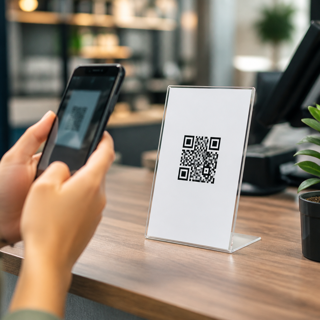
QR code placement determines whether a code gets ignored, noticed, or scanned immediately. In my work on retail signage, event materials, restaurant menus, packaging, and vehicle wraps, I have seen the same pattern repeatedly: even a well-designed QR code fails when placement ignores user behavior, viewing distance, lighting, motion, or the surrounding call to action. QR code placement strategies are the practical rules for putting a scannable code where people can find it, understand it, trust it, and use it without friction.
A QR code is a two-dimensional barcode that stores a destination such as a URL, payment link, app download, menu, ticket, or contact card. Placement refers to its physical or digital location within a layout, environment, or object. Good placement is not just about visibility. It also includes scan angle, size relative to distance, quiet zone protection, contrast, user reach, traffic flow, and the amount of time a person has to react. When those factors align, scans increase because the code feels effortless to use.
This matters because QR codes now sit at the center of many mobile experiences. Restaurants use them for menus and ordering. Retailers connect shelves to product specs and reviews. Brands place them on packaging for how-to content, warranty registration, and loyalty programs. Event teams use them for check-in, schedules, lead capture, and cashless payments. In each case, the code is a gateway between the physical environment and a mobile action. If the gateway is placed poorly, conversion drops before the user even reaches the landing page.
The best QR code placement strategies start with intent. Ask what task the user is trying to complete, where they are standing, what device they are using, and how much time they have. Then place the code where that task feels natural. A code for nutritional facts belongs near the product label, not on a distant shelf talker. A code for table ordering should sit upright at eye level when seated, not flat under glare. A code on a poster in a subway must be large enough for quick recognition and scanning from a few feet away. Placement is user experience design in physical form.
Match placement to context, distance, and user intent
The most effective placement decisions come from matching the code to the moment of use. I start with three questions: what action should happen, from what distance will people scan, and how much dwell time exists? Short dwell environments such as transit stations, trade show aisles, storefront windows, and stadium concourses require larger codes, stronger contrast, and more obvious positioning. High dwell settings such as tables, waiting rooms, product packaging at home, or hotel rooms allow smaller codes and more supporting text because the user has time to engage.
Distance changes everything. A practical field rule many designers use is roughly one inch of QR code width for every ten inches of scanning distance, then testing on multiple phones before production. That means a code viewed from five feet away needs to be far larger than a code on a business card. The formula is not absolute because camera quality, lighting, and error correction affect performance, but it gives a planning baseline. ISO and print production standards also support protecting the quiet zone, maintaining contrast, and avoiding distortion, all of which matter as much as placement itself.
User intent shapes where eyes go first. On packaging, shoppers look at the front panel, ingredients, and instructions. On a menu, they look near item names and table prompts. At events, attendees focus on badges, entrance signs, and agenda boards. Place the code near that natural attention area rather than in leftover space. The surrounding copy should answer the immediate question: what happens after the scan? “View ingredients,” “Pay now,” “See installation video,” or “Join the loyalty program” consistently outperforms a code with no explanation because uncertainty suppresses action.
Best practices for print, packaging, signage, and screens
Print and environmental graphics demand disciplined placement because the user cannot zoom or reposition the code easily. On posters and signs, keep the QR code between waist and eye level when possible, with enough white space that background graphics do not interfere. Avoid corners that curve, wrinkle, fold, or get covered by fixtures. On packaging, do not place a code across seams, glossy edges, tear strips, or highly reflective finishes. If the package is cylindrical, like a bottle or can, position the code on the flattest panel available so the modules do not warp around the curve.
Screen-based placements have their own constraints. A QR code shown on a digital display, self-service kiosk, presentation slide, or television graphic must stay on screen long enough for discovery and scan completion. For moving video, static end cards work better than codes floating over active footage. Brightness and refresh behavior can affect readability, especially on low-quality LED walls. On mobile screens, avoid asking people to scan a code that appears on the same device they are using unless there is a handoff path such as save, share, wallet pass, or open link button.
In stores and restaurants, I have seen the strongest results from codes placed exactly where the decision occurs. Shelf-edge labels work for product comparisons because the shopper is already evaluating options. Table tents work for ordering because the phone is in hand and the user is seated. Window decals are effective for after-hours browsing when paired with store hours, product category cues, and a clear benefit such as booking an appointment. By contrast, oversized decorative codes placed high on walls often earn attention but not scans, because they interrupt the natural flow of action.
| Placement context | Recommended position | Primary goal | Common mistake |
|---|---|---|---|
| Product packaging | Flat side panel near instructions or benefits | Education, registration, loyalty | Putting code on curved or reflective areas |
| Restaurant table | Upright at seated eye line | Menu, ordering, payment | Laying code flat under overhead glare |
| Retail shelf | Adjacent to price or product comparison zone | Specs, reviews, stock lookup | Separating code from the product decision point |
| Event signage | Entrance, badge area, or agenda board | Check-in, schedule, lead capture | Using small codes in fast-moving queues |
| Storefront window | Eye-level decal with clear offer | Appointments, catalog, promotions | Placing code too low or behind reflections |
Avoid friction: visibility, trust, and testing
Maximum scans come from removing small barriers that compound into abandonment. Lighting is a frequent culprit. Gloss lamination, glass reflections, and direct sunlight can make a technically correct code unreadable. Contrast is another. Dark code on a light background remains the safest option, while low-contrast brand colors should be tested carefully. The quiet zone, the empty margin around the code, must remain intact; decorative frames, busy patterns, or tight cropping often break scanning. Physical access matters too. If users must crouch, stretch, stand in traffic, or block others, scans will drop.
Trust also influences placement performance. People scan more readily when the code appears intentional, branded, and connected to a clear destination. Include a concise call to action and, when appropriate, a short URL or brand name nearby so the user knows where the scan leads. In healthcare, finance, and payments, this reassurance is especially important because users are alert to fraud. I recommend placing codes in clean, controlled zones rather than cluttered ad stacks. A code squeezed between unrelated messages looks suspicious and routinely underperforms one paired with a specific, credible offer.
Testing is the final placement strategy, and it should happen in the real environment, not just on a design proof. Scan with iPhone and Android devices, older cameras, dark mode settings, and common third-party camera apps. Test at the intended distance, under morning and evening light, through glass if relevant, and during actual foot traffic. Use dynamic QR codes with analytics to compare placements by scan rate, unique users, time of day, and conversion after the landing page. When scans are low, inspect placement before blaming creative or offer quality. The code may simply be asking too much effort.
Build a scalable placement system across campaigns
For teams managing many assets, the most efficient approach is to standardize QR code placement rules by channel. Create templates for packaging, flyers, counter cards, posters, menus, trade show booths, and digital displays. Define minimum sizes, safe margins, approved call-to-action language, contrast thresholds, and preferred placement zones. This reduces production errors and preserves consistency across campaigns. It also improves internal linking and content discoverability when every QR destination maps to a clear journey, such as product education, support, review collection, booking, or payment.
A scalable system should also connect physical placement to landing page intent. A code on a shelf should open a fast mobile page with specs and reviews, not a generic homepage. A code on packaging should deep-link to setup instructions for that exact SKU. A code at an event booth should open a brief lead form or downloadable brochure, not a dense navigation menu. Placement succeeds when the environment, message, and destination feel like one continuous action. That alignment is what turns a simple square graphic into a reliable conversion point.
The best QR code placement strategies are straightforward: put the code where the user already looks, size it for real scanning distance, protect contrast and quiet space, and pair it with a specific promise. Then test in the actual environment and refine with analytics. Good placement is not decoration. It is a measurable part of mobile user experience that directly affects scan rate, trust, and downstream conversions.
As the hub for QR code placement strategies, this topic connects naturally to deeper guidance on code size, print materials, packaging design, restaurant ordering flows, event signage, storefront decals, and landing page optimization. Start by auditing every current QR code in your business: where it appears, what action it asks for, how easy it is to scan, and whether the destination matches the moment. Small placement changes often produce the fastest gains. Review your highest-traffic assets first, test improvements, and build a placement standard your team can repeat confidently.
Frequently Asked Questions
What is the most important rule for QR code placement if I want more scans?
The most important rule is simple: place the QR code where people can comfortably notice it, understand why they should scan it, and complete the scan without friction. In practice, that means placement has to match real human behavior, not just available empty space on a design. A QR code may look visually balanced in a layout, but if it sits too low, too high, too far away, in glare, in motion, or without context, scan performance drops quickly. The best-performing placements are usually those that appear within a natural line of sight, at a readable size for the viewing distance, and next to a clear call to action that explains the benefit of scanning.
It also helps to think in terms of “scan readiness.” A person should be able to spot the code, decide it is worth scanning, and hold a phone up without awkward positioning. On retail signage, this often means eye-level or slightly below, where shoppers can pause. On posters, event displays, and menu boards, it means placing the code in a stable, visible zone rather than near edges, folds, corners, or highly cluttered sections. Good placement removes hesitation. If users have to guess what the code does, step into traffic, bend down, stand too close, or fight reflections from glossy materials, you lose scans. The strongest rule is not simply “make it visible,” but “make it easy and obvious to scan in the exact environment where the audience encounters it.”
How do viewing distance and QR code size affect the best placement strategy?
Viewing distance and code size are directly connected, and they should guide placement decisions from the start. A QR code that works perfectly on a tabletop menu will fail on a window sign viewed from several feet away if the code is too small. As distance increases, the code must become larger and be positioned in a place where the camera can frame it clearly. If a code is meant to be scanned from close range, such as on product packaging, receipts, table tents, or brochures, users can easily move their phone into position. But if the code is intended for a wall poster, overhead sign, storefront display, trade show banner, or vehicle graphic, the code needs enough physical size and surrounding quiet space to remain scannable from farther away.
Placement should support the expected scanning distance, not fight it. For example, if people will encounter a code while walking past a sign, the code should not be tucked into the bottom corner in tiny format. It should be placed prominently in a zone that users can center in their camera view without needing to stop excessively close. For larger-format applications, avoid putting the code too high, too low, or too near visual obstructions. In many cases, businesses focus on artwork and branding first, then add the QR code wherever there is room. That approach usually creates size and placement problems together. A better strategy is to decide how far away the audience will be when they first notice the code, then size and place it accordingly so the scan feels effortless. The environment determines the correct scale, and scale determines the correct placement.
Where should QR codes be placed on retail signs, menus, packaging, and event materials?
The right placement depends on the format, but the principle is always the same: align the QR code with the moment when the user is most likely to act. On retail signage, place codes where shoppers naturally pause and look for information, such as near pricing, product highlights, limited-time offers, or wayfinding instructions. A code placed near the bottom of a large display may be missed entirely, while one positioned beside a compelling call to action like “See colors,” “Check inventory,” or “Get today’s offer” gives shoppers a reason to scan immediately. The placement should feel intentional and connected to a decision point.
On restaurant menus, QR codes work best where diners expect interaction. If the code links to ordering, specials, allergen details, loyalty rewards, or payment options, it should be placed near the relevant section rather than isolated as a generic graphic. Diners should not have to hunt for it or wonder what it does. On packaging, the code should be easy to find after purchase and easy to access before disposal, especially if it links to setup instructions, authenticity checks, how-to videos, warranty registration, or reordering. Avoid seams, curves, folds, and textured print areas that make scanning harder.
For event materials such as badges, posters, flyers, booth graphics, and programs, the code should be positioned where attendees can scan without creating traffic bottlenecks. On posters, mid-to-upper visible zones often outperform bottom-corner placements because they enter the field of view earlier. On booth displays, place the code near the primary value message, not as an afterthought. If using vehicle wraps, remember that motion and angle matter. A QR code on a moving vehicle is rarely ideal unless the vehicle is parked for extended periods. In those cases, the code should be on a relatively flat, accessible panel where pedestrians can approach safely and scan from a practical distance.
How do lighting, motion, and surface conditions impact QR code placement?
These factors have a major impact because a technically correct QR code can still fail in the real world if the placement environment undermines scannability. Lighting is one of the biggest issues. Codes placed behind reflective glass, on glossy surfaces, under spotlights, or in dim conditions often become difficult to scan because glare, shadow, or low contrast interferes with the phone camera. Placement should account for how the code will appear at the time and angle people actually encounter it. A storefront window code may seem fine indoors during setup but become unreadable in direct afternoon sun. A laminated table menu may reflect overhead lights so strongly that guests need to tilt it to scan.
Motion is equally important. If the audience is walking quickly, driving, riding escalators, or navigating a busy venue, placement has to compensate by making the code larger, simpler to isolate visually, and easier to understand at a glance. This is why QR codes on fast-moving or constantly shifting surfaces often underperform unless the user can stop and scan safely. Surface conditions matter too. Curved bottles, wrinkled labels, textured cardboard, perforated packaging, mesh banners, and uneven wraps can distort the code or make camera focus harder. Placement should favor flat, stable, high-contrast areas with enough clean margin around the code. In other words, the physical reality of the surface matters just as much as the digital destination. Strong placement means designing for camera performance, not just human eyes.
Should a QR code always include a call to action, and where should that call to action be placed?
Yes, in most cases a QR code should include a clear call to action, because people are far more likely to scan when they immediately understand the value they will get. A bare QR code often creates uncertainty. Users may wonder whether it leads to a menu, coupon, product page, video, app download, payment portal, or something untrustworthy. Placement is not only about where the code sits, but also where the explanatory text sits in relation to it. The call to action should be close enough that the purpose of the scan is obvious in the same glance. Phrases like “Scan to order,” “Scan for directions,” “Scan for a demo,” or “Scan to claim your discount” consistently outperform vague or missing instructions because they reduce hesitation and set expectations.
The most effective placement pairs the code and the call to action in a compact visual unit. Do not force the viewer to look across the design to decode the message. Keep the explanatory text adjacent to the code, and if useful, add one short supporting line that clarifies what happens next, such as “Opens our menu,” “No app required,” or “Takes 10 seconds.” This is especially important in high-traffic retail, event, and hospitality settings where attention is limited. Good placement also supports trust. If the code appears integrated with the brand, near a legitimate offer or instruction, and within a clean layout, people are more comfortable scanning it. In short, the call to action should not be treated as optional decoration. It is part of the placement strategy itself because it turns visibility into action.





