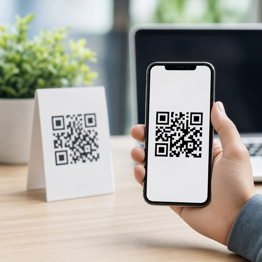
A QR code with a logo can look more trustworthy, reinforce brand recognition, and improve scan response when it is designed correctly. In mobile campaigns, packaging, menus, event signage, and app download flows, the logo acts as a visual cue that tells people what they are scanning and who is behind it. That matters because most users now decide in seconds whether a code seems safe, relevant, and worth opening on their phone. If the code looks generic, cluttered, or poorly printed, scan rates drop.
When people ask how to add a logo to your QR code, they usually mean more than placing an icon in the middle. They need to know how QR code error correction works, how large the logo can be before scans fail, which contrast rules matter on mobile screens, and how to test across iPhone and Android cameras. In practice, designing effective QR codes means balancing branding with machine readability. I have built branded codes for product labels, trade show booths, direct mail, and restaurant ordering flows, and the same rule applies every time: make the code unmistakably yours without making it harder to scan.
This hub article for creating mobile QR codes covers the core design decisions behind logo QR codes: placement, sizing, color, quiet zone, print specifications, dynamic versus static use cases, and testing methods. It also serves as the foundation for deeper articles on QR code size, QR code contrast, dynamic QR tracking, and mobile landing page optimization. If you want a branded code that works in the real world, not just in a design mockup, start with the fundamentals below.
What adding a logo to a QR code actually involves
Adding a logo to a QR code means overlaying a graphic, usually in the center, while preserving enough data modules for a scanner to reconstruct the encoded information. QR codes are made of small squares called modules, along with fixed patterns such as the three corner finder patterns and alignment patterns. A scanner uses those structures to identify the code, correct perspective, and decode the data. The logo must never interfere with those essential areas.
The reason logos are even possible is error correction. QR codes use Reed-Solomon error correction with four standard levels: L, M, Q, and H. Higher error correction allows more damage or obstruction while still decoding, which is why most branded QR codes should be generated at level H. In plain terms, level H gives you the best chance of surviving a central logo, minor print defects, or glare on glossy materials. It does not mean you can cover the code carelessly; it simply creates room for disciplined customization.
The safe approach is to keep the logo area modest, maintain a clear white border around it, and leave the finder patterns untouched. Most reliable designs keep the logo overlay around 15 percent to 20 percent of the code area, though exact tolerance depends on encoded data length, version size, and output quality. A short URL in a dynamic QR code generally produces a simpler matrix than a long static URL, giving you more design flexibility.
Best practices for logo size, placement, and contrast
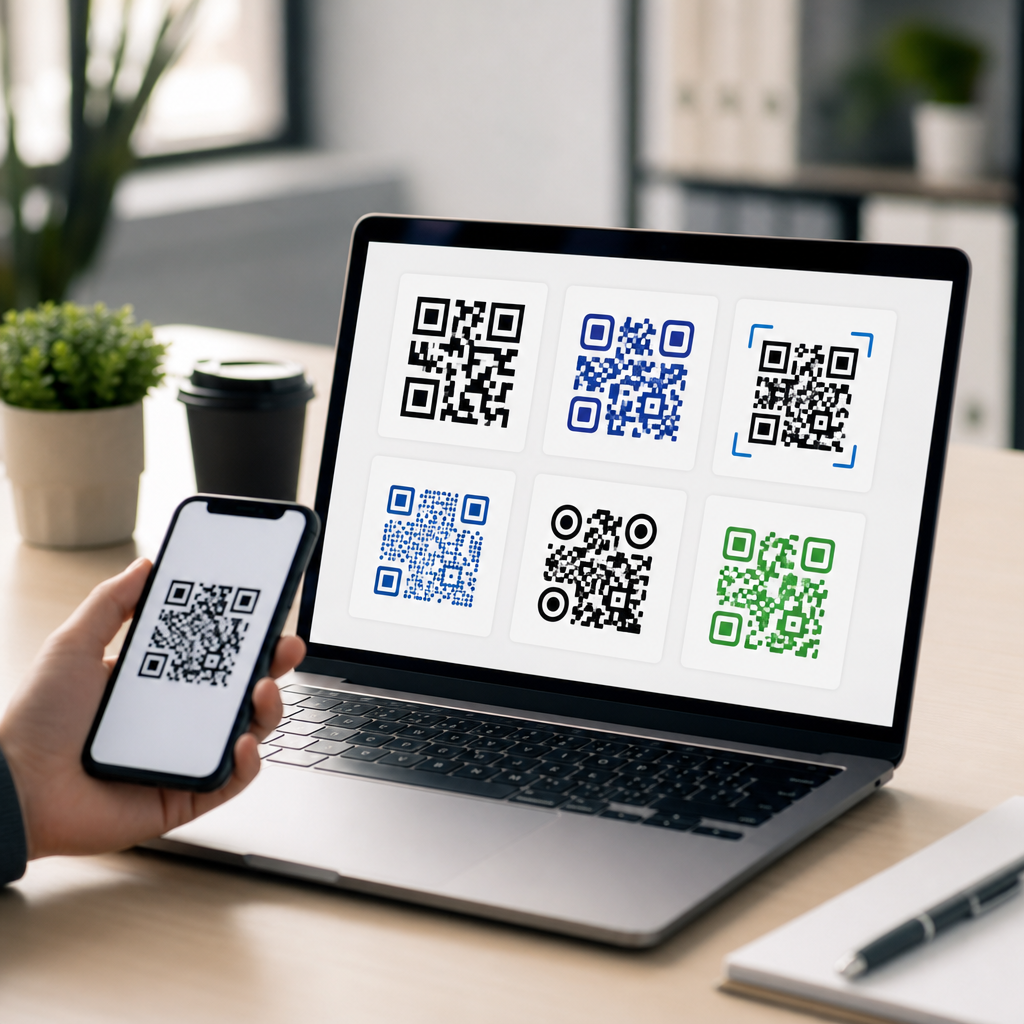
The center is usually the best logo position because it avoids the three finder patterns at the corners. Even then, the logo should sit inside a knockout area or white patch rather than directly over dark modules. That separation helps camera software distinguish the symbol from the code. Rounded logos, simple icons, and marks with strong silhouettes work better than detailed seals, thin typography, or low-contrast gradients.
Contrast is nonnegotiable. The darkest modules should remain dark against a light background, ideally close to black on white. While branded colors are possible, many scan failures happen because designers reverse the color relationship, use pastel modules, or place codes on busy photography. Mobile cameras, especially in dim indoor settings, need clear luminance contrast more than perfect brand matching. If your palette is light, use it in the frame or callout text, not in the modules themselves.
The quiet zone, the empty margin around the QR code, is just as important as the logo. Industry guidance commonly uses a minimum quiet zone of four modules on all sides. I recommend more when the code appears on crowded layouts, packaging with patterns, or social graphics. Without enough clear space, scanners struggle to separate the code from surrounding design elements, even if the logo itself is perfectly sized.
| Design element | Recommended standard | Why it matters for mobile scanning |
|---|---|---|
| Error correction | Use level H for most logo QR codes | Preserves readability when the center area is partially covered |
| Logo coverage | Aim for roughly 15% to 20% of total area | Reduces the risk of blocking too many modules |
| Placement | Center position with a white knockout area | Keeps corner finder patterns fully visible |
| Color contrast | Dark modules on a light background | Improves detection across iPhone and Android cameras |
| Quiet zone | At least 4 modules, preferably more in busy layouts | Helps scanners isolate the code from nearby graphics |
| Output format | Prefer SVG or high-resolution PNG for production | Prevents blur, aliasing, and print degradation |
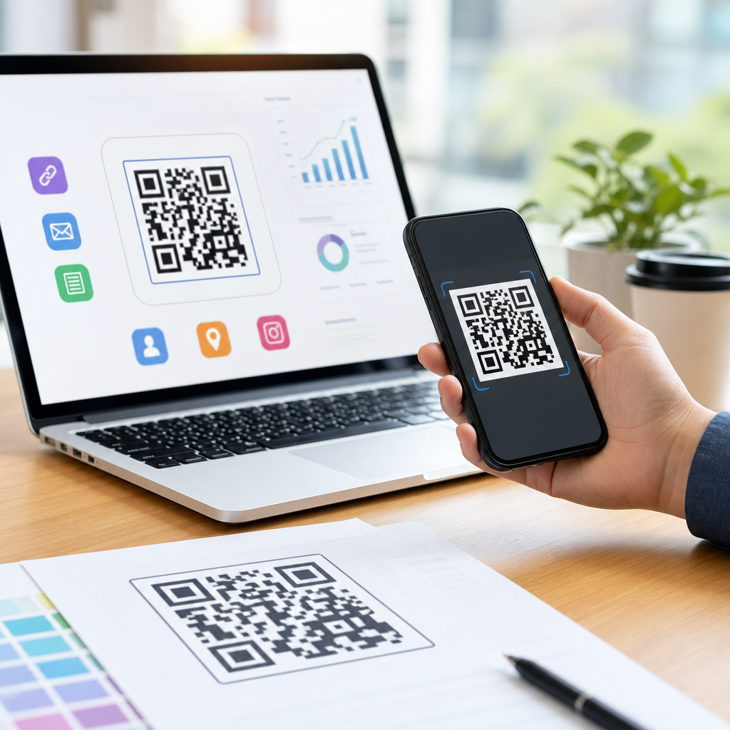
How to create a branded QR code without breaking scannability
The most dependable workflow starts with the destination. Decide whether the code will point to a mobile landing page, app store listing, PDF, menu, payment link, or contact card. For campaign use, dynamic QR codes are usually the better choice because they encode a short redirect URL, which creates a cleaner symbol and allows edits, analytics, and UTM tagging after printing. Static codes are fine for permanent data such as Wi-Fi credentials or plain text, but they are less forgiving when you need to change the target later.
Next, generate the base code with a reputable tool. Common platforms include QR Code Generator Pro, Beaconstac, Bitly, Canva, Adobe Express, and Adobe Illustrator plugins, though production teams often validate outputs with ZXing-based readers or native smartphone cameras. Export in SVG when possible so the modules stay sharp at any size. Then add the logo using the platform’s built-in feature or in a design tool, making sure the logo sits inside a protected white shape.
After that, test early and repeatedly. Scan the code from multiple distances, in bright daylight, low indoor light, and under reflections if the final piece will be laminated or behind glass. Test with iPhone Camera, Google Lens, and at least one lower-end Android device, because premium phones can decode codes that cheaper cameras miss. If scan speed slows noticeably, reduce the logo size, simplify colors, or increase final print dimensions before approving the artwork.
Print, screen, and environment factors that change performance
A logo QR code that works on a laptop screen may fail on packaging or a storefront poster because environment changes everything. Print resolution, substrate, viewing distance, glare, and motion all affect scan success. For printed materials, crisp edges matter more than decorative styling. If ink spreads on cardboard, fabric, or uncoated paper, small modules can fill in. In those cases, increasing the overall code size is smarter than pushing a highly detailed branded treatment.
Size should match scanning distance. A widely used rule of thumb is that scanning distance is roughly ten times the code width, though real performance varies by camera quality and lighting. A code on a business card may work at 0.8 to 1 inch wide, while a poster viewed from several feet away needs to be much larger. For menus on tables, product packaging, and shelf talkers, I typically start around 1.2 inches or 30 millimeters and scale upward based on testing.
Screen display introduces different issues. OLED glare, cracked screens, brightness settings, and motion in social videos can hurt recognition. Avoid placing QR codes over autoplay footage or highly compressed graphics. On digital signage, keep the code on screen long enough for users to open their camera and frame it, usually at least several seconds. If the code includes a logo, extra stability and contrast become even more important because users have less patience when scanning from a moving or distant display.
Common mistakes in designing effective QR codes
The most common mistake is treating the QR code as a decorative asset instead of a functional interface. Designers often shrink the quiet zone to fit a layout, recolor the modules to match a campaign palette, or enlarge the logo until it dominates the center. Another frequent error is exporting a small raster file and scaling it up later, which softens module edges and creates scan ambiguity. Every one of these choices can reduce first-scan success.
A second mistake is ignoring the destination experience. Even a perfectly branded QR code underperforms if it sends mobile users to a slow page, a desktop-formatted PDF, or an app install wall with no context. The code should be paired with a clear call to action such as “Scan to view the menu,” “Scan for setup instructions,” or “Scan to claim your discount.” Users scan more readily when they know exactly what happens next and trust the source because the logo supports that expectation.
Finally, many teams skip structured testing. They check one printed proof with one phone and assume the job is done. Better practice is to test on actual materials, from expected angles, and in the settings where the audience will scan. For high-volume campaigns, track scan-through behavior with analytics so you can compare versions, placements, and landing pages. Good QR design is not guesswork; it is measured performance shaped by real usage conditions.
Adding a logo to your QR code works best when branding supports usability instead of competing with it. The essentials are straightforward: use high error correction, keep the logo modest and centered, preserve strong dark-on-light contrast, protect the quiet zone, and export sharp files for print or screen. Just as important, match the code size to scanning distance and test it with real devices in realistic conditions. Those steps are what turn a nice-looking concept into a dependable mobile touchpoint.
As the hub page for designing effective QR codes within creating mobile QR codes, this guide gives you the framework for every related decision: logo treatment, color selection, sizing, dynamic tracking, and landing page readiness. If you apply these standards consistently, your branded QR codes will scan faster, look more credible, and perform better across packaging, signage, direct mail, and on-screen campaigns. Review your current codes, test them on multiple phones, and update any design that puts style ahead of scannability.
Frequently Asked Questions
Why should I add a logo to a QR code in the first place?
Adding a logo to a QR code helps turn a plain, generic-looking code into something users recognize and trust immediately. In most real-world situations, people decide within seconds whether they want to scan a code on packaging, a restaurant menu, a poster, event signage, or a mobile promotion. A visible brand mark gives them a strong visual cue about who created the code and what they can expect after scanning it. That extra clarity can improve confidence and increase scan response, especially when people are cautious about opening unknown links on their phones.
A logo also supports brand recognition. When someone sees your company mark centered in the QR code, the code becomes part of your overall visual identity instead of looking like a random technical element placed on a design. This is especially useful in campaigns where multiple touchpoints work together, such as print ads, product labels, app download flows, social promotions, and in-store signage. When designed correctly, a branded QR code feels more intentional, more professional, and more aligned with the rest of your marketing materials.
That said, the logo should always enhance the code, not overpower it. The goal is to make the code more trustworthy and visually appealing while preserving fast, reliable scanning. A well-branded QR code balances recognition and functionality. If the logo is too large, the contrast is too low, or the surrounding design is cluttered, the scan experience can suffer. The best results come from using the logo as a clear brand signal while keeping the QR code highly readable across devices and lighting conditions.
How do I add a logo to a QR code without making it harder to scan?
The safest way to add a logo to a QR code is to start with a high-quality QR code generator that supports logo insertion and uses strong error correction. Error correction allows the code to remain readable even when a small portion of the pattern is covered by a logo. In most cases, using a higher error correction level gives you more flexibility for logo placement, especially when the logo sits in the center. This is one of the main reasons branded QR codes can work well when they are designed properly.
Keep the logo relatively small compared with the full code. A common best practice is to place the logo in the center and make sure it does not cover too much of the data area. You also want enough clear contrast between the dark and light parts of the QR code, since scanners rely on that contrast to read the pattern quickly. Black on white is still the most dependable option, though carefully chosen brand colors can work if the contrast remains strong. Avoid low-contrast combinations, busy backgrounds, gradients that interfere with readability, or decorative effects that distort the core structure.
It is also important to preserve the quiet zone, which is the blank margin around the QR code. Many scan failures happen not because of the logo itself, but because the code is crowded by nearby text, images, borders, or design elements. After creating the code, test it thoroughly on multiple phones, under different lighting conditions, and at the actual size it will be printed or displayed. If it scans instantly and consistently in realistic conditions, your logo treatment is likely in a safe range. If not, reduce the logo size, simplify the design, improve contrast, or enlarge the overall QR code.
What size should the logo be inside a QR code?
There is no single perfect logo size for every QR code, because the right proportion depends on the amount of encoded data, the error correction level, the overall output size, and where the code will be used. However, the general rule is simple: the logo should be noticeable enough to identify the brand but small enough that it does not interfere with scanning. For most use cases, keeping the logo modest and centered produces the best balance between appearance and performance.
If the QR code links to a short URL or uses a dynamic QR code with a compact destination, you often have a little more room to work with than you would with a dense code containing more data. Even so, restraint is important. A code on product packaging, for example, may be printed quite small, so an oversized logo can quickly reduce reliability. By contrast, a large event sign viewed from a distance may allow a slightly bigger logo because the code itself can be printed much larger. The context always matters.
The smartest approach is to treat logo size as a practical testing decision rather than a purely visual one. Start with a conservative size, generate the code with appropriate error correction, and test it in the exact environment where it will appear. Print a sample if it will be printed. Display it on-screen if it will appear digitally. Then scan it with different devices and camera apps. If the code scans immediately and still looks clearly branded, you are in a strong position. If there is hesitation, inconsistent scanning, or the code fails under normal use, reduce the logo size or increase the total code dimensions.
What design mistakes should I avoid when creating a QR code with a logo?
The most common mistake is prioritizing style over functionality. A QR code is still a machine-readable tool first, and branding should support that purpose rather than compete with it. Oversized logos, weak contrast, complex patterns, heavily rounded modules, artistic distortions, and decorative backgrounds can all make scanning less reliable. Some designs may look impressive in a mockup but perform poorly in the real world, especially on older phones, in glare, or when the code is printed at a small size.
Another frequent issue is ignoring the quiet zone around the code. That empty border is essential for scanners to detect the code correctly. When designers place the QR code too close to text, images, packaging edges, or colored blocks, the scanner may struggle to isolate the code. Similarly, putting the code on reflective materials, curved surfaces, or poor-quality print stock can reduce readability even if the digital file itself looks fine. Print quality, size, placement, and surrounding layout all influence performance.
You should also avoid using generic destination links or disconnected messaging. If the logo tells users your brand is behind the code, the landing page should reinforce that expectation immediately. A mismatch between the branded QR code and the final destination can undermine trust. The best QR code designs work as a complete experience: recognizable logo, clean layout, clear call to action, easy scanning, and a relevant mobile-friendly landing page. When all of those pieces align, the code feels safe, useful, and worth engaging with.
How can I test whether my logo QR code is ready for real-world use?
Testing should happen before launch, not after the QR code has already been printed on packaging, menus, flyers, displays, or event materials. Start by scanning the code on multiple devices, including both iPhone and Android phones, and try more than one camera app if possible. Test in bright light, indoor light, and slightly dim conditions. If the code will be placed high on a sign or used on a product label, test it from the expected scanning distance and angle. A branded QR code that works perfectly at full size on a desktop screen may behave very differently when printed small or viewed under glare.
You should also test the complete user journey, not just the scan itself. Make sure the code opens quickly, the destination is mobile-friendly, the branding matches expectations, and the page or app screen delivers exactly what the user was promised. If the QR code includes a call to action such as “Scan to view menu,” “Scan to download the app,” or “Scan for event details,” confirm that the destination fulfills that message immediately. Strong scan performance means little if the post-scan experience feels confusing, slow, or disconnected from the branded cue provided by the logo.
Finally, test the production version, not just the original design file. If the code will appear on matte labels, cardboard boxes, acrylic signs, digital kiosks, or laminated menus, create proofs in those actual formats. Small changes in print sharpness, color, material, and placement can affect scan rates. If you notice any inconsistency, adjust the design before rollout by increasing the code size, simplifying the logo treatment, improving contrast, or giving the code more clear space. Real-world testing is what turns a visually attractive branded QR code into one that is dependable, trustworthy, and effective in campaign performance.